More-ma! Forma DJR gets new weights and variable fonts
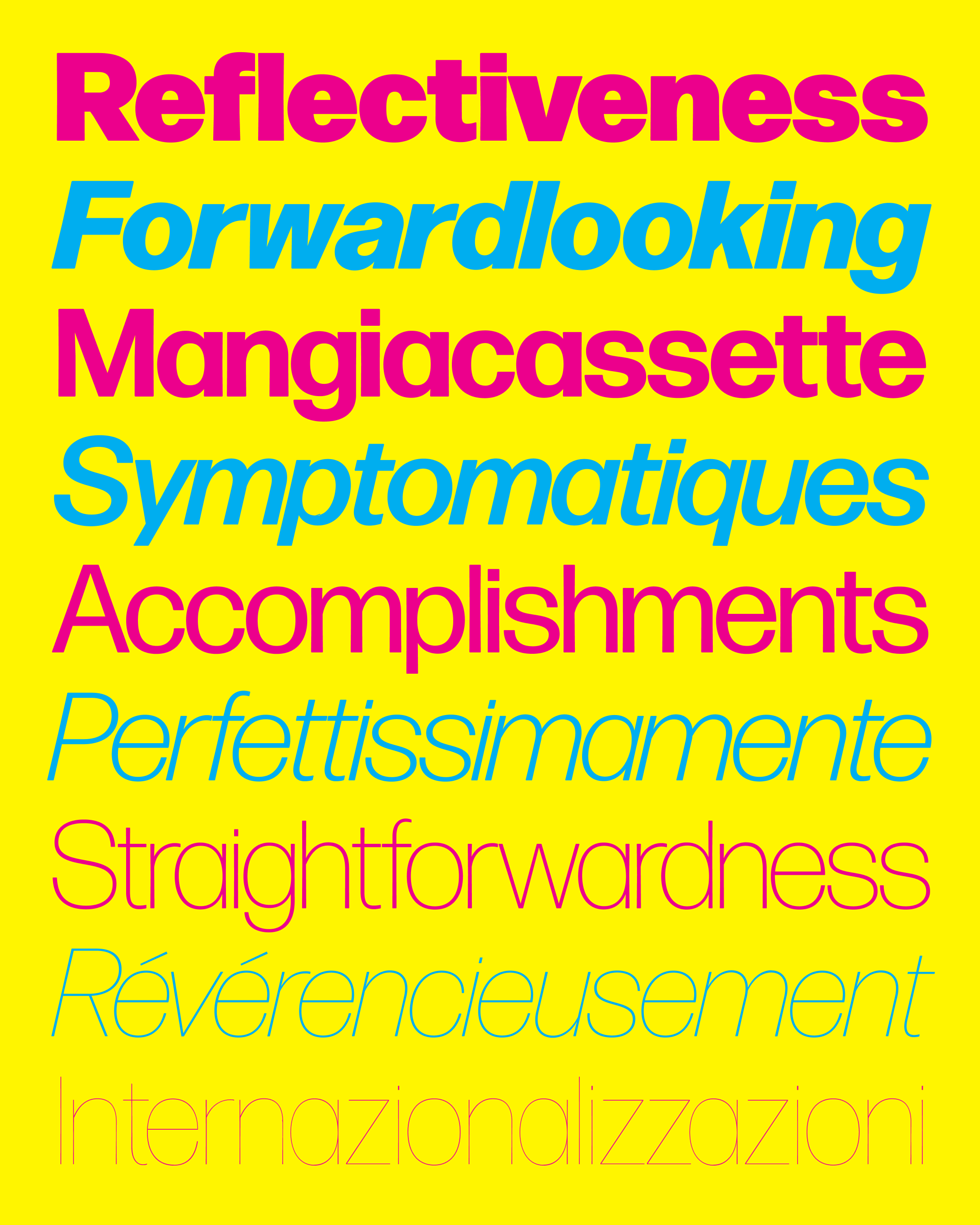
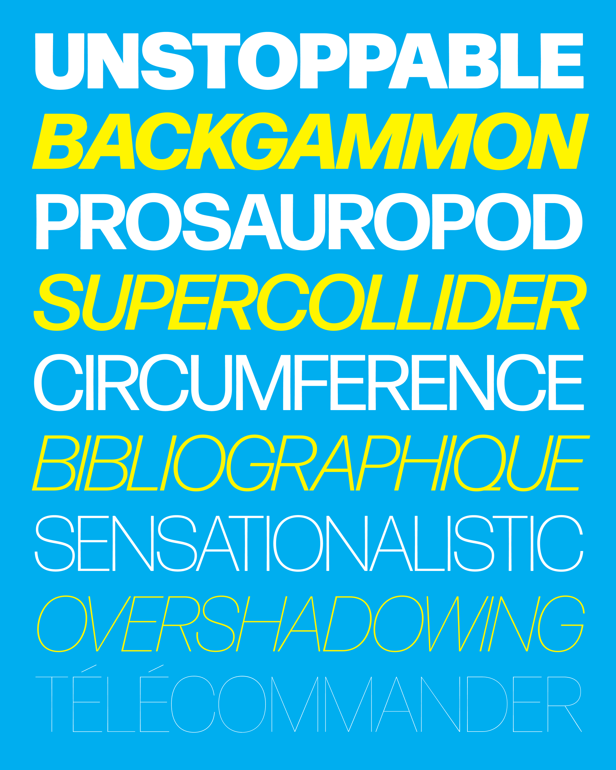
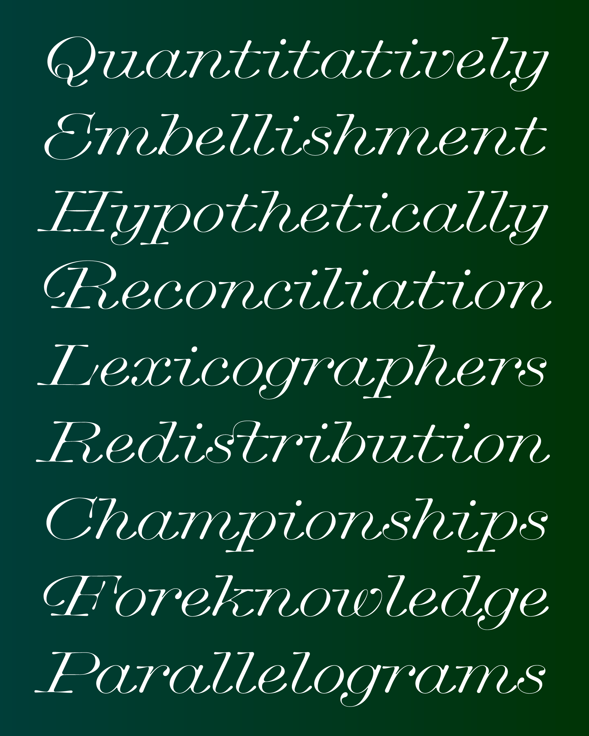
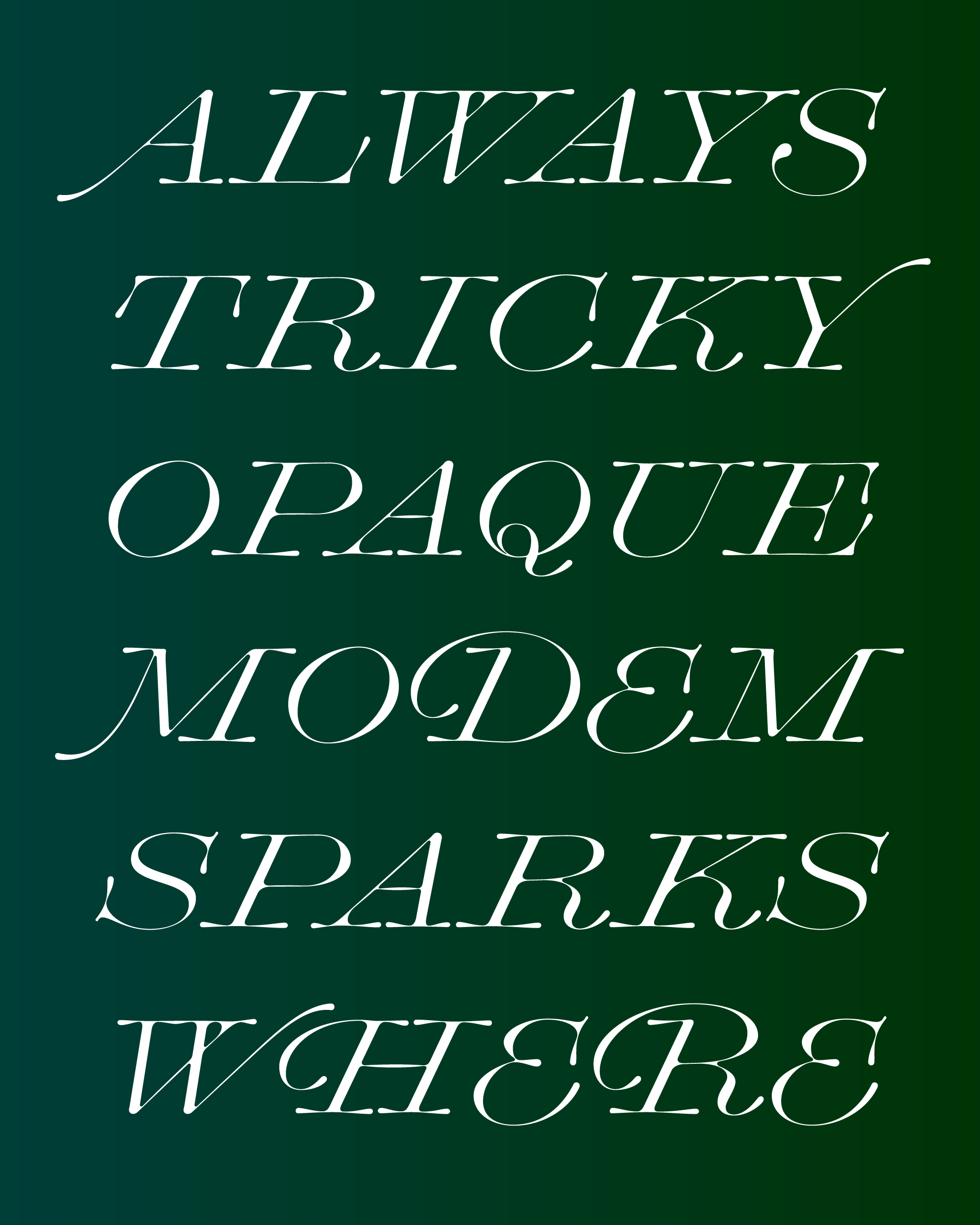
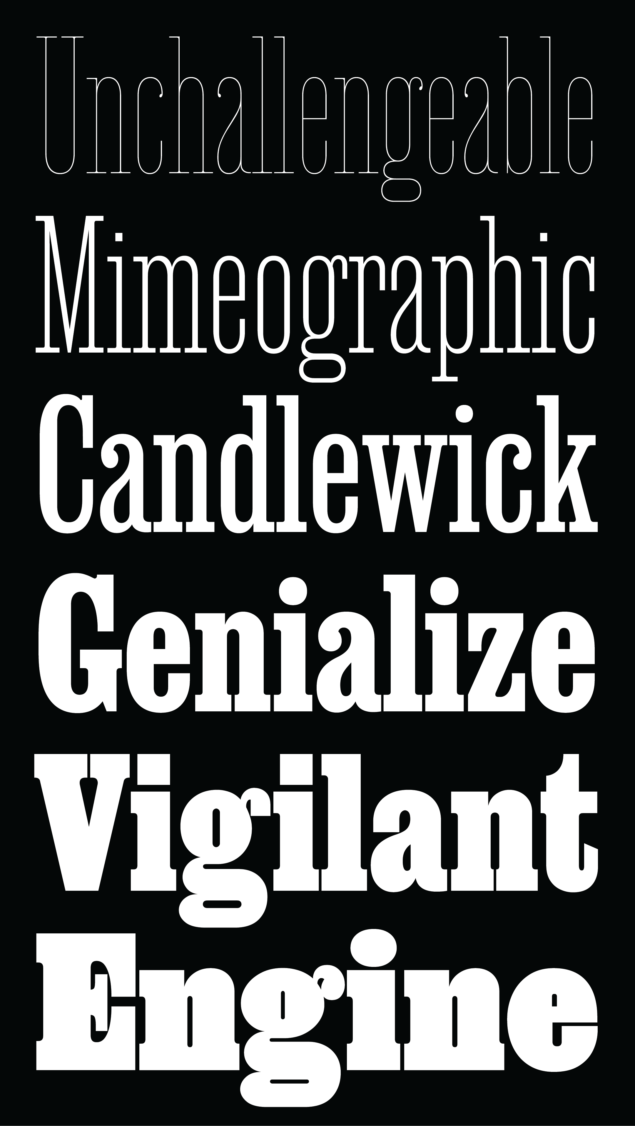
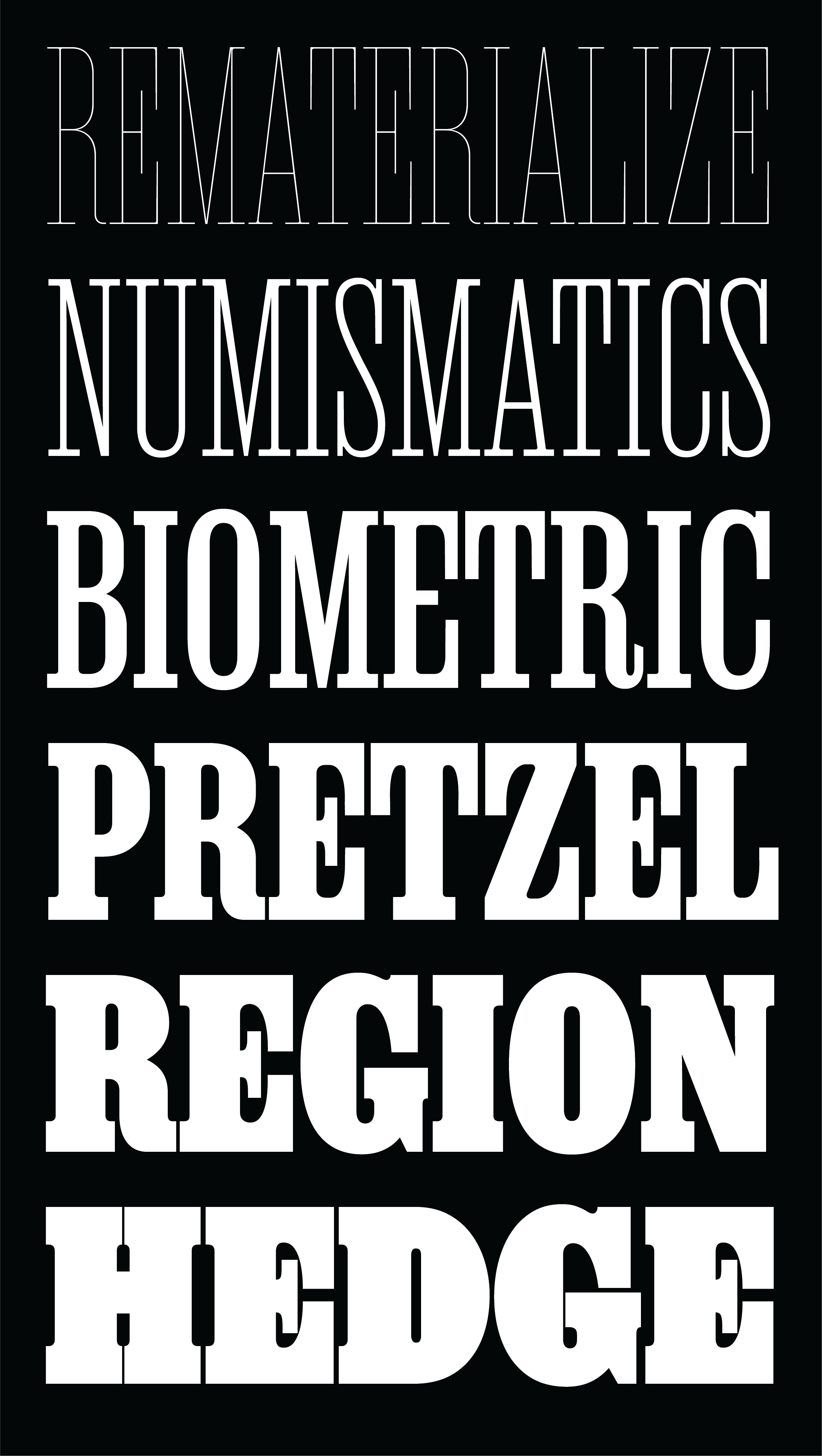
Forma DJR was conceived as an expansive family, and I’ve always felt that the weight range in the original release didn’t reach its potential. Now it has. I’m excited to announce a significant update to the family with four new weights, that take the design to light and dark extremes, and variable fonts, which give you full control over this expanded designspace.
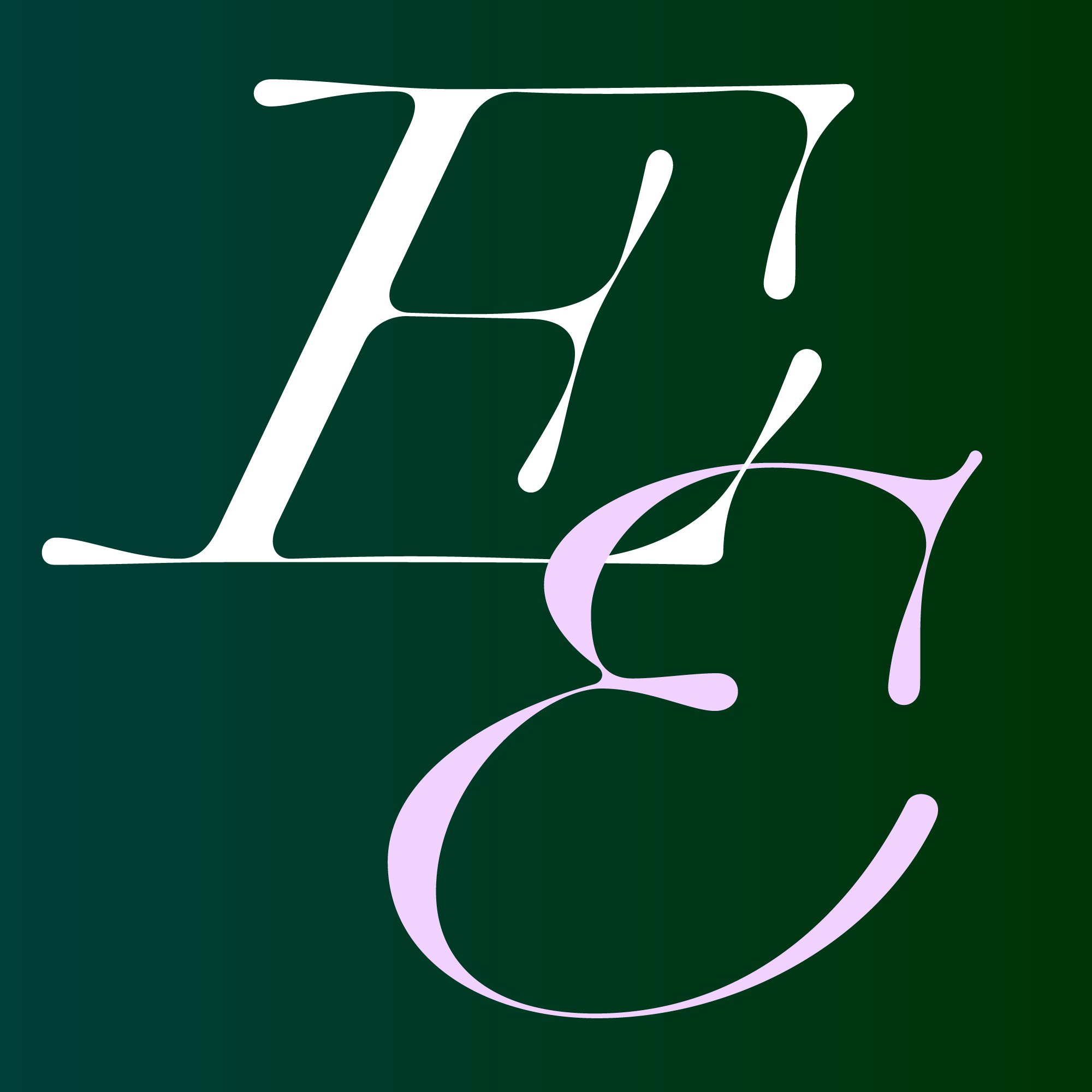
This all began when Roger Black asked me revive Aldo Novarese’s Forma, a slick neo-grotesque typeface, and make it a family that would work for editorial and branding typography. Under Roger’s direction, I embraced the qualities that were present in fresh proofs from metal type, and was guided by Indra Kupferschmid as I developed the rounded corners, tapered stems, and other imperfections that captures the feeling of ink on paper.
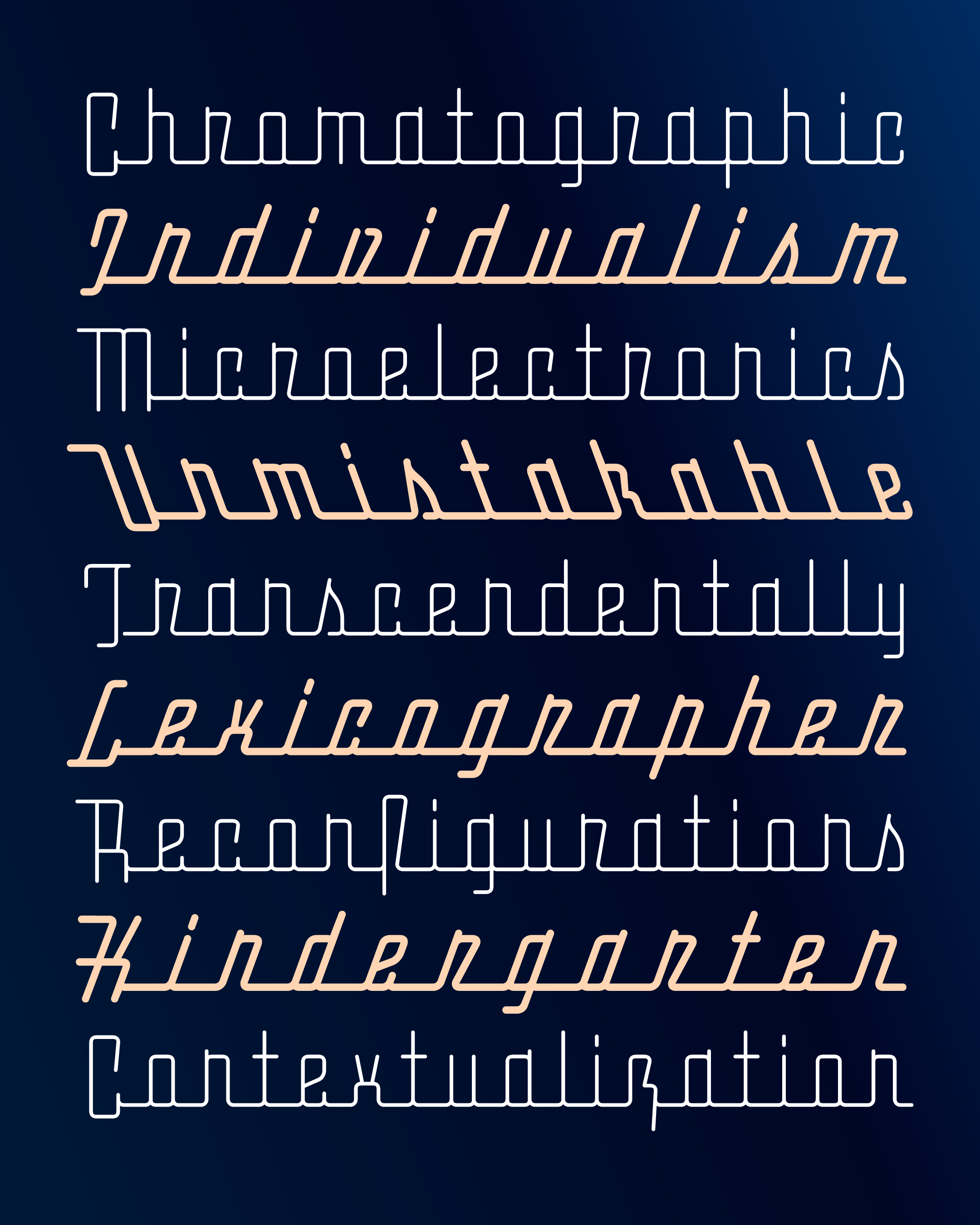
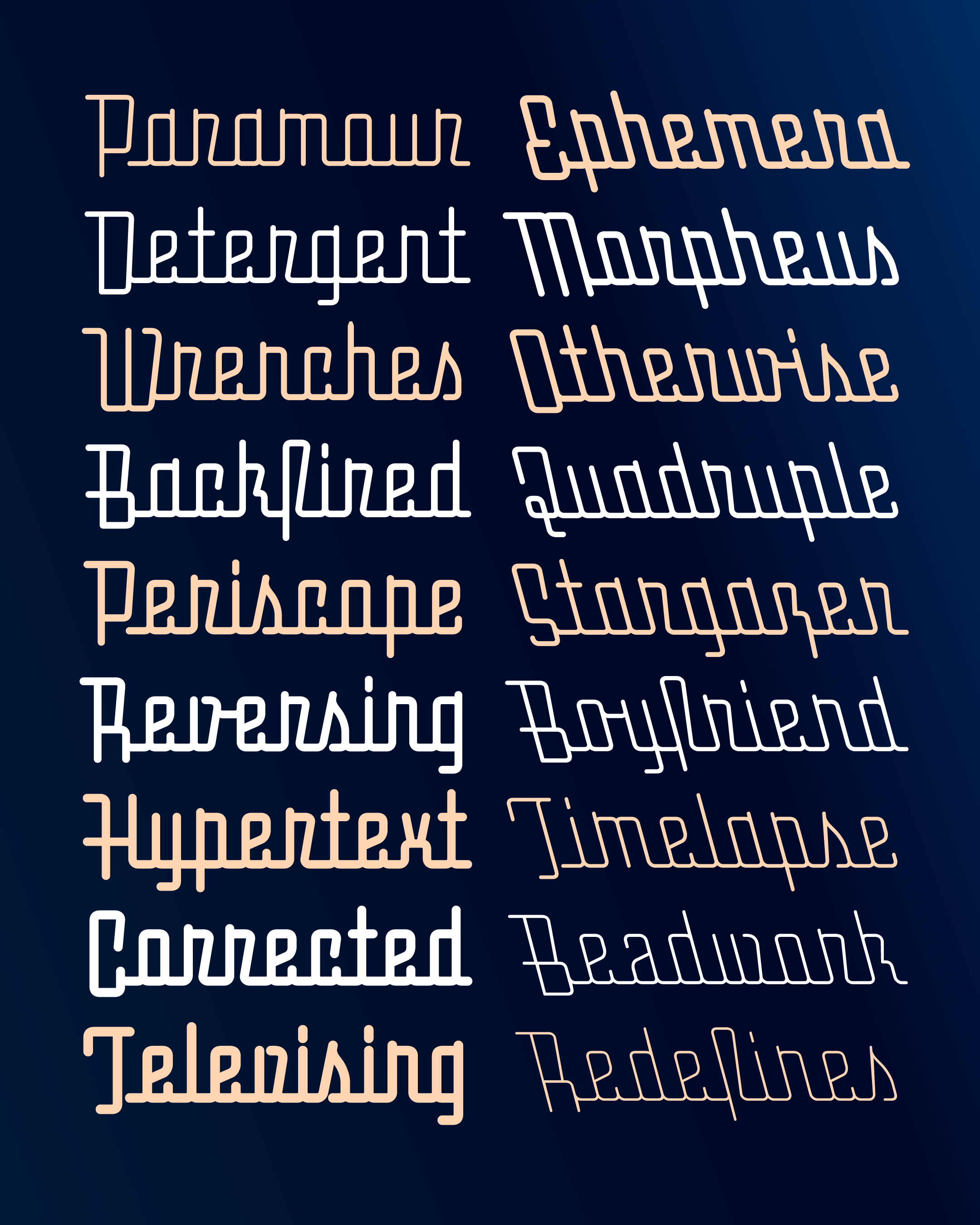
In the years that followed, I drew a Black and then a Hairline weight as outliers, but I never found the time to incorporate them into the family. Fortunately, Italian type designer and longtime Forma fan Ruggero Magrì stepped in and completed the project. He expanded the revival’s language support, drew a Hairline Italic, and brought the family together as variable fonts.
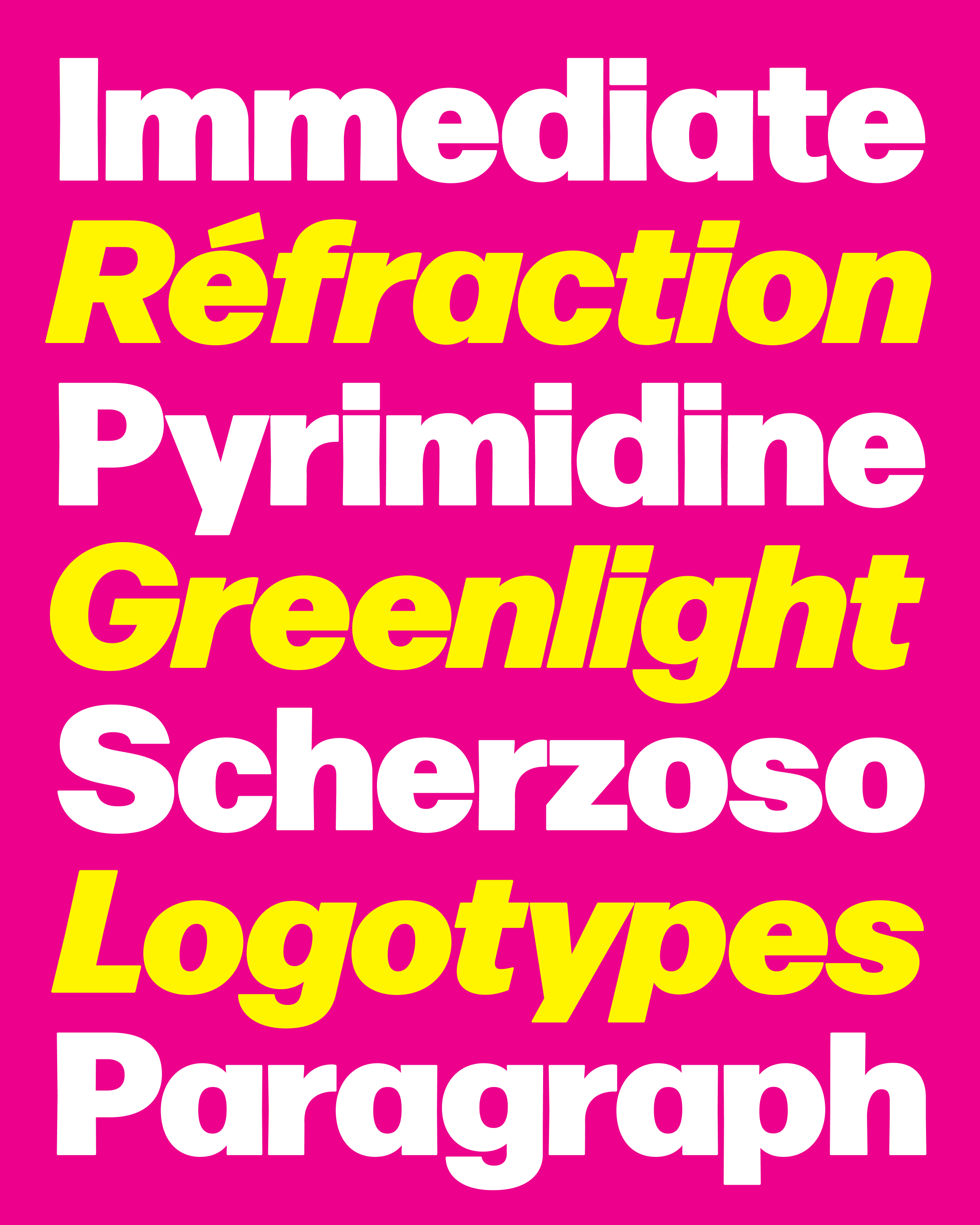
I drew Forma DJR’s Black weight in 2017 for the Belgian broadcaster VRT as part of the rebrand of their news outlet, VRT NWS. Working with the branding agency Today and Type Network, I tried to preserve the general weight and appearance of the original Forma Tonda Nerissima, but added a bit of width and thick/thin contrast so that this style would work seamlessly with the rest of Forma DJR.
Four years later, VRT NWS still uses the typeface every day, on TV, on the web, and on social media. And I can’t tell you how much I love seeing it on the weather report!
Read more about the VRT NWS rebrand at Type Network »
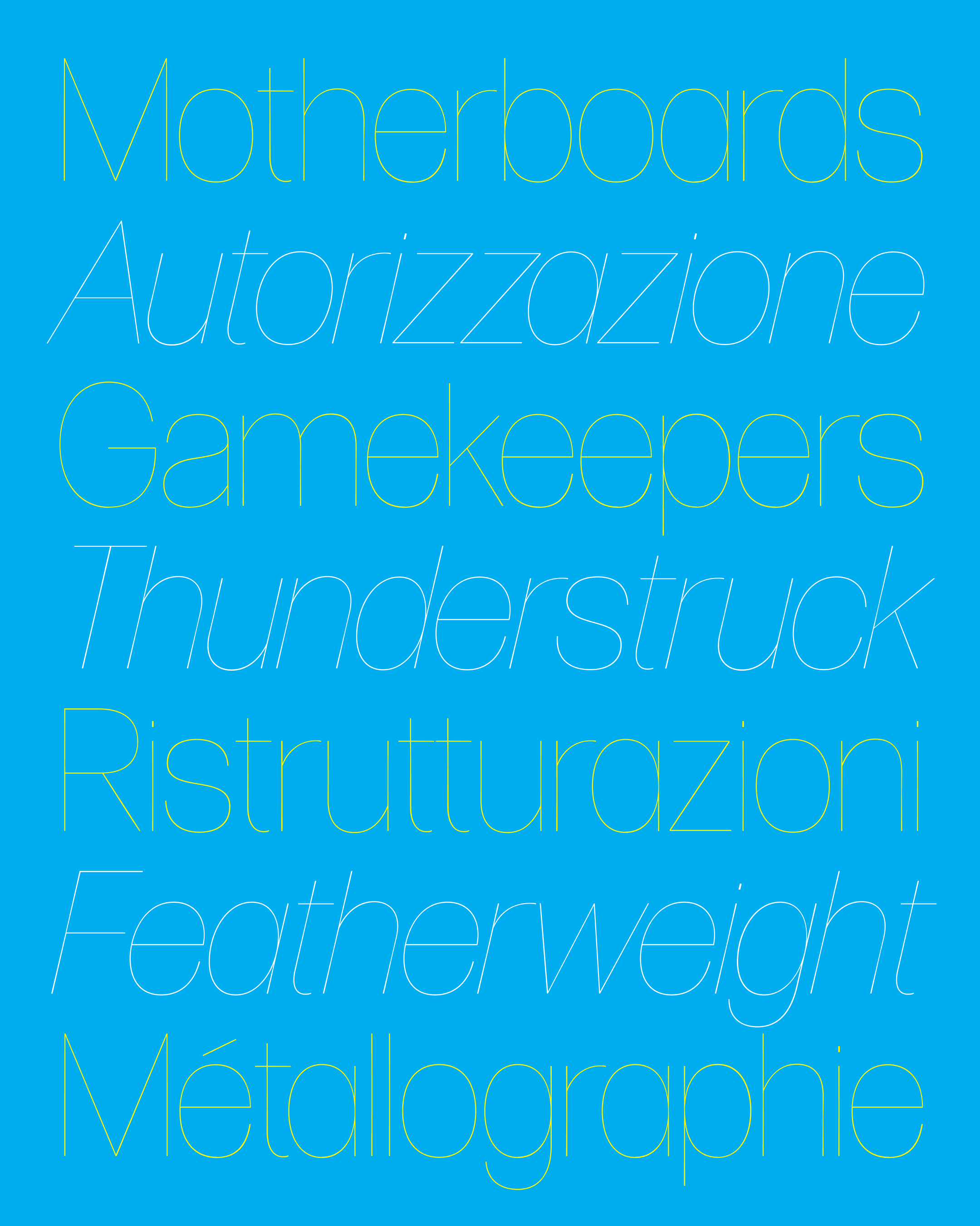
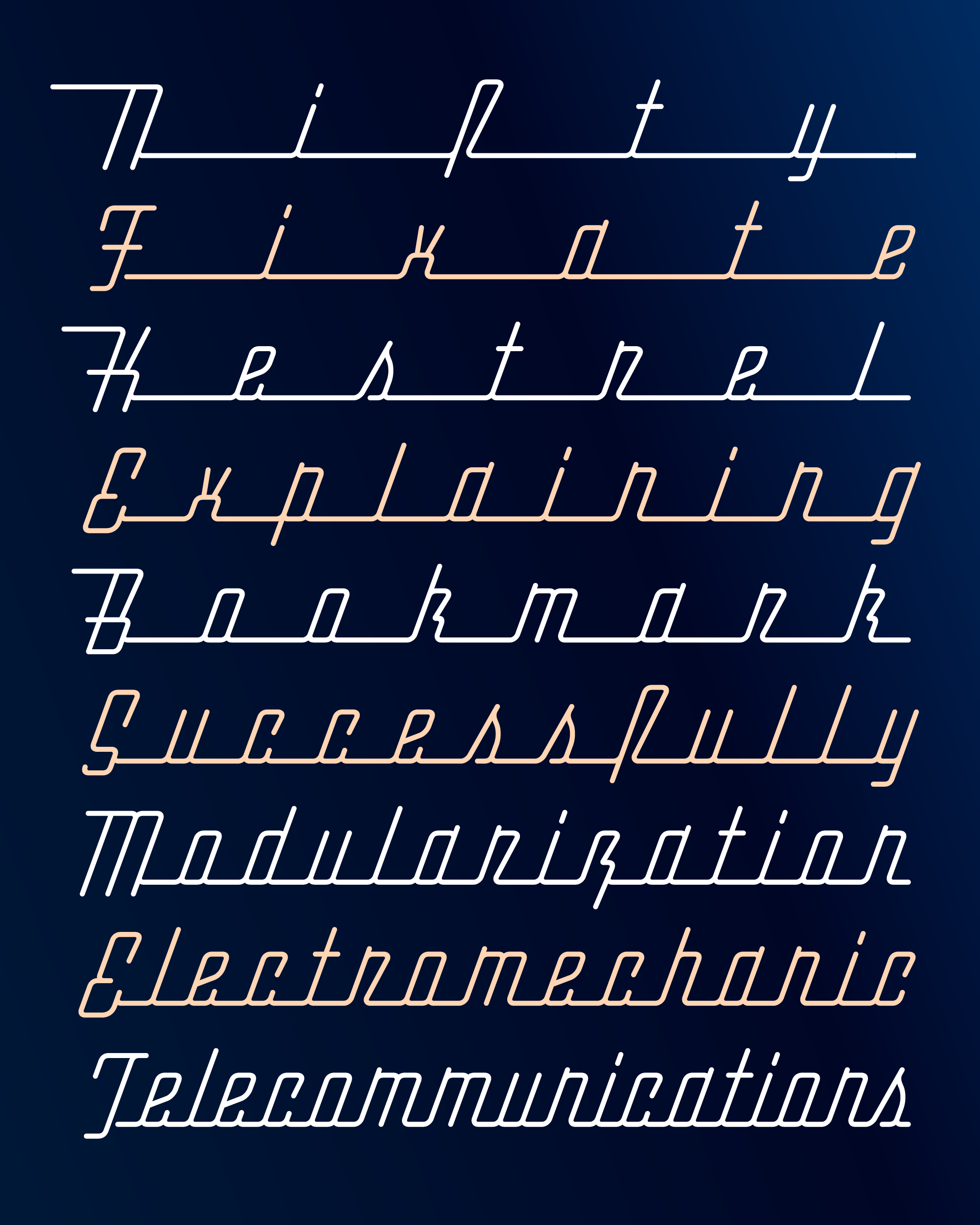
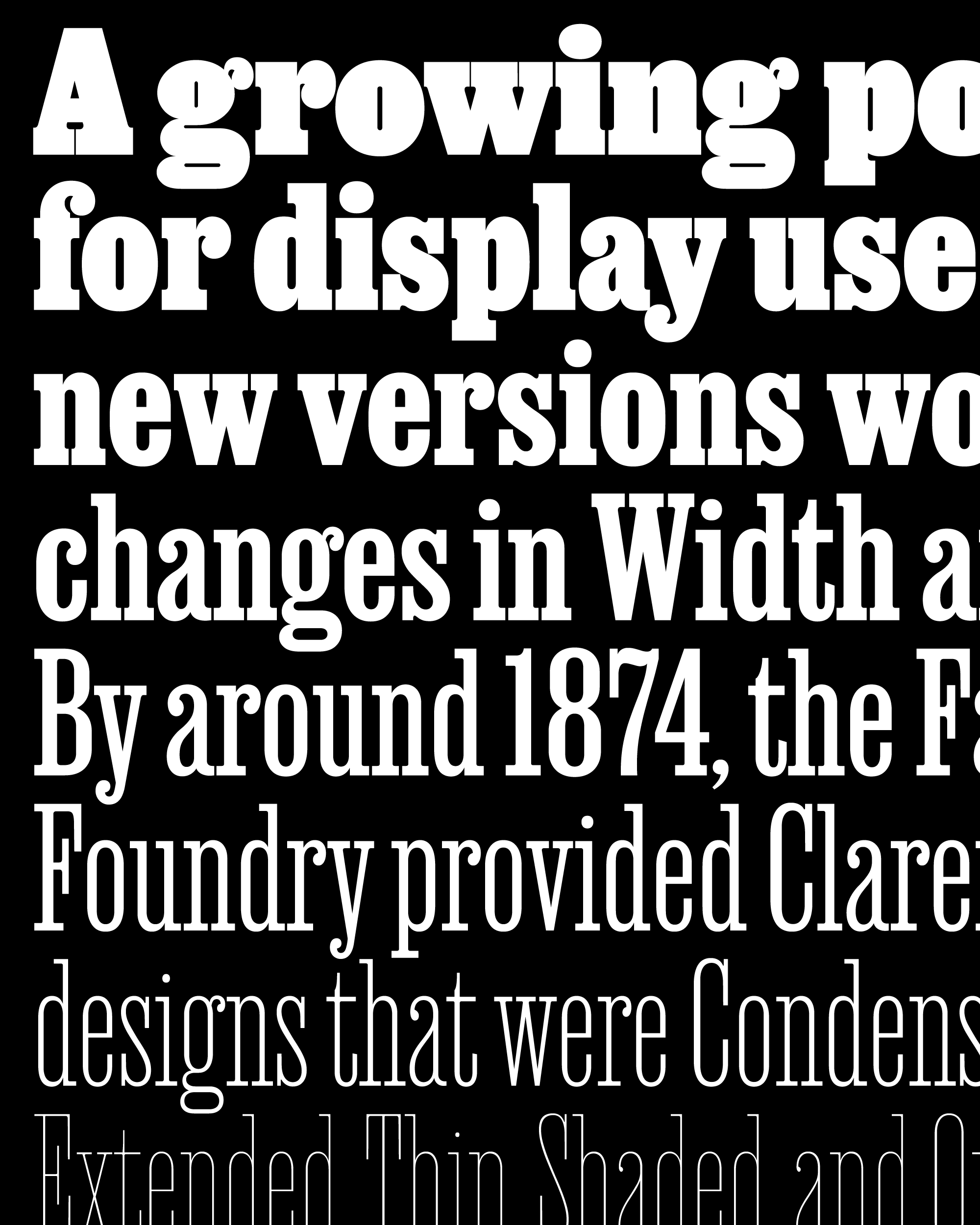
Before its release in 2016, Forma DJR was used for glamorous magazine headlines, and it has always excelled in large sizes. So an extremely light style was only a matter of time. In June 2019, I reduced the design to its skeletal form and released Forma’s hairline weight for the Font of the Month Club. With hardly any weight at all, its tapered stems and rounded edges are especially noticeable...but I like it that way.
After that came out, Ruggero took over, and I couldn’t have been happier with the Hairline Italic he drew. He managed to capture the naturalistic curves of the original, without any feeling of it being digitally skewed. And he managed to do this while maintaining consistent weights and round edges at a 13° angle, which is no trivial task!
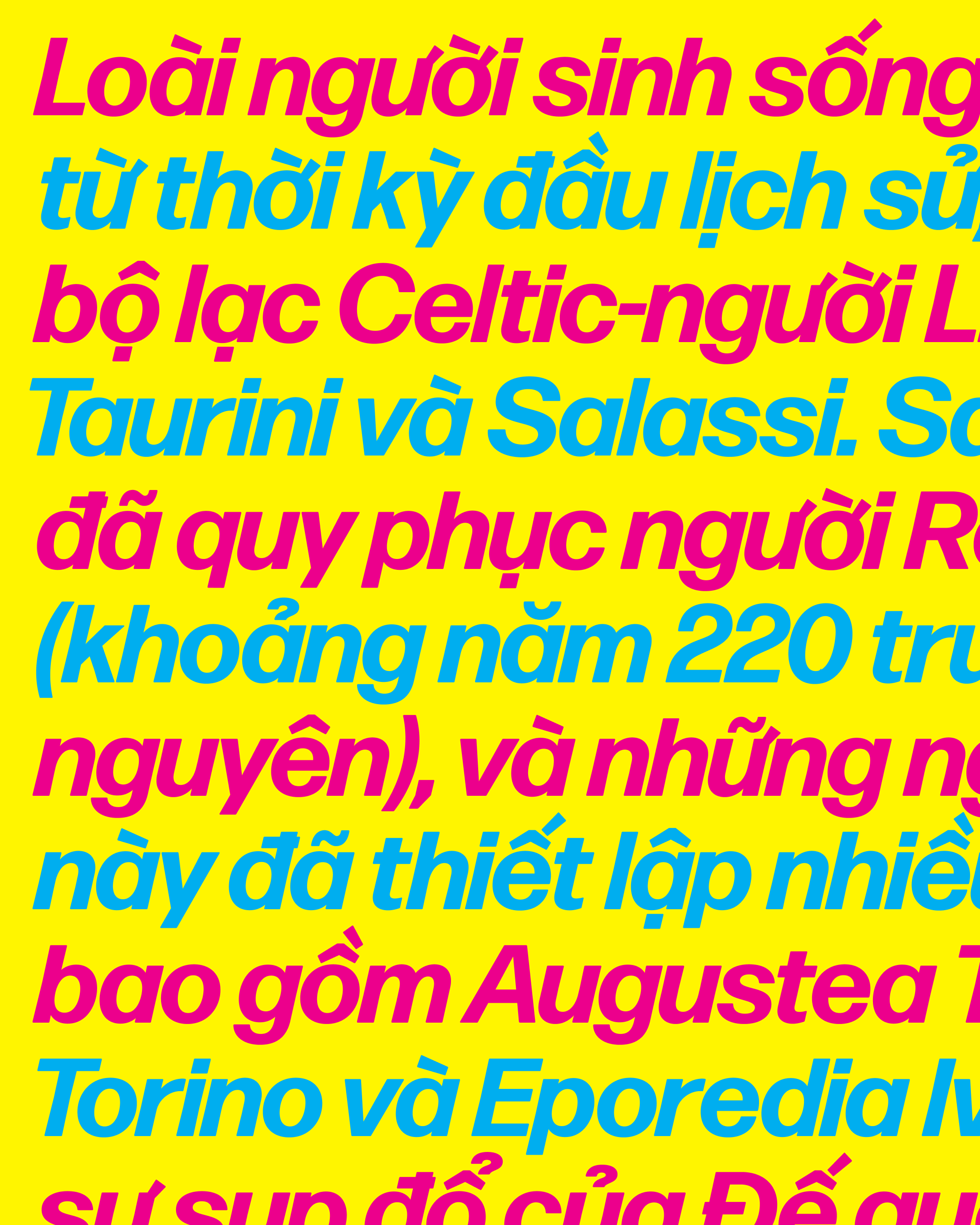
Ruggero also took the opportunity to add Vietnamese language support, bringing it in line with my other recent releases. Donny Truong, creator of the incredible Vietnamese Typography resource, advised us on the project, and was particularly helpful with the crucial diacritic horn.
We were nervous about using a straightened horn, which would be an unusual feature for a sans like this one, but we thought it vibed with Forma’s Modernist leanings. To our delight, Donny encouraged us to keep this more daring shape, and we took his pragmatic suggestion to provide a curved alternate for those who prefer it, especially in text.
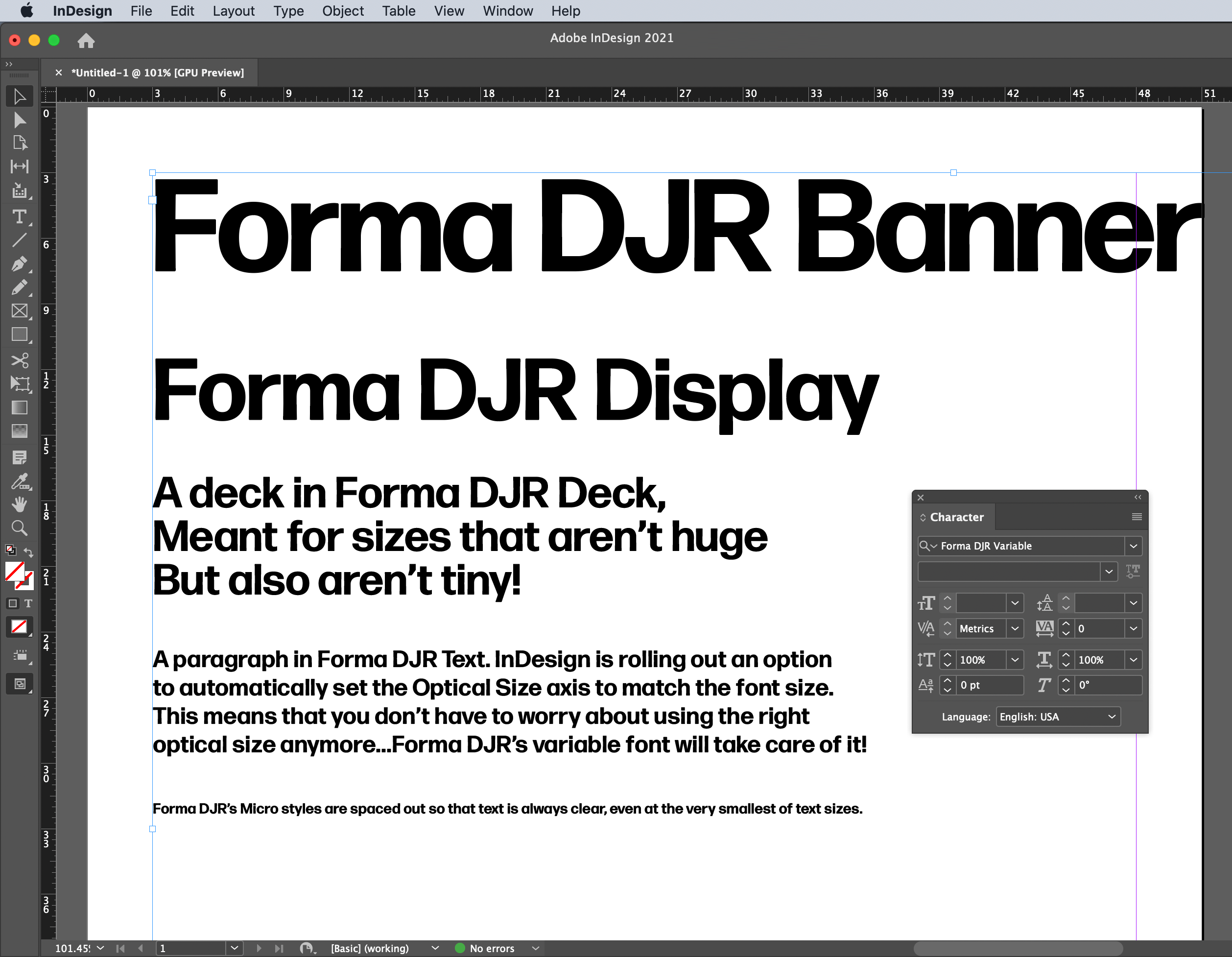
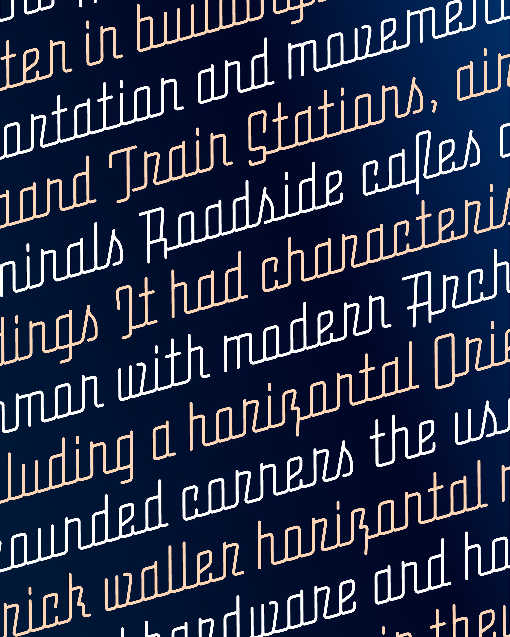
Forma DJR Variable’s Optical Sizes subtly tighten the letter spacing as the type gets larger.
As you may have noticed, Forma DJR’s super-tight spacing is incredibly sensitive to size. Its Optical Sizes were designed to make its spacing comfortable from tiny 8pt captions, to massive 144pt headlines. Now, with variable fonts, you’re no longer required to choose between “Banner” or “Display” font names when setting large type, or “Text” versus “Micro” when things get small. You still have as much control as before but it should take less work.
Some environments will even do that work for you. InDesign is starting to roll out their support for automatic optical sizing, which will match the Optical Size axis to the point size. Forma DJR is a perfect example of why this nifty feature should exist.
All weights of Forma DJR, including its variable fonts, are now available for licensing at djr.com/forma. Folks who’ve already licensed Forma from me can get in touch to upgrade at no additional charge. Free testing licenses are also available, so I encourage you to take it for a spin!