April’s font of the month: Nickel Gothic v2
One of my favorite bits of film jargon is “the Heavy”, a term that refers to the central villain of a story. Sure a villain can be physically large, but in my understanding, the weight of the Heavy is more metaphorical. It describes an antagonist whose mere presence is so forceful and looming that it casts a shadow over the events of the film—a shadow that propels the story as the hero fights to get out from under it.
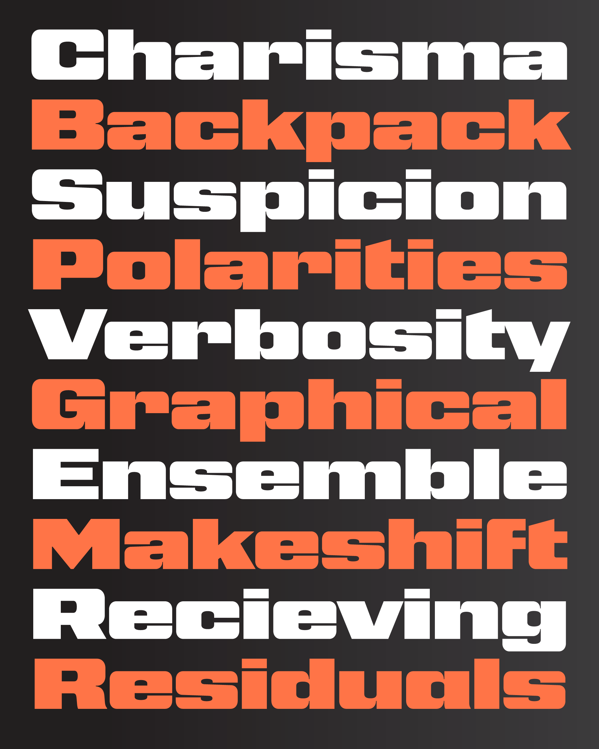
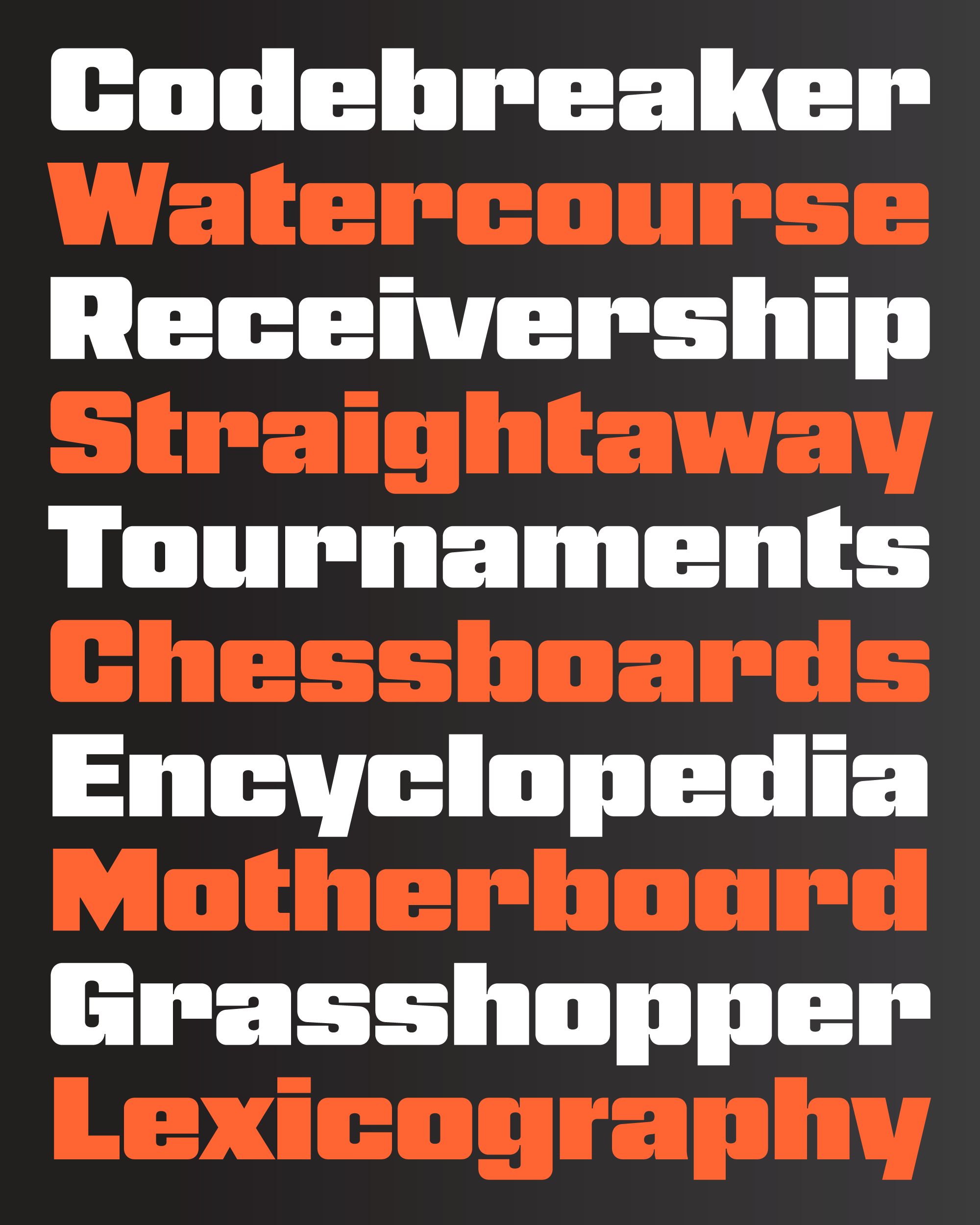
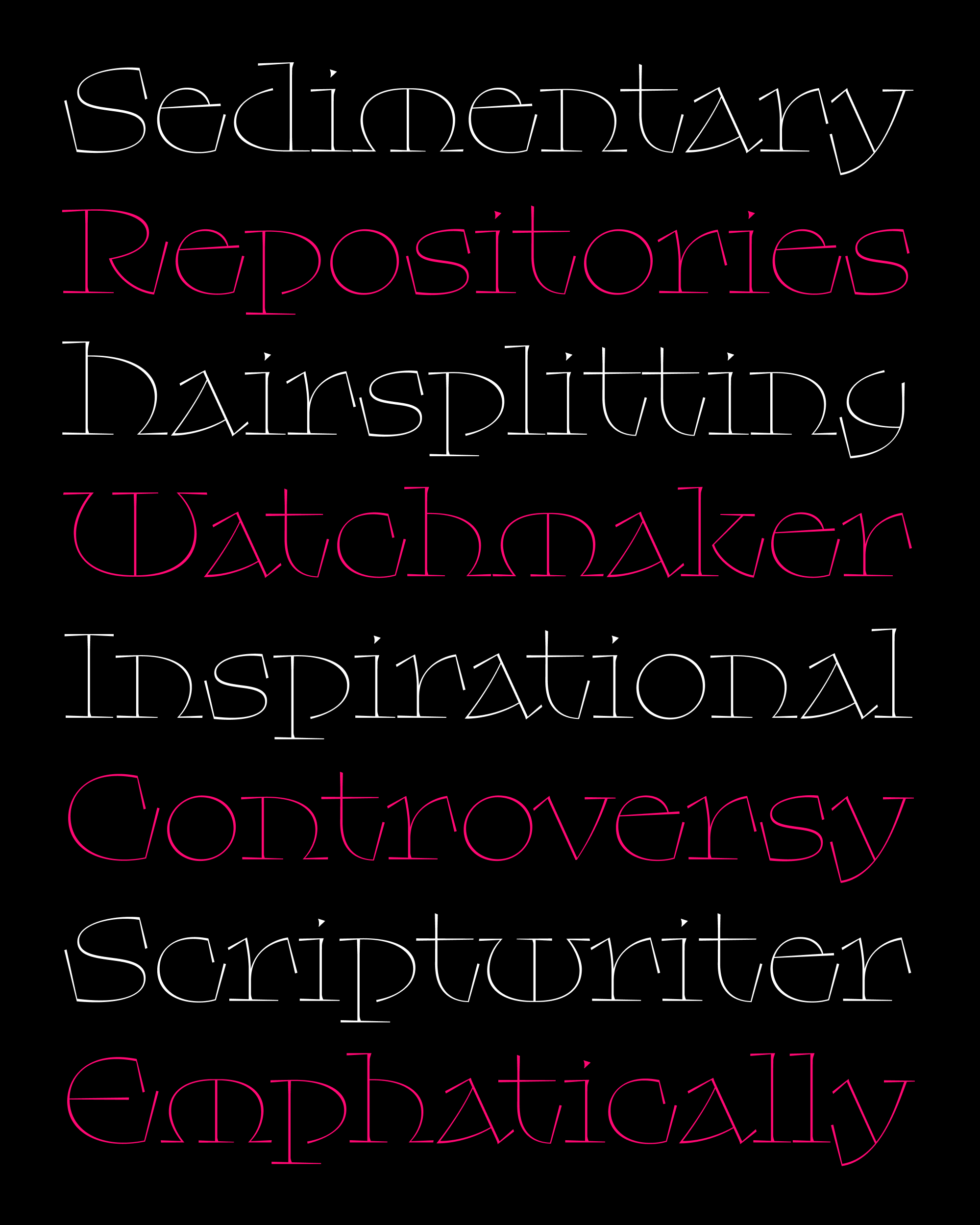
Nickel Gothic is bold, but it isn’t the boldest or widest font in my library. However, it has a singular presence, with square shoulders and a lumbering heft that makes you think that no font could possibly be more imposing. Every letter lands on the page with a resounding thud.
This month, I was in need of a palette cleanser. Two months of Warbling involved so many little tweaks, optical corrections, and harmonizations, that my brain was fried. I needed to work on something where I could work fast, where every move I make could be big and unsubtle, and where there was no need to get bogged down in manicuring and fine-tuning. And there’s no better way to reset than to make a blocky or modular font.
So I went back into my archives and dusted off Nickel Gothic Wide, an all-uppercase sans serif that I drew back in February 2019. It was based on some small capital letters found on a Chinese banknote from 1918 that I saw in a New York Times article about the design of money. (Thanks Mom for sending me that article!)
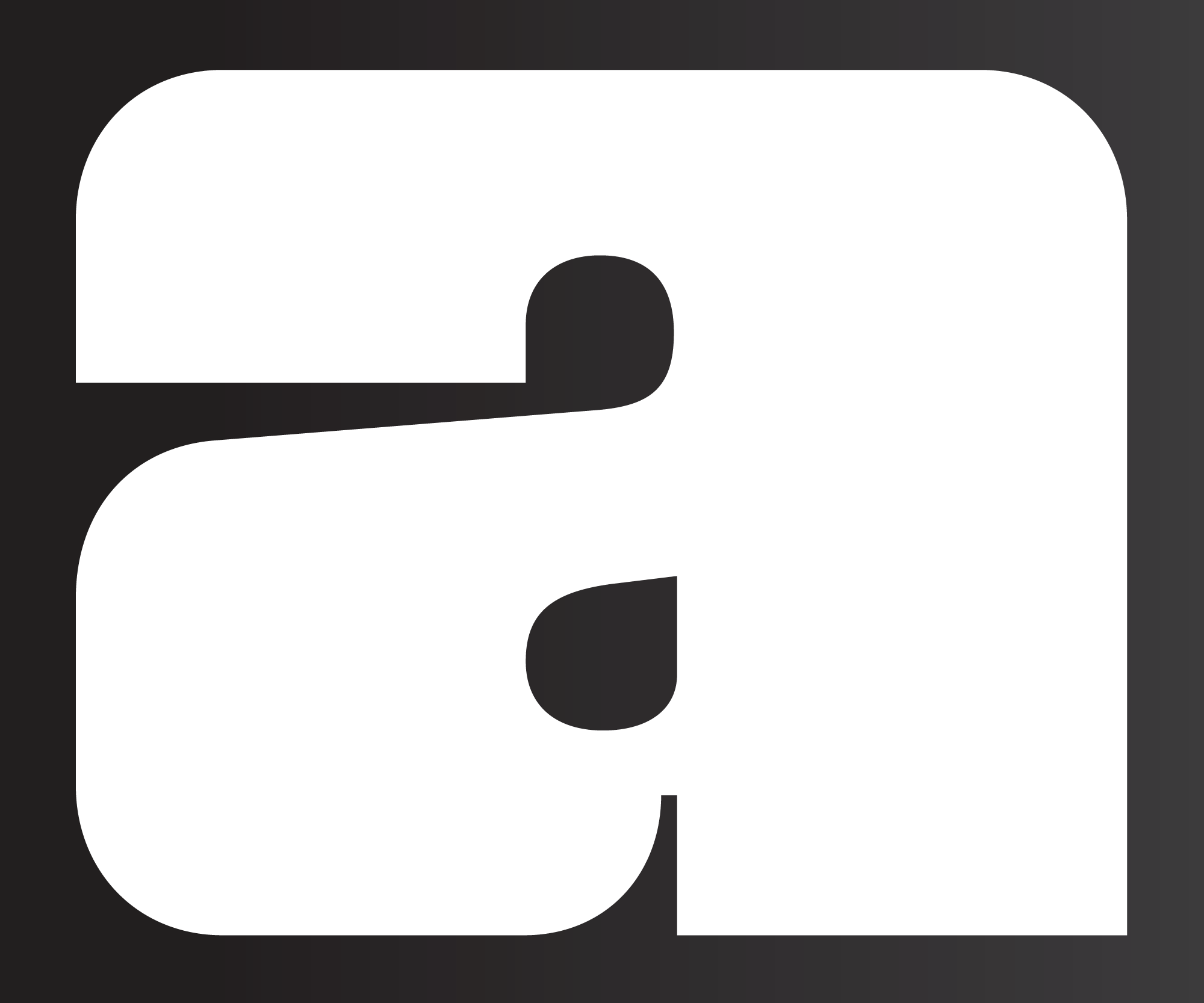
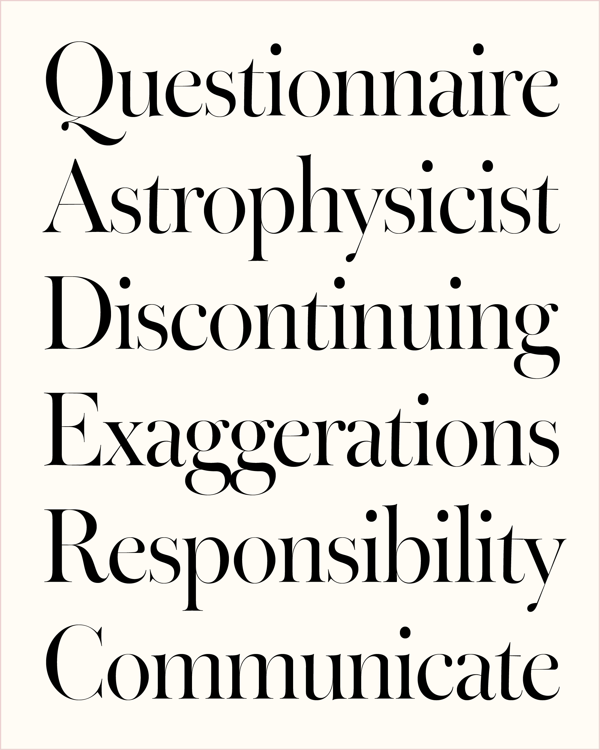
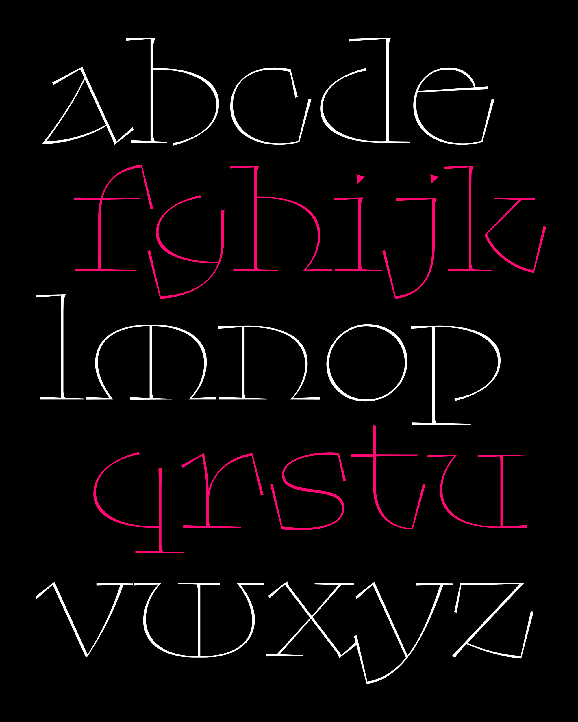
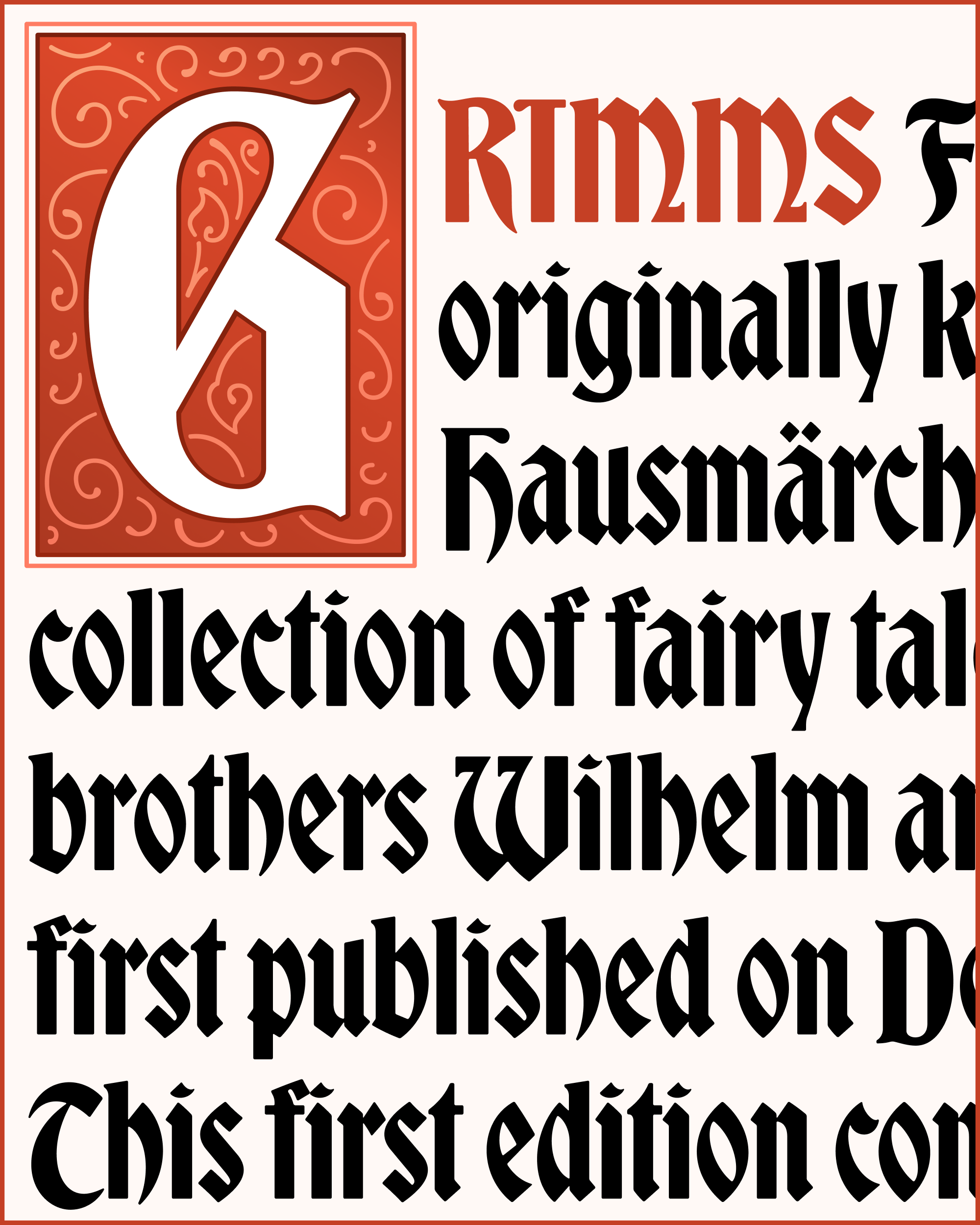
The first thing I did was add a lowercase, figuring it would make the typeface that much more versatile. Fortunately for me, Nickel Gothic’s capital G is bearded, which creates a little divot on the bottom right of the glyph. This shape was outlier in the original caps, but it ended up being a foundational part of the entire lowercase. I love when I can borrow something from the existing vocabulary of a typeface rather than having to come up with something new.
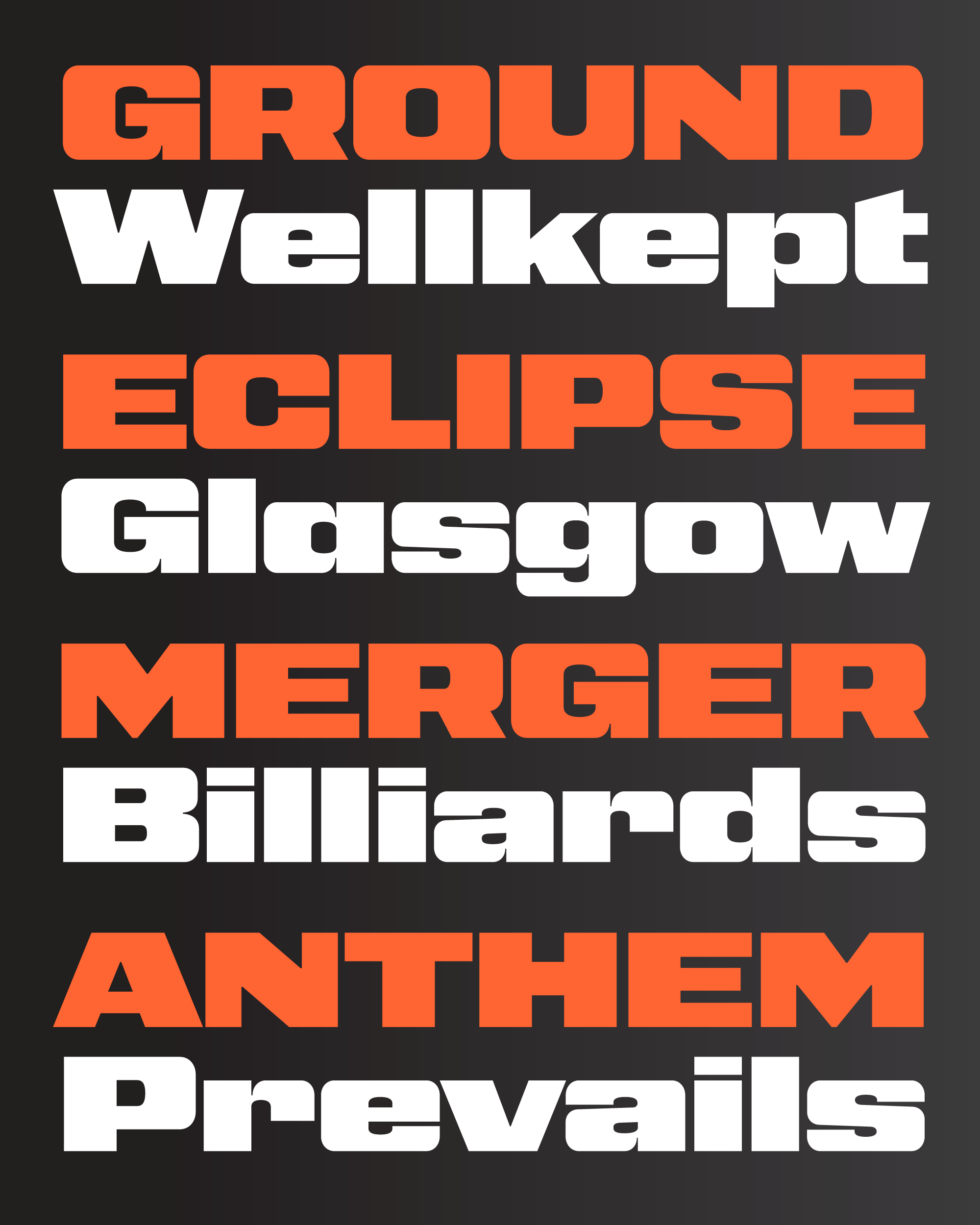
Then, I tried my hand at a narrower width where the capital letters are closer to a square. This style starts to play in the same sandbox as designs from the ’70s like Neographik and Serpentine. I leaned into this vibe by tightening up the letter-spacing across the family, which I hope makes Nickel Gothic better suited to headlines with upper-and-lowercase settings. (You can always add a bit of tracking to the caps if you want.)
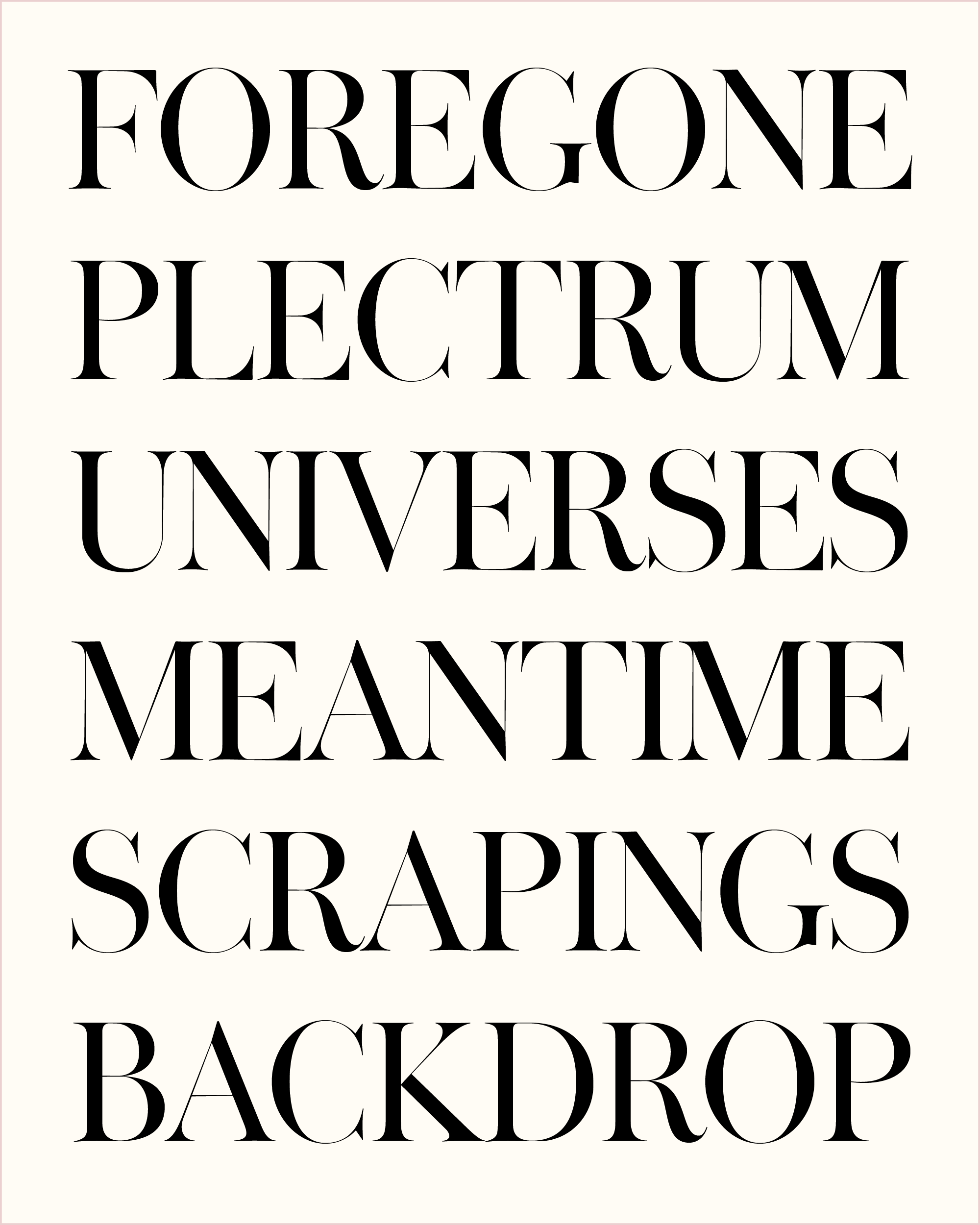
We’ve seen a resurgence of high-octane sans serifs in recent years—Conductor, Tempel Grotesk, Review, and Mortier to name a few. What sets Nickel Gothic apart is its approach to “round” shapes like O: there is a tension between the flat tops and bottoms of the exterior shapes and the rounded tops and bottoms of the counterforms. This forces the corners of the letters to get thicker than they typically would, essentially acting as shoulder pads that give Nickel Gothic its extra strength and heft.
Maybe this is pushing my metaphor too far, but I kinda like the idea of casting typefaces in a project like they are roles in a film. You might need a relatable protagonist that caters to a wide audience, but a Heavy doesn’t need to do that. The Heavy’s job is to create intrigue and tension, and I wonder if this tension is missing in too many contemporary type palettes. Without something to resolve, it’s hard to tell a good story.