May’s font of the month: Bild Widths
What follows is an abridged version of the Font of the Month Club’s May mailing:
As longtime club members might recall, Bild is a straight sided sans inspired by two outlier styles found in Trade Gothic, Bold and Condensed No. 20. These styles stand apart from the majority of Jackson Burke’s famous midcentury grot, with a clunky rigidity more in line with Alternate Gothic or Railroad Gothic. Back in 2012, Sam Berlow suggested an entire family stemming from these outliers, and I’ve been toying with the idea ever since.
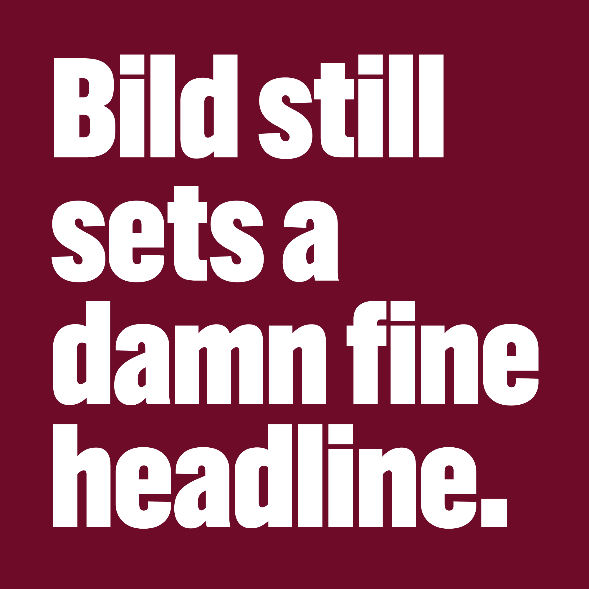
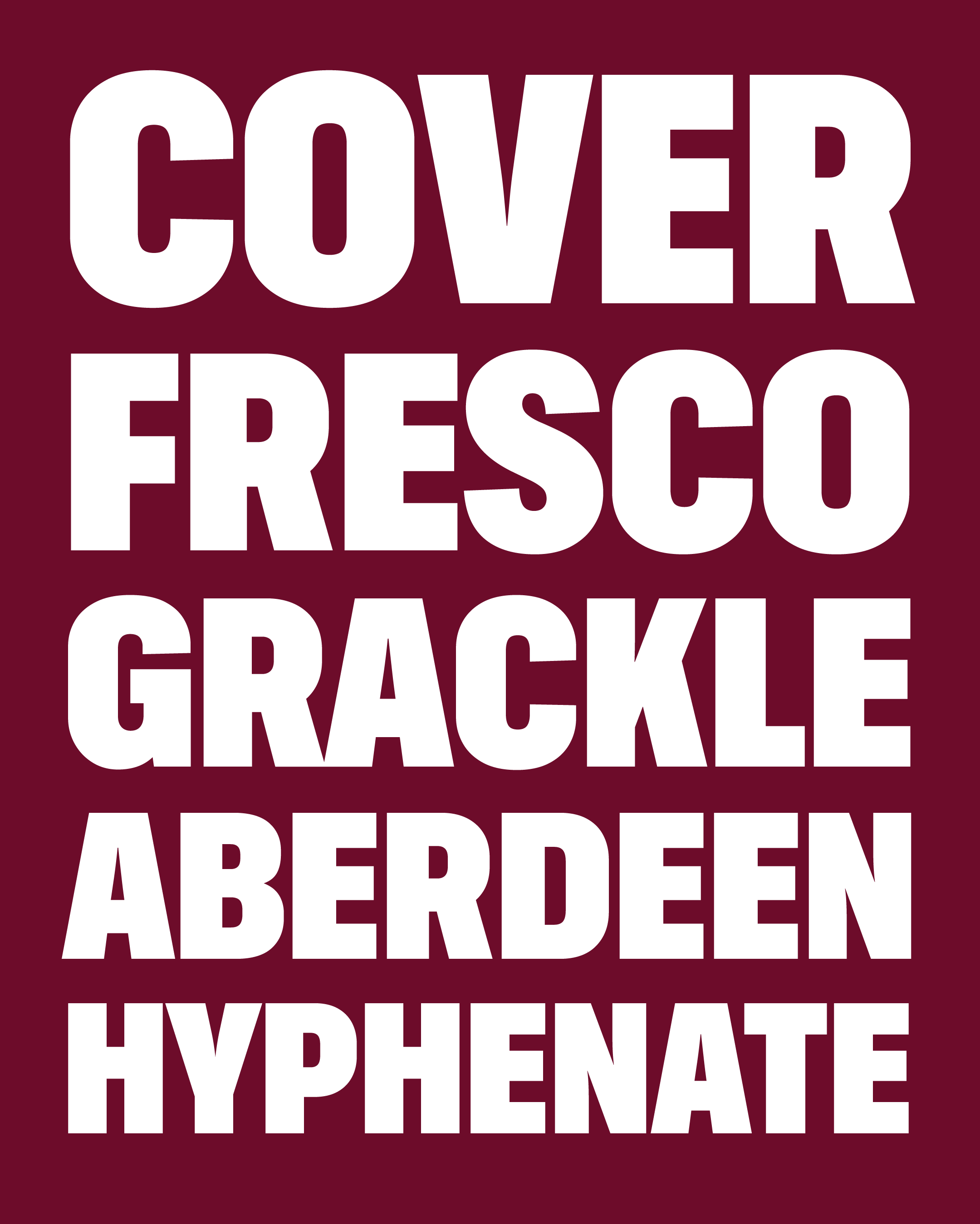
In September 2017, I issued Bild’s Compressed Black, where the straight sides of “round” letters like C, G, and O are well suited to the narrow, dense headlines that it is meant to set.
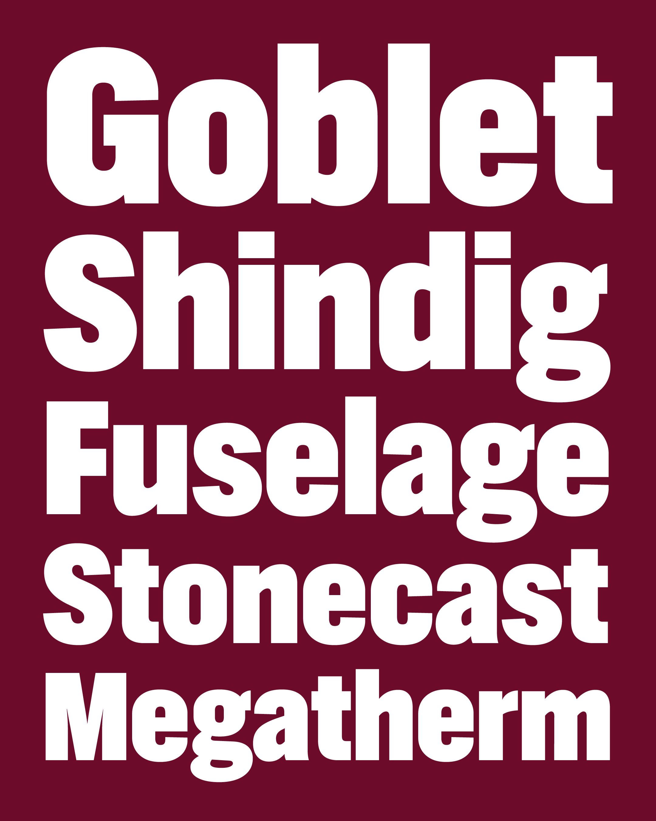
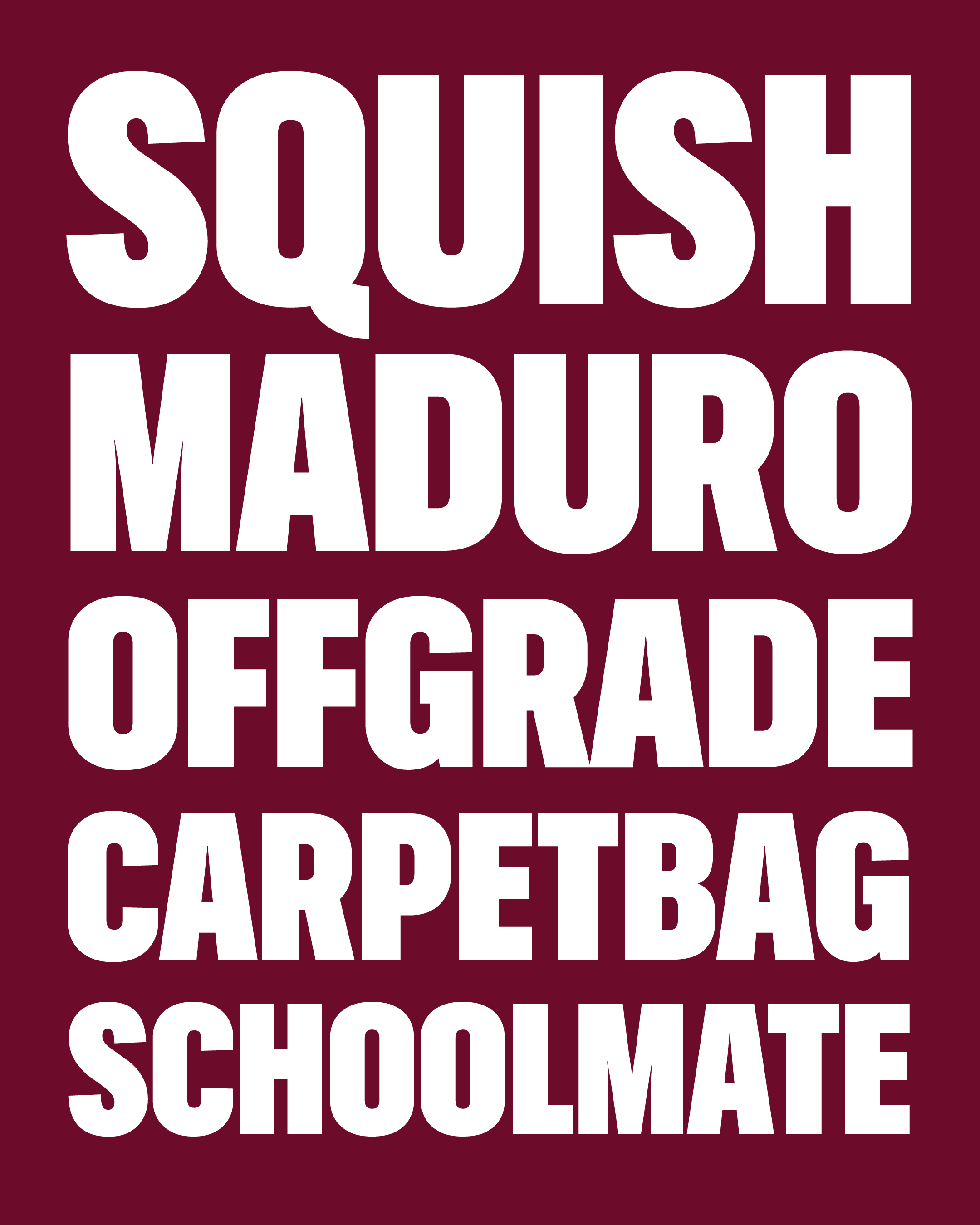
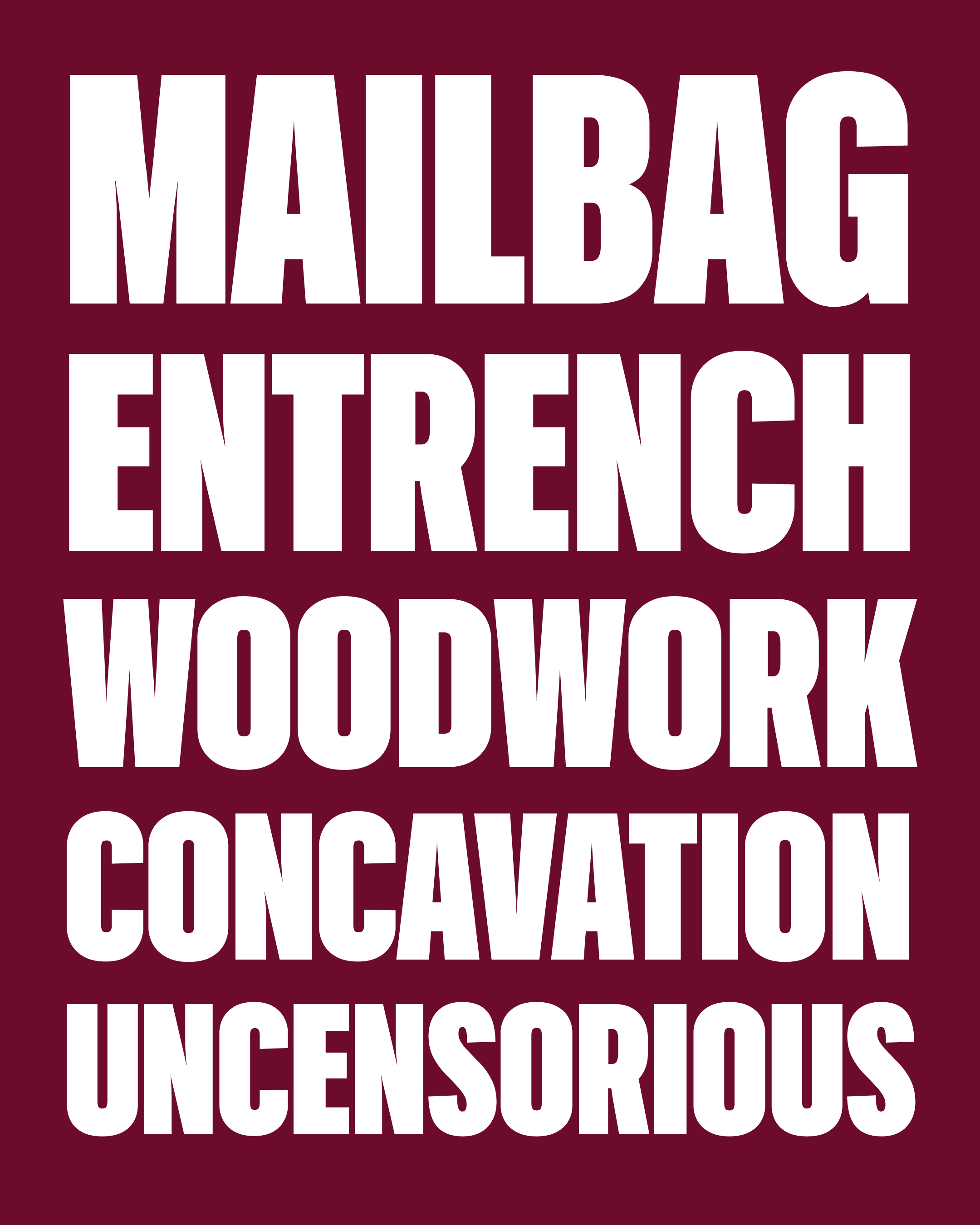
More recently, I’ve been curious to see what happens to those straight sides as the letters gets wider. The straight sides of those “round” letters can’t stay straight for quite as long in wider shapes, and the curves become a much more prominent element of the design.
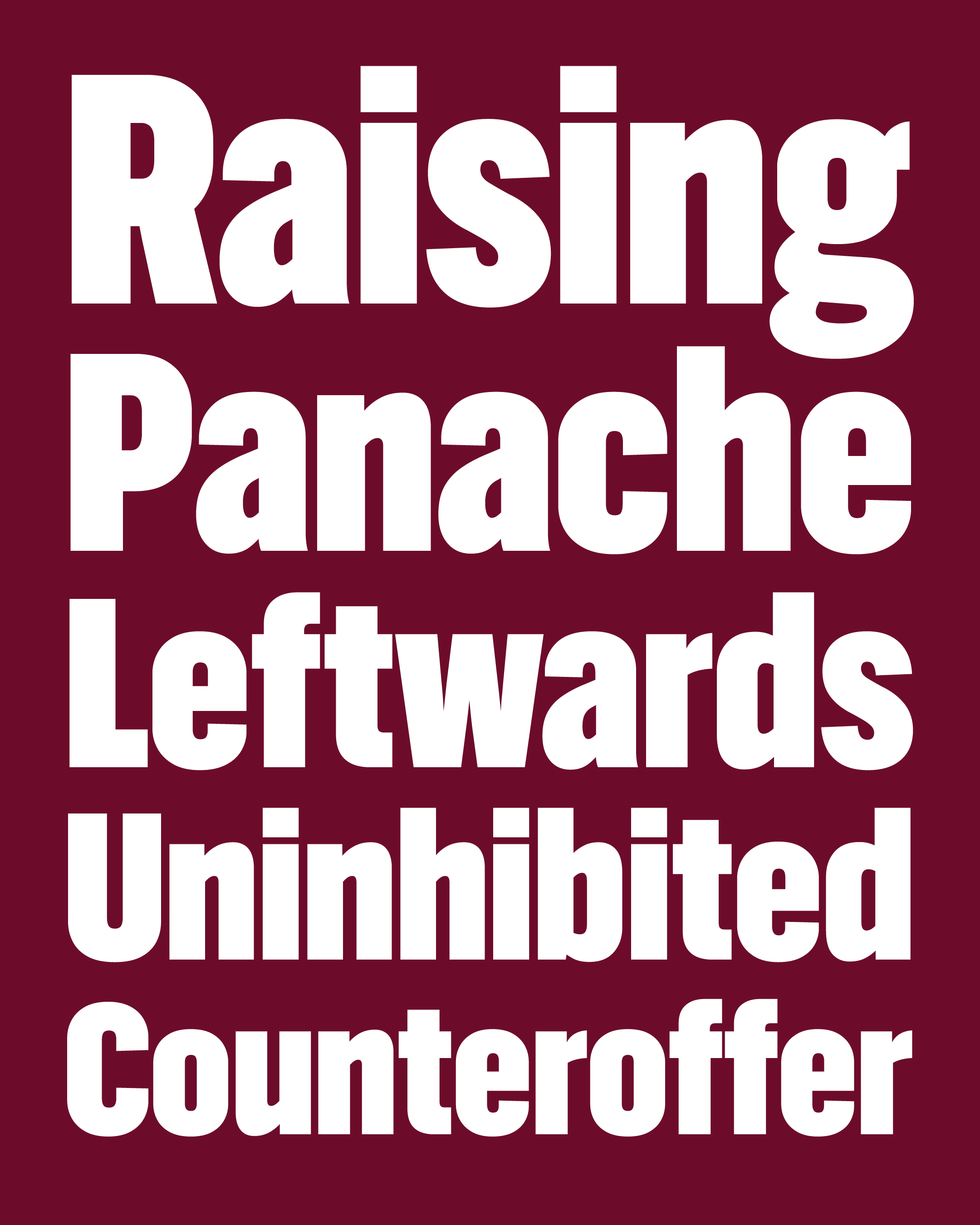
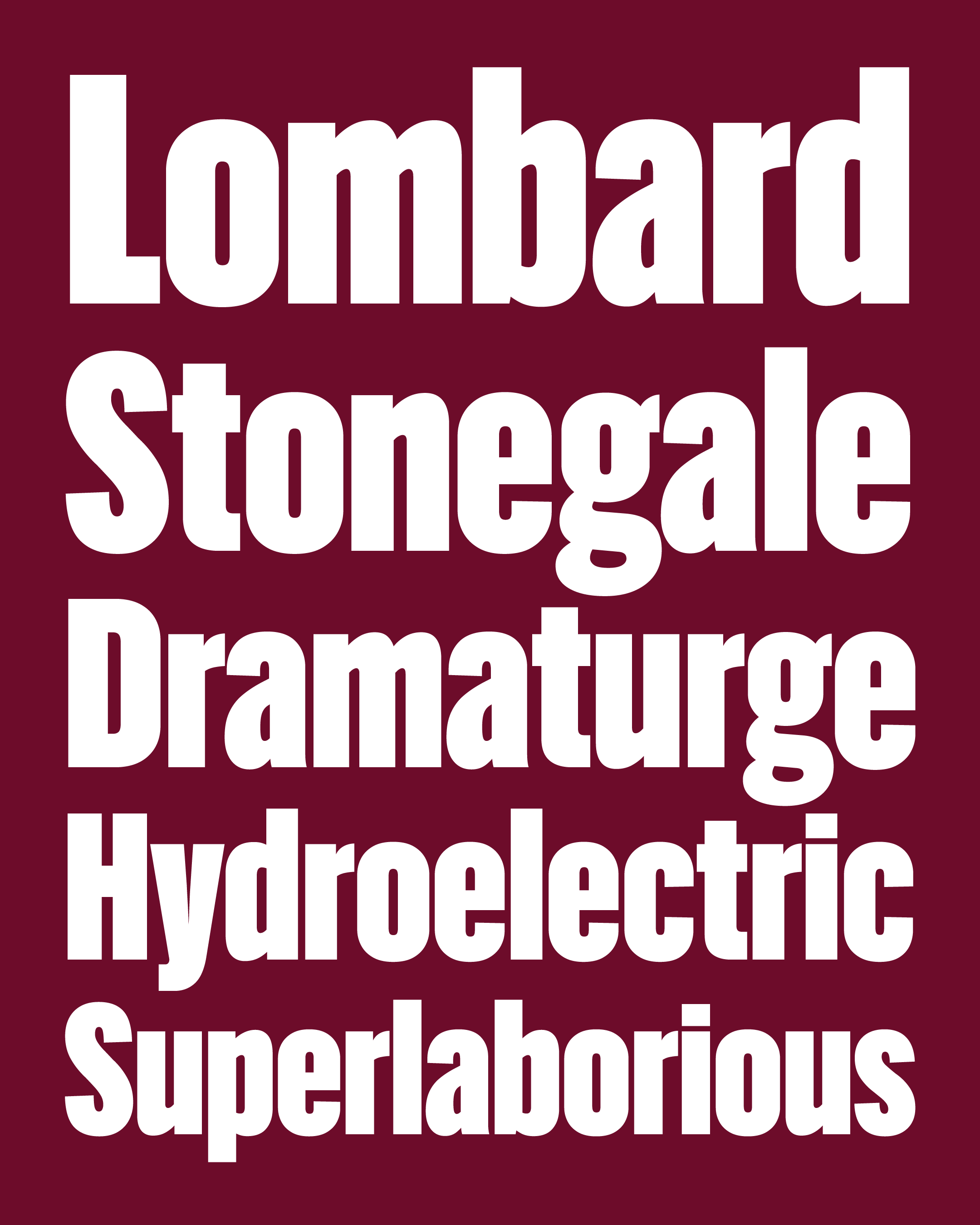
This month I’m sending you three new widths of Bild’s Black weight, in Narrow, Condensed, and Extra Condensed.
These new styles are every bit as dense and blocky as the original, but take on a new rhythm now that things aren’t so squished together. In order to maintain this density, the stroke weight gets significantly thicker as the design gets wider.
I also tried to keep some balance of the rigid and organic forms in the typeface, contrasting straight-sided forms like c and p with the curves of s and a. My hope is that this will allow the typeface to walk the line between a “poster font” like Impact and a versatile sans serif.
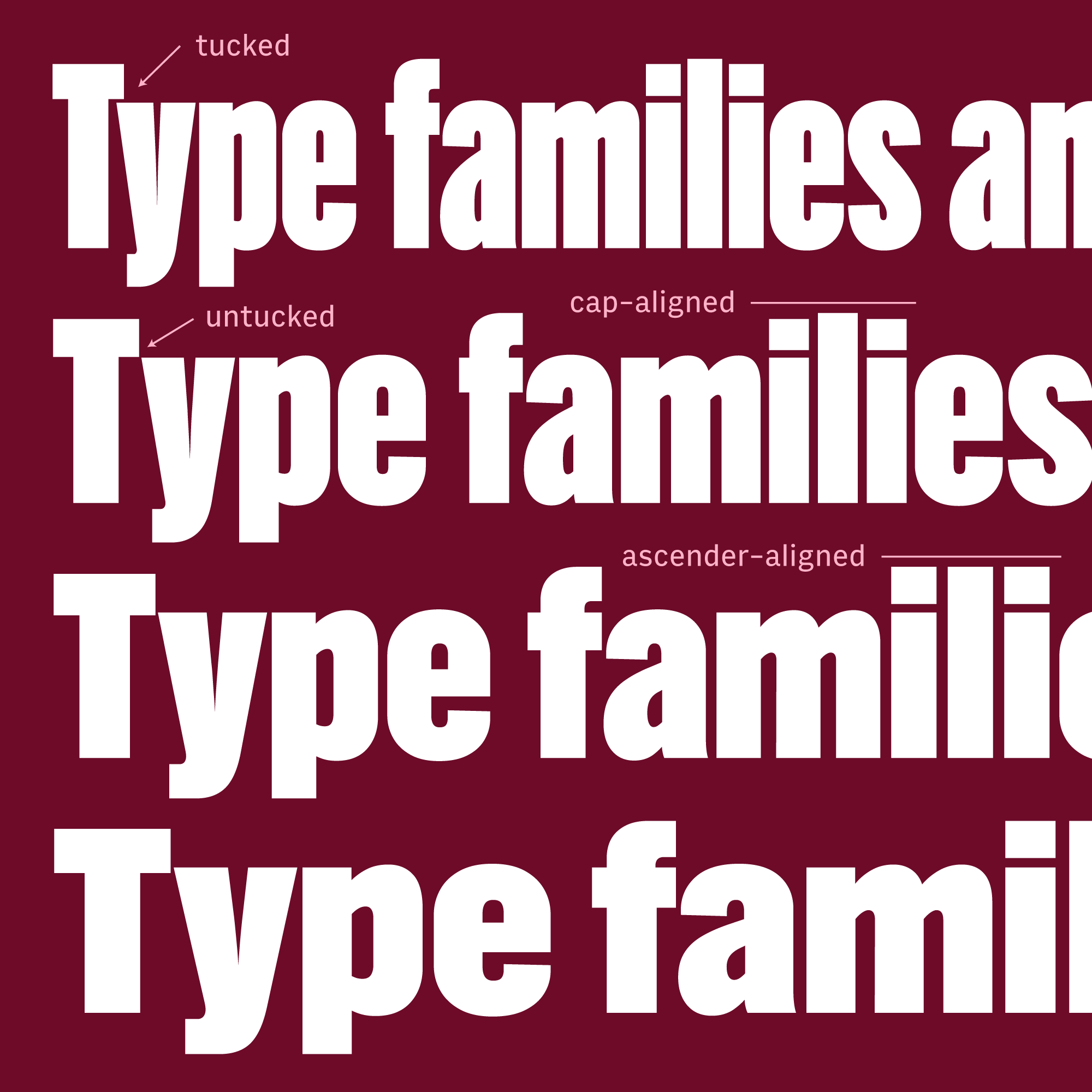
I’ve also included a Bild Variable font that covers the entire width range between Compressed and Narrow. Even though this is a relatively straightforward design, it still threw me a few unexpected curveballs along the way.
If you look at the Ty pair below, you can see that the y tucks underneath the T but that becomes impossible as the T’s crossbar gets heavier. This meant that I couldn’t rely on linear interpolation for these kern pairs across. Instead, I had to create a separate set of “kerning alternates” that allow the lowercase letters to snap out from underneath the T at the exact moment that they run out of room.
Likewise, I gave some special treatment to the dot on the i. In narrower widths, it aligns with the height of the uppercase letters, dipping below the lowercase l in an unintentional homage to Herb Lubalin’s Families logo. As the stem weight gets wider and the dot gets more elongated, it made sense to snap it up to align with the ascending lowercase letters instead.
And here what it looks like in Illustrator so you can see the feature variations for T and i in action:
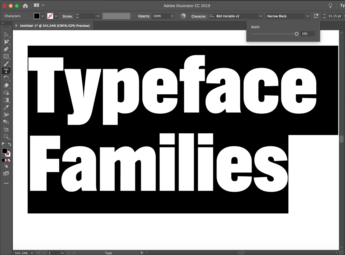
Bild Widths is the twenty-fifth installment of the Font of the Month Club 🎉, available to members this May. Memberships go for as little as $6/month, so with a four-width headline sans like Bild as your first get, the subscription kind of pays for itself immediately! Sign up today!!