Building Bild
As September winds down, I wanted to jot down a few notes on Bild, the chunky, narrow sans that I distributed to Font of the Month Club. (There are two more days left in the month, so sign up now and get your own copy!)
If you look at Jackson Burke’s seminal Trade Gothic family, you will notice that a couple of the weights don’t quite fit in. They are clunkier and more condensed, with echoes of Alternate Gothic and ATF Railroad Gothic.
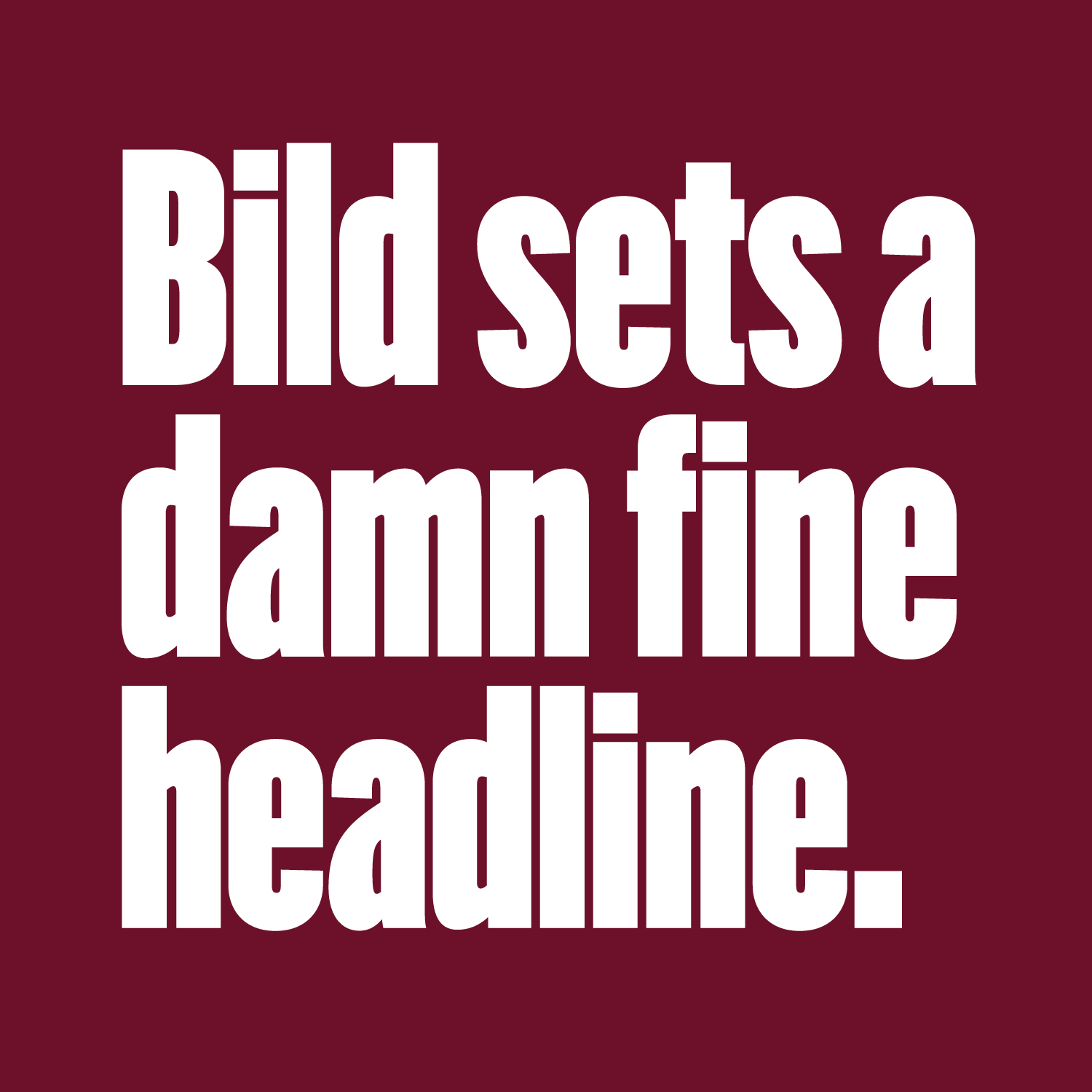
I originally started drawing Bild in 2012 when Sam Berlow suggested that I check out these weights to use as source material for a new design. I kind of took the freeform approach, but without much in the way of scans or specimens. Bild, the typeface that emerged from these sketches, builds upon the stylistic features of these outliers in the pursuit of a singular goal: to set dense, punchy headlines.
Sure there are already a lot of condensed sans serifs out there, but what I like about this one is that it walks the line between structured and organic. For every straight-sided curve or rigid shape present in the typeface, there is also a grotty detail to liven things up. Curvy shapes like the S or the bowl of the a break up Bild’s mechanical regularity. The closed-in terminals vary in length, and not one of them ends on a true horizontal.

Bild’s Black Compressed style is part of a larger series of widths and weights that has been sitting on my desktop for far too long. I’m hoping that my work on this preview weight will give me the kick in the butt I need to work on more of the typeface.
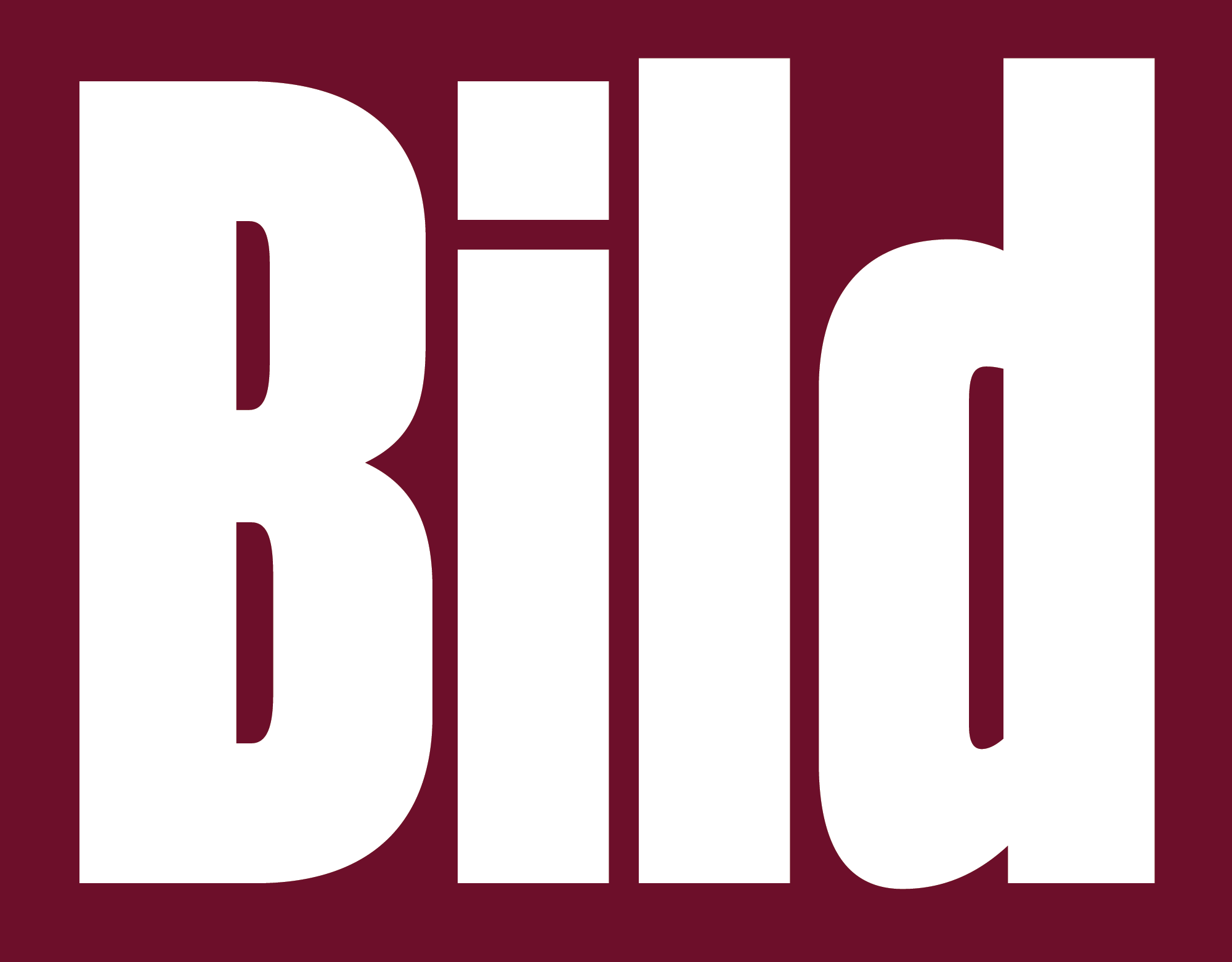
Oh, and one last thing: the name Bild isn’t a typo; it means image in German. Thanks to Indra Kupferschmid for suggesting it!