Roslindale is back!
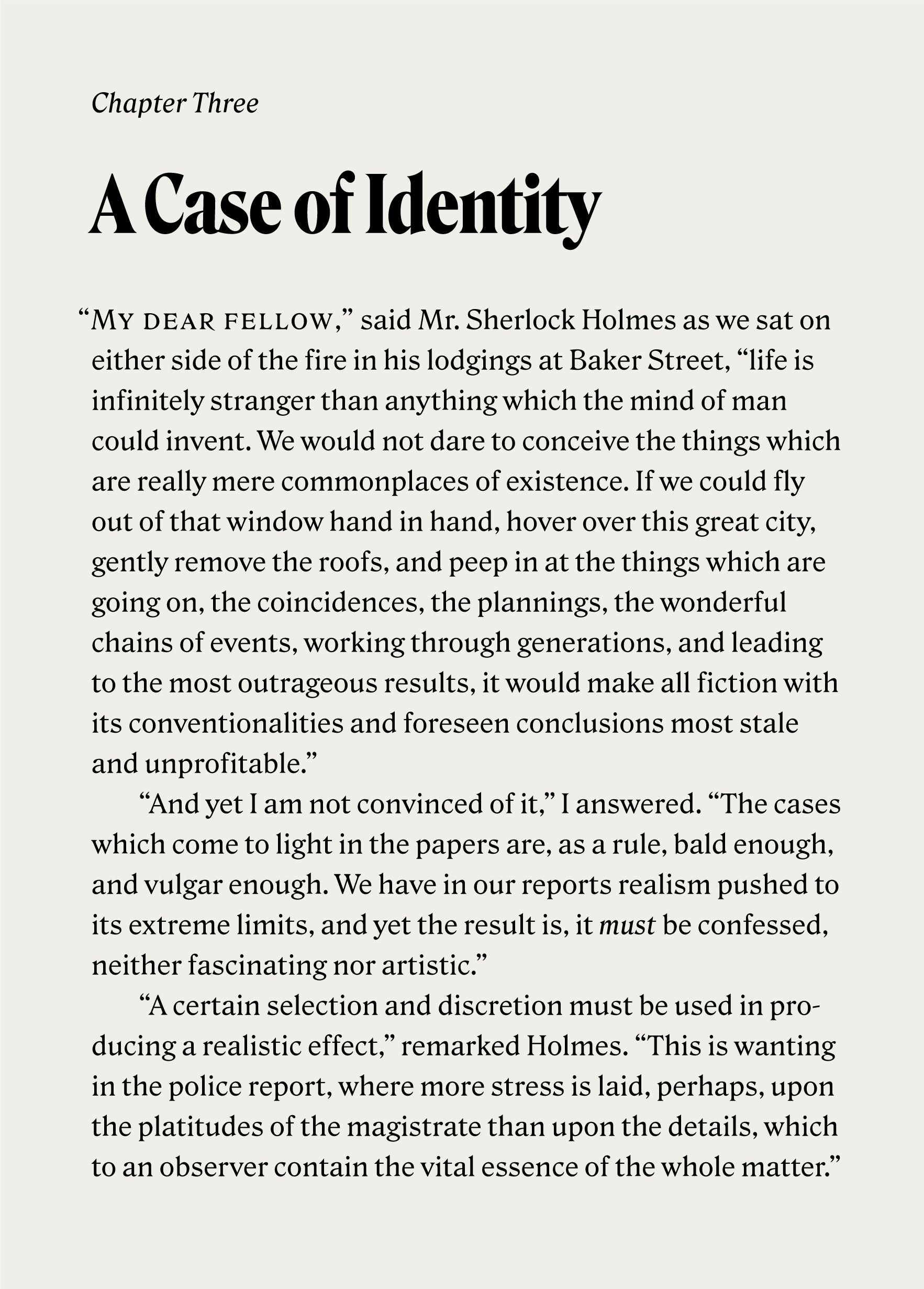
Six months ago, I had the pleasure of sending a bold display cut of Roslindale to the fine members of the Font of the Month Club. This month, I followed up with Roslindale Text, designed specifically for extended reading.
Like its headline companion, Roslindale Text takes its inspiration from De Vinne, a Victorian oldstyle with heavily bracketed serifs and a distinctive diagonal stress. De Vinne was designed in the 1890s by Gustav Schroeder and Nicholas Werner of the Central Type Foundry, and was named for the famed nineteenth century printer Theodore Low De Vinne.
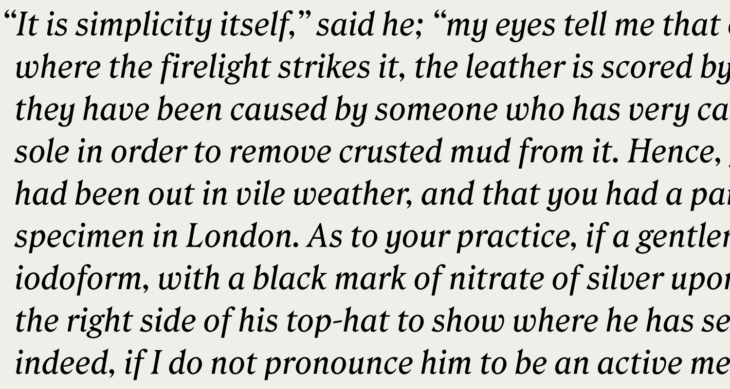
I didn’t see much precedent out there for Italics in the De Vinne style, so as a result Roslindale Text’s italic is mostly improvised. I probably could have done more research, but sometimes it is nice to just get drawing.
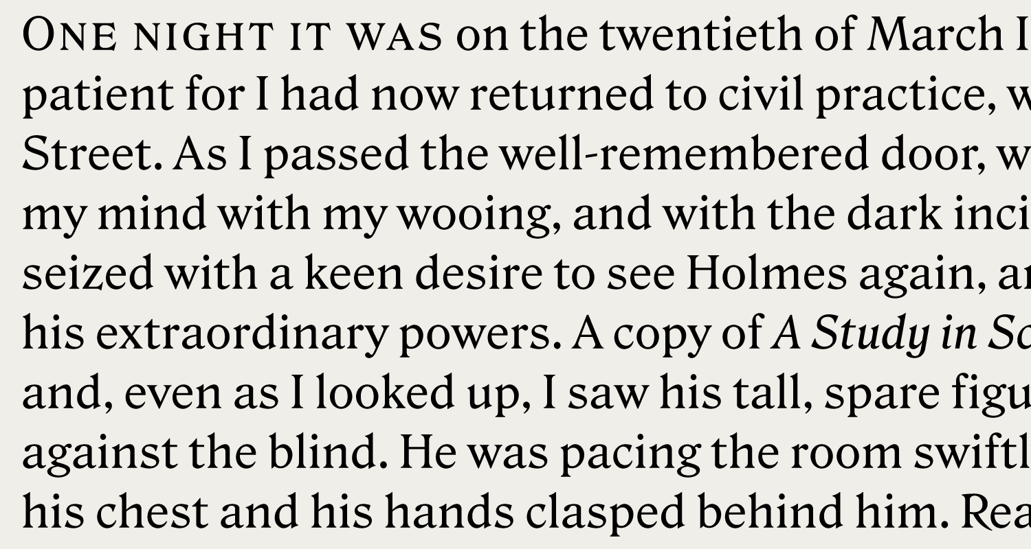
The trickiest part of this design was striking the right balance between utility and flavor. I didn’t want to distill all of the De Vinne-ness out of this design, but I knew it needed to be palatable in paragraphs. In addition to the italic, I also added small caps which are well-suited to the design’s Victorian charm. Overall, it is still very much a work in progress, but I feel like it is finally coming together.
Font of the Month Club has been mostly focused on display typography, and I hope that the members enjoyed this little departure into the realm of text. Roslindale’s original Condensed Display is still available as a back issue, so you can sign up today and get the whole family, either for yourself or as a gift for your favorite font aficionado!


