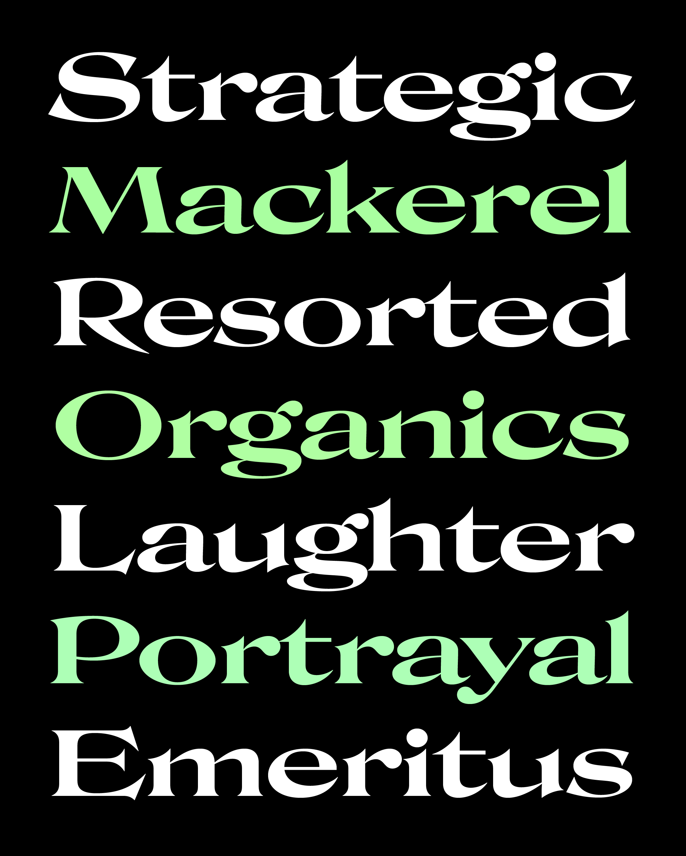
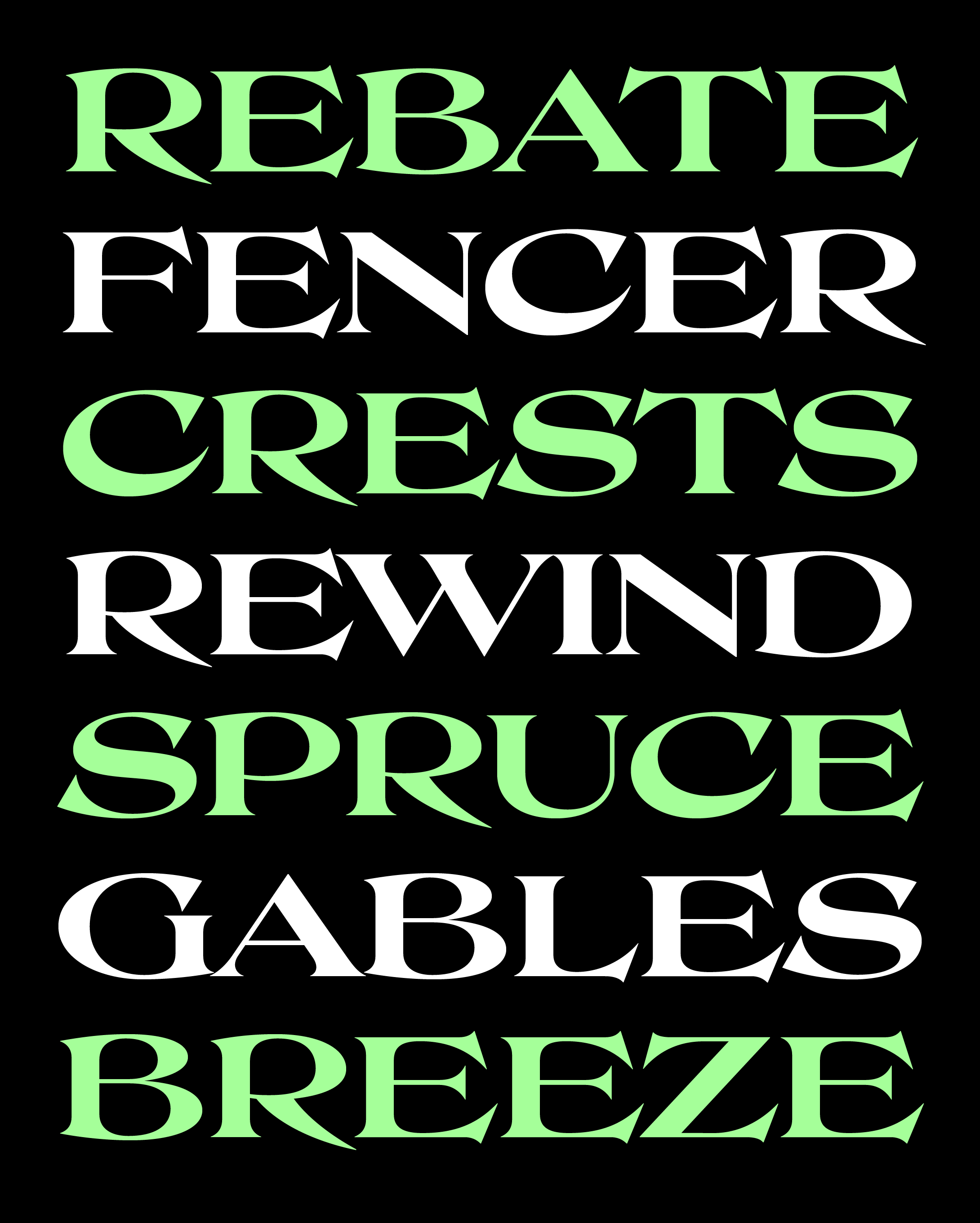
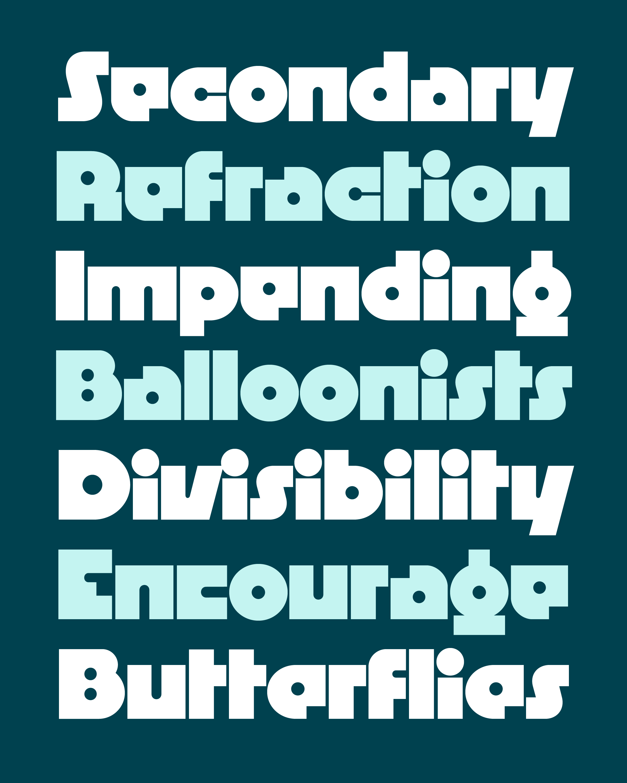
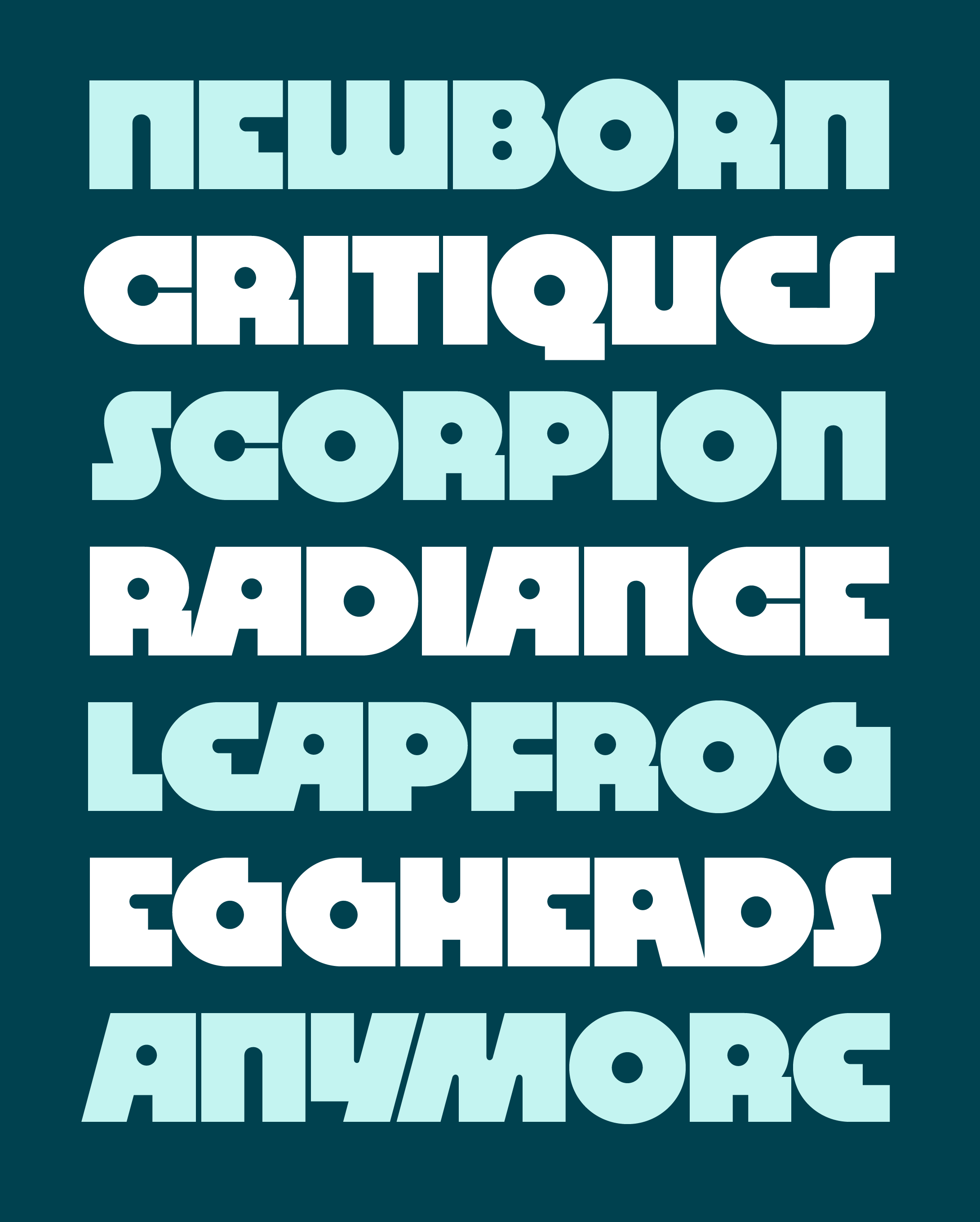
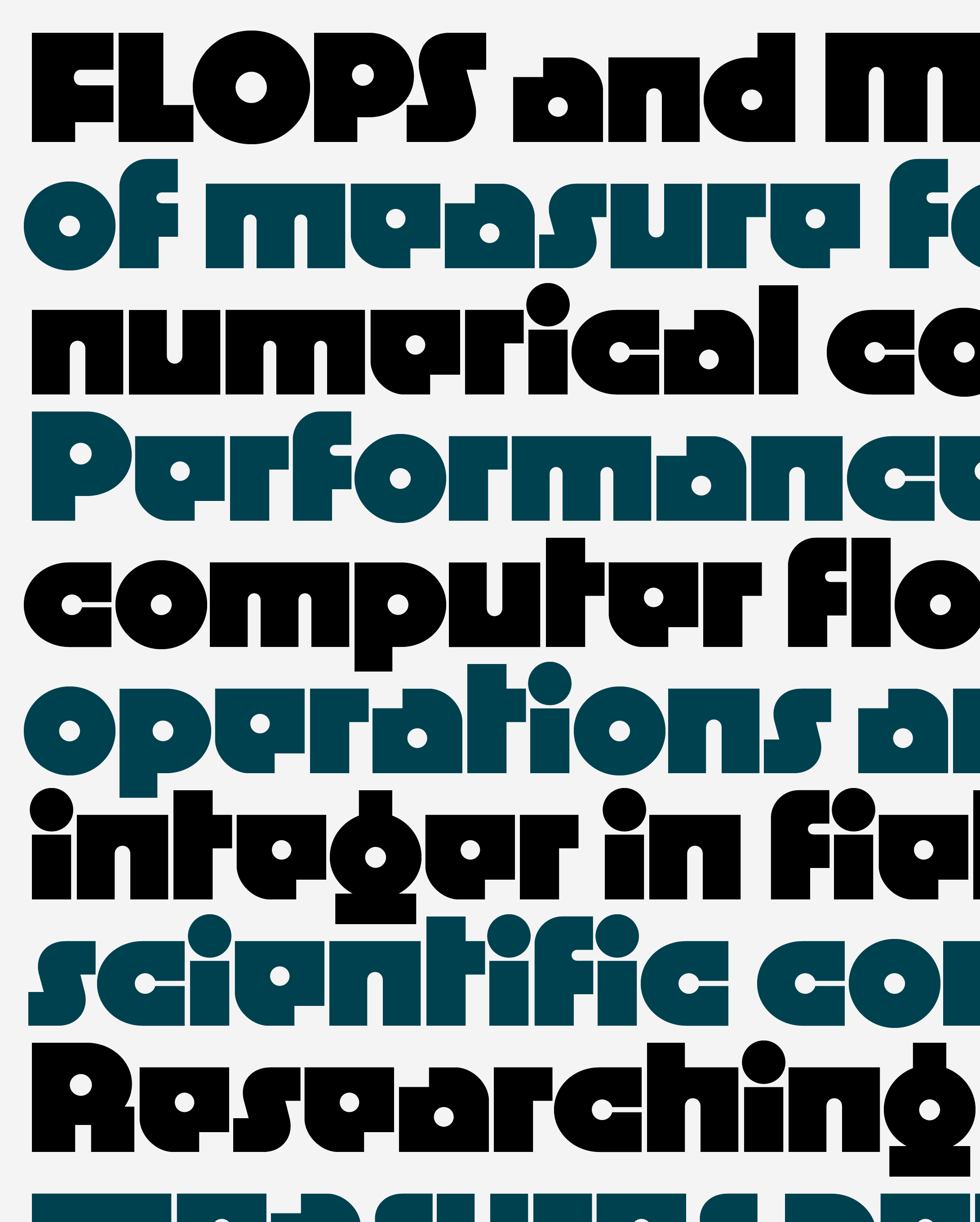
November’s Font of the Month: Rustique
Sending the club monthly fonts has taught me a lot about the ebb and flow of my own productivity. Some months, I have tons of energy, everything flows smoothly, and projects just click into place. Other months, like this one, I’m hardly able to focus on making new fonts, the gears start to grind, and all of the previous momentum evaporates. It’s hard not to panic when this happens, but I’ve been through enough cycles of this that I’ve come to accept it as a natural part of the way I work.
My focus has definitely been elsewhere recently: life stuff, teaching, a little custom typeface design, and a lot of strumming my mandolin in outdoor music jams. Sensing that I’m in an ebb time with no energy to start something fresh, I paid a visit to my “bottom drawer,” the folder of half-baked typefaces that I’ve discarded over the years. And at the very bottom of my bottom drawer, I uncovered one of my first typeface designs (from 2007!), an abstracted take on Capitalis Rustica that I call Rustique.
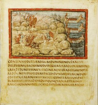
Rustic capitals in the Vergilius Vaticanus, from the collection of the Louisiana Digital Library.
I think of typefaces on a spectrum ranging between figurative and abstract, from marks that feel like they were made with a certain tool to those that feel like they were simply imagined (I say “feel like” because, as Matthew Carter points out, they’re all just a bunch of digital outlines regardless 🙃).
There are plenty of typefaces that play across this spectrum, taking the the pen-formed shapes of historical calligraphic styles (say, blackletter) and translating them into “raw” typographic shapes (Totally Gothic/Glyphic, Fakir, and Blaktur come to mind). But you won’t find nearly as many contemporary designs revisiting the distinctive Rustic capitals that were used in Rome during the first several centuries of the common era.
At first glance, these Rustic capitals felt shockingly dissimilar to their predecessor, the Roman Square Capital of Trajan’s Column fame. But upon closer inspection, I learned how calligraphic efficiency transformed these letters: their simplified structures were quicker and easier to write with a pen, and a steep pen angle led to narrower letterforms that took up less space on expensive writing materials like parchment or vellum. (This steep pen angle also made Rustic caps the original use of horizontal stress in the Latin alphabet!)
My original drawing of Rustique, c. 2007.
I drew Rustique during my final year in college to be used on the poster for a sci-fi-infused production of Shakespeare’s Titus Andronicus, staged by the theater department at my school (no, I can’t find an image of the poster I designed, and yes, that’s probably for the best 🙃). The unfamiliarity of the Rustic style seemed like a good fit for this retrofuturistic production; it somehow feels stuck in the past and the future at the same time. But like all of the other typefaces I designed in school, I abandoned it as I went on to pursue more practical designs and begin my career at Font Bureau (from that year, only Manicotti made it out after it was cleaned up and released in 2010).
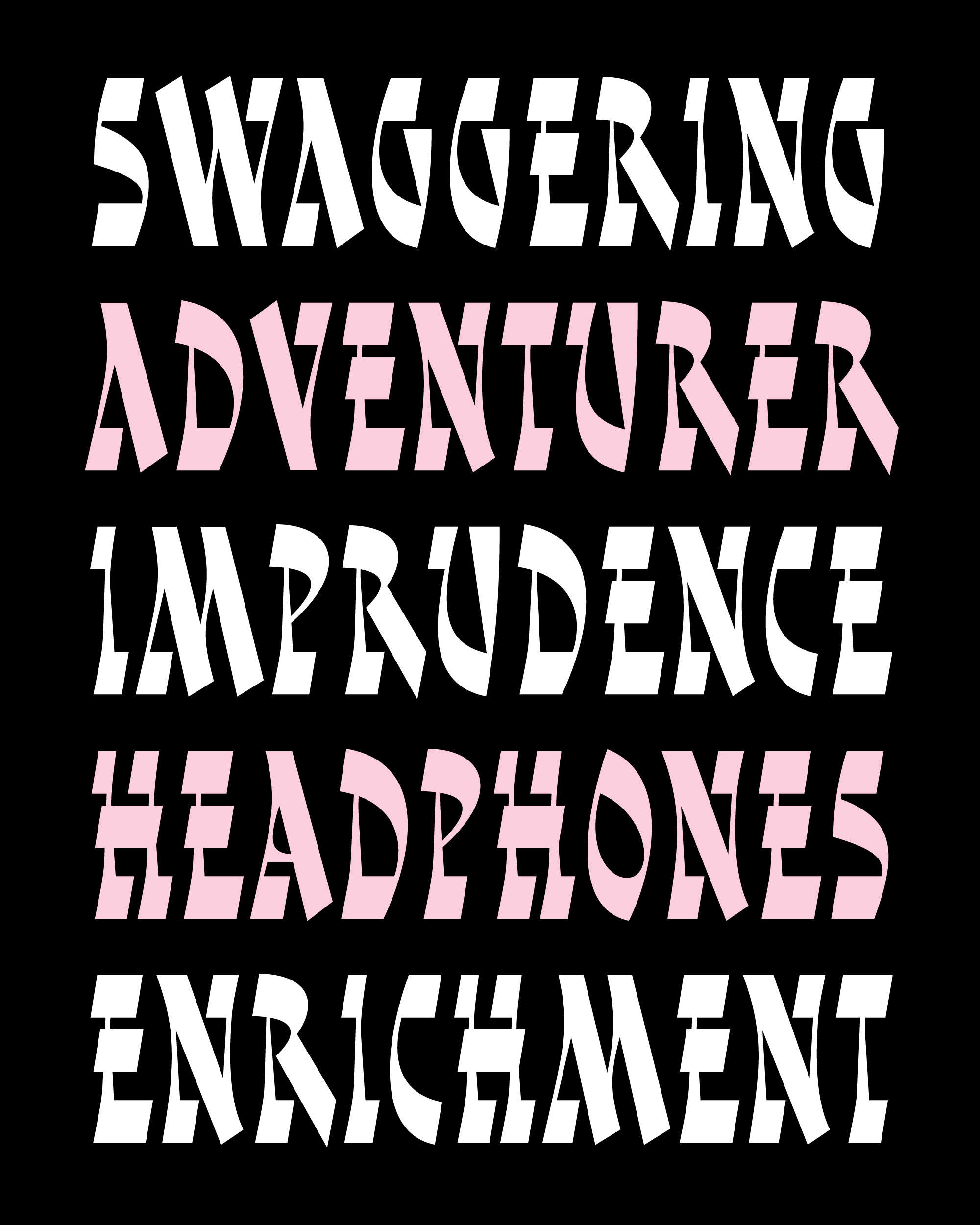
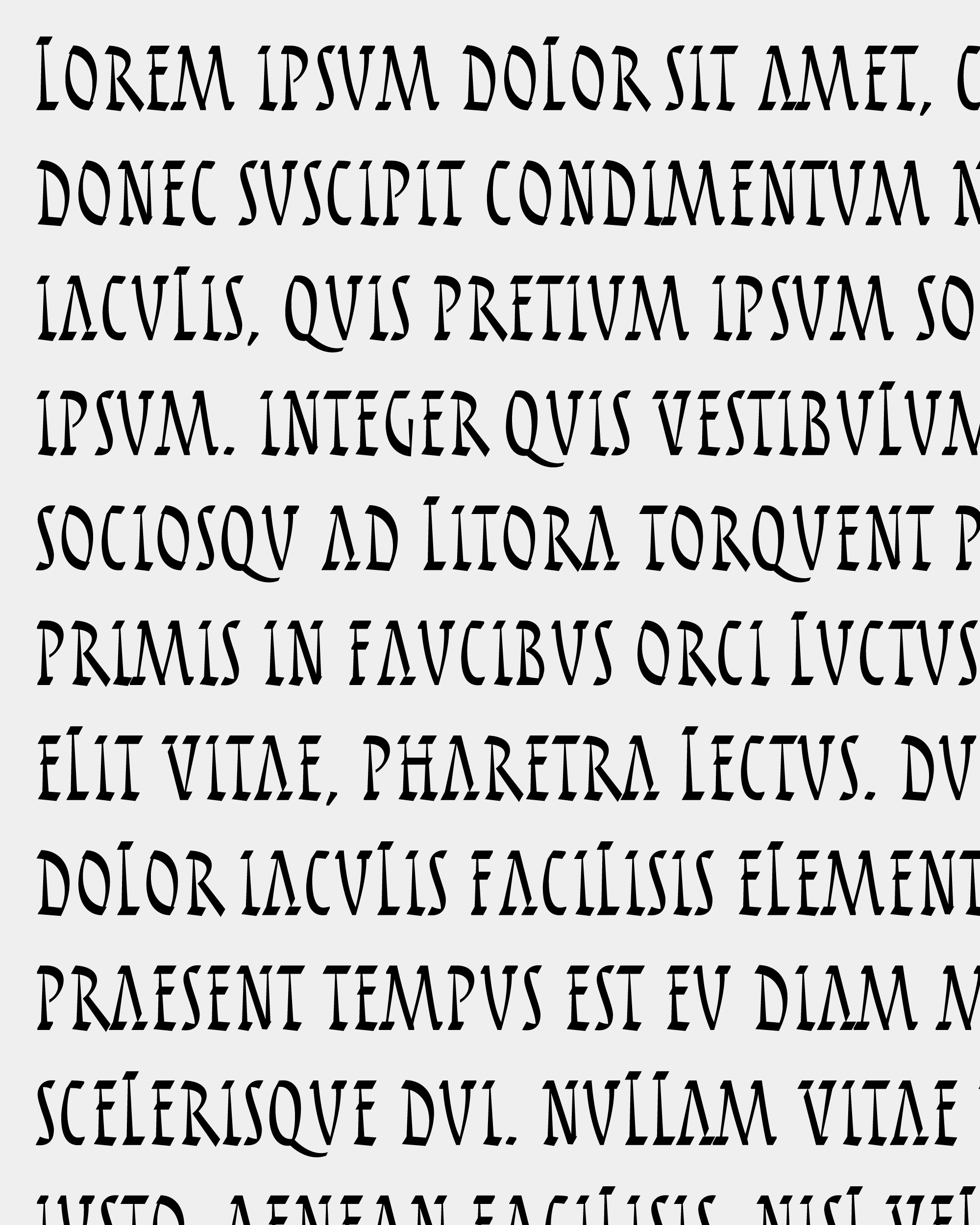
My original design for Rustique stayed fairly close to the rhythms of Rustic calligraphy, with modest thick/thin contrast, a high waistline, and generous spacing between each letter. In the image above, you can also see small inconsistencies, where I was experimenting with sharp corners (as opposed to blunted ones), a flatter baseline, and tall caps, all of which I adopted in the version I’m sending you today. I was happy with letters like H and E that were made up of all straight lines and tapered gently from bottom to top, but they felt disjointed from any letter with curves like O and B and diagonals like A and V that weren’t allowed to taper as much.
Picking up the design again this month, I tried as hard as I could to unify these elements and minimize the tension between curved and straight forms. The diagonals proved to be an especially tough nut to crack; with the theoretical pen held at such a steep angle, they are the only elements of this hand that get very heavy for a very long time. Of course, this is a feature that makes Captialis Rustica distinct, but it also makes them stick out like a sore thumb when you’re looking at more than a few words at a time.
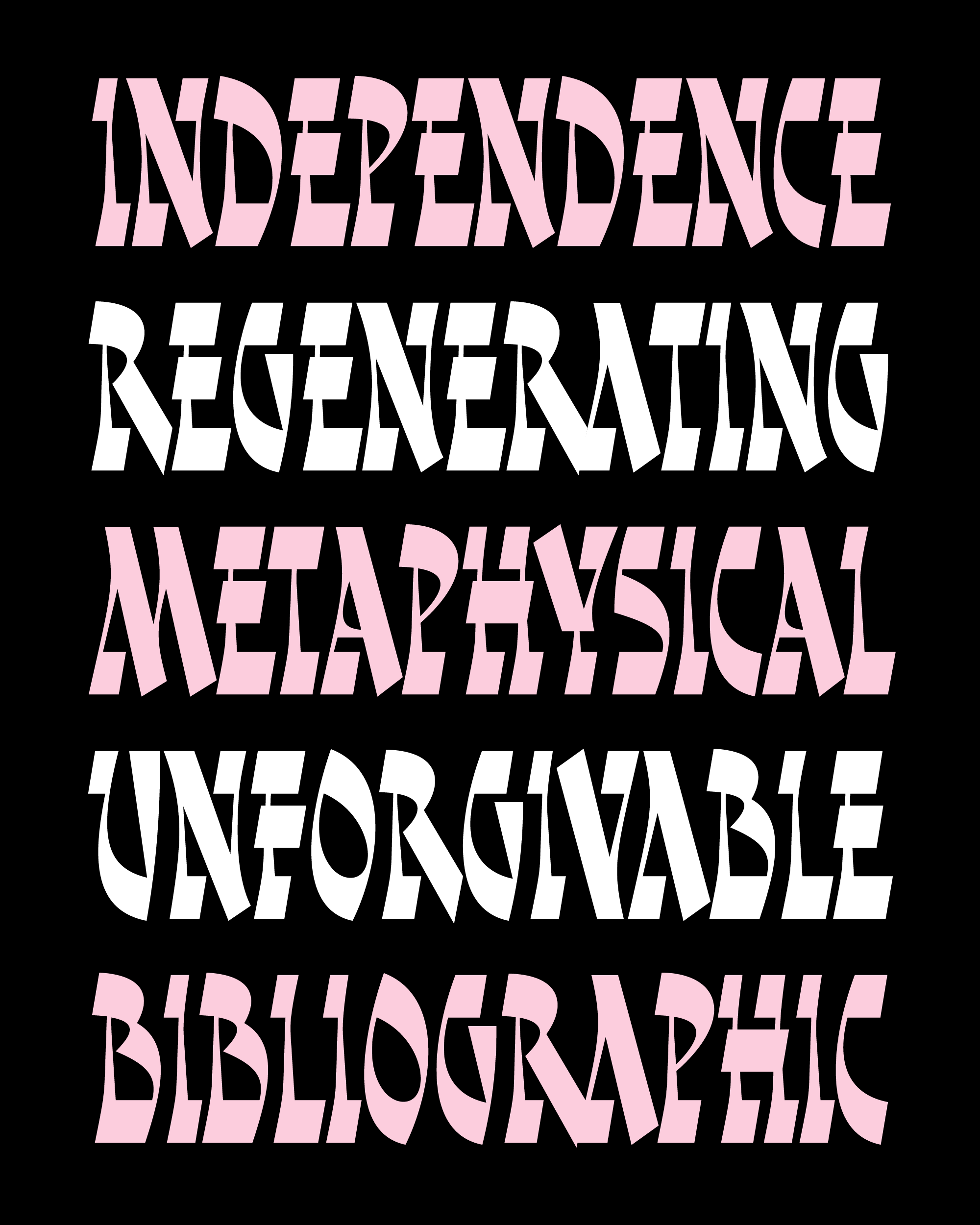
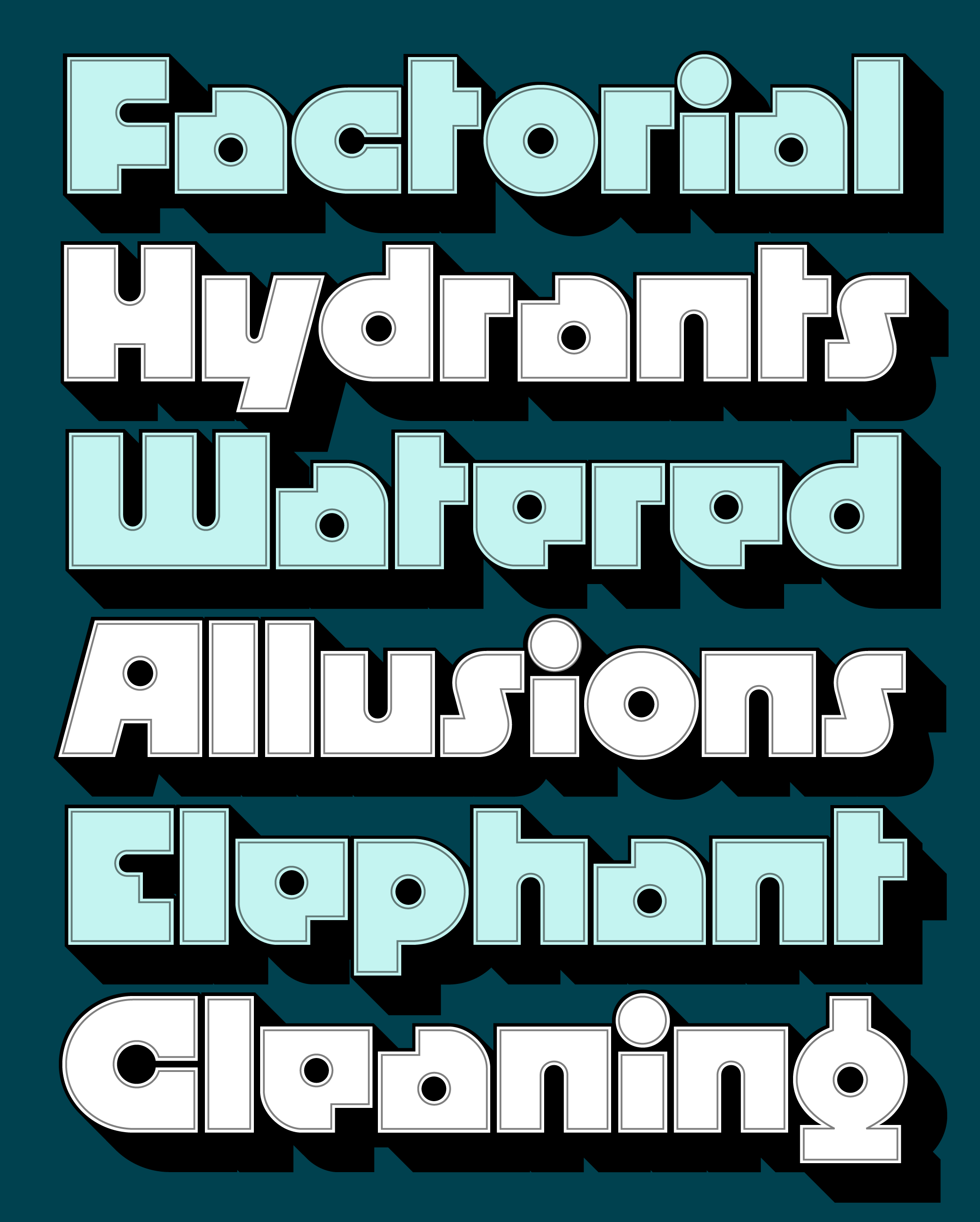
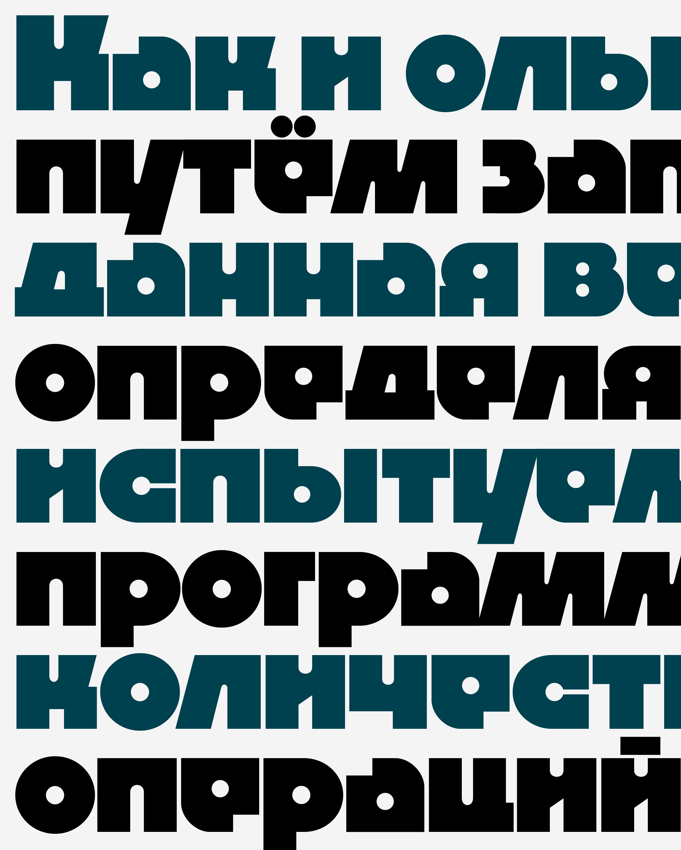
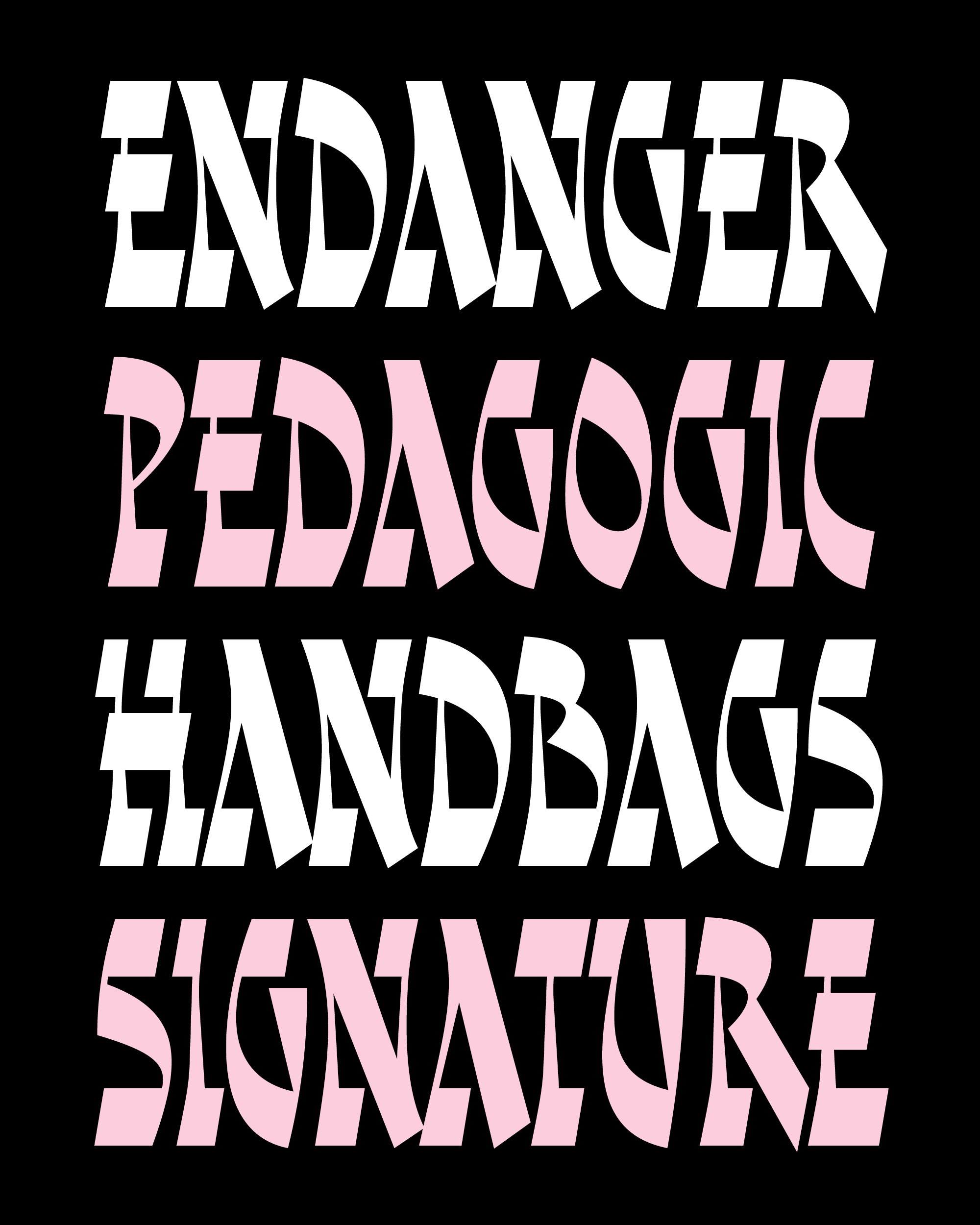
In the past few weeks, I made some last-minute changes in order to make it better suited for contemporary display typography. First, I amped up the horizontal weights so it is now less of Regular weight and more of a Bold. I also tightened up the letter spacing significantly and introduced more “swing” into the curves, imbuing the design with more chaotic energy. It’s amazing how much of a difference spacing makes: if you add some tracking (+25–50, maybe?), you’ll chill things out and give the design more of a historical flavor.
This might go without saying, but I have absolutely no idea what you’re going to do with this typeface! I hope it at least piques your interest in Rustic capitals, and makes you think about how you can somehow incorporate their unique flavor into your designs. This is one of the trickiest designs I’ve worked on in a while, and I could probably keep tweaking it forever...we’ll see what it looks like in another 14 years!