November’s font of the month: Roslindale Ultra
When making a type family, one of the biggest challenges is deciding how big it should be...sometimes it can be hard to know when to stop.
Expansive type families can be great, but there’s definitely a point of diminishing returns as one ventures away from the family’s “core” styles. (A font’s Bold Italic Small Caps will never get used as often as its Regular lowercase.)
On top of that, there’s always the question of how much can change in a typeface before some parts of the family start to feel categorically different than others. And that is precisely the question I am asking myself about November’s offering, Roslindale Ultra.
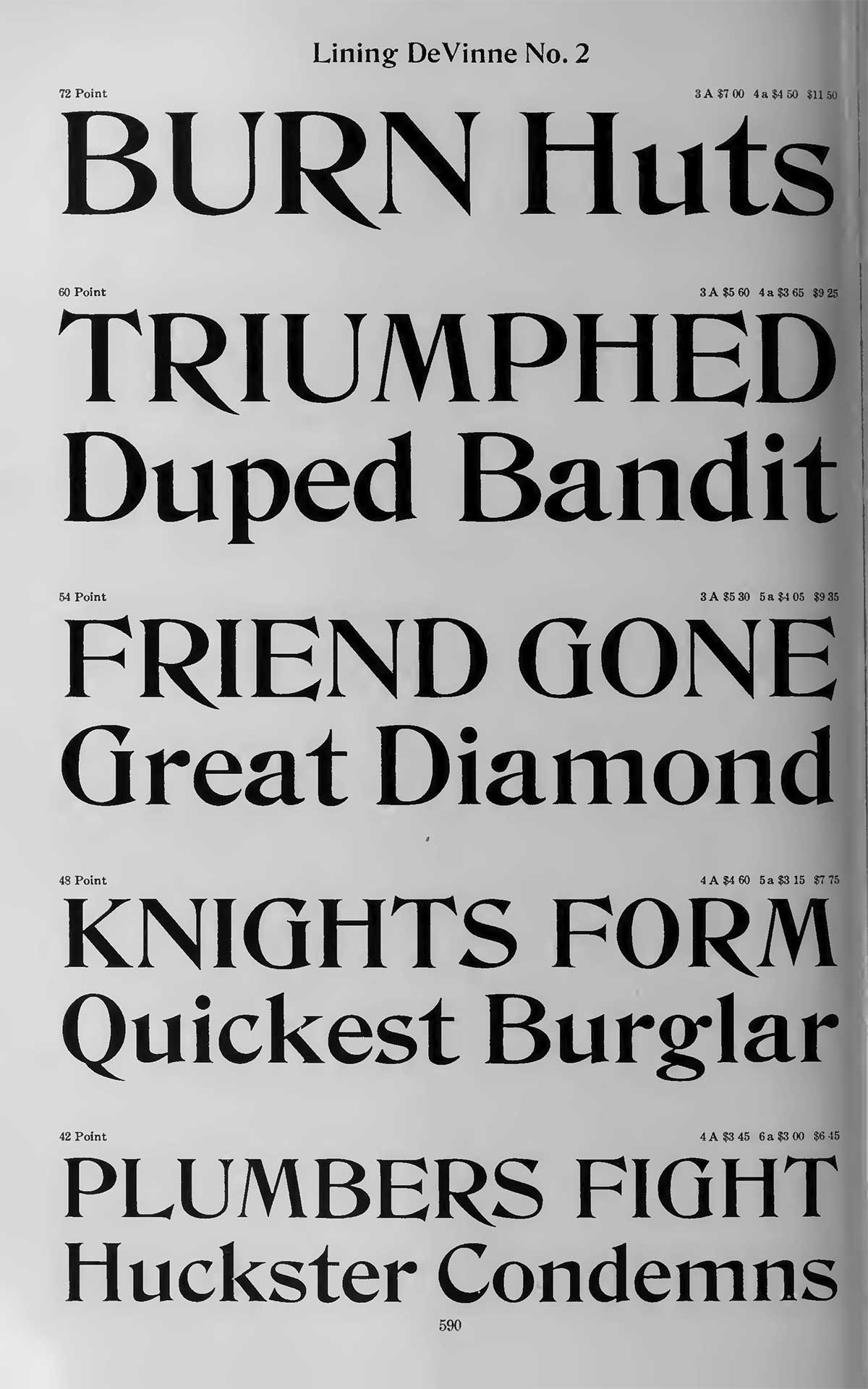
As longtime club members may remember, Roslindale was inspired by De Vinne, a typeface attributed to Gustav Schroeder and Nicholas Werner and released by the Central Type Foundry in 1892.
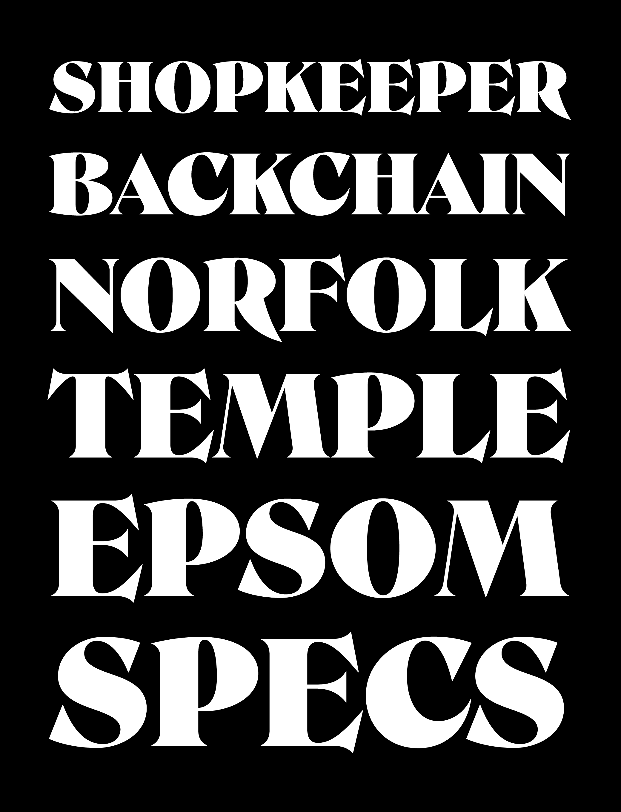
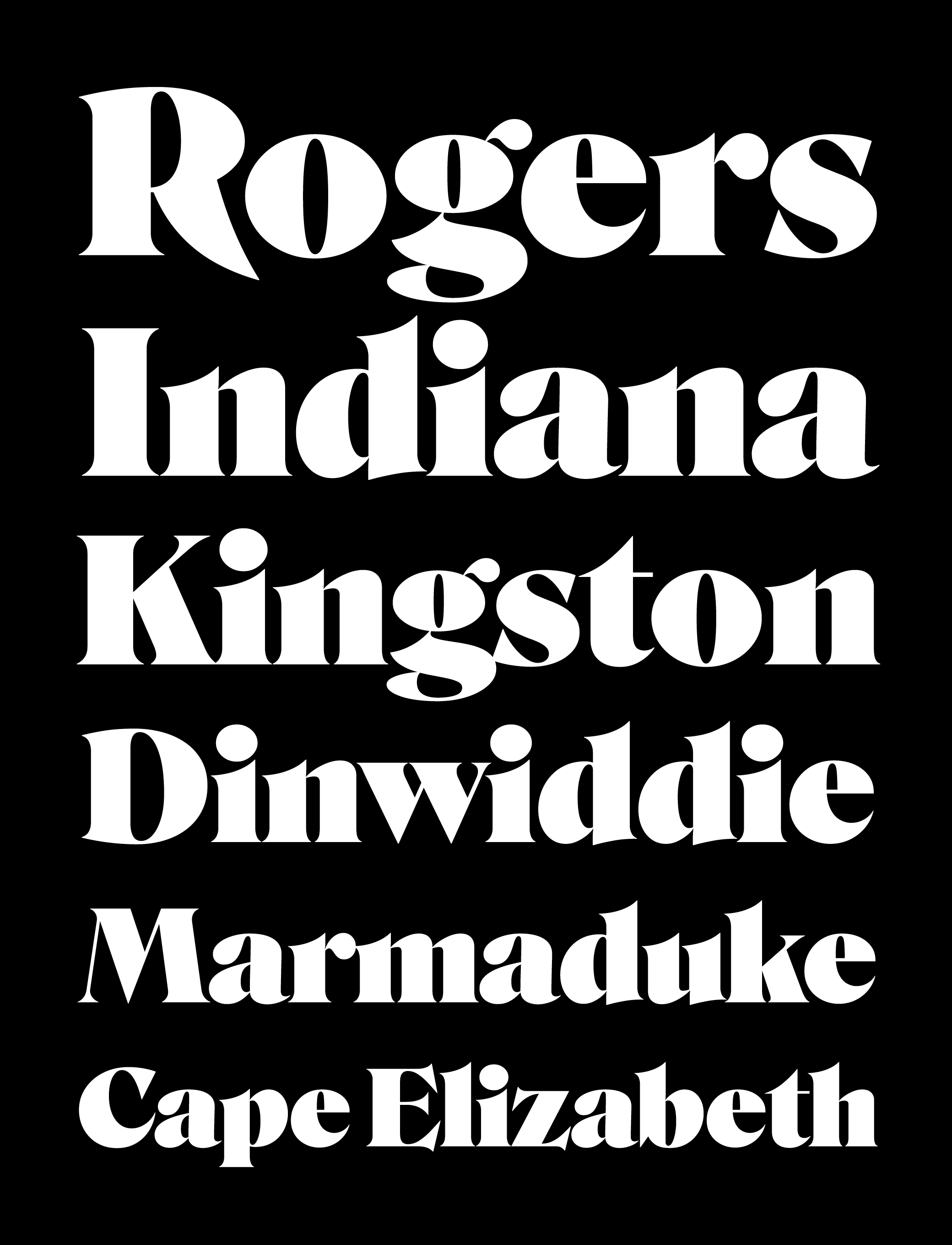
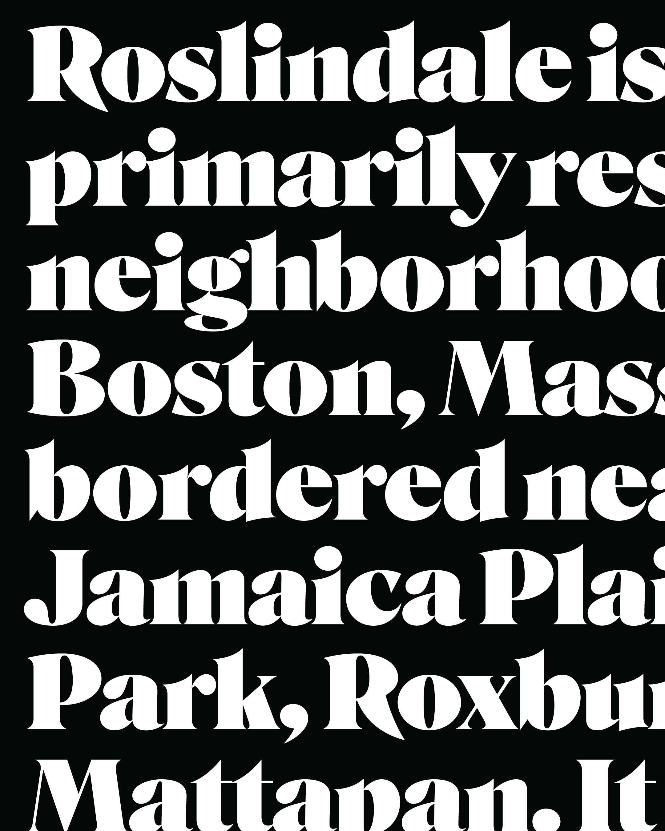
But as you can see in the image below, this new style of Roslindale bears only a passing resemblance to De Vinne’s wider styles. The overall skeleton is virtually unchanged, but the originals never got this bold, and featured a lot more uneven angularity and wobbliness than I was able to retain in this latest rendition.
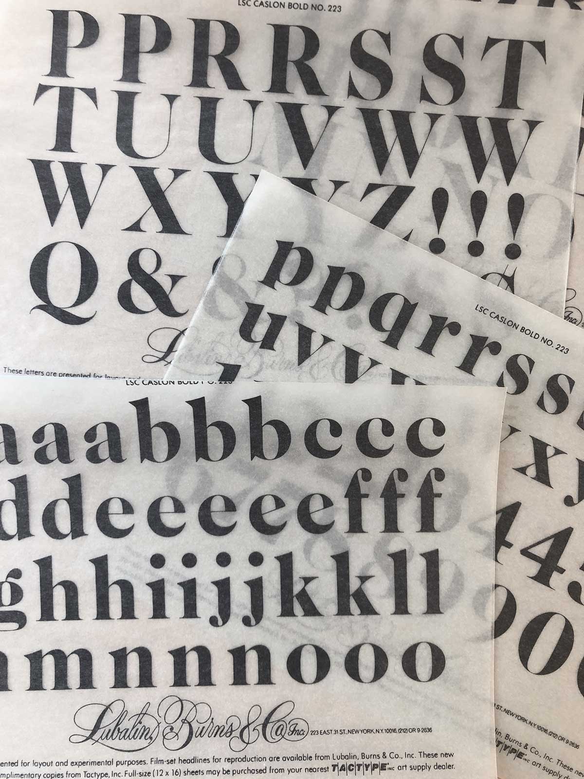
In fact, whether I like it or not, Roslindale Ultra may owe more to the bold, high-contrast, Victorian-inspired serifs of the International Typeface Corporation (better known as ITC) and designers such as Herb Lubalin, Tom Carnase, and Ed Benguiat that came to define American typography in the 1970s.
I noticed a similarity early on between Roslindale and ITC Bernase, but as the font gets bolder and wider, the high contrast and buxom curves typical of the ITC aesthetic become more and more prominent, and the connection is harder to ignore.
As I continue to expand this family, I’m trying to figure out whether I’m okay with this. With all of these influences, does it feel new enough? Should I try harder to preserve some of that Victorian eccentricity in the far corners of Roslindale’s designspace, or is this just a natural progression of the design?
Roslindale Ultra is November’s installment of Font of the Month Club. As always, you can sign up for as little as $24!