January’s font of the month: Klooster Thin
One of the joys of this club is having the opportunity—but not the obligation—to revisit and expand upon my previous work. It feels like a natural way to let some fonts grow into multiaxis families (Roslindale, for example) while others can simply remain one-offs (ahem, Pappardelle Party).
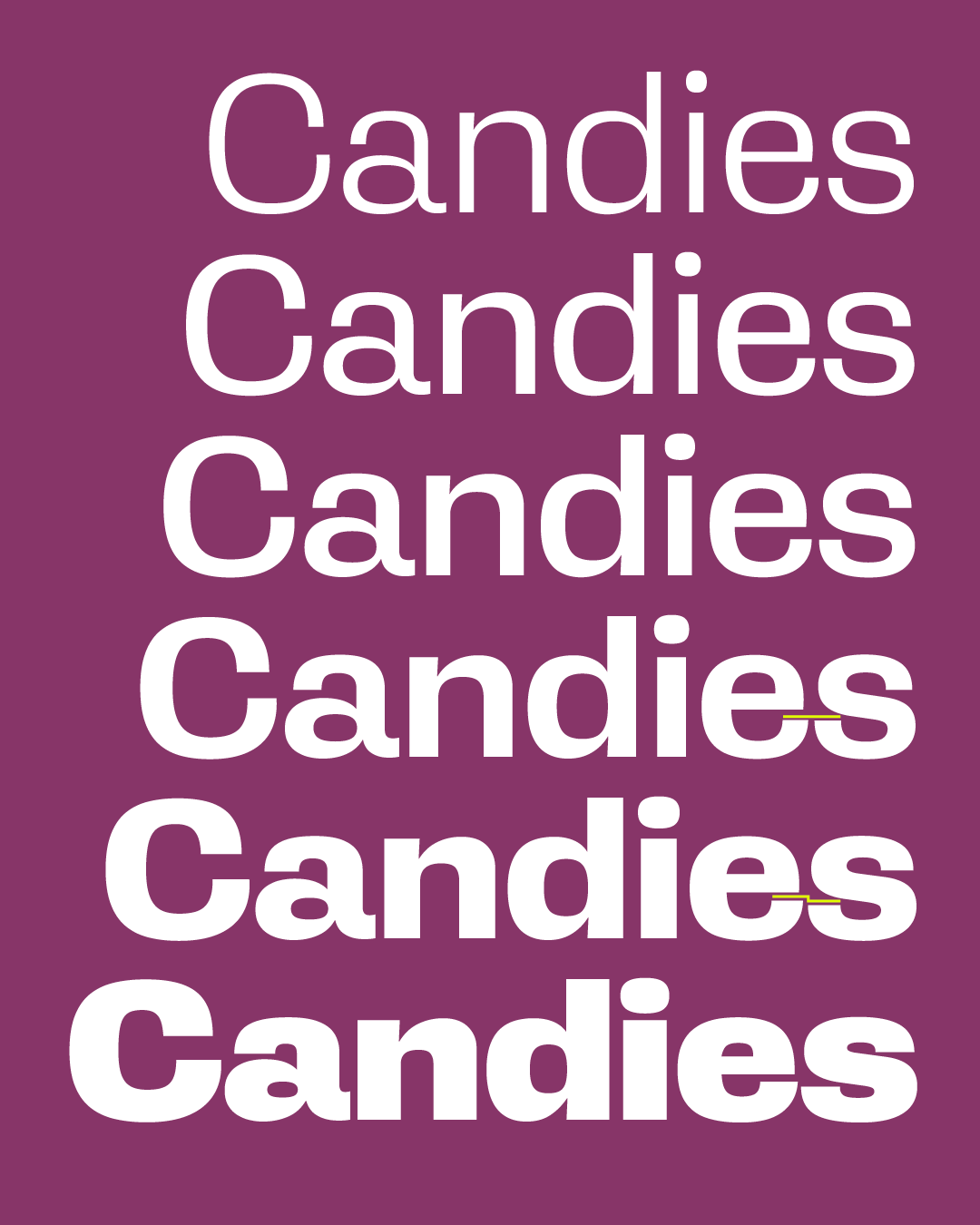
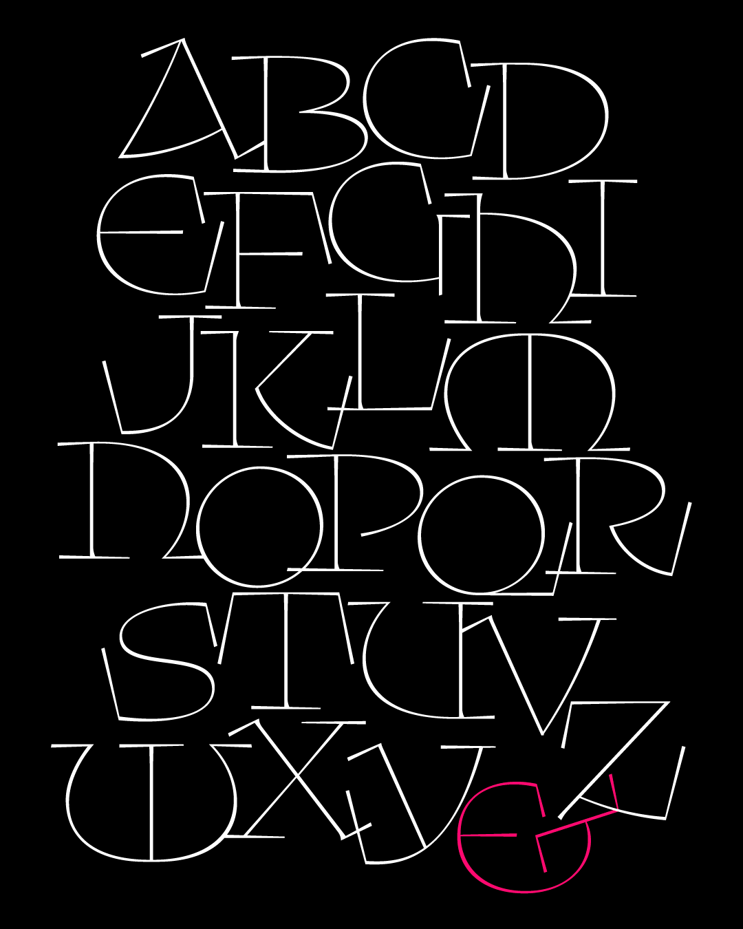
I always thought that Klooster was one of those one-offs: a font that I never expected to revisit, and certainly one that nobody has asked me to revisit. I sent out Klooster three years ago as a single heavy weight inspired by a bookplate I saw while browsing a friend’s book collection (shown below). I don’t think anybody has thought about it much since then, and hey, that’s fine with me...it’s not like there are a lot of contemporary use cases for a wacky bold uncial!
But this typeface has always been a personal favorite of mine because it was one of the first club fonts that really got me drawing outside of my comfort zone. It gave me the opportunity to research the uncial hand, a phase of the Latin script I knew relatively little about, and forced me to consider what the alphabet was like before the lowercase had fully evolved.
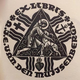
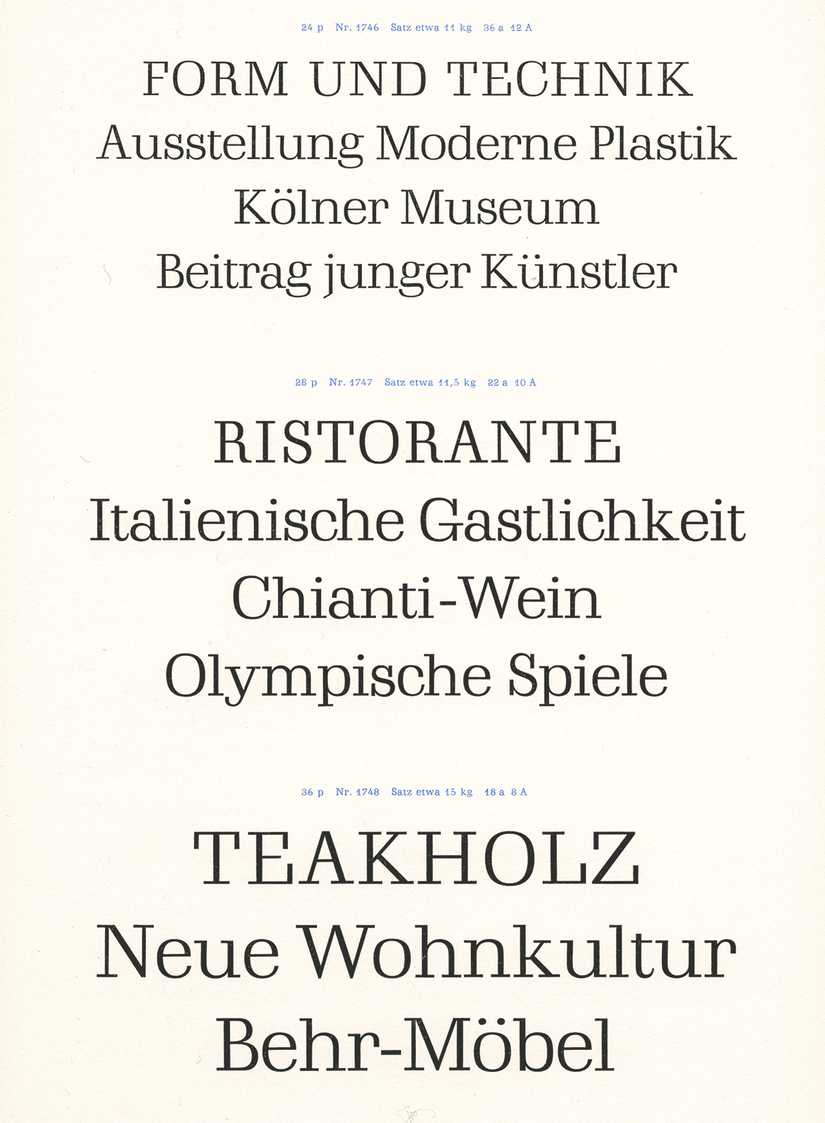
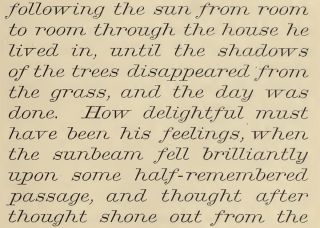
The image from Dutch Bookplates by D. Giltay Veth that served as the jumping-off point for Klooster
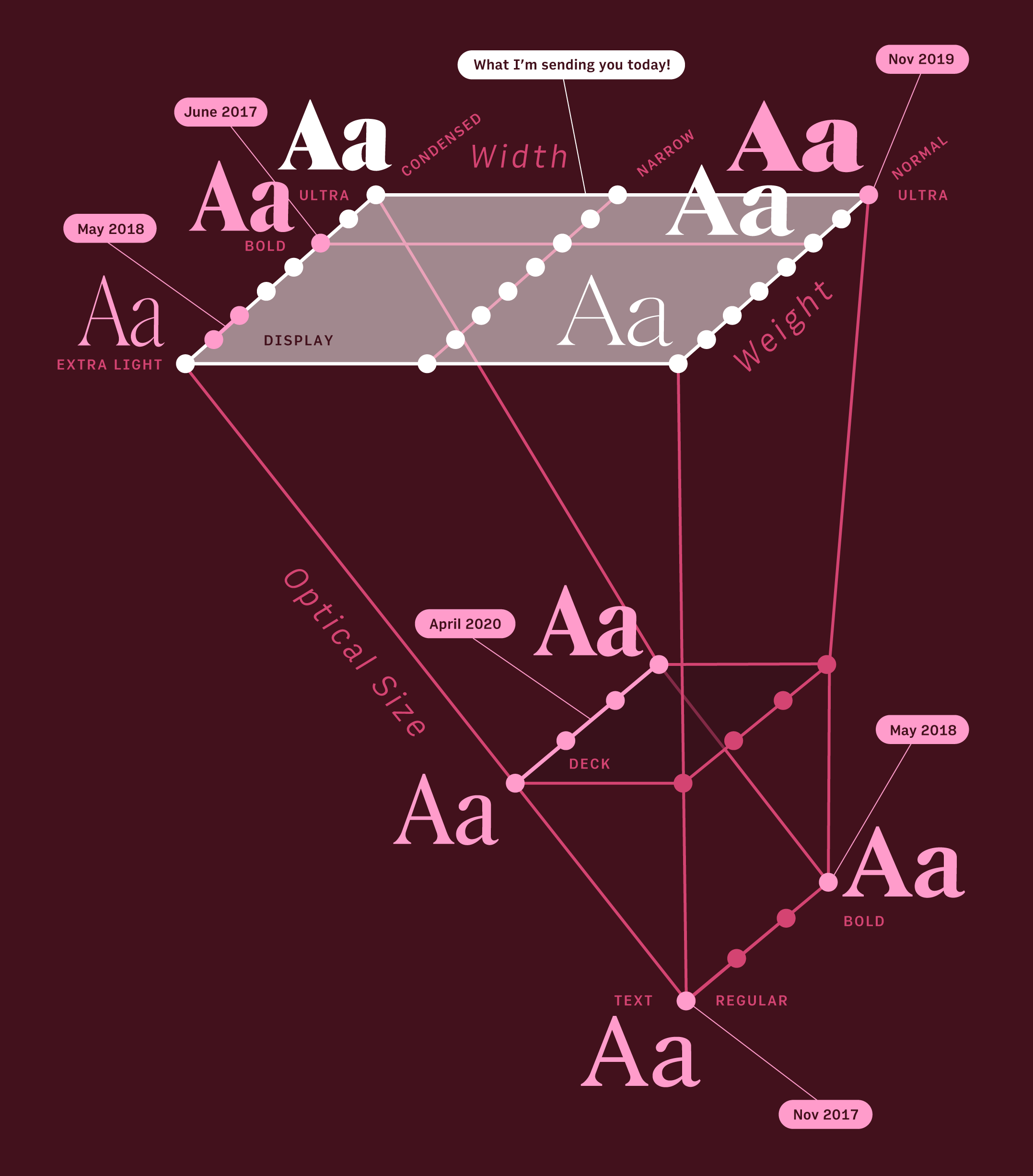
A typeface is a system of shapes, and a type family is a system of those systems. It can be taxing to track the consequences of every little change across a family, and I’ve written before about how this requires a different kind of thinking in interpolating variable fonts, which demand a certain level of compatibility across variations.
But with nobody very invested in Klooster’s original weight, I felt free not to worry about fealty to it or compatibility with it. Instead, I decided to let the new Thin style lead me in new directions. I know designers can champion “systems thinking” but this is a perfect example of where too much of it is a bad thing; I cannot tell how refreshing it was to focus on the problem in front of me and not sweat the rest!
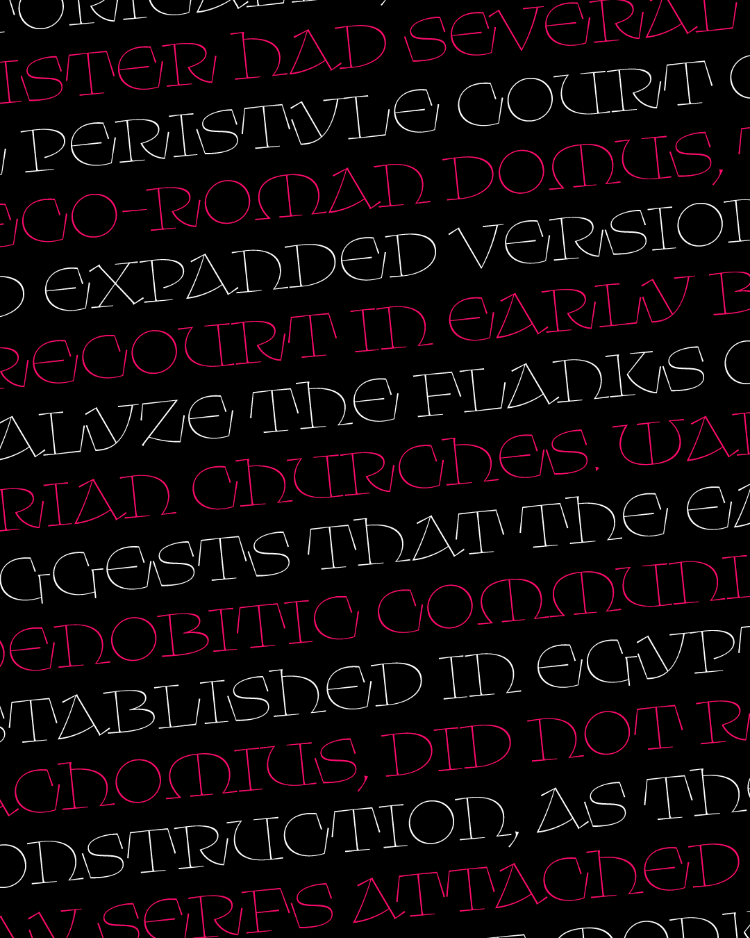
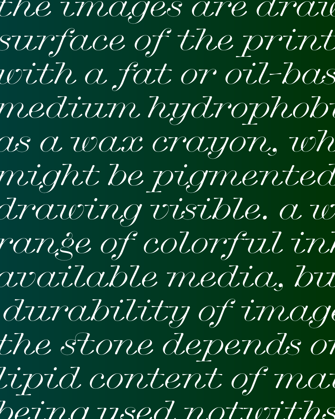
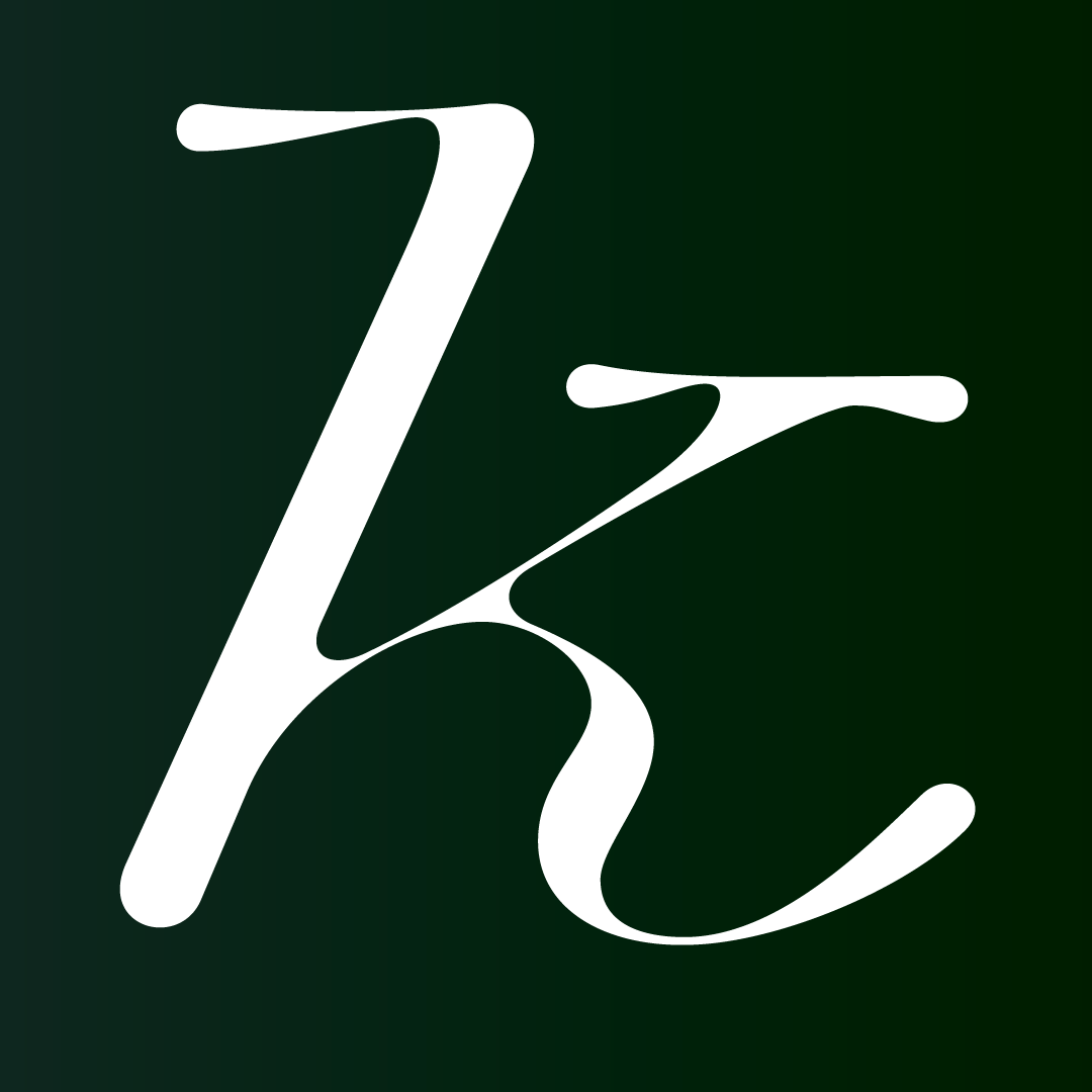
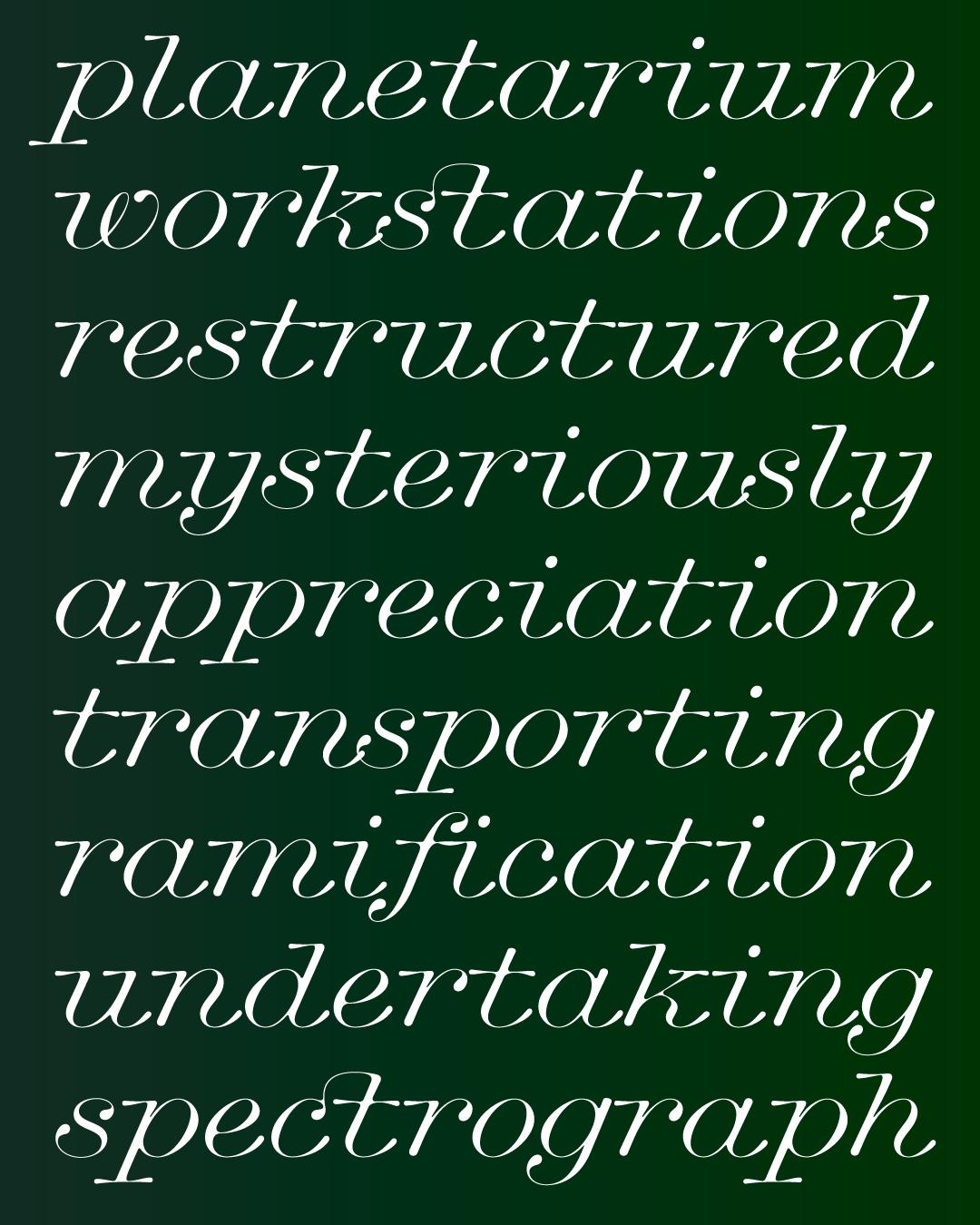
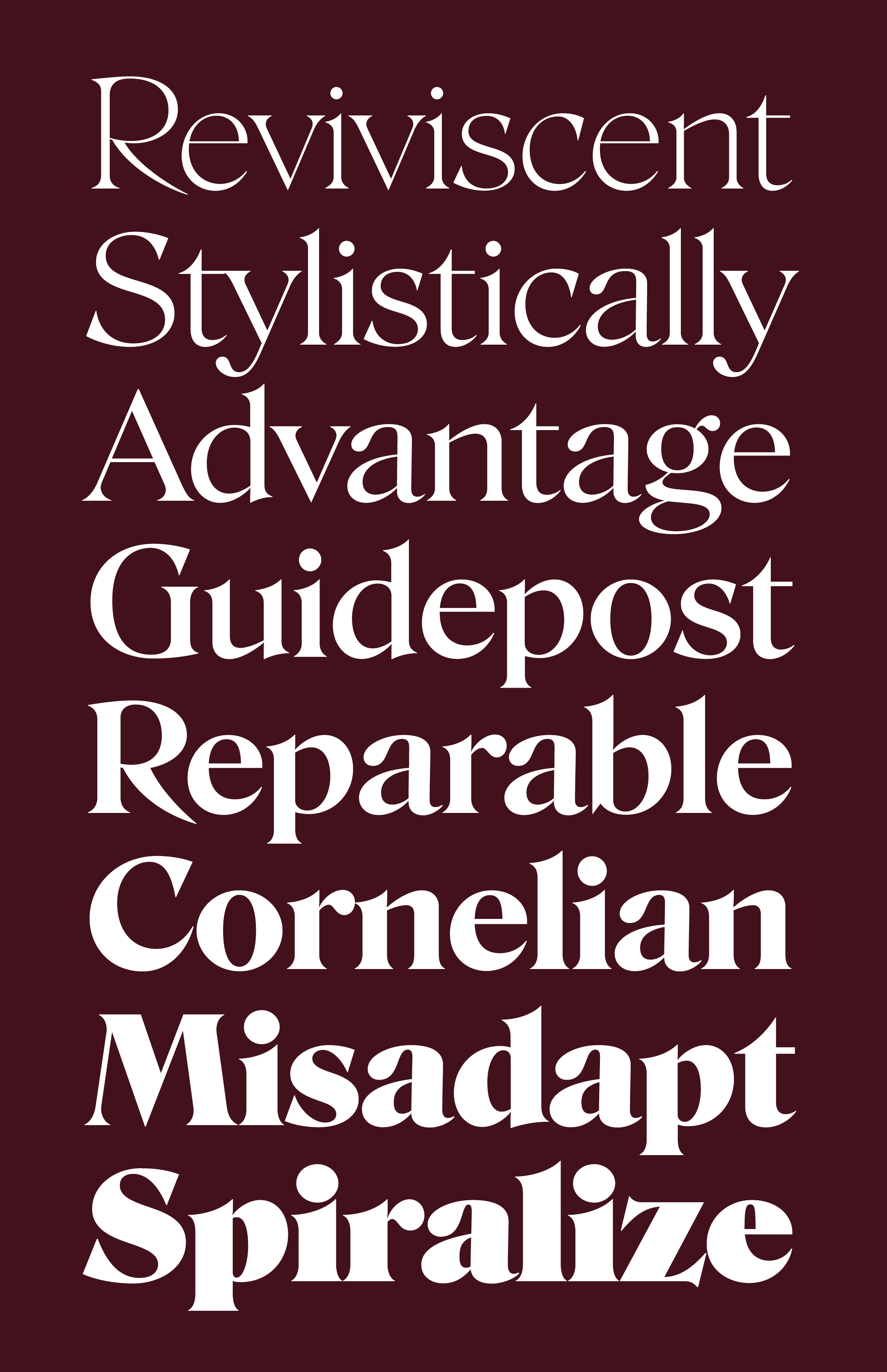
While the original Klooster had a vertical axis, this time I ended up with a diagonal axis more closely connected to the calligraphic origins of the uncial hand. And while the original Klooster had tails and terminals on letters like R and E that gradually gained weight, this new style is dominated by extraordinarily long wedge-shaped vertical serifs that abruptly protrude from the letterforms. And because this is not a variable font, I was able to easily change minor details that I felt made more sense in this new weight (the triangular period, for instance, or the serif on the middle stroke of the M and W).
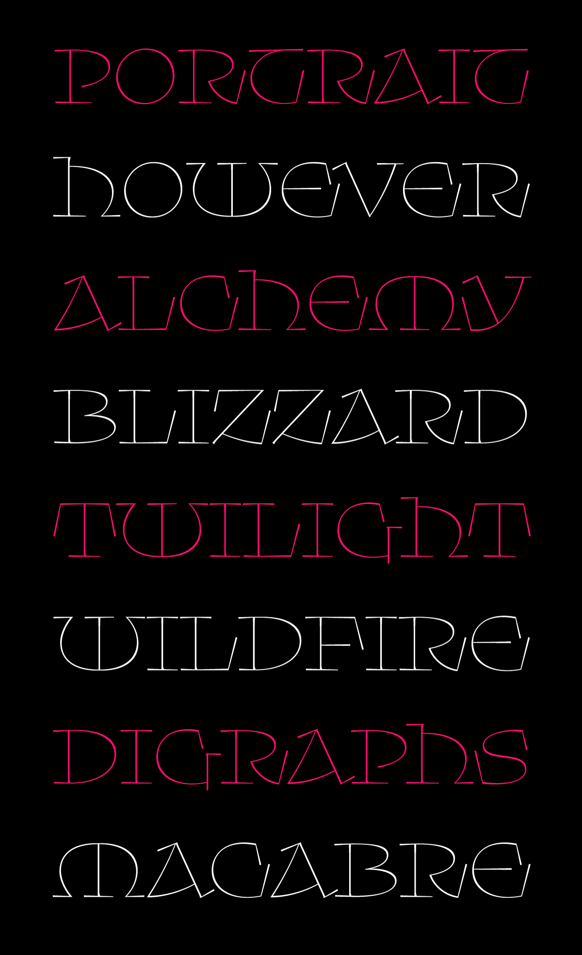
Every time I opened up the font to work on it, I kept on making those vertical serifs longer and longer until they became arguably the most important feature in the new design. I liked how the rigidity of the vertical wedges contrasted with the broad, round shapes that are characteristic of the uncial style, adding some snap and elasticity to the curves and giving the letters an untamed energy.
Having so many of these serifs opened up a host of spacing and kerning issues. There’s a bit of tension every time two vertical serifs appear next to one another...I think of it like the tinge of feedback you might get when two microphones get too close. After testing out ligatures and alternates to help them blend in more seamlessly, I decided to let the weirdness stand...some dissonance felt appropriate for this typeface, and I hope it doesn’t bother you too much!