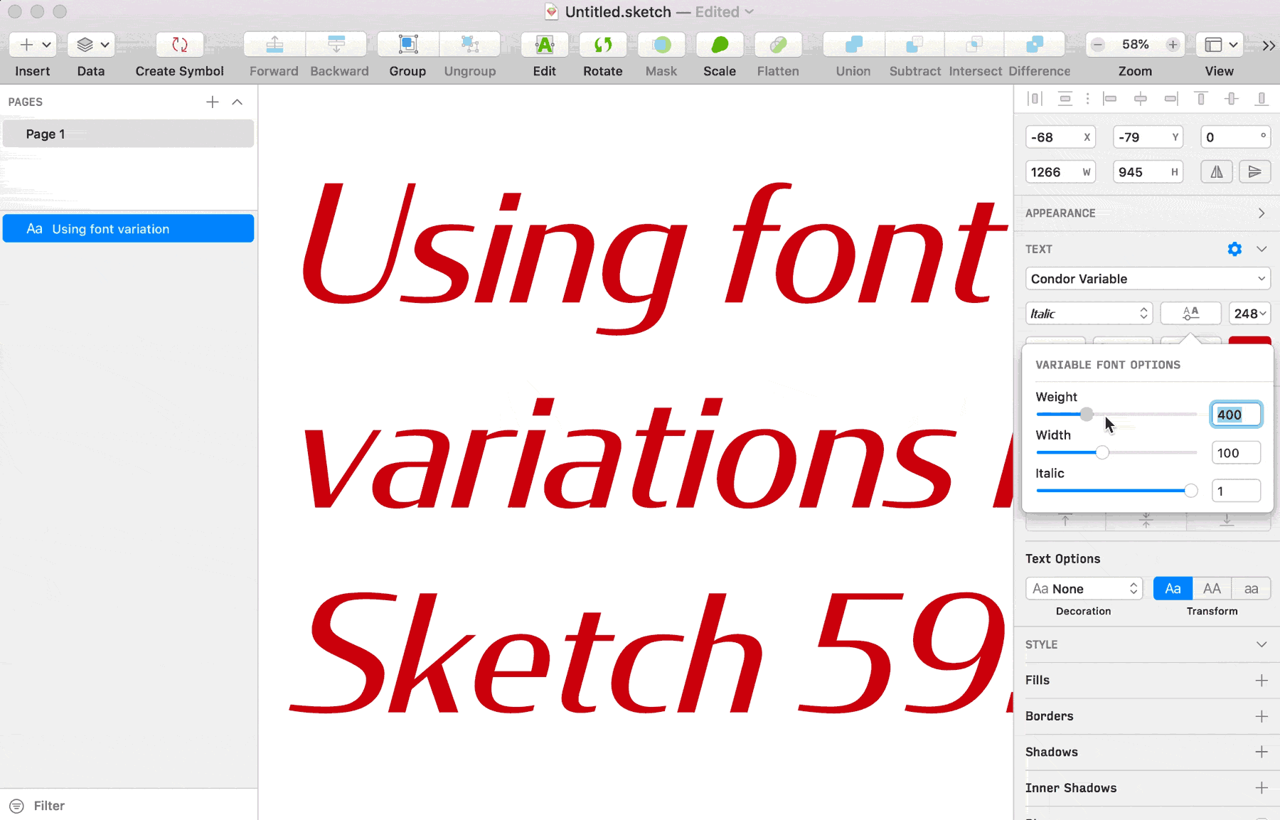
I’m very happy to share that my variable fonts are now supported in Sketch! Here’s a sneak peek of my in-progress Condor Variable working in the latest version.
Announced this week on the Sketch blog, Sketch 59 also has improved support for OpenType features. Variable axis sliders can be found right next to the Font Style menu, just like in Illustrator.
Between this news and other design apps making strides to support OpenType features, I am very excited to see support and enthusiasm for variable fonts from the makers of the latest UI design tools. I hope this helps everyone use my variable fonts to their full potential!
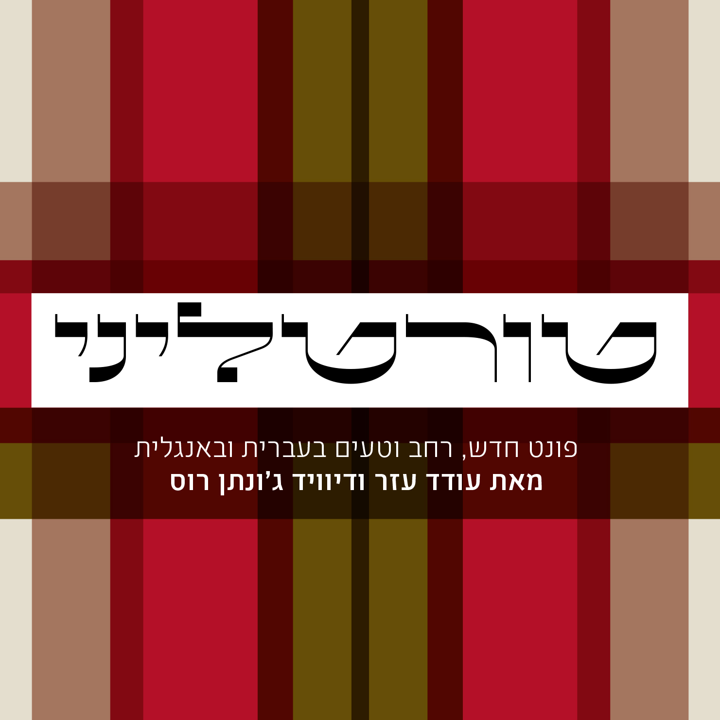
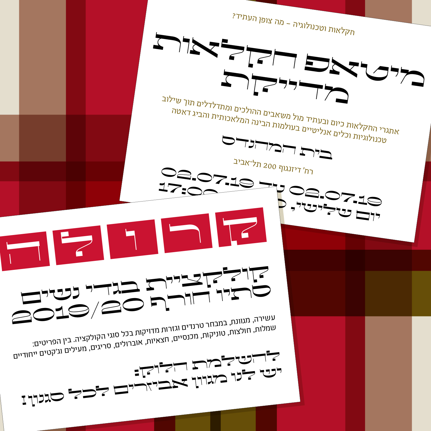
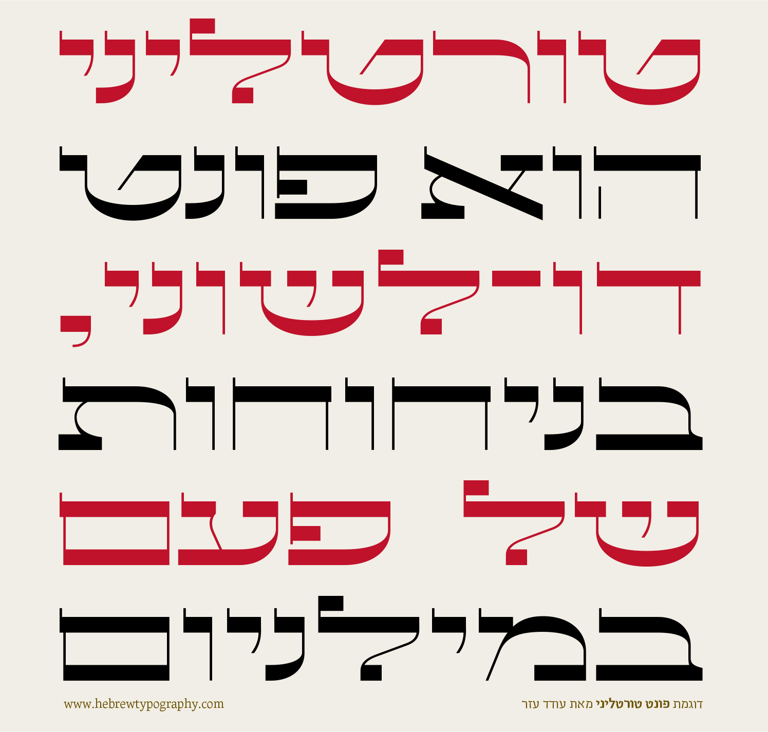
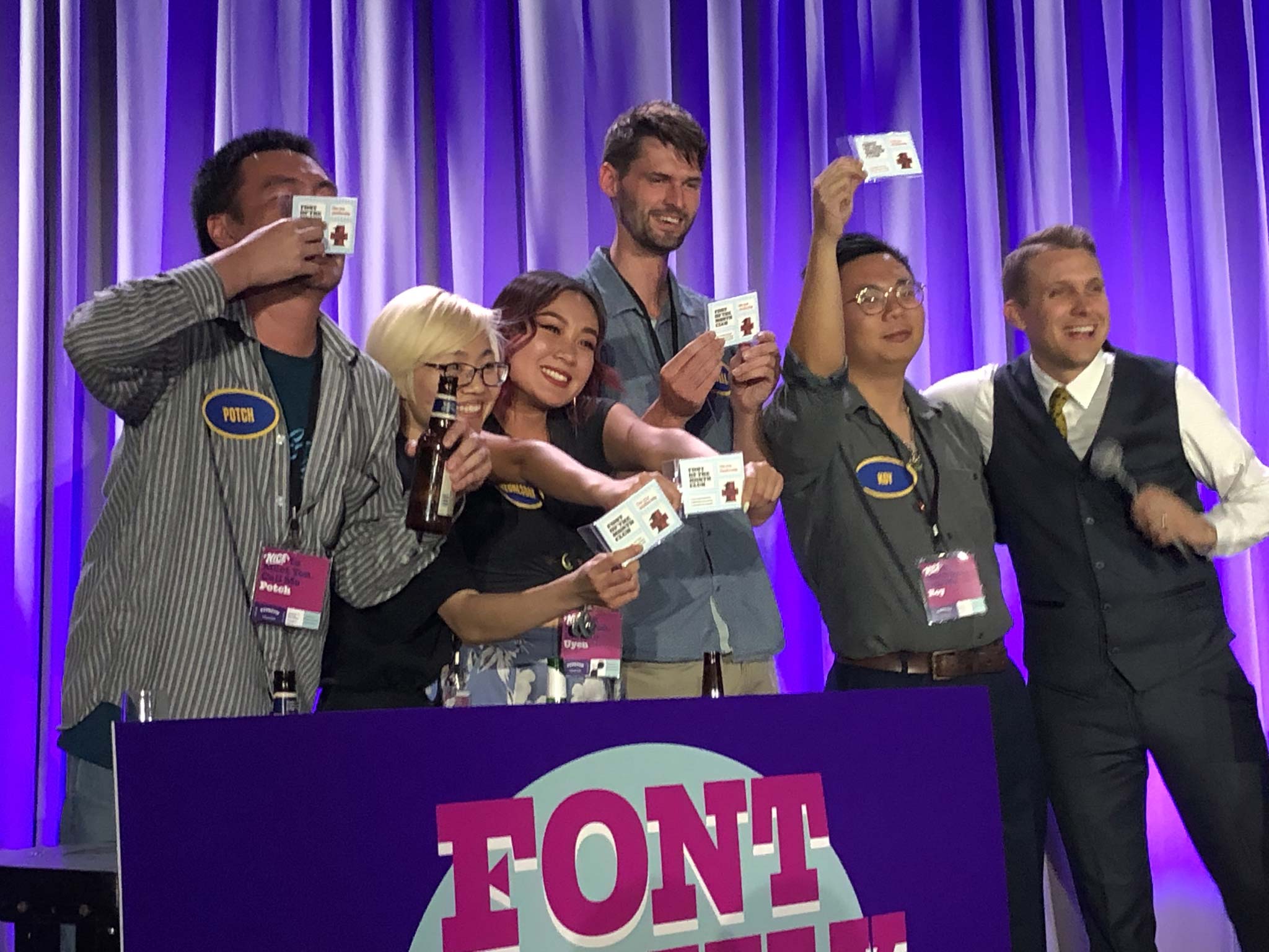
Check this out! Oded Ezer just released a Hebrew extension of July’s Font of the Month, Tortellini!
I love seeing how he adapted the design to a script where horizontal contrast is not the same as reverse contrast.
Lautsprecher DJR is September’s installment of Font of the Month Club. Sign up this month to get this revival as well as two mystery fonts for as little as $24!
This club has explored many typographic genres in the past couple years, but there is one that I have conspicuously neglected: cursive scripts. I don’t have a lot of experience working in this genre, and I’m honestly not sure I’d be any good at it.
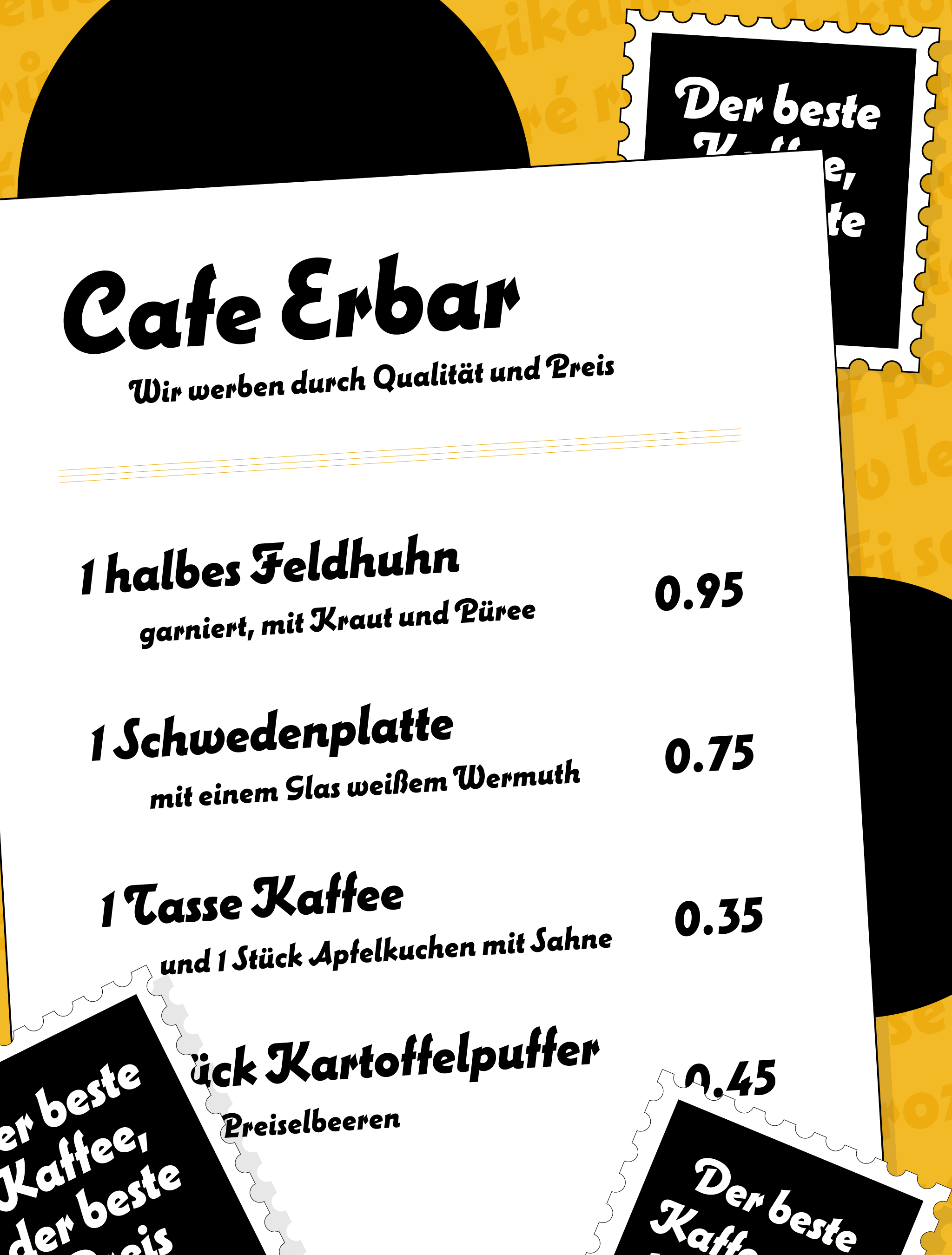
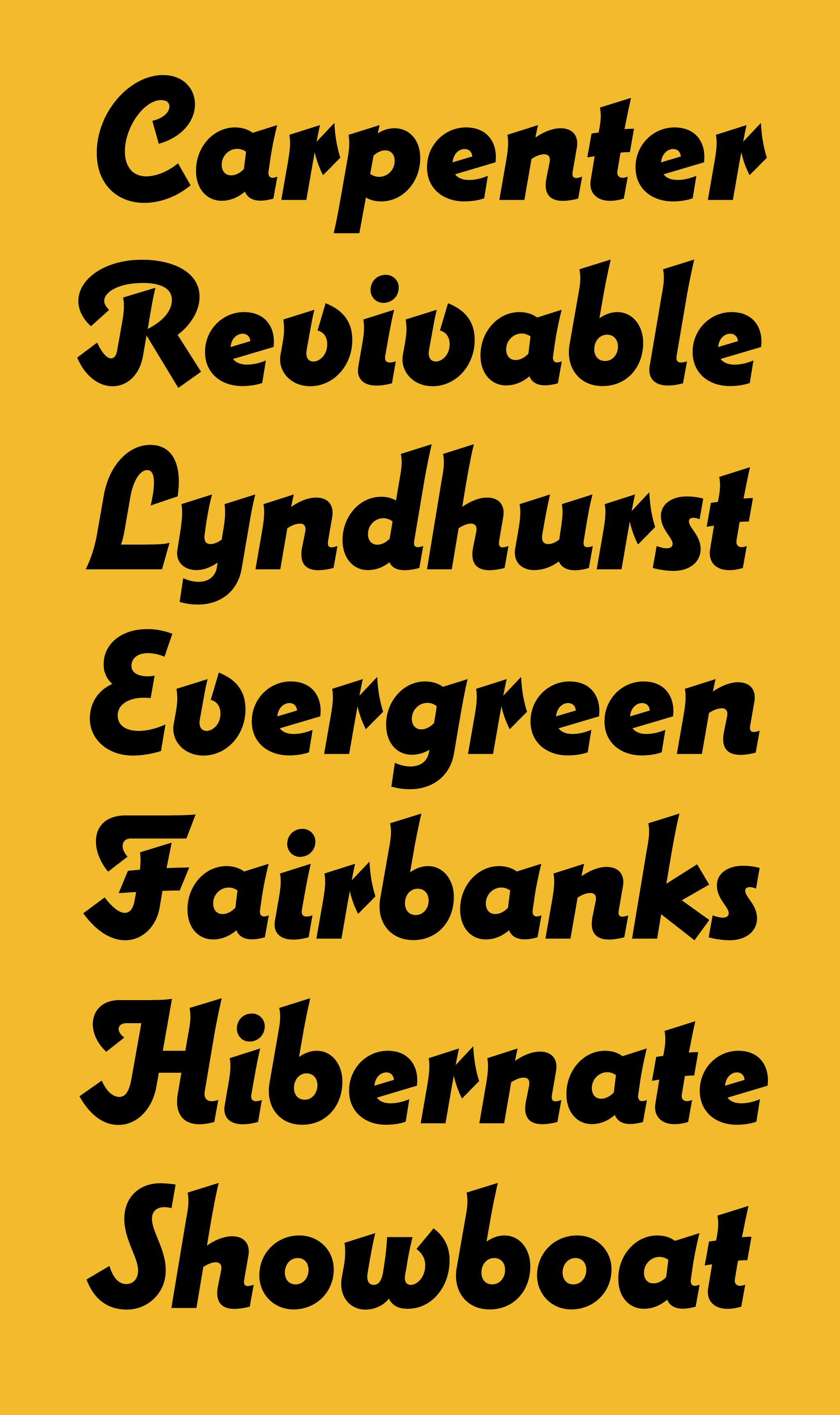
I mention this only to acknowledge that this month’s revival of Lautsprecher is the ultimate connected script cop-out. The typeface fills the role of a connected script, but is actually a curious hybrid of cursive capitals and an italic sans-serif lowercase.
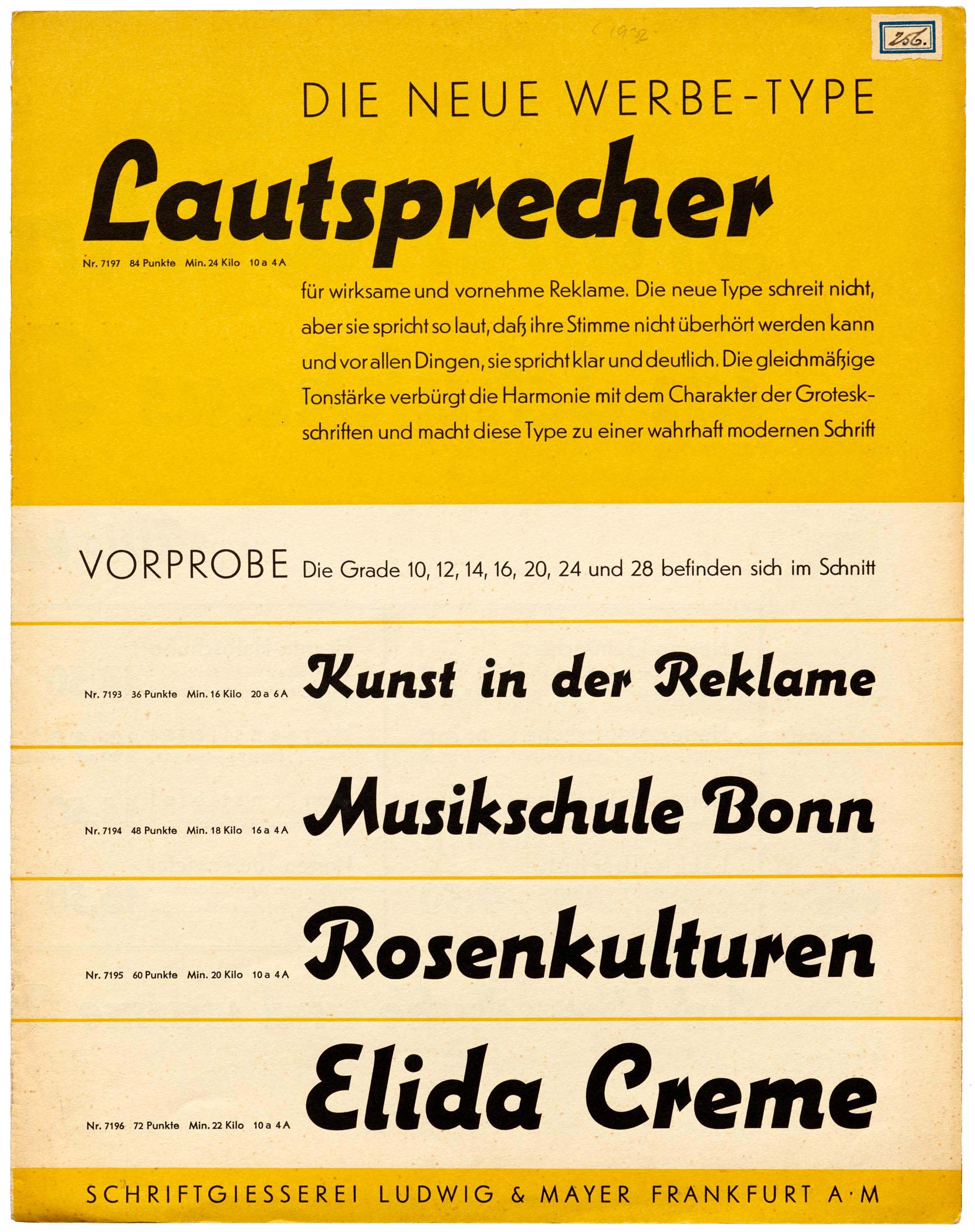
Lautsprecher specimen, Ludwig & Mayer, 1931. Image courtesy of Letterform Archive.
Lautsprecher (German for “loudspeaker”) was created by Jakob Erbar, a German professor and designer active in the early part of the 20th century. He is best known for his eponymous Erbar-Grotesk, a prototypical geometric sans published by Ludwig & Mayer in 1926 and recently reimagined as Dunbar by CJ Dunn in 2016. (CJ is also the person who taught me how to skateboard, but that is a whole other story!)
Ludwig & Mayer published Lautsprecher in 1931, and unfortunately, I don’t know much about the life of the design after that. Erbar died in 1935, and Ludwig & Mayer’s foundry in Frankfurt was destroyed in 1943 during World War II. When the company re-emerged after the war, Lautsprecher was nowhere to be found in its catalog.
In 2015, a specimen for this funky pseudo-script made its way to Letterform Archive in San Francisco as a part of the Tholenaar Collection. And thanks to some cheerleading from Stephen Coles, that is where it caught my attention.
It has been said that not every typeface needs to be revived, and I don’t disagree. Even though Lautsprecher may not be the greatest typeface of all time, I think is just too damn charming too ignore.
I love its details, like the itty-bitty serifs, the hooks on the L and J, and the distinctive diamond terminal on the r. I love its subtle bottom-heaviness and how it incorporates both geometric and organic forms. And I love how Erbar dealt with the constraint of the metal block, chopping off letters like S so that they did not need to hang over the following letter.
I am someone who was taught that a typeface is “a beautiful collection of letters, not a collection of beautiful letters.” But Lautsprecher’s little idiosyncrasies are a helpful reminder that there is some flexibility in how systematic a typeface needs to be.
After Crayonette in 2017 and Bradley in 2018, Lautsprecher is the third summertime revival I’ve done for the club. I’m thinking about making it a tradition!
Of course, many thanks to Stephen and Letterform Archive for providing these resources and for encouraging me to take on the revival. I encourage you to pay them a visit the next time you are in the Bay Area, and if you have a few bucks to spare, you can consider donating to their new home so they can continue preserving and sharing great design.