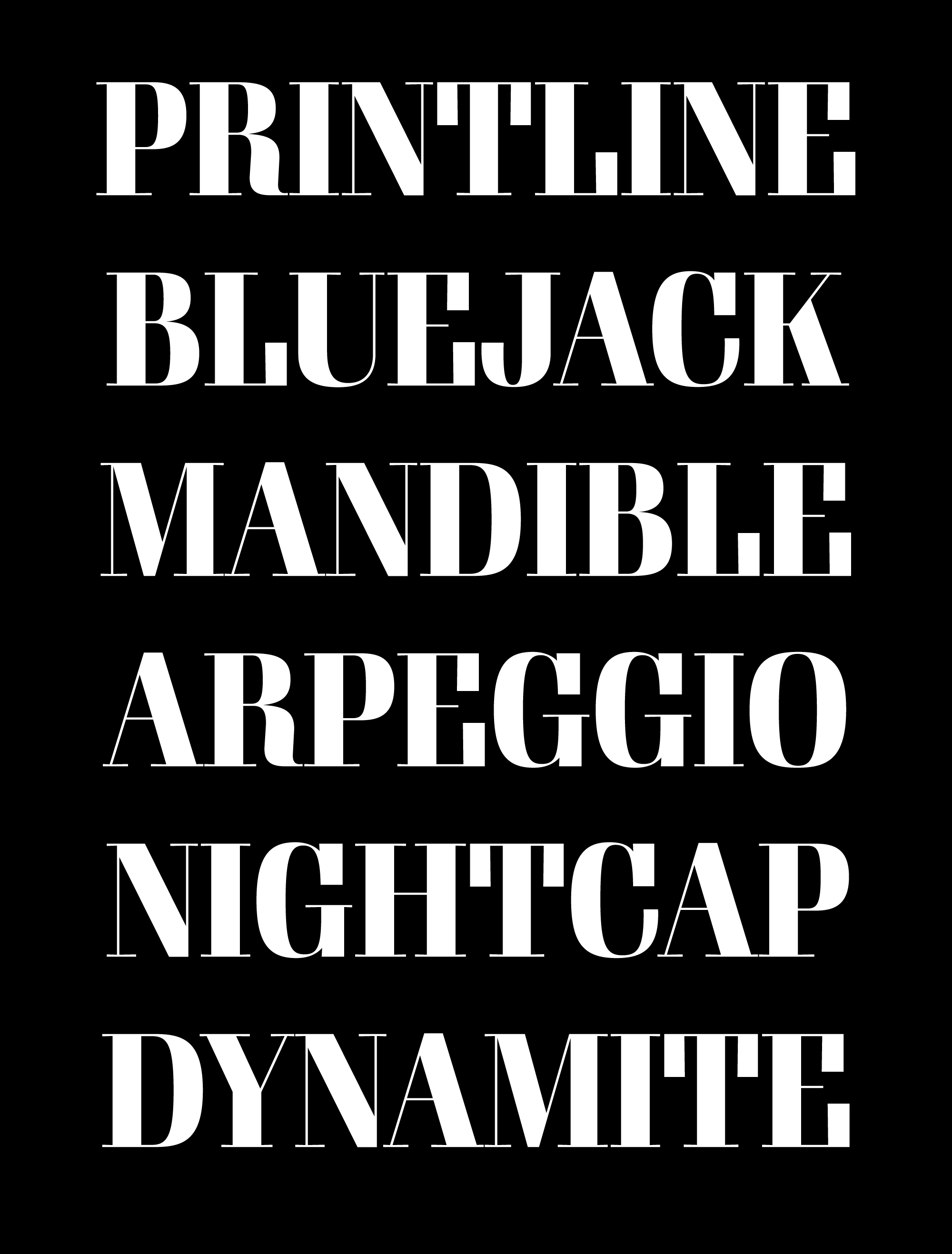
March’s font of the month: Gimlet Banner
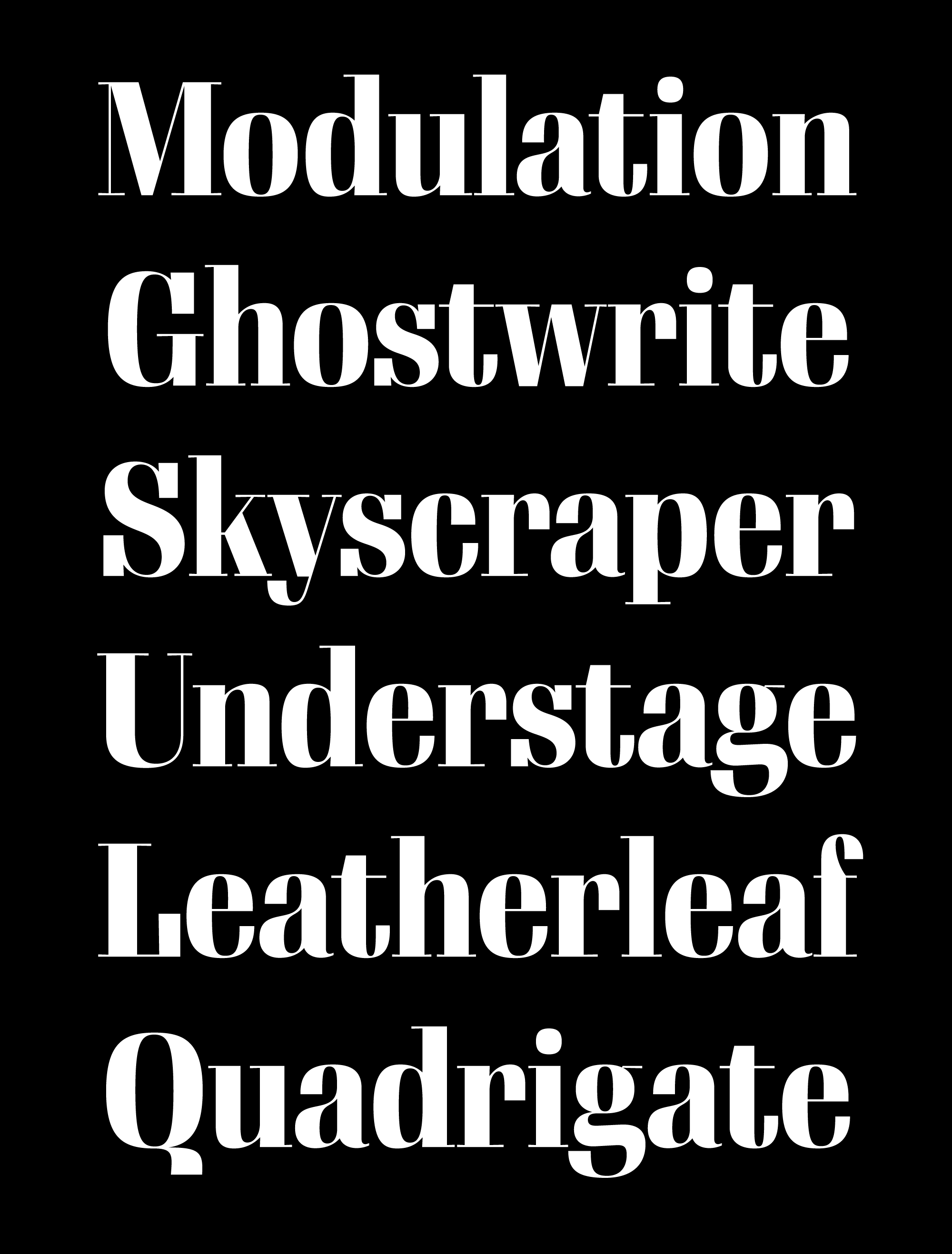
Gimlet is one of my most extensive type families, released in 2016 in three optical sizes, four widths, and five weights. Many large serif families use thick/thin contrast to create dramatic tension, especially in display sizes, but Gimlet is different. Gimlet’s contrast remains relatively low throughout the series, owing mainly to the slabby roots of its inspiration, Schadow, designed by Georg Trump in 1938.
My interest in Schadow started with Nick Sherman, who suggested that I use it as a jumping-off point for a new design. Gimlet has always had an unusual relationship with its predecessor; rarely do my typefaces owe so much to a single source, yet strive to be so different from it. Gimlet isn’t really a “revival” even in the loosest sense of the word, but it draws so much from Schadow that it’s also hard to think of it as an entirely original design (in John Downer’s helpful classification, I think/hope it would be considered an homage).
Following in Schadow’s footsteps, Gimlet’s serifs aren’t quite slabs, but they’re not too far away from slabs either. But in my mind, Gimlet was never supposed to be a slab serif. I’ve always wondered what would happen if I took the design one step further from its source material and started to amp up the contrast.
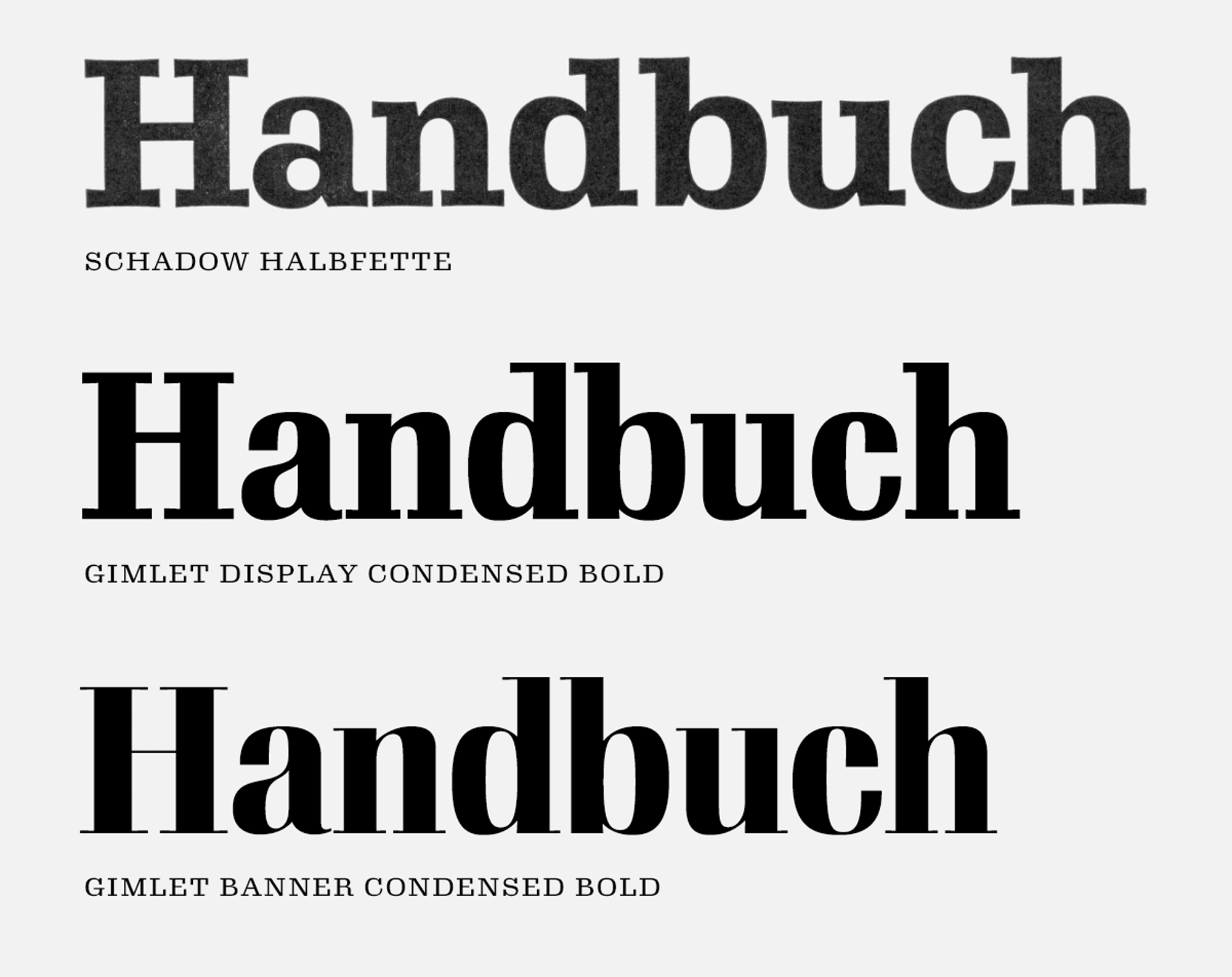
This month, I’m sending you an exploratory style of Gimlet Banner, a font intended for very large sizes that eschews Schadow’s low contrast in favor of razor-thin serifs and hairlines. I use the word “exploratory” to describe this exercise because, in a family as large as Gimlet, it’s nice to dip my toe in the high-contrast waters before committing to the development of 40 new Banner styles.
I’m not sure I’m 100% sold on this yet, but I’m warming up to it. The extreme thins are inherently brittle, and I might have gone a little too far. But I do like how the Banner style exaggerates the unusual thick/thin/thick transitions between stems and arches in letters like n or d.
Interpolation has been a crucial part of Gimlet’s development (as it is for many large families); I was able to generate many variants from a relatively small set of master designs. But for this exploration I’ve chosen to work in the Bold Condensed style precisely because it is not one of the original masters.
This may seem counterintuitive at first. I’m creating extra work for myself, and should I choose to pursue Banner styles for the entire family, I’ll probably have to discard this version and redraw the family in a more systematic way.
But I’ve been thinking a lot about how easy it can be to rely too much on interpolation, and how difficult it can be to maintain a sense of individuality and specificity at any given point in a large, fluid designspace. (This is especially apparent in Gimlet, which has already taken many style-specific quirks from Schadow and ironed them out into a more unified family.)
So despite the inefficiency, this exploration has forced me to spend some time drawing in a less-familiar area of the designspace. And hopefully I’ve learned something in the process.
Gimlet Banner is available this March for members of the Font of the Month Club; memberships go for as little as $6/month, so be sure to sign up today!