January’s font of the month: Gimlet X-Ray
Gimlet X-Ray was January’s installment of Font of the Month Club. As always, you can sign up for as little as $24!
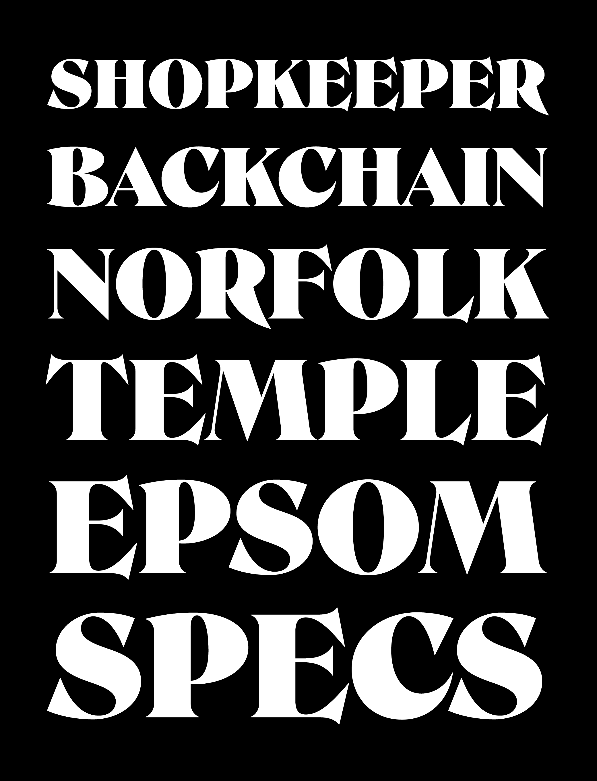
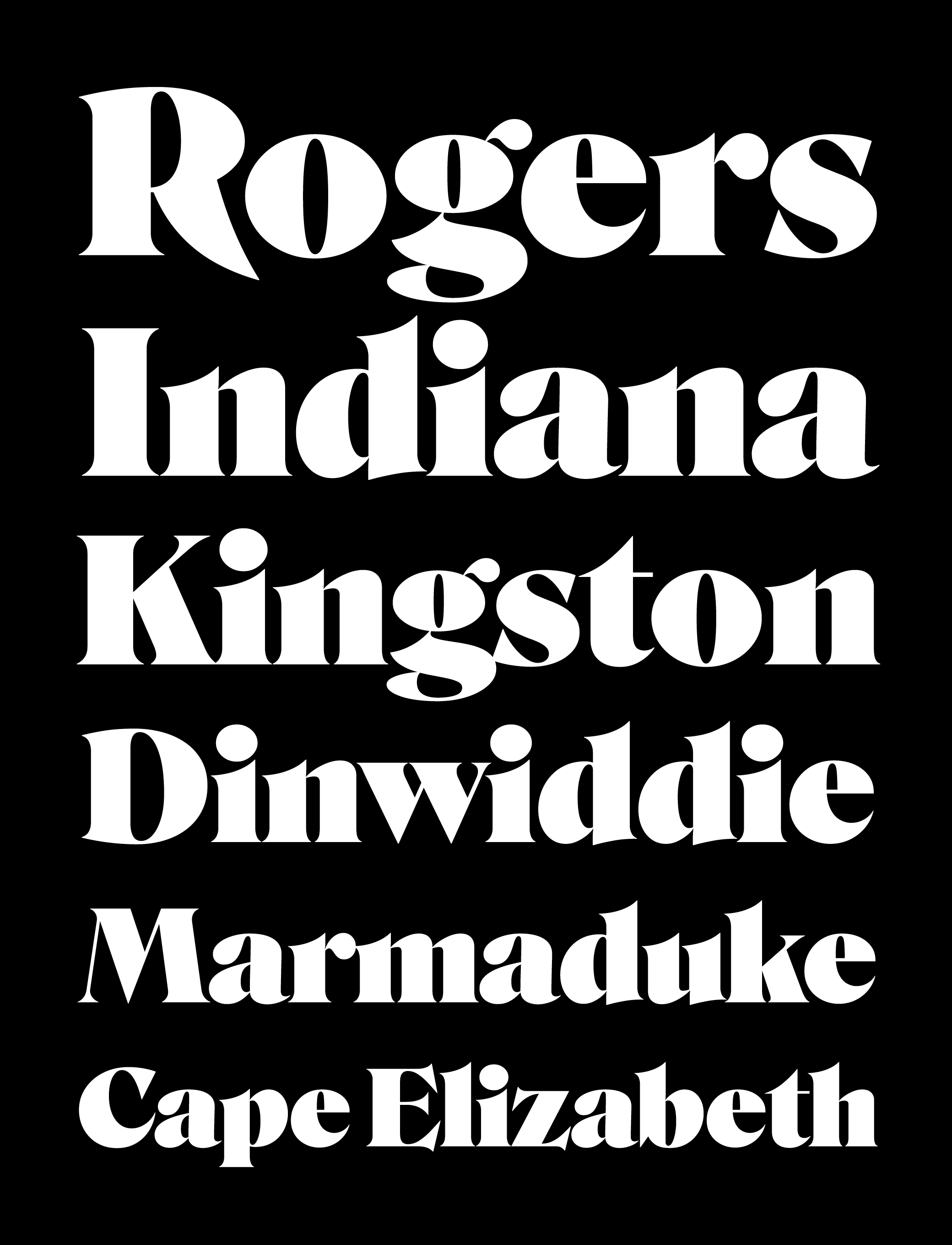
Recently I’ve been converting a lot of my older font families into the new(ish) variable font format...and for the most part, it has been pretty tedious work. It involves wrangling tons of disparate outlines in order to get them working together in a single designspace, where their point structures match and everything interpolates.
It is a tricky balance of family unity on one hand, and specificity and variety on the other. And it has forced me to think a lot about Bézier curves as a medium and how outline interpolation affects the way I design (for better and for worse).
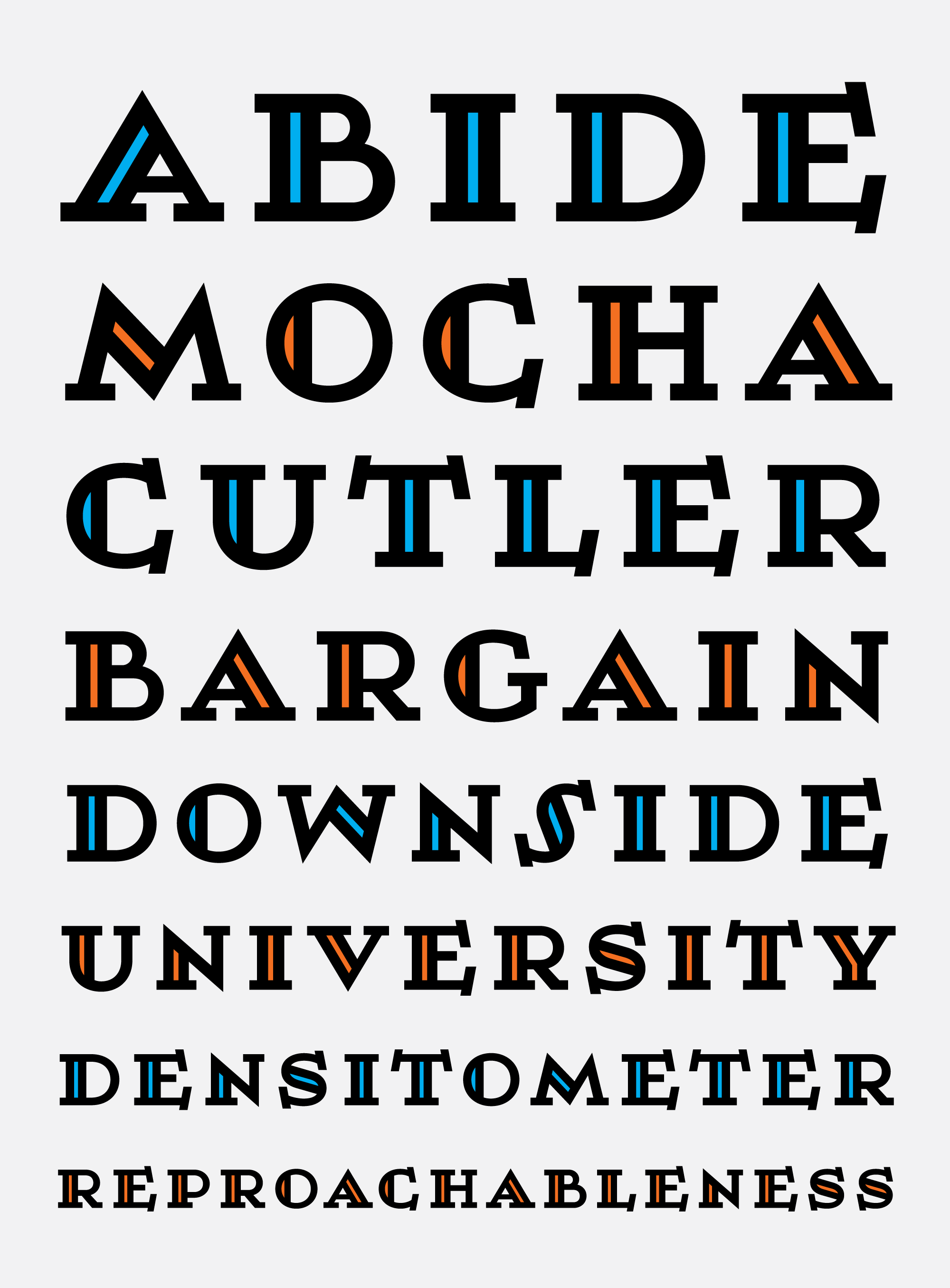
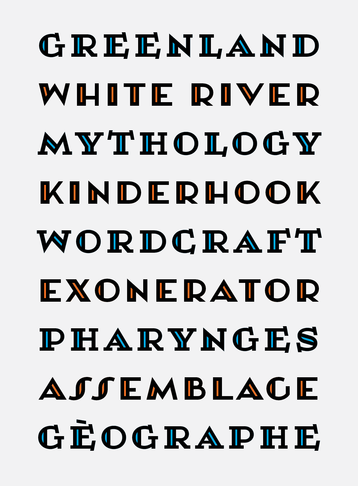
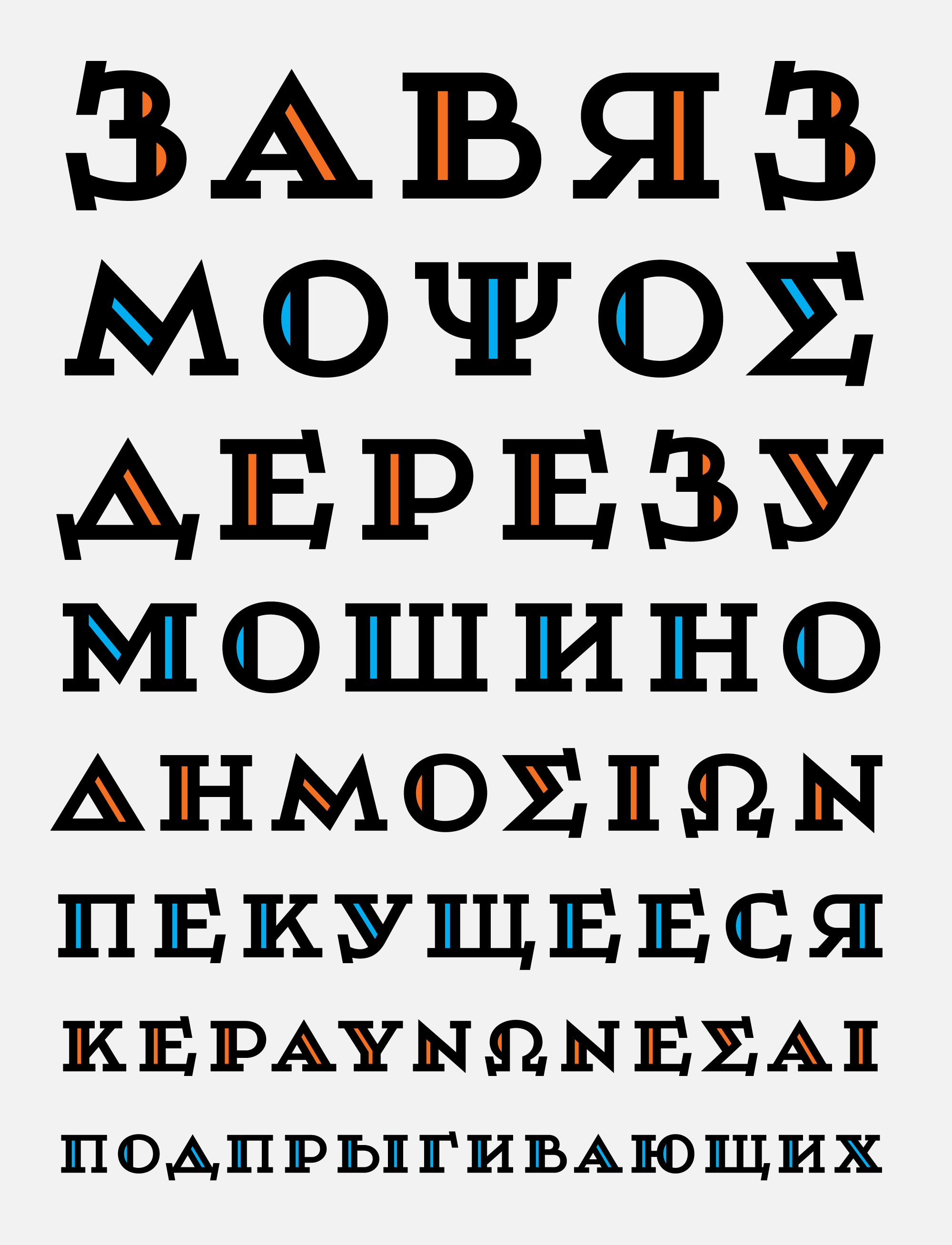
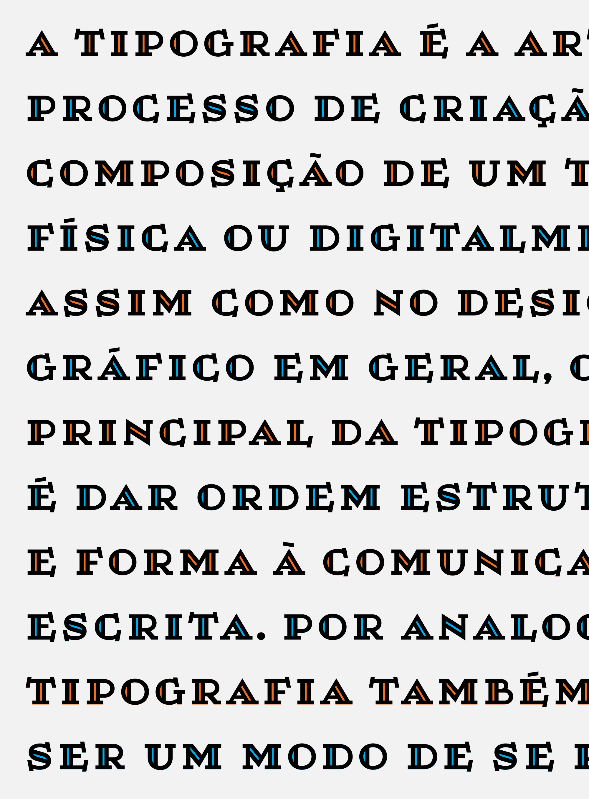
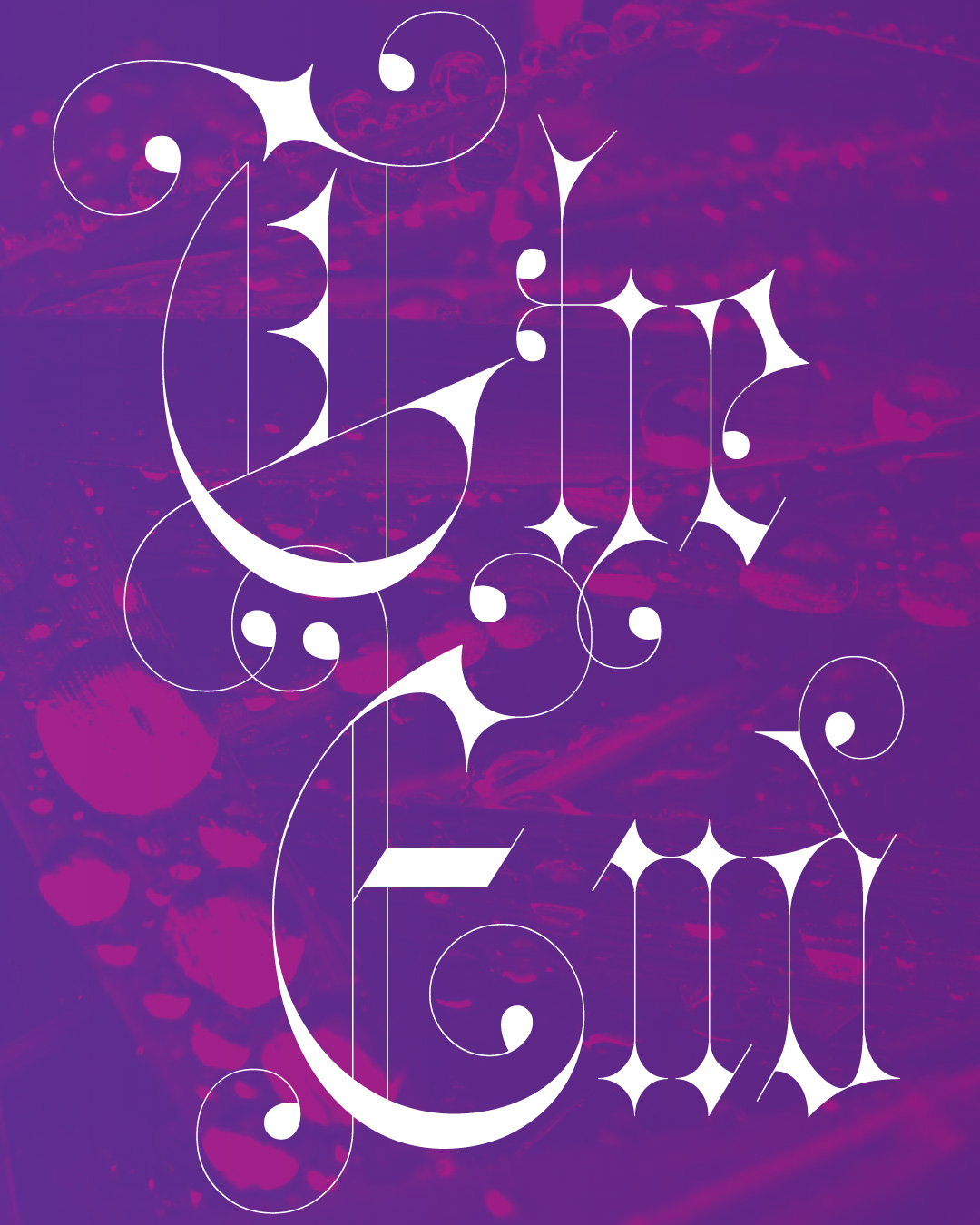
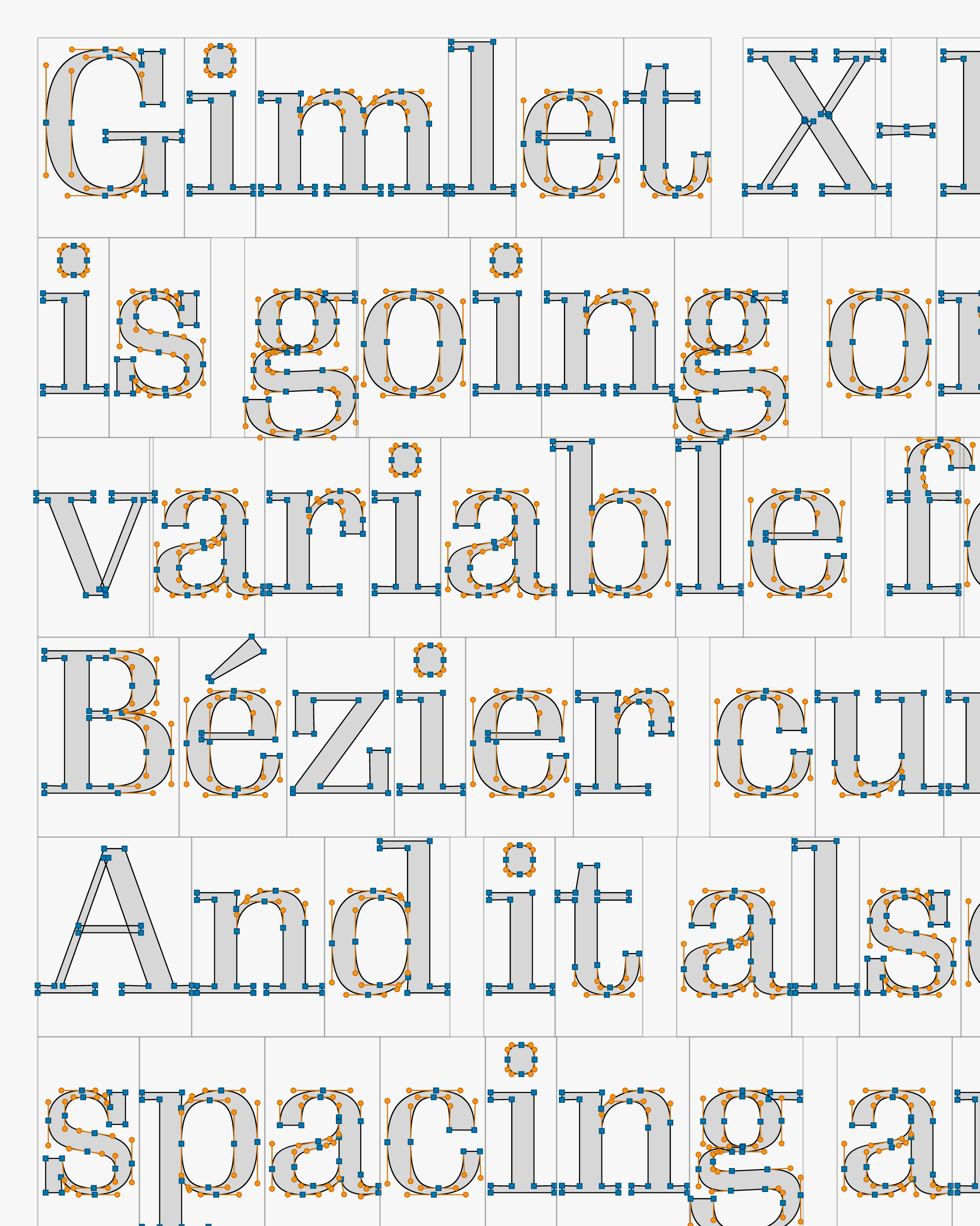
Needing a break from working on Gimlet, I started experimenting with a variable color font that could showcase the internal mechanics of an outline as it transforms inside a variable font. The result is Gimlet X-Ray, a font that wears its insides on the outside.
A variable font this complex is feasible because of a recent OpenType enhancement that we don’t talk about enough: contours are now allowed to overlap.
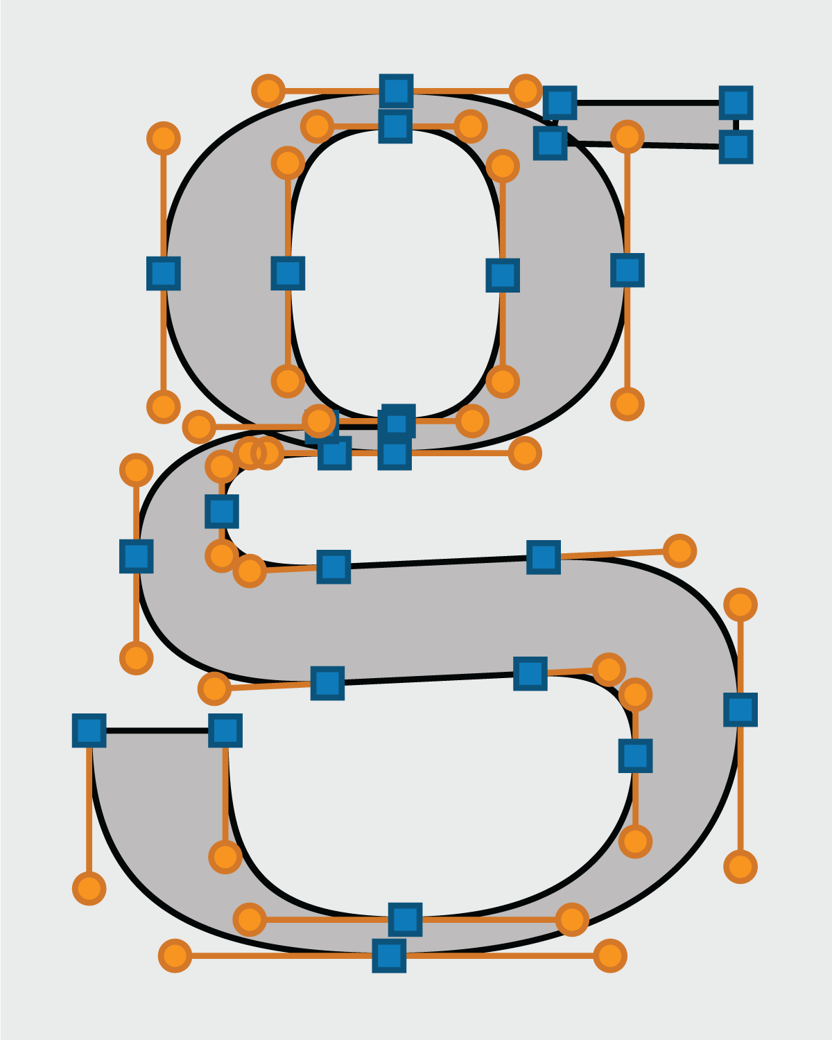
Gimlet’s overlaps are exposed in Gimlet X-Ray. For example, you can see that the g is defined by one counterform and by three separate shapes. This allows each curve to transform independently from how it intersects with the others.
On top of that, Gimlet X-Ray has its own overlapping contours, with hundreds of thousands of independently-moving squares, circles, and lines. (Probably the hardest part of this project was the trigonometry that I had to re-learn in order to draw the angled handles...SOHCATOAH to the rescue!)
Gimlet X-Ray lets you explore the design across weight and width, and offers additional controls over the the size of the control points and the outline thickness.
As was the case with last month’s font, you can drag the fonts onto my Color Font Customizer, choose your own colors, and download a customized version of the font. Also included is Gimlet X-Ray SVG, which is not a variable font but will give you the colors in Adobe apps. And finally, I stuck a little DrawBot script that shows how you can use the OpenType Stylistic Sets to customize the color layers.
To see the color variable font in all its glory, Chris Lewis helped me put together a Gimlet X-Ray demo page where you can play with the color palettes and variations. I hope you find this to be a fun experiment! 🎨