May’s font of the month: Gimlet Sans
When I’m working on a serif typeface and I get a little bored or stuck, I’ll often do a save-as and start sketching a sans serif version of it. You already got a glimpse of my Nickel Sans last year, and sitting buried somewhere on my hard drive are the beginnings of a Roslindale Sans, a Trilby Sans...even a Bradley Sans!
This month I’m sending you something that started as one of those sketches, a sans serif companion to my “quirkhorse” serif Gimlet that dates all the way back to April 2016. Let’s call it Gimlet Sans—for now at least.
I do these sketches not because I believe that every family should be a superfamily (I don’t), or because I think the results will be useful or worthy of publication (most aren’t). But I find it to be a helpful exercise in distilling the core idea of what the typeface is supposed to be, separating the details that become crucial to a typeface’s identity from the superfluous details that only serve to dilute it. Serifs in particular get repeated so often that they instantly become central to that core idea, and Gimlet’s distinctive slabby wedges are no exception. That’s why I find it so interesting to see what’s left after they all get peeled away.
Type designers are always eager to tell you how creating a sans serif involves so much more than simply chopping off serifs. But that’s how some of the earliest sans serifs got made, and it turns out that it’s a pretty good place to start.
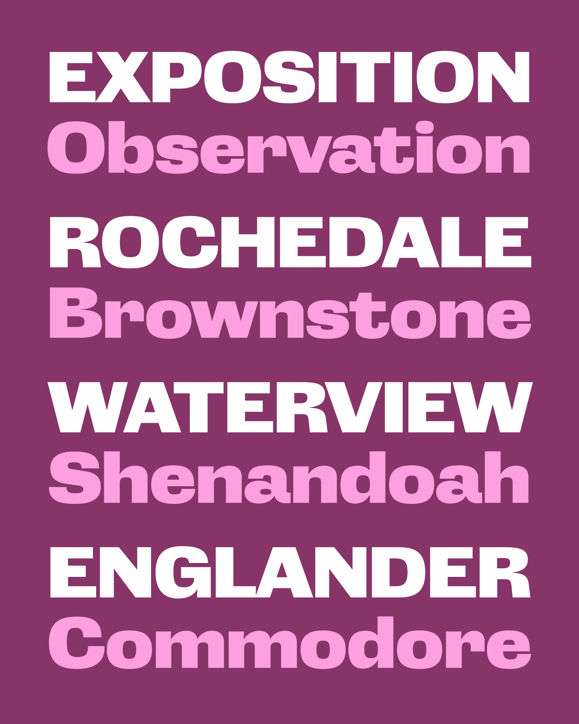
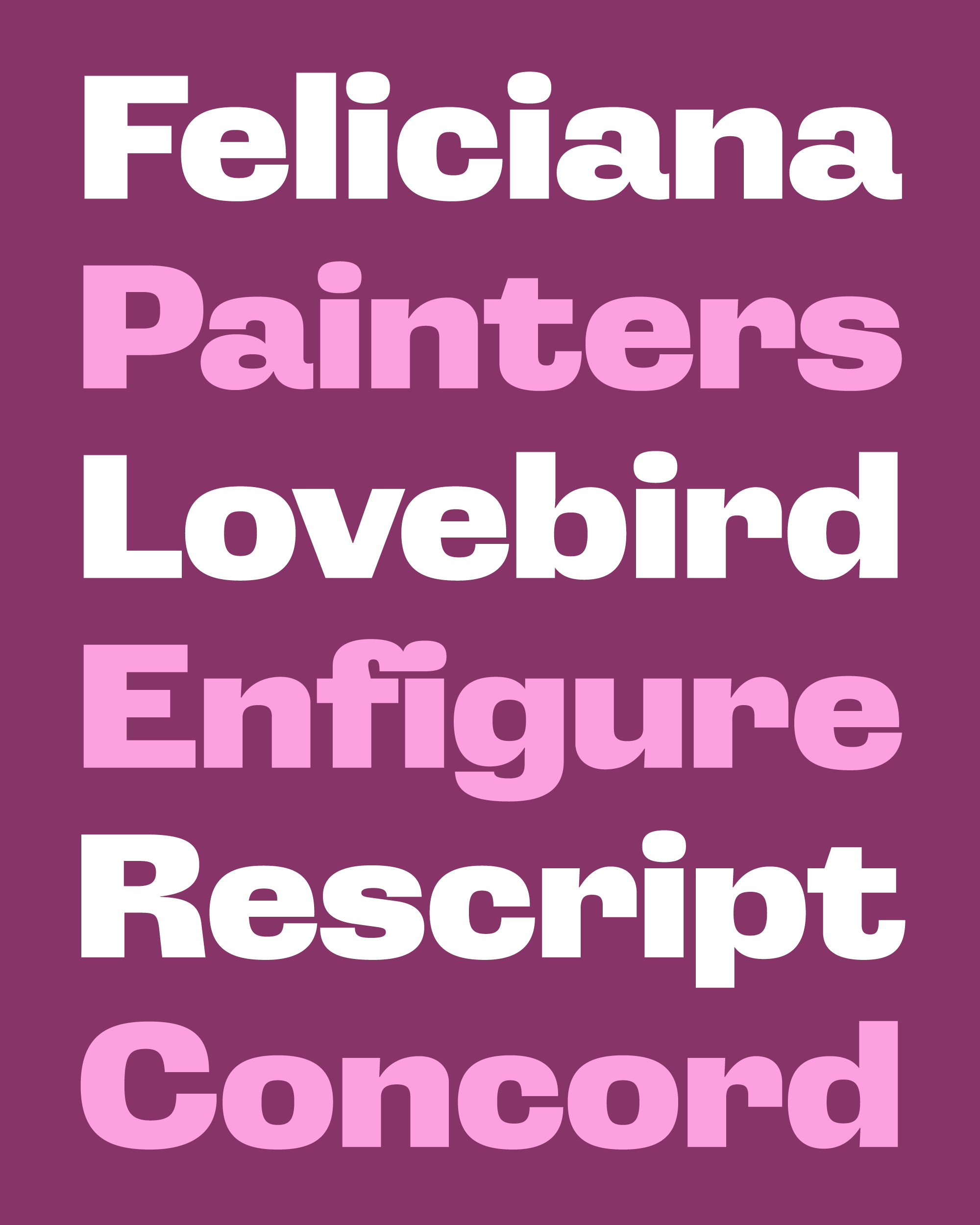
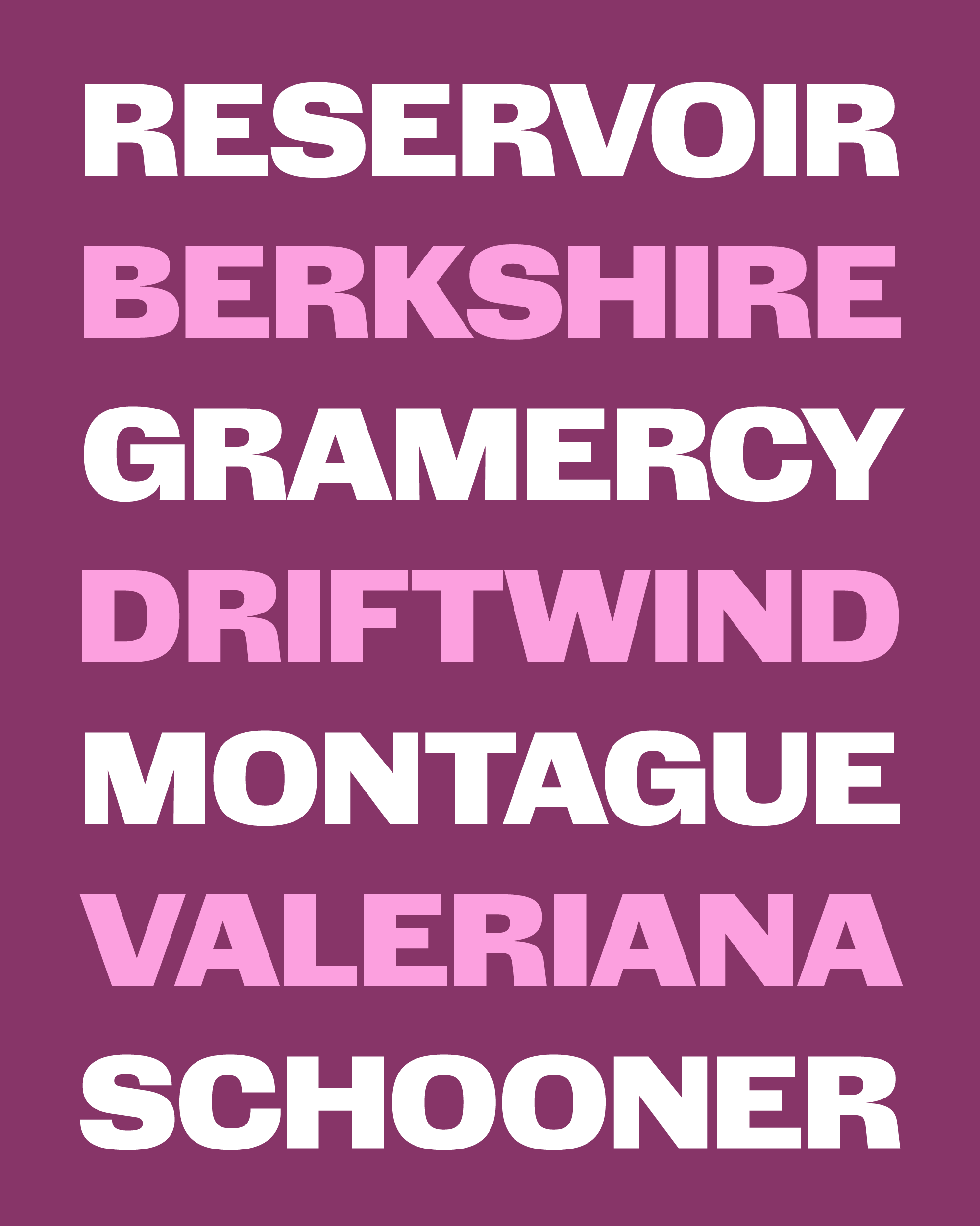
Even without its serifs, Gimlet Sans owes a lot to Georg Trump’s Schadow. I love how Schadow manages to be rigid and clunky and somehow simultaneously organic and spontaneous, and I hope that Gimlet Sans has captured a bit of that tension. If you look closely, you can see it in the bowl of the p, which starts with a pinch and some bounce on the top of the curve, but transforms into a squarish superellipse by the time it reaches the bottom. And you don’t have to look too closely to see the closed apertures, exaggerated underbites of letters like C and e, and the distinctive water-faucet r or potbellied a.
If this kind of constructed sans serif exists on a spectrum, with Eurostile on the sleek-verging-on-sterile side, and Ad Lib on the fun-but-a-little-too-goofy side, my hope is that Gimlet Sans lands right in the middle.

I’m still not sure whether I want to develop this into a whole family, or if this should remain a one-off experiment. I’ll be excited to hear what you think, and I hope this font proves to be a useful asset to your designs, or at least a welcome distraction!