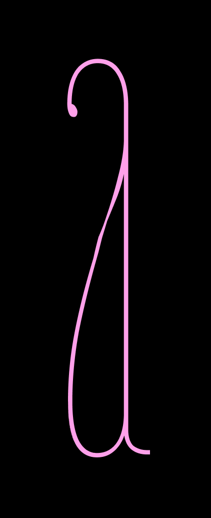
July’s Font of the Month: Fern Titling Caps
When it comes to finishing projects, I can be my own worst enemy. The Club keeps me working at a reasonably fast pace, and I love that, but it means I’m constantly switching focus and the progress of any given typeface can get pretty… dang… slow.
Recently, I’ve made a more concerted effort to “graduate” club fonts to full releases (to borrow a term from Future Fonts), with all the specimen-making and documentation that that entails. And Fern is a perfect candidate: it’s a font I started in 2013 that is still represented by a holding page on my website. 😅
Last year I wrote about the multiple failed attempts I’ve made to create a display cut for Fern…nothing I did felt right. This was more of a theoretical problem (wouldn’t it be nice if the family were more versatile?) but suddenly I was presented with a tangible problem: I want Fern to have a new specimen page, I want that specimen page to have a title, I want that title to be bigger than the text, and I want a font that will thrive in that larger setting. Out of this, Fern Titling Caps was born.
Titling a text typeface is surprisingly tricky. I thought about how W. A. Dwiggins made hand-lettered titles for his type promotions—what a bold move to advertise a typeface with something other than the typeface! And I thought about Bely by Roxane Gataud, which in my mind has the perfect composition for a small family: four text styles accompanied by a single, dazzling display variant.
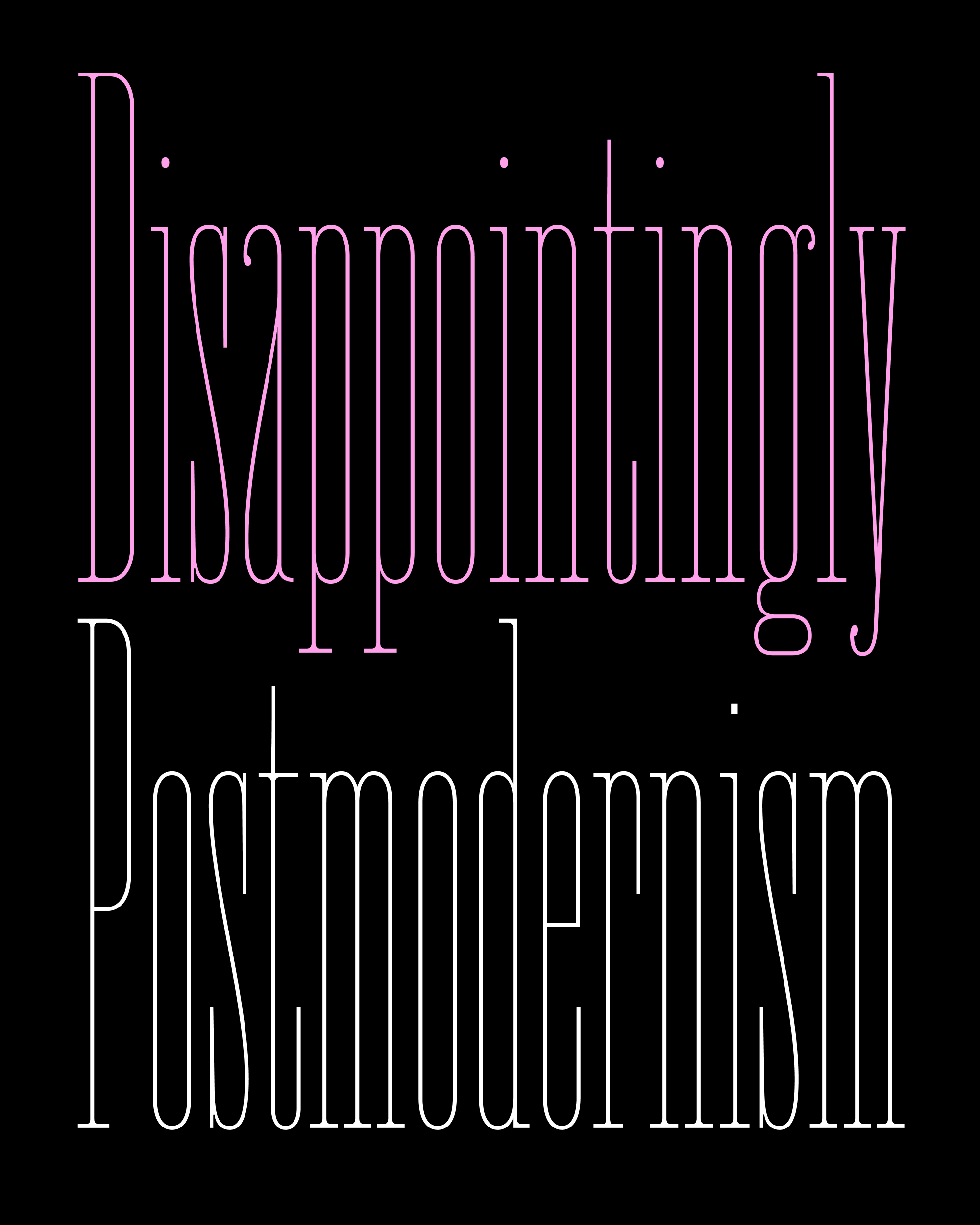
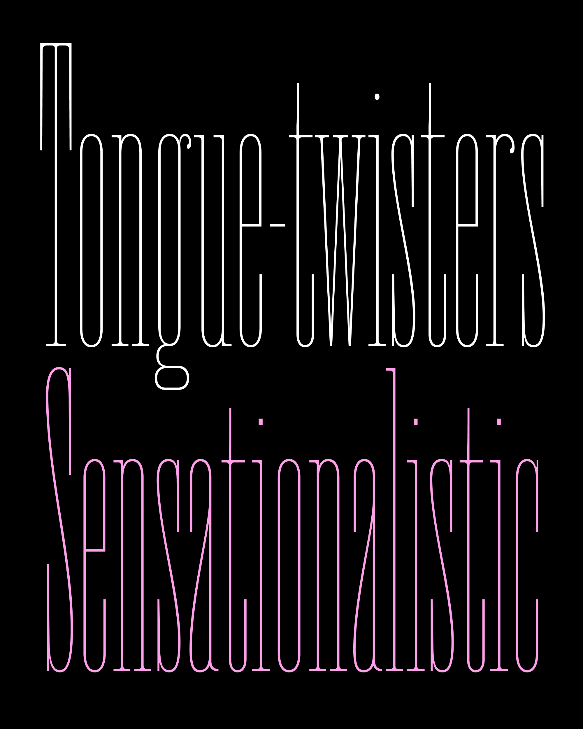
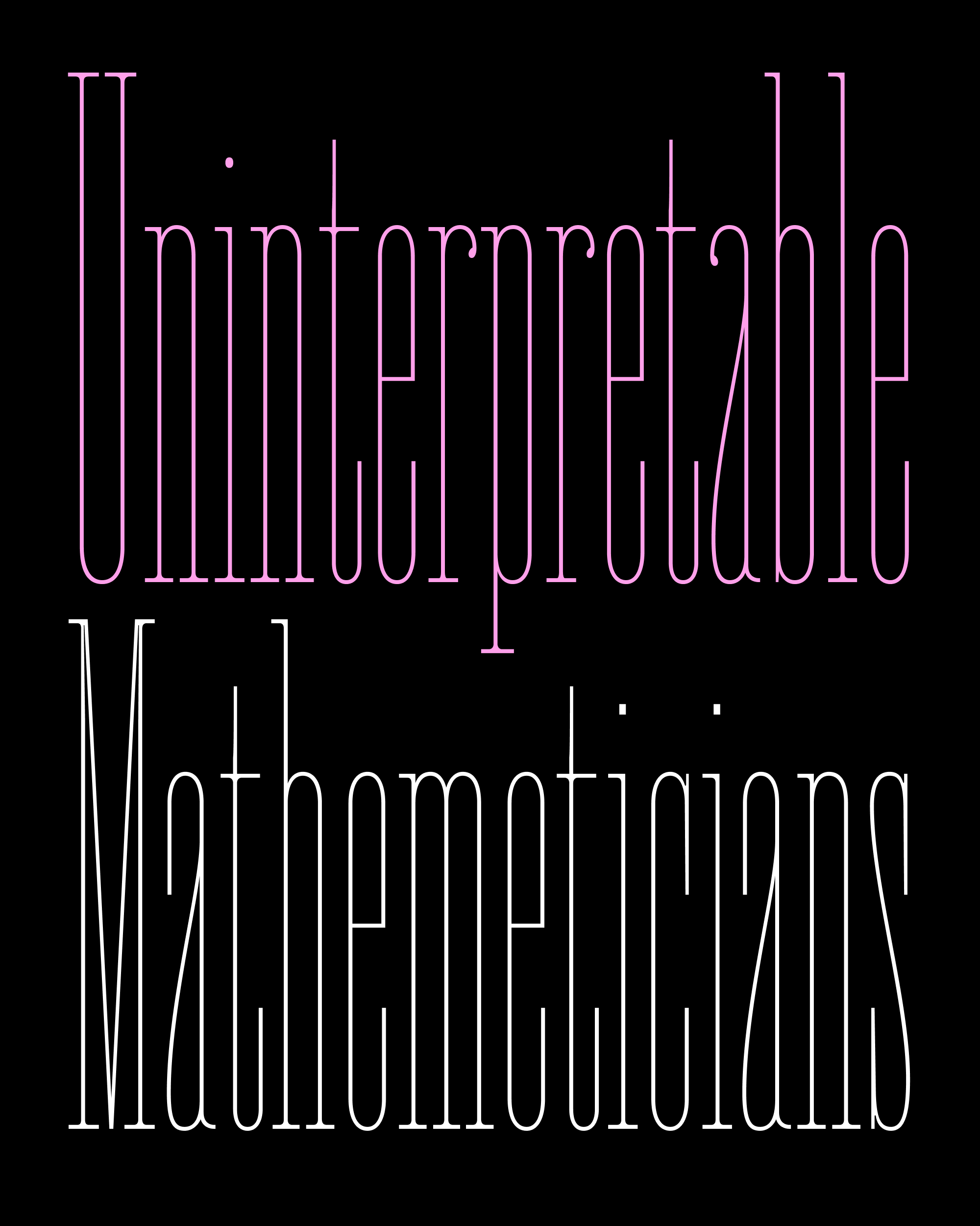
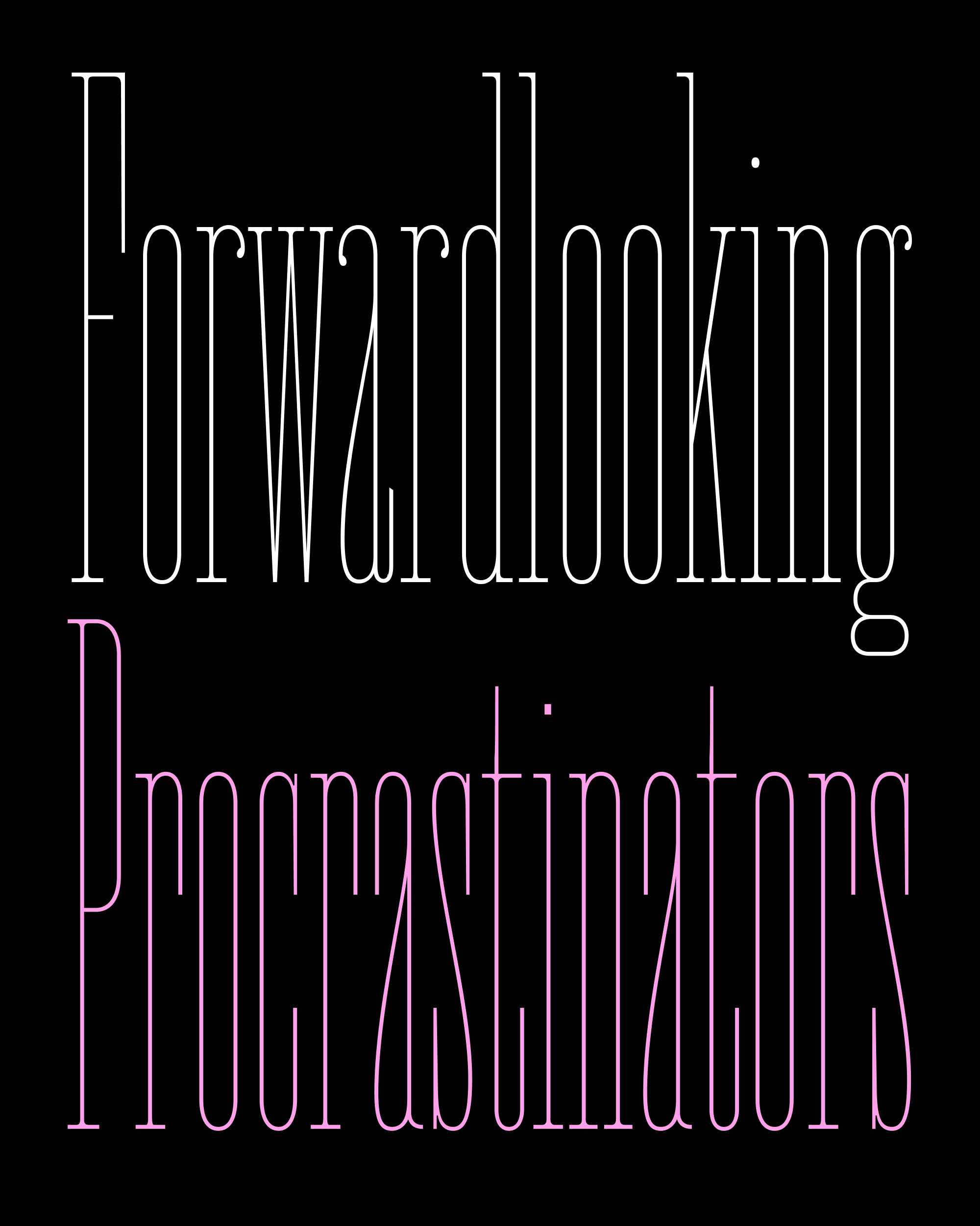
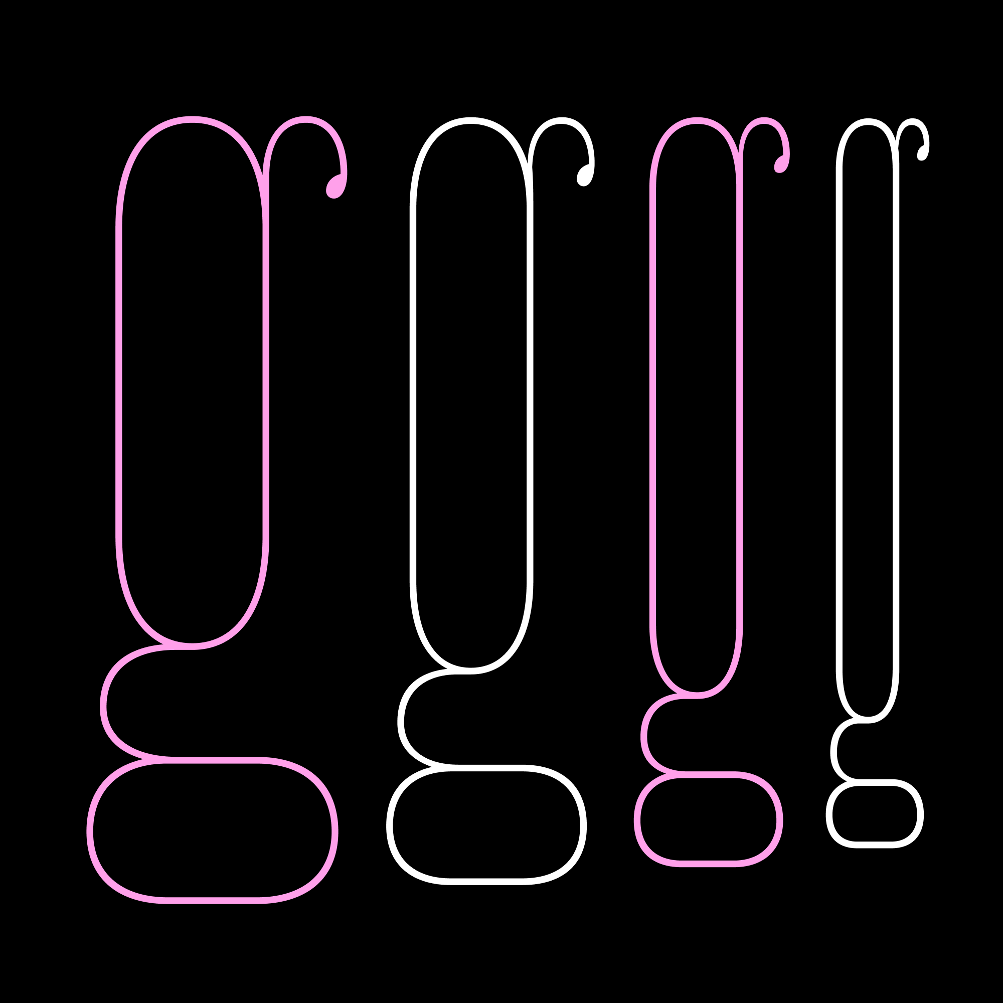
Fern is rooted in the simplicity of Renaissance books and the twentieth-century private press movement that revived it. All in all, it is one of the quietest typefaces in my library. It lives in the middle ground between traditional, pen-informed shapes and edgy, digitally-made shapes, and I didn’t want a display version to veer too far in one direction the other.
The thing about display serifs is that they tend to gravitate towards extremes in stroke contrast: sometimes they get thin and spiky, and sometimes they get slabby and monolinear. Both of those seem to betray the unusual blend of chunkiness and elegance that makes Fern what it is at small sizes. Fern was originally designed for text at small sizes (particularly on screen), and small-size thinking is baked into the family’s DNA—you can take Fern out of texty situations, but you can’t take the textiness out of Fern.
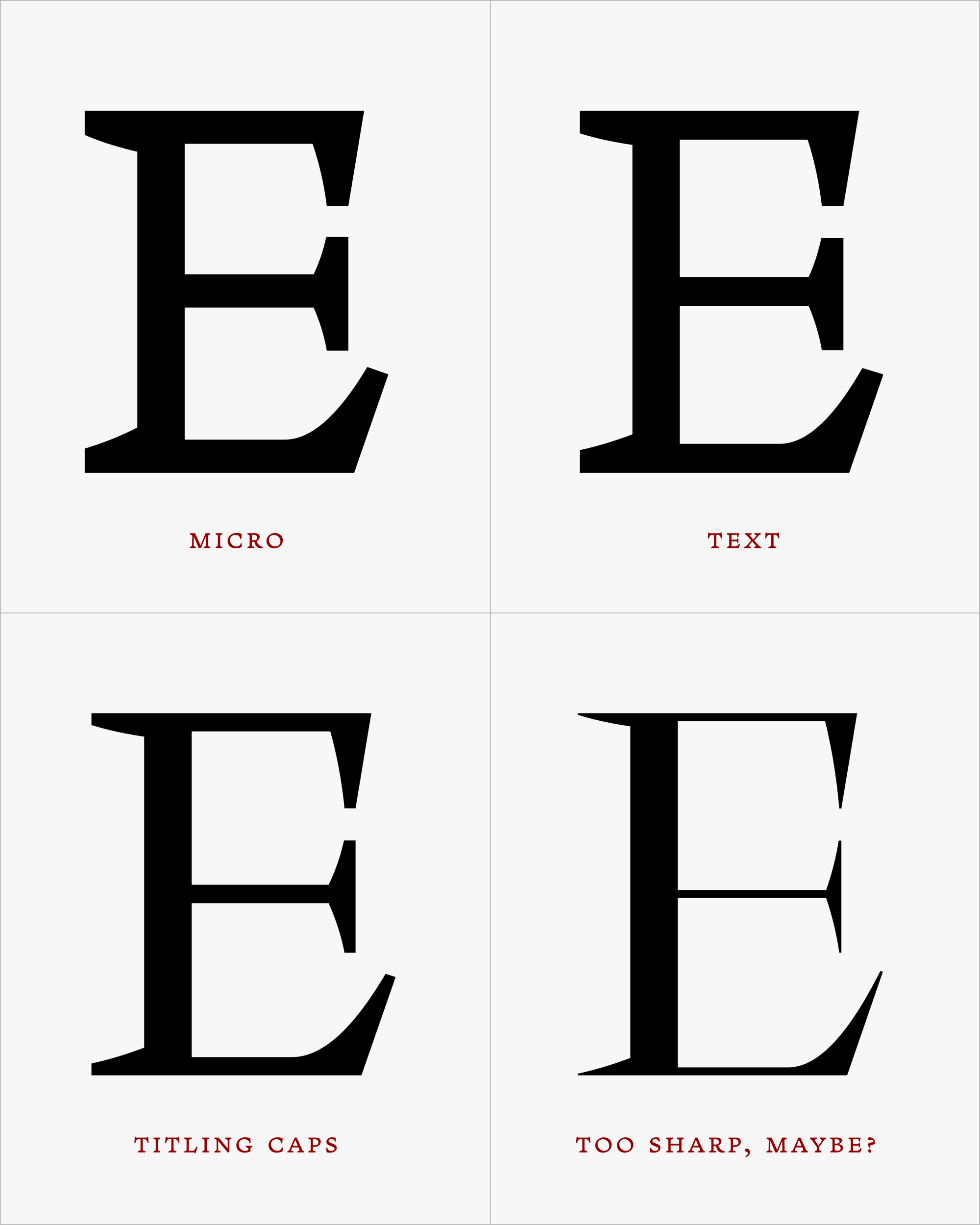
For now, I’ve continued my incrementalist approach to this family. Fern Titling Caps needs to be a little more delicate than the Text, just as the Text needed to be a little more delicate than the Micro.
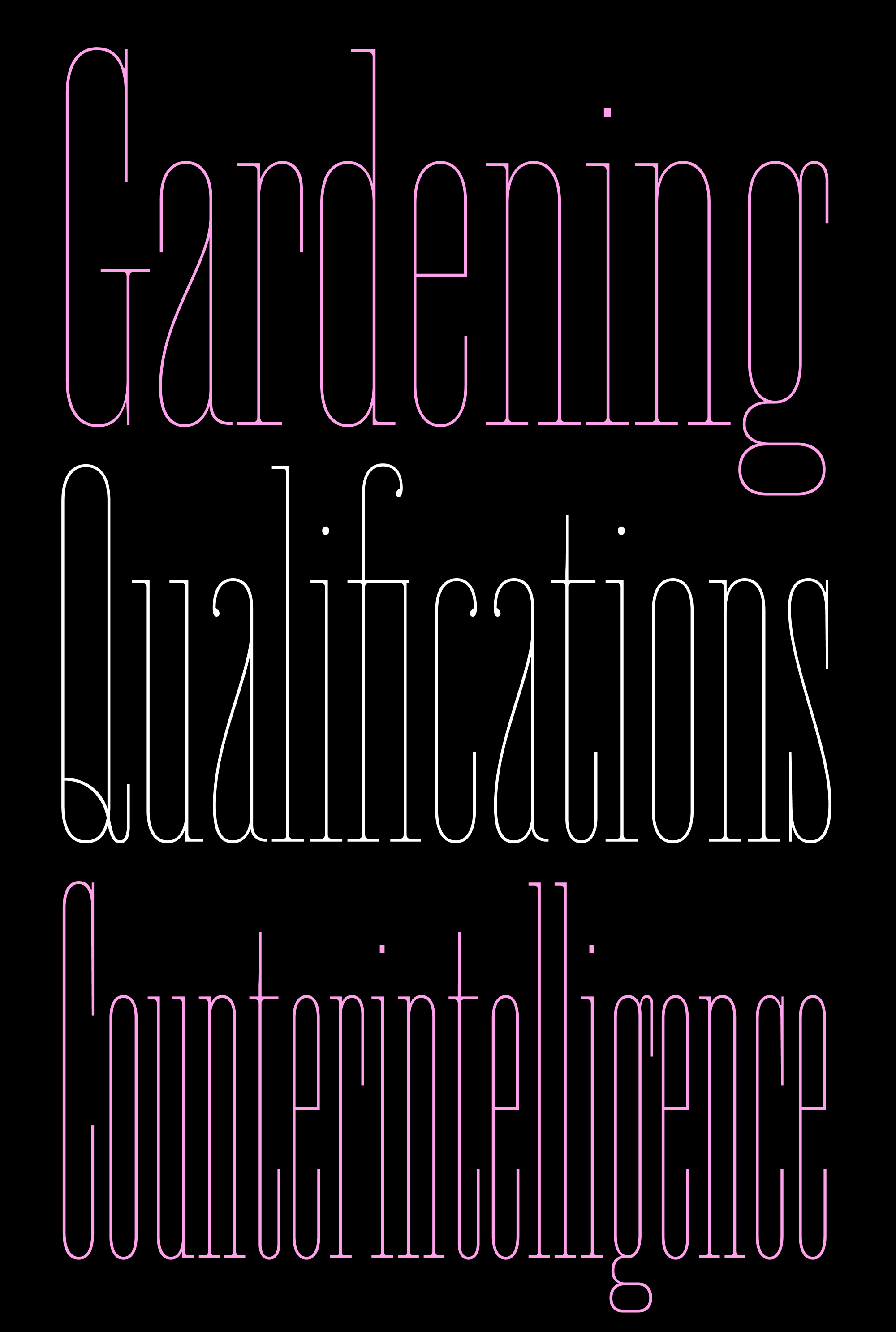
So I started with the four letters I actually needed for my title: F, E, R, and N. All I had to do was make them look like Fern Text, but a little less horsey when blown up to 36 or 40px. Then, I applied the same transformations to the rest of the alphabet and small caps. I retained some of the splotchy color that comes from the fluctuation of thick and thin in the serifs and round strokes, and added generous spacing so that titles feel nice and airy. On average, the thin strokes of the Titling Caps are 20 units lighter than in Fern Text.
I’m still playing with the right amount of taper on the terminals and diagonals, and I’m still filling out the character set. But at least I’ve managed to get out my own way, and I have the thing I need to make the specimen page I want. Perfection? No. But it keeps things moving.
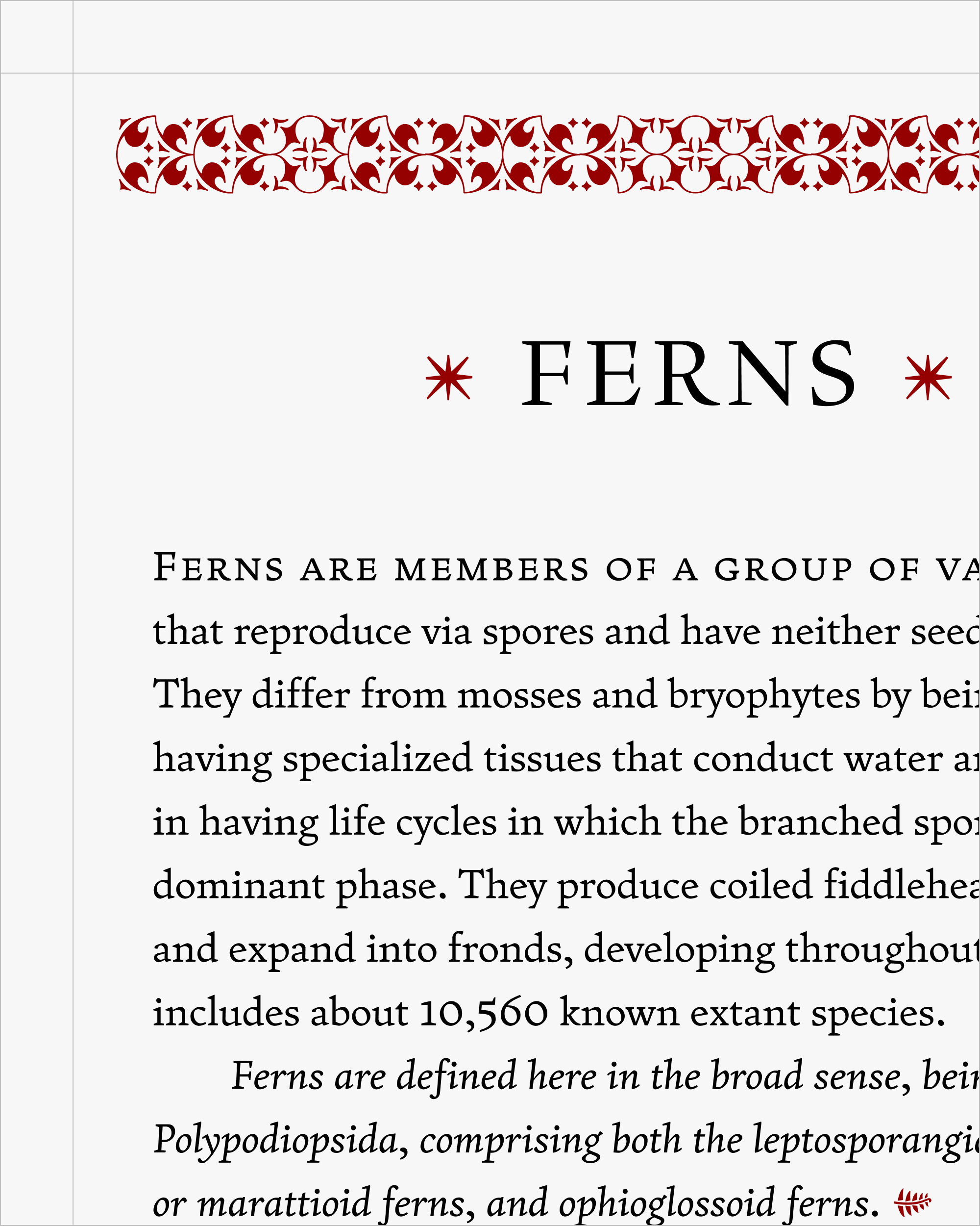
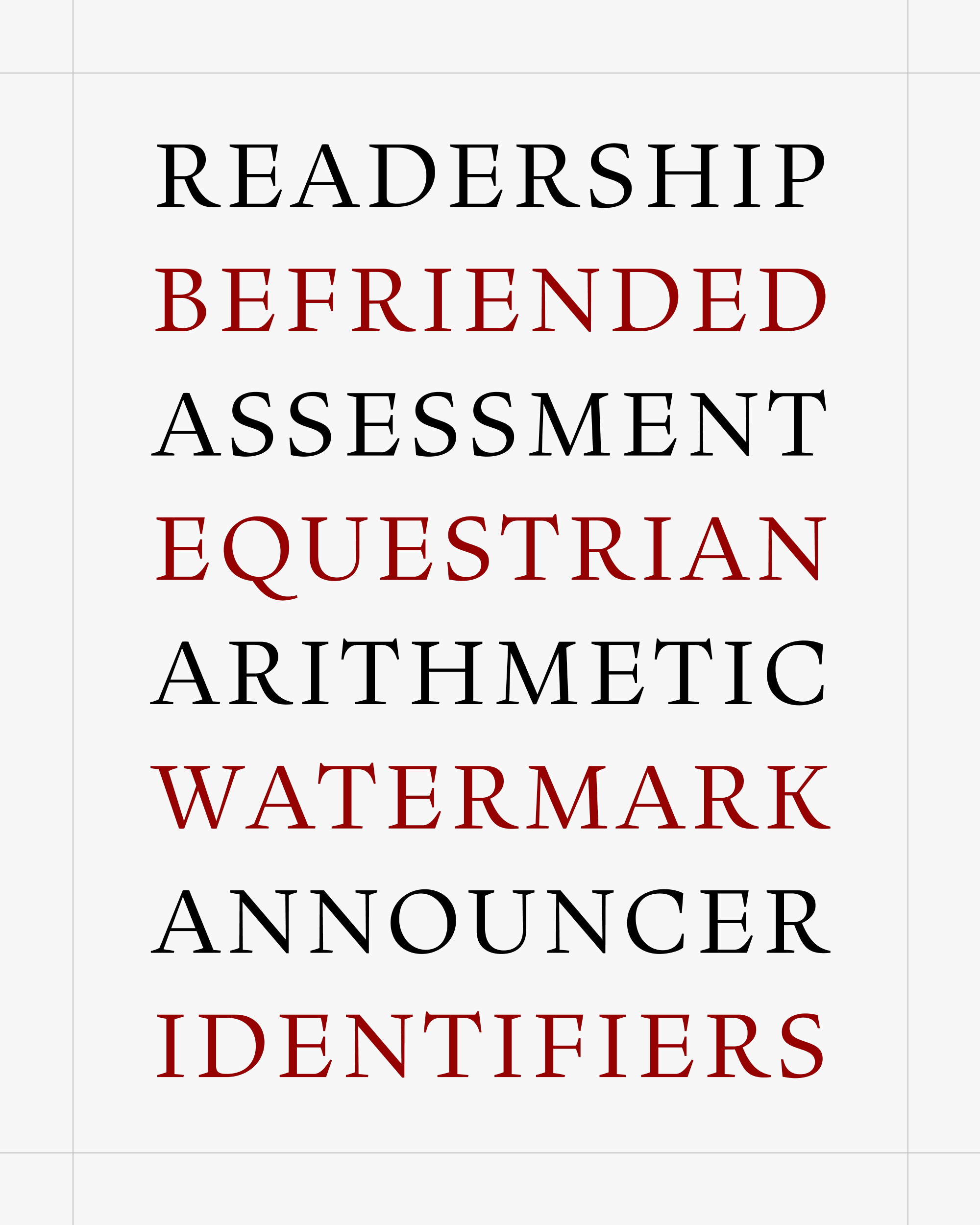
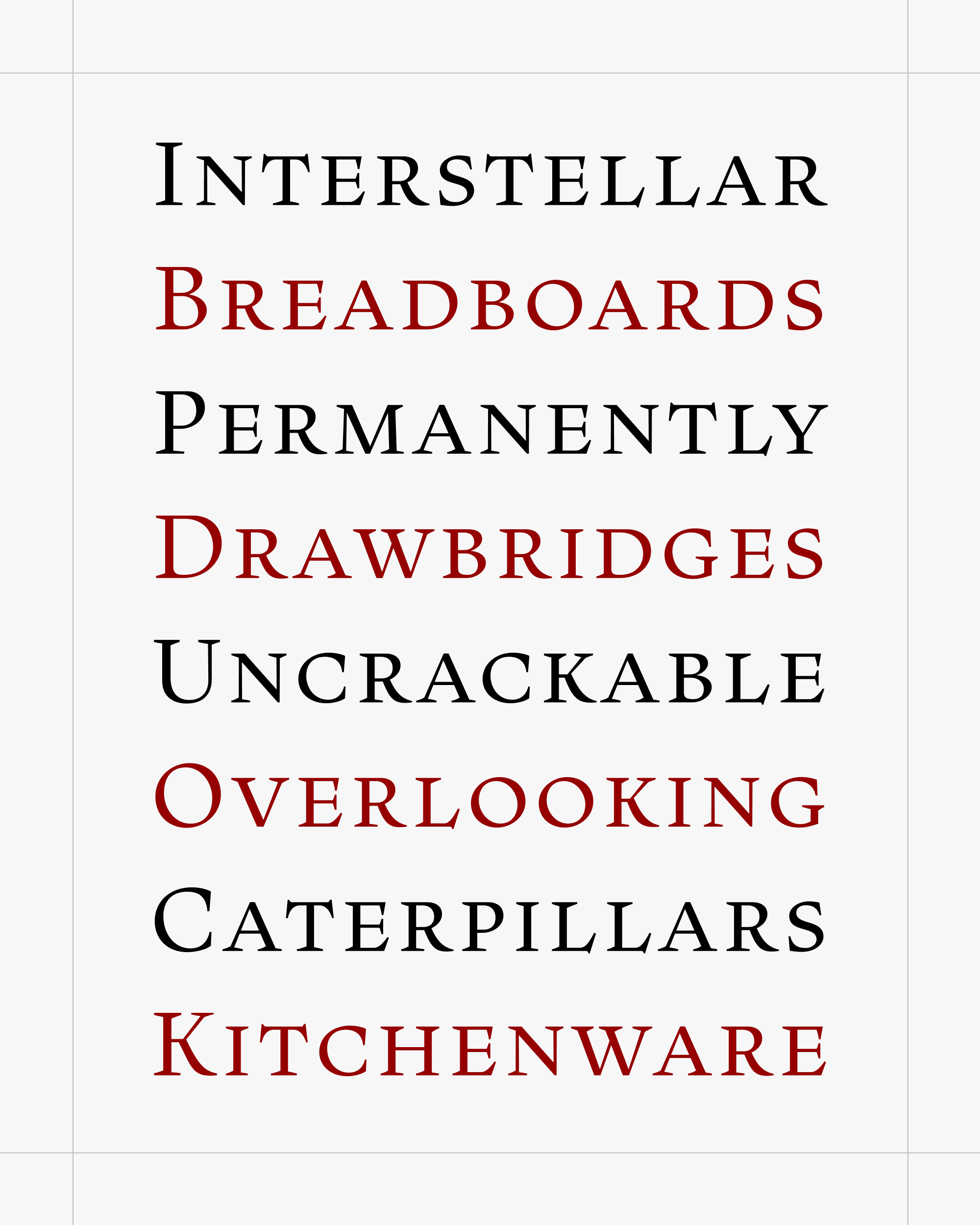
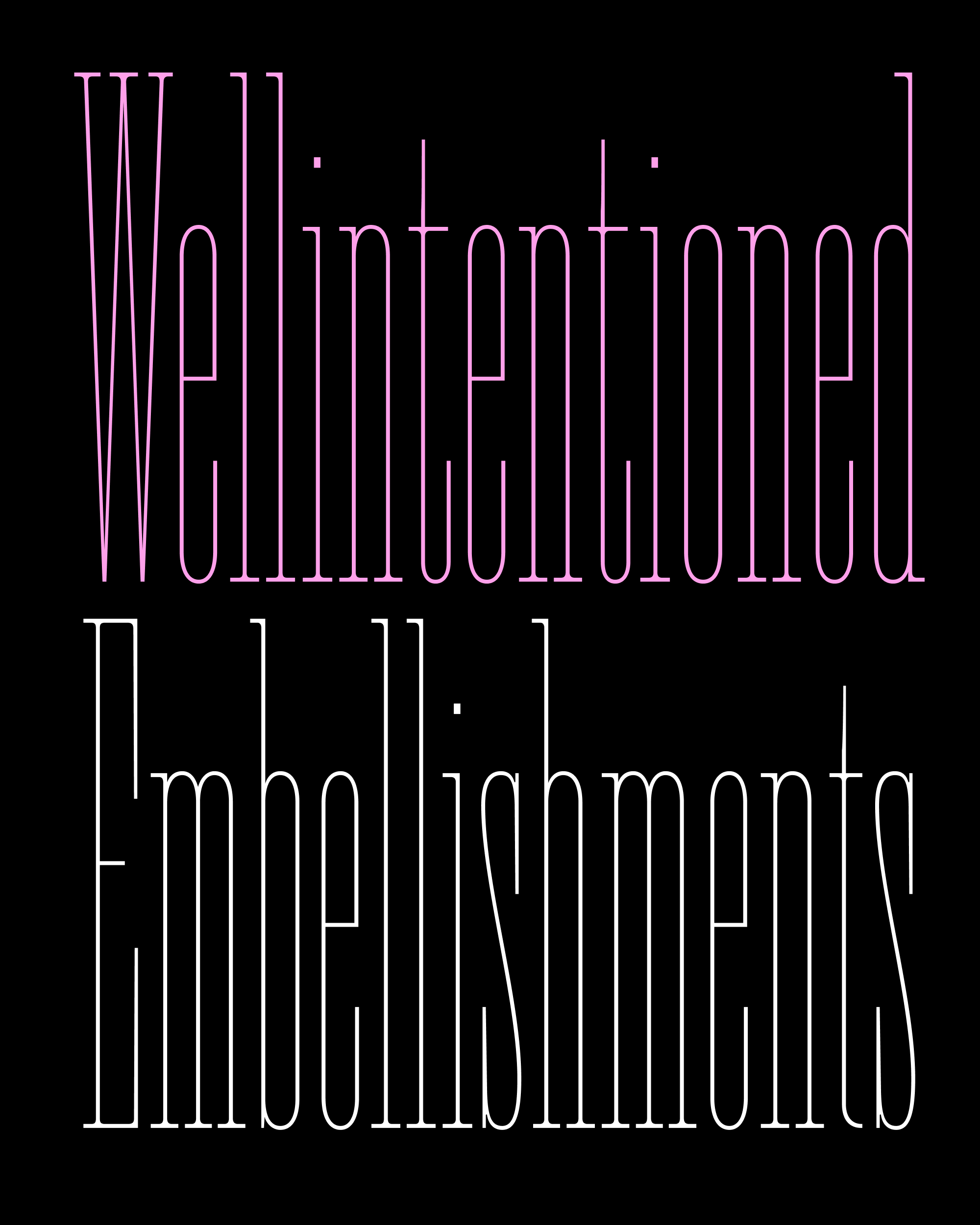
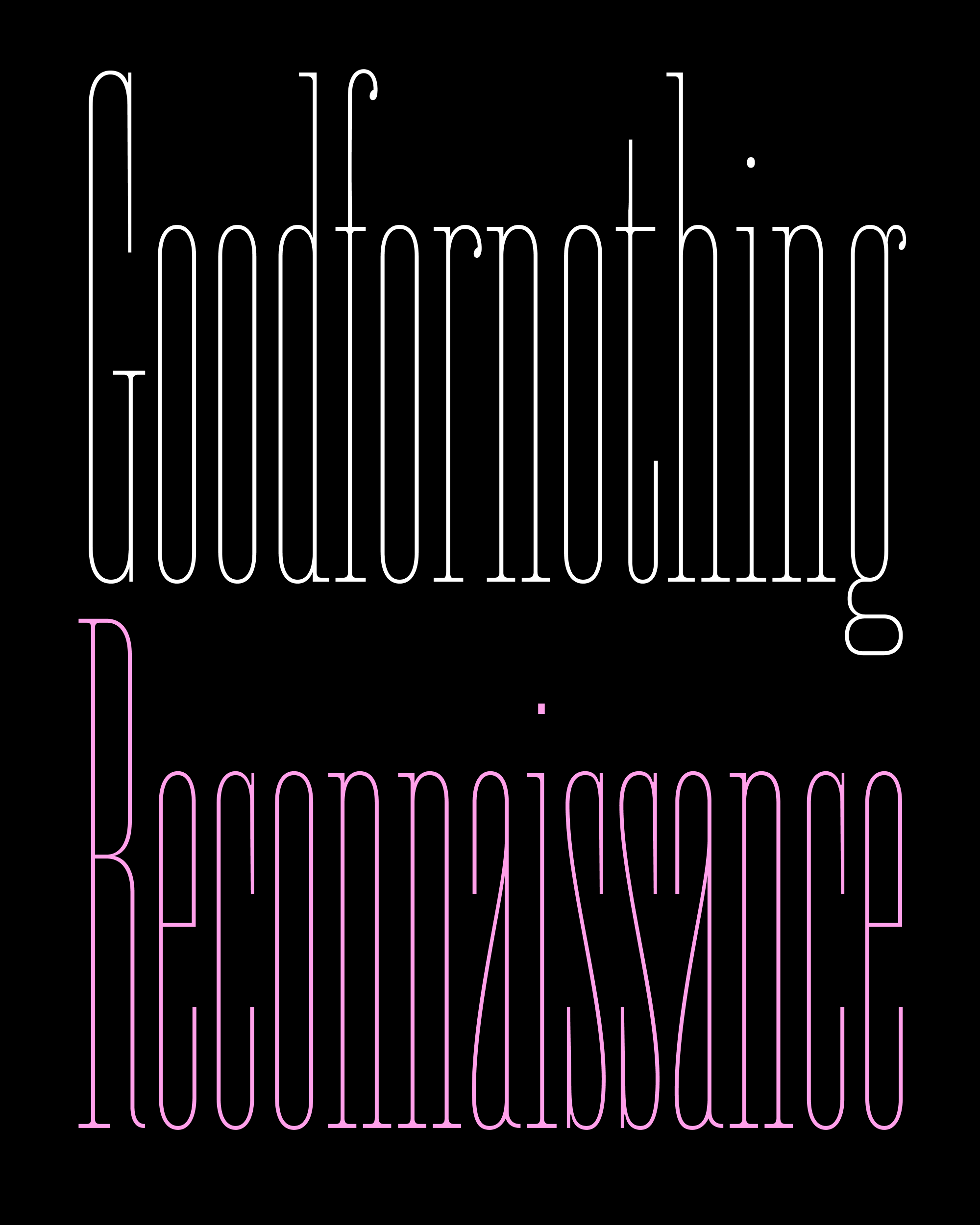
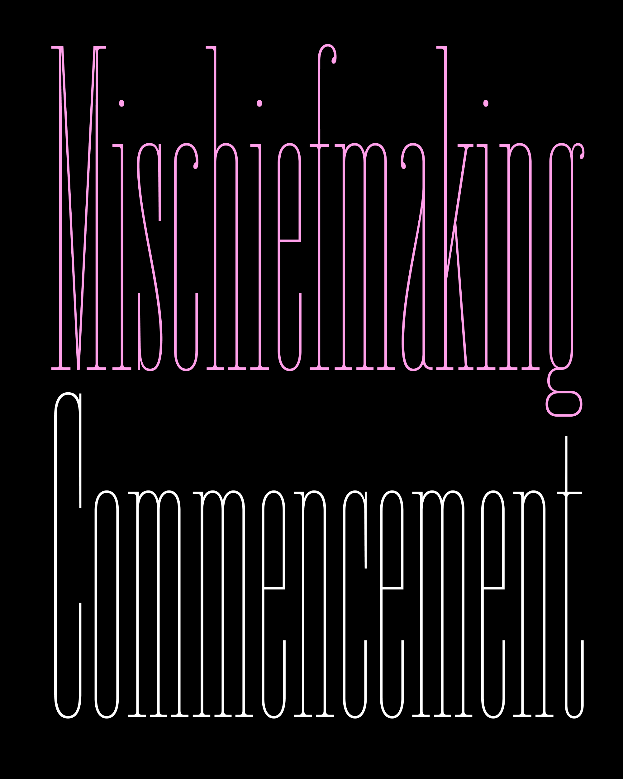
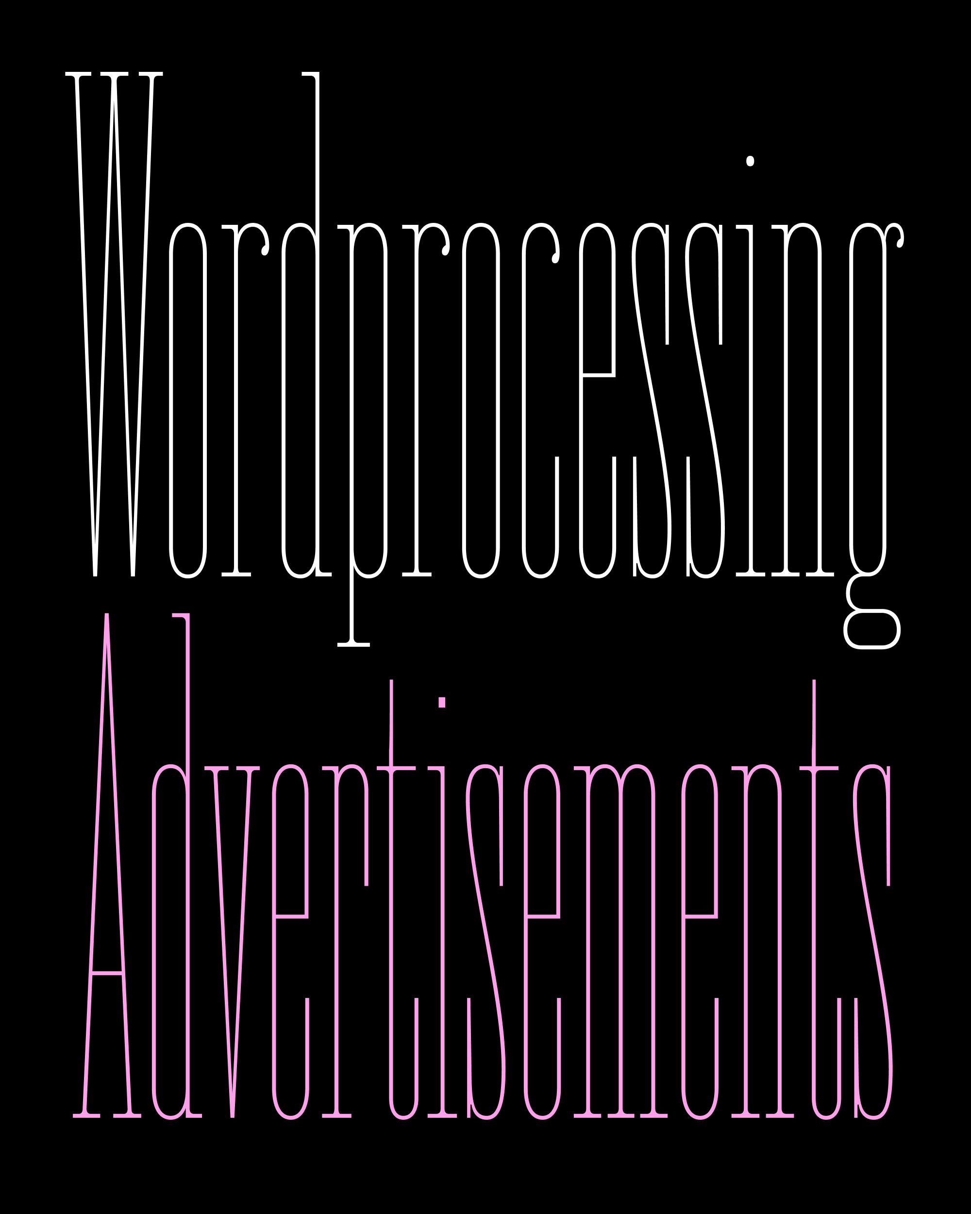
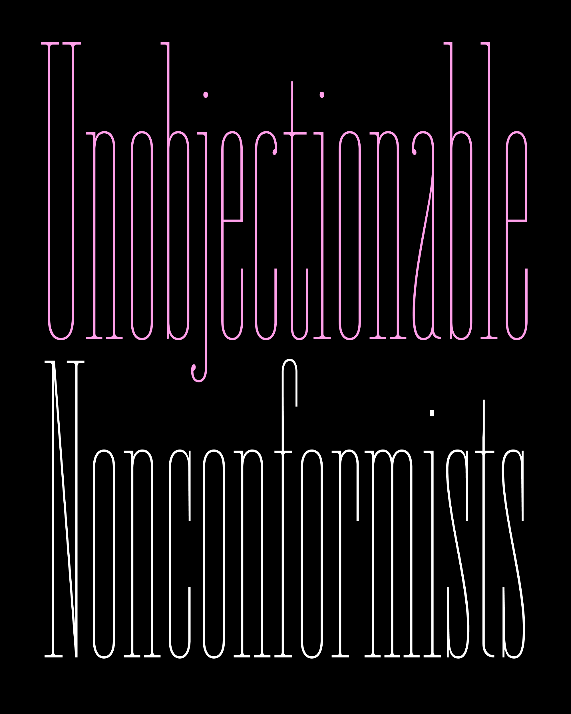
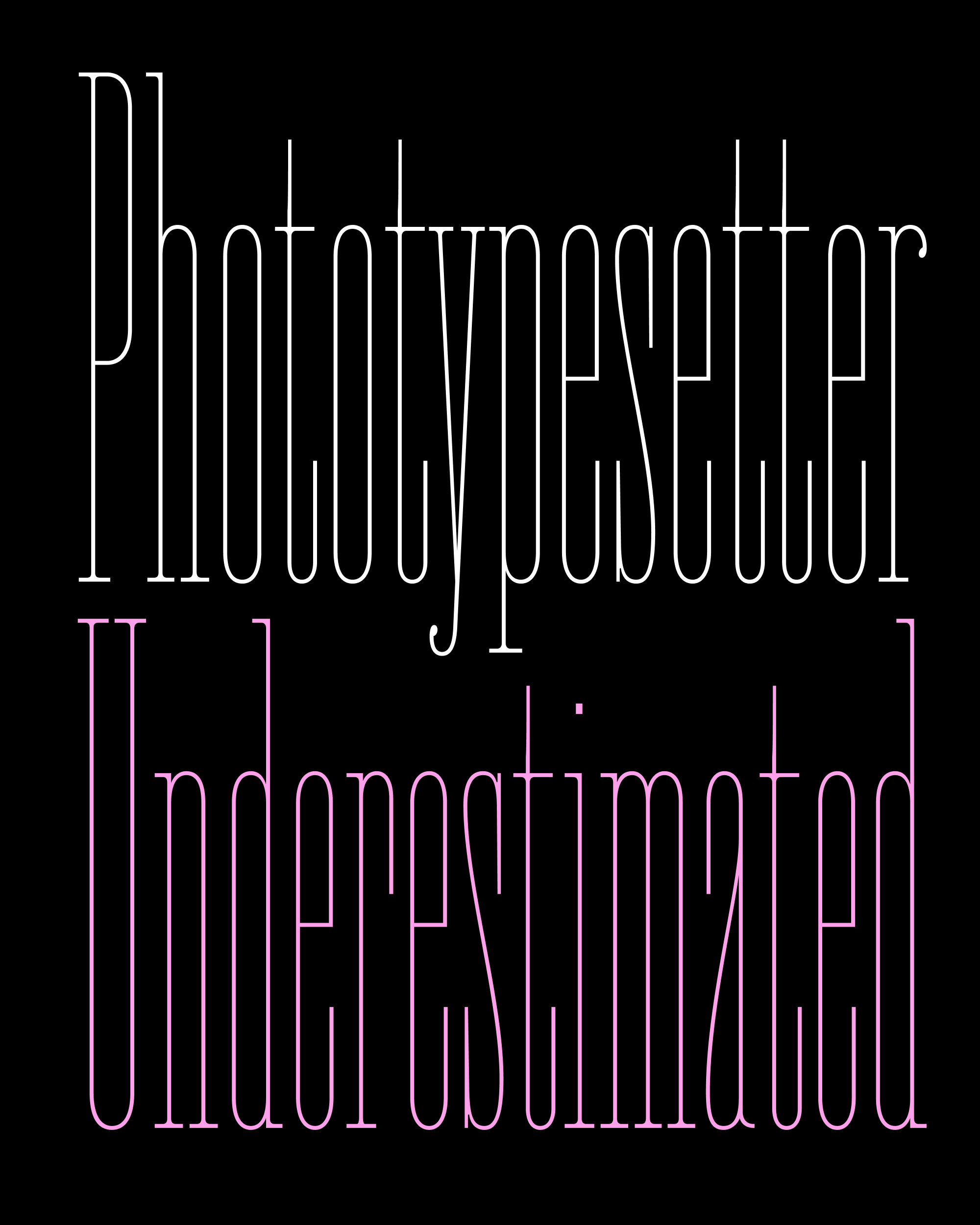
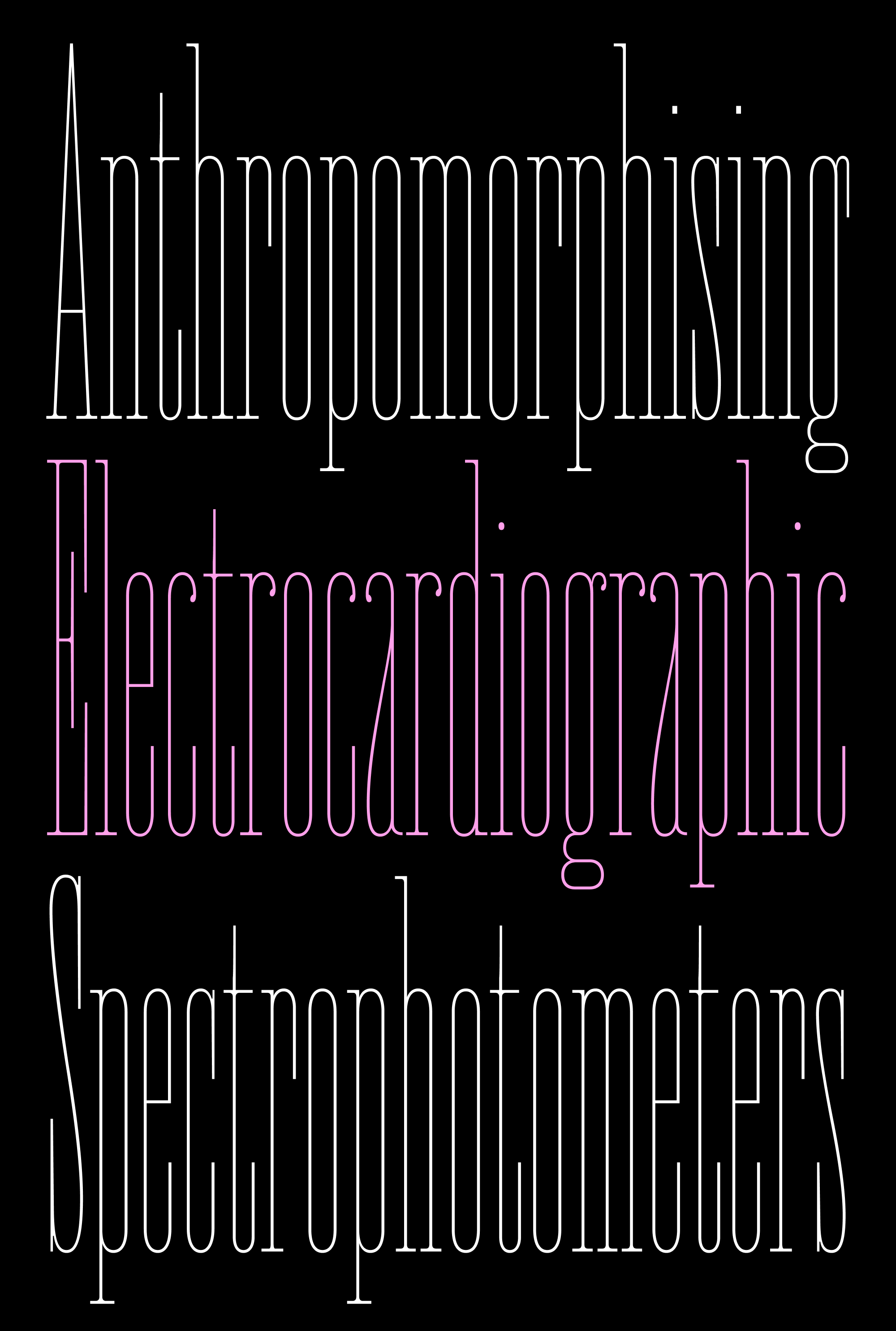
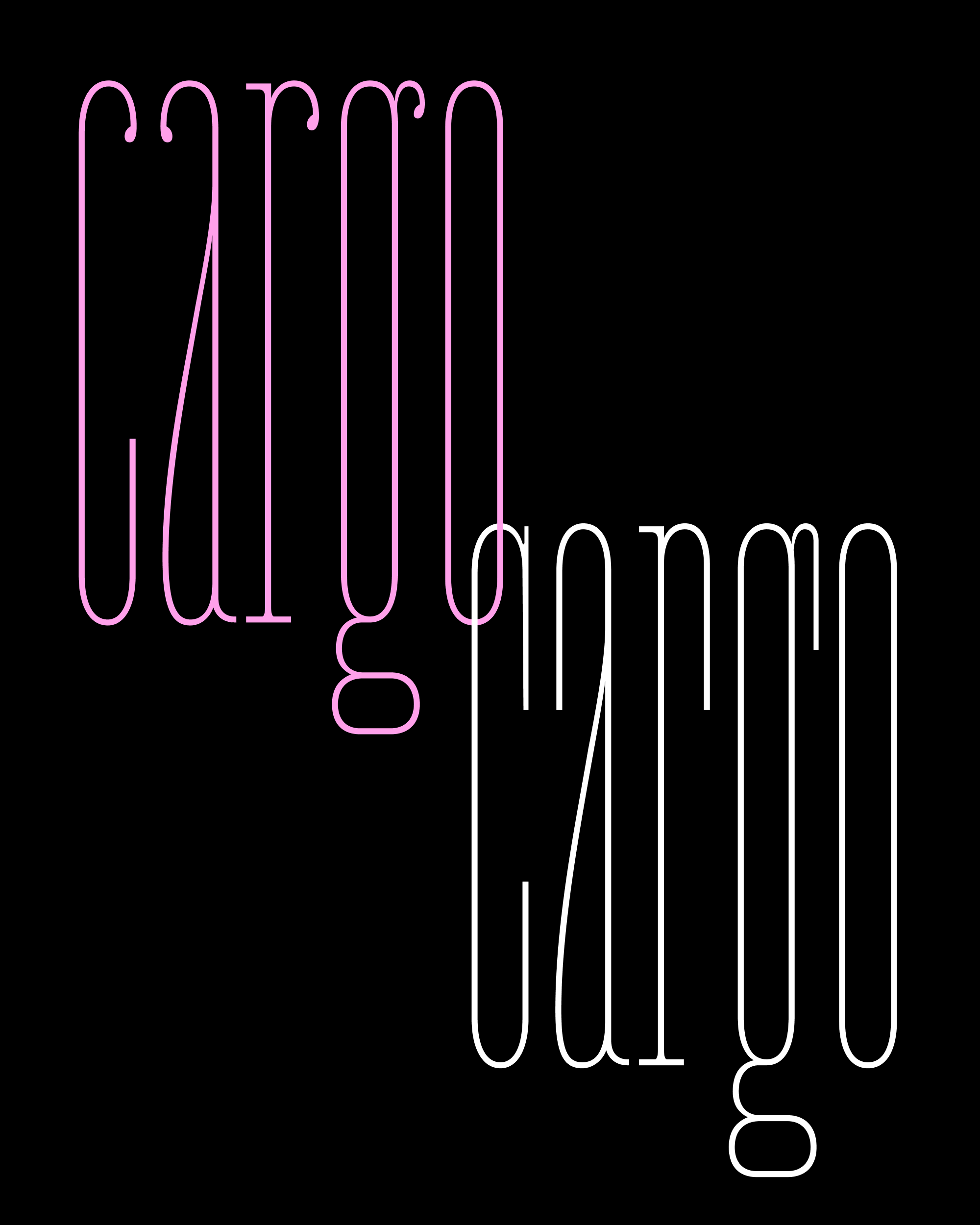
Fern Titling Caps, as used with Fern Text and Text Italic