October’s Font of the Month: Output Sans v2
September 14 marked the fifth anniversary of the introduction of variable fonts. I didn’t see too much in the way of fanfare, but it feels like this is a good opportunity to reflect on how far they’ve come, and to appreciate what folks have done to make variable fonts easier to make and use. (If you played a role in that, THANK YOU!)
It’s also a moment to consider what comes next for variable fonts. In my perception, they’re in a bit of an awkward phase right now. Support in browsers is great, and designers are using techniques such as animation to push the limits of the technology — after five years we can hardly think of them as a shiny new toy. But at the same time I don’t think they’ve fully left the “experimental” realm and entered the day-to-day workflow of the average designer.
As I pondered what zany, over-the-top, variable display face I could send you to commemorate this half-decade, it occurred to me: if I really want to help variable fonts get over this hump, maybe it’s worth taking a step back and thinking more about how I want to see them used in practical, everyday typesetting. And that’s why I’m sending you a beta variable version of my practical, everyday sans serif, Output Sans.
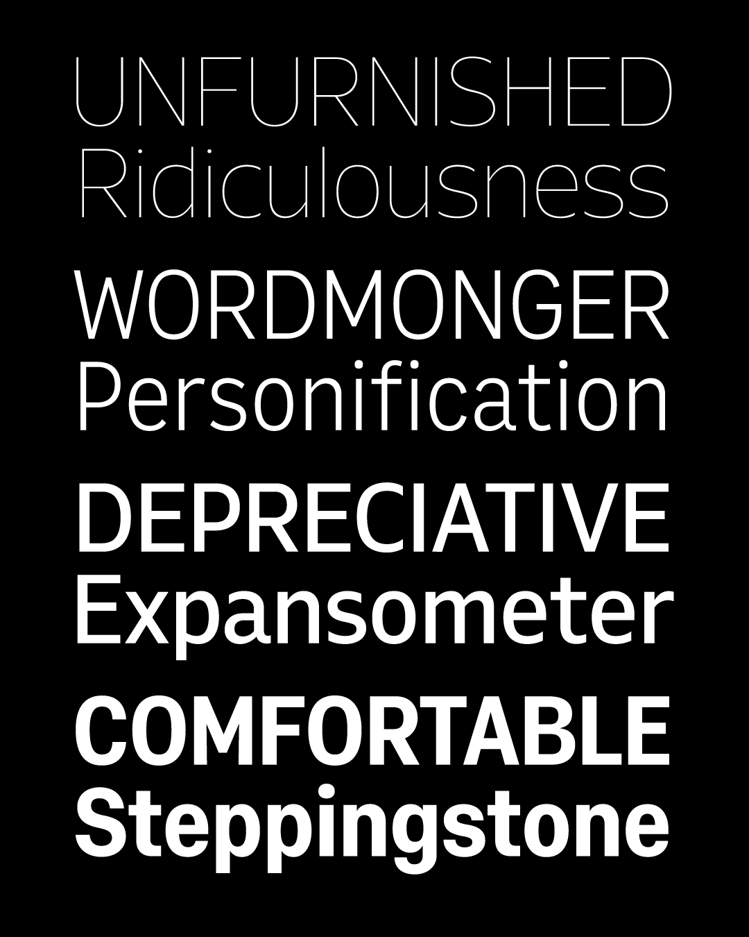
Output Sans is the closest thing I have to a “personal default”...how letters look when I shut my eyes and picture them in my head. It’s a matter-of-fact design that’s a little narrow, with curves that are a little tense. And it has a slight techy flavor, which makes it especially well-suited for user interfaces and in a supporting role alongside more decorative designs.
It has been kicking around on my desktop since 2014 when Mac OS changed their UI font to Helvetica and people were hungry to customize their UI appearance. I think I’m happy with the overall design, but with all the sans serifs out there, I lost the confidence to say that it was different enough, or special enough, to ever declare the family “finished” and give it a formal release.
This month, I decided to remake Output Sans with a variable-first approach, a maximalist spin on a minimalist design. Part of this is admittedly a psychological shift...I tried to stop thinking of it as a family of individual members and instead as a single tweakable design. And I tried to shut off my type designer brain that worries too much about smooth curves and internal consistency, and instead focus on mapping out all the different ways I’d want to adjust the design. In addition to the weights and italics from the original version, I’ve now roughed in width, size, grade, and terminal openness.

So here’s the catch: this is very much a proof-of-concept, and parts of the designspace are ROUGH. Typically I send out these club fonts once I have reached a good stopping point, but with Output Sans I am still in the thick of it. If you hang out around the default Regular style, I hope you’ll find this to be quite usable, but just take a little more care the further you venture away from there.
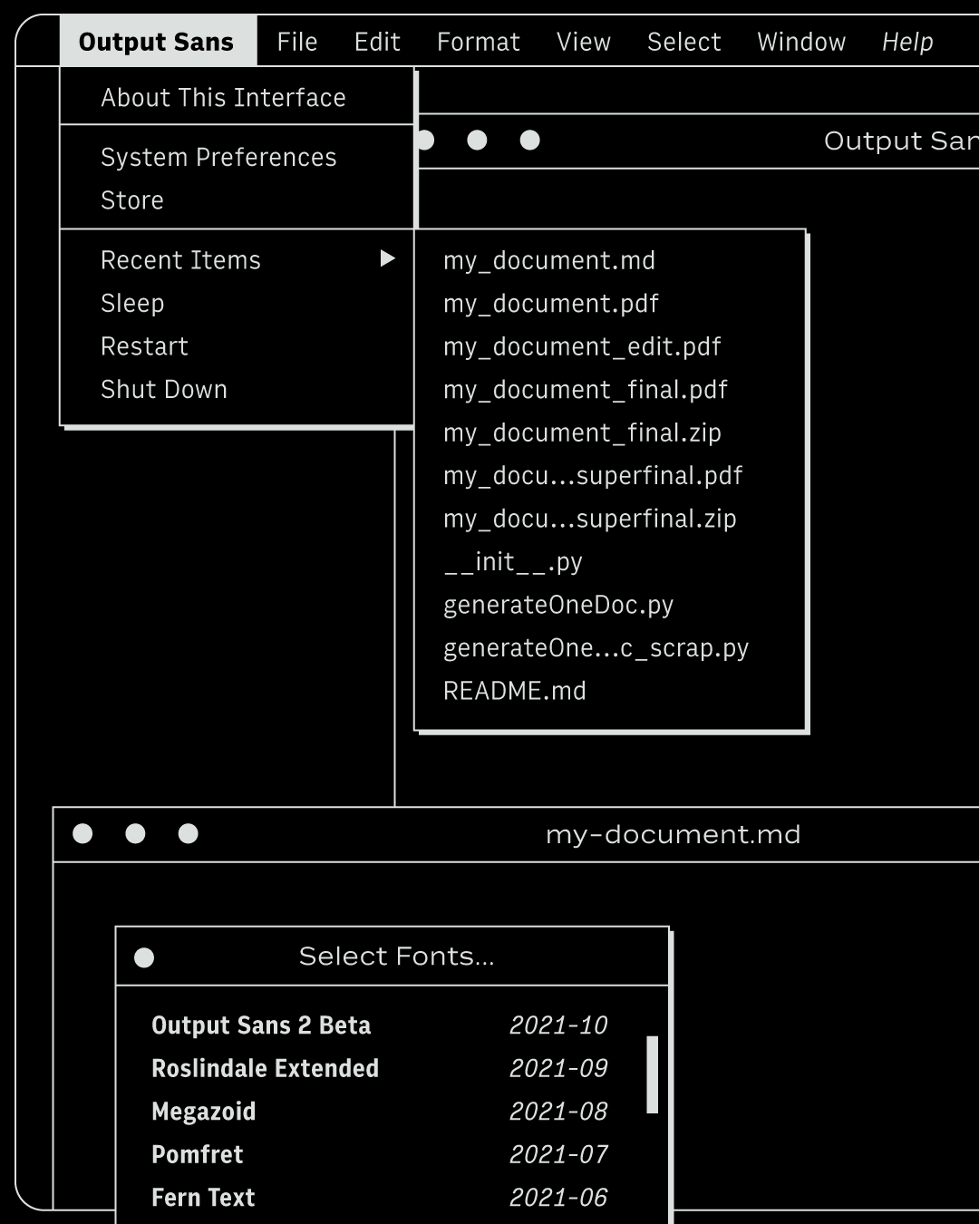
One of the stated goals of this club is to give you a view into my process, and my process is this: a constant cycle of roughing-in and refining, as opposed to just drawing one perfect glyph after another. So even though I’m a bit nervous to share something in an unpolished state, my hope is that the excitement (and embarrassment) of my lumpy curves will propel me to keep improving the design in the coming year. I won’t bug you every time I do, but I plan to make updates early and often...the latest version will always be at the download link at the top of this email. So feel free to give this a fresh download/install if you use it for something, but note that you may get some reflow of your text between versions!
Meanwhile, I hope Output Sans provides an opportunity to think about the role of variable fonts in your everyday workflow. Do they slow you down? Speed you up? Is this what the future of font families should be, or am I better off whittling a big, flexible system like this down to something more specific? I’d be happy to hear which of these axes seems like overkill, which of these seem worth cleaning up and finalizing, and what other tweaks you’d want to make to this design (square dots, maybe!?).
I realize that not all of you do your work in environments that support variable fonts, and that is not your fault. I’ll mention two things: Dinamo’s excellent Font Gauntlet has a “Generate Static Font File” feature that lets you export static font files from this variable font, which you are totally allowed to do under the modifications clause of my license. And maybe it’s worth taking a moment to send an email or (re)post a feature request to the makers of the app you’re using...after all, it has been five years. 😉