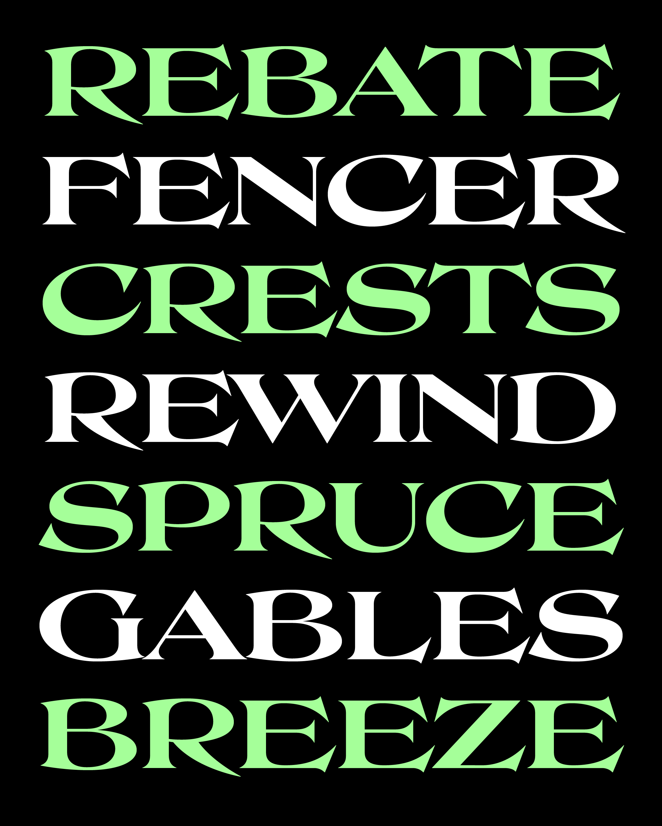
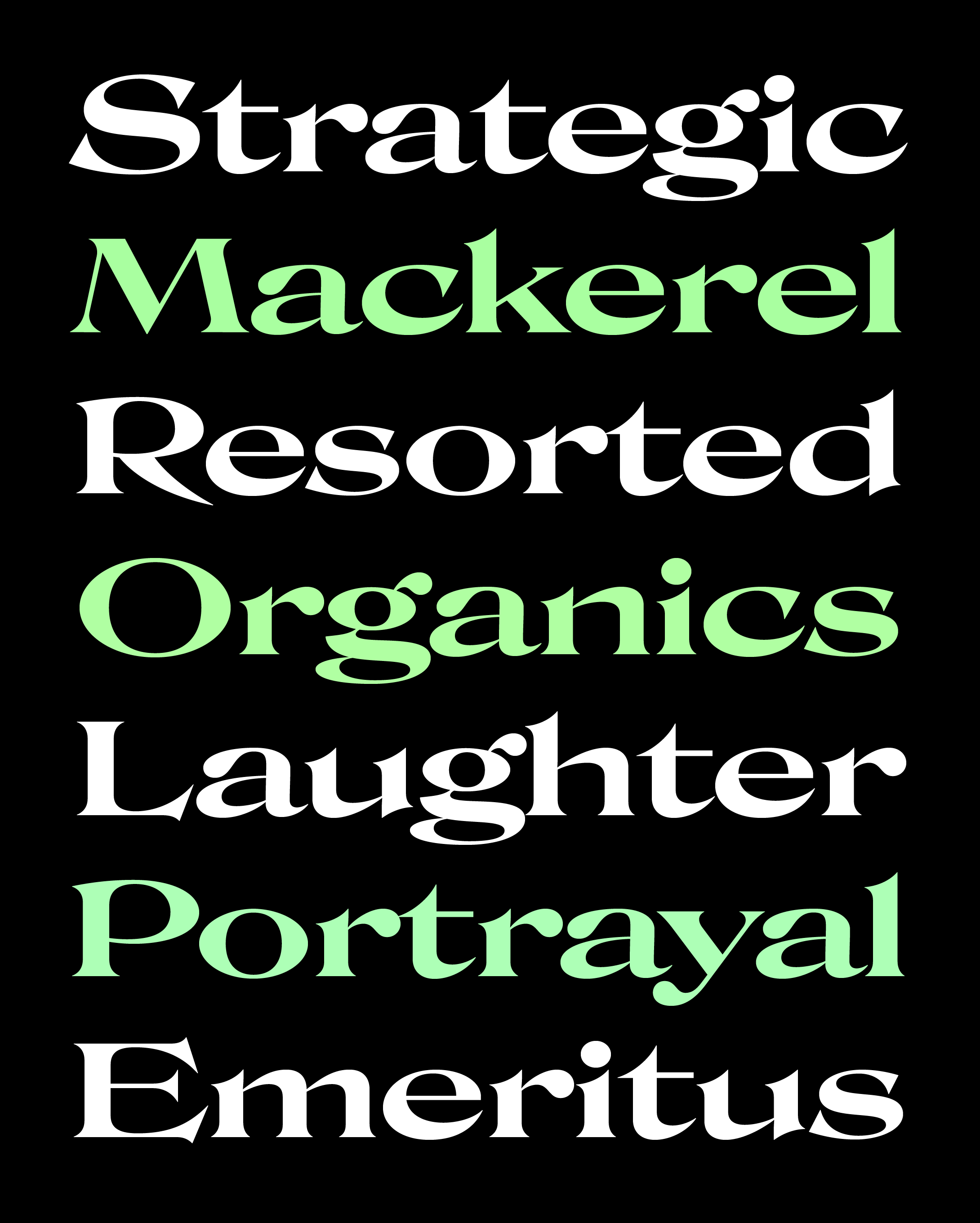
September’s Font of the Month: Roslindale Extended
One of the hardest things about making a type family is, like all creative endeavors, knowing when to stop. There is always another variant to explore, another alternate to try, another character to add.
Roslindale has been the most popular typeface I’ve produced for the club. Of course I’m very excited about the possibilities for this family, but I’ve also consciously tried to avoid letting this become a Roslindale of the Month Club. I really try to strike a balance between stuff that *I think* designers will like and use, and stuff that *I hope* designers will like and use.
It has now been an entire year since I’ve issued any new styles of Roslindale. In that time, I’ve been working with Jaimey Shapey to fill out the existing grid of weights and widths, adding the remaining italics, symbols, and small caps in order to complete the designspace (whatever that means). And just as the family felt like it was finally approaching a stopping point, I couldn’t help but throw a wrench in the works: Roslindale Extended.
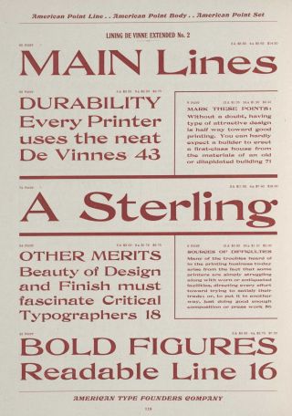
De Vinne Extended, from the ATF Specimen Book of American Line Type Faces, 1903
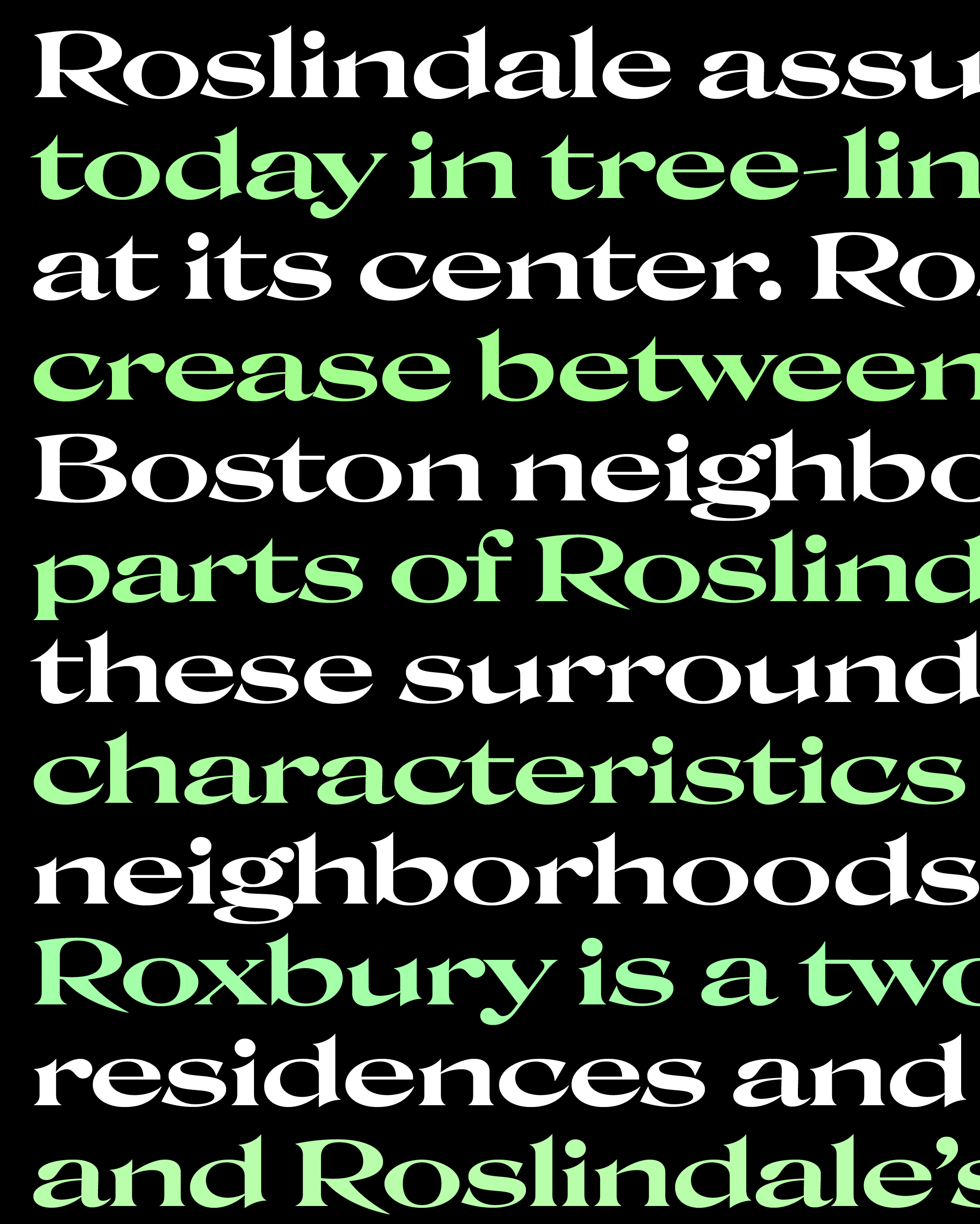
As you might recall, Roslindale follows in the footsteps of Central Type Foundry’s De Vinne, a clunky faux-oldstyle produced in several widths and variants starting in the 1890s. Each one of them had an uneven, blotchy texture, but De Vinne’s Extended cut was perhaps the ugliest duckling of them all. The qualities that makes these shapes particularly grotesque also makes them kinda compelling, and I became curious to see what that might look like in Roslindale...and you never know until you try!
For the record, I don’t think of Roslindale Extended as a finished design, and I’m definitely not committing myself to drawing this in all weights/italics just yet. It’s more of an exploratory sketch like Gimlet Banner, possibly a non-canon entry in the Roslindale Extended Universe.
You really don’t see too many extended oldstyle serifs like this out there, and maybe there’s a good reason why. When thicks and thins are oriented on a vertical axis, it’s easy enough to widen them by spacing out the thick verticals and broadening the thin horizontals between them. But when the axis is diagonal, the distinction between verticals and horizontals are blurred and bits of thick start to creep into the horizontal strokes. When those get stretched out, it puts the round shapes even more at odds with the straight shapes and things get really weird really quickly!
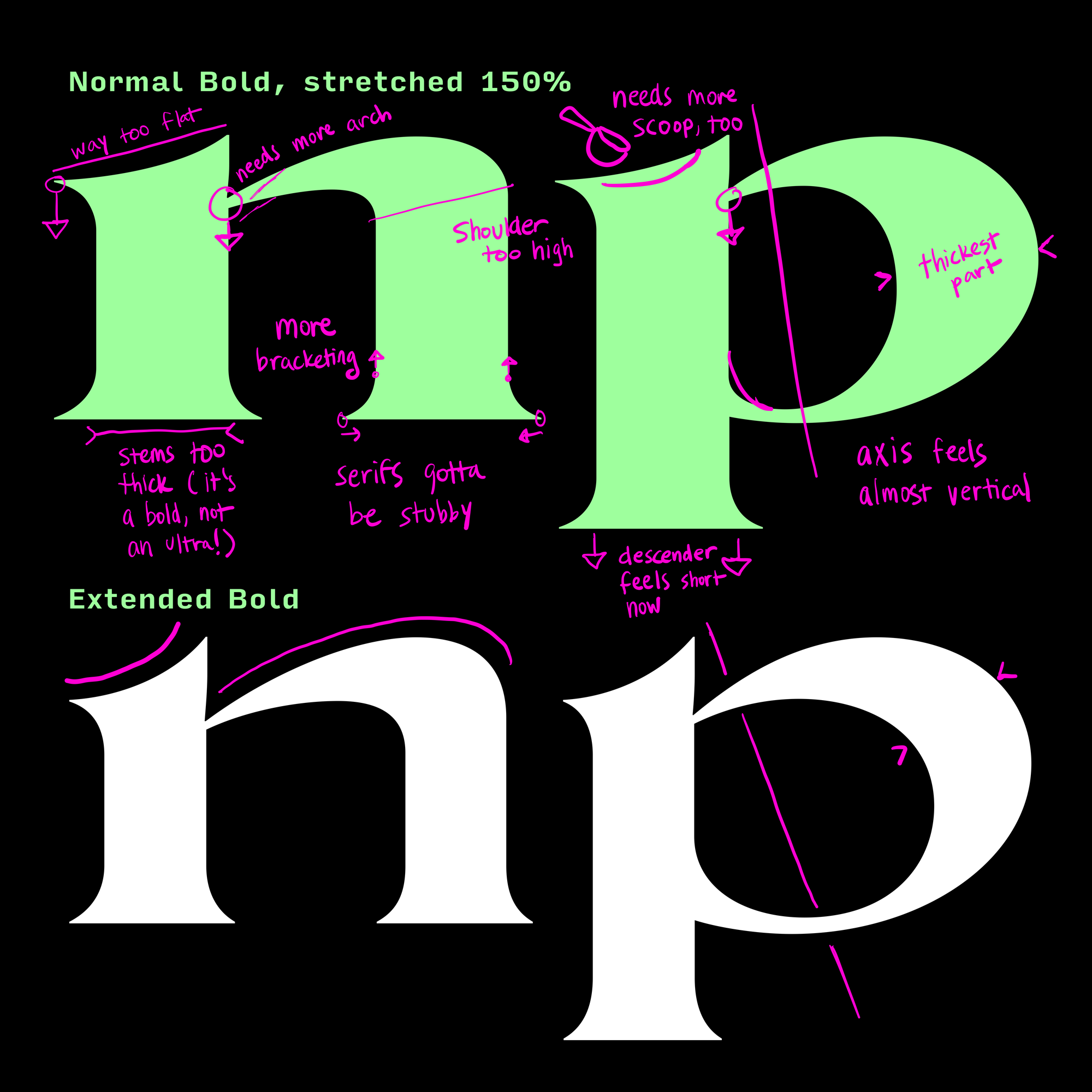
You were probably taught that you shouldn’t mechanically stretch type, and that’s generally good advice since it throws the whole vertical/horizontal relationship out of whack. But I’ll also admit that stretching Roslindale Display’s Bold by 150% was the very first thing I did. 😇
From there, I attempted to preserve the newly broadened proportions while undoing all of the stretching’s unfortunate side-effects: verticals that are too thick, horizontals that are too flat, serifs that are too long, and a diminished diagonal axis. The trickiest part by far was figuring out how letters like c/e and p/d/b/q should throw their weight around the curve, but I think I found a way to get some thickness back into the tops and bottoms of those letterforms.
These tweaks capture a little of De Vinne Extended’s bounce, but without too much of the lumpiness and unevenness. Shapes so wide are going to be inherently stretchy, but if I keep going with this style, I’ll see if I can refine them even further.
I don’t think this is the most utilitarian cut of Roslindale, but I hope you understand why I just had to try it out! You’ll also find an interpolated Wide style and a variable font in there for good measure. And if you’re able to use it for something, do let me know...I’ve now made it my official policy to offer a free back issue to anyone who submit uses of my fonts to Fonts in Use!