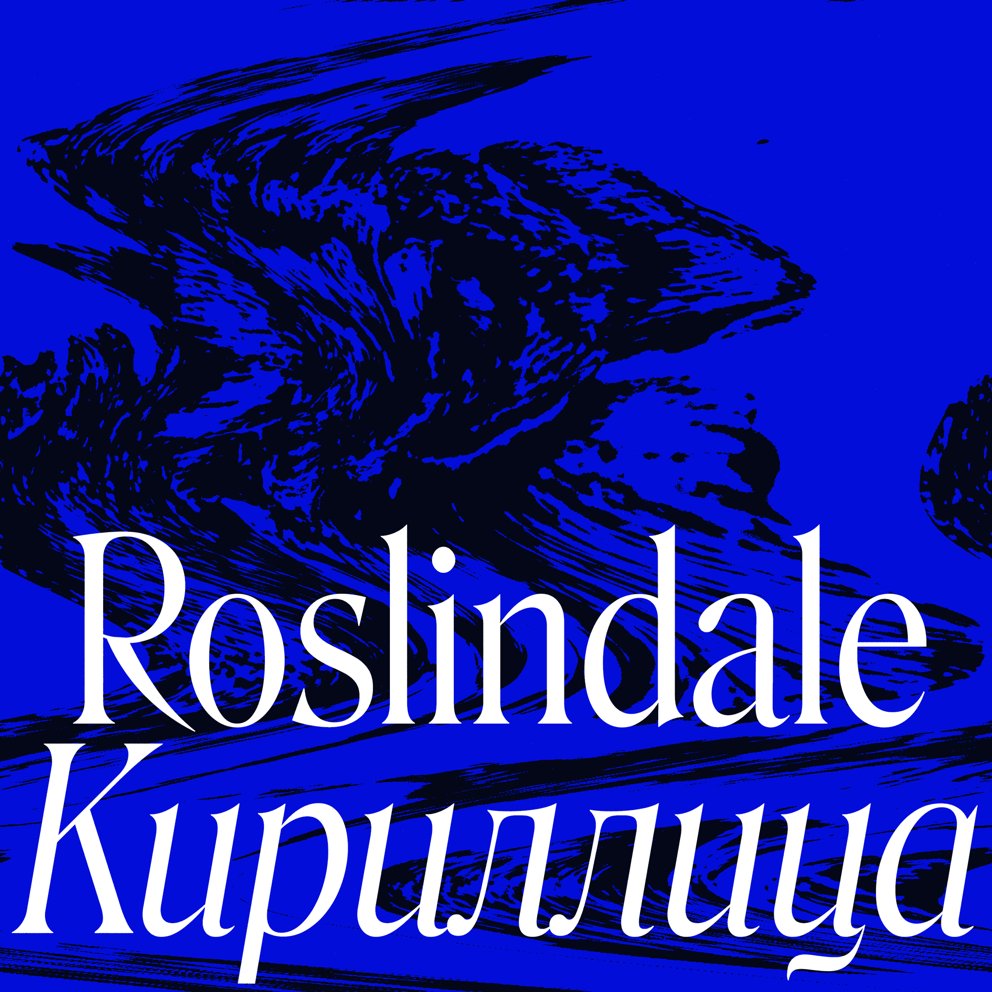
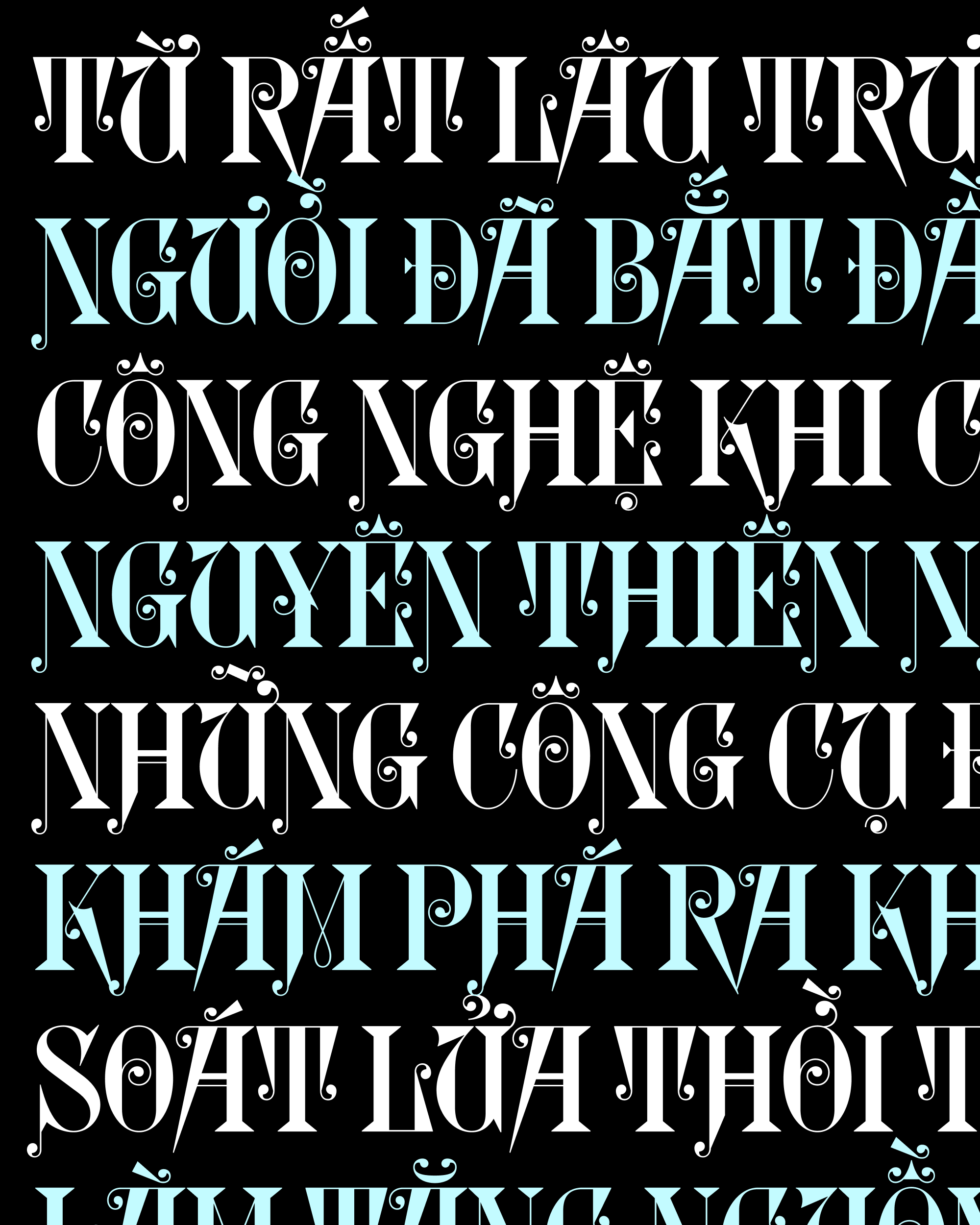
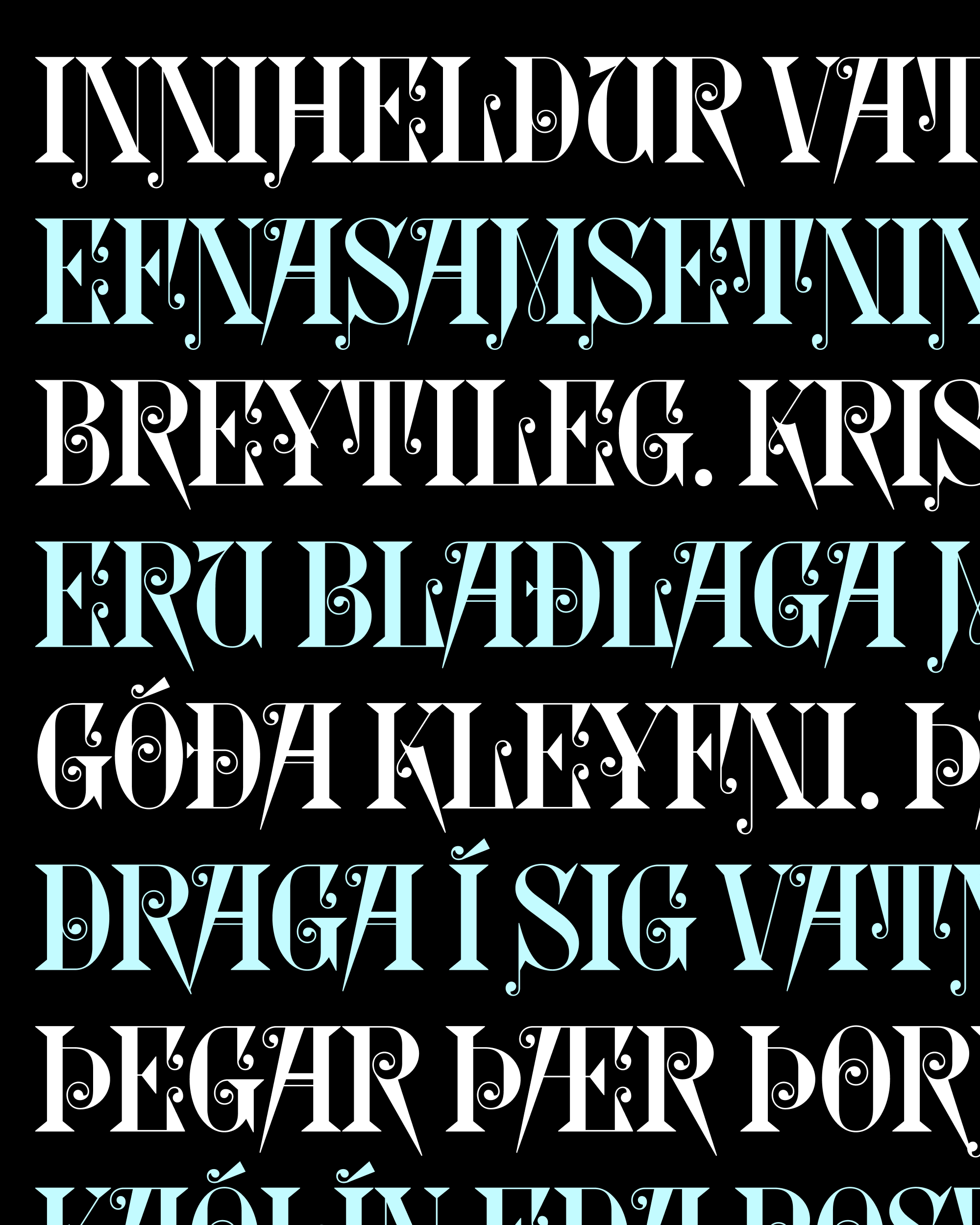
Last year, Jovana drew a Cyrillic extension for Forma DJR, and I thought she knocked it out of the park. So I was excited to work with her again on Roslindale, a quirky Victorian stew where pointy serifs, bulbous terminals, and italic forms add a new layer of complexity.
Roslindale is a reinterpretation of De Vinne, a typeface that was originally published in the 1890s by the Central Type Foundry. It turns out that its spiky/blobby contrast is a natural fit for the Cyrillic script, which has more opportunities than Latin for both spikes and blobs. And in her Cyrillic extension, Jovana passes up no opportunity to heighten this juxtaposition.
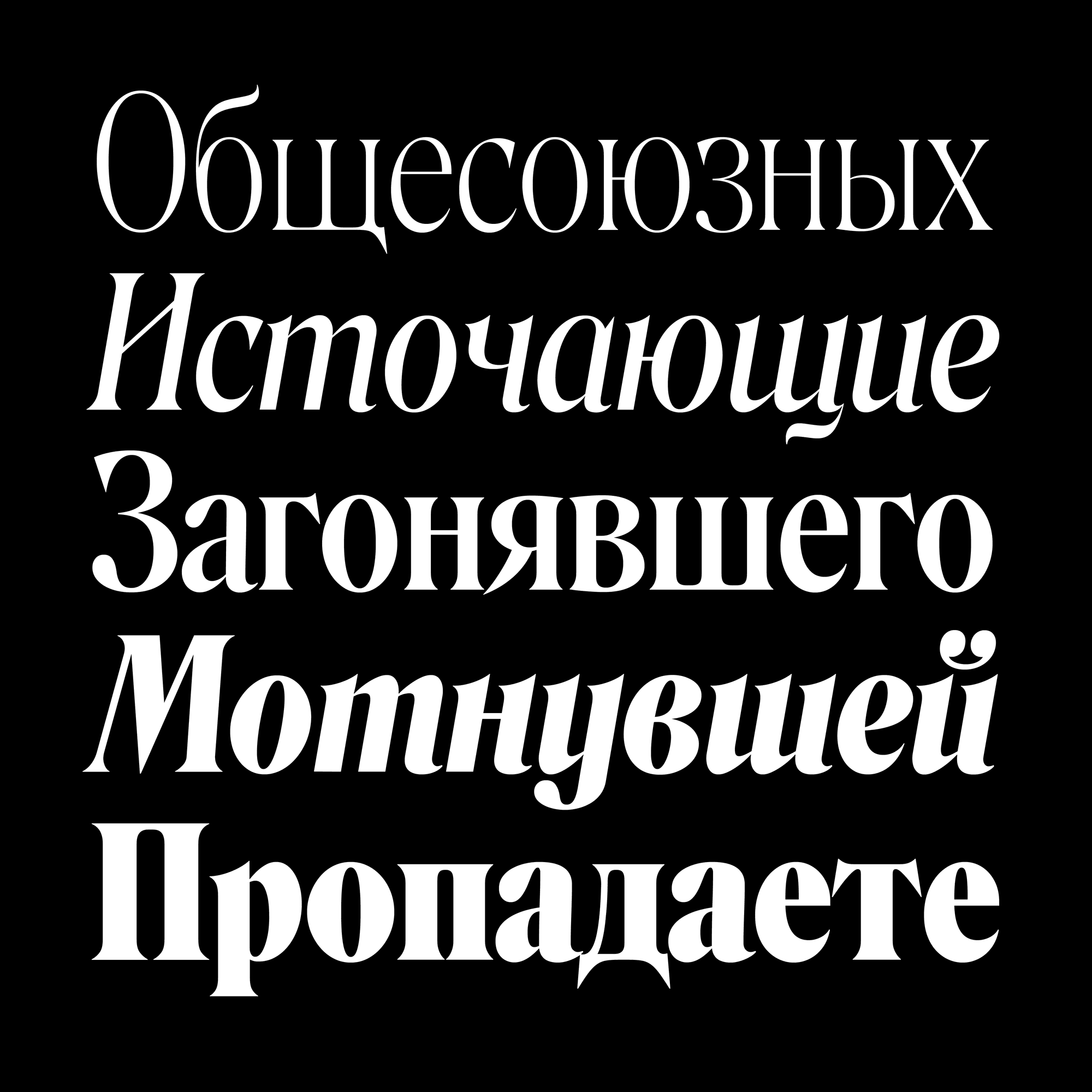
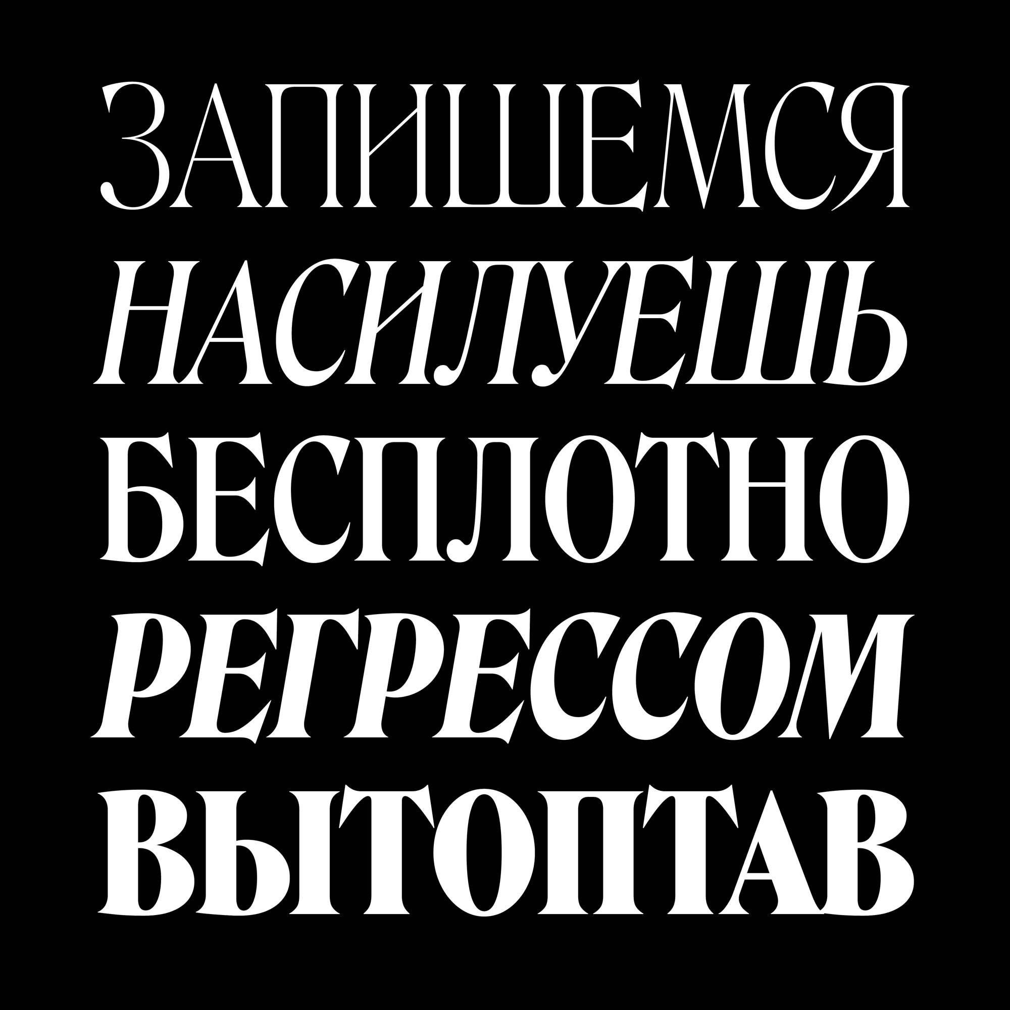
Of course, Jovana made sure that the key features of my Latin design were brought over to the Cyrillic. For example, the spike on the Я is similar to the Latin R (but not exactly a reflection of it!). But she also carefully expanded Roslindale’s vocabulary of shapes to include forms that don’t exist in the Latin. This includes the “teeth” that descend at the bottom of д and ц, the ball terminals atop Й, and the swishes in Э and б that feel like toothpaste being squeezed out of a tube.
Throughout the design process, Jovana and I met regularly, looked over proofs, and discussed the best way to balance the needs of the typeface with the needs of the script.
Roslindale Cyrillic is available in a series of Display Condensed weights from Extra Light to Ultra, as well as a more limited set of sturdier Deck and Text weights for smaller sizes. It contains Bulgarian, Serbian, and Macedonian alternates, as well as stylistic alternates that allow you to easily deploy Italic forms in the Upright fonts and vice versa. Oh and there’s a variable font too!
The images on this page are only the beginning...feel free to browse the specimen page, view the PDF specimen that Jovana designed, and grab a copy of the the trial fonts. We can’t wait to see what you do with this extension!
You can give it a listen wherever you stream your podcasts (including spotify, apple podcasts, and google podcasts), and I also suggest you check out their other recent interviews...they’ve had some incredible guests on recently.
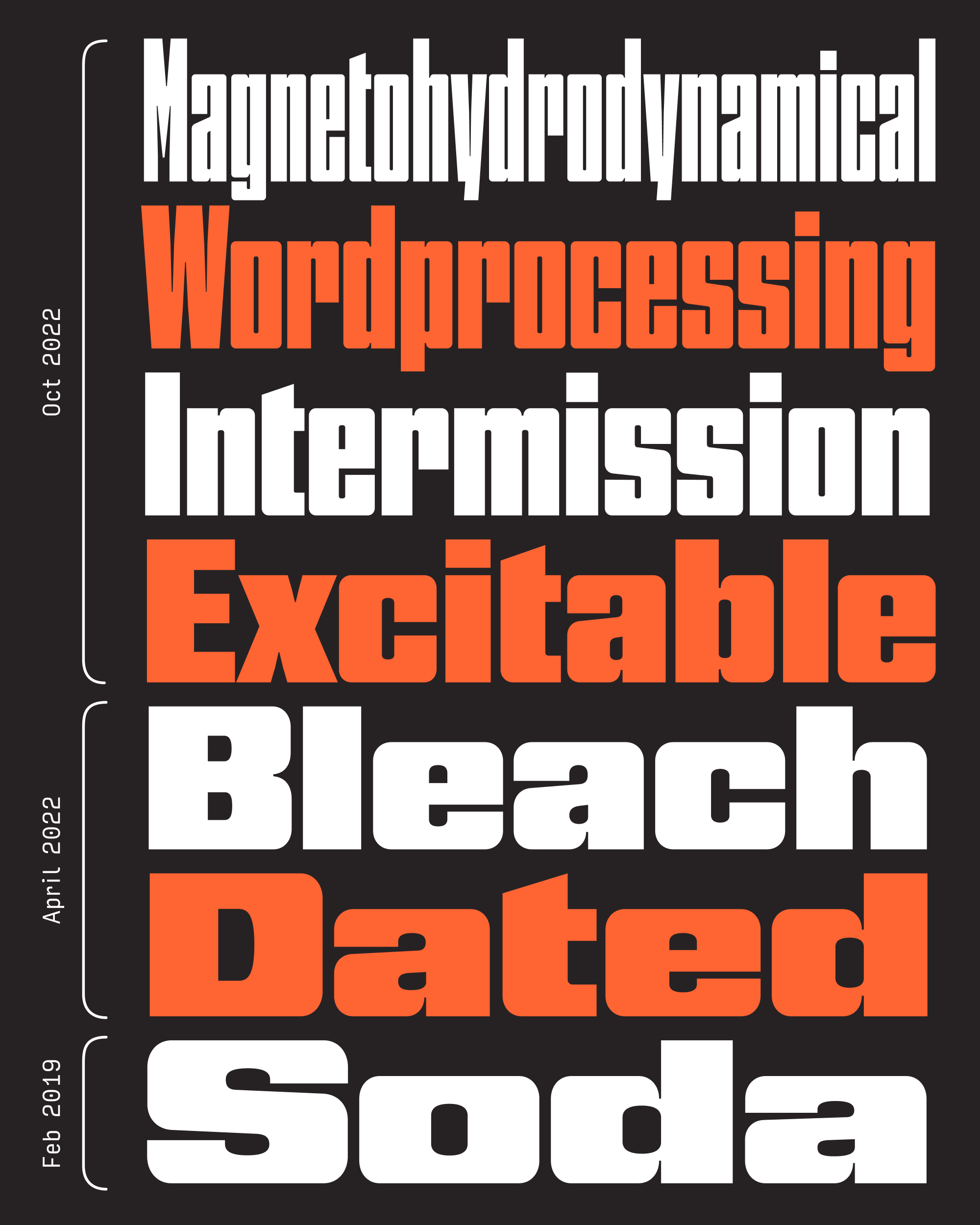
Six months ago, I sent an update to Nickel Gothic that included lowercase and a couple narrower widths. As I hit “Send” on the mailing, I felt a pang of regret, thinking to myself: “I should have gone narrower!”
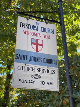
After that, I started to notice narrow, rectilinear sans serifs in the wild—on freight train cars, on construction equipment, and even on the sign for the church in the next town over. They taunted me. And they made me think about how much more useful and fun Nickel Gothic would be if it was used in the same way that folks employ classic fonts like Impact and Haettenschweiler. So I made it narrower.
Saint John’s Church, Ashfield, Massachusetts
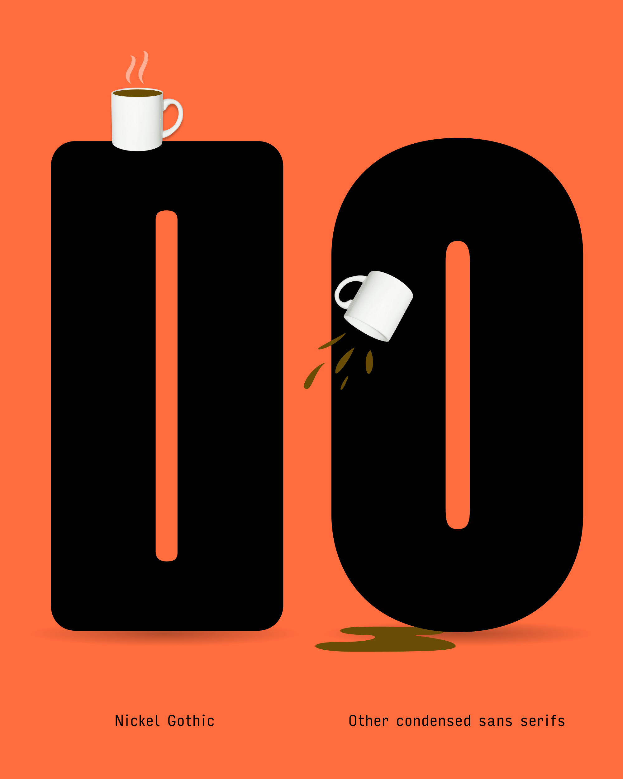
The Condensed Sans genre is a crowded one. It’s one of the reasons I’ve hesitated to update Bild even though I know I should…I’m still trying to find the thing that makes Bild special. But for whatever reason, Nickel Gothic feels easier. I said in my April mailing that each letter of Nickel Gothic should land with a resounding thud, and a big part of that has to do with the exaggerated flatness of “round” shapes like O.
Plenty of sans serifs get more rigid as they get narrower, exchanging their ovoid O for a stadium shape. Heck, it even happens in Helvetica Compressed! But Nickel Gothic has “rounds” that have straight sides to begin with, not to mention completely flat tops and bottoms. These flat-top exteriors contrast with the round-top interiors and leave additional weight in the corners (shoulderpads?), giving Nickel Gothic the feeling of being more “engineered” than “drawn”.
The problem with making Nickel Gothic narrower is that these distinctive flat tops started to get less and less noticeable. So I raised the thick/thin contrast and reduced the corner radius of the exterior shapes, accentuating the flat surfaces as much as possible. And I made no attempt to create a gradual transition between the straight and round segments, further underscoring the flatness that sets Nickel Gothic apart.
I tend to gravitate towards typefaces that hang out in between genres. The thing I like about Nickel Gothic Condensed is that it’s not materially different from a classic headline sans, but its flat-top style moves it one step closer to abstract shapes. It’s an odd midpoint between a functional sans like Bild and a novelty sans like Fit.
Nickel Gothic’s narrower version exacerbated the difference between closed-in, double-stroke letters like O and C and open, single-stroke letters like E and T. The latter group had to get significantly narrower in order to avoid leaving big open spaces in text. Diagonal letters like v and y also took lots of extra massaging to get their intersections to not feel overwhelmingly congested.
But, as I was writing up this mailing a couple weeks ago, I started to feel the same pang of regret that I felt in April. I should have gone even narrower!
I didn’t necessarily feel the need to explore the illegible extremes of something like Barcode (after all, Fit has been there, done that), but as I was looking at uses of Permanent Headline and Compacta I wondered if Nickel Gothic could be a flat-top alternative to those as well. I followed their lead and added a bit of letter spacing to battle the picket-fence-effect that Compressed fonts get when the space outside the letters is equal to the space within them.
These new styles get pretty far from the 1918 Chinese banknote that served as Nickel Gothic’s jumping-off point, but I think they feel like a logical extension for the family, not to mention a lively variable axis to play with in your headlines.
Thanks for letting me take the extra time this month, and I hope a few of you appreciate that these four new widths are available in Cyrillic and Greek as well. Let’s plan on the next mailing landing late as well so I can play a little catch-up. 😅 Enjoy your month!
At the very end of 2020, I issued Gimlet Sans Blah, which is probably my silliest font to date. It uses a little OpenType trickery to replace all text with “blah blah blah”, helping the user get some distance from messaging apps (like Slack) and unwind a bit, while still remaining logged in.
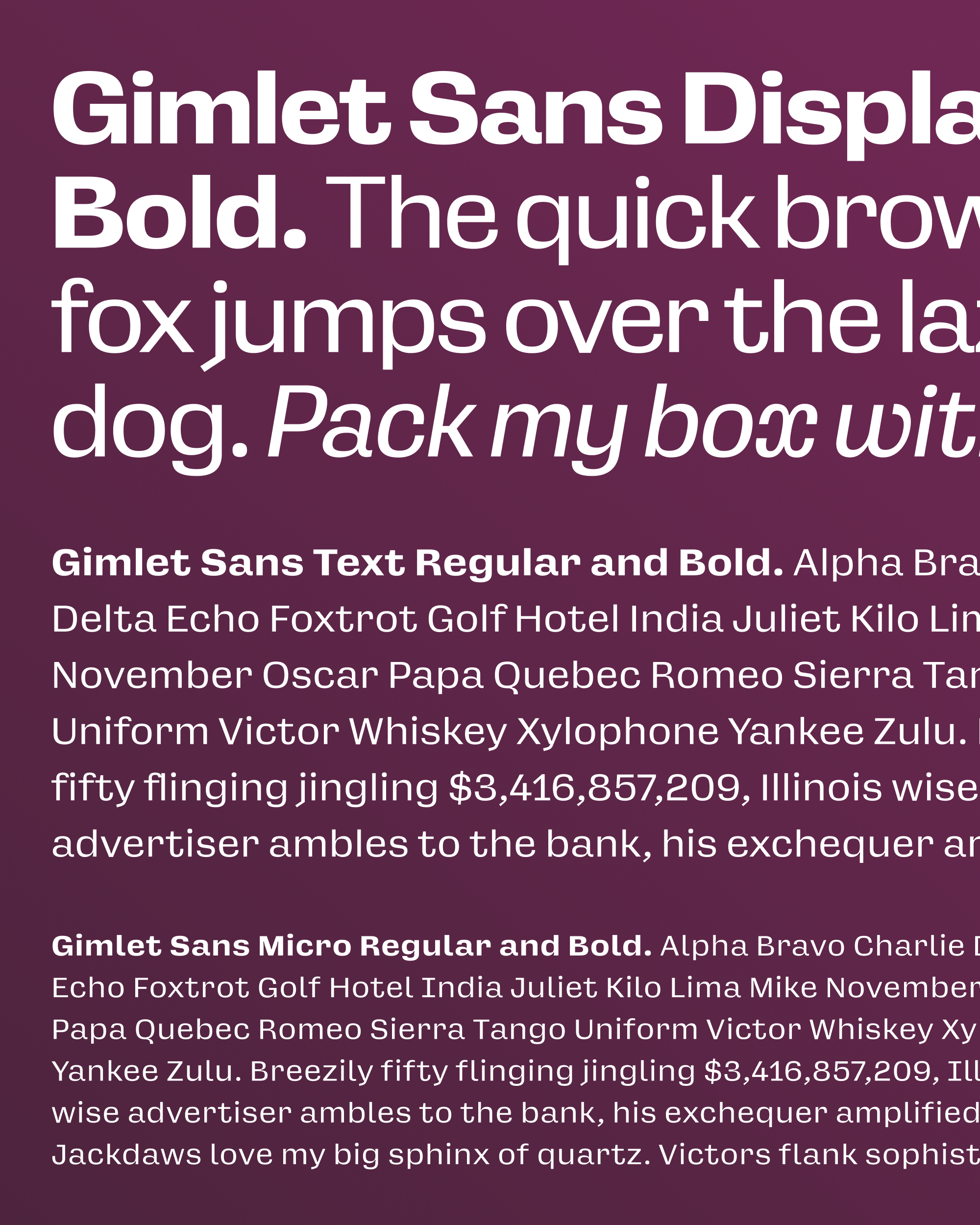
But this jokey font revealed a serious limitation of the Gimlet Sans expansion I sent out earlier that month: those four letters (and one wordspace) didn’t look great at small sizes! I didn’t bother mentioning it at the time, but I had actually modified the forms in Gimlet Sans Blah to make them feel a bit less cramped when used in a text or interface setting. The x-height got larger, the letterspacing opened up, and thus, the idea for Gimlet Sans Optical Sizes was born.
I’ve been working on a few UI fonts for clients in recent months. Each time we’ve had to figure out how to address legibility/accessibility concerns without boiling out every last bit of personality from the typeface. So I’ve been asking myself a lot recently, how far can you stretch a design before it stops feeling like that design? And conversely, how much personality can you get away with in a font made for small sizes?
Size-specific adjustments in type are a pretty subjective thing, but they generally follow the same playbook. As a font gets smaller, it gets looser, airier, simpler, and more obvious. A small-size font is a ruggedized font…details need to get exaggerated or they need to disappear.
That being said, it feels like we are turning a corner in small-size typeface design. It once felt like open forms were the key to a great UI font (Lucida, for example), but with better rasterizers and higher screen resolutions, many of the common UI fonts out there today have closed apertures, including San Francisco and Roboto. My hope is that this is a stepping stone towards more diversity and expression in small-size text.
You tend to see optical size variants a lot more often in serif fonts, where changes in thick/thin contrast, serif sharpness, and proportions tend to be more radical or even showy (take the changes I made to Warbler Banner several months ago).
As a sans-serif, Gimlet Sans already had a lot going for it in terms of small-size-friendly attributes: it was low-detail and relatively low-contrast, and already had a decently-high x-height. Much of its off-kilter charm comes from its wide stance and exaggerated underbites, so I didn’t have to worry about anything being too narrow or subtle.
But it did need something. So just like I did with Warbler Text, I grabbed my trusty HTML test page and custom stylesheet and I started changing stuff and testing it. And while I did, I’d ask myself two questions: Does this change genuinely make the text a little easier to parse? And, does this still feel like Gimlet Sans?
So much of typeface design is about the trial-and-error process of figuring out “recipes” that transform one style into another. What I mean is something like this: Increase the x-height and lowercase width by nearly 10% while maintaining the existing stroke width. Then, loosen the letterspacing by roughly 100 units and increase the gaps of the pothook terminals by 20–30 units, including the distance of dots and accents to the base letter.
At a certain point, the system breaks down and I have to shift my focus towards managing the details. It turned out that round-sided shapes needed to gain a little more letter-spacing than straight-sided ones. The taller lowercase letters couldn’t tuck underneath capitals like T and F anymore, so I created untucked alternates to manage the transition.
I tried to keep as many distinctive Gimlet-y quirks as I could, but I did have to part with some along the way. The pothook of the lowercase f got to be way too crowded in the now-reduced ascender space, and I begrudgingly replaced it with a simpler form. The t’s pothook, on the other hand, didn’t feel as disruptive, but there’s a simplified alternate in case you disagree. I even toyed with the idea of throwing in high-legibility alternates into the mix, including a Verdana-style serifed capital I and a lowercase l with a tail (which both felt sufficiently quirky and Gimlet-y to me!)
This month’s download contains a bunch of fonts. You get the new Micro size (optimized for 9pt and below), a Text size (optimized for 10–13pt), and fresh cut of Gimlet Sans Display (previously “Gimlet Sans”), which has various improvements such as tighter spacing, OpenType alternates, tabular figures, and (*gulp*) a few bug fixes—thanks to the club members who reported them!
And it finally has Italics. Instead of shooting for a more flowing Italic, I stuck with the approach I used for Gimlet Serif, which follows Schadow’s unusual mix of oblique Roman forms and exuberant cursive outbursts. It features a round v and w, and I even managed to shoehorn in the notorious x, which is essentially a backwards c glued to a forwards c. It’s weird, but it’s not overly-crowded and definitely not subtle. I figured I might as well see if you’ll let me get away with it! 😆
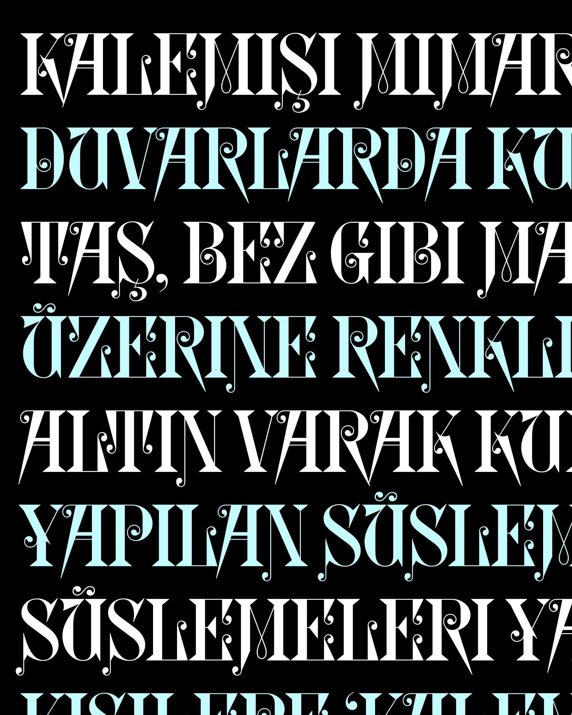
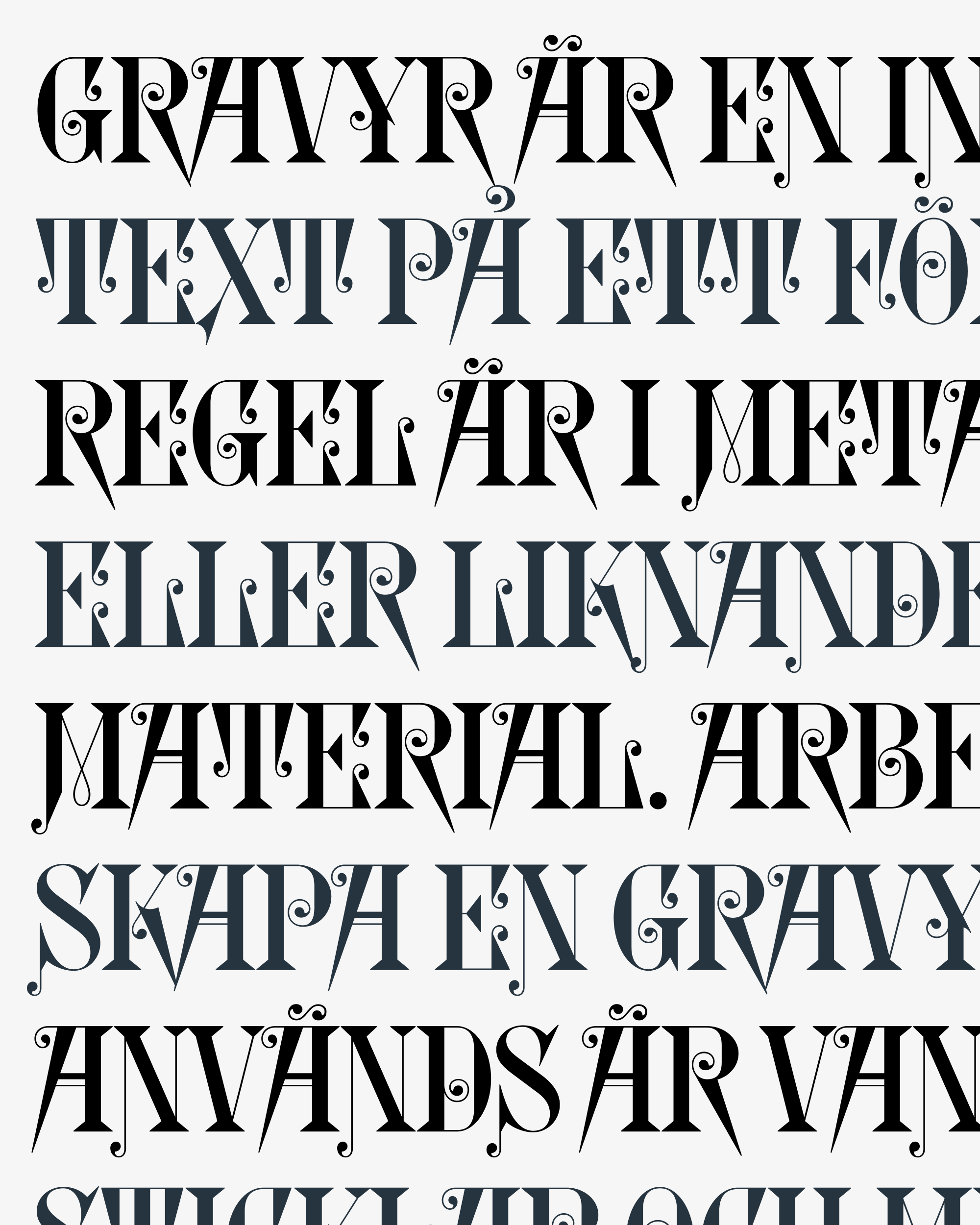
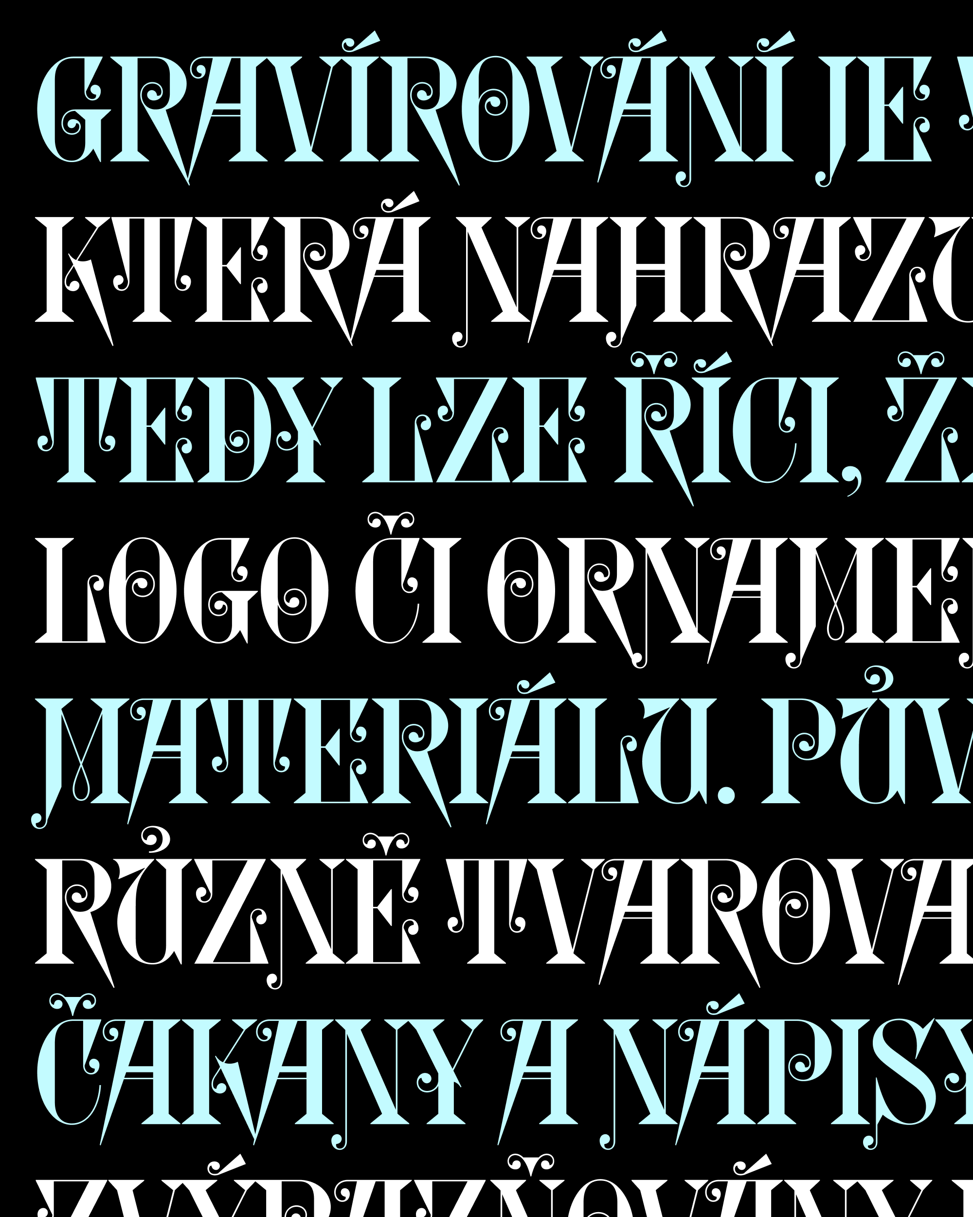
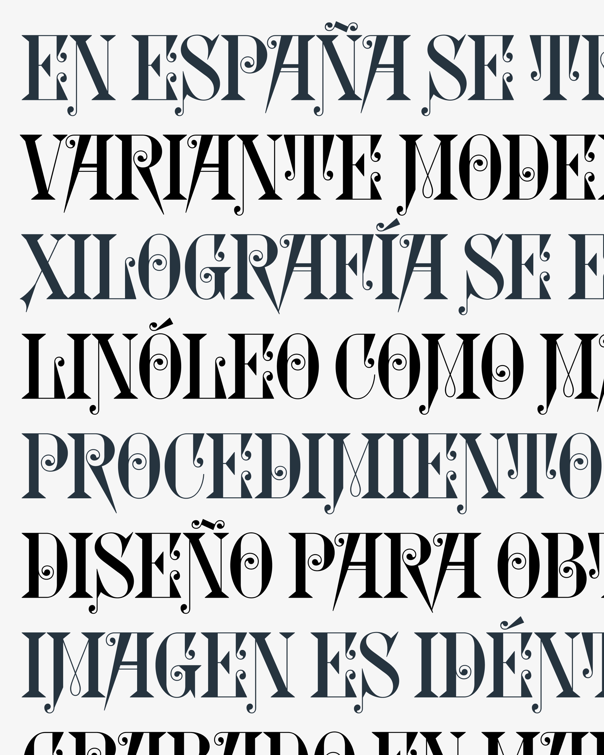
With letterforms as outlandish as Glyptic’s, run-of-the-mill accents just wouldn’t do. So I did my best to translate that chaotic energy into my revival’s diacritics, where there wasn’t a historical precedent to work from.