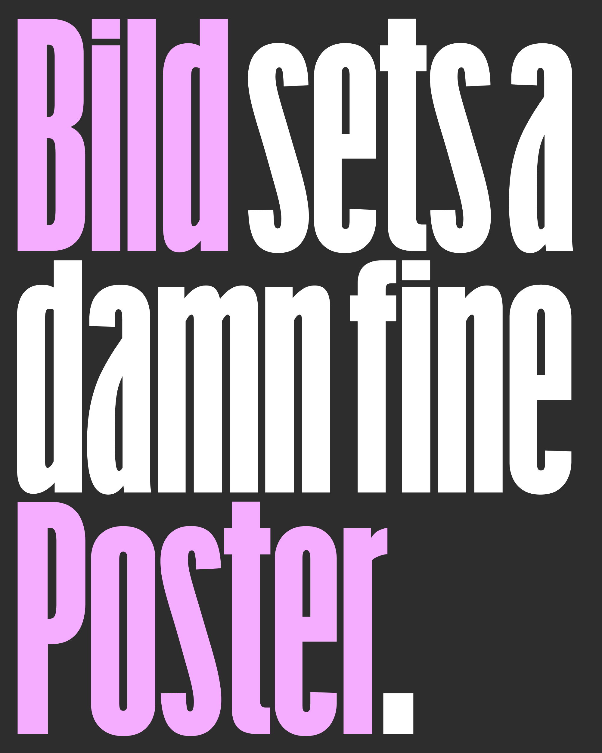
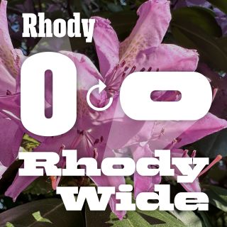
August’s Font of the Month: Bild Poster
Last month I sent you The Rest of Bild, a name I now realize misleadingly implies some kind of happily-ever-after ending for the font. On the contrary, I consider Bild to be anything but finished, and this whole month I haven’t been able to shake the nagging feeling that something was still missing from the family.
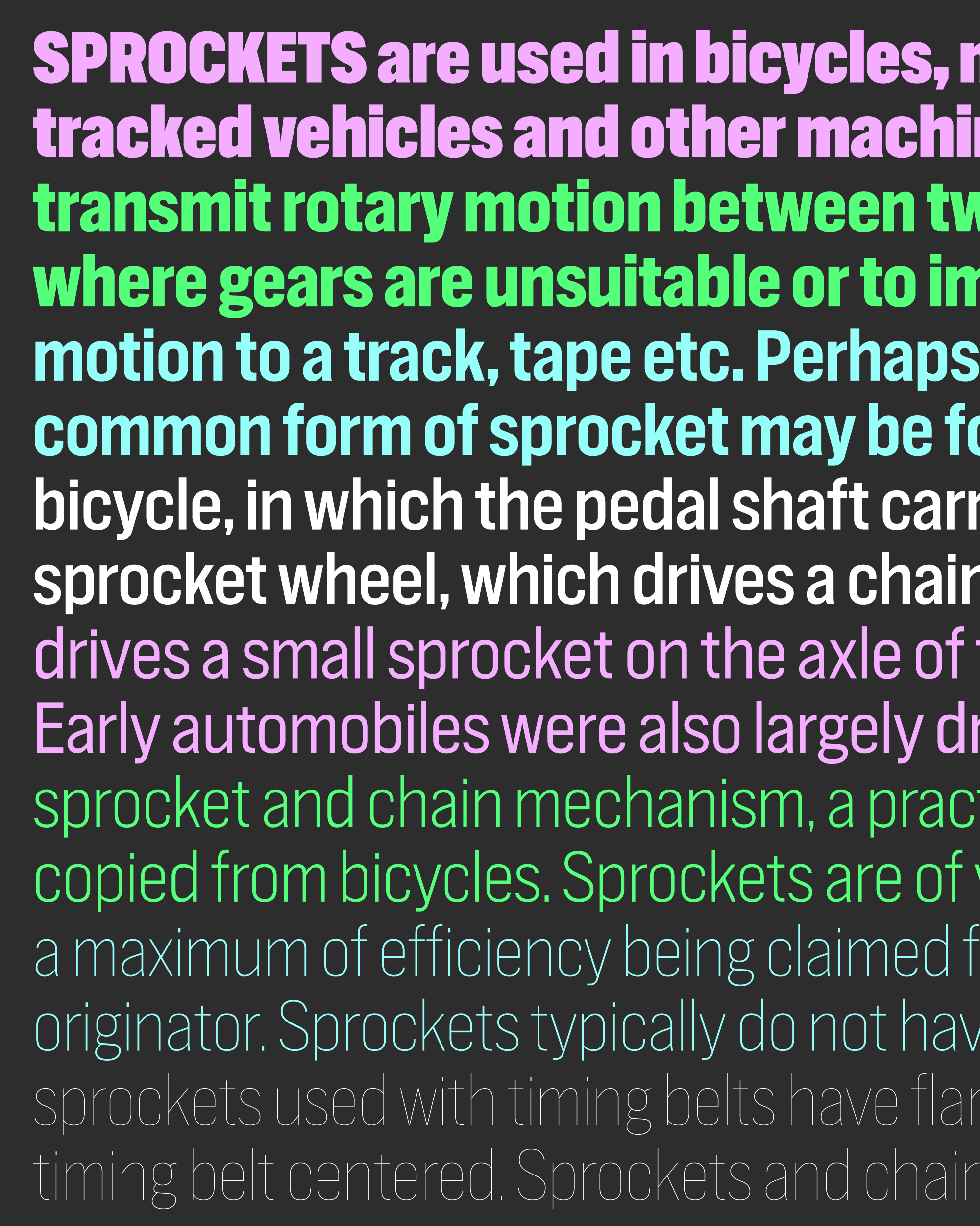
Bild is a “what if” font: what if Trade Gothic was built around its Bold Condensed styles? By carrying that style across weight and width, it creates a bigger straight-sided Gothic sandbox for designers to play in. But at the same time, it’s not a very opinionated design—I wouldn’t call it generic, but it isn’t very specific either. It doesn’t tell you a lot about how it wants to be used, and perhaps doesn’t do enough to invite you to play in the sandbox it has created. Where are the swings? The slides? The monkey bars?
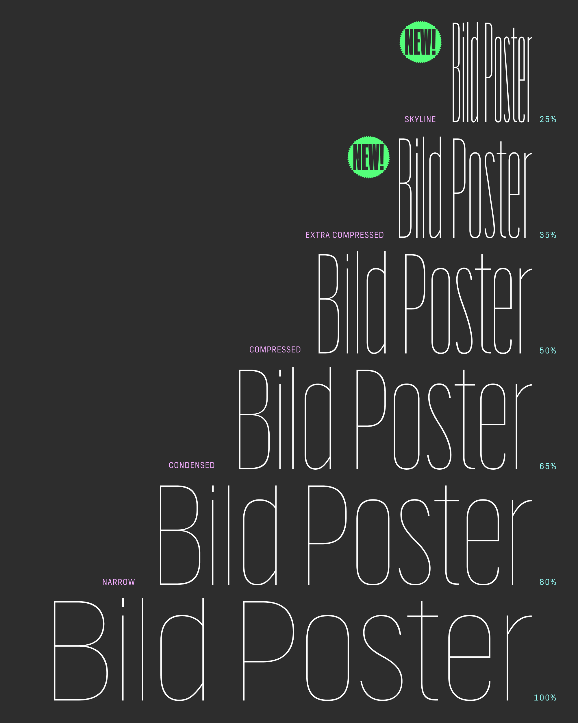
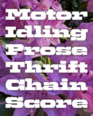
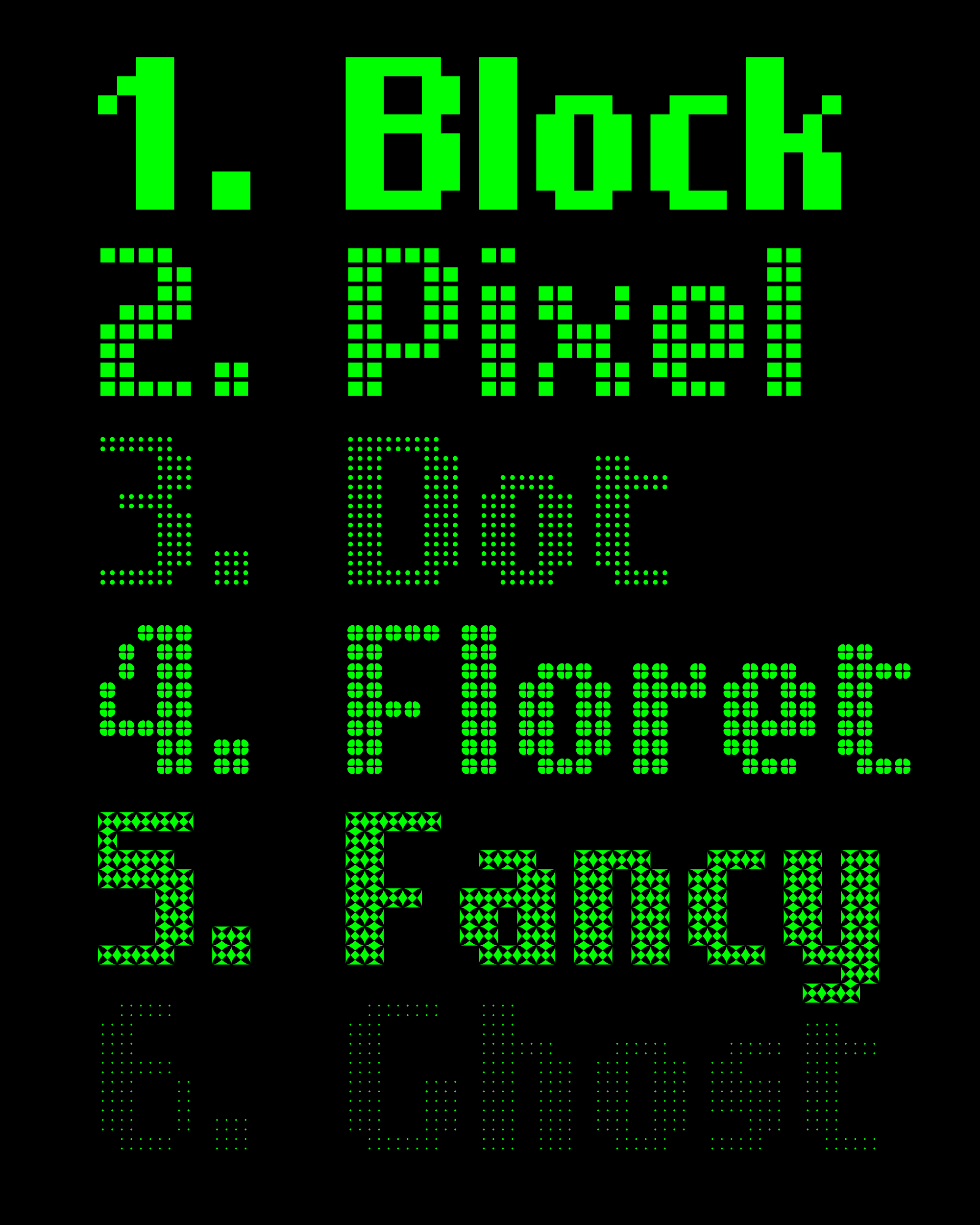
Type design involves so many details that it’s easy to forget that, when viewed at a distance, fonts essentially boil down to rhythm, density, and proportion. Bild’s width and weight variants give you lots of control over the rhythm and density pretty nicely. But the proportions…maybe there is still something there that could unlock expressive potential while keeping within the parameters of the original design. So this month, I’m sending you Bild Poster, which asks the question: Is Bild’s x-height its X-factor?
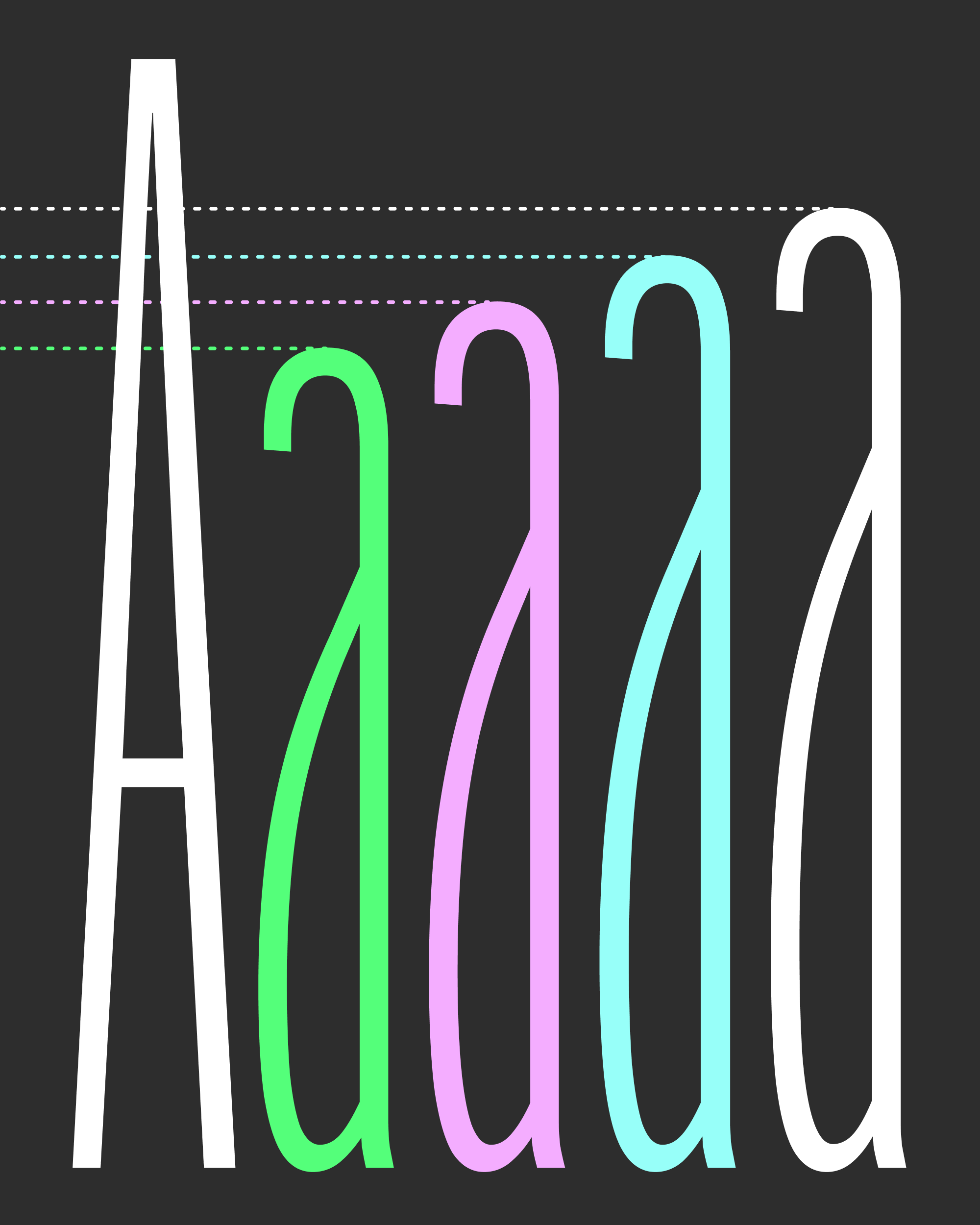
Bild now features a variable x-height axis (XHGT) that gives you the ability to dynamically raise the height of the lowercase letters. It’s a very simple transformation but one that radically alters the character of the design. It offers an edgier, Display-ier look that I hope can really sing in large poster use, following in the footsteps of other supertall x-height grots like Inserat-Grotesk, Anzeigen-Grotesk, and of course the ubiquitous Impact.
Bild is far from the first variable font to provide a variable axis for manipulating the x-height. CJ Dunn’s Dunbar, one of the earliest variable font releases, has an axis that took his Erbar-inspired geometric from the low-slung 1920s look to the almost-too-much ITC style of the 1960s and ’70s. There are also several parametric fonts out there that allow for manipulation of the x-height via with the YTLC axis. I also just discovered that newglyph’s Swiss Poster (released two days ago!) features a similar concept.
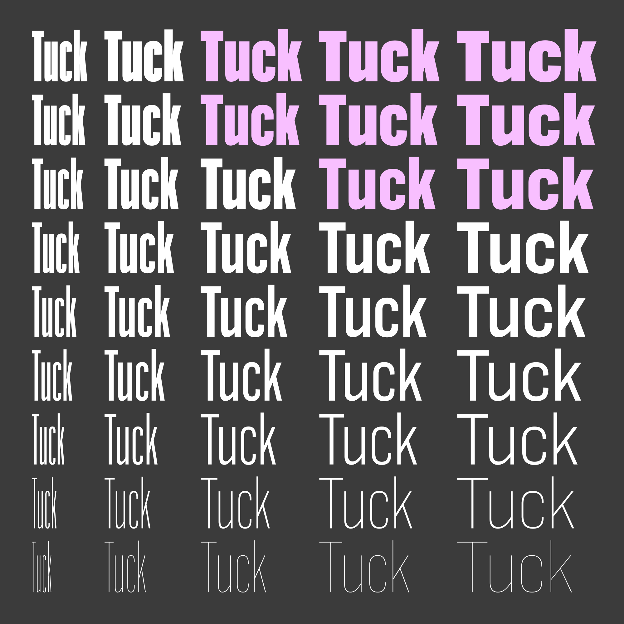
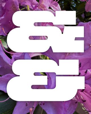
Bild’s lowercase doesn’t get wider as it gets taller, but it’s not quite parametric either. First, I made subtle reductions to the descender lengths to keep them from sticking out too much. Then I changed the kerning, especially in situations where lowercase could no longer tuck underneath other caps as the x-height grows, like the word “Tuck” shown above. It took a lot of trial and error to map these breakpoints across what is now a three-dimensional space (a perfect use case for Occupant Fonts’s helpful tool).
A taller x-height leaves less space for all stuff that appears above the letters: ascenders, accents, and the dots on i and j. I took special care to manage their alignment as you traverse the space, and added a special “Cap Snap” OpenType feature that will clip the tops and bottoms of the will shorten the ascenders to match the cap height, helpful when stacking lines of text with super-tight leading.
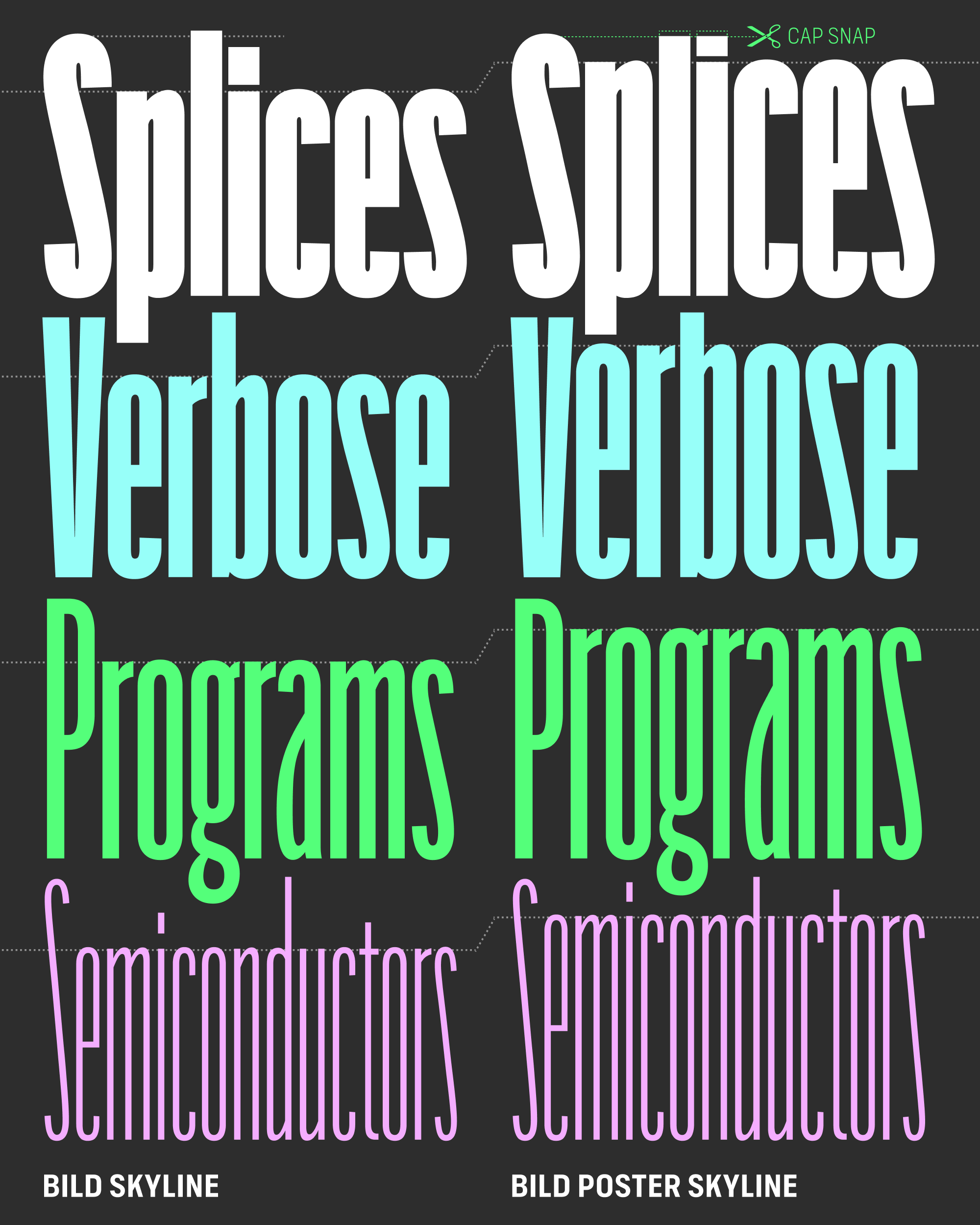
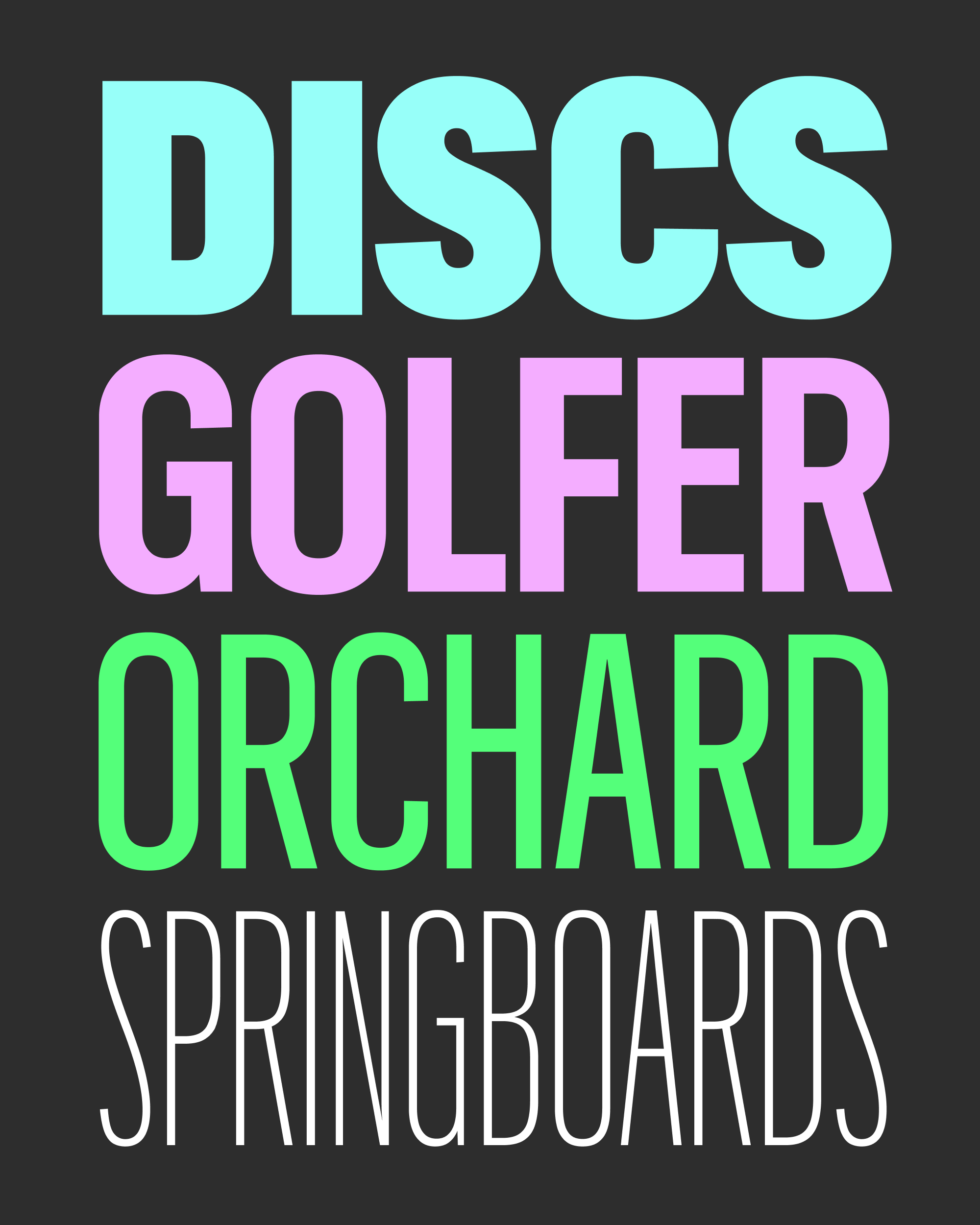
As I increased the x-height for Bild Poster, it dawned on me that elongating the letterforms to make them taller was just another way of elongating the letterforms to make them narrower. Since I was practically doing half the drawing already, I went ahead and added two new widths to the family (Skyline and Extra Compressed) as well.
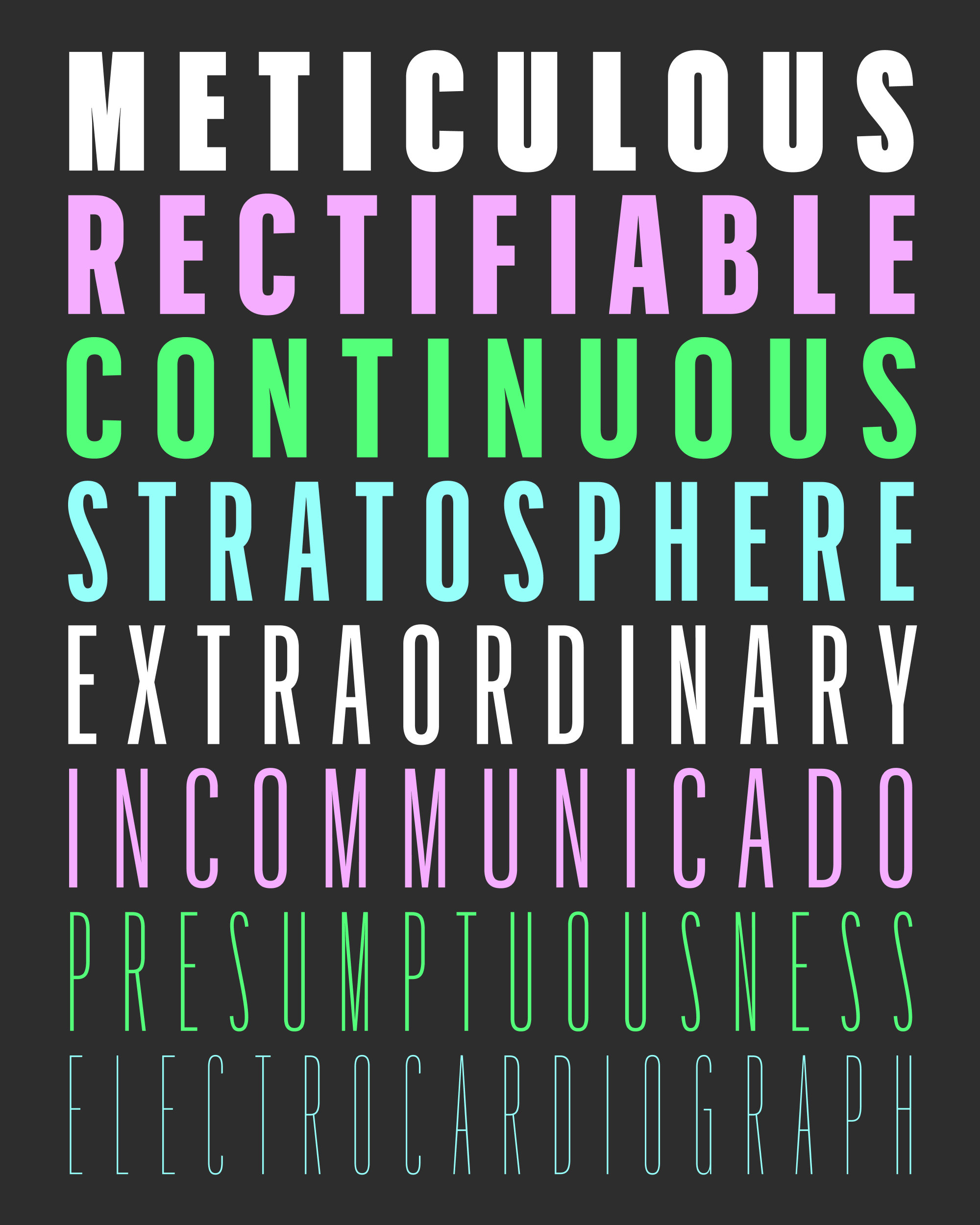
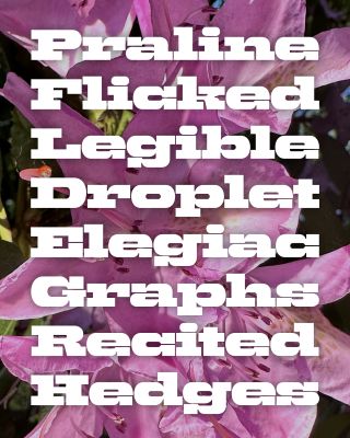
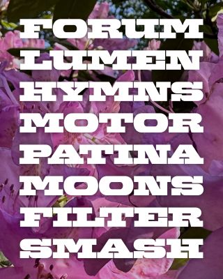
Most supertall sans serifs can get very picket-fence-y, with long terminals on letters like s, c, and e that reach inward to enclose their whitespaces (two fonts of mine that do this are Fit and Nickel Gothic). Even at its narrowest extremes, Bild sets itself apart by truncating its terminals prematurely, leaving massive gaps that make the letters feel both closed and open at the same time (check out “Splices” above). This feature, along with the angular, asymmetrical arches on h, m, and n, prevents things from getting too clean and same-y, and preserves the feeling of Trade Gothic even as the proportions stray farther and farther from the source material.
Is an adjustable x-height actually worthwhile? Is this what the sans serifs of the future will offer, or is just a cheap gimmick? I don’t know but I figured it was worth an extra month of work on this to inject something unexpected into this otherwise-straightforward design. I hope you find some value in this addition to Bild, and I’m x-heighted to see what you do with it! (sorry)