July’s Font of the Month: Roslindale Compressed
Memory is an imperfect thing, and it can sometimes be jarring when my mental picture of a typeface doesn’t align with the real thing. I’ll never not be shocked by how different Times’s Bold is from its Regular, or how much narrower Helvetica’s f, j, and t are than my brain expects them to be.
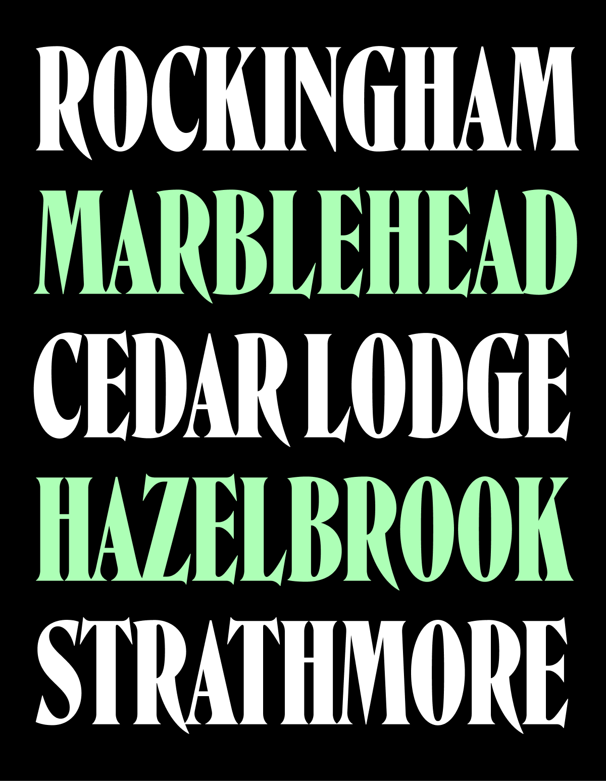
I’ve now been making fonts long enough that I even experience this with my own designs. My typeface Roslindale started off in 2017 as a single Bold Condensed weight. In my mind’s eye, it was fairly narrow, maybe something along the lines of this:

But then I take a look at the font file and am surprised to see that Roslindale at its narrowest actually looks like this:

I could have sworn it was narrower!
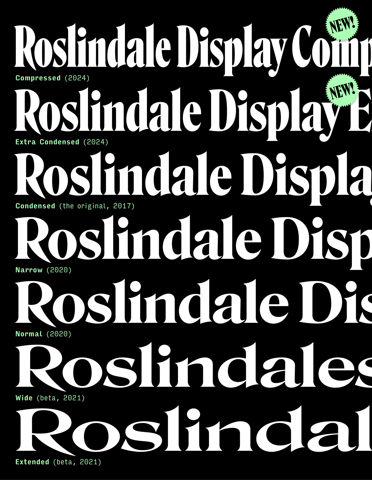
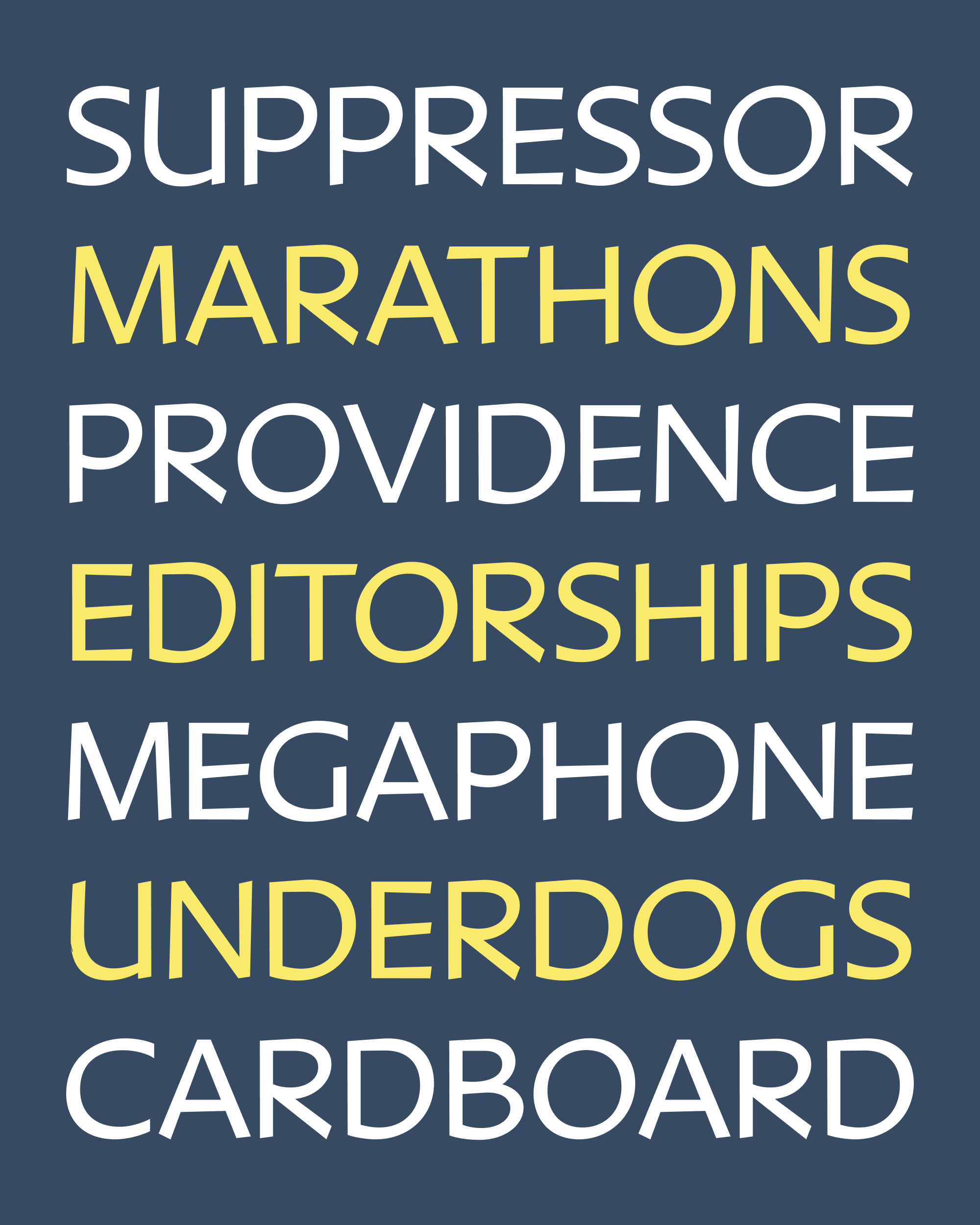
I’ve spent a fair amount of time making this typeface wider and wider, but clearly my subconscious demands that I push it in the other direction and really put the squeeze on this design. So this month I’m sending you my first stab at Roslindale Display Compressed Bold, which goes as narrow as this:

I’ve also thrown in an intermediate Extra Condensed Bold for good measure, which leaves us with an array of widths that looks something like this:
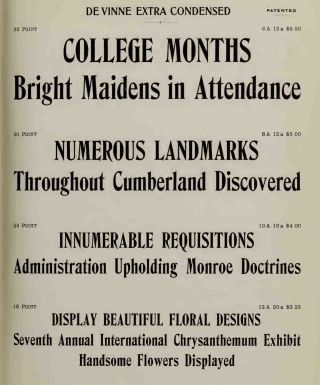
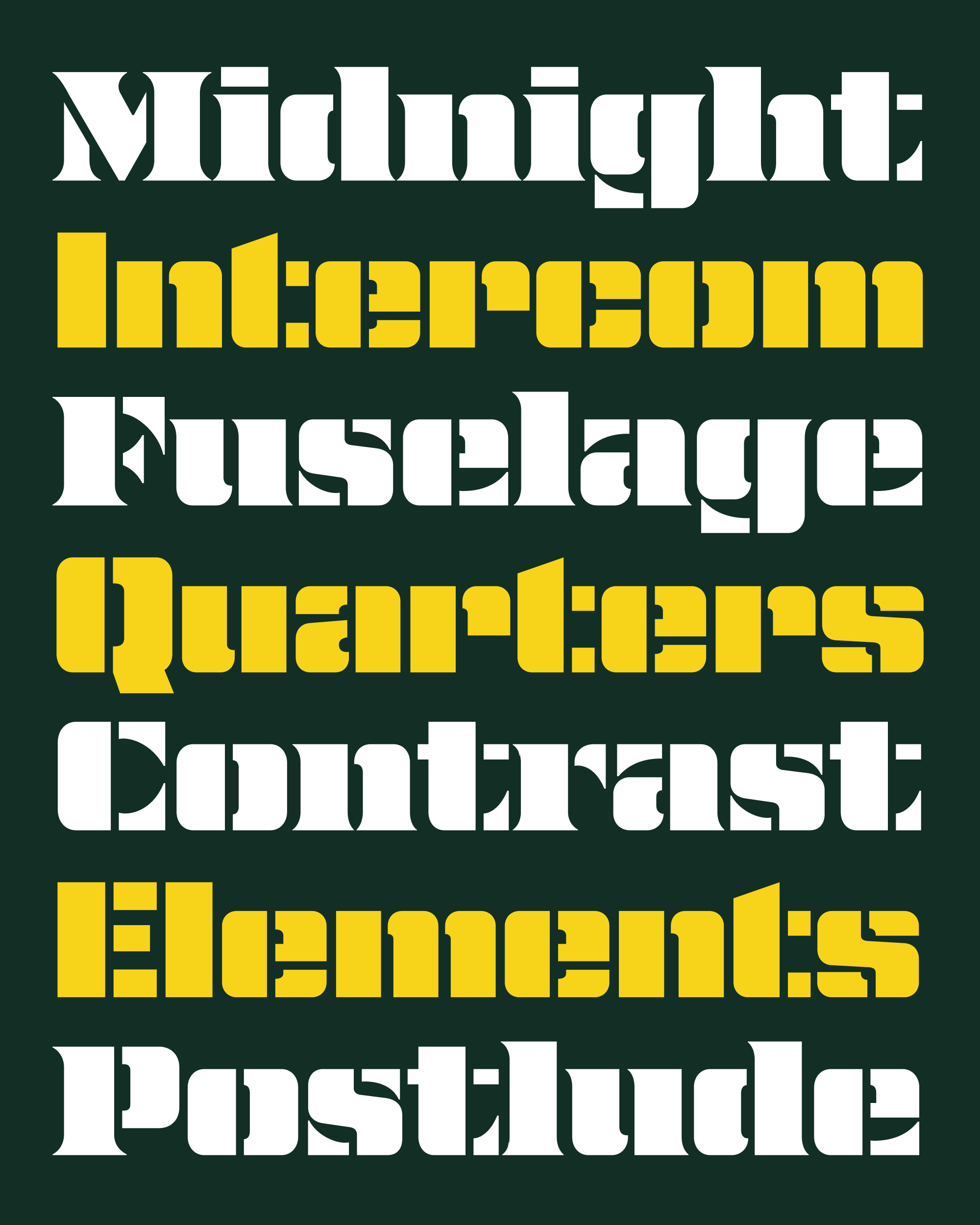
Like the rest of the Roslindale family, this design takes major cues from the Victorian-era serif De Vinne. Narrow, space-saving versions of De Vinne began to pop up shortly following its release in 1890, including an Extra Compressed from Barnhart Brothers & Spindler, a separate-but-related typeface called Howland from Dickinson Type Foundry, and finally an Extra Condensed style offered by the newly-amalgamated American Type Founders (pictured below).
For me, the trick was to balance the funkiness of these historical sources with the smoother, slicker vocabulary of shapes that I’ve already established elsewhere in the Roslindale family.
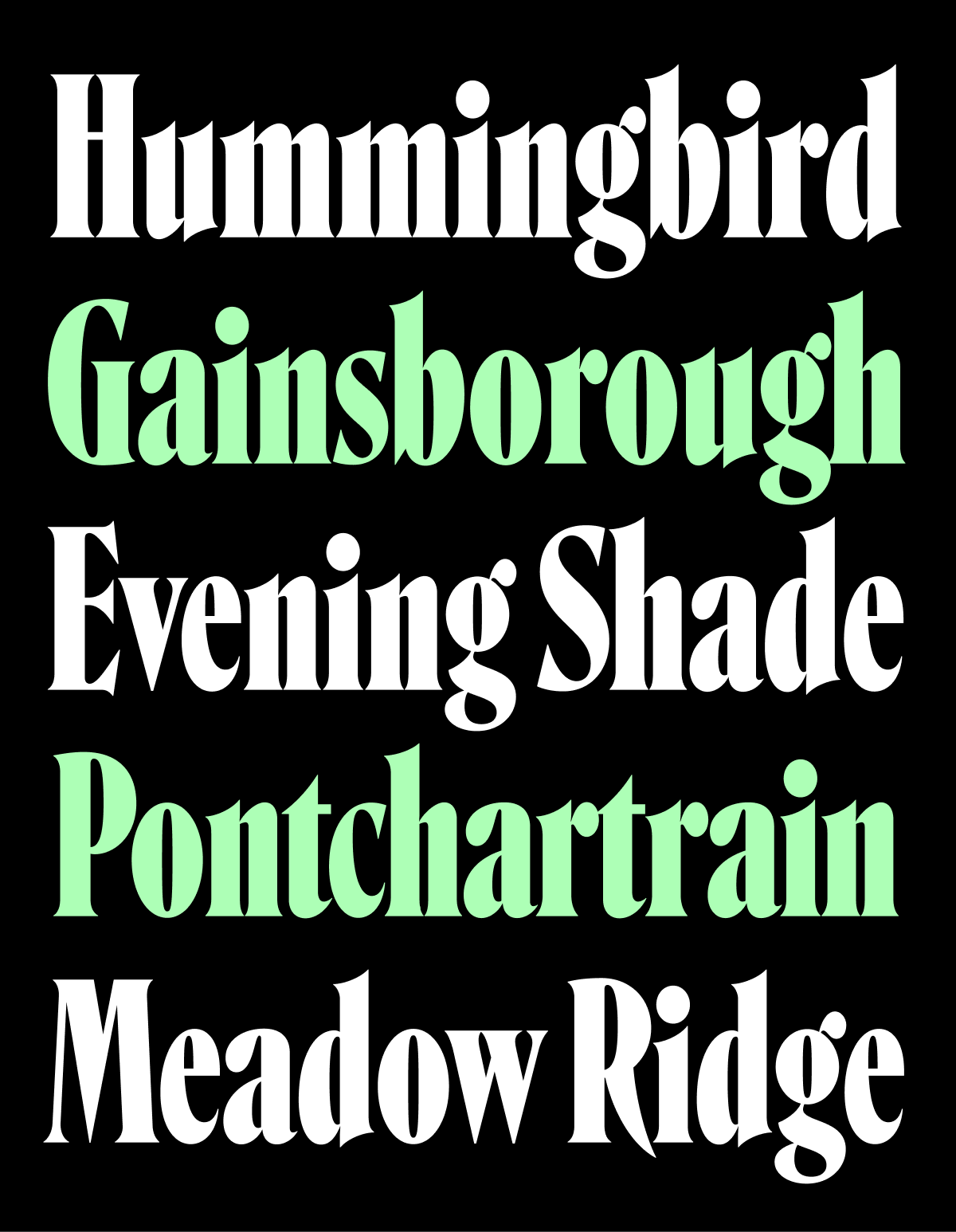
Compressed fonts tend to take on a picket-fence regularity, with little room for oldstyle-influenced diagonal stress. I sought to preserve and even exaggerate that diagonal stress (see the sagging curves of c, d, and e and the sharp shoulders of m and n) at the same time that I was smoothing out out all of De Vinne’s lumps and bumps.
In other Roslindale news, I’m delighted to announce that the retail type family has a brand new web specimen! It was designed and produced by Typetura, and features interactive specimens, a breakdown of the family’s designspace, in-use examples, and a deep dive into the history of the Elzevir / De Vinne style (thanks to writing and research by Florence Fu and André Mora).
Wishing you a wonderful month!


