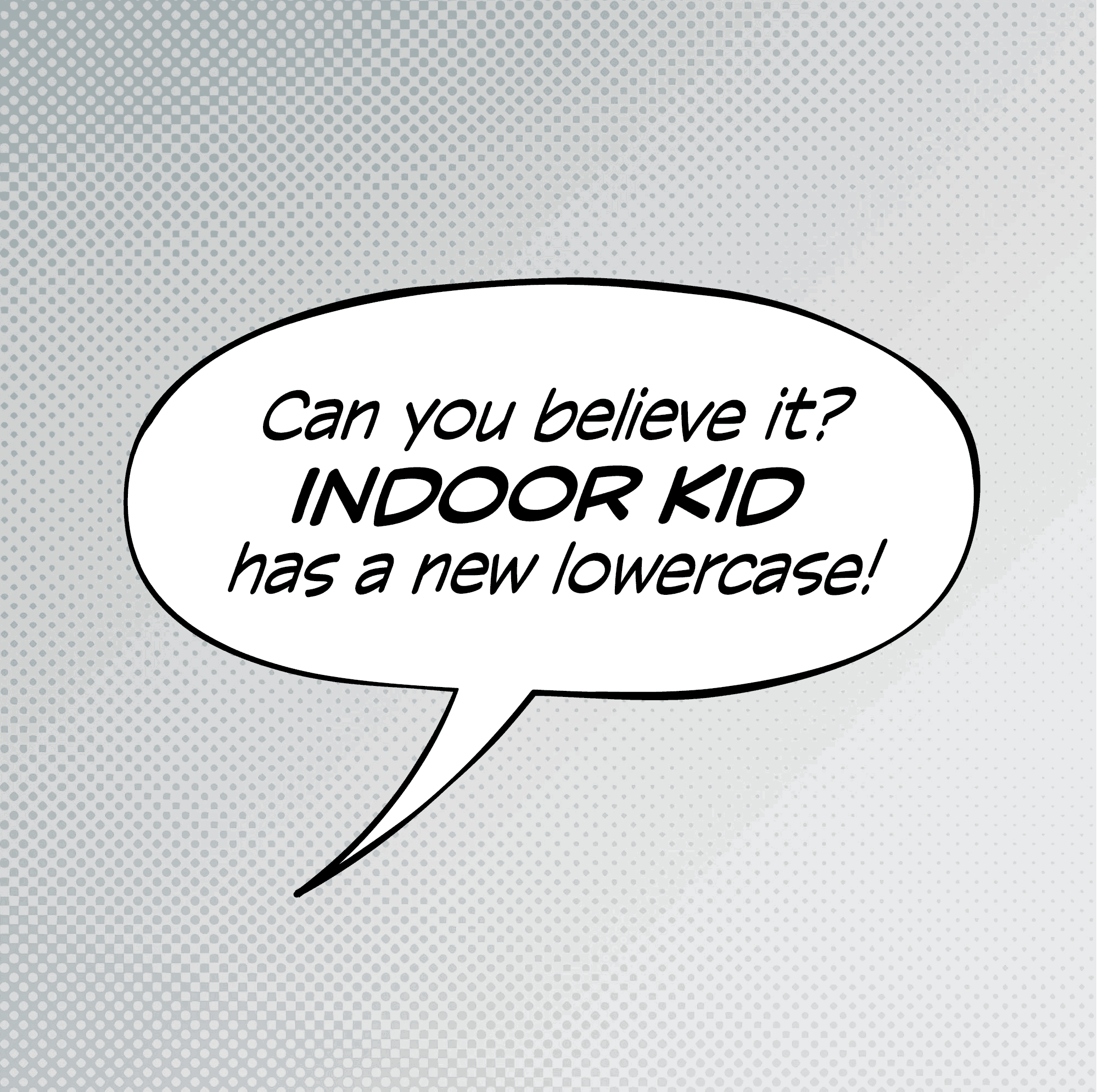
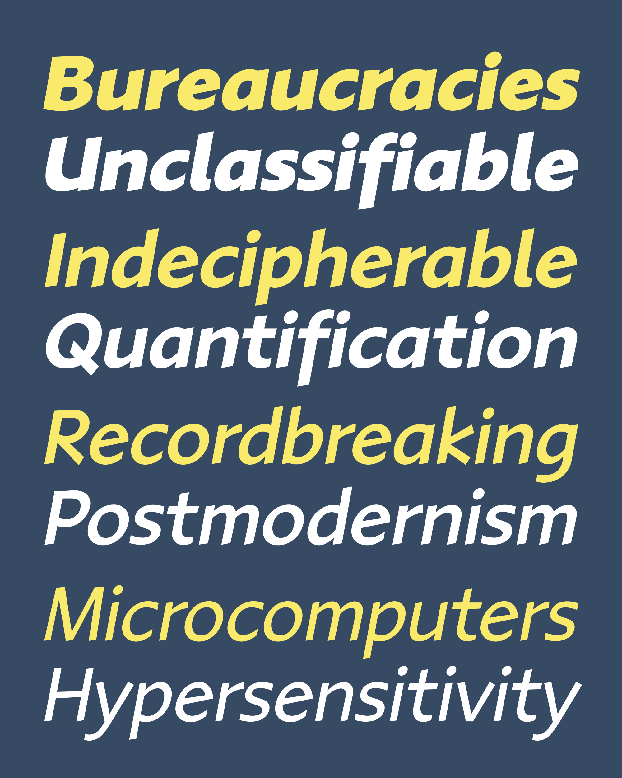
March’s Font of the Month: Indoor Kid Lowercase
One year ago, I sent you my first draft of Indoor Kid, the collaboration I have been working on with comics writer/editor/publisher Ellis Bojar. It attempts to fulfill his vision for an expansive designspace in the comic book lettering style: variable axes for weight, width, and slant, plus a special emphasis axis that enlarges letterforms from their vertical center without affecting the stroke weight.
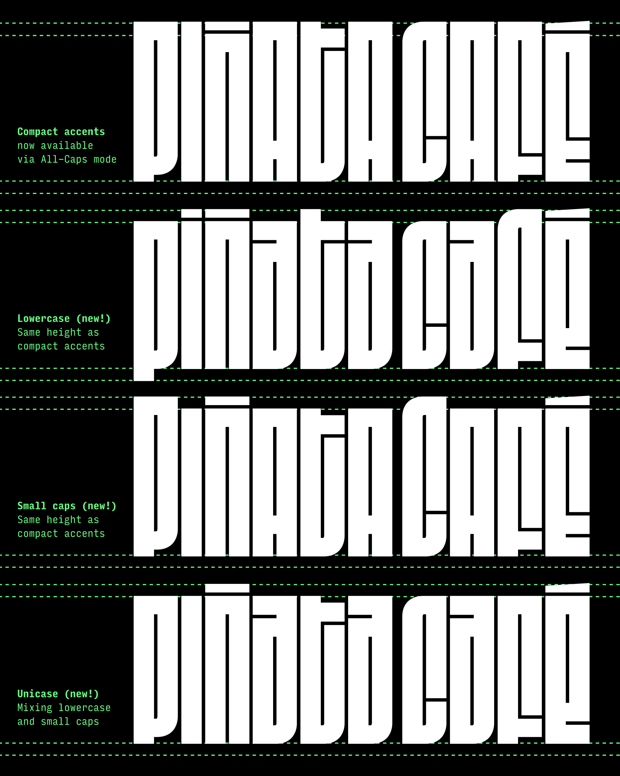
It has been so rewarding to see uses of Indoor Kid pop up over the past year, most recently in the latest run of DC’s Harley Quinn lettered by Lucas Gattoni. That gave me some momentum to dive back into the font, and now Indoor Kid is back with a shiny new lowercase!
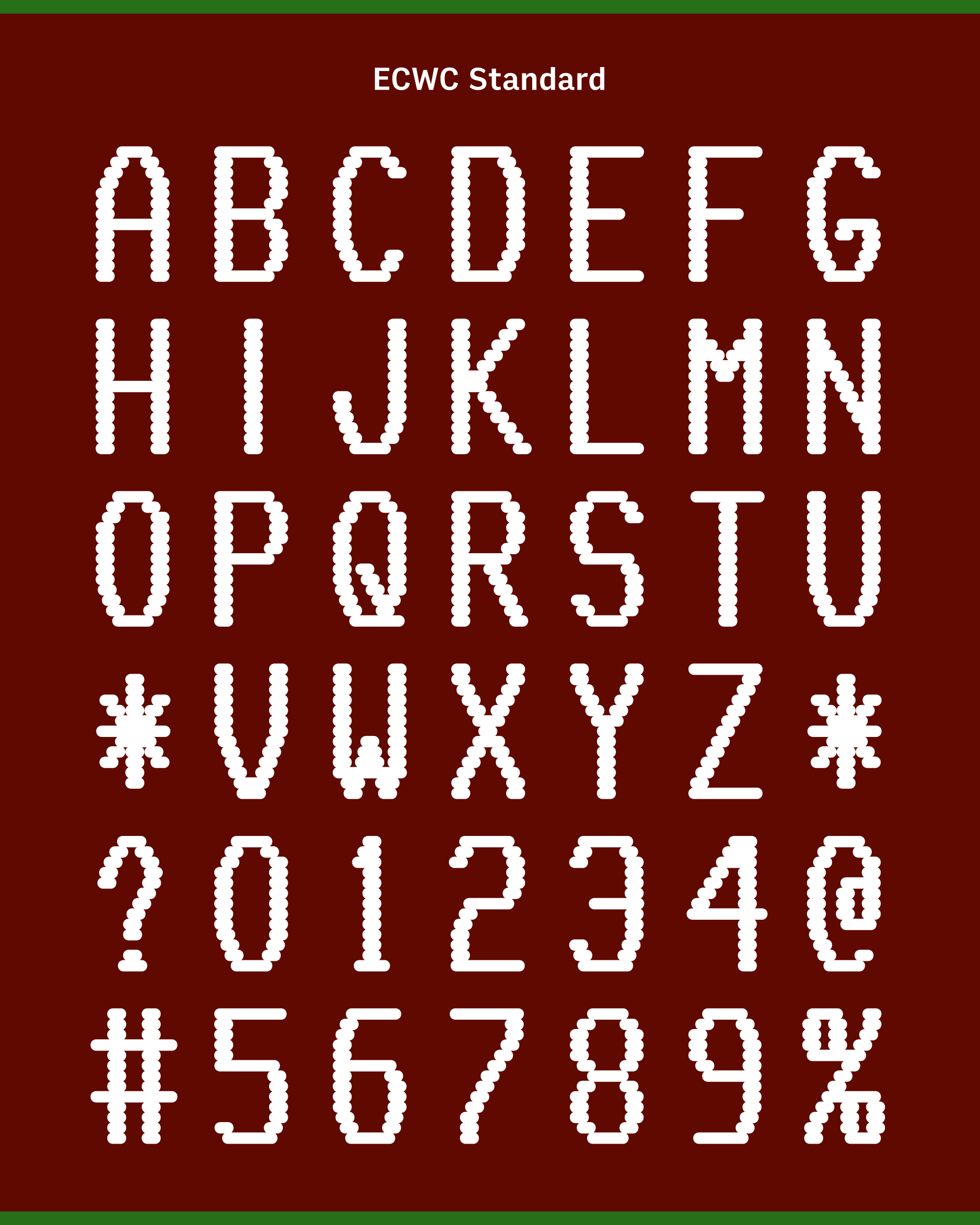
Traditionally-speaking, lettering in American comics is all-caps. Various explanations are offered for this convention—due to the lack of ascenders and descenders, capitals appear larger, require fewer alignments, and allow lines to be packed closer together. There’s also an argument that distinctive shapes of capital letters can withstand the poor print quality of early comics far better than the repetitive gestures of lowercase would.
Ellis first remembers seeing mixed-case text in Kevin Nowlan’s expressively angular lettering from Moonshadow, as well as in underground comics like Art Spiegelman’s Maus. In Maus, it is frequently used to set the narration apart from the dialog, and there is similar precedent for using lowercase in captions, whispers, and gasps.
In 1987, Todd Klein used mixed case to set apart journal entries in Batman: Year One, which Ellis considers a turning point for the style in mainstream American comic books. Wider adoption of the style followed in the ’90s, culminating in the use of lowercase throughout Marvel Knights after 1998, with lettering contributions from Richard Starkings and John Roshell of Comicraft Fonts fame.
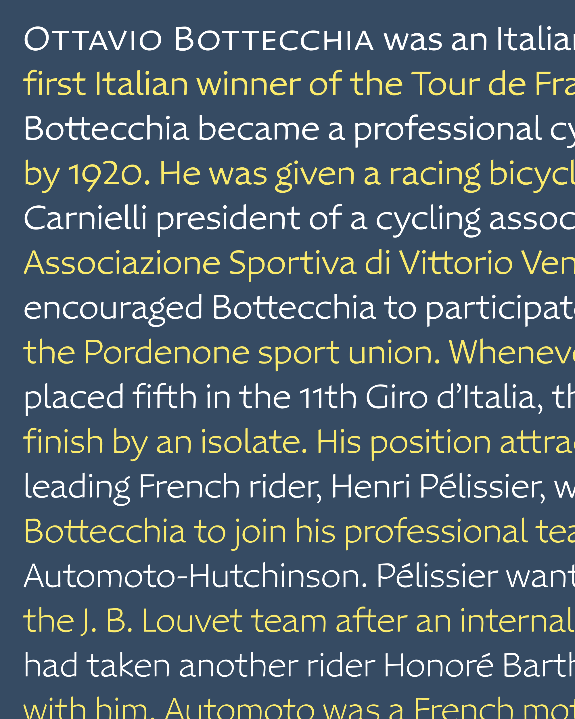
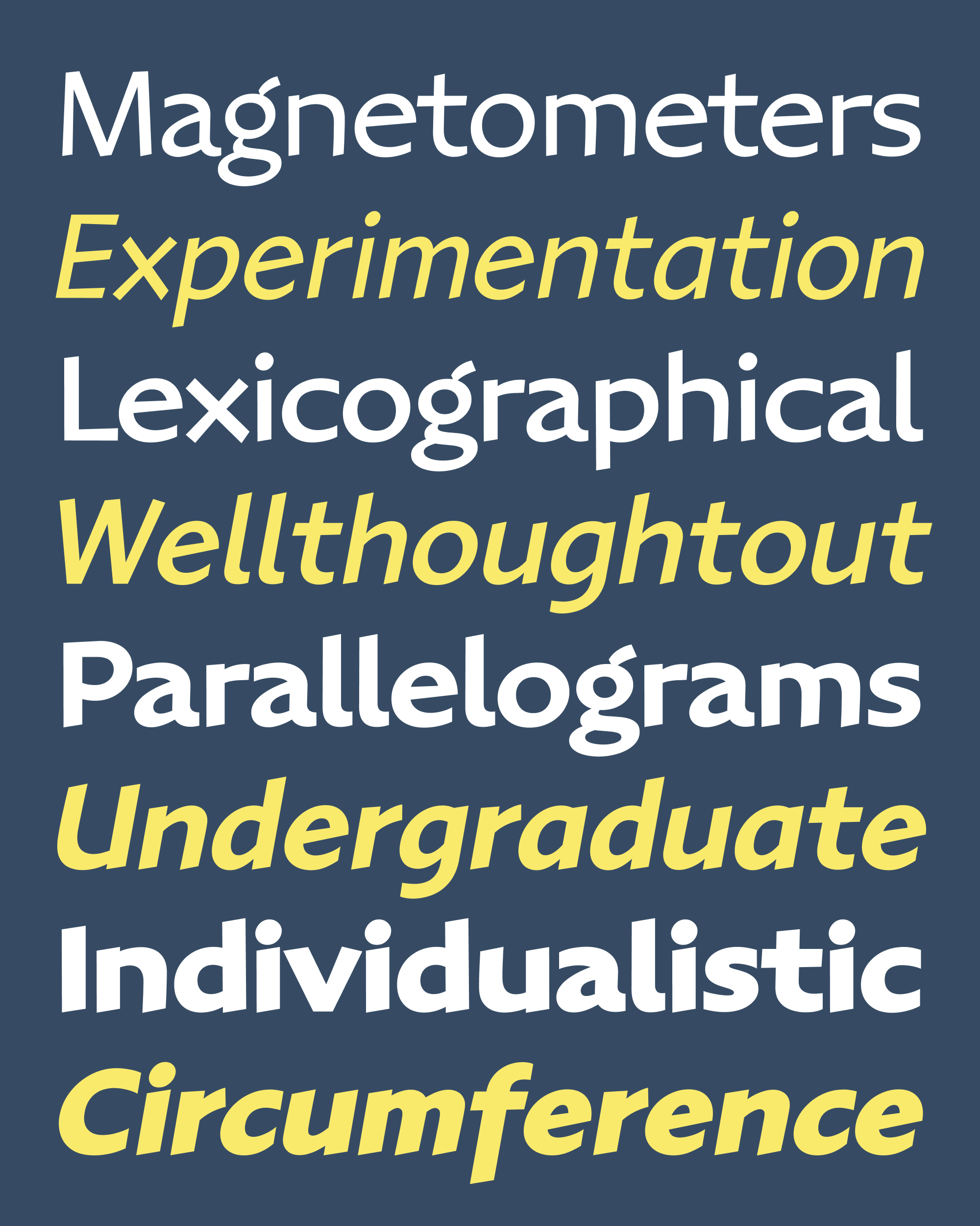
In keeping with Ellis’s love of the pre-digital era of comic books, Indoor Kid’s lowercase is a blend of the above influences, and more. It strives for a middle ground between the angular, handwritten captions of Willie Schubert and the rounder, looser style of John Workman’s oeuvre. We attempted to mitigate the small size and repetitiveness of the lowercase with a large x-height and a fair amount of dynamic asymmetry in the gestures—for example, see how triangular the counterforms of b/d/p/q get!
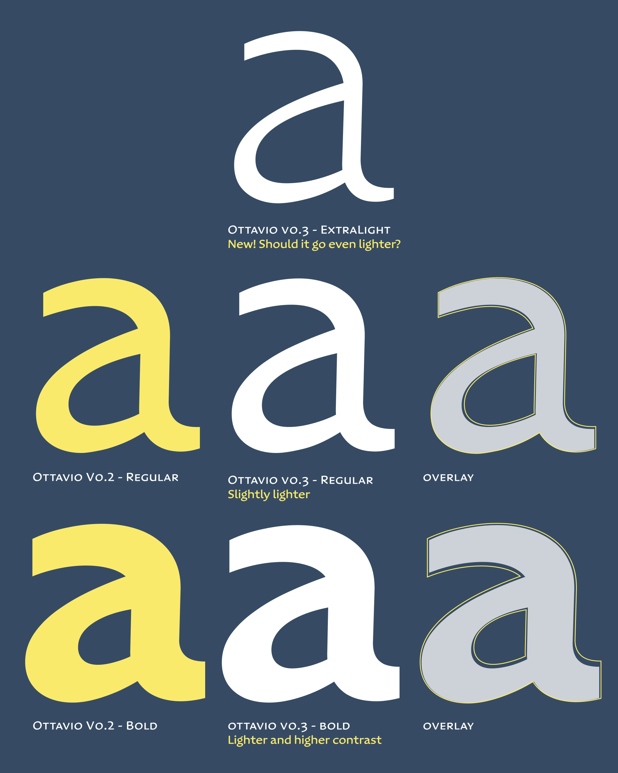
We spent a lot of time in the Bold Condensed corner of the designspace, where the smaller shapes of the lowercase tend to get a bit closed in. A physical pen would produce the same stroke thickness in both uppercase and lowercase, but after some debate we introduced some optical correction so that the counterforms in the a, e, and s didn’t alter the typographic color too much.
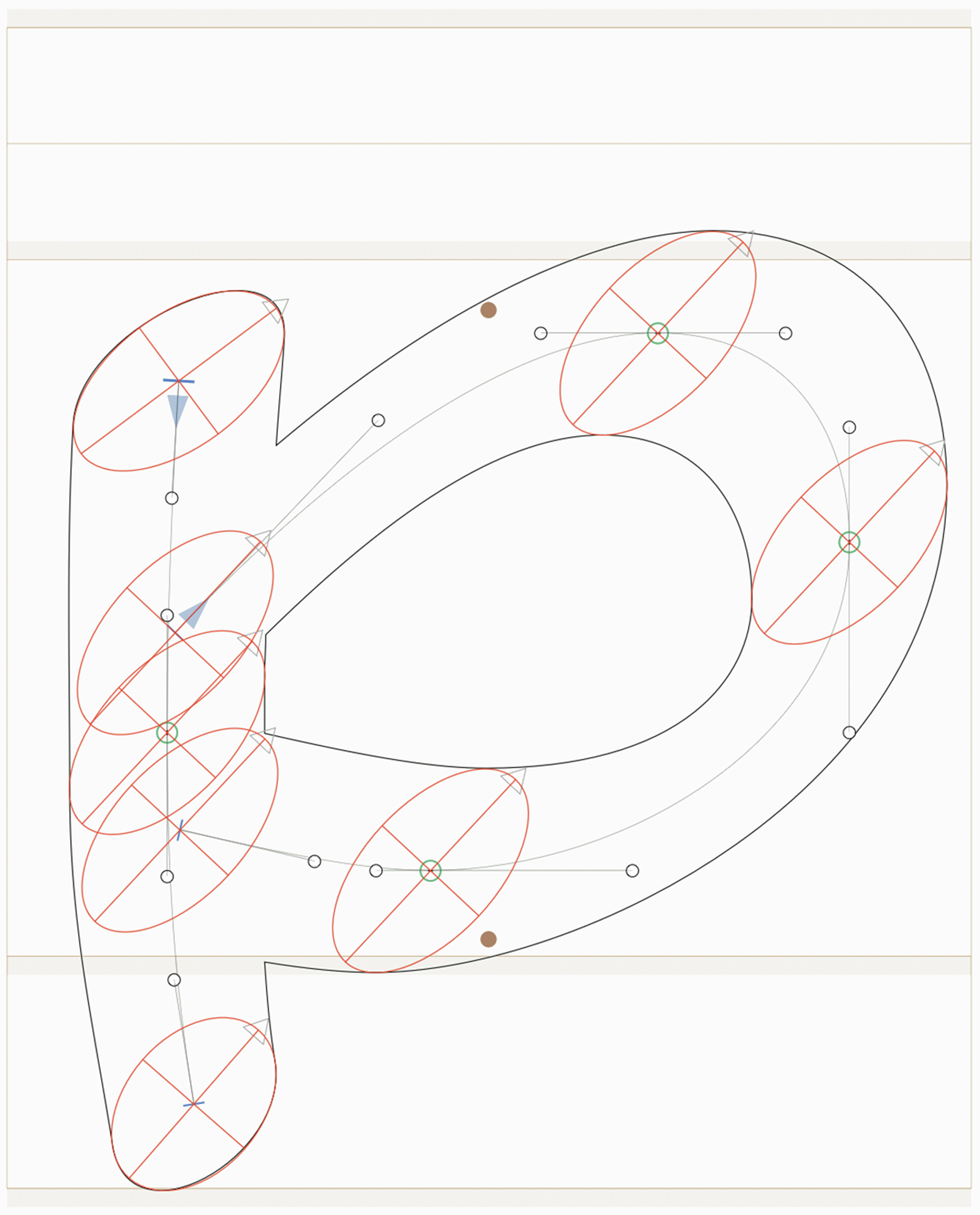
LTTR/INK attaches adjustable ovals to each point on the skeleton, allowing me to fine-tune how the thicks and thins fall around it.
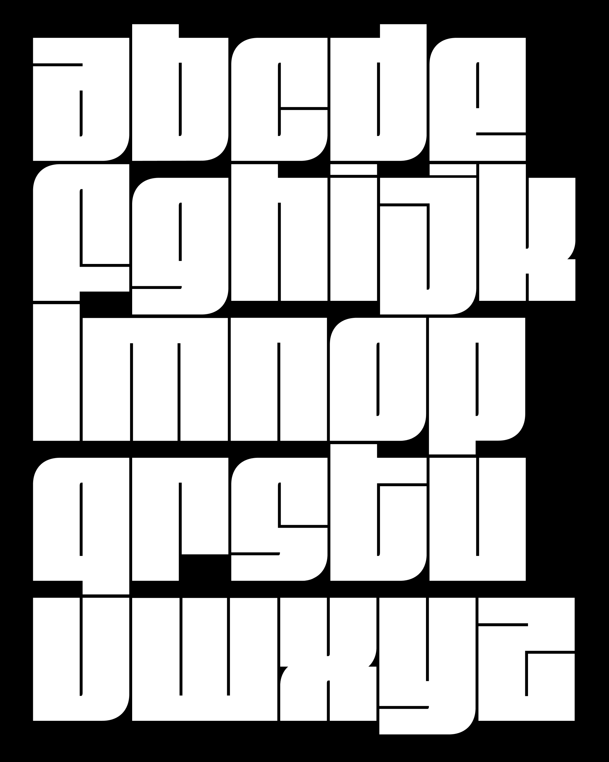
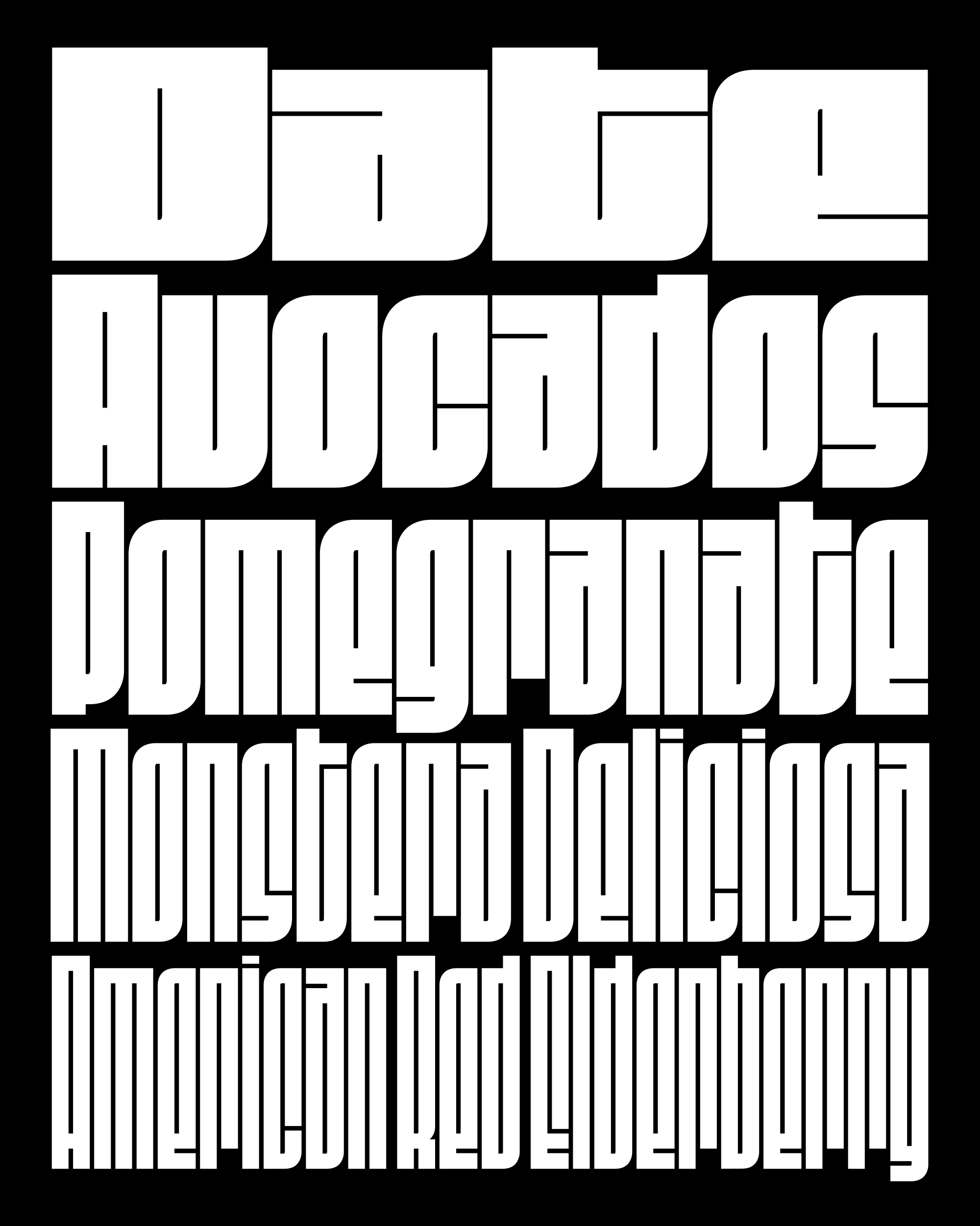
In theory a typeface is an orderly system of rules, but in the end it is really just a bunch of individual drawings that happen to look good together. With 24 sources anchoring the designspace and three variants per letter to give text a bit of bounce, I feel the entropy in this system more than in any of my other typefaces. Again I must credit the LTTR/INK tool for doing much of the work that a pen would do in the physical world, enabling me to think less about shapes and more about the skeletal structure of the letters.
The other thing that helped me was working with Ellis. Being able to lean on his judgement freed me from having to interrogate my own vision about what this typeface should be. It is a relief to only worry about what one person thinks, rather than about what everybody thinks!
There is always more kerning and cleanup to do, and Ellis really wants me to try a reverse italic next, just in case the designspace wasn’t big enough. 😜 But my hope is that Indoor Kid is on its way to a full retail release within the year!


