October’s Font of the Month: Megazoid Italic
Megazoid is not a font begging for an italic companion. It’s not some bookface that needs a secondary style. And it’s definitely not in need of added emphasis.
It’s easy to forget that Italics were not originally the sidekicks they are today. Entire books were rendered in the italic hand and typeset in italic fonts. They represented an independent way of thinking about the Latin lowercase that was separate from the Roman style and more connected to the flow of handwriting.
.jpg)
Megazoid is about the furthest thing from handwriting. It’s a typeface built up from pure geometry—squares, circles, and trapezoids. But what if I attempted to harness those same shapes, and reassemble them with an Italic mindset? It feels like it shouldn’t work, but Megazoid Italic turned out to be one of the most perversely fun italics I’ve ever worked on.
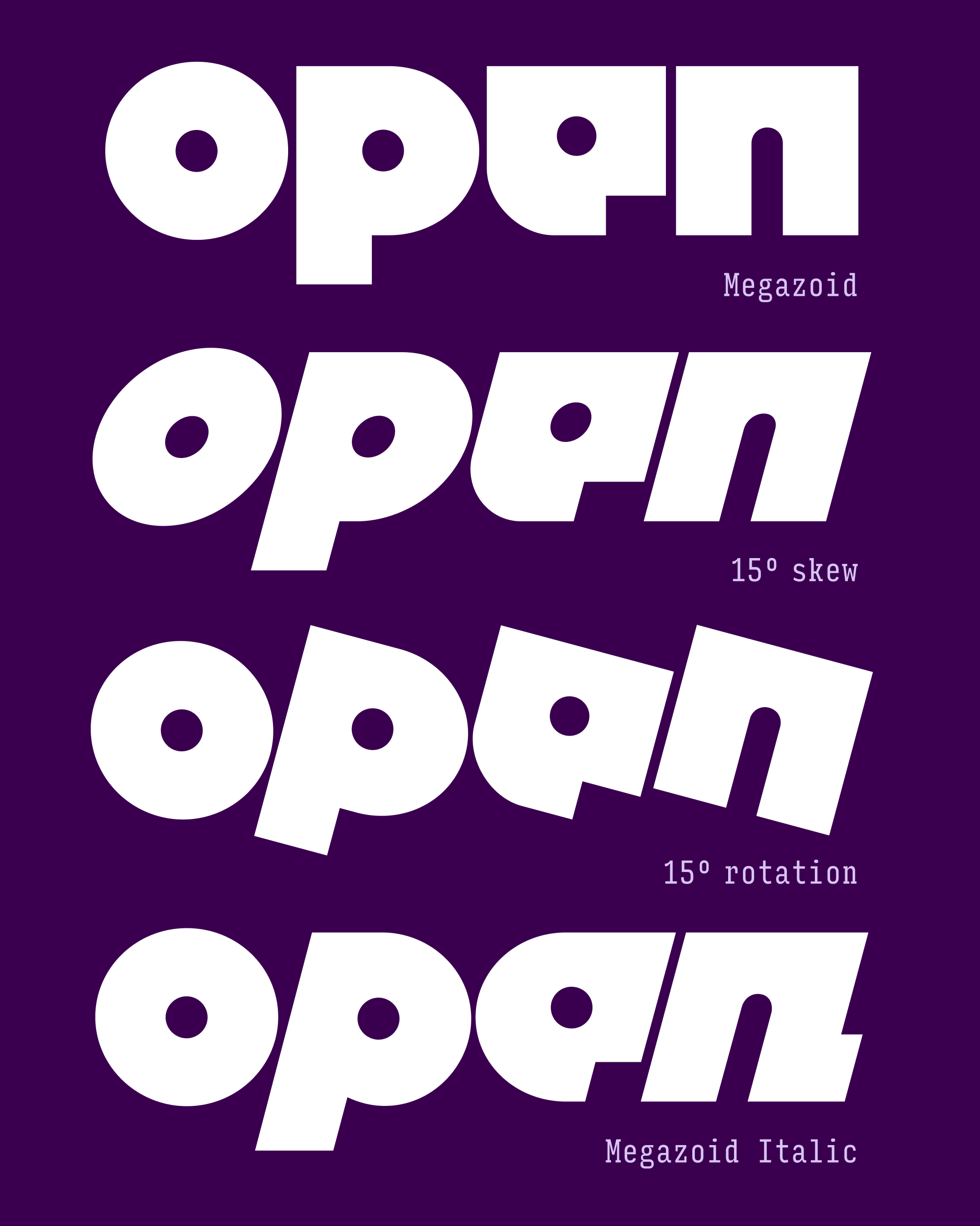
Megazoid is rooted in basic, unsophisticated geometry, so it was of paramount importance that its circles remained circular. This became my furthest foray into the exciting world of rotalics, where Italic letterforms are rotated more than they are skewed. It almost requires that you tilt your head, transforming the reading experience from 😂 to 🤣, at least when you’re reading something funny.
Even though Megazoid does not go full-on rotalic, there is evidence of the approach in letters like O/o and the circular counters, which are identical to the Roman. You can also see rotation at work more subtly in the curves inside the counterforms of letters like n and the slight curve on the bottom of p before it meets the descender.
I chose a 15° italic angle because it matches the 15° angles already present in the diagonal letters such as A/V/Y/v/y. These letters contain one slanted side and one upright side, and I found that they could work equally well in both Roman and Italic, so I left them untouched.
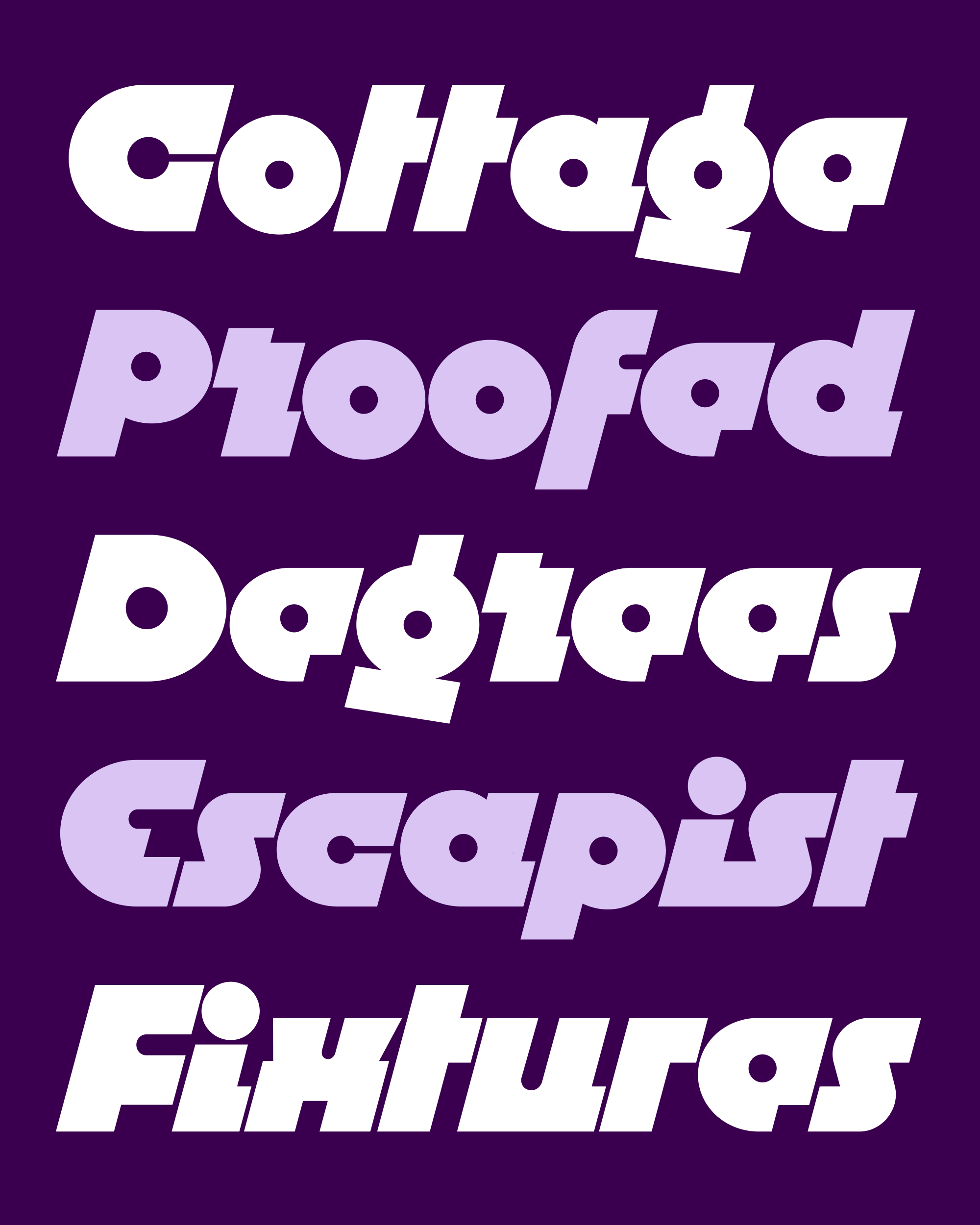
This juxtaposition of bold geometry and cursiveness has been simmering in my brain since I revived Erbar’s Lautsprescher in 2019, and it was reignited again in 2021 when I visited Cleveland, Ohio, for the first time. Aside from hosting some of the best transit logos in the country, Cleveland is where I happened to pass by Zagar Machine Tool Builders, whose distinctive logo emboldened me to draw what is probably Megazoid’s most objectionable letter, a zig-zag lowercase r. (Don’t worry, there is an alternate.)
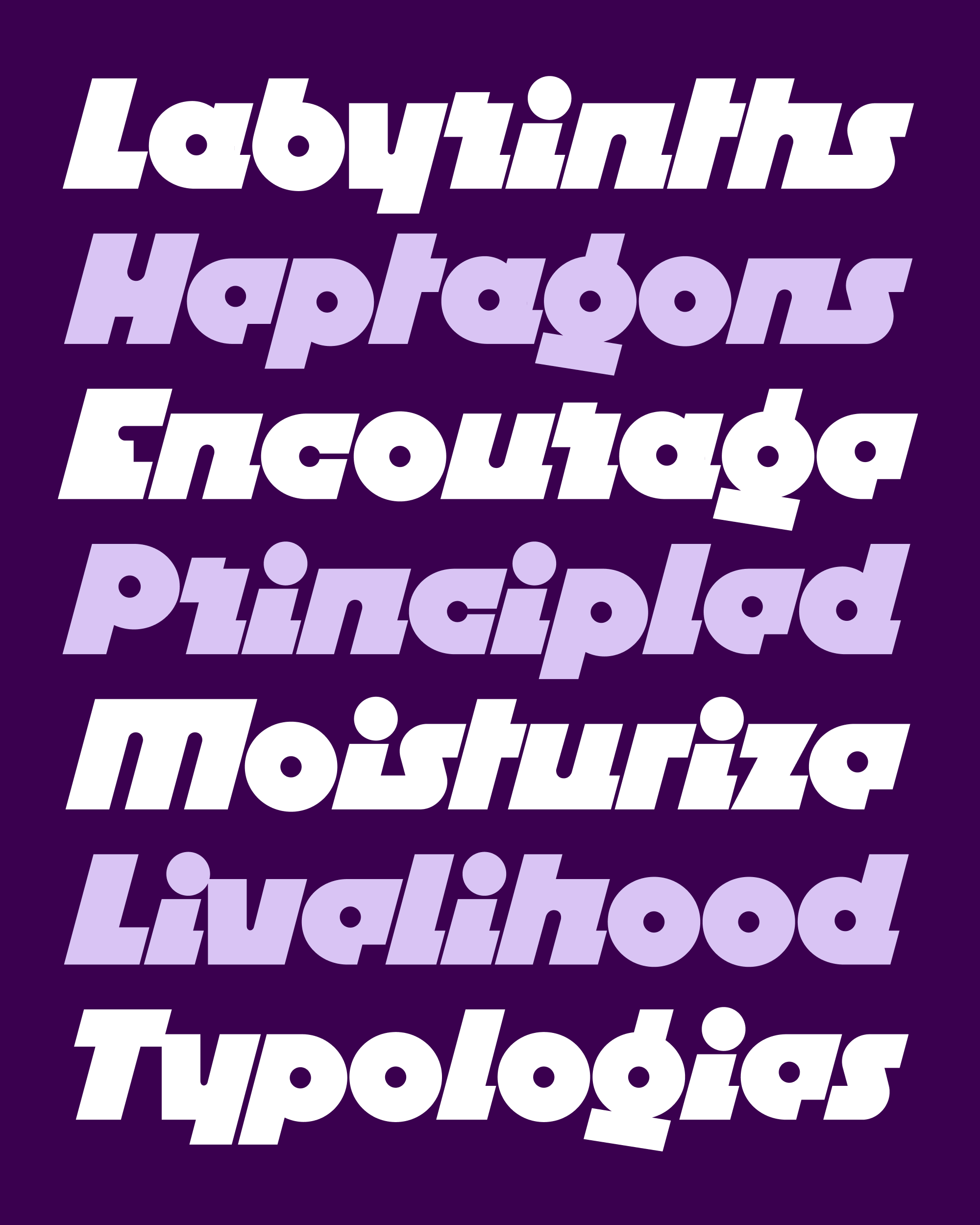
This was the same year that Ricola moved away from the geometry in their original logo, and my original vision for this typeface was more along the lines of a connecting geometric script in that style. Over time, it distilled into a kind of Minimum Viable Italicness, with common Italic call-signs like a single-story a, rounded e, and descending f, as well as little horizontal tails protruding from the right side of letters like n/m/u/w.
I might return to the idea of a connecting script for Megazoid someday, but I’m pleased at how effective these pared-down tails are at communicating a sense of cursiveness. They do disrupt the letterspacing quite a bit, and muddy the waters of Megazoid’s geometric purity. But they’re fun and weird—in the end, that’s what Megazoid is all about!