November’s Font of the Month: Pomfret Optical Sizes
I hope you don’t mind that this month’s mailing is a quick one! My wife Emily and I are celebrating the early arrival of our twins, Astrid and Hazel, who were born less than a week ago. All is well, but I thought I had more time! 😅

Small caps
This month I am sending you something else that is small—Pomfret Optical Sizes.
Longtime club members may remember Pomfret, a typeface I began in 2020 after Roger Black encouraged me to seek inspiration in the work of Bertram Goodhue.
I drew the typeface with razor-thin hairlines, which turned out to be a double-edged sword. I loved how they glimmered at the very largest of sizes, but they could be a headache-inducing liability in practically any other context.
Pomfret’s new Micro size is sturdy, wide, and slabby—a big departure from the delicate, slender serifs of the original Banner style.
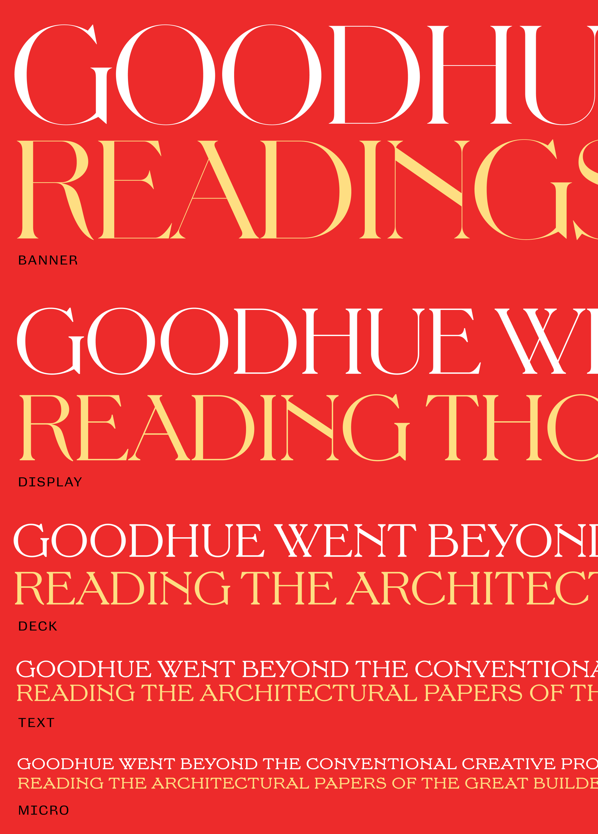
While the Micro isn’t quite as elegant as the original Banner style, it opens the door to useful interpolations between the two extremes. These can take the edge off of Pomfret’s super-high contrast and ensure that its hairlines never disappear.

These fonts are very much a work-in-progress—caps only, with a limited character set and features. But I see them as a first step towards a proper text family for Pomfret, designed for extended reading.