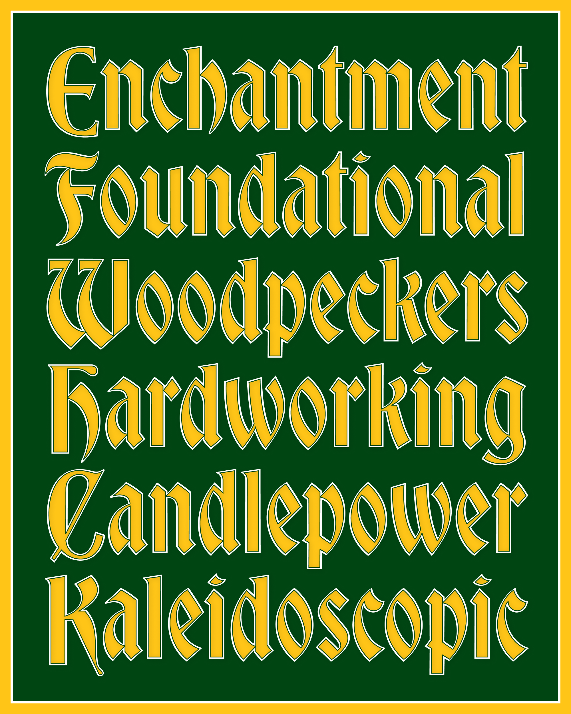
February’s Font of the Month: Buckridge
This month, I’m sending you Buckridge, a contrasted sans serif inspired by the lettering on the cover of a trigonometry textbook. I encountered this book at Nancy Dole Books & Ephemera, a lovely used bookstore in Shelburne Falls, Massachusetts—it’s actually the same shop where I encountered the boy scout manual that led me to make Merit Badge.
The book is the 1952 edition of Plane and Spherical Trigonometry published by Ginn & Co. (See also this post of Dwiggins designs from the same publisher.)
Anyway, here’s the cover:
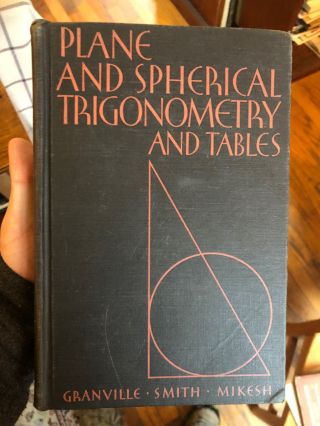
I wasn’t able to find out anything about the book’s designer (please tell me if you know anything!), but I absolutely fell in love with this cover. The lettering on a geometry textbook could have easily gone in a more geometric direction, but instead the designer chose to introduce deco-humanistic elements. They create a compelling contrast with the illustration and add so much life to the design.
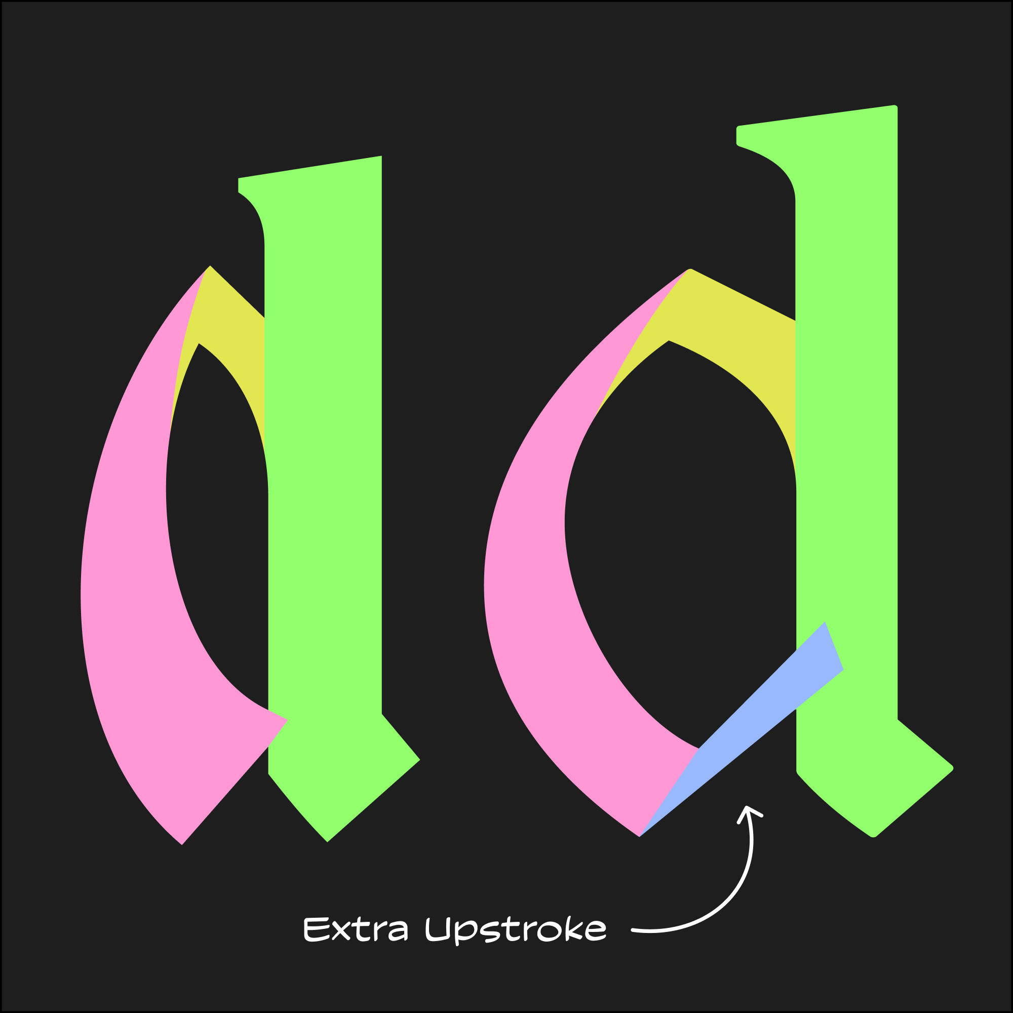
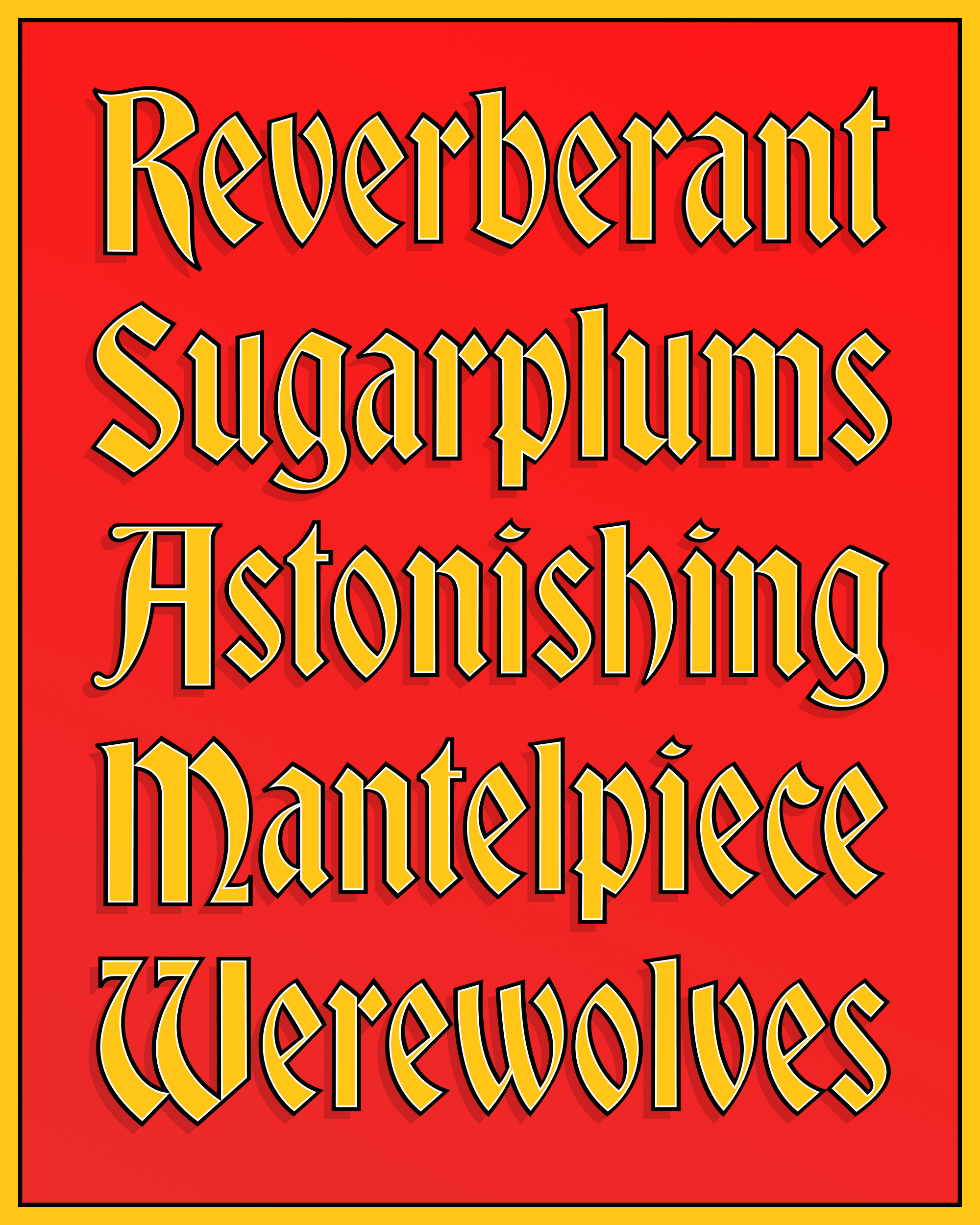
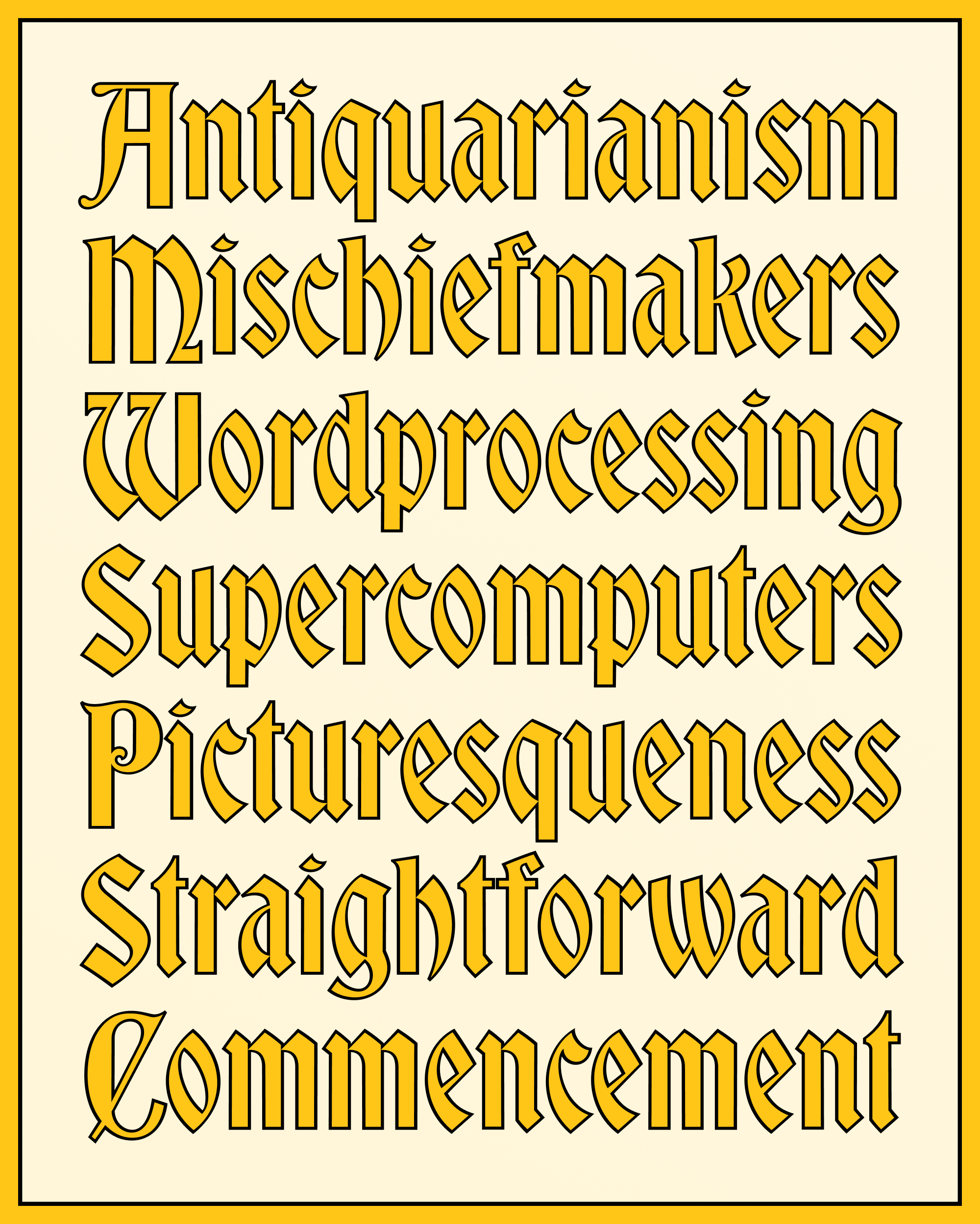
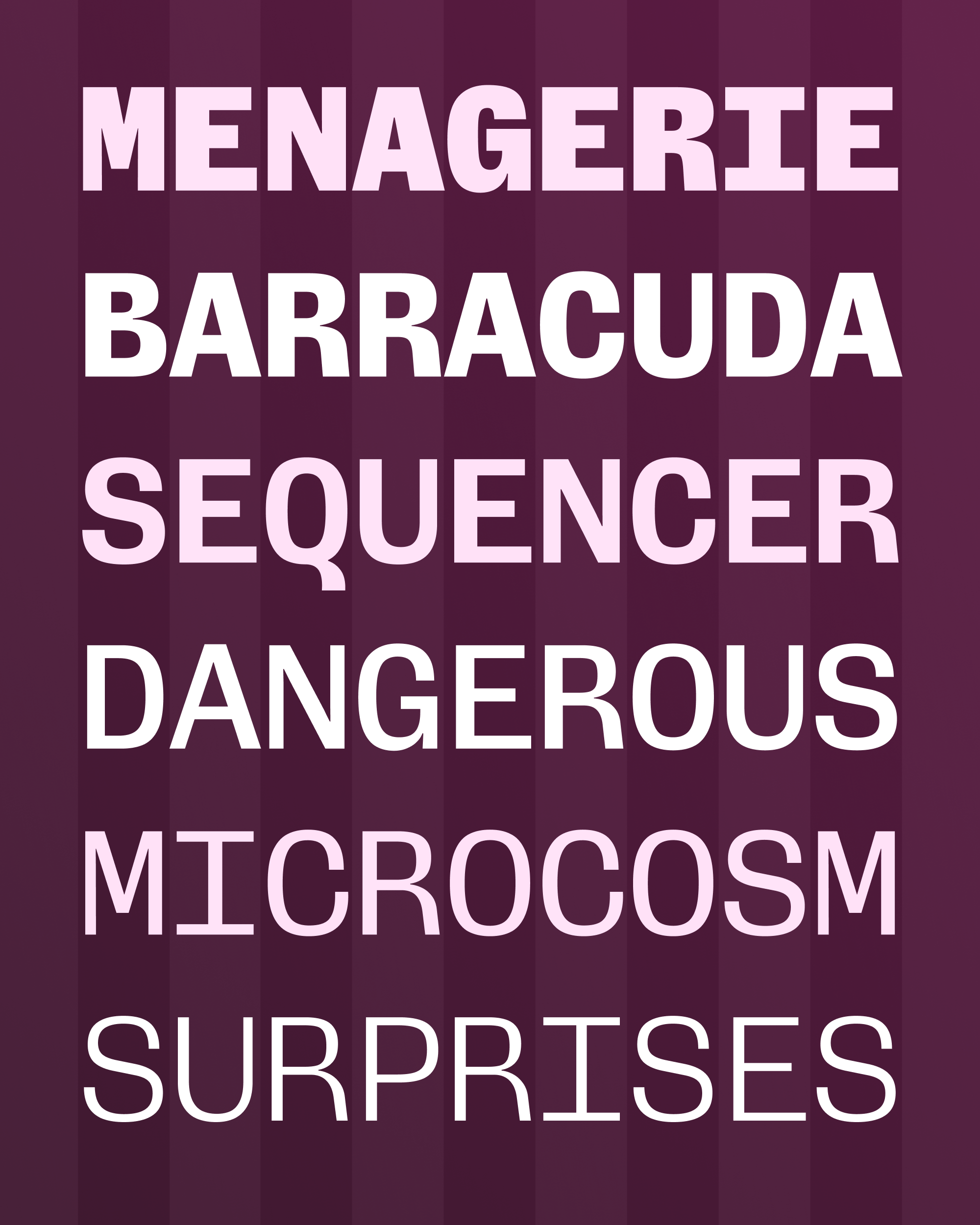
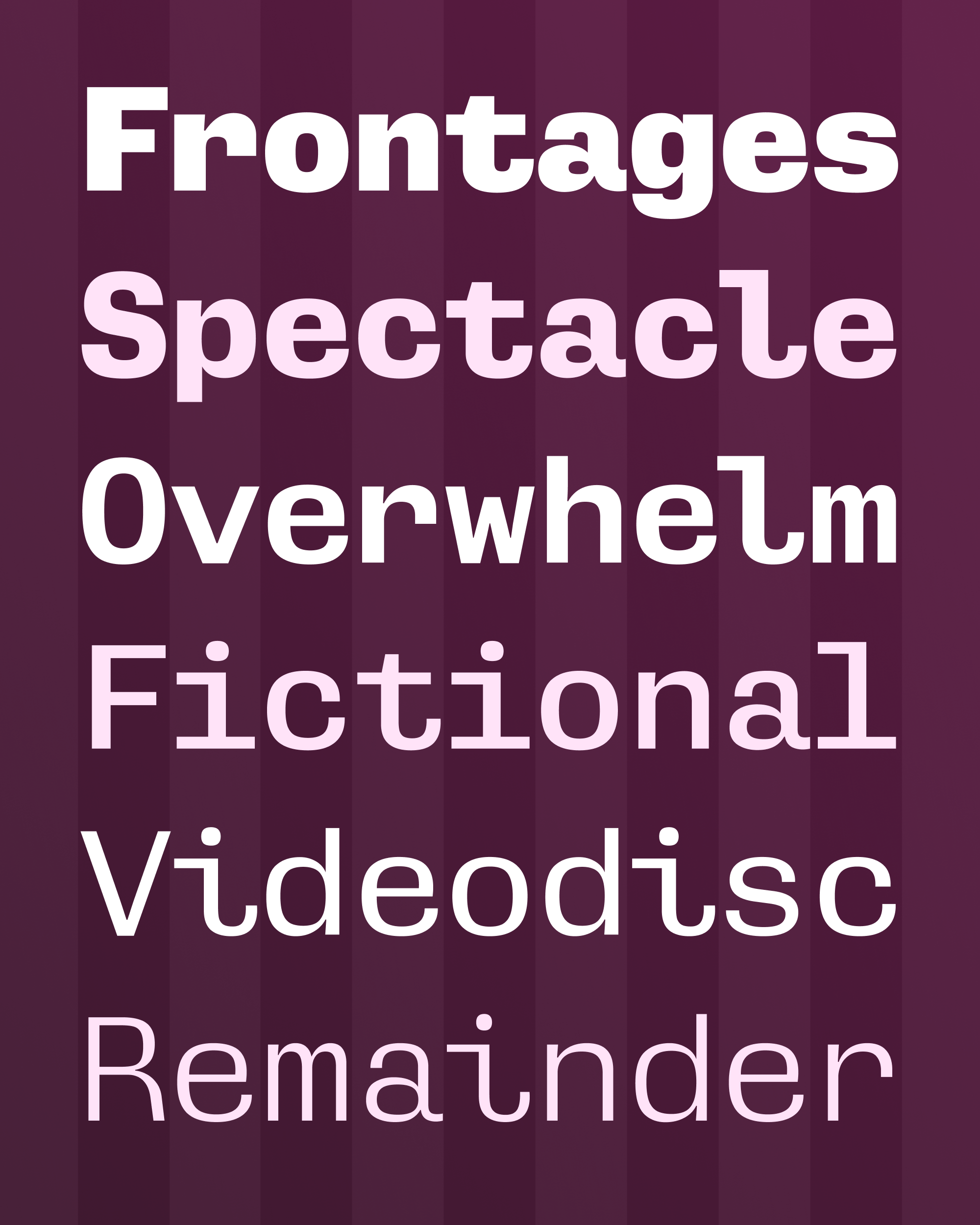
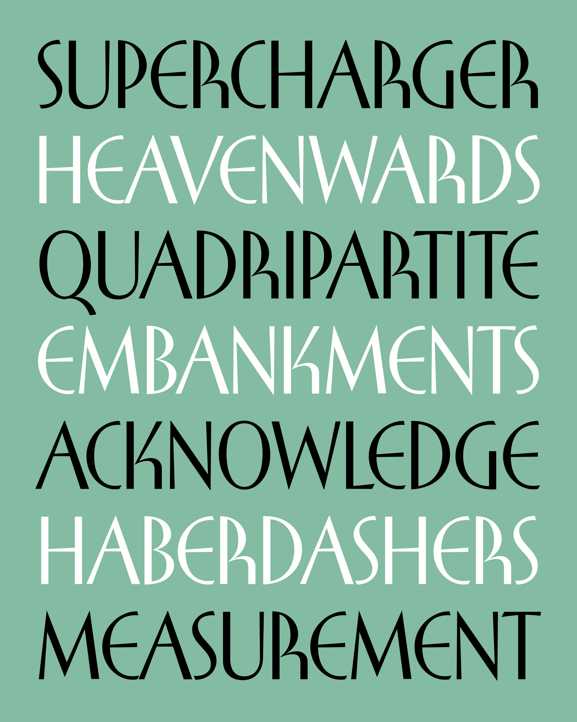
Naturally, the swooping curve of the R and the round form of the E were the first details to catch my eye. But there’s a lot of subtle forces at work here as well: the slight angle of the A in “AND”, the gentle flaring of the horizontal and diagonal strokes, and an intriguing mix of Art Deco and humanist features. Take for example how the S with diagonal stress and flared endings sits alongside a P which has none of that stuff and whose bowl is 100% vertically symmetrical. This doesn’t make any logical sense, but I can’t deny that it works!
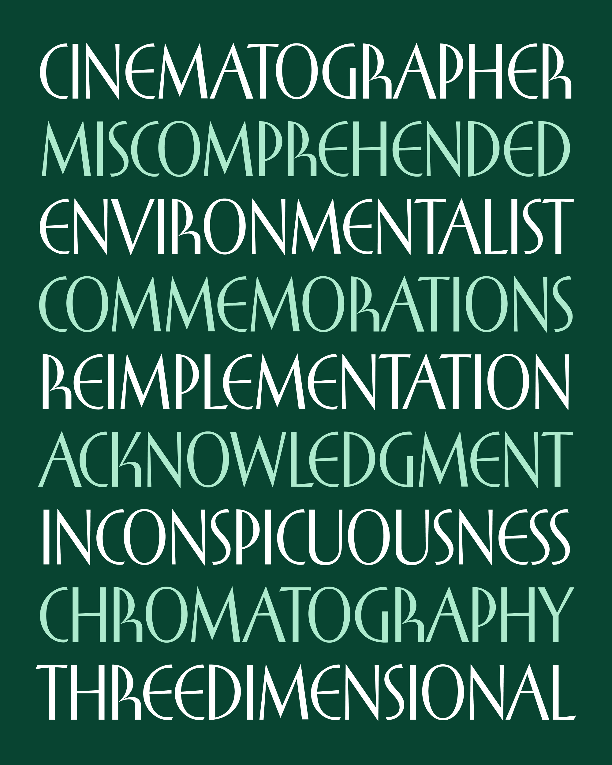
The original designer leaned towards a more conventional K (see “MIKESH”). But in my interpretation, I thought it best to embrace my favorite elements and just run with them.
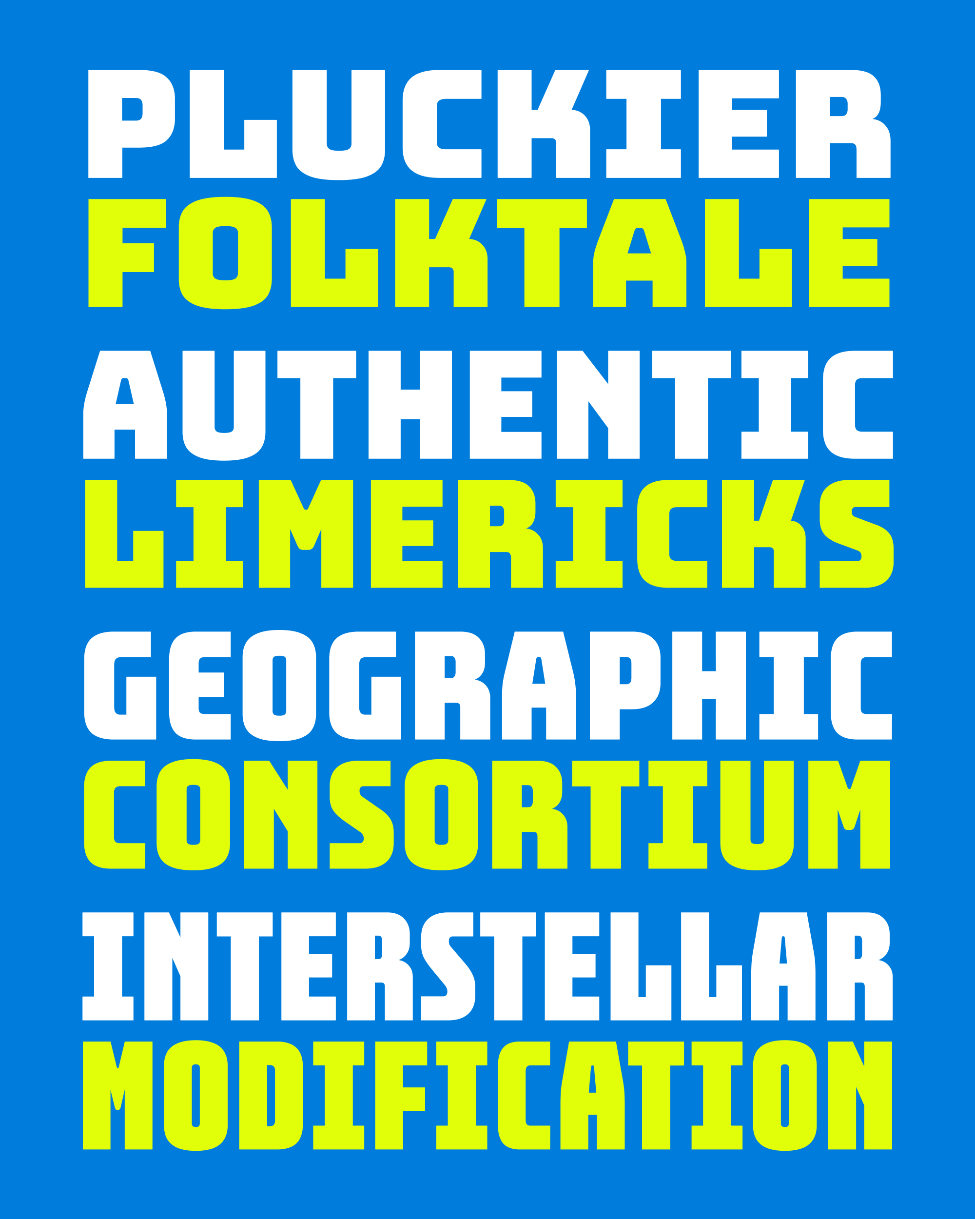
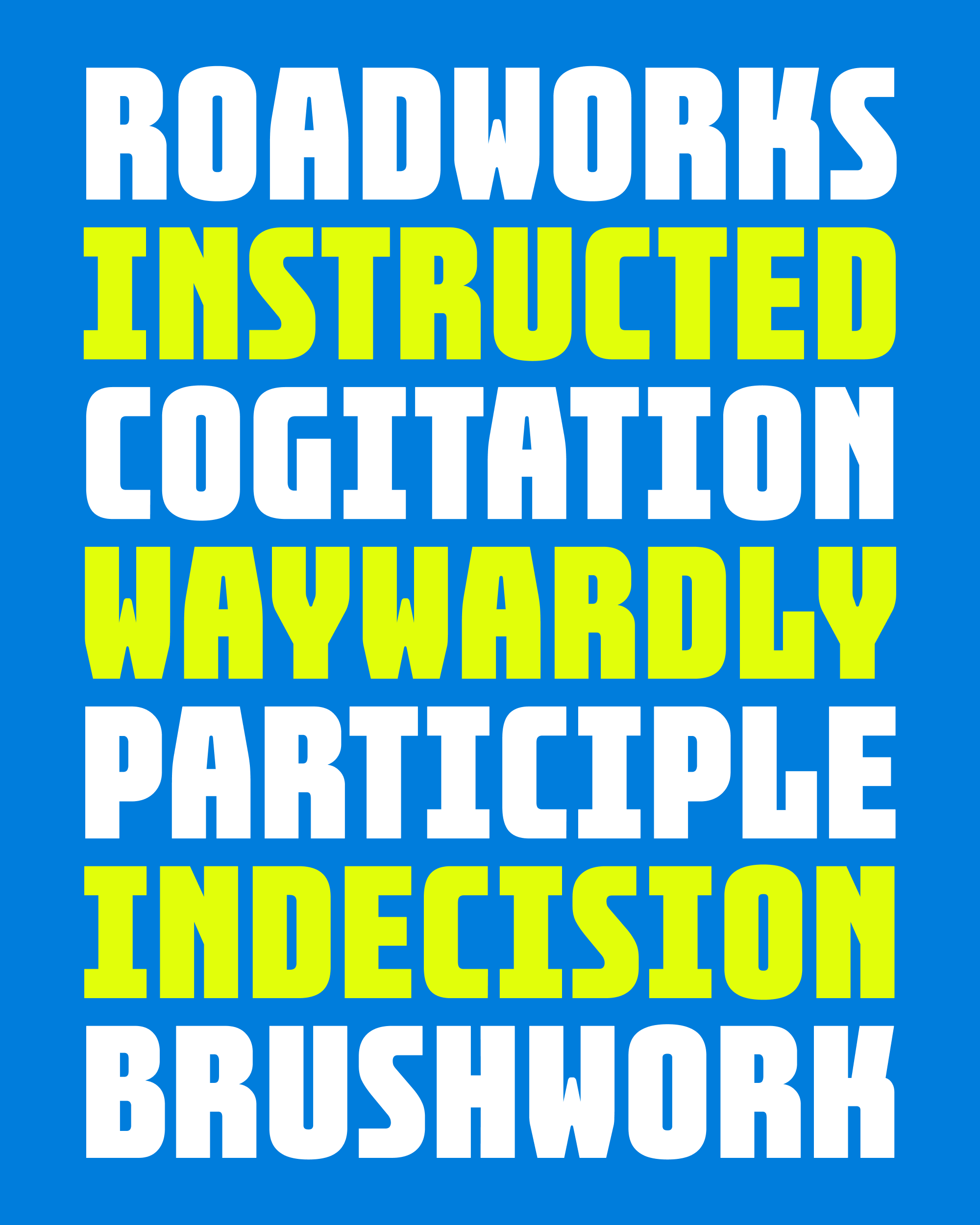
With this choice, I ran the risk of letting the R and K be a little too interesting for their own good. A typeface is always going to have more interesting letters and less interesting letters, but I try to avoid making fonts where there are a couple of letters that are SO MUCH more interesting than the rest…it’s essentially putting all of your typographical eggs into one basket. It’s great when they happen to be sprinkled evenly throughout the text, but it can be overwhelming when there are too many of them too close together. And when there are too few, it’s like eating the part of the burrito that is only rice.
After the designs of the R and K were settled, my job was to modulate the volume of the other letters so that a word without R or K doesn’t feel disappointing after a word that has them.
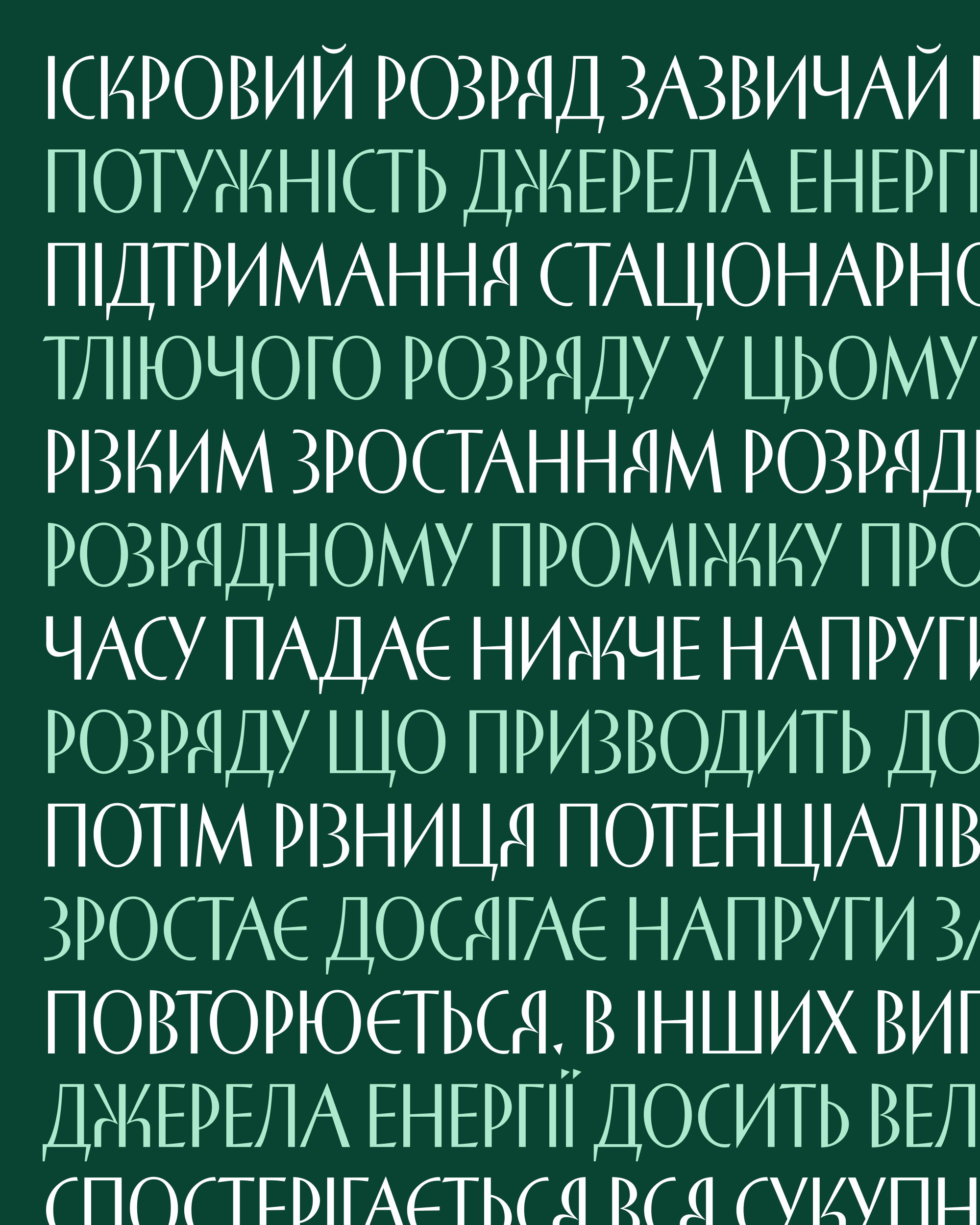
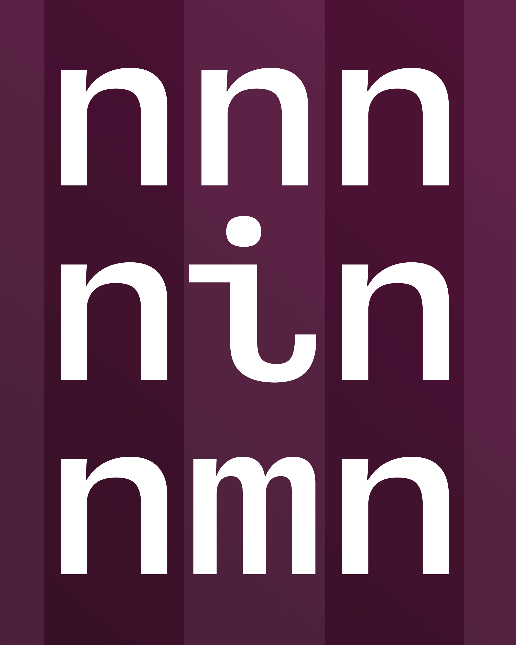
All of this talk about R and K got me interested in what this typeface would look like in Cyrillic, which has related letters such as Я and Ж. Buckridge’s Cyrillic uses a more conventional form of E to distinguish it from the Ukranian letter Є. I am grateful to Jovana Jocić (designer of Forma Cyrillic and Roslindale Cyrillic) for giving me incredibly helpful feedback on this design. You’ll also find the starting point for a Greek in there, but I just started that a couple days ago, and haven’t been able to solicit feedback from a native speaker quite yet.
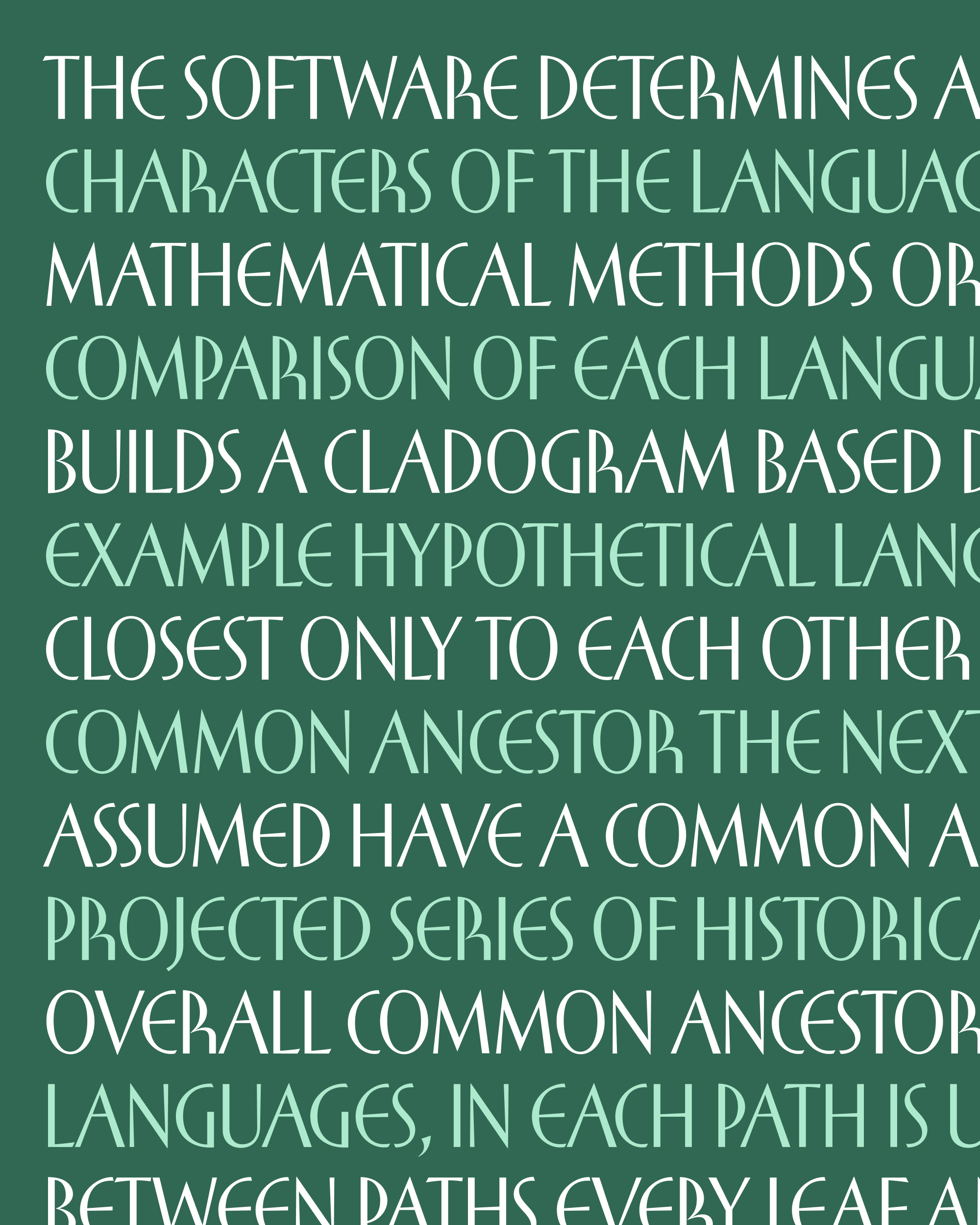
I don’t know what else to say about this typeface except that it just makes me very happy. I wanted to work from this source material because I feel that it radiates with lightness and energy, and I hope I’ve captured that in my interpretation.