June’s Font of the Month: Ottavio

Last year I was approached by Caterina Piatti with an unusual request: she wanted me to design a typeface in honor of her great-grandfather. My type families rarely have anything to do with actual families, so I was intrigued!
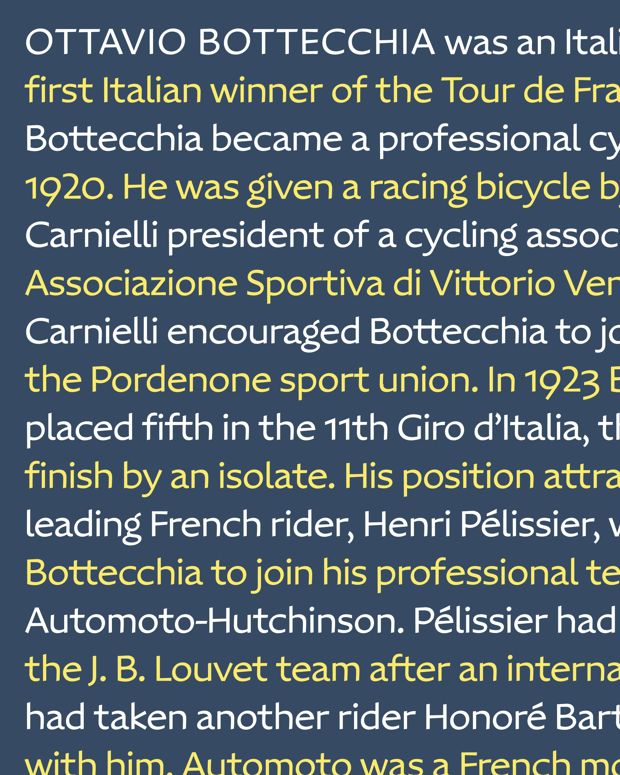
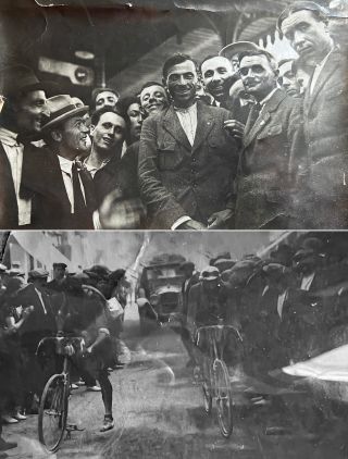
Then she told me why: in July 1924, her great-grandfather Ottavio Bottecchia won the Tour de France, the first Italian to claim the honor. He was also the first rider in the history of the Tour to win with a start-to-finish sweep, leading each stage and possessing the coveted yellow jersey throughout the race.
This month, we mark the 100th anniversary of Ottavio Bottecchia’s historic win. So, with Caterina’s blessing, I’m sending you my first draft of the typeface that came out of her one-of-a-kind prompt. We decided to simply call it Ottavio.

Ottavio Bottecchia, images courtesy of Caterina Piatti.
This design is a bit outside of my comfort zone, and that’s probably a good thing. An issue I’ve found with my font-of-the-month format is that it can lead to a very goal-oriented approach to type design (“This month, I’ve designed x, a font that does y and is based on the historical model of z.”) Lately, I’ve been missing a more meandering, exploratory design process that gives a typeface time and space to percolate and figure out what it is actually about.
Caterina and I decided early on that Ottavio should not be a period piece, referencing the signs of 1920s Europe that her great-grandfather may have sped by as he rode to victory. And even though we bonded over our admiration for the work of Aldo Novarese, we decided that our typeface should not draw from the collection of dry-transfer gems that she has at Reber R41, the foundry that she operates.
Instead, what Caterina offered was a blank slate of sorts—an opportunity to freely explore shapes that had some connection to cycling, and more abstractly, the idea that an inherently unbalanced object can achieve balance through a sense of constant motion.

Ottavio’s letterforms are wide, open, and simple. It has a looser drawing style than I’m accustomed to, with broad, sweeping gestures, a humanist thick/thin axis, and stroke endings that are clipped at inconsistent angles. Its open terminals reach out into the space of adjacent letterforms, throwing letters like a and c out of balance. Typically-narrow letters like f and t are given extra space to complete their gestures. Diagonals like x and k are almost childlike in their simplicity, creating triangular counterforms that recall the shape of a typical bicycle frame.
After his win in 1924, Ottavio Bottecchia went on to win the Tour de France again in 1925. So between now and 2025, Caterina plans to use the typeface in a series of designs that celebrate the sport and the centennial of her great-grandfather’s contribution to it. Meanwhile, I hope to see the design continue to evolve as I push it into lighter and heavier weights. And I’m happy to incorporate your feedback too, if you have the occasion to try it out on something!
