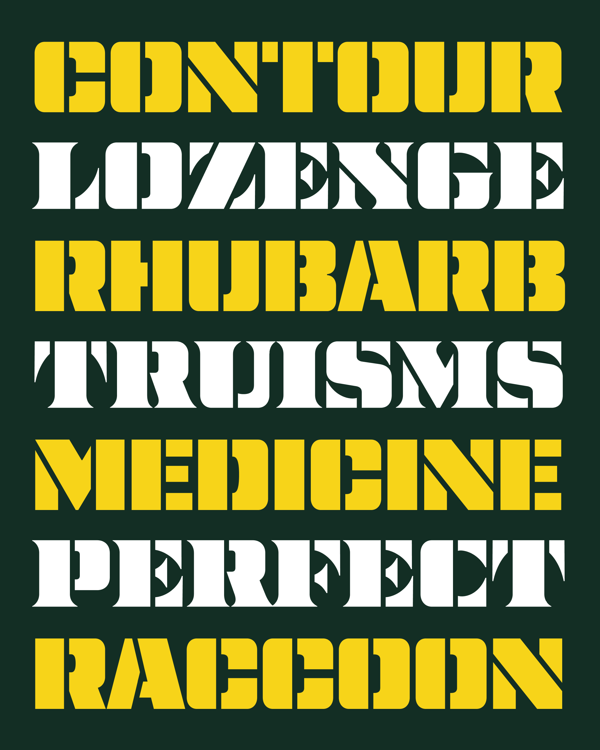
May’s Font of the Month: Nickel Stencils
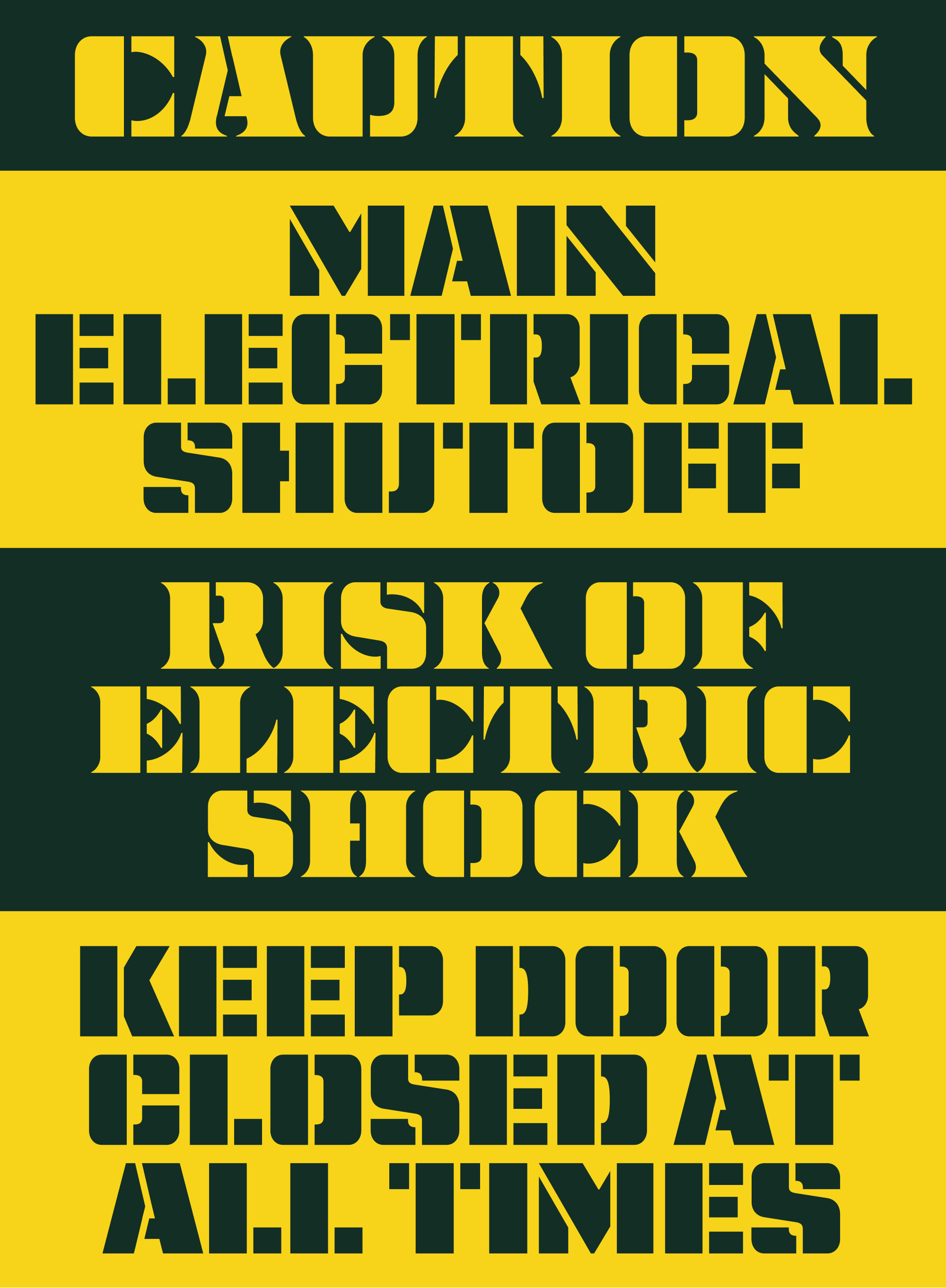
For several years, my wife Emily worked in a makerspace—a creative lab complete with 3D printers, a laser cutter, woodworking tools, etc. (She even fabricated our trail signs there, typeset in Zenith DJR.) During that time, she visited and toured a lot of makerspaces in the area, and sometimes I would tag along.
I still think about a workshop I visited where the instructor was laser cutting a text-based design into wood. He was disappointed to see the counterforms in his text getting obliterated in the process. Rather than choose a different font, he went back into Illustrator and manually created several dozen “bridges” that connected the counterforms to the rest of the negative space…what a pain!
That gave me new appreciation for the humble stencil font, which it turns out is just as practical and relevant in our digital world as it was a hundred years ago. So this month I’m sending you stencil cuts of Nickel and its sans serif counterpart Nickel Gothic, two fonts with rigidity and heft that lend themselves quite well to this treatment.
Since 95% of my work on this was subtractive, it was the perfect project for a hectic month. And I gotta say, it was also strangely therapeutic to take a thing I made in the past and spend a few weeks slicing and dicing it with a (digital) knife.
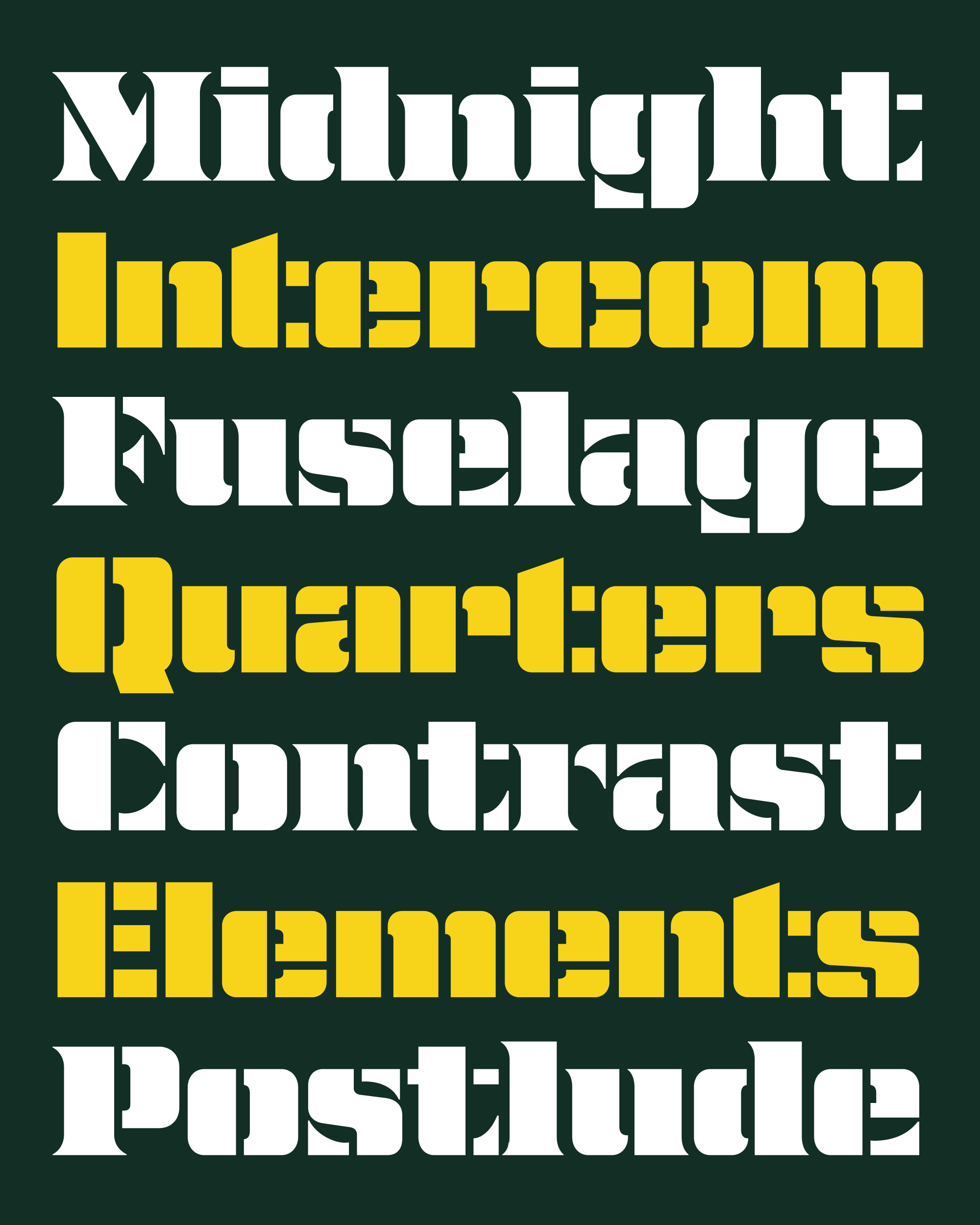
Stencil fonts offer an opportunity to play with the fuzzy line that separates shapes that register in our brains as letterforms and shapes that simply register as shapes. Making a stencil font nearly always involves breaking up letterforms into smaller pieces, but what is truly interesting about them is how that breaking apart gets done.
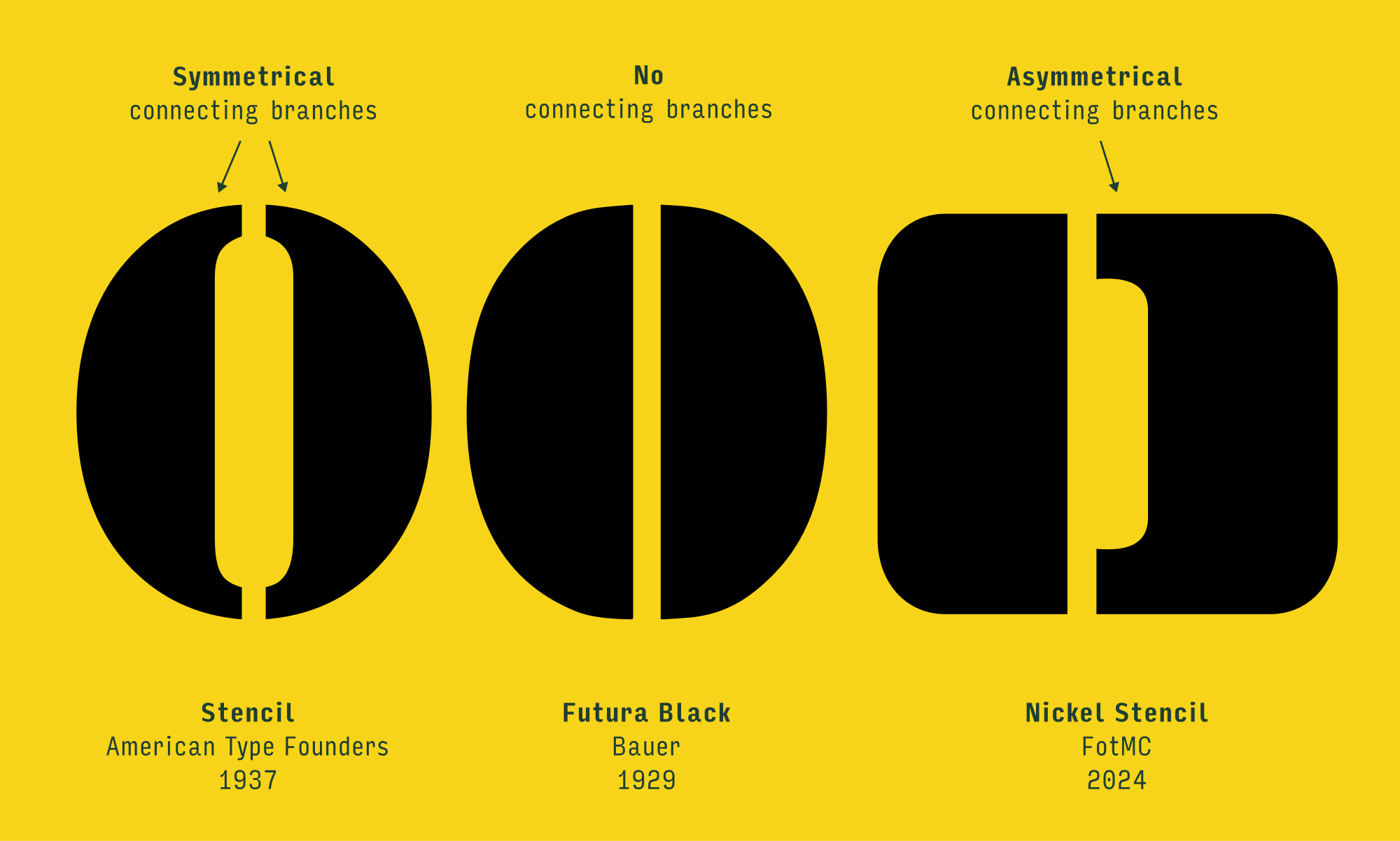
Some stencil fonts, such as ATF’s classic Stencil typeface, keep the larger letterform more or less intact, with small bridges that only briefly interrupt the connection from one side to the other. Others like Futura Black (or more recently Tick/Tock, Joschmi, and Joost Stencil) take a more Bauhausian approach and bring the letter’s constituent parts to the forefront, reducing and abstracting them to the point where it becomes a visual game to see the forest through the trees.
I tried to land Nickel’s stencil cuts somewhere in the middle, between the figurative and the abstract. It was an easy choice to make Nickel’s bridges predominantly vertical, since they follow the vertical axis of thicks and thins in the typeface. But it took some time to figure out what to do with their horizontal placement, and I’m pretty happy with the result.
Take the letter O for example. Most stencil fonts will slice their O right in the center to preserve its symmetry—in the case of ATF’s Stencil, this creates a connecting branch on both sides, and in the case of Futura Black, it eliminates the connecting branches entirely.
By shifting the bridge of Nickel Stencil’s O to the left, I end up with a lefthand shape that feels more abstracted, like Futura Black, and a righthand shape that feels more like a slice of a conventional letterform, like ATF’s Stencil. I made similar choices throughout both sans and serif versions of Nickel, shifting the bridges opportunistically to the left or right in order to achieve a mixture of figurative and abstract shapes.
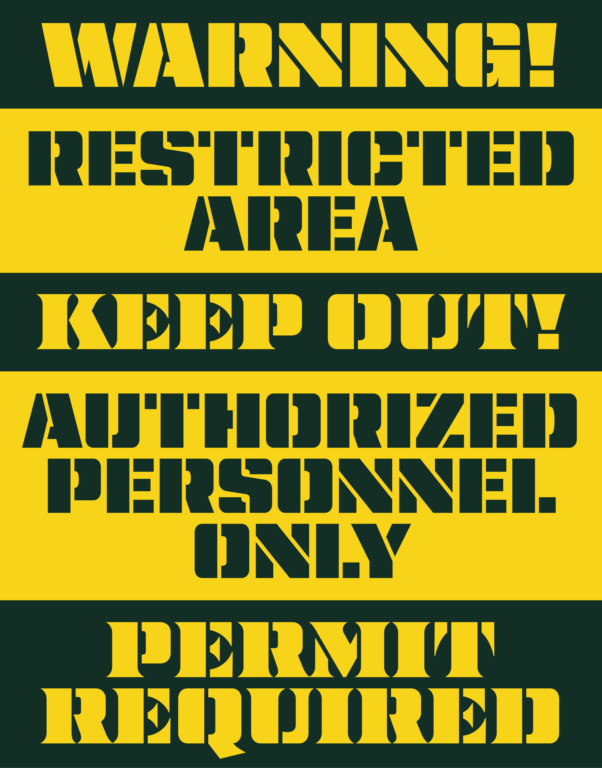
I added bridges to pretty much every letter aside from single-column letters like I, l, i, and sometimes j, including letters that don’t have enclosed counterforms and technically don’t need bridges at all. In the physical world, a lot of these decisions come down to what material the stencil is made out of…in a metal or wood stencil, the open counterforms of E would probably be fine without bridges, but in a cardboard or paper stencil they would be far too flimsy and prone to breaking off. And in the digital world, these extra bridges help to unite all the letters with a common motif.
I spent a lot of time worrying about the spaces within letters, but not as much time worrying about the spaces between them. Especially in the serif, many letter combinations involving diagonals like KY or AA will touch. I originally devised a system of alternates that would simulate bridges between touching letters, but they impeded legibility and I found them to be too distracting for something that would only be useful in certain cases. So if you are making a physical stencil with a flimsy material, just add a little tracking! 😆
Whether you use them in a digital design, on a fancy laser cutter, or just with some cardboard and an x-acto knife, I hope that this sans/serif pair gives you an excuse to incorporate more stencils into your design practice. I’d be very curious to hear if you think it’s worth expanding this to Nickel Gothic’s wide and compressed widths, or if there are other fonts/styles out there that you’d like to see stencilified. Wishing you a wonderful month!
