September’s Font of the Month: Job French Clarendon

The horizontal-stress slab serif was my entry point into type design, and I can’t seem to stop myself from going back to this particular well every year or two. It’s not a bestselling genre, but for me it perfectly embodies the central struggle of type design: balancing the needs of each character with the needs of the typeface as a whole.
Every letter needs to look a certain way in order to be legible, while the typeface needs the shapes arranged a certain way to act as a cohesive system. Nowhere is this struggle more evident than in the French Clarendons of the 19th century, where letters are distorted, warped, and smeared in order to satisfy the unique distribution of weight imposed by the system, as if they were flattened by a steamroller. As Bethany Heck puts it, “The goal of these designs was to create more boldness in the typeface without sacrificing horizontal space.”
While we were working on Job Clarendon, Bethany would occasionally send me scans of French Clarendons from her extensive research into nineteenth century wood types. She encouraged me to think about a horizontal-stress slab that could serve as a kind of B-side for Job Clarendon. This month, I am sending Job French Clarendon, a celebration of the bracketed horizontal stress slab serifs from the heyday of letterpress printing.
As with Job Clarendon, my goal was to capture the charming variety of shapes in these nineteenth century designs without reinventing or reimagining them. Essentially, I’m trying to draw the letterforms as I imagine the original designers might have drawn them if they had used a laptop with some font software installed. This involved modernizing details that were byproducts of the wood type production process, such as the lack of overshoots, kerning, and other typographic niceties. I also chose to make the uppercase serifs thicker than the lowercase so that they are closer in density.
Many of the early French Clarendons were beefy and low-contrast, but Bethany and I found ourselves really appreciating some of the examples that we found at the tail end of the wood type era, around the turn of the 20th century. They were sharper, more consistent, and more refined, with big bracketed serifs. We thought they could be an excellent jumping off point for a contemporary French Clarendon type system.
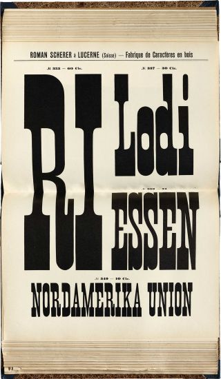
Wood type from Roman Scherer, ca. 1910. Courtesy of Letterform Archive.
(Also, for your browsing pleasure, Letterform Archive has a full scan of an earlier Roman Scherer specimen)
What I’ve included today is a modest range of widths for you to play with, ranging from a Condensed (roughly comparable to the example above) all the way down to a Skyline that really crams things together.
Bethany and I hope that this is just the start of an “anthology” series like Job Clarendon, one that traverses a range of widths and weights, pulling from disparate historical sources from across the genre and unifying them into a cohesive family. Job French Clarendon will never be as versatile as its A-side companion, but that just makes it all the more striking when judiciously deployed at the largest possible size.