August’s Font of the Month: Glyptic DJR
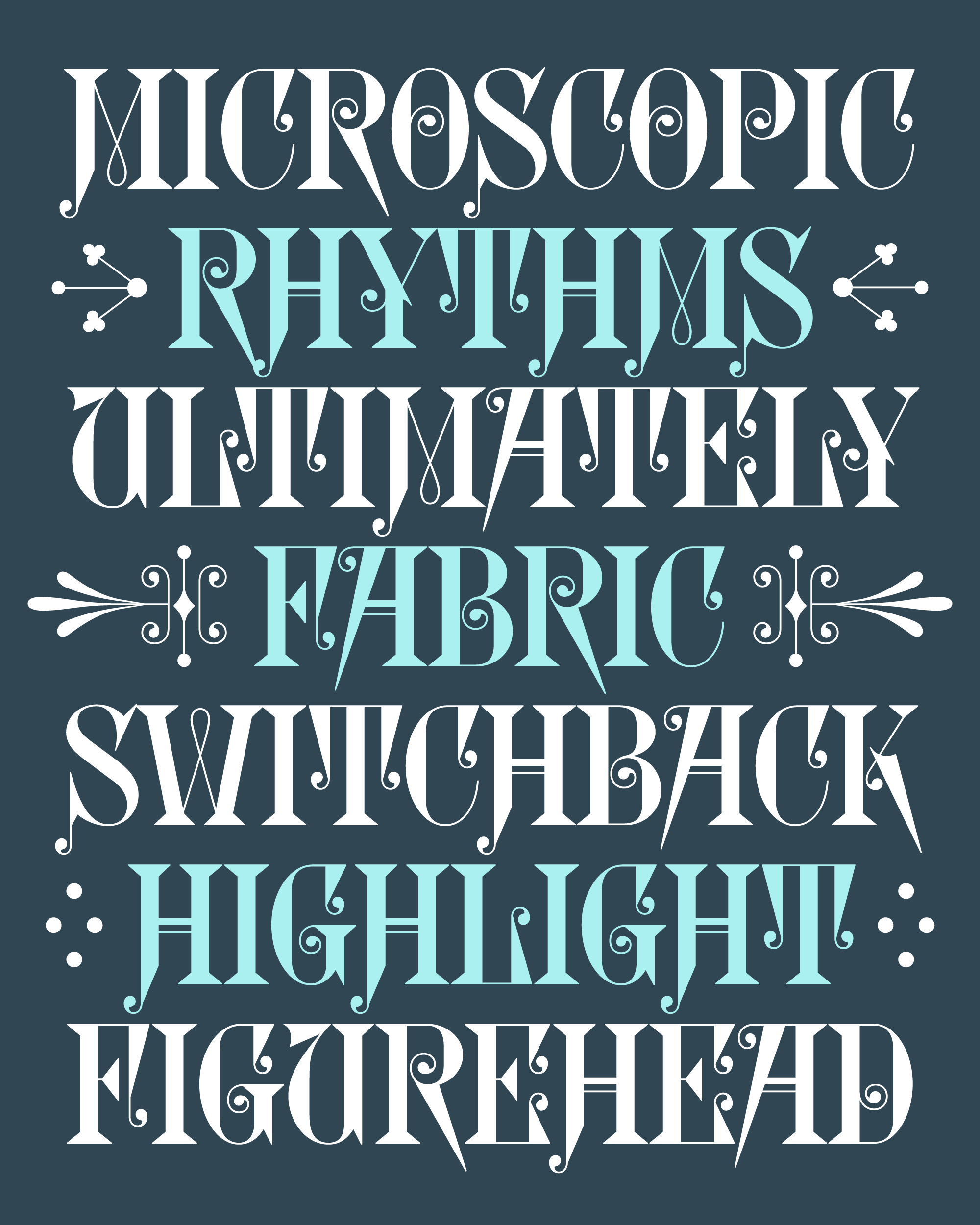
When I look at a Victorian type specimen book, I feel like time flattens out. I’ll catch the 1880 vibes, for sure, but also whiffs of 1970 and 2022. I’ll see frilly fonts on one page that feel hopelessly antiquated, relics of a bygone era. Next to them, I’ll see fonts that feel strikingly contemporary, virtually indistinguishable from what’s popular today. It’s funny to see them coexist, and it reminds me of how limited my definition of “contemporary” can be.
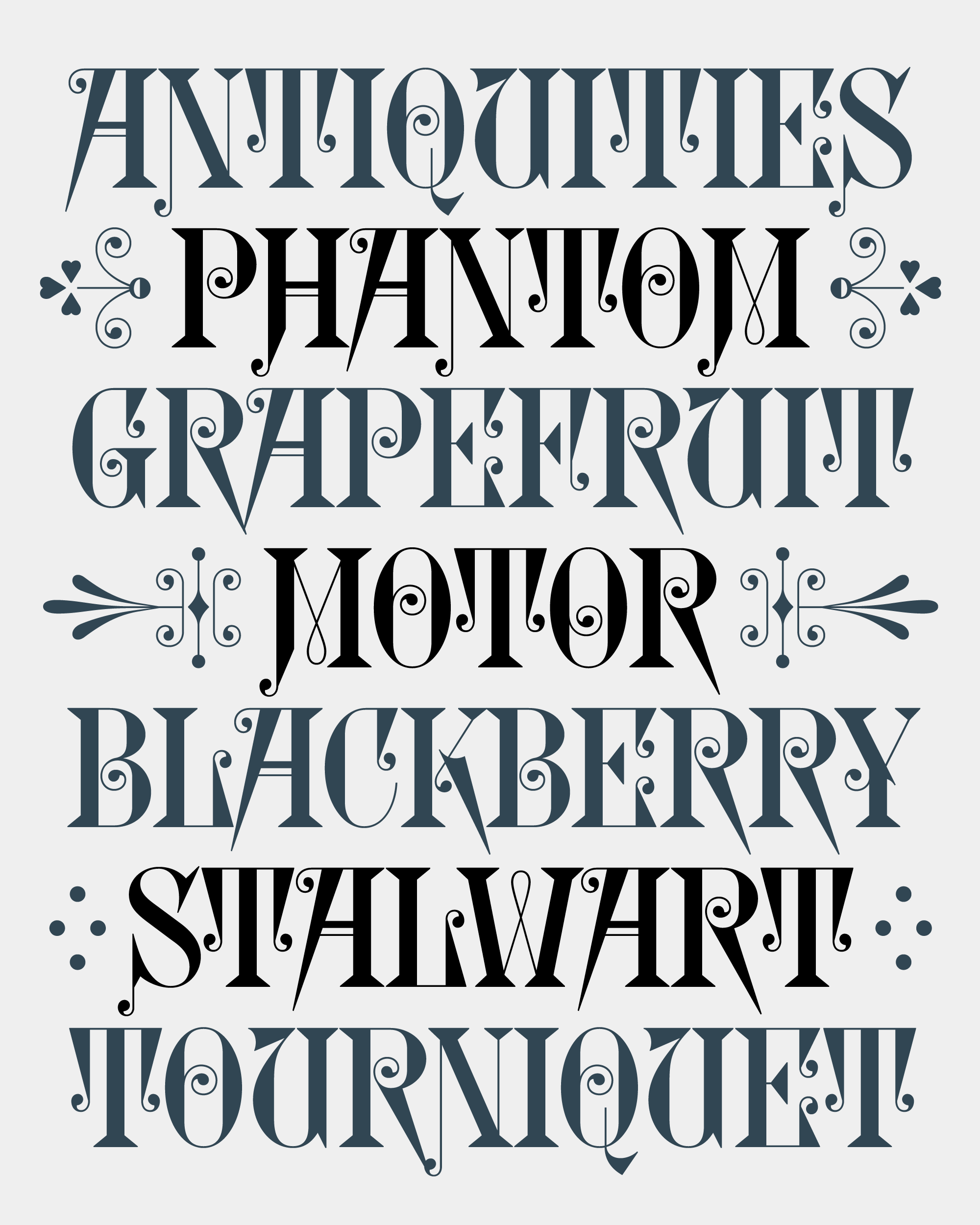
Glyptic is one of those frilly fonts that, at first glance, feels hopelessly antiquated. But underneath its Victorian veneer, it contains fascinating choices that I would never make as a type designer, and I wanted to digitize it if for no other reason than to understand what the heck is going on. So this month I’m sending you my revival: Glyptic DJR.
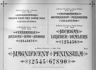
Glyptic, as shown in the 1889 Franklin Type Foundry Specimen
Glyptic is an ornamented Latin serif designed in 1878 by Herman Ihlenburg and issued by the Philadelphia type foundry Mackellar, Smiths and Jordan. Longtime club members will recognize Ihlenburg’s name, as I’m a repeat-reviver of his work: Bradley DJR is a revival of his interpretation of Will H. Bradley’s lettering, and Crayonette DJR is based on a typeface that was in turn inspired by Ihlenberg’s Crayon.
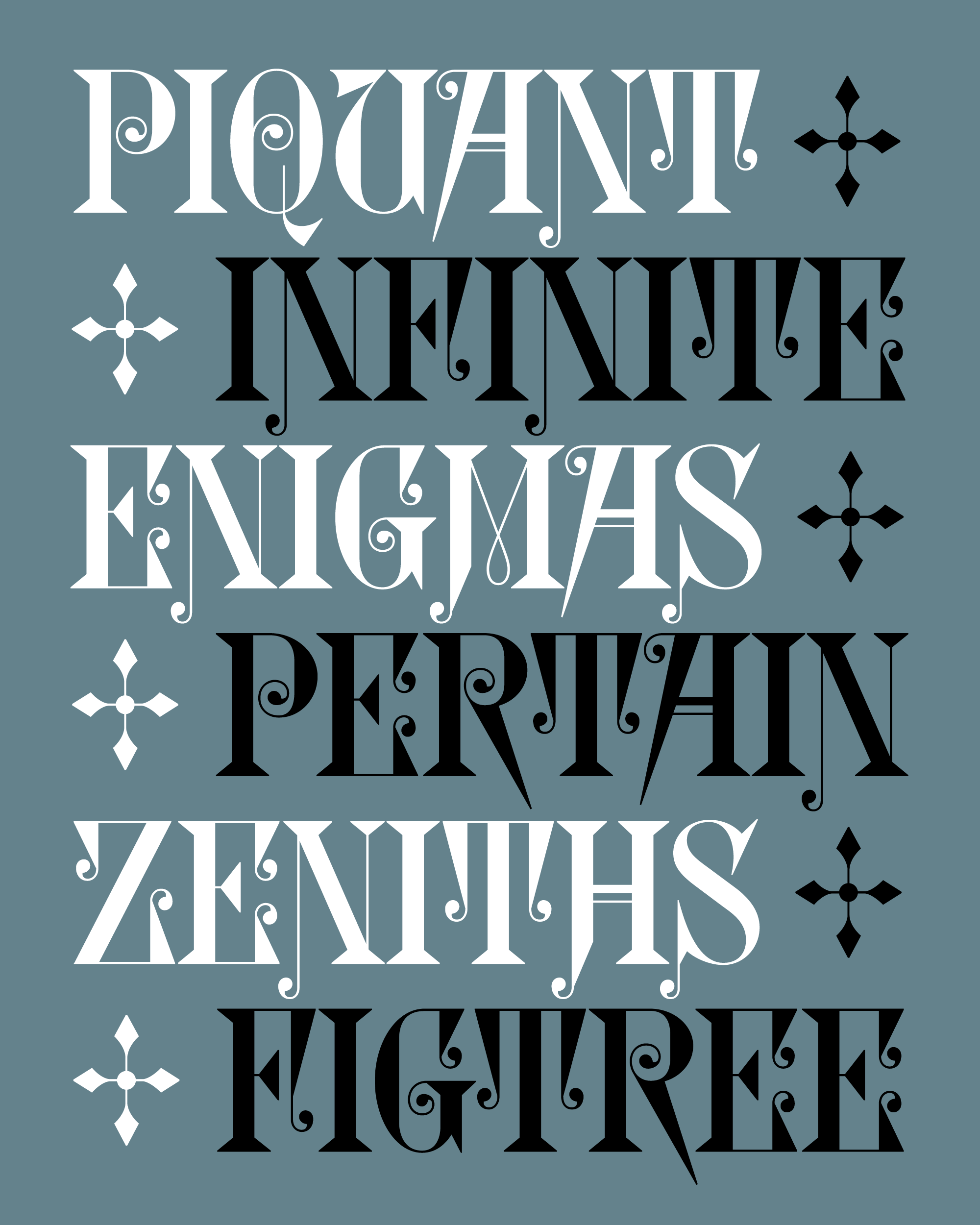
What to say about Glyptic…it’s kind of a chaotic design! It contrasts sharp triangular serifs against delicate spirals and curlicues. On top of that, it comes with a host of unconventional letters: a razor-sharp R, an uncialesque U, loads of descenders, and a M / W pair that abandons the typical alternating thick-thin construction in favor of a near-symmetrical looped form that is downright bizarre.
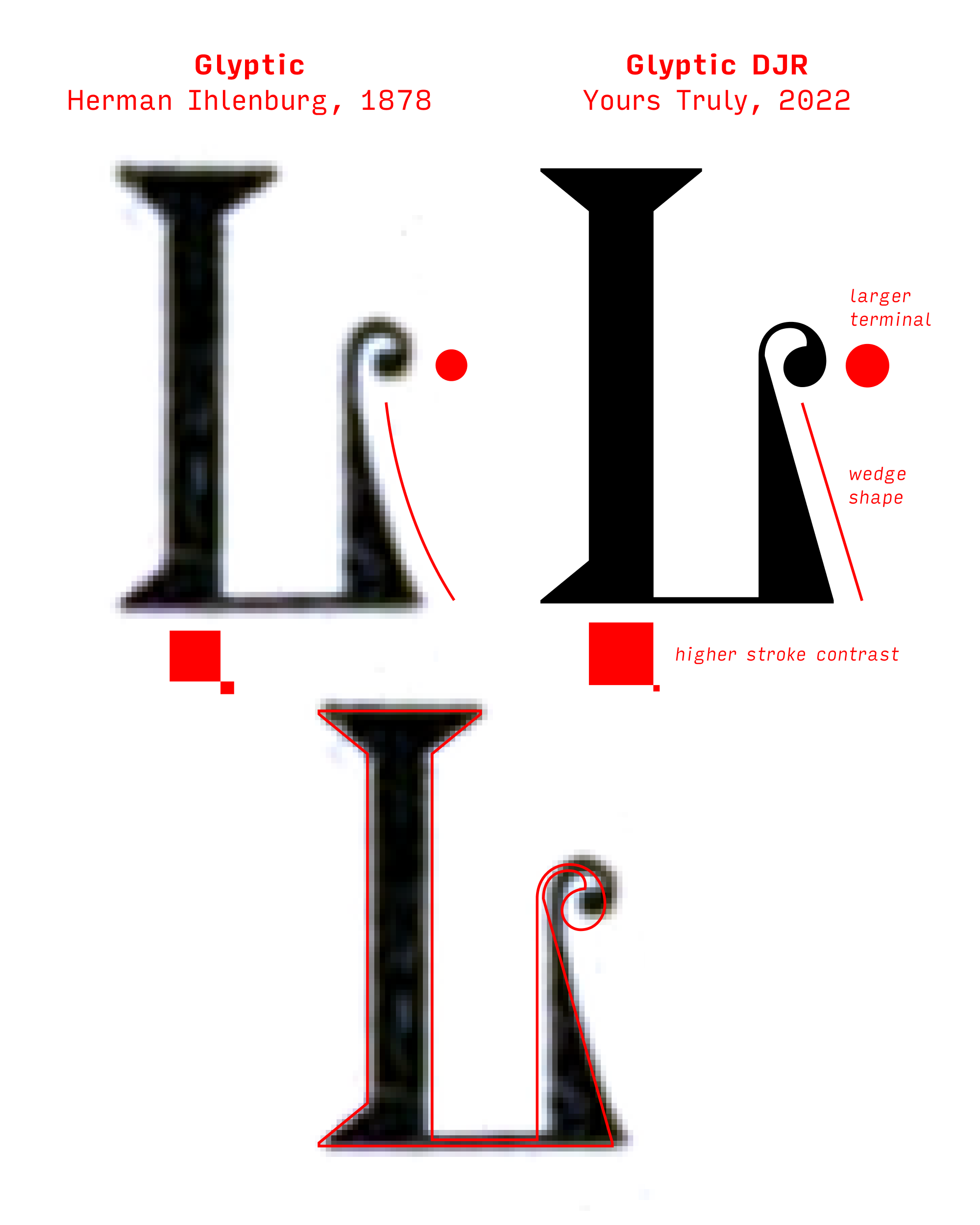
My digitization mostly follows the proportions of Glyptic’s two-line pica cut (24pt). But in my interpretation, I chose to double down on the design’s frenzied energy and heighten the contrasts between sharp and round elements. The original vertical serifs on letters like T dangled like delicate tendrils; mine, on the other hand, are more angular and severe. The descenders of H, M, and J follow suit. The original K has a surprisingly conventional form, which I felt was a missed opportunity. I drew an entirely new form to match the aggressive tails of A and R. (Don’t worry…the original is available as an alternate.)
As I was making the pointy stuff pointier, I was also adding heft and rigidity to the rounder elements in the design. The counterforms of curved shapes like O have entirely straight sides, and the ends of the curlicues become full-on ball terminals…all of those spirals were surprisingly hard to draw!
Whenever the original Glyptic was shown, they always went really hard with the ornaments. So I made sure to include them in my revival and feature them prominently in my showings too. Since they often enclose the text, I made them alternates of the parentheses, brackets, and braces, so you can type them easily. You’ll even find that the humble wordspace has an ornamented variant!
At least to my knowledge, Glyptic hasn’t been a part of the design conversation for 100+ years, and maybe there’s a reason for that. It is doubtlessly a product of its time, and it’s okay for some styles to get left behind as tastes evolve and trends cycle in and out.
But in my view, this long absence makes it all the more ripe for a comeback. Type revivals give us an interesting opportunity to hack the timeline and short-circuit the cycles of fashion that we live in. It’s a chance to interrogate the vicissitudes of our current tastes and better understand why we use the fonts we use. And in that process, we might even broaden our contemporary tastes.
