March’s Font of the Month: Megascope weights
A typeface is a system of shapes, and every system has a breaking point. Part of the type design process is finding out where a typeface’s sweet spots are, and testing where the system breaks down and the cracks start to show.
I have a lot of affection for typefaces that get pushed right up to their breaking point. Last month, I felt funny sending you a moderately chunky weight of Megascope without even doing a cursory exploration of what the design would look like in a weight that’s more extreme. So I couldn’t help but take the opportunity to dive back into Megascope, and push it as thin as it can go.
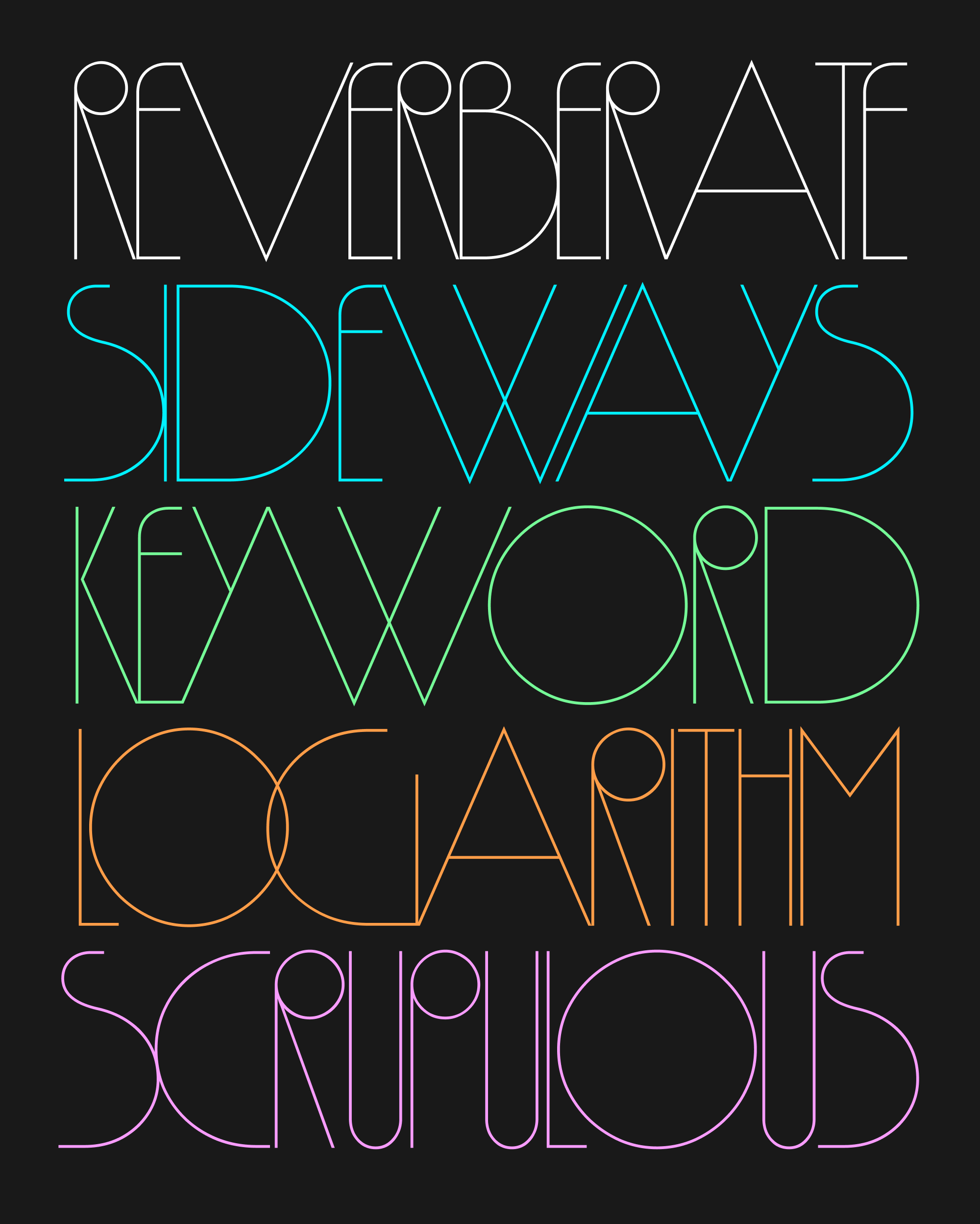
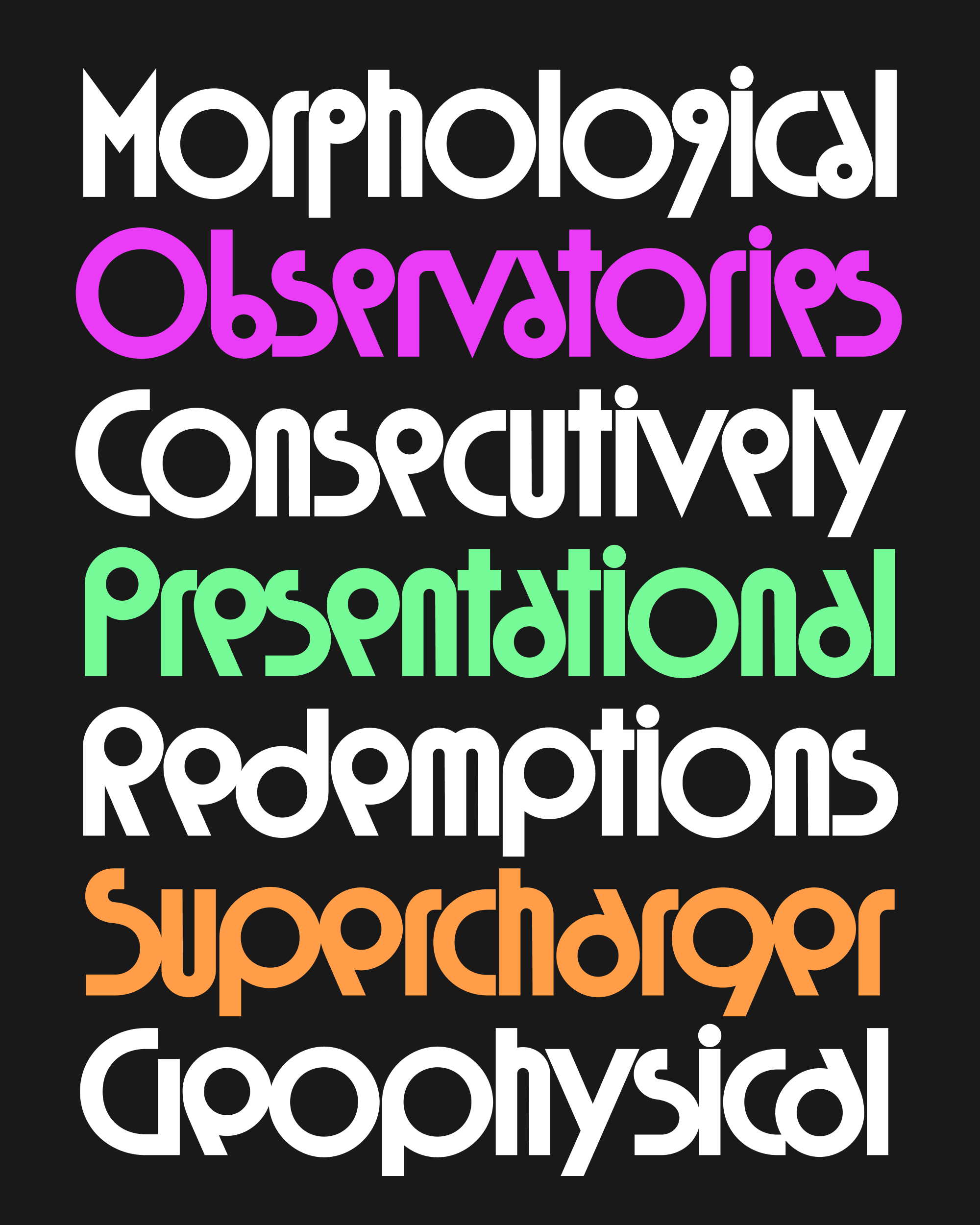
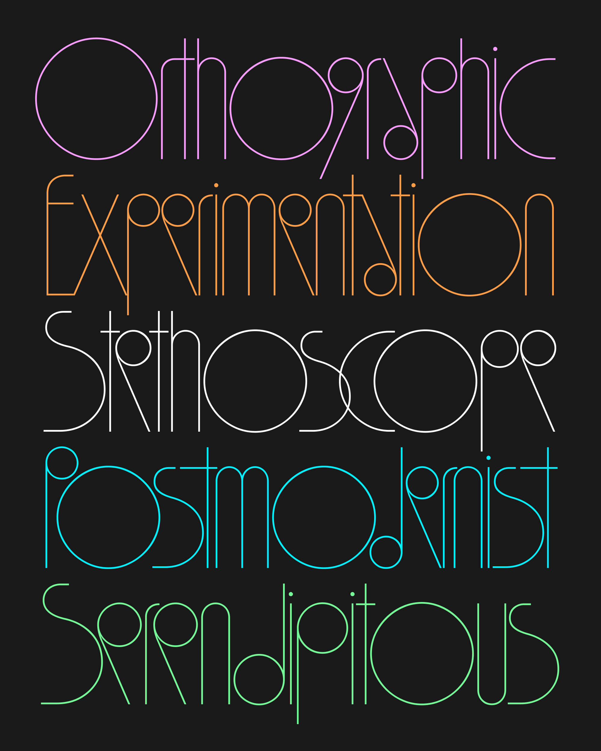
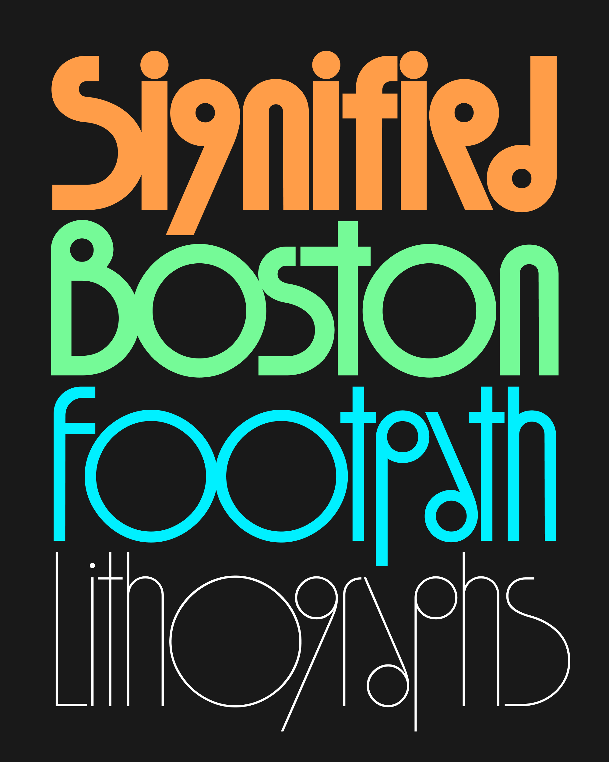
I don’t have many new things to say about the design of this new weight. It’s still rooted in the Deco-inspired geometric sans serifs of the 1970s, like Syncopation and ITC Ronda, and it still operates under a strict set of rules about perfect circles, dynamic proportions, and 66° diagonals.
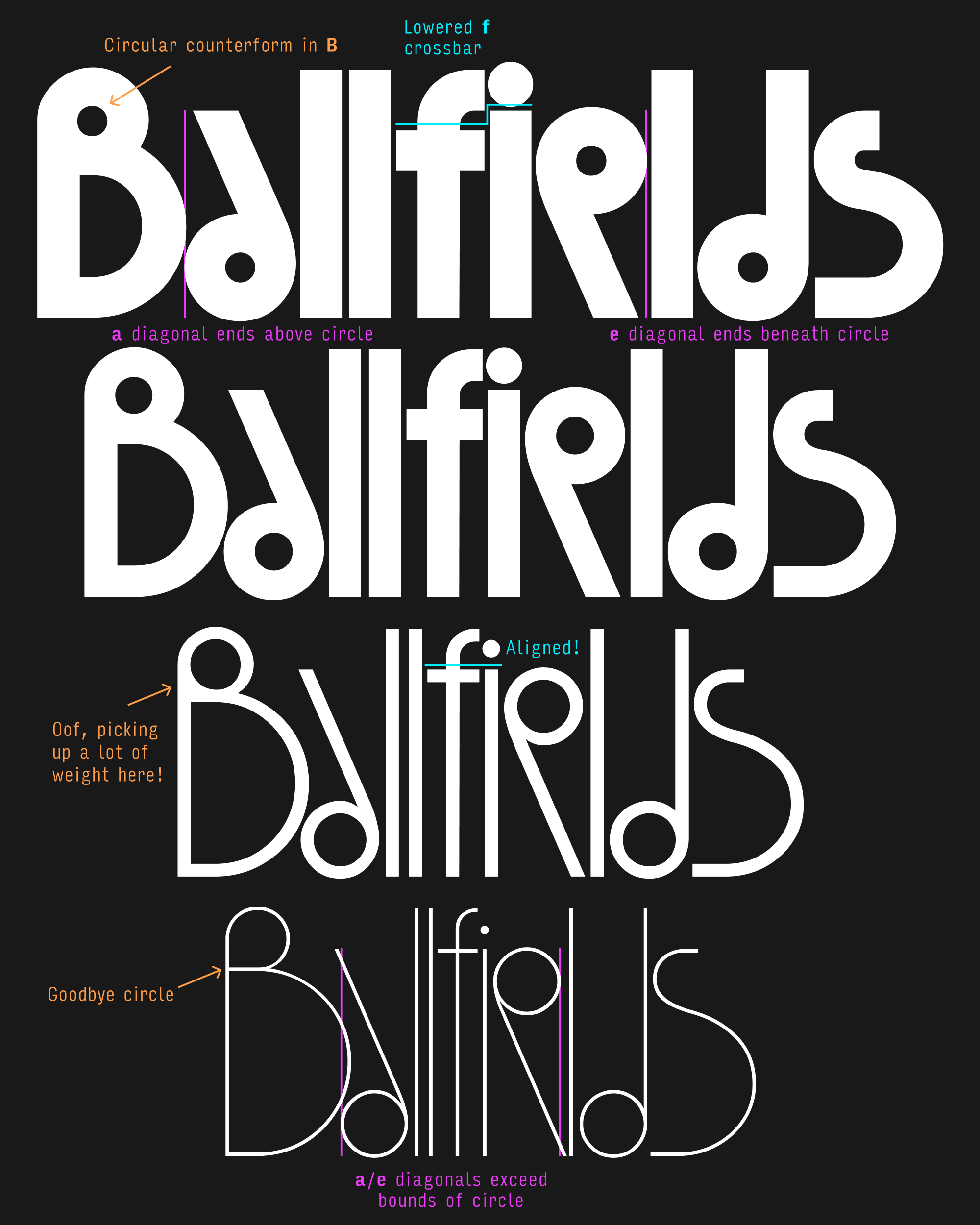
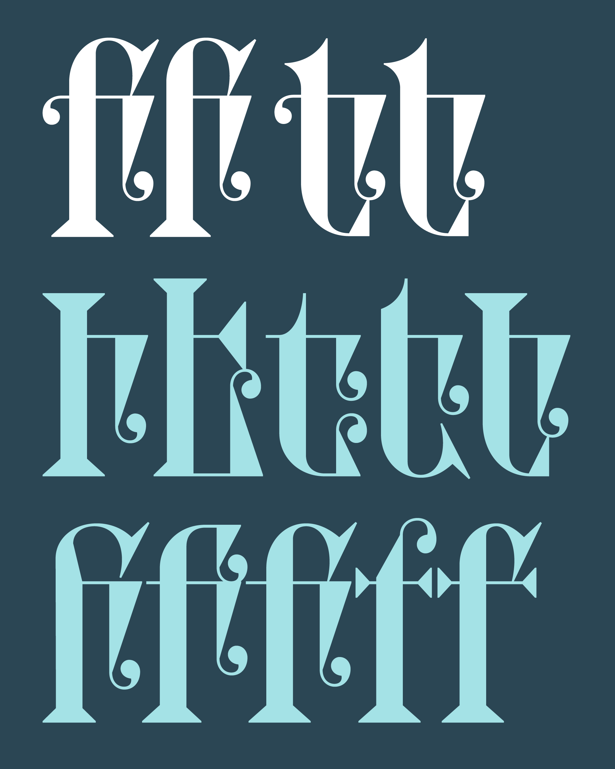
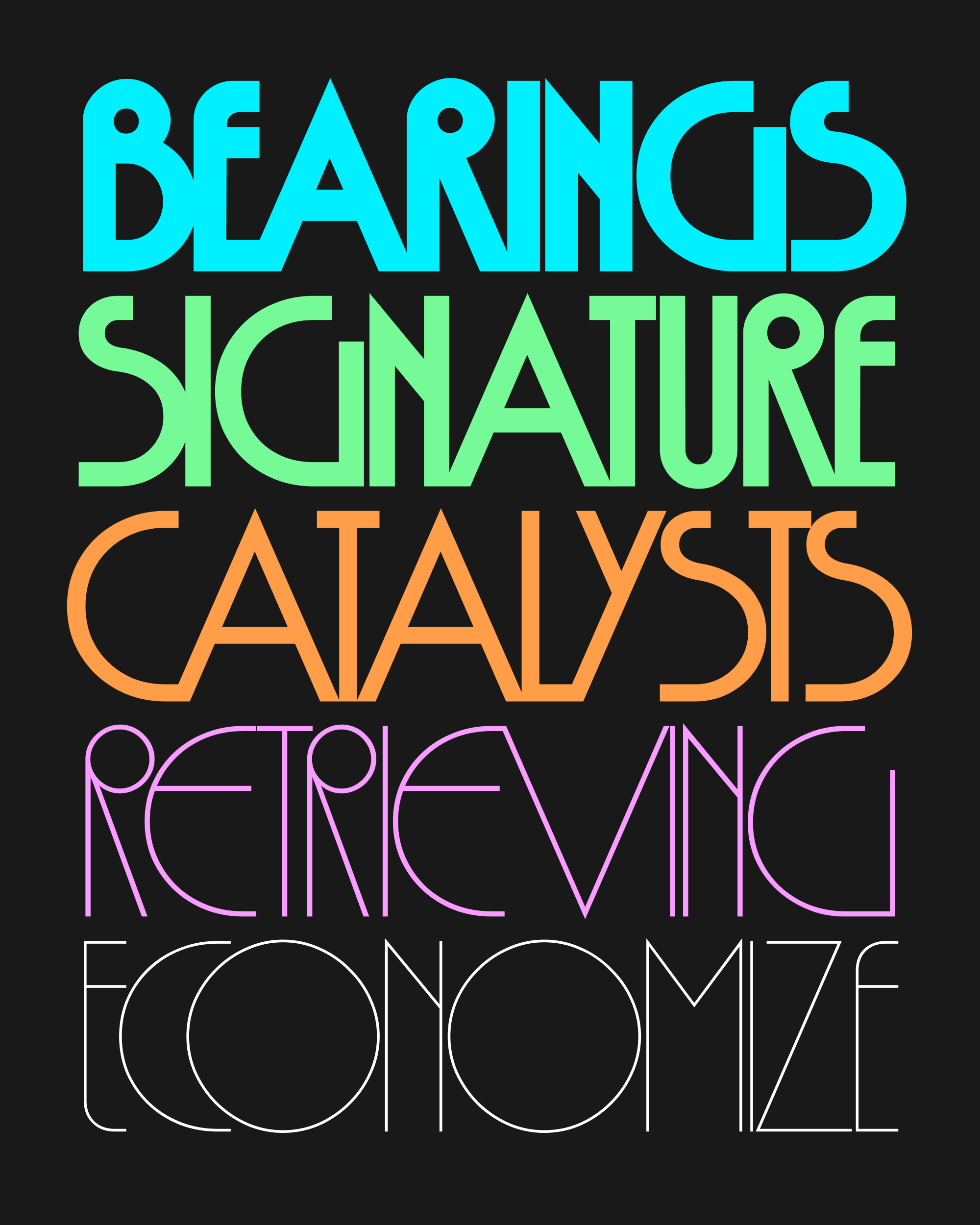
Following those rules, the proportions of the Thin become even more lanky and exaggerated than they were in the original weight, which I’m now calling Bold. The majority of letters get narrower as they get thinner (as expected), but large circles like O and diagonals like A remain just as wide.
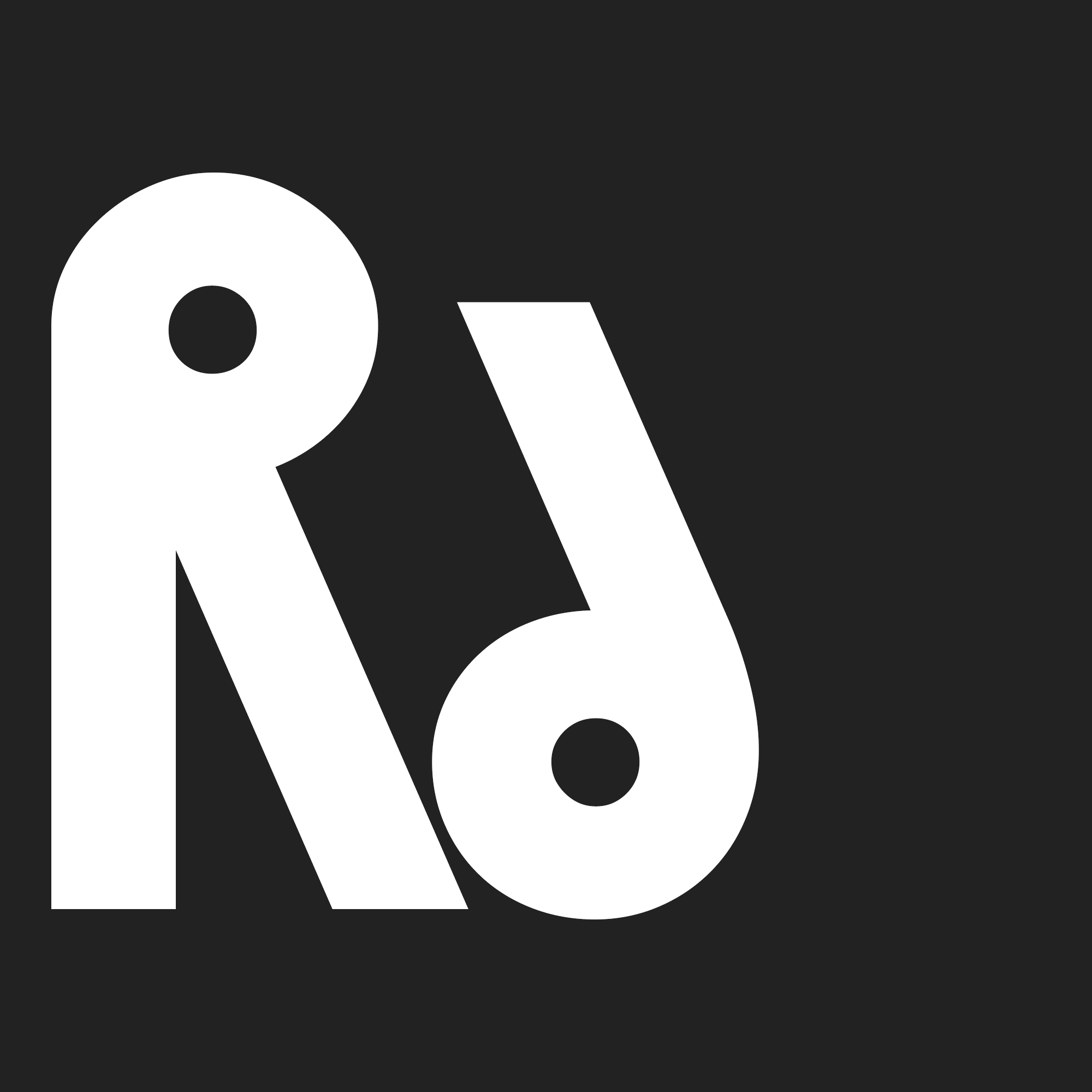
The already-too-small circles in letters like R, a, e, and g get even smaller, pushing the waistline even higher than before. The diagonal strokes of these letters, now even longer, extend past the bounds of the circle and throw them even more off balance.
Some measure of legibility and versatility is sacrificed, as what was weird about Megascope becomes even weirder. But it’s fun to hear the gears grind a bit as my little system of circles and diagonals begins to struggle…this is the tension that makes type interesting!
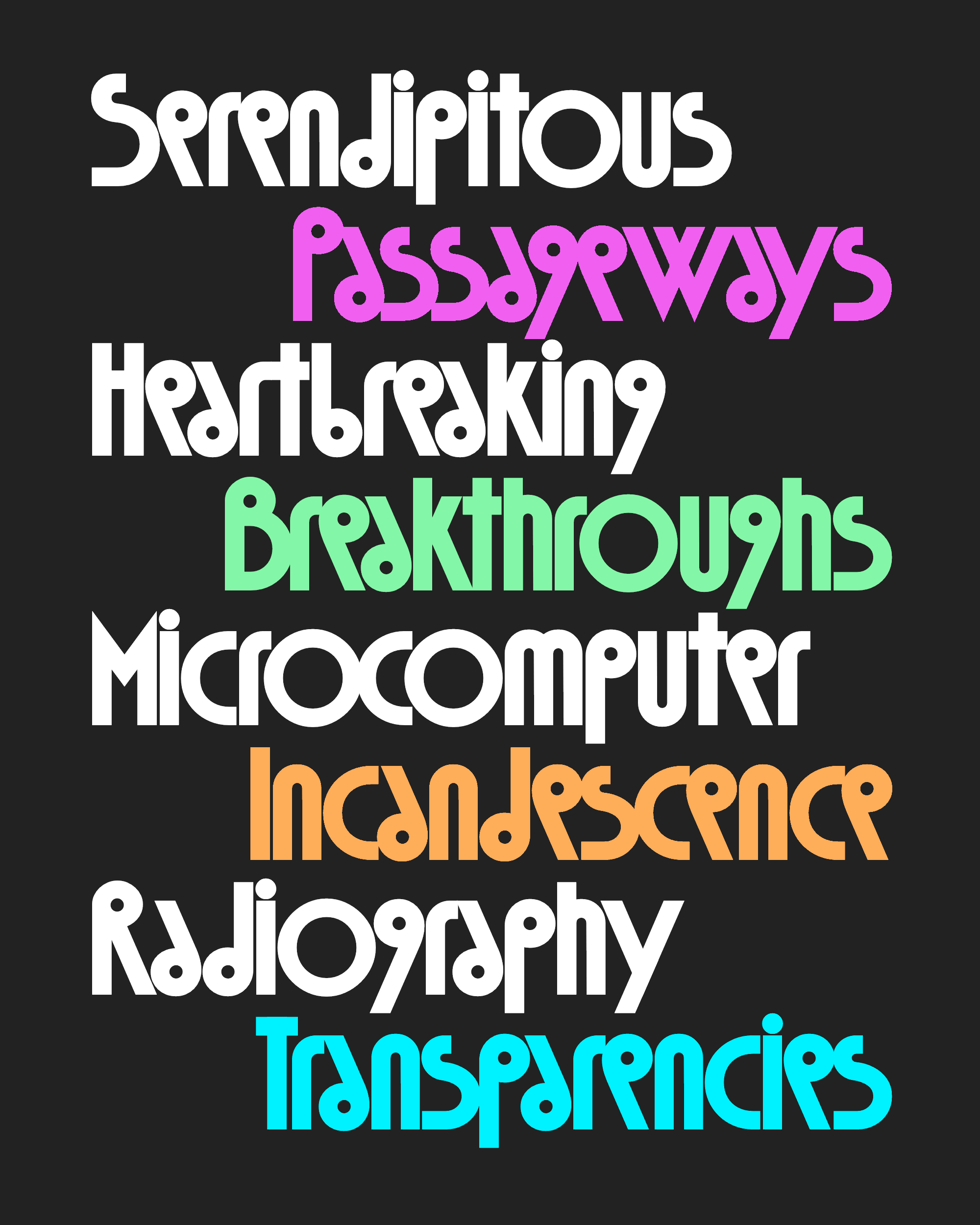
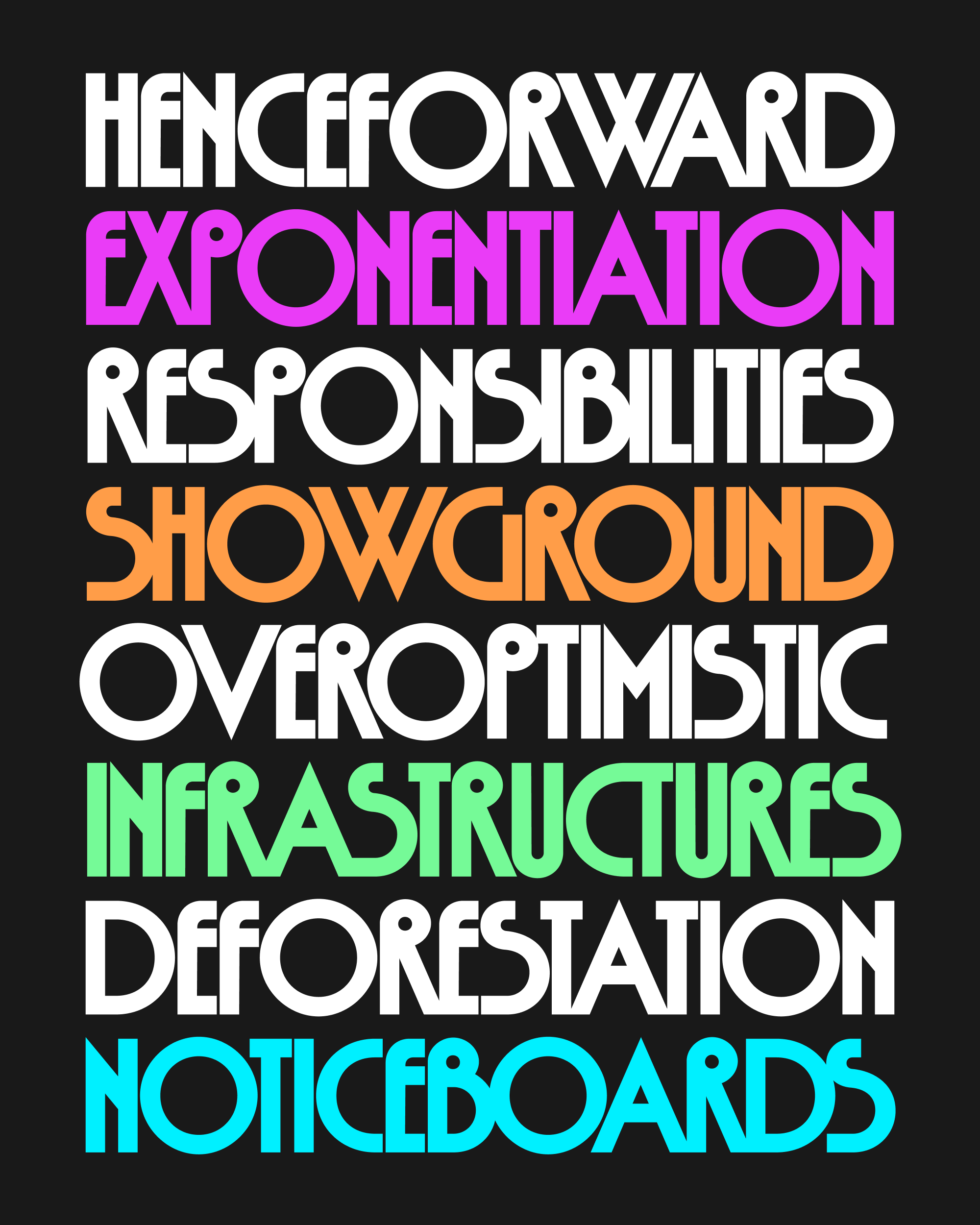
I feel less confident about the Thin weight than I do about the Bold, but I’m excited that its presence unlocks a range of in-between weights that are really starting to work for me. So I’m sending you a variable font and five named weights: Thin, Light, Regular, Medium, and Bold.
Megascope’s kerning is a monster—a single style of Megascope has more kerning exceptions than all of the other Megafonts combined—and I feel like I’ve only started to scratch the surface. I tried to let letters collide when they look good in a particular instance, but struggled to find compromises that would also interpolate nicely in the larger system.
Eventually, I may have to add even more kerning tweaks for the middle weights (not to mention the kerning of the accented characters 😬), but in the meantime, please feel free to manually pull things together or push things apart, and let me know if you encounter any letter combinations that seem especially fishy!
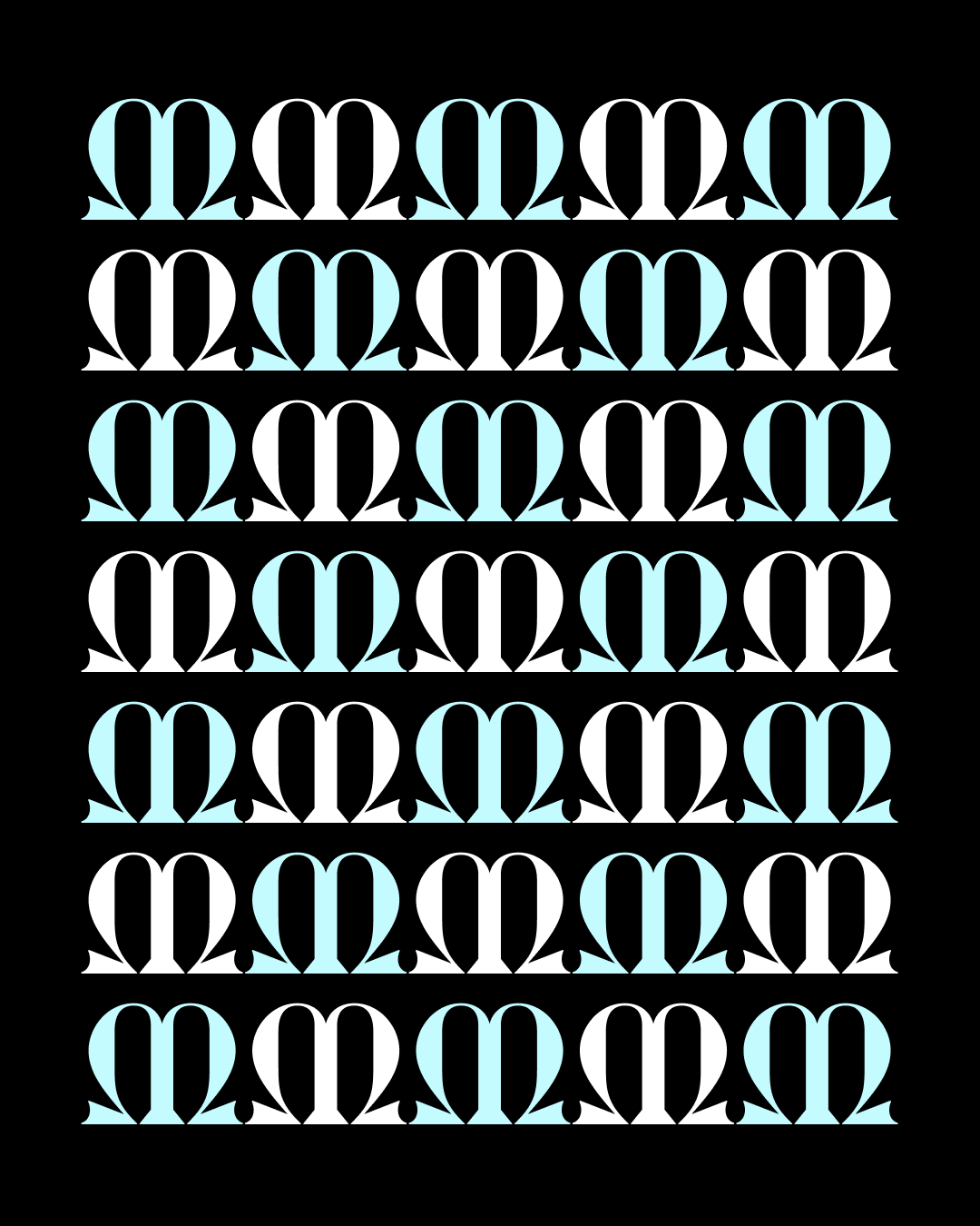
Some decisions that I made in the Bold no longer apply in the Thin, and I employ several feature variations to swap out one shape for another. For example, the B needed to lose its circular counterform as the circle gets larger and the stroke weight gets thinner. And the crossbar of f, lowered to create space in the Bold, gets replaced in lighter weights with one that aligns with the x-height.
Sticking with Megascope this month gave me the opportunity to incorporate some helpful feedback from club members. I added discretionary ligatures for some interlocking combinations (like ST, suggested by H James Lucas) and created upright alternates for a and e (suggested by Stephen Nixon).
I never intended for Megascope to become a family, but I hope you’ll agree that this (Mega)scope creep was worthwhile!