June’s Font of the Month: Job Clarendon Compressed Hairlines
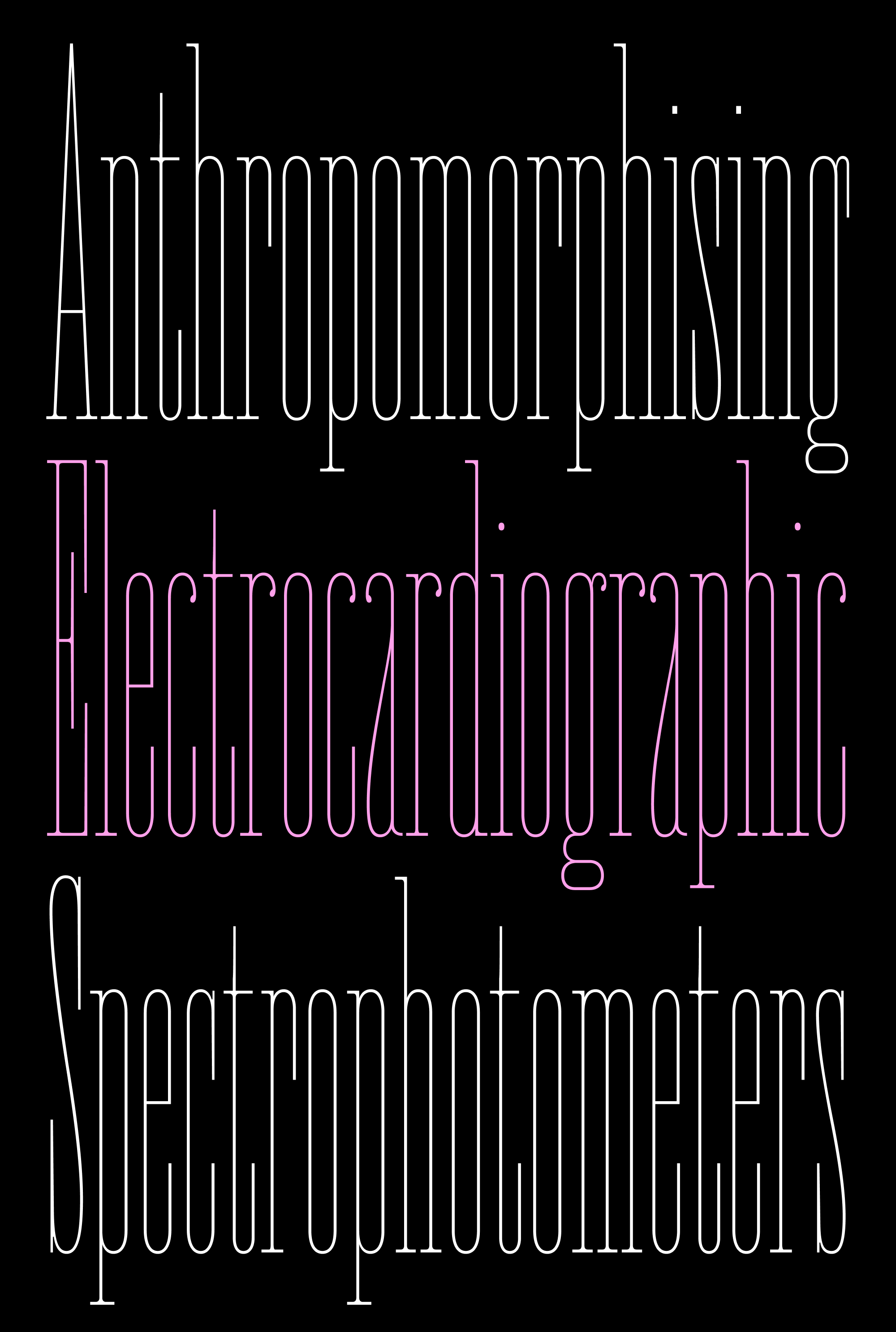
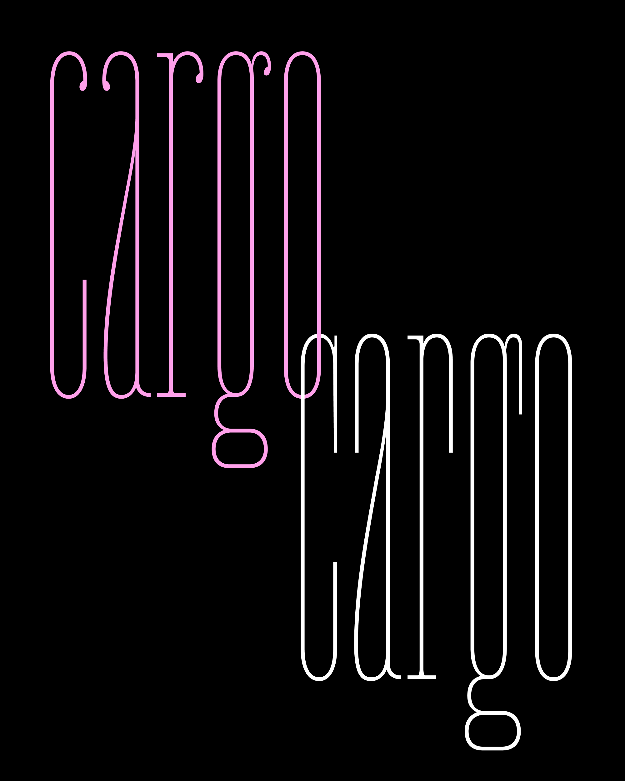
How condensed is too condensed?
I love it when a type family is allowed to cross the invisible threshold between expected, practical proportions and something that bumps up against the limits of what we can read and perceive.
Job Clarendon is already a narrow typeface. But with the encouragement and art direction of Bethany Heck, I’m sending you some new Hairline weights that are so narrow, they make the original version feel like Hellenic Wide! 😜
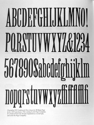
Page’s Clarendon XX Condensed, as seen in my copy of R. R. Kelly’s American Wood Type (I’m not at home, so thank Emily for the photo!)
In the nineteenth century, job printers relied on wood types in an electric array of widths to fill up their flyers and broadsides. Bethany and I are super curious how contemporary designers can translate this playful approach to typographic proportions to variable fonts, navigating between conventional and extreme proportions to find a sweet spot for each particular project, or perhaps even each individual headline within it. (Unfortunately, I am omitting the variable version for now because some outlines are so brittle they don’t survive the conversion...yet 😅)
As the horizontal widths condense, it’s funny to see how many other aspects of the design need to change as well. The straight sides of round letters get straighter, the overshoots get smaller, descenders get smaller, and the rhythm of black and white shapes gets more regular overall (resulting in more of a picket fence effect).
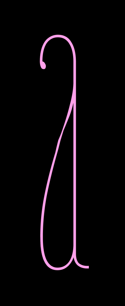
The extremes in horizontal proportions are echoed in the vertical proportions as well. Following patterns we found in Job Clarendon’s nineteenth century predecessors, elements like the top of g the and the belly of a grow wildly, forcing these letters to feel like funhouse mirror reflections of the original.
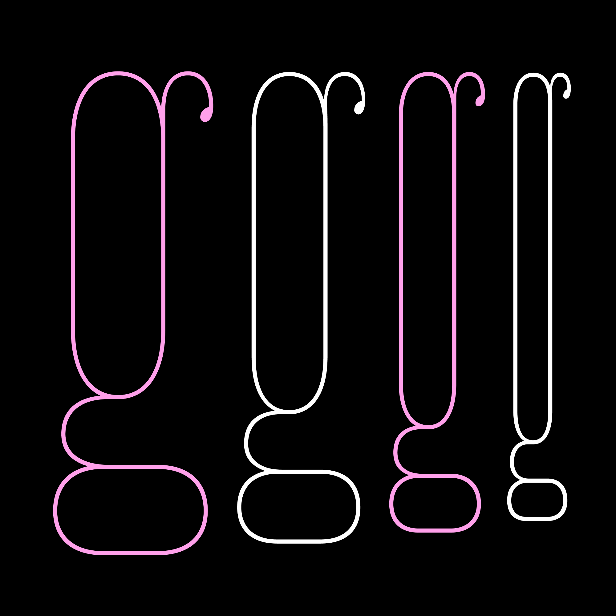
I typically gloss over (or don’t even mention) alternate forms in these write-ups; I tend to think of them more as easter eggs that you can uncover as you spelunk around in the fonts. But Job Clarendon’s alternates, especially the “Square Terminals and Dots” are worthy of another mention. This is partly because it was a lot of work to manage all these extra glyphs, but also because they completely change the character of the typeface. In the new Compressed and Extra Compressed, I might actually prefer these to the default ball terminals!
I believe Job Clarendon is destined to be one of the most versatile titling faces in my library, and I’ve been frustrated with myself for letting it sit for over a year already! (Sorry, Bethany!) You can let me know if you think I’m doing too many updates for the club in general, but I really appreciate the opportunity to pick up projects like this and give them some renewed momentum.
In other news, my month is off to a good start—this week, I am finally getting to visit with some of my family for the first time since the pandemic. I’m also looking forward to Typographics later this month. (At least as of today it’s not too late to propose a talk for the TypeLab...just saying!) I hope your month is off to a great start as well!
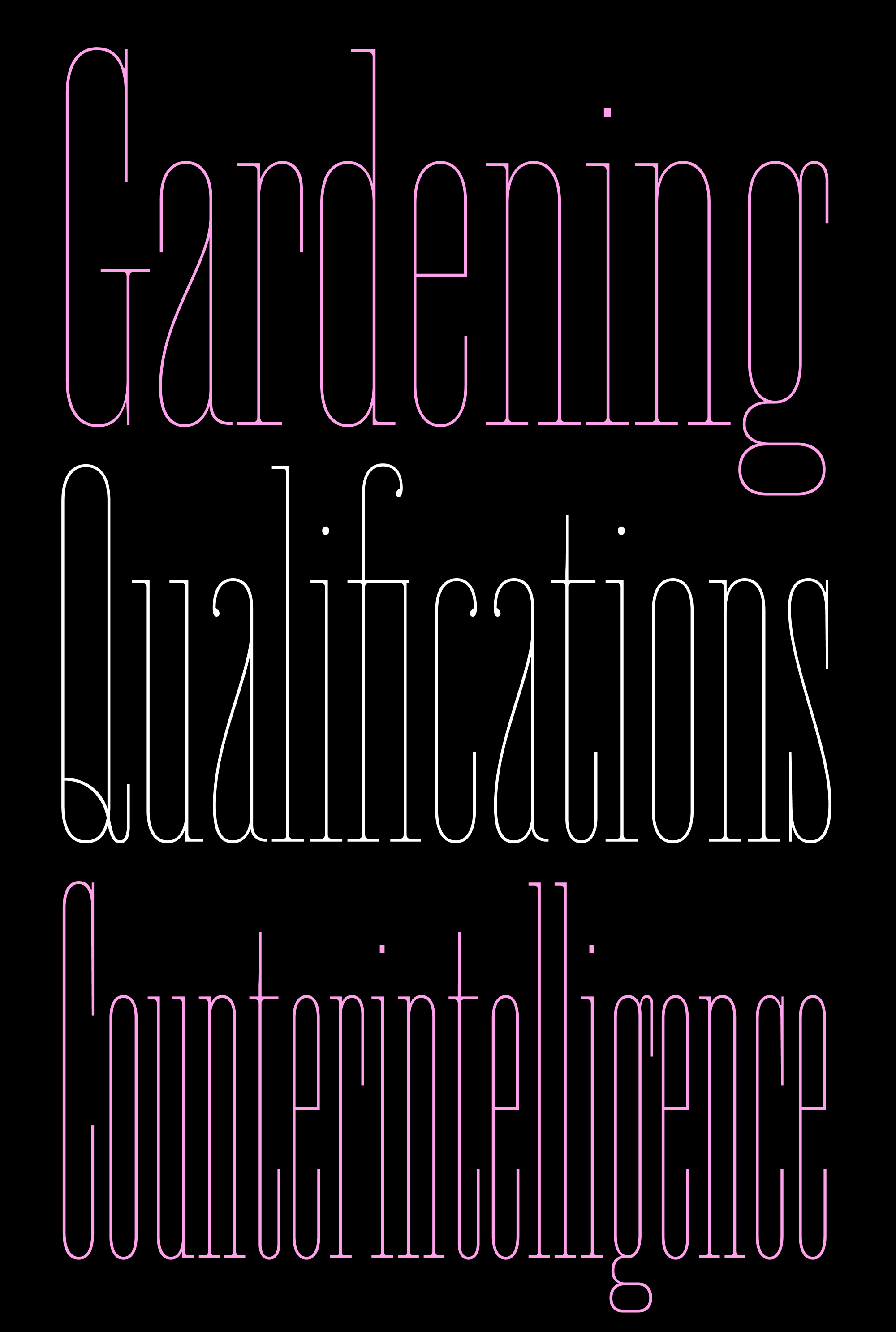
Condensed, Compressed, Extra Compressed