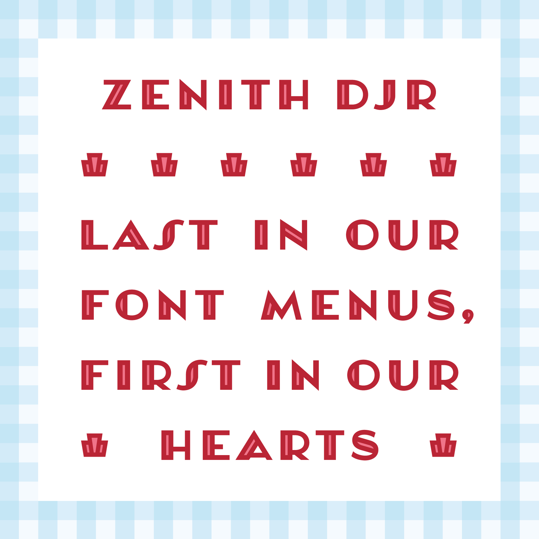
Notes on Zenith DJR, July’s Font of the Month
In April, I had the opportunity to visit Charlotte, North Carolina (my first time!) to attend the excellent Society for News Design conference (also my first time!).
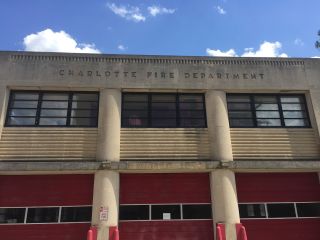
On the final day of the conference, I found myself walking up South Blvd with Caren Litherland and Claire Linsdey after a delicious lunch (yes, grits were involved). We passed this old firehouse with a fantastic Art Deco inscription, and felt compelled to cross the street to take a closer look.
It didn’t take long before I was sketching, and I started the font that would become Zenith DJR on the plane ride home.
Style
I’ve always been a sucker for Art Deco, and this inscription struck me as being a particularly elegant example of the style of contrasted sans serif typified by Morris Fuller Benton’s Broadway. But unlike Broadway, Zenith avoids any hint of glitz and glam, instead finding its voice in the stoic optimism of Art Deco geometry.
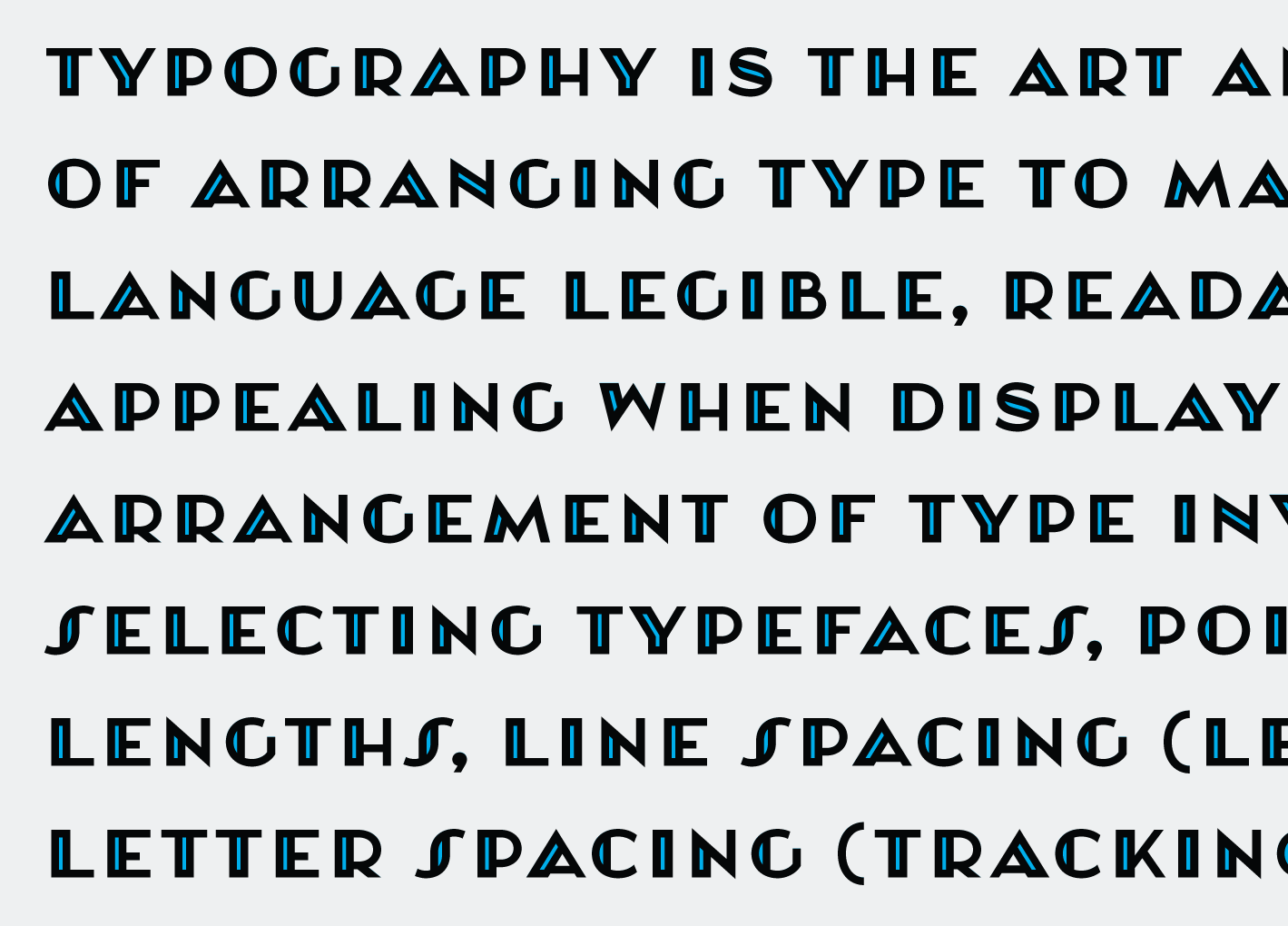
The most distinctive element of this design is the heavy stems, which usually appear once per letter, and sometimes not in places where you might have expected them. The sporadic appearance of these thick strokes makes for a funny, uneven texture. Even though Zenith DJR is a display face, my favorite uses of it are in short passages of text that where there enough room for that texture to come alive.
I decided to push that texture further and create an inline style where the thick strokes are split into two. By layering these two styles, designers can use color to punctuate that texture, really making those thick strokes pop. Cyan is my favorite!

Alternates
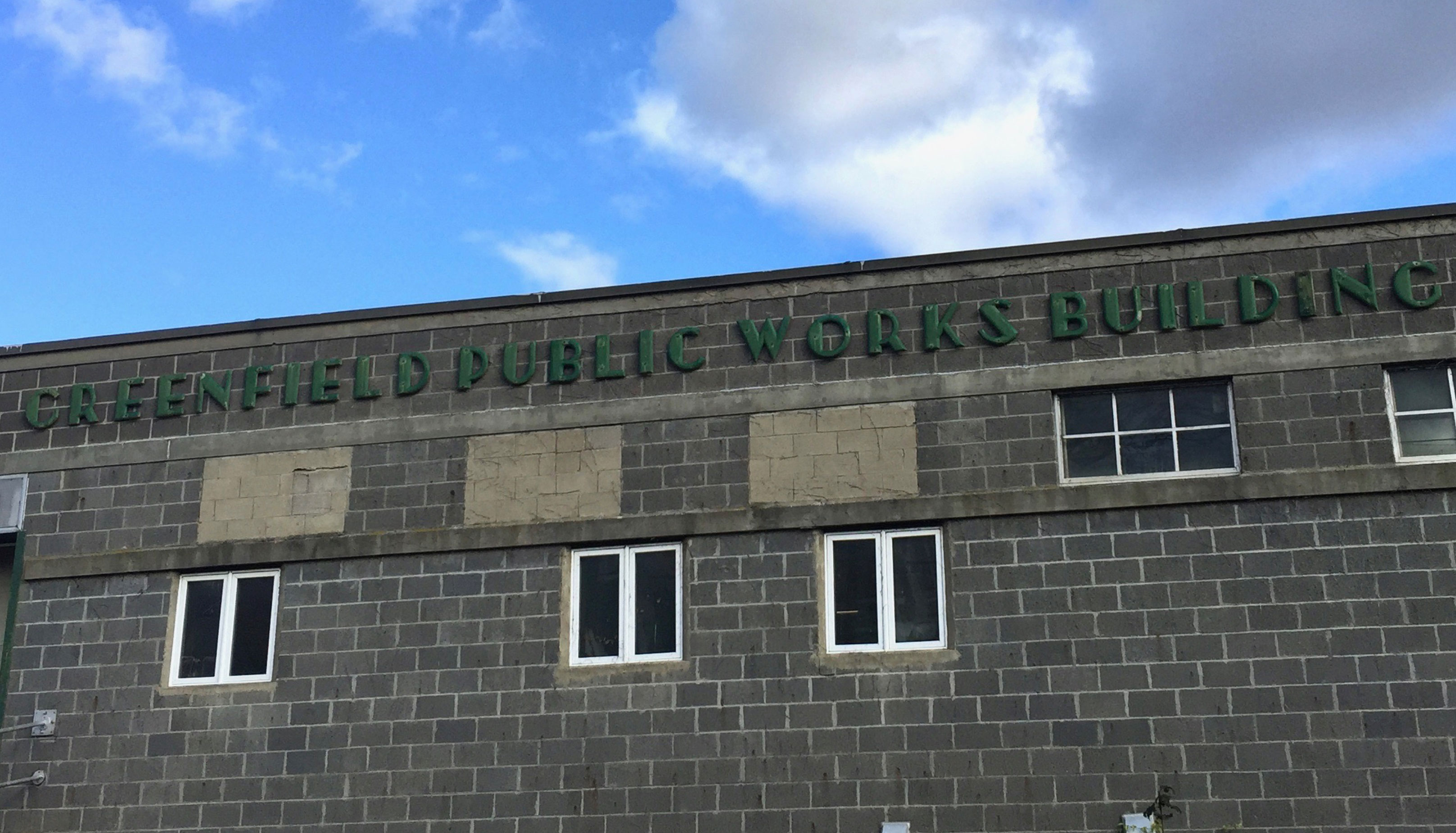
I started to notice similar signs in other places, and began to have a bit of fun with the alphabet, especially letters that were not present on the original sign in Charlotte.
I ended up with three versions of the S: the default, the Escalator S (borrowing a term I heard from Thomas Rinaldi, who I think heard it from Paul Shaw), and the Pointed S.

I was also captivated by the sharpness and peculiarity of the fire station’s M and N and the overly wide and low-waisted A. It’s pretty rare that diagonal letters are my among favorites, and I tried my hardest to capture those qualities in this design.
As I examined the diagonals I began to wonder: why is M and N thick on the left side while A is thick on the right? I drew alternate forms for these characters where the thick strokes are shifted to a different part of the character, and realized that shifting the position of the thicks could help designers finesse that uneven texture that I mentioned before.

For example, if two thick strokes appear right in a row, the designer can employ an alternate to add some space between them. I considered writing OpenType substitutions to automatically reduce instances where two thick strokes appear side by side, but in the end I decided that these were better implemented solely at the designer’s discretion. Fortunately the effect is subtle enough that both versions can even happen in the same word.
Going further
These diagonals made me curious about how this design might play out in other scripts, especially the triangular forms of the Greek Δ (Delta) and Λ (Lambda). George Triantafyllakos, who drew Walter in this style, was kind enough to offer feedback on the design.

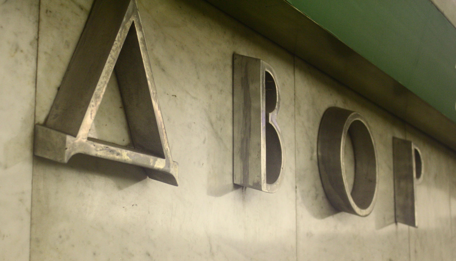
In turn, these Greek letters made me curious about what would happen to their counterparts in Cyrillic: Д (De) and Л (El). While triangular forms of these letters are typical in Bulgaria, they are much less common in Russia and other places that use the Cyrillic script.
Speaking with Ilya Ruderman at the Typographics festival in June, I learned that these triangular forms can easily look dated in contemporary Russian text. But, since Zenith DJR specifically calls to Art Deco influences from the 1920s and 1930s, we decided that the triangular forms would be a good fit after all. I am very happy with them!

One week left!
Zenith DJR has come a long way since that fire station in North Carolina, and I hope you find it to be a worthy take on the Art Deco sans. The typeface is available until July 31 at fontofthemonth.club – that’s just one week away, so I encourage you to sign up today!