Now available: Fit Devanagari

I am excited to announce Fit Devanagari, designed by Kimya Gandhi.
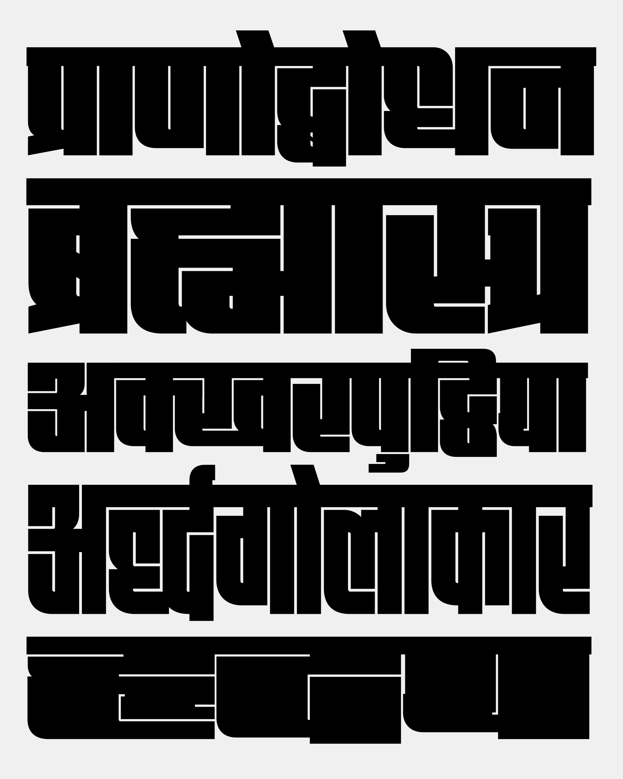
Fit is a blocky display sans-serif that is designed to fill space with maximum impact. Its comes in an agonizingly wide array of widths (and a variable font). This gives Fit the ability to squeeze just about any text into just about any space, forming an intricate maze of positive and negative shapes in the process.
With Fit Devanagari, Gandhi takes this concept to new heights of labyrinthine complexity. She had the difficult task of finding abstract shapes in letterforms that maintain a close connection to calligraphy, and then executing them in a way that maximizes their recognizability as well as their graphic impact.

Fit Devanagari is the latest of a series of script expansions for the typeface. Fit’s original release in 2017 supported typesetting Latin, Cyrillic, and Greek scripts, and it was later expanded into Fit Hebrew by Oded Ezer in 2018 and Fit Armenian by Gor Jihanian in 2019.
Using their combination of squares and curves as a jumping-off point, Gandhi carefully constructed a distinct vocabulary of shapes for the Devanagari, with a powerful top line (shirorekhā), swooping curves in the lower-left, and a dazzling array of divets and intersections needed to express the hundreds of complex conjuncts that are part of the Devanagari script.
There are relatively few Indic typefaces that reach this design’s extremes of weight and width, that engage with stark geometry so directly, and that utilize Variable Font technology so dramatically. For these reasons, and so many others, I hope you find Fit Devanagari to be a worthy contribution, and a powerful tool for posters and titles.
Fit Devanagari is available for purchase directly from its designer over at Mota Italic (you’ll also find it included in my Fit offerings as well). And I encourage you to browse its specimen page and PDF specimen as well!