A bit more about February’s font
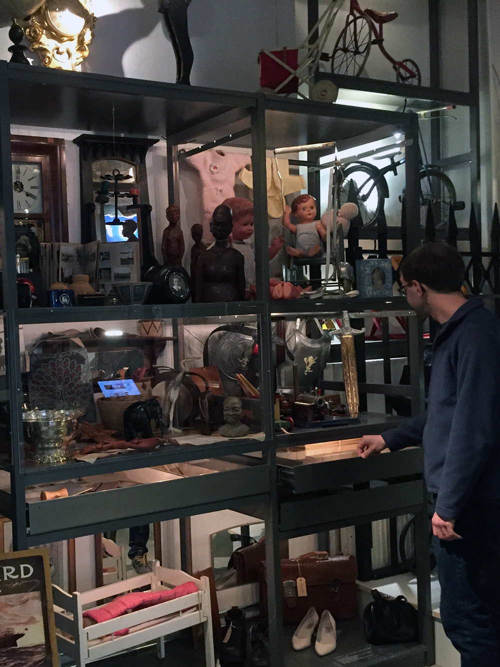
At the Mölndals Stadsmuseum outside of Gothenburg, Sweden, the most interesting parts of the collection aren’t in the exhibitions. Instead, they reside in the museum’s “Open Storage,” which includes 10,000 everyday objects from 20th-century Sweden that visitors can see, touch, and wear.
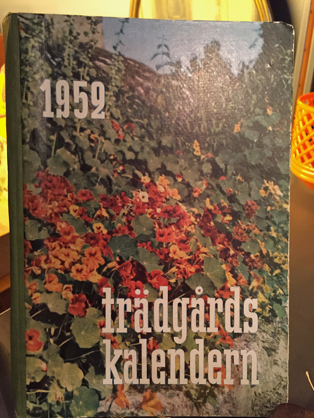
When I visited the museum in the summer of 2016, one item that caught my eye was the midcentury Swedish garden calendar that is pictured below. Its title seemed like a condensed take on a geometric slab like Memphis or Stymie, and I loved how its rationalist letterforms contrasted with the organic shapes of the leaves behind them. But what interested me most about it were the atypical (some might say gratuitous) vertical slab serifs found on characters like e, a, and 9.
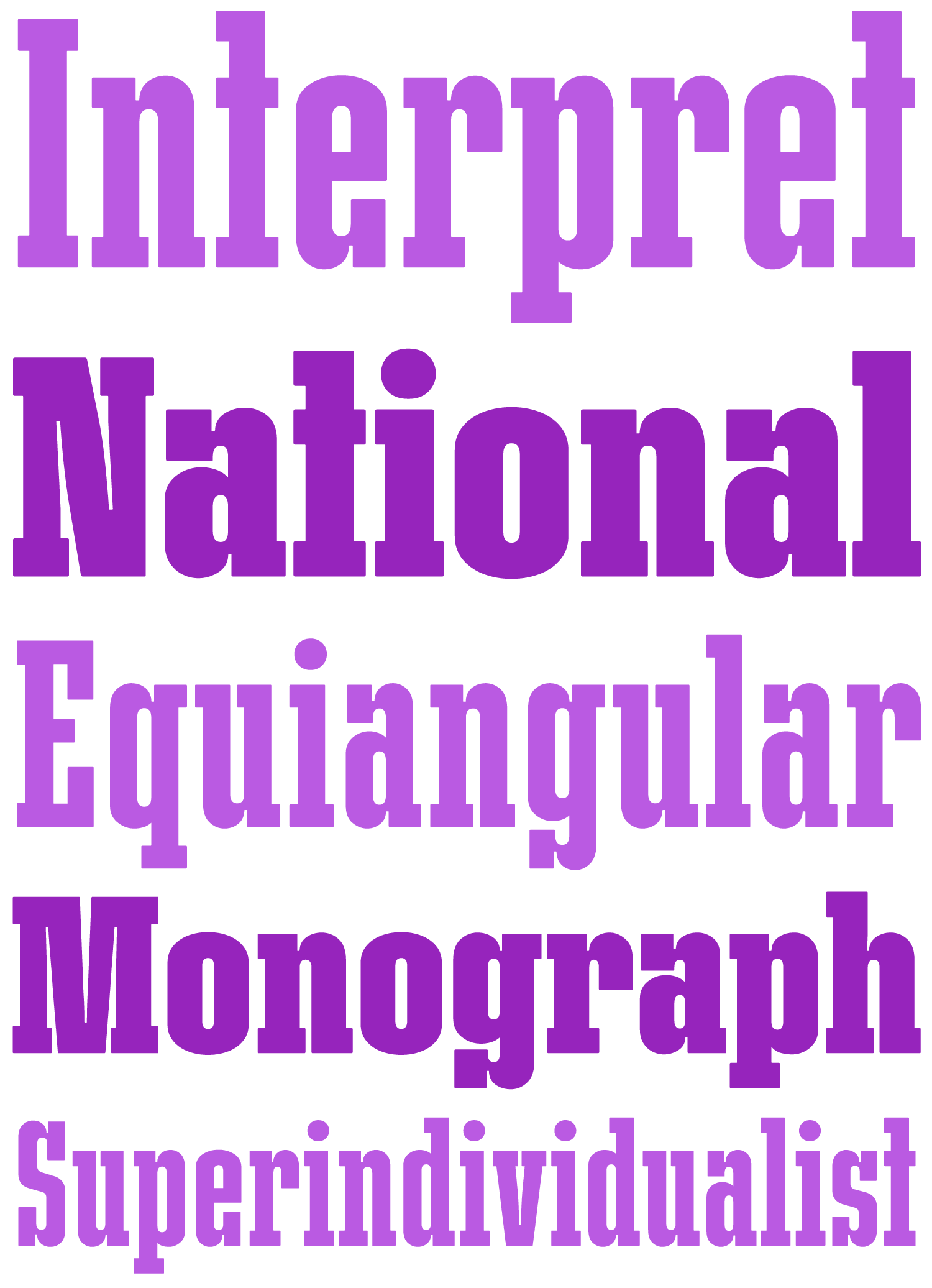
There was something that appealed to me about this overly-simplistic approach to modularity. If you’re drawing a slab serif, why not add a slab at every possible opportunity? So that is exactly what I tried to do.
As you might have guessed, the result is a slabfest. Rhody has narrow, straight-sided forms, rationalist curves, and extra-gappy inktraps that give it a little edge. Its mechanical nature is underscored by the unusually blocky shapes of f, j, and t, but the overabundance of vertical slabs prevents it from ever feeling sterile. I threw in a couple of weights, and some fun alternates and bonus features to explore!
A note on the name
I had some trouble coming up with a name for this one until I looked outside my window. There aren’t many leaves on the trees right now in Western Massachusetts, but my rhododendron is still nice and green. Seemed like an appropriate inspiration for a font based on a garden calendar!
But, just the other day, I was reminded that Jitka Janečková did a type]media project called Rododendron in 2016 (that’s the Czech spelling, which is probably why it didn’t come up in a search). Not only was Jitka extraordinarily nice about the whole thing, but Rododendron is a pretty kickass typeface, so you should go check it out!
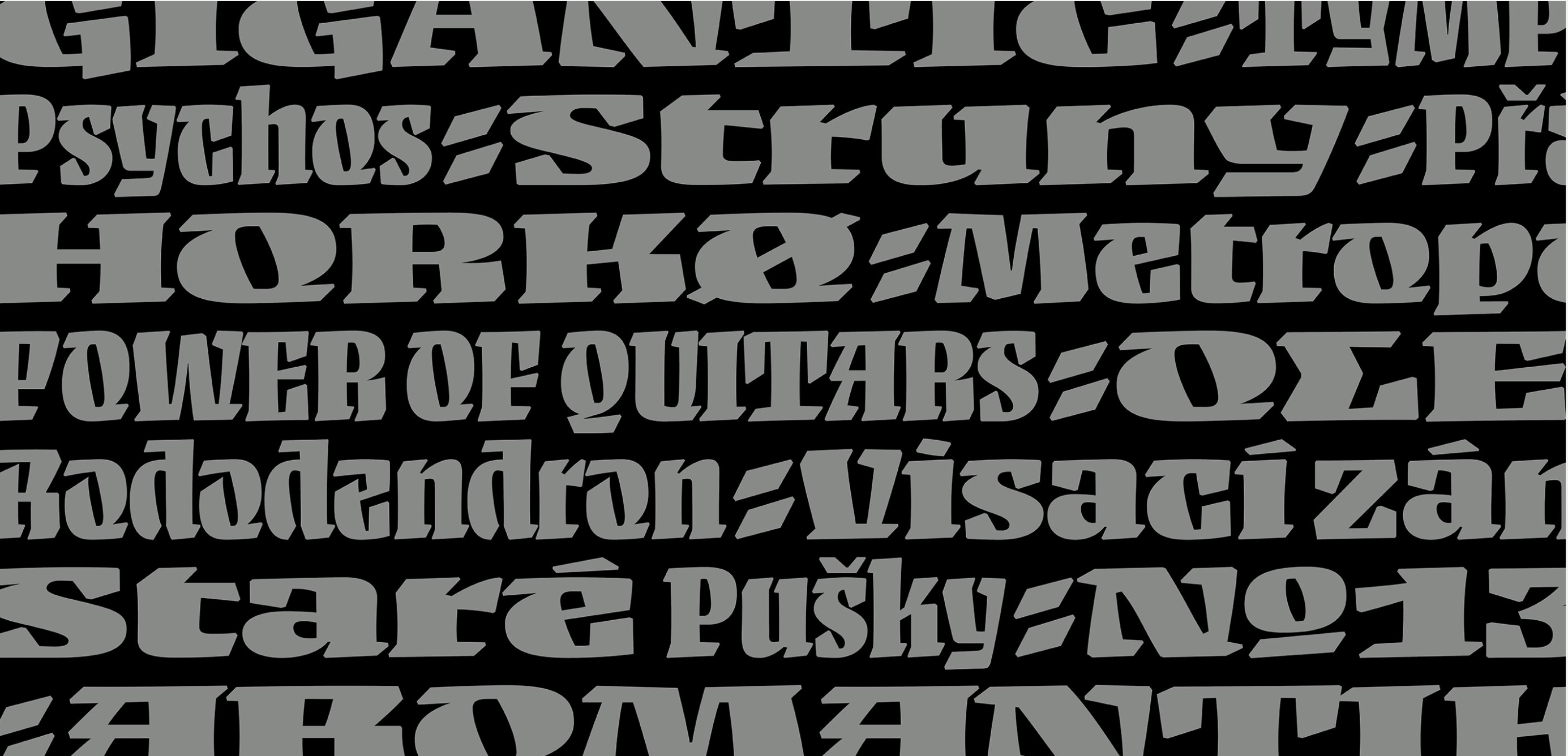
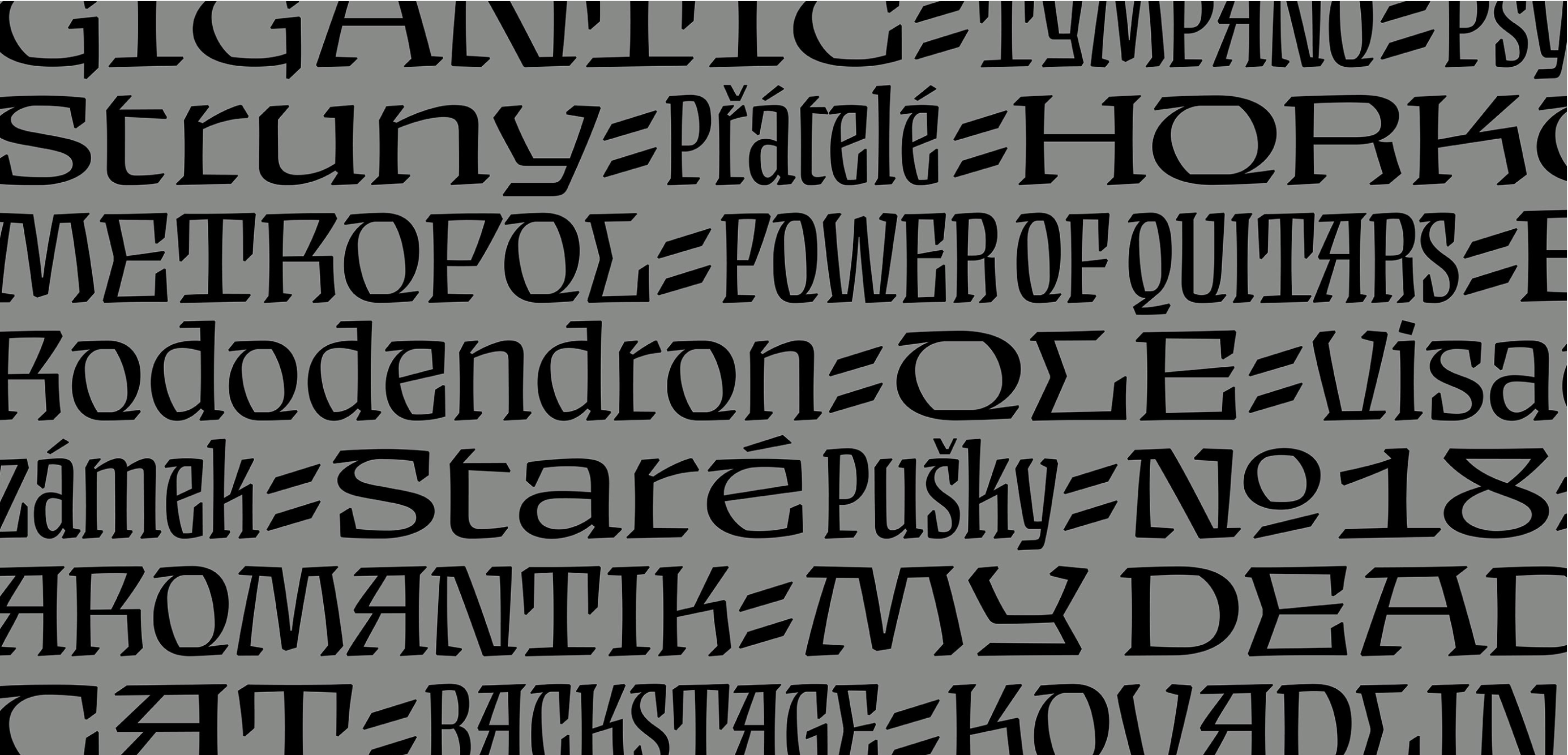
Rododendron, by Jitka Janečková
So for now, I’m just nicknaming my design Rhody (which, of course, gets close to the classic Font Bureau grot, Rhode!) So we’ll see what happens to the name if/when I return to make this a full-fledged release.
Regardless of what you call it, this is the last day of February, so I encourage you to pick up your copy today!