November’s Font of the Month: Fit U&lc
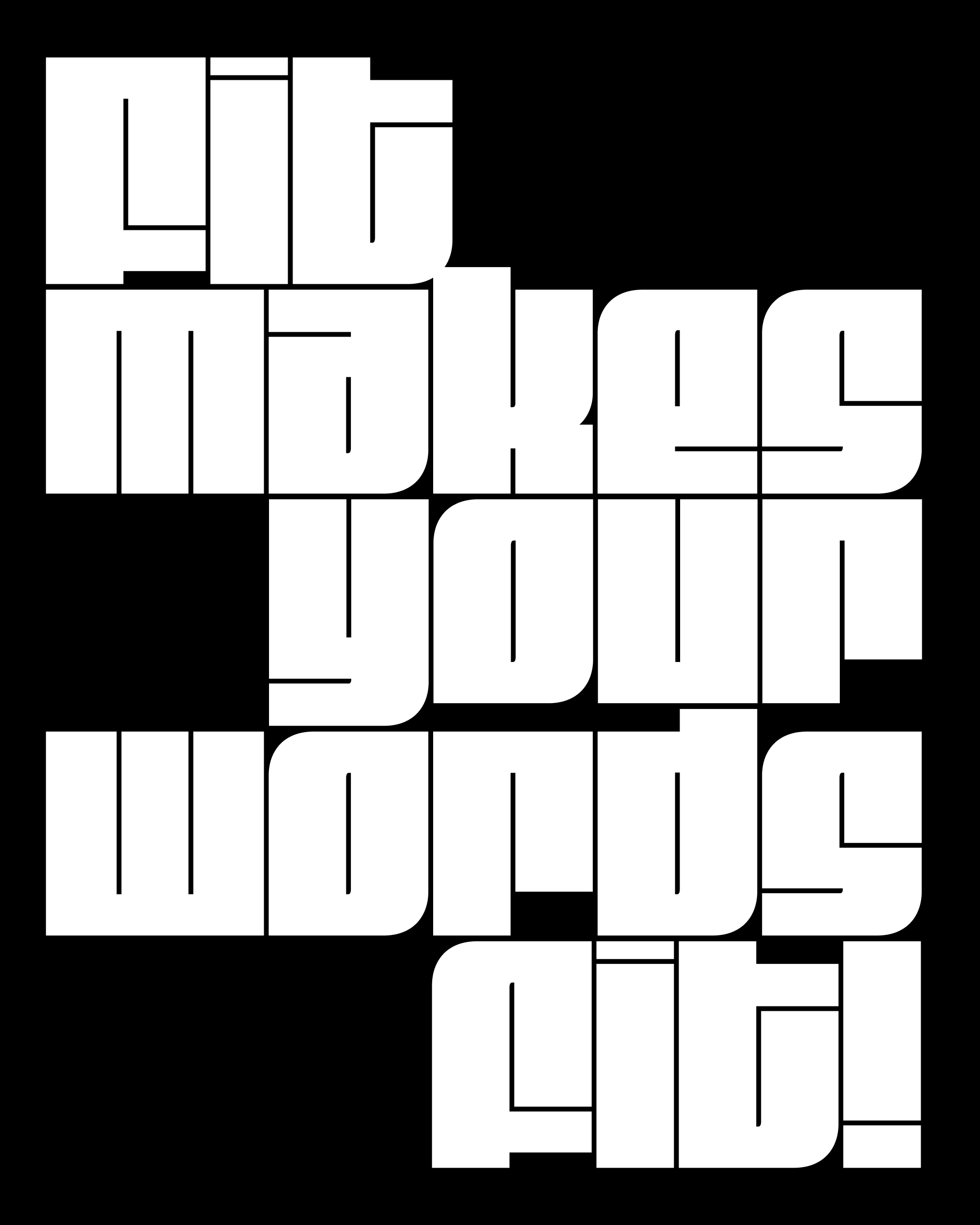
Fit is a font that marked a turning point in my career. It is the narrowest font I’ve ever made, and the widest font I’ve ever made. It was the first variable font I put on the market, and I had so much fun making it that it led me to start this club in the hope that I could keep making more stuff like it. It was the font that made me realize that I wanted to take novelty typography seriously, and give it the same attention and prominence in my library as the workhorsey stuff.
It has been an unexpected delight to see other designers translate Fit’s simple design vocabulary to different writing systems: Hebrew by Oded Ezer; Armenian by Gor Jihanian; Devanagari by Kimya Gandhi, and most recently, Tamil by Aadarsh Rajan. We can also expect to see Fit expand to more writing systems in 2025—Boom, Promphan Suksumek just posted a sneak peek of her upcoming Fit Thai the other day.
I drew Fit as an all-caps face so that I didn’t have any ascenders or descenders to worry about—filling up all of the available space was the name of the game. But new writing systems present new challenges. I recently had Boom’s Fit Thai file open on my computer to take a look at possible solutions for Thai’s ascending forms. It made me wonder what I would have done if I had been forced to draw a lowercase for Fit…and before I knew it, I was drawing one.
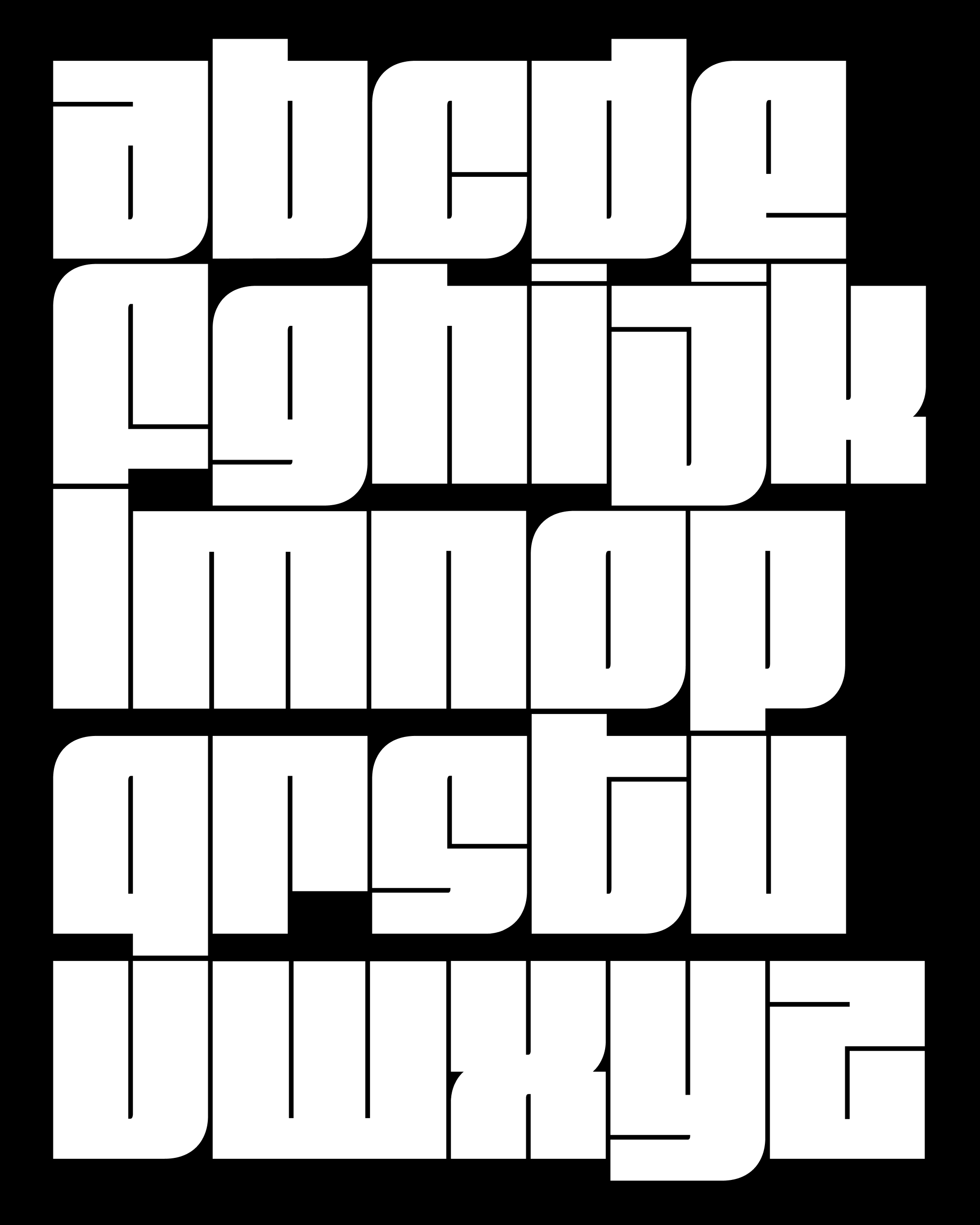
My first thought: why the heck didn’t I try this earlier!?
I think originally I was just too fixated on Fit being an “experimental” design that fits the allotted space. I never considered how much more usable it could be if it functioned a bit more like a conventional blocky sans (Nickel Gothic, for example).
The new lowercase retains Fit’s system of corners in the southwest/northeast and curves in the northwest/southeast, but the texture feels subtly different and the ascenders and descenders give the word shapes a playful bounce. I was also pleasantly surprised by how much more readable it is now! Relatively speaking, of course. 😜
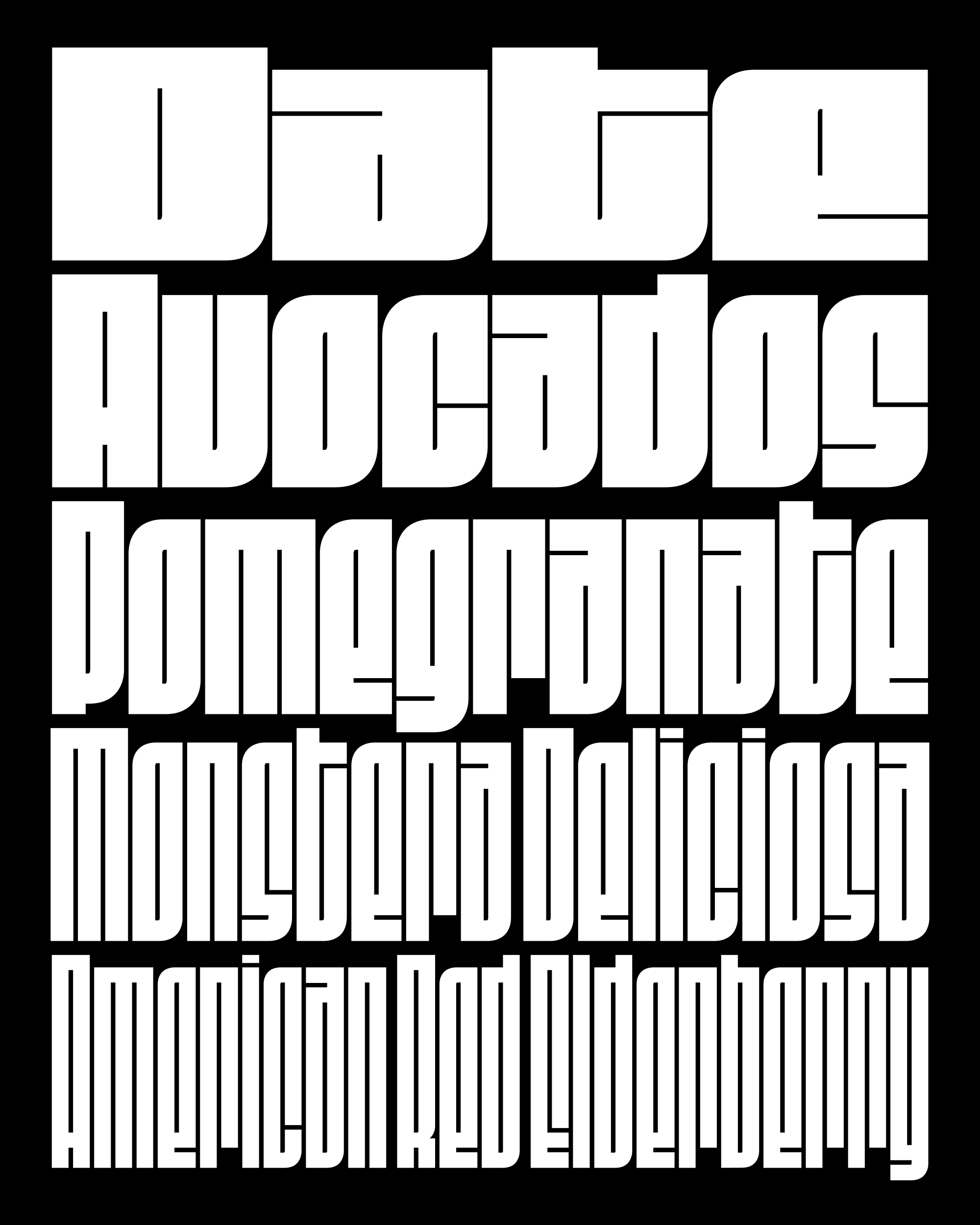
Most of the ideas in Fit’s lowercase have a precedent in the original all-caps design. The lowercase r? Well that’s like a shorter, upside down version of the uppercase L. The lowercase e? That’s a flip of the a, which in turn is a shorter version of Fit’s unusual capital Ð.
Fit’s x-height finds its precedent in Fit’s compact accents, which duck down to create room for the diacritical mark above. Because I had already drawn shorter letters to accommodate those accents, I was already halfway to a lowercase! They also served as the starting point for a full set of small caps, which you can use to mix upper- and lowercase forms in a single word.
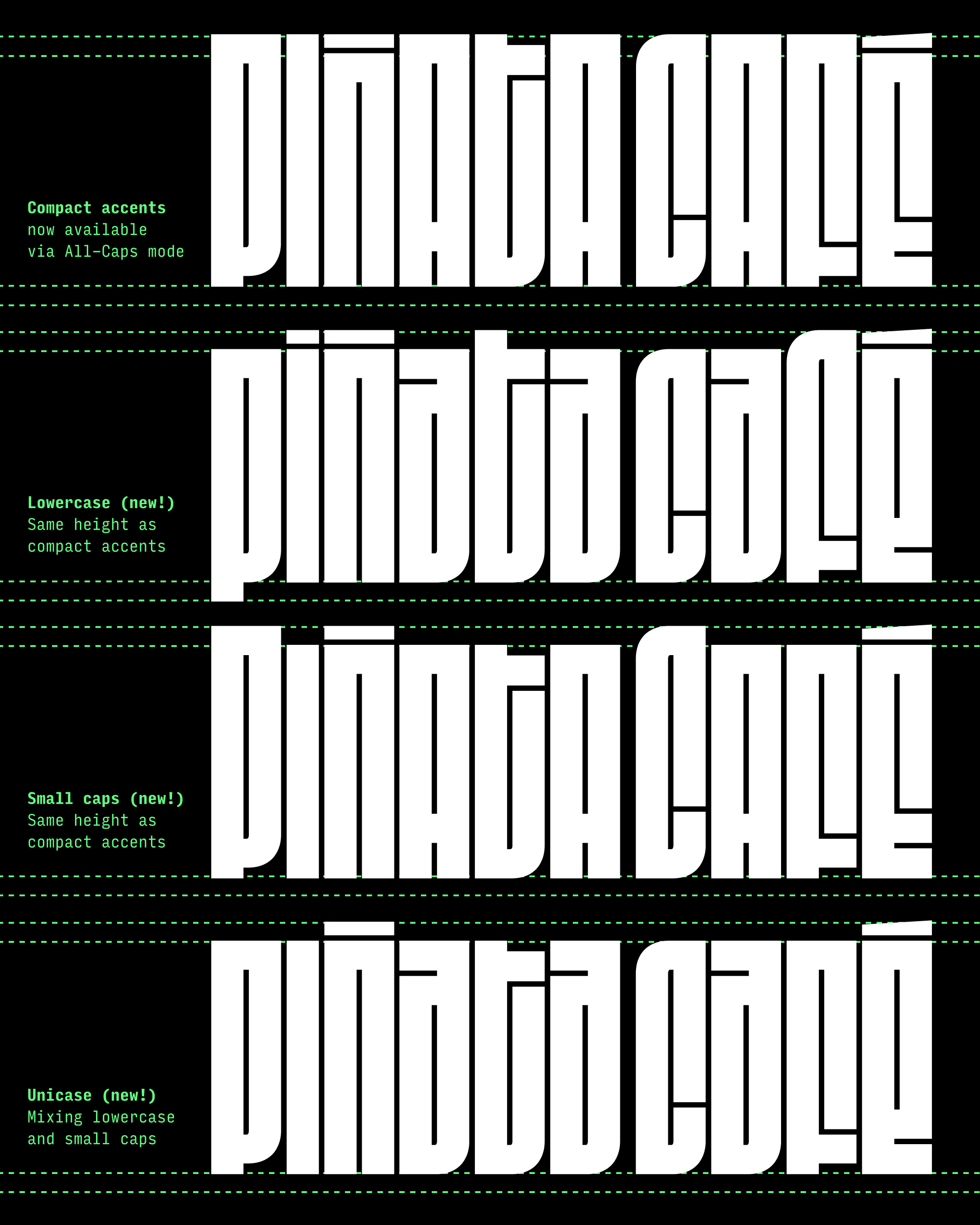
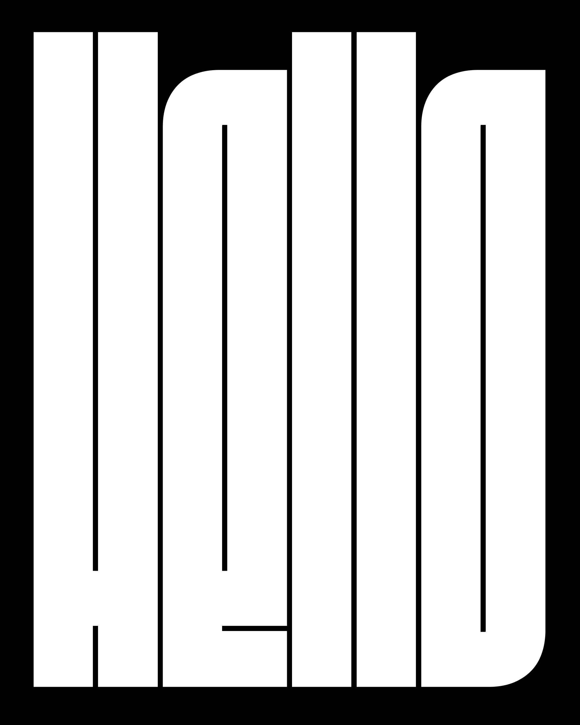
Fit is an extremely “editable” font, so I hope you find a lot to play with here. You can convert it to outlines, select a bunch of points, and drag them around. And since all of the counterforms are the same, it’s easy to add a stroke to your text to get the exact form/counterform balance you are looking for (you can see a subtle example of this in the “Hello” image at the top).
I also must shout-out Gor Jihanian—in addition to designing the aforementioned Fit Armenian, Gor has been working on a parallel track to create a multiaxis concept font designed with animation in mind. In the process, he did a lot of cleanup in Fit’s source files, which made drawing the lowercase a whole lot easier for me! This included converting the curves to corner components and making the design more modular so that letterforms align more precisely to a grid. At wdth=1200, the capital H is a square, at 600, it’s half a square, at 300, it’s a quarter-square, and so on.
