March’s font of the Month: Indoor Kid
Comic books were not a big part of my childhood, but they certainly were for Ellis Bojar. After his first encounter with an issue of X-Men at the age of 10, he quickly fell in love with the iconography, the stories, the bright colors, and—you guessed it—the lettering.
Since then, Ellis has grown up to be a comics writer/editor/publisher, an advertising and publication designer, and a longtime Font of the Month Club member. He approached me initially in 2020 to see if I could help him develop a font inspired by the comics lettering of his childhood. My first inclination was to say no—I had very little experience reading comic books, and I knew that comic book lettering is a whole world unto itself…there is already an incredible array of comic book fonts out there produced by specialized foundries.
But Ellis convinced me that he was looking for something different: a variable-first comic book superfamily, with all the weights and widths and accoutrements that a typographer might expect from a workhorse sans, but designed specifically for a wide range of comics dialogue and caption styles. This month I am thrilled to send you a beta version of Indoor Kid, our first step towards that ambitious goal.
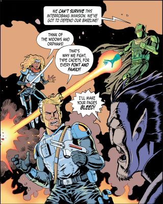
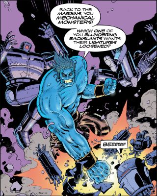
These comic type specimens were created by Ellis and his collaborators—Ellis did the writing, Nick Brokenshire did the illustration, and Frank Cvetkovic did the lettering.
Comic book professionals still call it “lettering”, but since the 1990s, captions and dialogue in many comic books have been typeset digitally with fonts, as opposed to being hand-lettered with pen and ink. Variable fonts don’t seem to be a big part of this practice—at least not yet, but we think they should be! (And we are certainly not alone in thinking this...see for example Comicraft’s Mighty Mouth.)
First and foremost, Ellis wanted a flexible width. On a macro level, a typeface with a wide range of widths gives letterers the power to adjust the rhythm of the storytelling to fit the amount of dialogue in the story. And on a micro level, it’s extremely helpful to be able to make subtle tweaks to linebreaks and copyfit when typesetting text inside small speech bubbles (without having to resort to stretching the type).
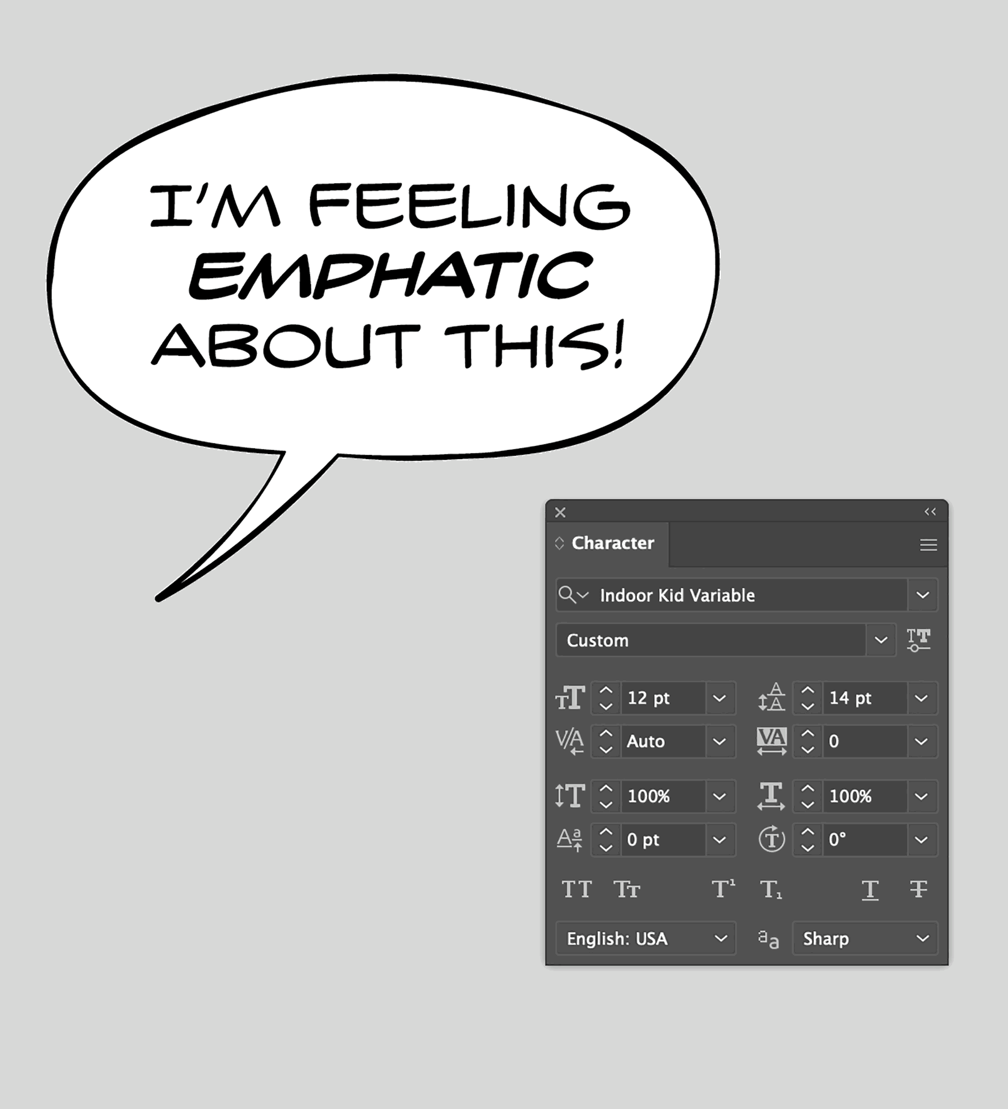
Ellis also requested a custom Emphasis axis that would make it easier for letterers to enlarge and vertically center words or phrases within a block of text. This is a longstanding comic book practice, especially for Bold Italic text. With conventional fonts, it can involve a lot of tedious adjustments to font size, baseline position, and leading. But with a variable font, it’s a quick flick of a slider, and the letters grow from the center as the stroke weight is maintained throughout.
Ellis wanted the design to be a tribute to the pre-digital era of comic books, and most of the first year of our collaboration was dedicated to research. We dove into pages of lettering by some of Ellis’s favorites like Gail Beckett, Tom Orzechowski, Stan Sakai, Gaspar Saladino and John Workman. We were not interested in trying to revive a particular piece of hand-lettering or emulate a particular letterer’s style. Instead, we were trying to identify details that really worked in one context (how much bounce in the baseline, how much variation in the stroke weight, how much speed in the gesture) and synthesize them into a flexible system of weight and width.
Since then, it has been nearly three years of slow-burn trial and error. I would send Ellis a new batch of fonts, and he would pop them into an existing comic he liked, analyze how it compared to the original, and send lots of feedback. Without his expertise and intuitive sense of what works and what does not, I would be totally lost.
To be able to iterate over such a large designspace, my process involved a lot of spline-based drawing and some very heavy use of the LTTR/INK tool. Even though the source material we referenced was exclusively pen-and-ink, we agreed that Indoor Kid should feel crisp and “typographic”, and didn't make much of an effort to simulate the blobby, irregular edges of ink on paper. But this is very much a beta font, and I do intend to come back and give these outlines a little more TLC.
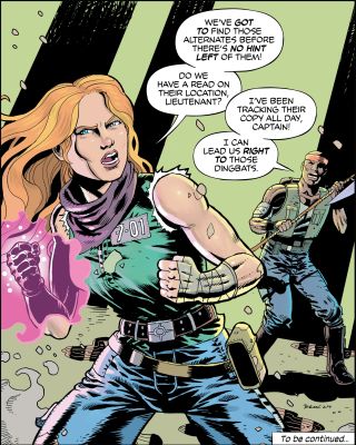
We were also sure to include features that professional comic book letterers have come to expect. Indoor Kid includes three variants for each letter to give your text a little extra bounce (not unlike the feature I recently added to Daily Special…make sure you have Contextual Alternates on!). There’s also a capital I that is serifed when it is alone and sans serif when set within a word. In addition to my standard character set, you’ll find some extra goodies in the glyph set such as breath marks, stars, hearts, and musical notes that are sometimes found in manga.
Ellis says, “I’ve wasted a great deal of my life rebuilding simple things from scratch to suit my taste. This thing is one of those things, and I could not be more proud.” I have loved the opportunity to discover comic book lettering through Ellis’s eyes, and with a lowercase already in progress, I think this is only the beginning…