April’s Font of the Month: Job Clarendon Text
While assisting the production of Font Bureau’s Reading Edge Series, I was taught to think of Optical Size as a kind of funnel. In a typeface’s display sizes, there’s almost infinite room for variety and detail. But as the size gets smaller, the constraints of what is legible or readable begin to outweigh the expressive character of the design, and the design options narrow.
As a thought experiment, we can take this funnel to its logical conclusion—below 4pt, every serif kinda has to become a slab serif, because anything thinner just wouldn’t show up. And at 1pt, readability concerns would completely take over, any serif would be too distracting, and every typeface would simply converge into the same hyper-legible sans.
Of course, type designers would never agree what that idealized “vanishing point” of type should look like, but we can probably make some assumptions based on what it would need to survive at a tiny size: it’d be wide, spacious, and uncomplicated, with a generous x-height and low contrast.
This month I’m sending you my first draft of Job Clarendon Text, a font that is certainly not intended for use at 1pt. But it is wide, spacious, and uncomplicated, with a generous x-height and low contrast. You could say it sits somewhere between the clunky rigidity of the original Job Clarendon and the most legible typeface in the world.
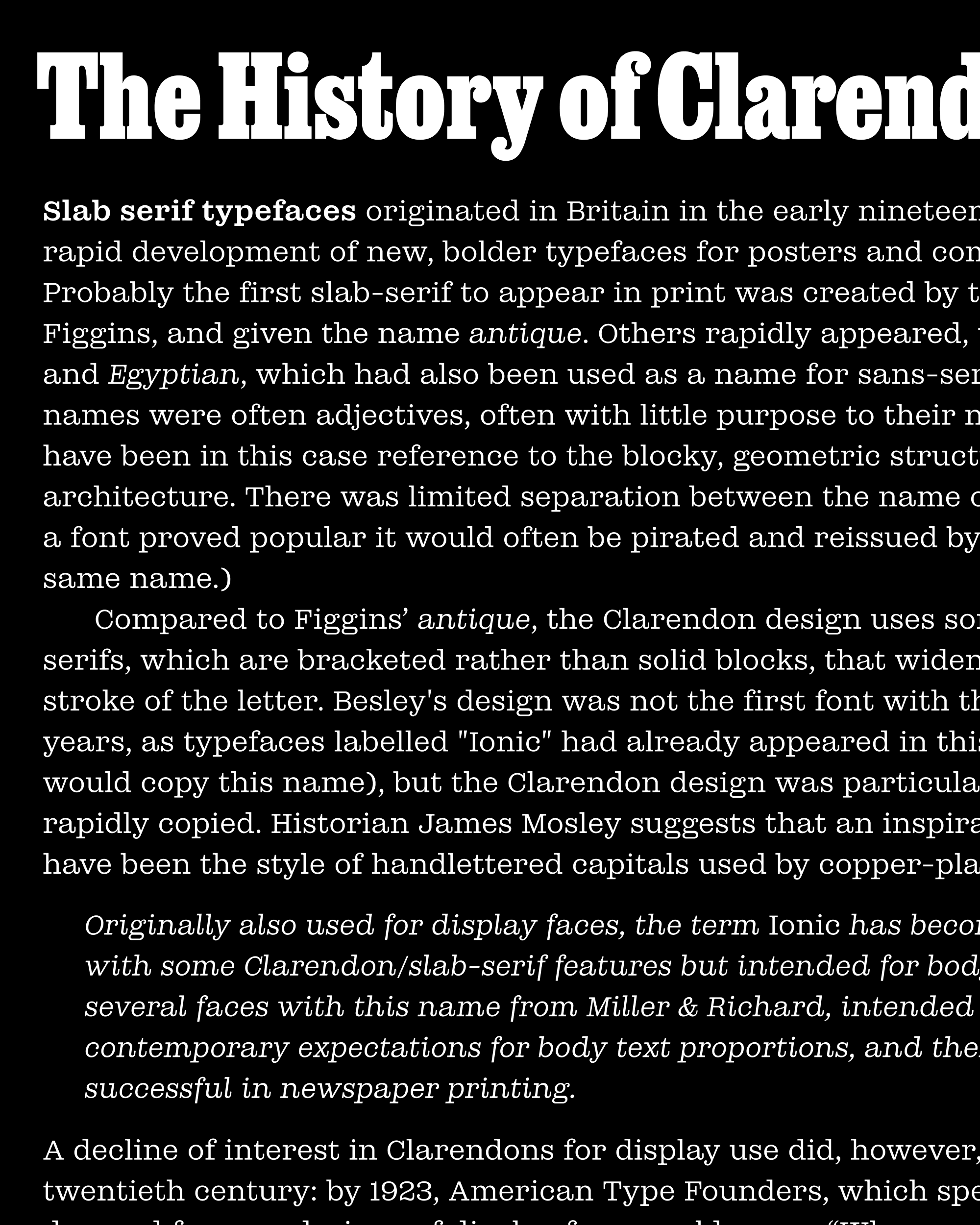
Job Clarendon is all about display—at least that’s how Bethany Heck and I conceived of the design five years ago. It was inspired by the big, bracketed slab serifs that job printers would use for their everyday posters and flyers in 19th century Britain and America. Over the past year, we completed a multiweight, multiwidth designspace with the help of type designer Sophia Tai, who did a lot of work on the boldest, narrowest styles.
Last year, Bethany, Sophia, and I also worked on wider styles of Job Clarendon for a commission, which also included contributions from type designer Jacques Le Bailly (The client hasn’t announced it yet, so I’ll hold off on sharing specifics for now.) The client and I discussed creating a version of Job Clarendon for body text, but in the end it was dropped from the project. I couldn’t shake the idea that a text face derived from this commission would be an interesting next step for the display-oriented series.
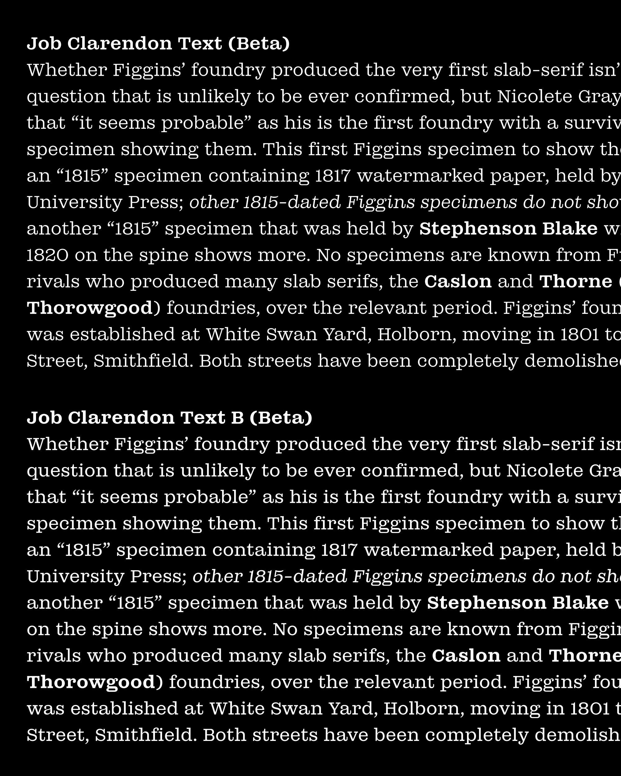
Obligatory screenshot using Type-X showing how I test my text fonts as I work on them. A crucial part of the process!
While the original Job Clarendon emphasizes narrowness and density, this text version is light and wide. In many ways it moves closer to the prototypical Haas Clarendon in terms of its overall style and proportion, with a fully round O (only the Bold weight retains any straight-sided counterforms) and long tails on R and a. At the same time, I tried to preserve Job Clarendon’s rigidity in a way that is subtle but hopefully still shines through in text—I’m talking about details like the overly-wide a and the elongated lower bowl of g.
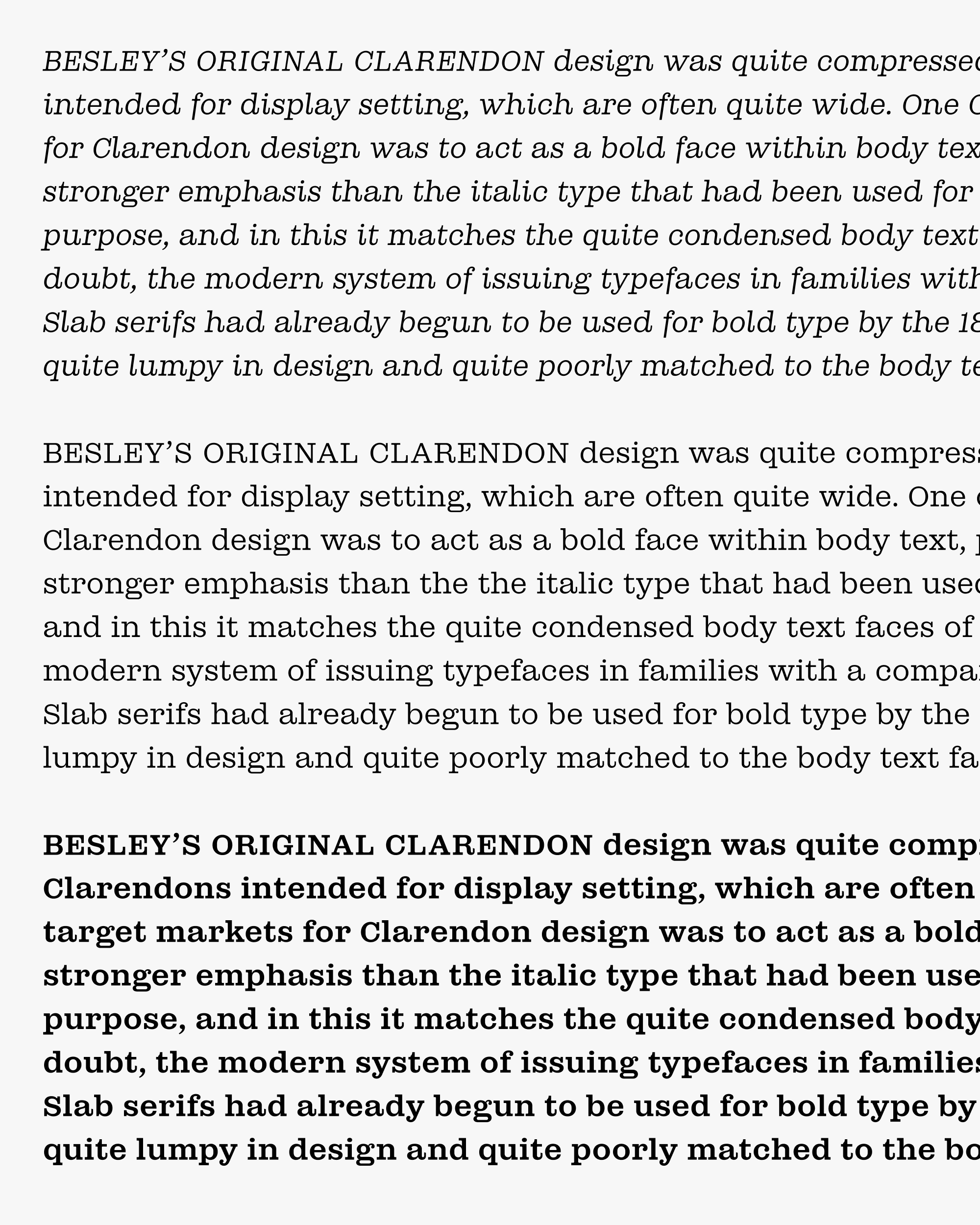
At text sizes, global decisions like weight, rhythm, and proportion matter far more than details like serifs and ball terminals. To make the typeface robust in small sizes, I enlarged the x-height beyond what is typical for the style, and allowed the ascenders to exceed the cap height. While testing the font, I ended up preferring a slightly lighter weight than I expected to at my target size of 14px / 10.5pt. If the light weight bothers you, I’ve made the last-minute decision to throw in a beefier variant, called “Job Clarendon Text B”...I’m curious to hear if you prefer it! (The variable font’s not quite ready yet, sorry.)
19th-century Clarendons did not have italic counterparts, so part of what I worked on with my client was figuring out what style of Italic would feel the least anachronistic: all tails, all slabs, or a little bit of both. We ended up choosing the hybrid model (slabby instrokes and tailed outstrokes) and used Egizio as our primary reference. I think it’s a good compromise—the plethora of tails at the baseline completely transforms the Italic’s texture, but the slabs prevent the design from feeling too flowy or cursive.
I’m happy to be working on this update at a particularly fruitful time for bracketed slab serifs — other recent releases include Stringer by Emily Klaebe, Ploquine by Emma Marichal, and an update of Commercial Type’s Caslon Ionic / Ionic Modern. I hope this is only the beginning of a full-on Slabissance in contemporary graphic design!
Even if Job Clarendon Text gets used nowhere else, I am happy that I finally have a text font that is perfect for Job Clarendon’s new(ish) web specimen! It was art directed by Bethany Heck and developed by Phil Moody, and includes 26 gorgeous type posters designed by Noah Baker.