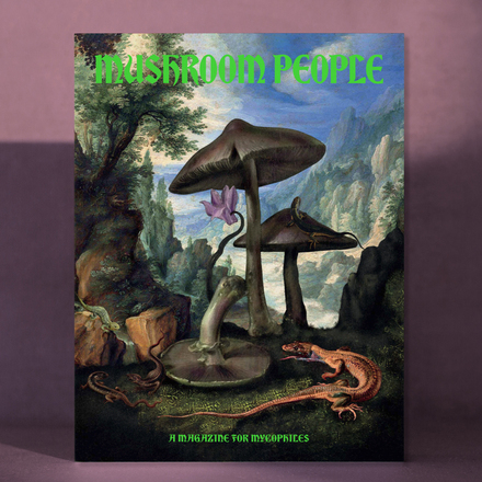
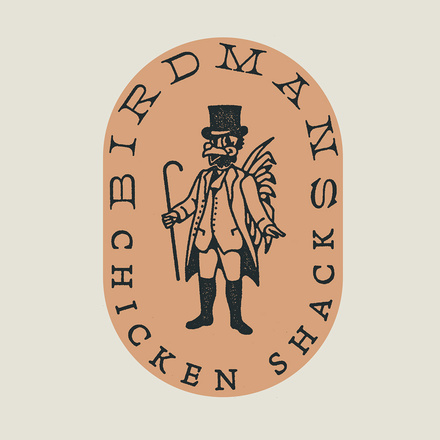
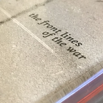
Fern
A Venetian oldstyle for screens & other things by David Jonathan Ross
From the Renaissance faces of Nicolas Jenson to the great twentieth century revivals like Centaur and Dante, the Venetian Oldstyle represents the typographic Roman letter’s first big break from the calligraphic tradition of the Carolingian Minuscule. When it comes to elegant book typography, nothing beats its light, ribbonlike forms.
Text on the screen is a different story. It’s easy for these designs to get light and splotchy. Web designers frequently pass over these classics, opting for sturdier alternatives based on Baroque and Enlightenment Romans instead (or, let’s be honest, sans serifs).
Fern is a Venetian that is native to the screen. Instead of reducing the diagonal stress that can be so troublesome on screen, I exaggerated it. Fern’s weight clumps in its round strokes and its chunky triangular serifs, giving it a rich texture that shines even on the smallest screen.
Fern is undeniably humanist, but it is not precious or dainty: it is a typeface that lends elegance, strength, and grace to text.
Specimens
Ornaments
OpenType features
Small caps
font-variant: small-caps;
All small caps
font-variant-caps: all-small-caps;
Lining figures
font-variant-numeric: lining-nums;
Tabular figures
font-variant-numeric: tabular-nums;
Superiors
font-variant-position: super;
Scientific inferiors
font-variant-position: sub;
Fractions
font-variant-numeric: diagonal-fractions;
Discretionary Ligatures
font-variant-ligatures: discretionary-ligatures


Get Fern
Additional information
- PDF Specimen
- Desktop Format: OpenType CFF Format (Postscript OTF)
- Web Formats: Web OpenType Font Format (WOFF & WOFF2)
- App Format: OpenType TrueType (TTF)
- Don’t see what you need? Get in touch!