Backasswards!
Reversed-stress typefaces occupy a funny little corner of the world of typeface design. While most genres have grown organically, these faces intentionally flip conventions on their head, with jarring, amusing, and sometimes even useful results.
These faces can offer more to typography than the novelty of gunslingers and swinging saloon doors. I will explore the history of the genre, take a closer look at some particularly interesting specimens, and detail the drawing challenges that arise when the thick parts get thin and the thin parts get thick.
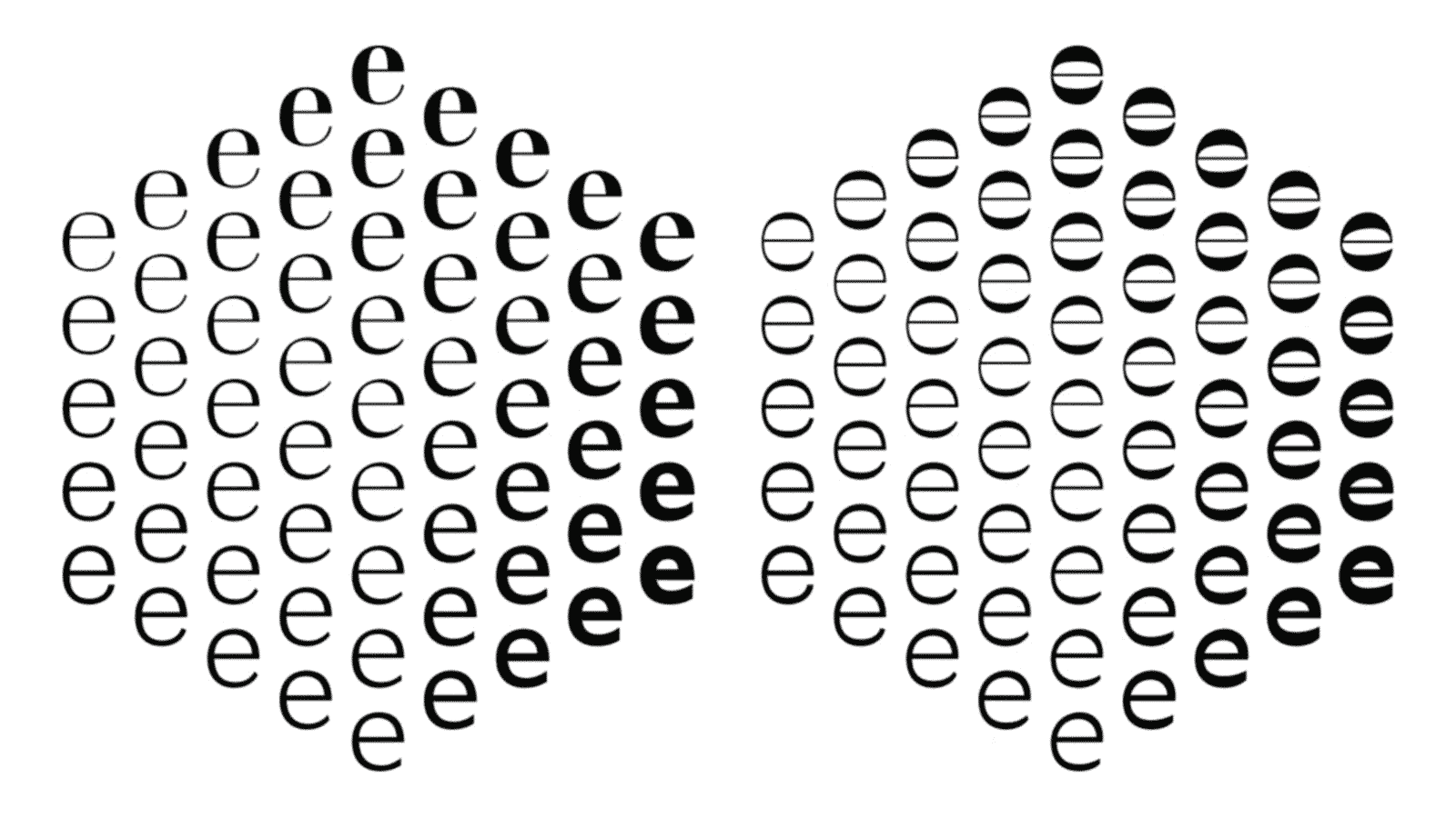
One of the hardest parts of drawing a typeface is finding a new approach to the same old alphabet. I will demonstrate how the reversal of one little attribute is enough to open up a host of uncharted letter-drawing possibilities.
Slides
- Download Slides (PDF, 33mb)
Digital typeface links
Opposite
- Caslon’s Italian, by Paul Barnes (unreleased)
- Karloff, by Peter Biľak, Pieter van Rosmalen, Nikola Djurek
- Maelstrom, by Kris Sowersby
- Slab Sheriff, by Alex Sheldon
Texture
- Manicotti, by David Jonathan Ross
- Playbill, by Robert Harling
- Figaro
- PT Barnum
- Westside, by Adrian Frutiger
- Monster, by Sindre Bremnes
- Arbor, by Chester Jenkins
- Trilby, by David Jonathan Ross
Funkiness
- ITC Bottleneck, by Tony Wenman
- West Barnum, by Dave West, digitized by Ben Kiel and Adam Cruz
- West Banjo, by Dave West, digitized by Mitja Miklavčič
- Benguiat Buffalo, by Ed Benguiat, digitized by Donald Roos
- Dude, by Dan Gneiding
- ITC Zipper, by Philip Kelly
- Jackson, by Bernard Jaquet
- Assorted Device Fonts, by Rian Hughes
- The Satura Suite, by Göran Söderström & Peter Bruhn
Dynamism
- Estro, by Aldo Novarese
- Chimera, by Maria Doreuli
- Eggwhite, by Cyrus Highsmith
- Seashore, by Ale Paul
- Inverse script lettering, by Marina Chaccur
- Antique Olive, by Roger Excoffon
- FF Balance, by Evert Bloemsma
- Enquire, by Antonio Cavedoni
- Signo, by Rui Abreu
Play with Contrast & Stress
Drag your mouse to change the contrast. Hold down shift and drag your mouse to change the stress. This demo was built in Processing.js.
Noordzij cube app
At this time, this demo will only work as a desktop application (Java required). Move your mouse to change the orientation of the cubes. Hit space bar to animate. Hold down ‘q’ to focus, and press ‘e’ to change perspective. This demo was built in Processing.
Alternatively, grab your popcorn and watch this little movie:
See also Wei Huang’s take on the reverse cube!
Acknowledgements
Many thanks to the following people who provided images and insights for this talk:
Contact
Did I forget something? Cool reverse stress finding? Ideas for how I can make this into a more complete resource? Please, get in touch!