A look at January’s Extraordinaire
It’s hard to believe we are already halfway through January. Here’s a bit more on the design of Extraordinaire, this month’s font for the Font of the Month Club.
When I started my typeface Bungee in 2011, I originally drew its shade as a simple “pin-line” stroke. This turned out to be a lot more difficult than I anticipated; because the shade never touches the letterform, it was hard to know how to end the stroke or what to do when one disappeared behind a curve. In the end, I was never able to get this to feel right for Bungee, and eventually abandoned it in favor of a more conventional drop-shade. But I didn’t let go of the idea.
I figured that a single-stroke shade might work better with a single-stroke typeface, but there’s just one problem: hairlines can be kinda boring. So much of what I love about drawing type comes from the contrast of thick and thin, and a hairline has none of that.
So I looked to Art Deco, as practitioners of this style did a ton of weird, interesting stuff with the skeletons of letters. I confess I am a sucker for their high and low waists, exaggerated proportions, and letters like C and S that can get so narrow that they almost disappear.
I found the final piece of the puzzle just last month during a visit to São Paulo for the amazing DiaTipo conference. Wandering past beautiful Art Deco buildings in the city center, I kept seeing this diamond-shaped O appearing in the signage above the doorways. It dawned on me that a pin-line shade would never have to awkwardly disappear behind an O with pointy tops and bottoms, so it would always feel well-defined.
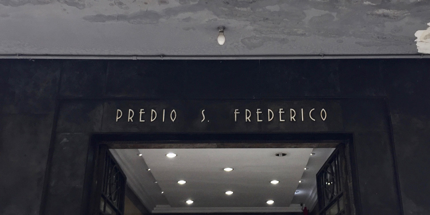
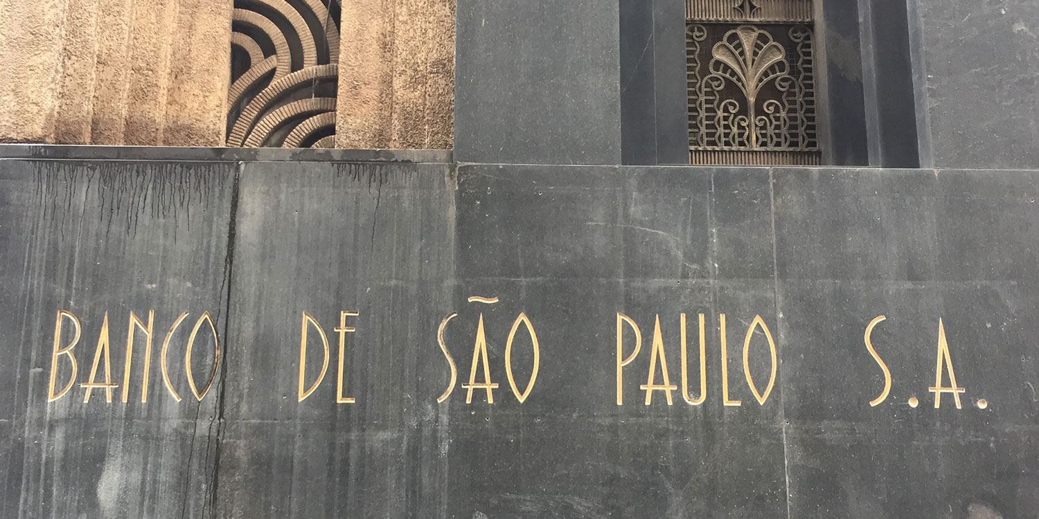
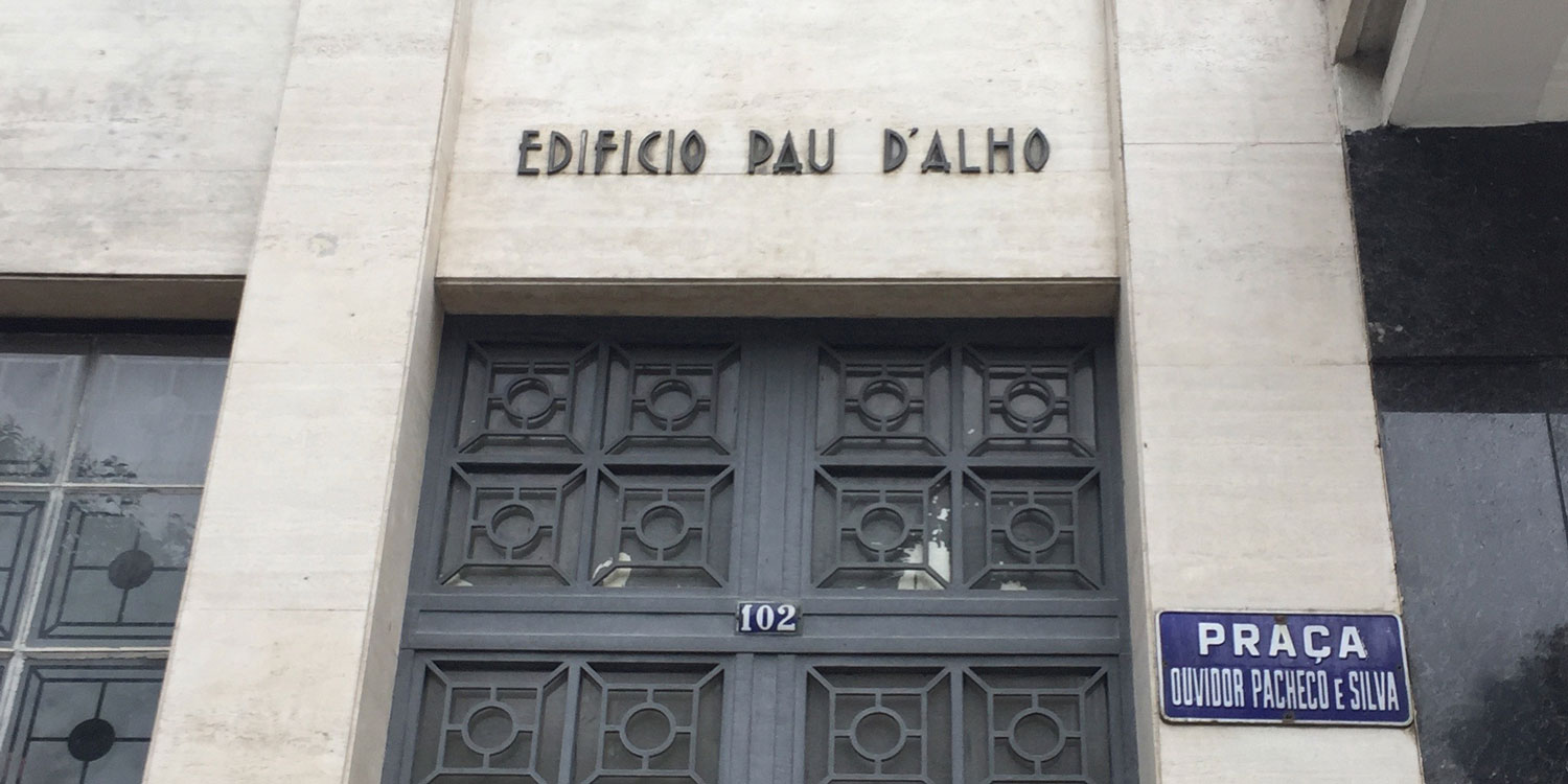
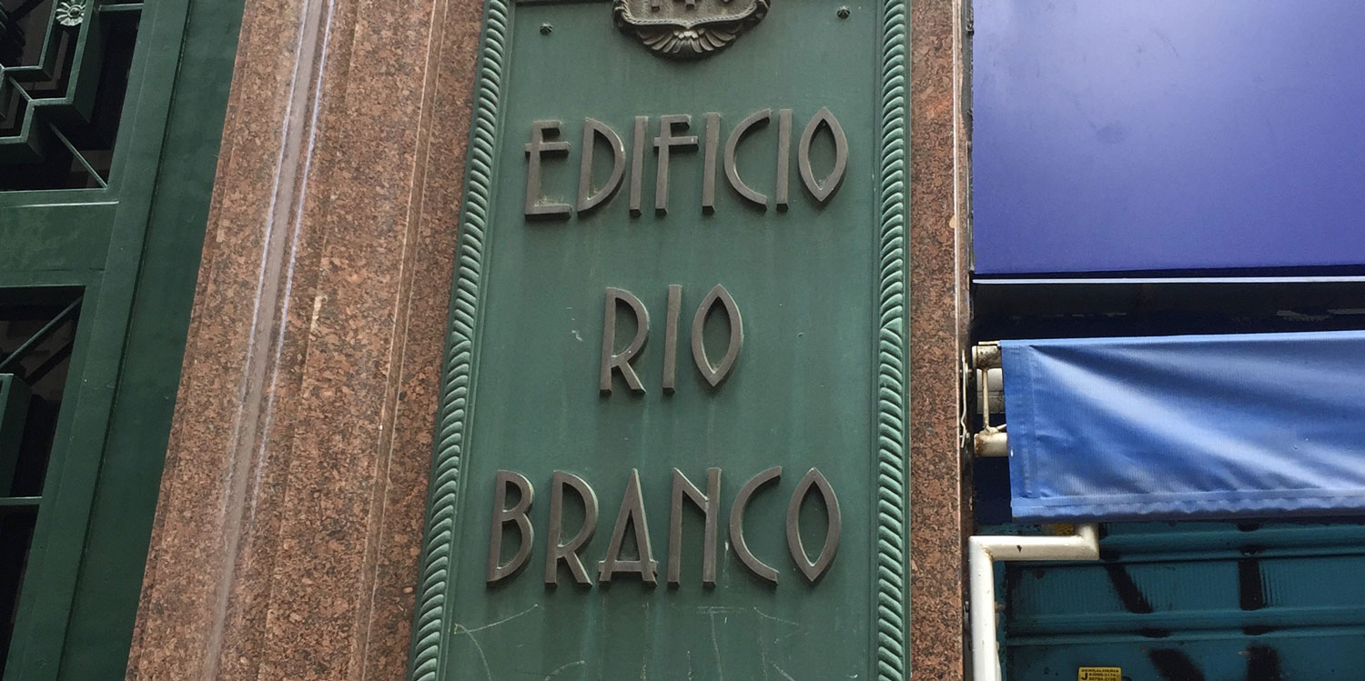
Signs I saw during my day wandering around São Paulo. Many more examples at Tipos Paulistanos.
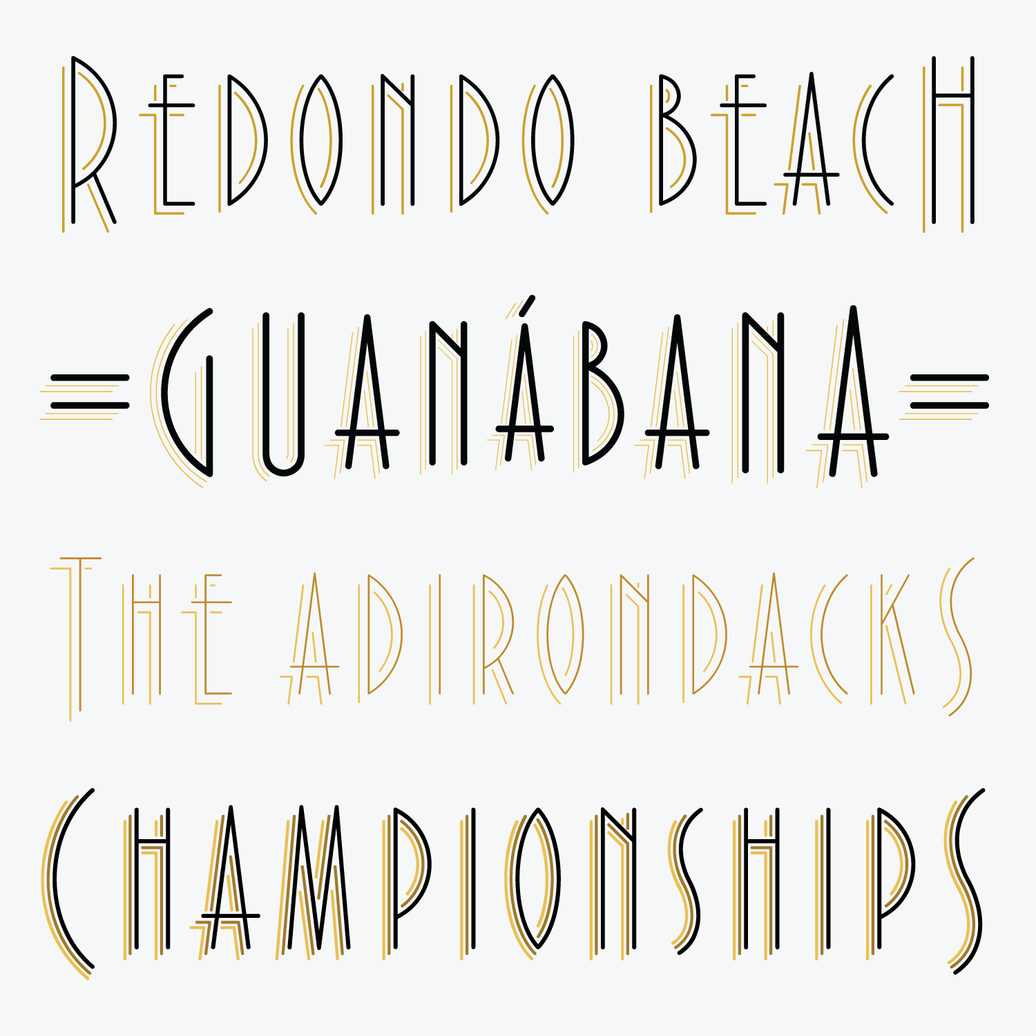
Out of all this comes Extraordinaire, my proof-of-concept for a variable single-stroke shade. Not unlike my revival of Crayonette, its capitals descend below the baseline so that the small caps are vertically centered. The round endings of the strokes give the face a breezy, informal look that is distinct from the sharpness that I usually associate with Art Deco.
One last thing: Extraordinaire is meant to be used big. Super thin strokes can be tricky to work with and are always a challenge for printers and rendering engines. I hope that club members will take advantage of Extraordinaire’s adjustable weight and shade distance; by using its assortment of styles and/or its variable fonts, you can maintain a consistent stroke weight across different sizes, or layer multiple shades together to create a variety of dazzling effects.
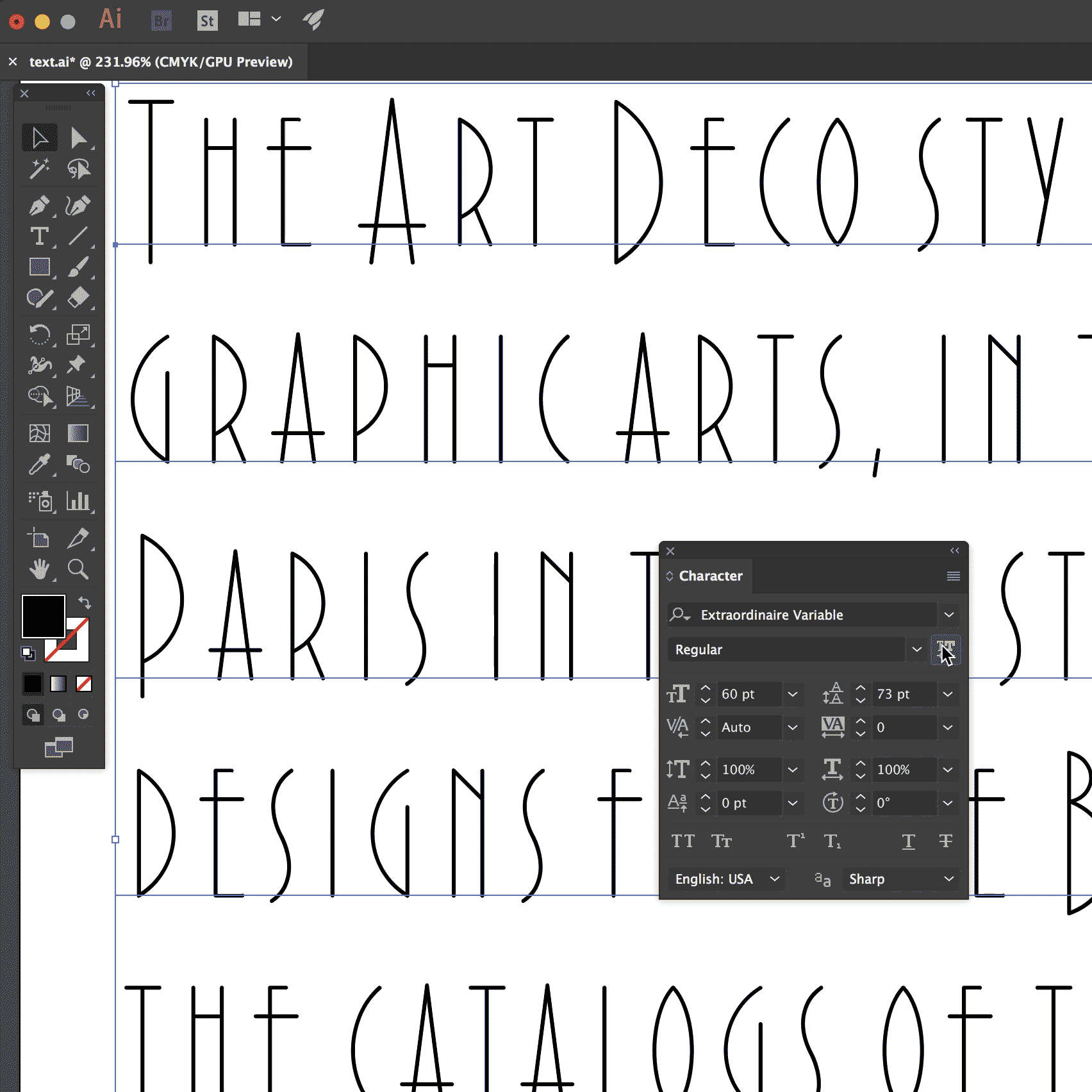
Using Extraordinaire in Adobe Illustrator CC 2018
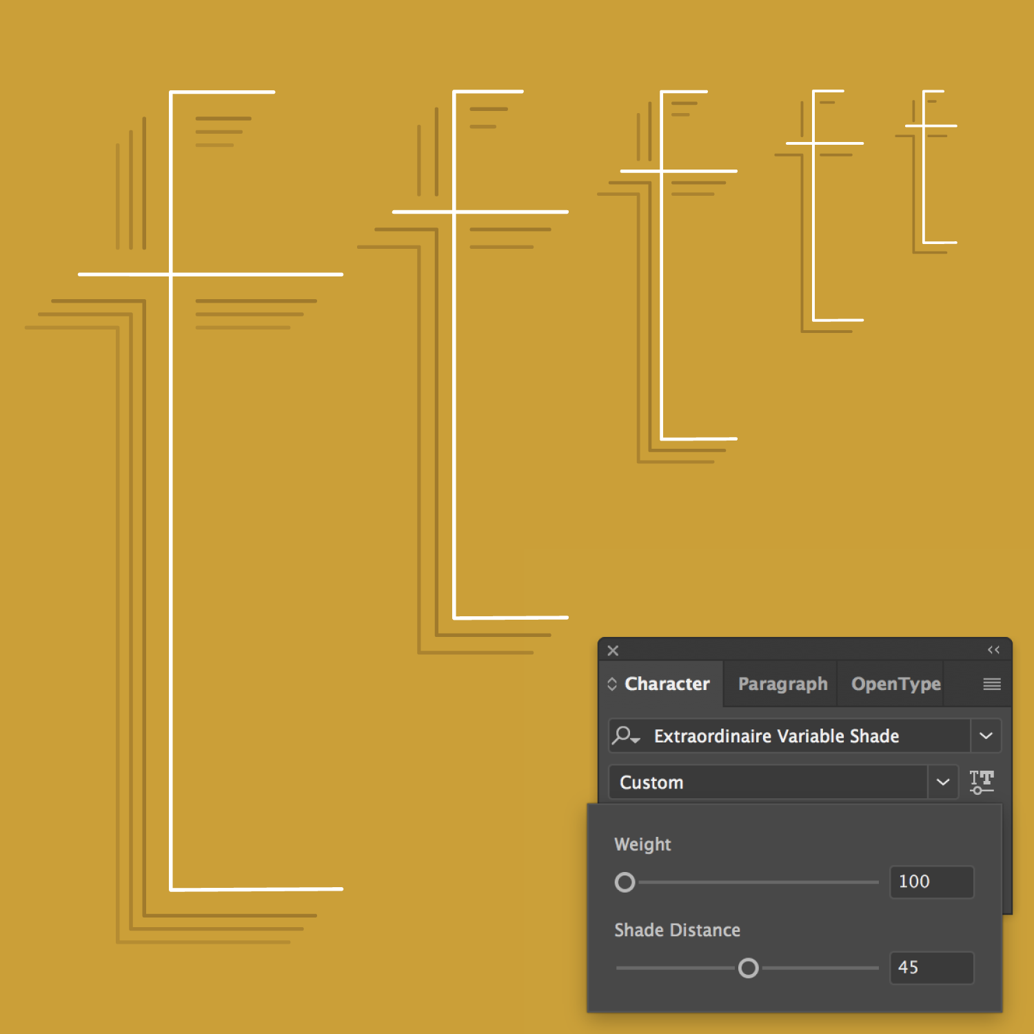
Managing hairline weight and shade complexity across multiple sizes
That’s all for January! If you aren’t already a member, I hope you’ll consider joining Font of the Month Club and putting this font to some extraordinary use!