It all started with a trip to Russia. Gayaneh Bagdasaryan invited me to speak at Serebro Nabora in Moscow, and I chose to give my talk on one of my favorite subjects: reversed-stress typefaces. Since I had no experience drawing the Cyrillic alphabet in reversed-stress, I figured I should prepare for my speech by trying my hand at a Cyrillic version of my first typeface, Manicotti.
The Cyrillic alphabet has a multitude of opportunities for serifs, which makes a thick slab like Manicotti a joy to draw. But what began as a weekend diversion quickly turned into quite the challenge as I sought to tighten up the forms and bring Manicotti’s density and rhythm to an incredibly diverse set of shapes in the Cyrillic alphabet.
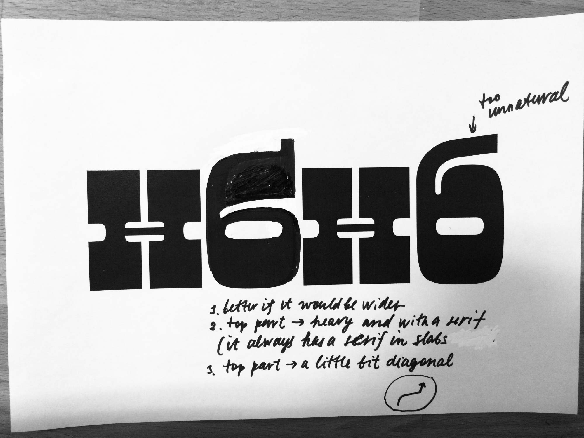
Since I’m not a native reader of Cyrillic, I turned to Russian designer Maria Doreuli. She had previously consulted with me on Input’s Cyrillic and has drawn an amazing reversed-stress face of her own. Maria’s feedback is always incredibly helpful to me, and this was no exception.
Maria Doreuli marked up proofs of Manicotti with ink and white-out.
I had an amazing time in Moscow, and was excited to discover that Manicotti’s Cyrillic was recognized in the Modern Cyrillic competition. Inspired by a chat I had with Bulgarian designer Krista Radoeva, I returned to the font once more to add a set of Bulgarian alternates.
Manicotti’s default forms above, and Bulgarian alternates below.
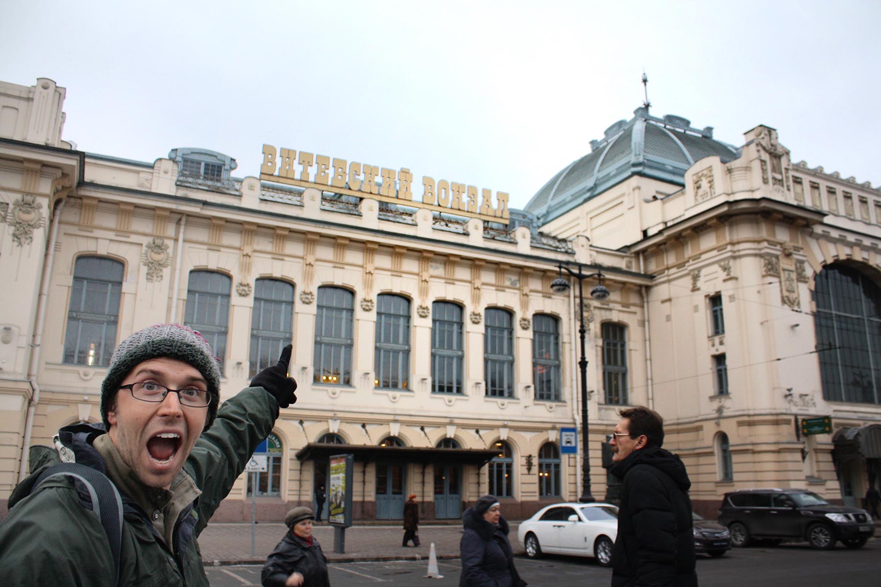
I was amazed to see so much reversed-stress signage and typography in Russia! Here I am, in awe of the Playbill-style sign for a train station in St. Petersburg:
Even though I had no similar plans to travel to Greece, the Greek script seemed like the next logical step for Manicotti. While Cyrillic lowercase letters have significantly more serifs than Latin, the Greek lowercase hardly has any at all. In a design where serifs are such a prominent element of the design, Manicotti required a completely different approach.
Instead of appending unnatural serifs onto the letterforms, I chose to emphasize the horizontal, calligraphic flow of the Greek lowercase. I found that there were more than enough horizontal strokes in Greek to support Manicotti’s weight. The resulting texture is quite distinct from the Latin and Cyrillic lowercases, but I was happy to find a solution that didn’t over-Latinize the alphabet.
Greek designer George Triantafyllakos kindly offered some comments on the design. Among other things, he helped me rethink my gamma and lambda, which pose special challenges since they have no horizontal stroke.
As I expand my typefaces to scripts other than Latin, I am learning to delicately balance of the visual needs of the typeface and the cultural and historic needs of the script. In a novelty face like Manicotti, striking this balance can lead to completely different solutions for different writing systems. I hope you find a way to put both of them to good use.


 Manicotti at Type Network
 Manicotti at Fontstand
 Manicotti at Adobe Fonts