Using Output Sans Hairlines
I’ve been working on Output Sans a lot recently. And in anticipation of its upcoming release, I prepared a special preview of Output Sans’s thinnest weights for the wonderful members of the Font of the Month Club.
Output Sans Hairlines is not the thinnest hairline font out there (talk to Lucas de Groot about “The Thinnest”), but it is still pretty dang thin. One other notable thing about Output Sans Hairlines is that its stroke thickness and optical size are inextricably linked between 34pt and 166pt.

This means that, using its variable font, you can set text at 34pt and then set the stem weight of the letters to be 1px thick. Then you can double the size (or triple it, or quadruple it!), and then set the stem weight to remain (roughly) 1pt thick the entire time. Hairlines can be super finicky and sensitive to size, so this feature can be handy when you want to maintain consistency in weight across text of different sizes.
Setting these 1pt hairlines is pretty easy: just make sure that the value of the Optical Size axis is equal to the point size of the font. Here’s how that looks in the latest version of Adobe Illustrator CC:
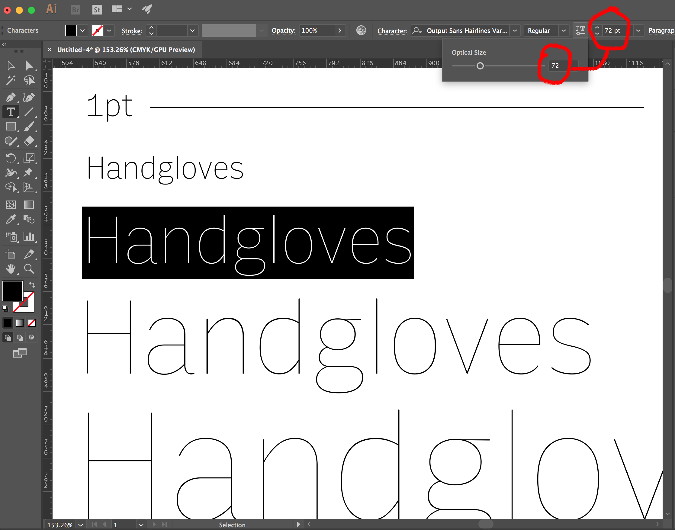
In the future, I would love to see an optional checkbox that would link these two values together, so the optical size axis’s value can be set automatically.
This is not the only feature in Output Sans Hairlines...did anyone see the alternate forms? To all the Font of the Month Club members, I hope you enjoyed this month’s edition. And if you’re not a member yet, there are two days left to sign up before I send out April’s font!