February’s font of the month: Nickel Gothic Wide
Deriving a sans serif typeface from a serif is rarely as straightforward as I want it to be. And that goes double for a typeface like Nickel, whose serifs are so large and distinctive that it’s hard to imagine what it would look like without them.
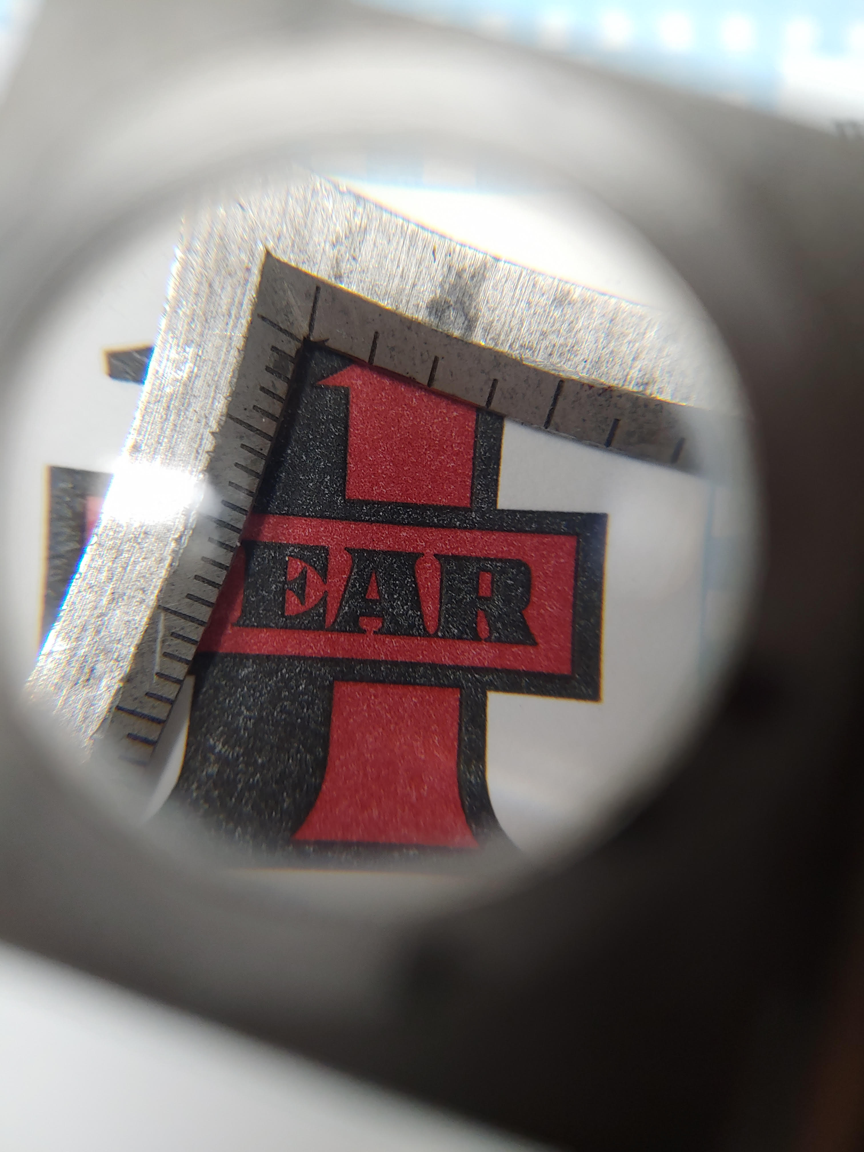
Longtime club members might remember Nickel as the Font of the Month Club’s inaugural release. It’s a stocky engraver’s alphabet based on a banknote inscription that I found in a New York Times article about the design of money.
If you look closely at that banknote, you can see that it also features small supporting text rendered in a squarish sans. It is blocky like the prominent serif above it, but also a good deal wider and heavier. This became the jumping-off point for February’s font, Nickel Gothic Wide.
Seeing those tiny bits of sans serif on that banknote made me realize that, hiding behind Nickel’s oversize, swooping serifs, there’s actually a lot of subtle-yet-interesting stuff that could serve as the blueprint for a sans serif design. And I think this true of many sans distillations; with fewer opportunities to show off, they need to reach a little deeper into their bag of tricks.
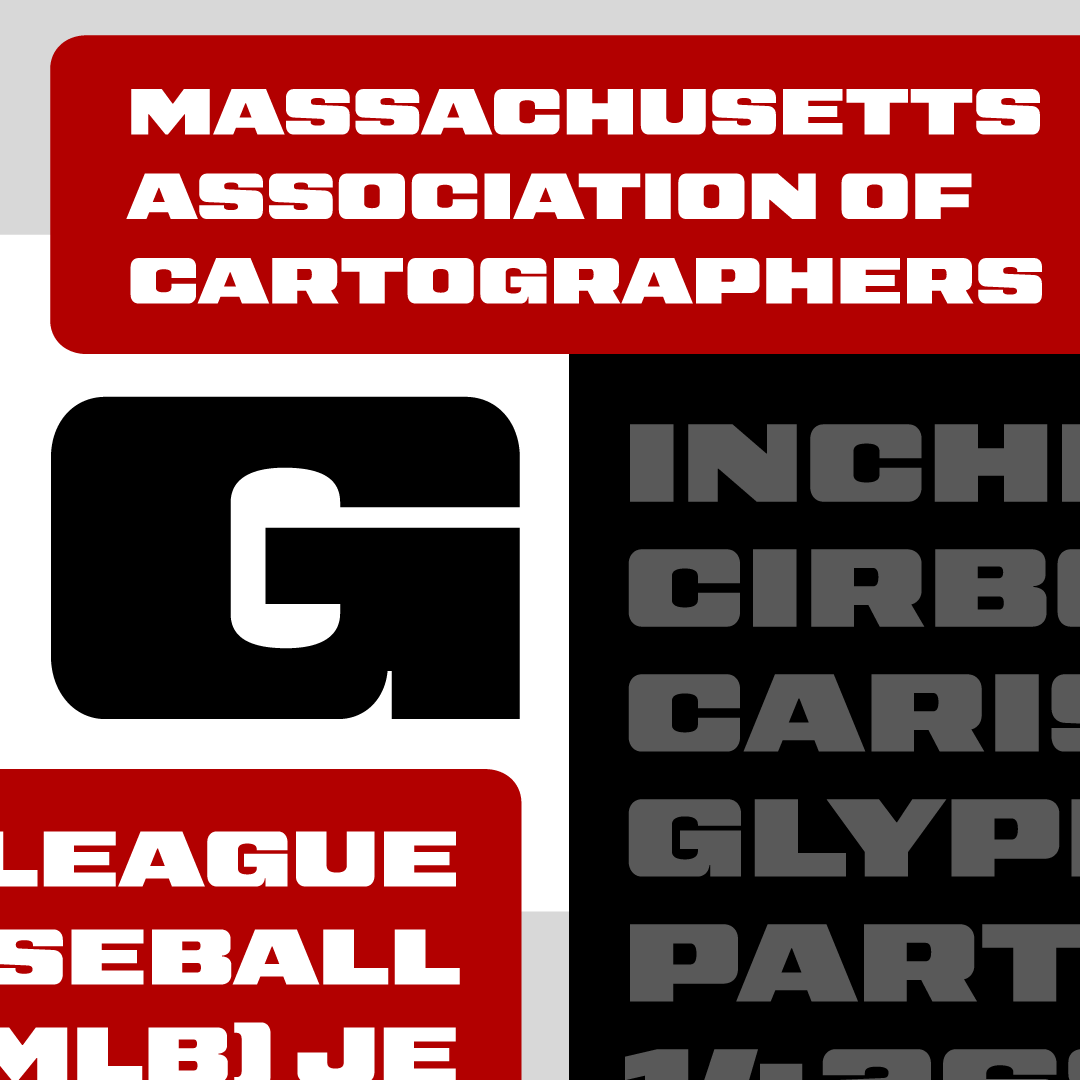
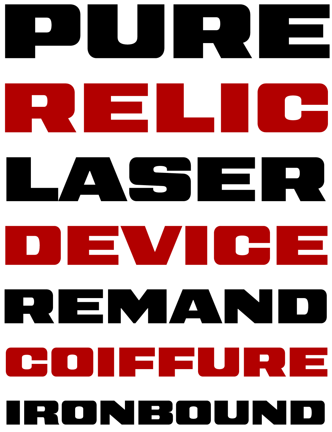
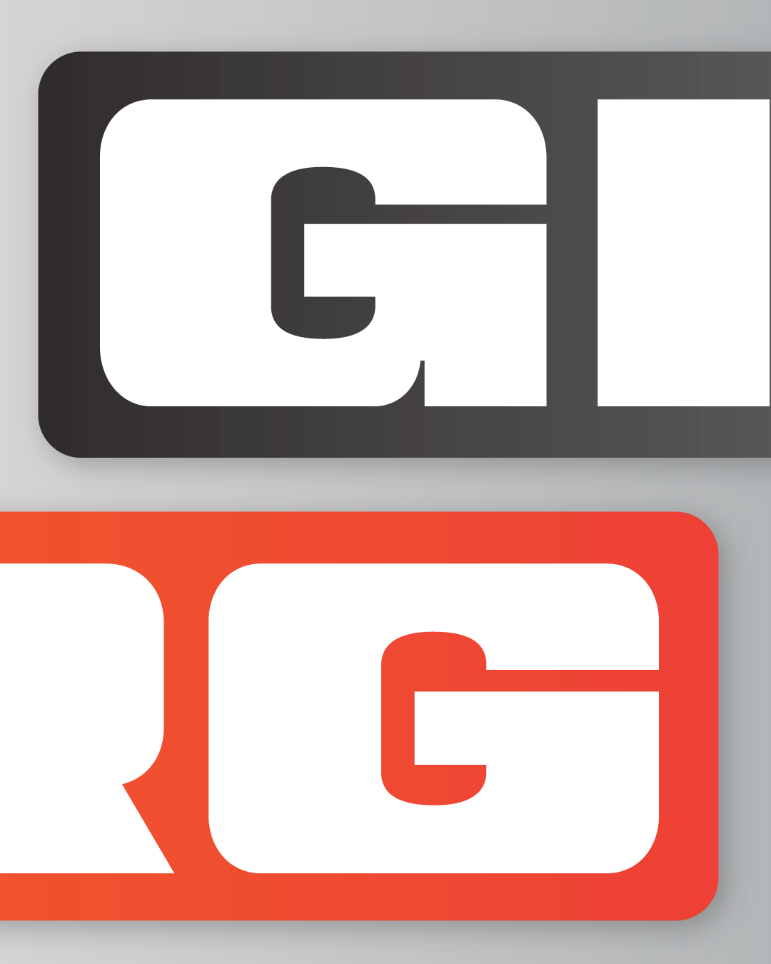
The new sans serif retains the overall squarishness and closed apertures of the original design, but its heavier weight and broader proportions endow it with an intense energy of its own. There is an unusual tension between the round counterforms (with two straight sides) and the round outside shapes (with four straight sides), which sets it apart from other straight-sided gothics.
There is also a certain rawness to Nickel Gothic Wide’s drawing style. The stroke contrast varies greatly depending on the complexity of the letterform (compare the horizontals of B and T, for example), and the shapes are defined by abrupt, near-mechanical transitions between straight and curved segments.
Despite its 1918 roots, Nickel Gothic Wide has a certain ’70s vibe that I made no attempt to shy away from. I was told by multiple people that this type of squarishness reminded them of Neographik, a typeface designed by Robert Barbour in 1970. I’m not sure I had ever seen it before last week, but I totally see the connection!
Neographik got me thinking about drawing alternates that would allow you to calibrate the amount of “Grottiness” in the design. The Neographik-style curvy R pulls the design a step in the direction of the British Grotesques, while the G without the little beard on the bottom (I’m calling it “clean-shaven”) pushes it towards modernist extended faces like Information and Microgramma.
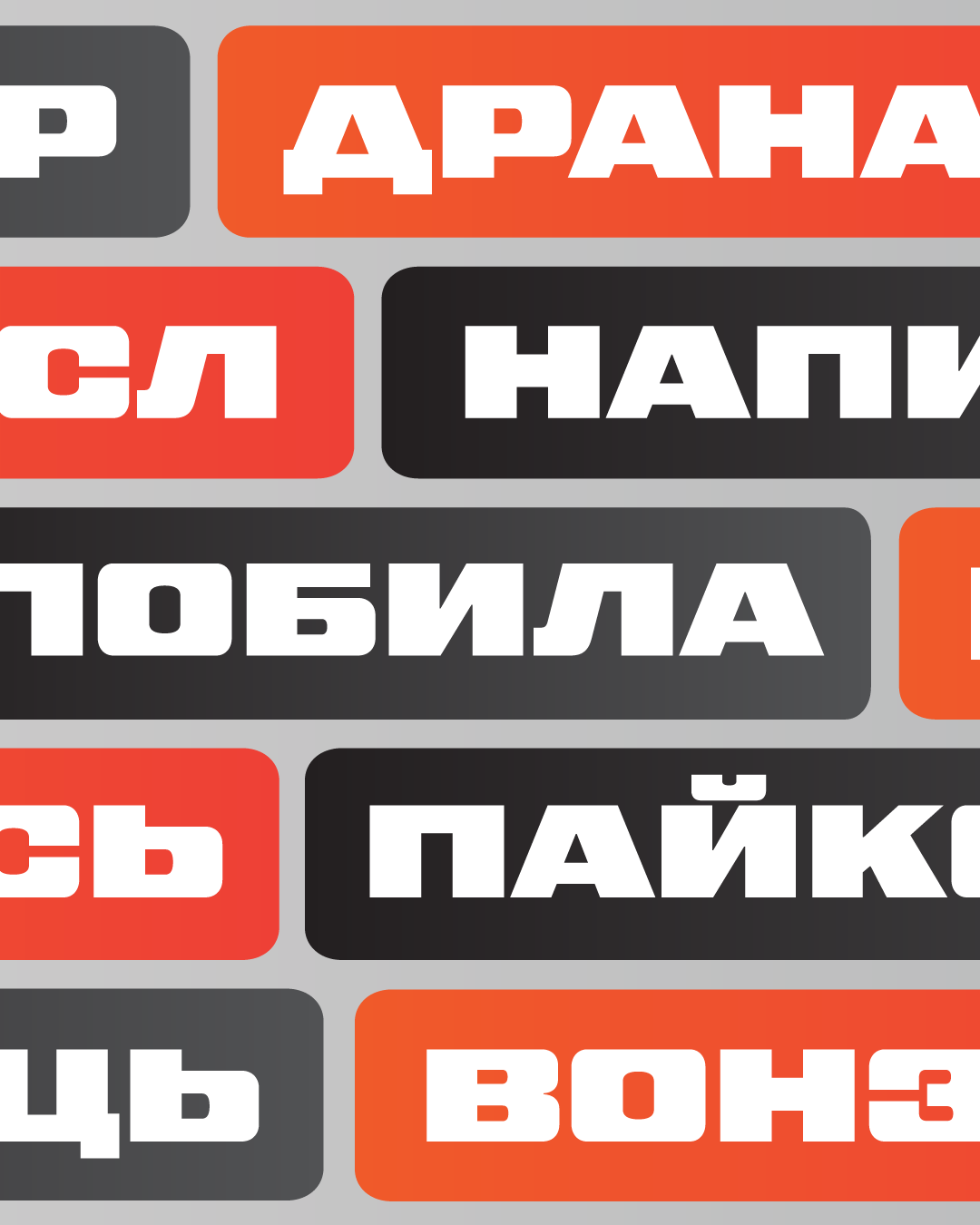
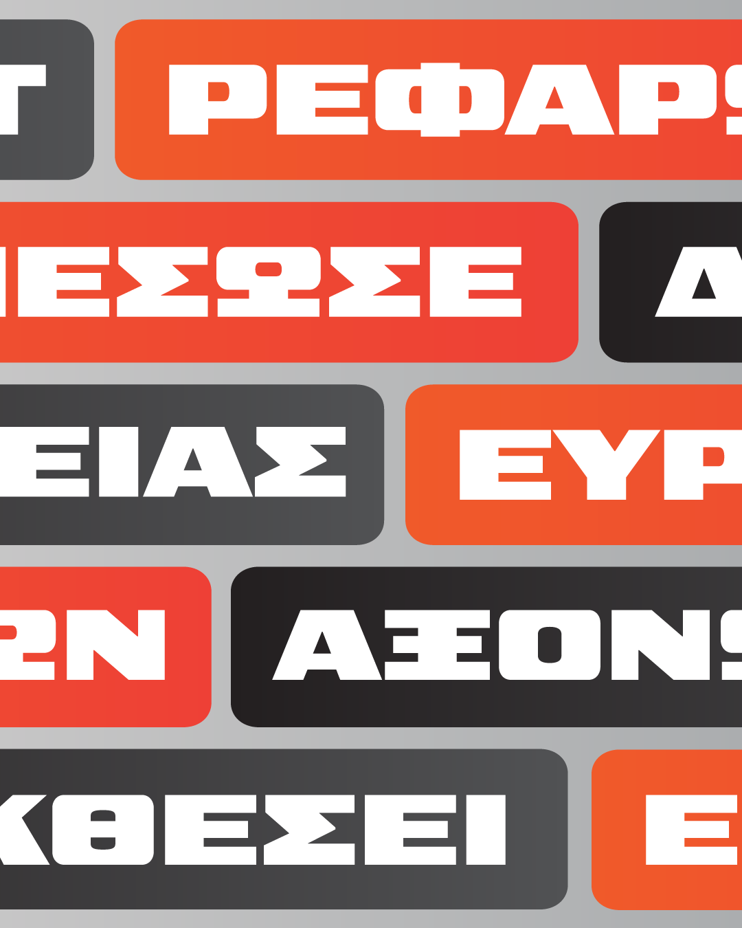
I was curious about how Nickel Gothic Wide would look in other writing systems, and kind of fell into a rabbit hole drawing matching capitals for Cyrillic and Greek. I’m pretty happy with the results, and I hope at least some of you appreciate the additional language support.
Special thanks to Masha Doreuli, George Triantafyllakos, and Irene Vlachou for their comments on the Cyrillic and Greek, and Sybille Hagmann, André Mora, and Nick Sherman for their general suggestions about the design. And finally, many thanks to María Ramos and Stephen Coles for writing/publishing the review of Nickel on Typographica, which convinced me to move forward with an expansion of the design.
Nickel Gothic Wide is available this February for members of the Font of the Month Club; memberships go for as little as $6/month, so be sure to sign up today!
Work in progress…cover design of the script book of five plays/musicals pic.twitter.com/2liE130nxL
— Elvin Hu 🌈 (@e_l_l_l) February 13, 2019
Up/down. Featuring Input Mono by @djrrb pic.twitter.com/y4ZwjBR75s
— Just van Rossum (@justvanrossum) February 1, 2019