November’s font of the month: Pappardelle Party

It is no secret that I have a soft spot for fonts with horizontal and reverse stress. In fact, I was worried that this affinity would lead me to lean too much on the genre when choosing what I would make you for this club.
So I am celebrating a small milestone this month: I managed to make it a whole year without featuring a horizontal stress face in this collection. What restraint! And what better way to celebrate this milestone than to break that streak and send you one right now?
Pappardelle Party is a stencil version of Pappardelle, a twentieth century take on the French Antique that I released last October. Compared to its wood type predecessors, Pappardelle takes a more modernist approach, interested more in the abstract shapes than in their connection to the ruggedness of the Wild West.
The stencil version further abstracts the design into a geometric grab bag of lines, rectangles, and semicircles. Even though Latin stencil designs tend to have vertical “bridges” that hold the shapes in place, the bridges in Pappardelle Party follow its contrast, creating horizontal bands that cut across a line of text.
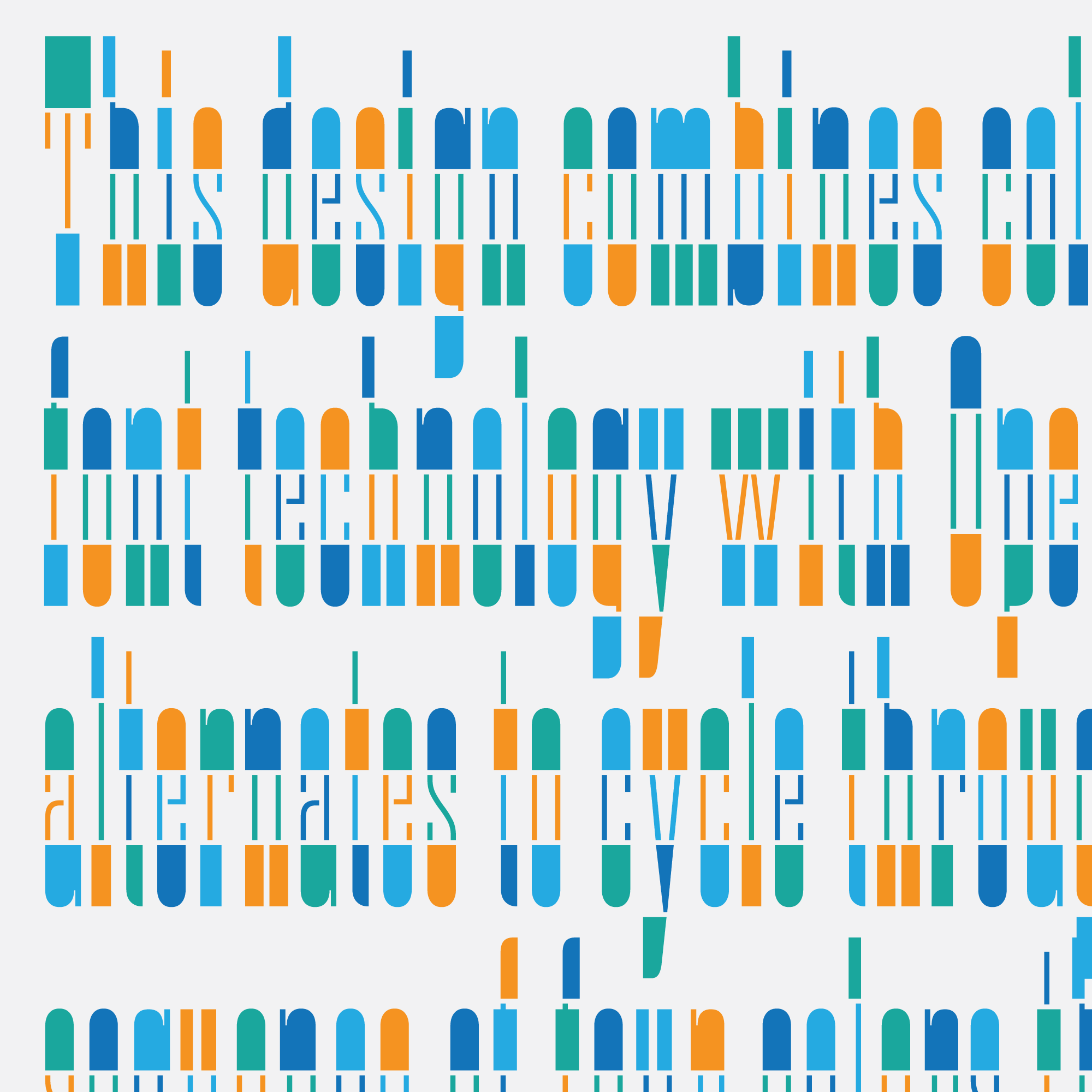
But Pappardelle Party’s true novelty comes from its unconventional combination of chromatic glyphs, OpenType contextual alternates, and a variable axis. With a palette of four colors, the font cycles through four different arrangements of colors for each character that is typed.
The starting point of this endless cycle is governed by a variable “Color Spinner” axis. This allows you to vary the “seed” which begins the contextual cycle, and is also great for animation and interaction.
With all the things that Pappardelle Party does, it is also notable for one thing it doesn’t do: interpolate. Unlike other variable fonts out there, there are no changing weights or morphing outlines; the variable axis simply swaps out glyph after glyph (a big thank you to Irene Vlachou for her technical advice on this). I hope this will lead to more exploration of how variable fonts can give users new ways to access alternate glyphs.
There are a few flavors of color fonts out there, each with their own complexities and support issues. I am sending you two: COLR/CPAL, which has a smaller filesize and is supported by most modern web browsers, and SVG-in-OT, which is supported by apps such as Photoshop and Illustrator (Photoshop can be a little finicky though, so you may have to disable and re-enable Contextual Alternates to get it working).
And because alternative color palettes are not supported in apps and browsers quite yet, I now have a new and improved Color Font Customizer, where you can drag on your font, pick your own colors, and download a customized version. Many thanks to Chris Lewis for putting it together!
I fully admit that Pappardelle Party is one of the tackiest things I have ever produced. Try not to do anything too cringeworthy with it, okay? 😉
Pappardelle Party is available to order as a back issue for all members of the Font of the Month Club.