Congratulations to @djrrb on being honored with the 10th Prix Charles Peignot at #ATypI2018 in #Antwerp. It’s such a pleasure to recognize this innovative, kind, and generous member of our community. Inspirational. pic.twitter.com/rycJH6ojIm
— ATypI (@ATypI) September 14, 2018
September’s font of the month: Bradley DJR
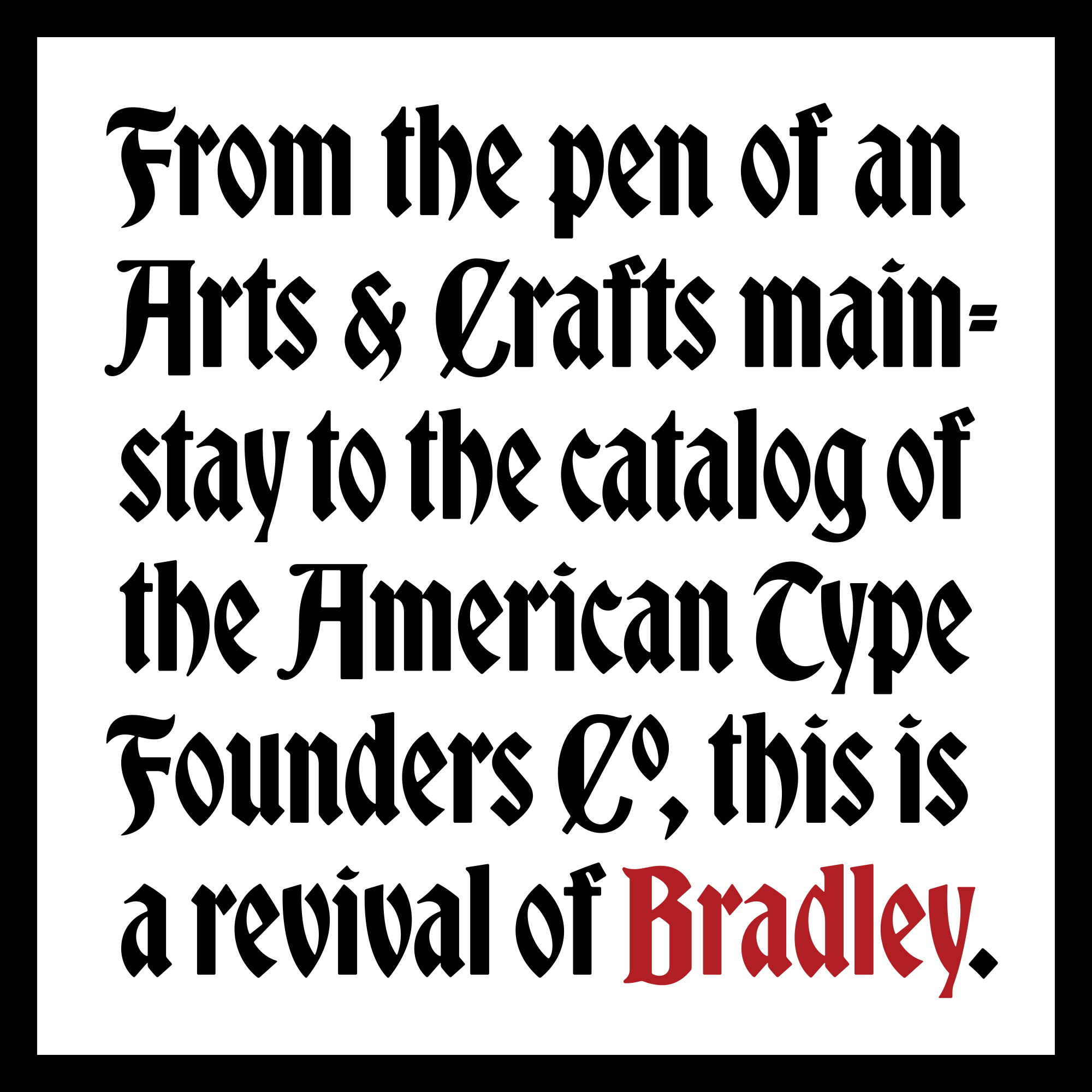
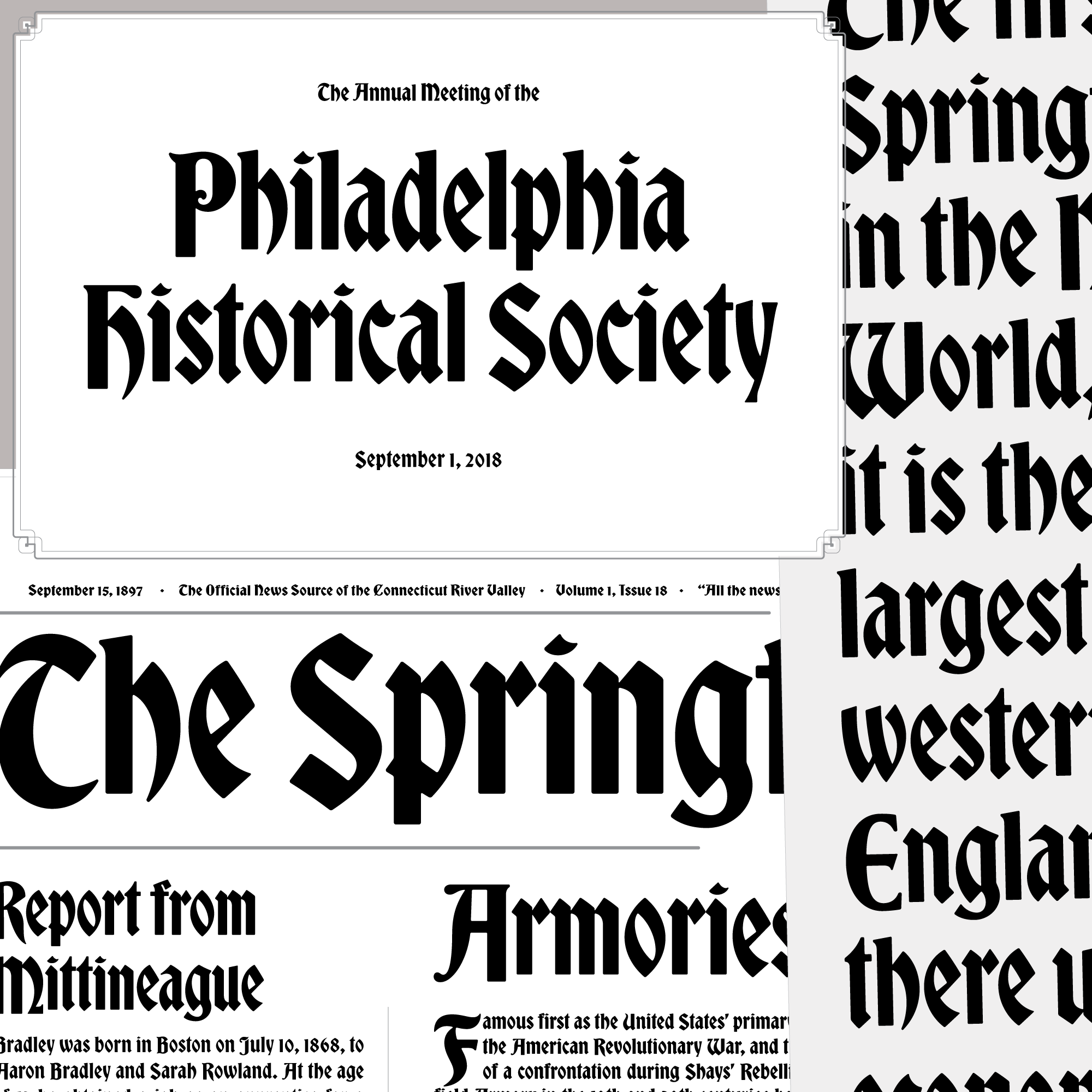
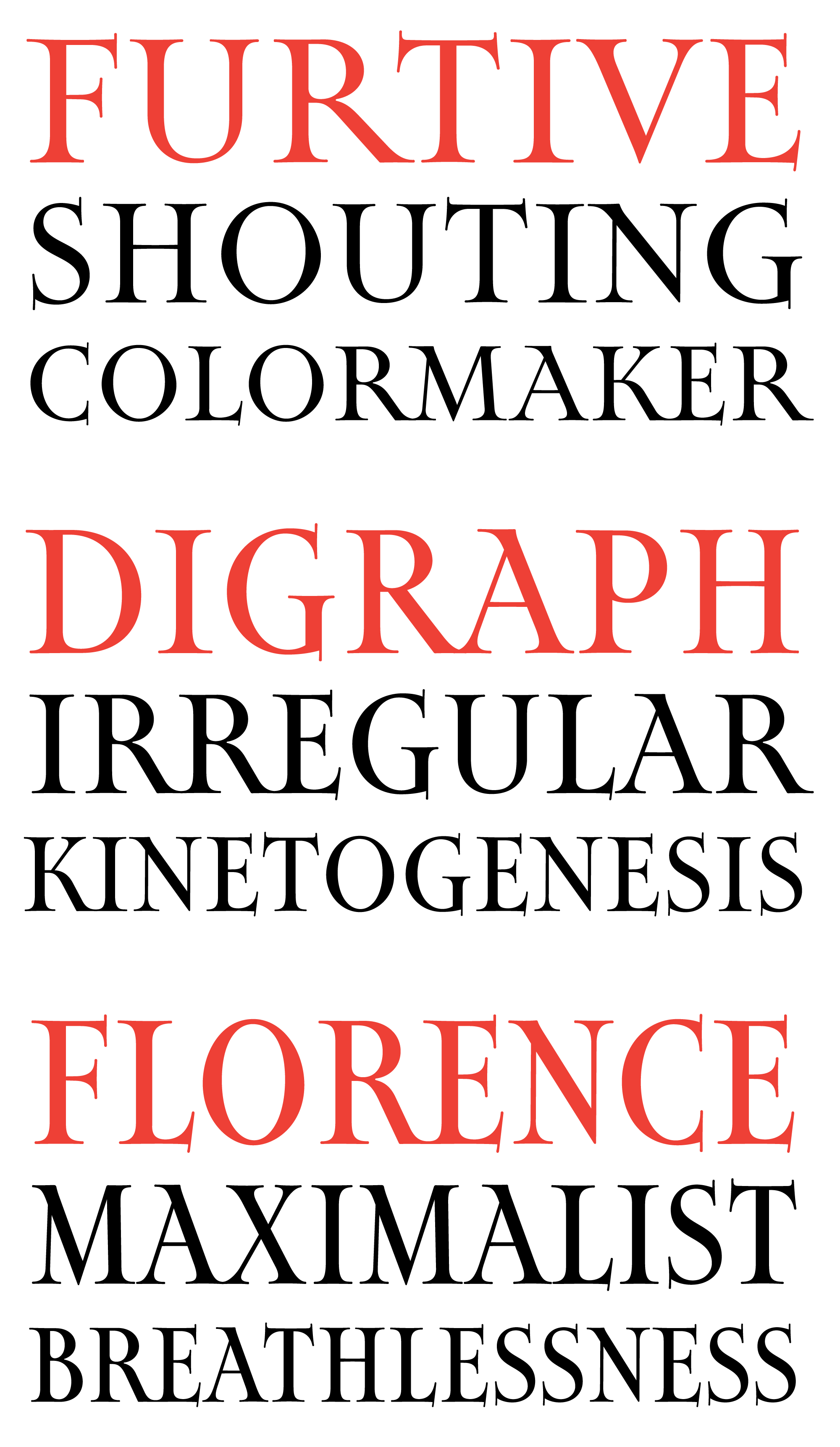
A blackletter has been on my Font of the Month Club bucket list since the beginning. So this month I am very happy to cross that off the list and to send the Font of the Month Club a revival of Bradley, an unusual blackletter published in 1895.
I’ll confess to not knowing much about drawing blackletters, so this was an opportunity for me to learn by diving deep into an peculiar design and trying to make some sense of it. I’ve felt a connection to this typeface for a while, which intensified when I learned that its namesake, Will H. Bradley, was living and working in Springfield, Massachusetts at the time of its publication (not so far from where I live now!).
At the time, Bradley had been making a name for himself with work that blended the historicism of the Arts & Crafts movement with the expressive lines of Art Nouveau. In 1894, he illustrated and lettered an incredible series of covers for The Inland Printer, a trade magazine for the printing industry, including the Christmas issue pictured below.
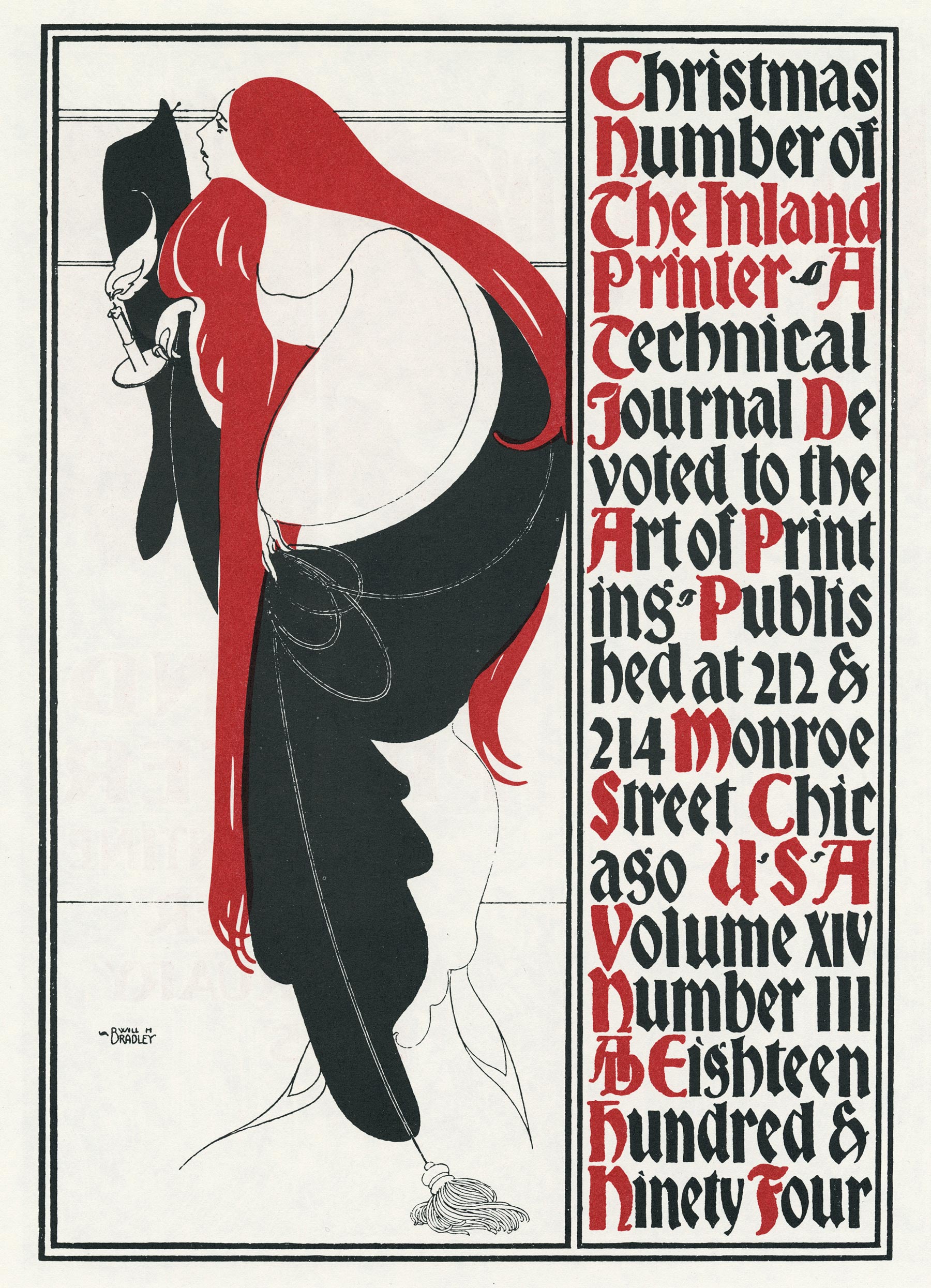
The cover for the Christmas 1894 Inland Printer, as reproduced in “Will Bradley: His Graphic Art.”
The unusual blackletter on that cover must have caught the eye of someone at the recently-formed American Type Founders Company and they promptly licensed the design. Most sources point to Hermann Ihlenburg as the person responsible for transforming it from a piece of lettering into a full-fledged type design. (Longtime club members might remember Ihlenburg as the as the designer of Crayon, the precursor to my last revival, Crayonette.)
As we type designers tend to do, Ihlenburg regularized the shapes in Bradley’s lettering, and the choices I made in my digitization certainly continue that trend. The simplified, unadorned letterforms made it more accessible to American readers unaccustomed to blackletter. And Bradley’s style has a vibe that is quite distinct from other blackletters: it is more antique store than heavy metal album, more fantasy storybook than medieval manuscript...after all, it was the choice for the Sleeping Beauty storybook in Disneyland’s famous castle! 🏰
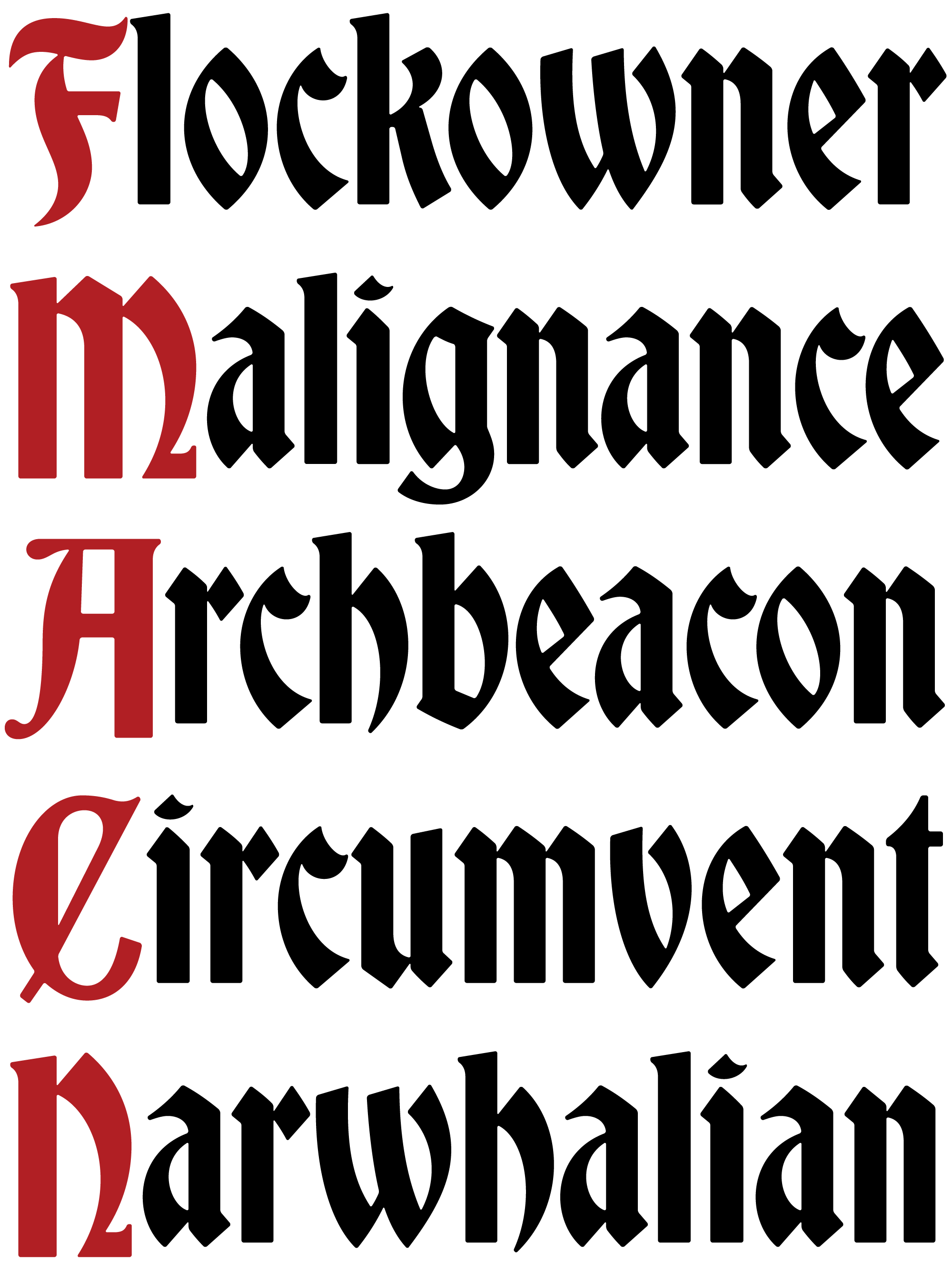
I should point out that I’m not the only person to attempt a digitization of this typeface, but the others weren’t quite doing it for me. They were drawn with super-crisp edges and the result just felt too digital (in the direction of Emigre’s Totally Gothic). To me, the paradox of a blackletter like this one is that it can have so many corners but it somehow never feels sharp.
Following the strategy that Roger Black and I employed in our revival of Forma, I drew Bradley DJR with subtle rounding that gives some more substance to those corners, not exactly mimicking the blotting of printed foundry type but certainly paying homage to it. I also tried my hand at a variable Optical Size axis that spans ATF’s original range of sizes, from 60pt headlines to teensy 6pt text (a Micro version is a rarity for digital blackletters).
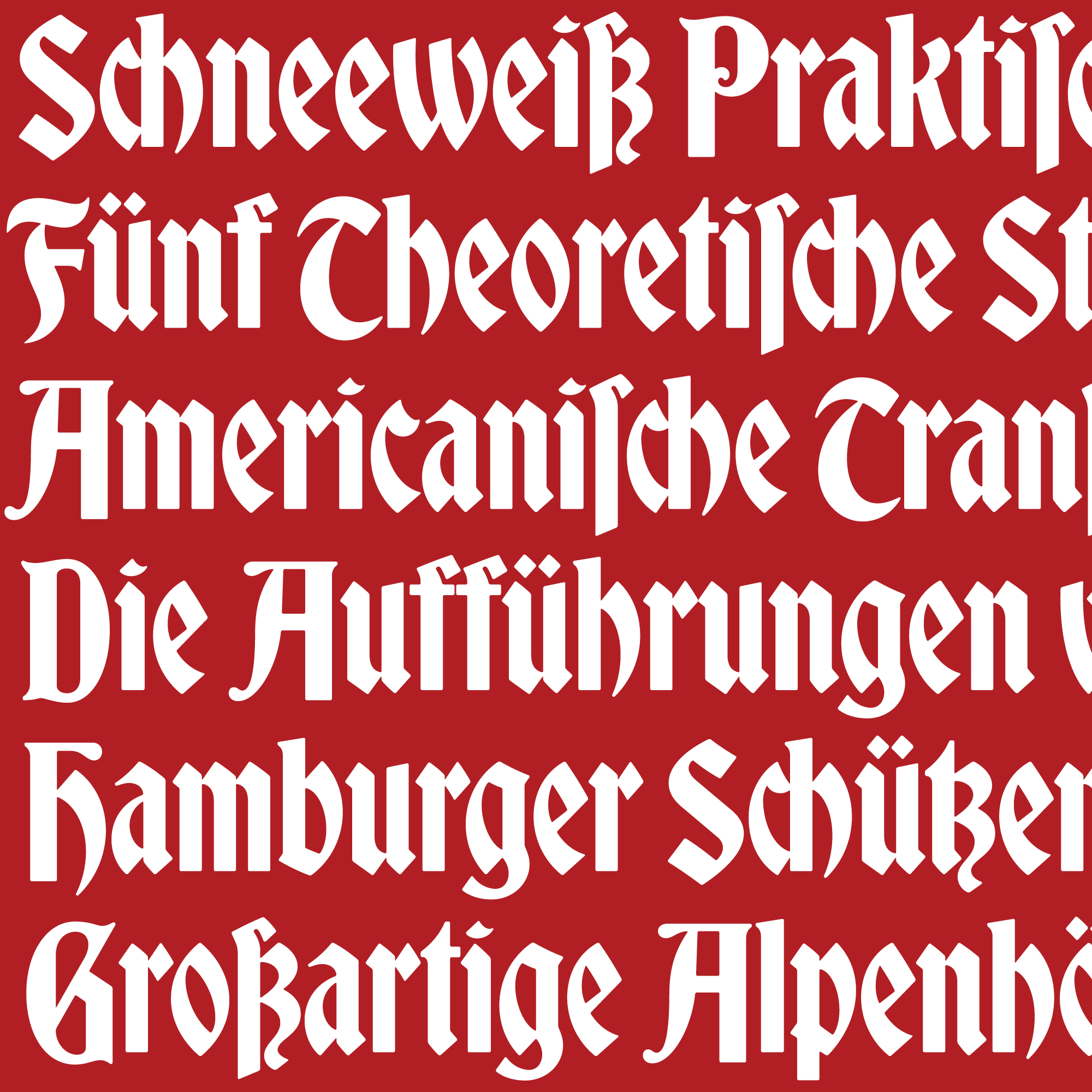
One other feature I’ll call your attention to are the special German characters, which ATF issued a few years later under the name Ihlenburg. This includes some digraphs such as ch and ck, a long s and tailed z, and of course the ß that joins them together.
For those of you who have admired Bradley in the old specimen books, I hope you think this little revival does it justice. And I’m excited for everyone else to get to know the design. A fairytale blackletter might not be among your usual go-to typefaces, but it can’t hurt to have one in your back pocket! 😃
You can see more examples of Bradley DJR in the PDF specimen, and you can get your copy today by joining the Font of the Month Club!
Special thanks to Stephen Coles, Kent Lew, Dan Reynolds, Laura Serra, and Nick Sherman for providing information and advice on this project.
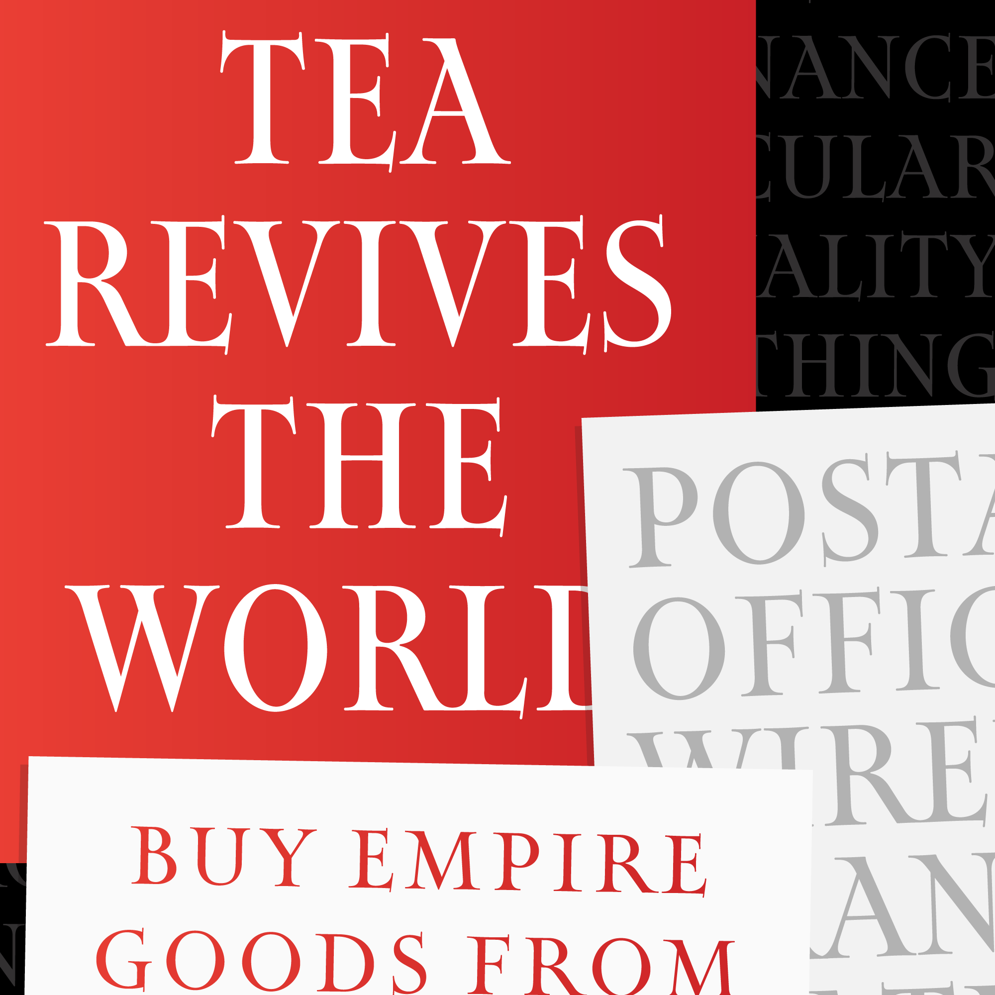
August’s font of the month: Map Roman
Map Roman is a great replacement for titling fonts like Perpetua Titling or Trajan, and is available for as little as $6 with a yearlong membership, but just for three more days! Sign up for the Font of the Month Club today to get your copy. Here’s a bit more about the design:
A while ago, on my way from Los Angeles to visit my brother in San Diego, I made a quick stop at the Map and Atlas Museum of La Jolla. It’s in an unassuming spot in an outdoor mall, but the collection was impressive and spanned many centuries of mapmaking. I spent much of my short time there admiring the illustrated maps of a twentieth century British graphic artist named MacDonald (Max) Gill, but I was in a bit of a rush and didn’t really have time to read the blurbs or make anything of his name.
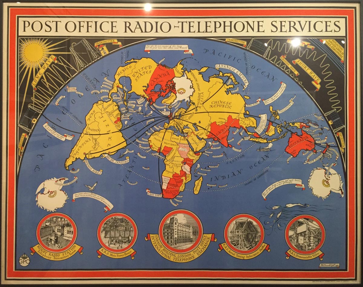
It wasn’t until recently that I decided to work on a titling font in this style, so I dug up the photos that I took at the museum and tried to learn more about these maps and and the artist behind them. And it was only then that I found out what some of you might already know: MacDonald Gill (known as Max) was the younger brother of Eric Gill, famous for his stone carvings and type designs but a problematic figure today due to the sexual abuse that he committed during his lifetime.
Knowing this, it is easy to see the clear similarities between the lettering on Max’s maps and Eric’s work, not to mention he similarities to the calligraphy of their mutual friend Edward Johnston. And while this relationship certainly remains in the font I sent to the club, I deliberately chose not to refer to work by other artists, relying only on the maps and my own intuition.
Map Roman is my attempt to distill this elegant lettering style into a typeface for titling. It is characterized by classic proportions and end strokes on the vertical serifs that extend below the baseline and above the cap height. The drawing style is a bit on the loose side for me; I left inconsistencies in stem weights and serif lengths and tried to draw the curves so that they snapped with elasticity.
Map Roman does not try to simulate hand lettering, but it does borrow a few tricks of the trade. Here you can see how the font elongates K, R, and L to subtly fill space next to gappy letters.
Map titling requires that words are sometimes squeezed into crowded spaces, and Max caps adapted to a variety of different widths. So I was especially excited to make Map Roman a bit squeezable, and to overcome the tension of classic letter proportions (where letters occupy the space they need to occupy) and realities of narrower titles (where words have to fit in a certain space). And if you all like what I’ve got so far, I’d be interested in taking it even narrower in the future...
I’ve also learned that the exhibit I saw is part of a larger trend of renewed interest in Max Gill’s work. My hope is that this typeface can continue this trend in some small way, inviting you to incorporate a bit of the charm of Max’s maps into your own work.

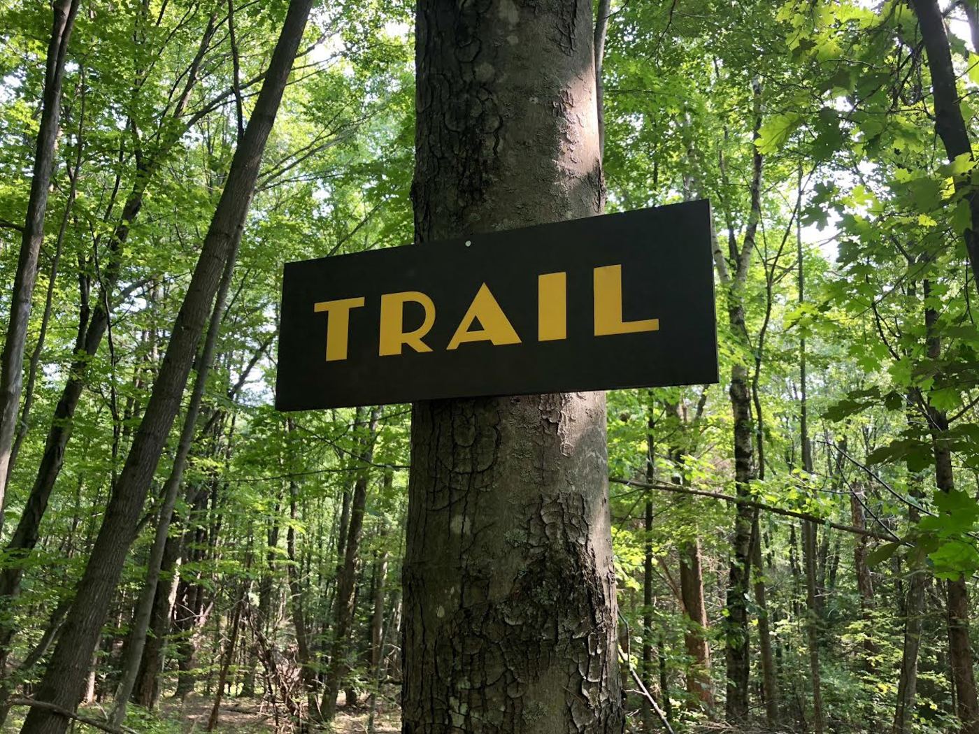
Finally got around to posting our first trail sign on Trail Type.
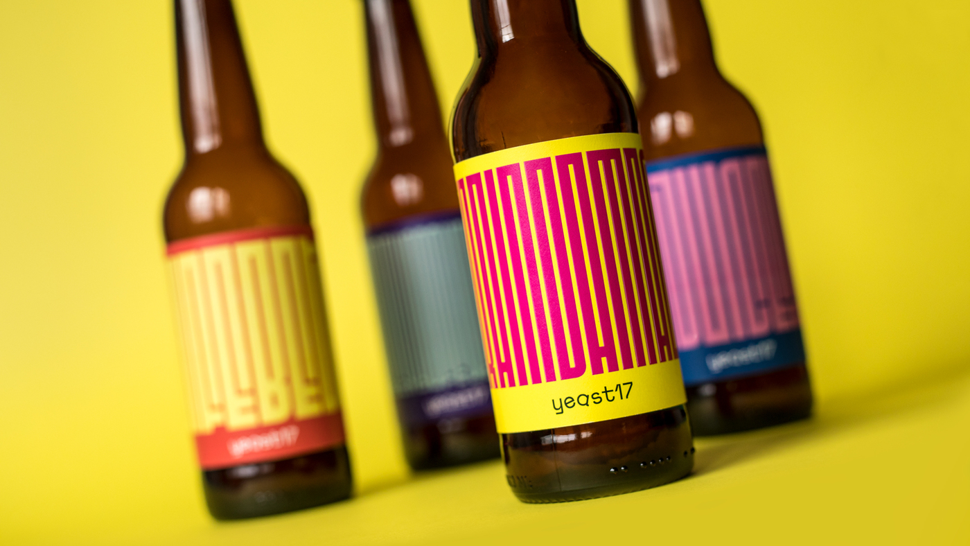
Check out this great use of Fit by Matteo Di Iorio for British brewer Yeast 17!