This beautiful minisite features TypeJournal.ru’s top 10 fonts of 2017, including Fit!
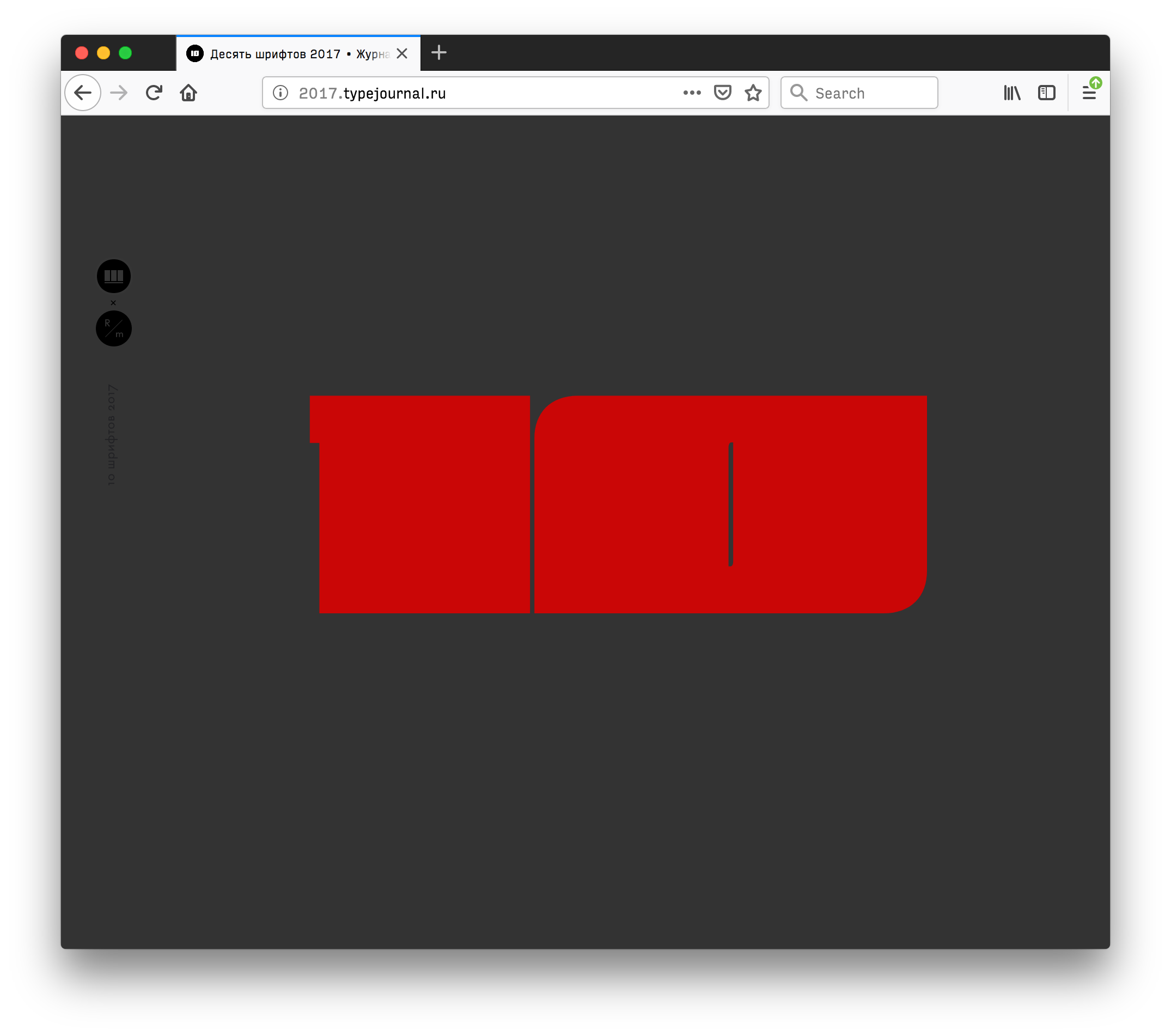
This beautiful minisite features TypeJournal.ru’s top 10 fonts of 2017, including Fit!
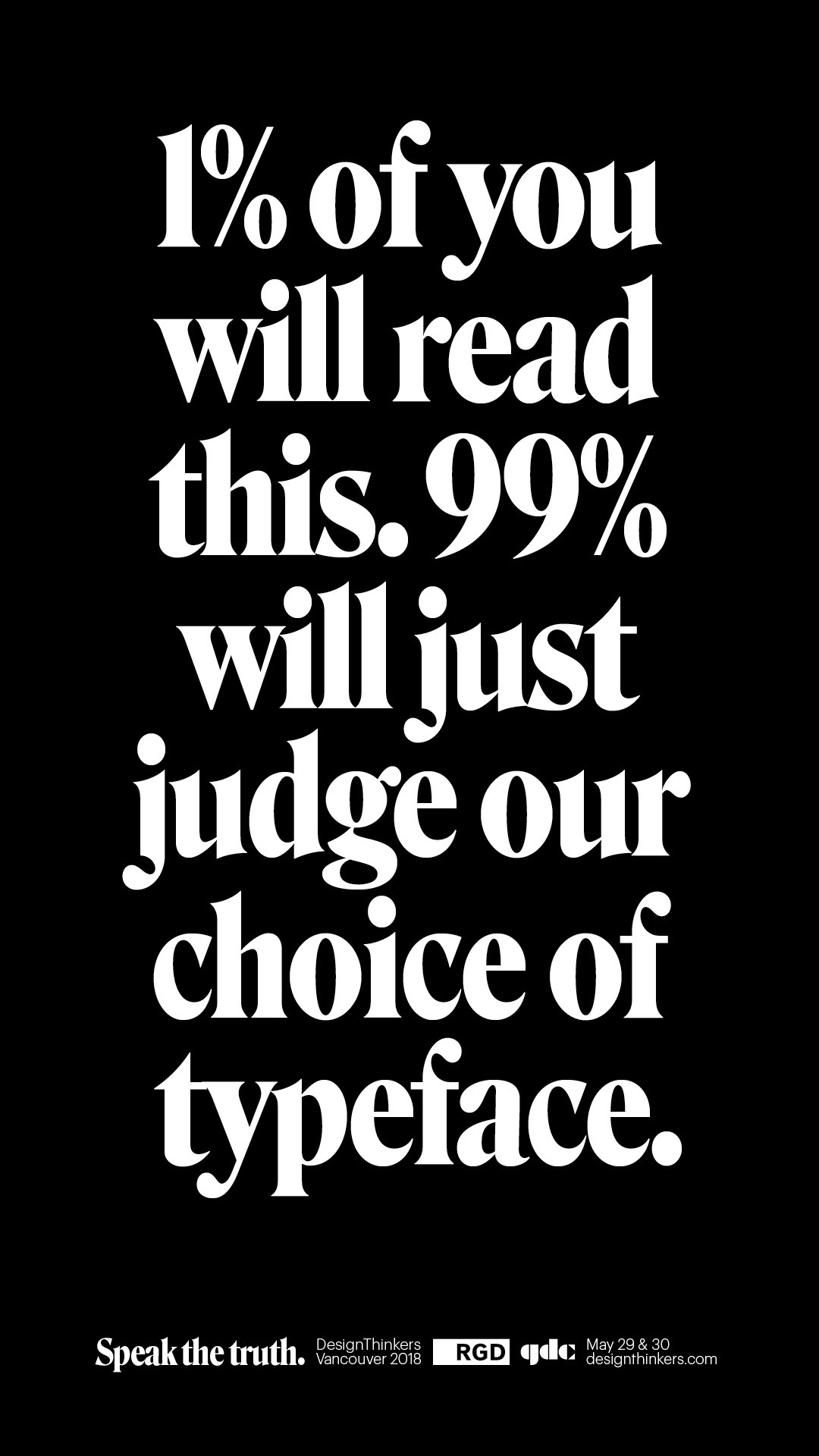
I love the identity that Zulu Alpha Kilo came up with for RGD DesignThinkers 2018 using my Roslindale and Commercial Type’s Graphik. Now you can see more examples at @FontsInUse!
A month ago @djrrb came over to @BBCRD to help us explore the new and fantastic world of variable fonts. We're now sharing our findings with the community. https://t.co/bE3bv1Aqyn
— Mathieu Triay (@MathieuLoutre) August 9, 2018
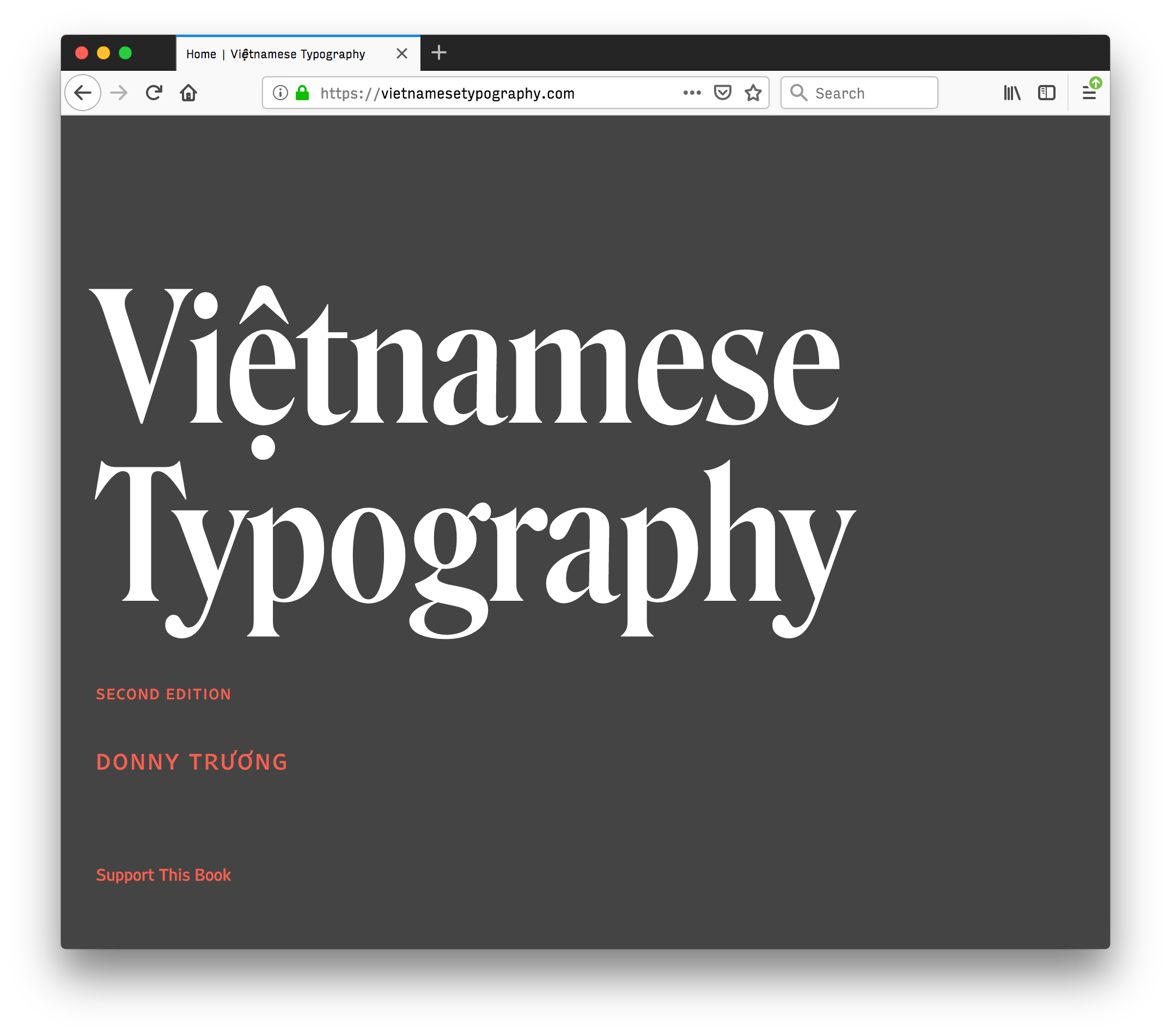
Donny Truong just released the second edition of his invaluable resource , featuring Roslindale and Fern (with Vietnamese accents I drew just for him!)
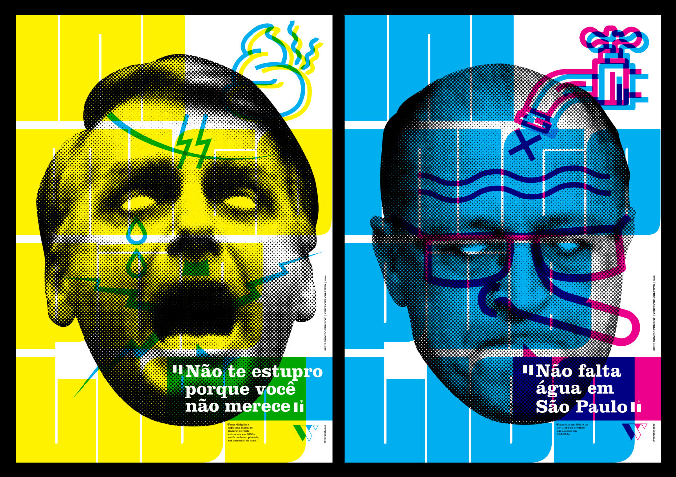
Marina Chaccur at Type Network just posted a great write-up about Fit’s use in the Inimigo Publico poster series