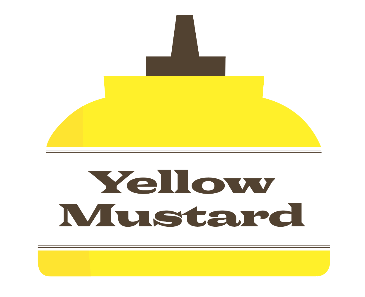
April’s font of the month: Rumpus

Distinctive serifs can be a blessing and a curse. The shape of the serif can get repeated so many times in a line of text that it can easily come to be the defining characteristic of a typeface, and consequently the glue that holds that line together.
But serifs don’t go everywhere. In typefaces that rely on distinctive serifs to be that glue, there is always a problem: How do you get unserifed letters like O to feel like they are speaking the same visual language as the rest of the typeface?
One of the things I love about Stephenson Blake’s 1883 Wide Latin is that it lets pointy stuff get super pointy and it lets round stuff get super round, but it all seems to kinda work. But I’ve been wondering what all this wonderful sharpness and roundness would be like if it just weren’t so...circus-y. And that’s where April’s Font of the Month Rumpus comes in.

I started drawing Rumpus years ago in a variety of widths, and to be honest, I’m still not sure that I have a handle on the design. It abandons Wide Latin’s modern structure for a more humanist one, and is more consistently wide across both caps and lowercase. It also plays the round/pointy game a little differently than its predecessor, losing some of the extra serifs on letters like V and W, but making up for it with diamond dots and interior corners.
Rumpus is stilly very much a work in progress, and I think pieces of the design are still unresolved. Still, I find that it is an excellent choice if you don’t have a lot to say but have lots of room to say it!
