Input travels to the past

Yves Peters wrote a very nice piece on Input’s use in the Netflix/Showcase sci-fi series Travelers. And thank you Marina Chaccur for watching and taking screenshots!

Yves Peters wrote a very nice piece on Input’s use in the Netflix/Showcase sci-fi series Travelers. And thank you Marina Chaccur for watching and taking screenshots!
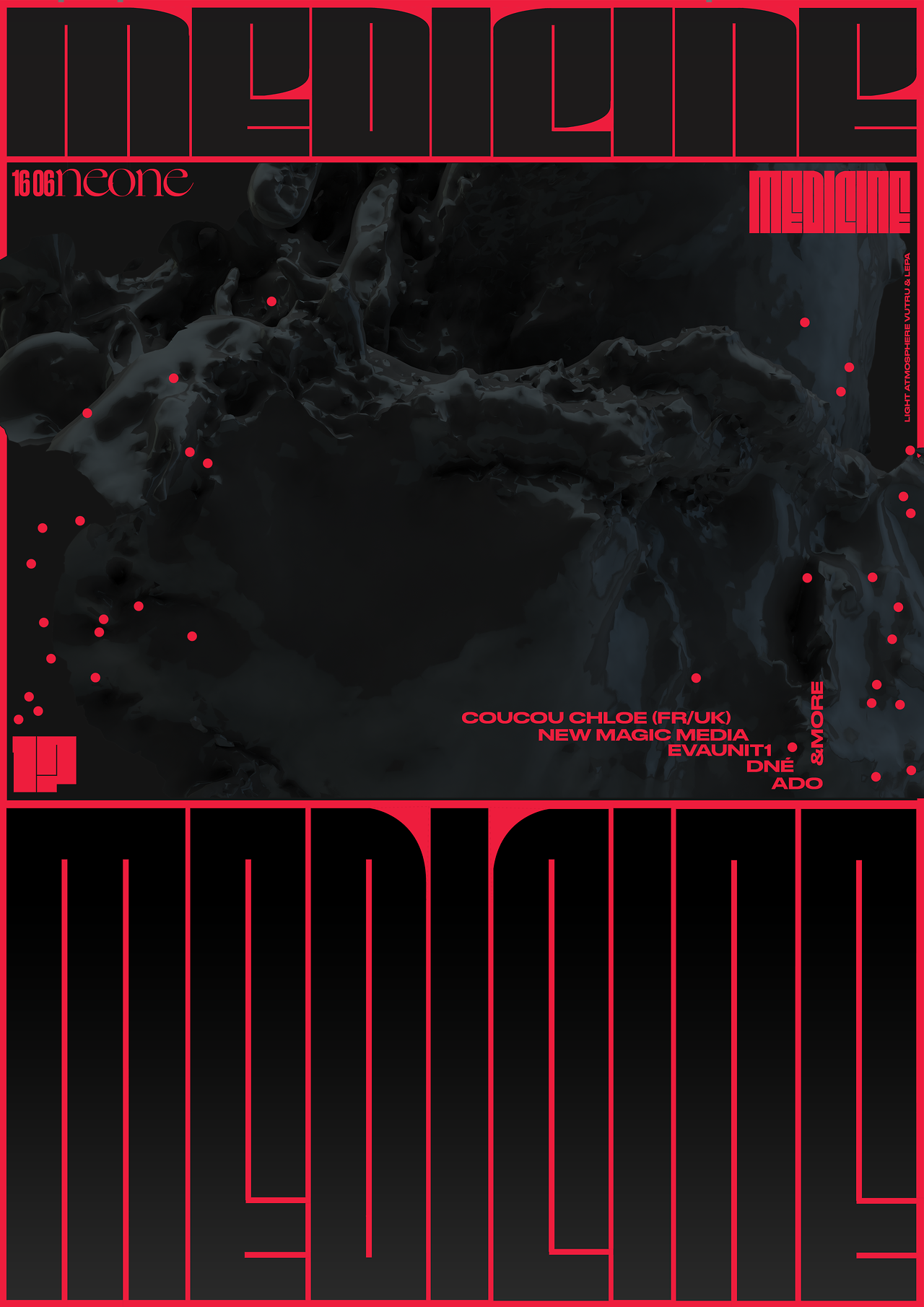
I was super impressed by this intense concert poster by Kristyna Kulikova, using a customized Fit. Read more on Fonts in Use »

(h/t Nick Sherman)
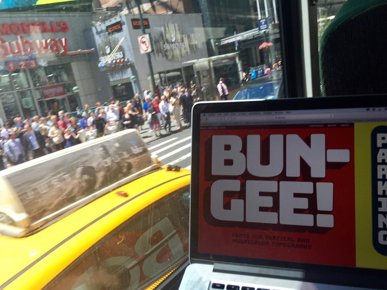
One year ago today, I launched Bungee from a bus on my way to New York for Typographics. I am so excited to be back!

Thank you to Slanted Magazine for featuring Font of the Month Club! (in German)
Last week, I had the pleasure of attending An Event Apart Boston, where I got to hear some great talks, chat with some interesting designers about type on the web, and meet web standards pioneer and Forma-user Jeffrey Zeldman.
On the final day of the conference, Jen Simmons led an incredible workshop on CSS Grid, where she not only explained the new syntax but the concepts behind it. Even though I spend more time designing type than I do designing websites, I was blown away at the potential for designing on a new level with this technology, and I could not wait to try it out myself.
So, as a first test of how I could use CSS grid, I created this colorful and responsive character showing of Nickel, May’s Font of the Month.
That shaded style that you see is Nickel Open Face, now available as a bonus offering for those who join my Font of the Month Club in May!