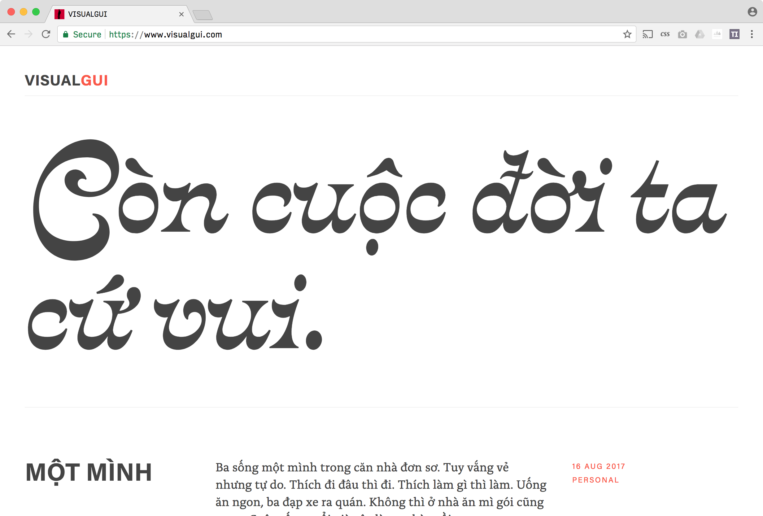
It has been great to see Donny Truong update his headline typeface with the current Font of the Month!
 {: .lightborder}
And here’s how it looked in June, with Roslindale:
It has been great to see Donny Truong update his headline typeface with the current Font of the Month!
And here’s how it looked in June, with Roslindale:
@djrrb Bungee in use in a coffee place at Dubrovnik airport. Unfortunately no inline or shade :(. pic.twitter.com/OsjRHPcwMD
— Alessia Mazzarella (@ammazzarella) August 16, 2017
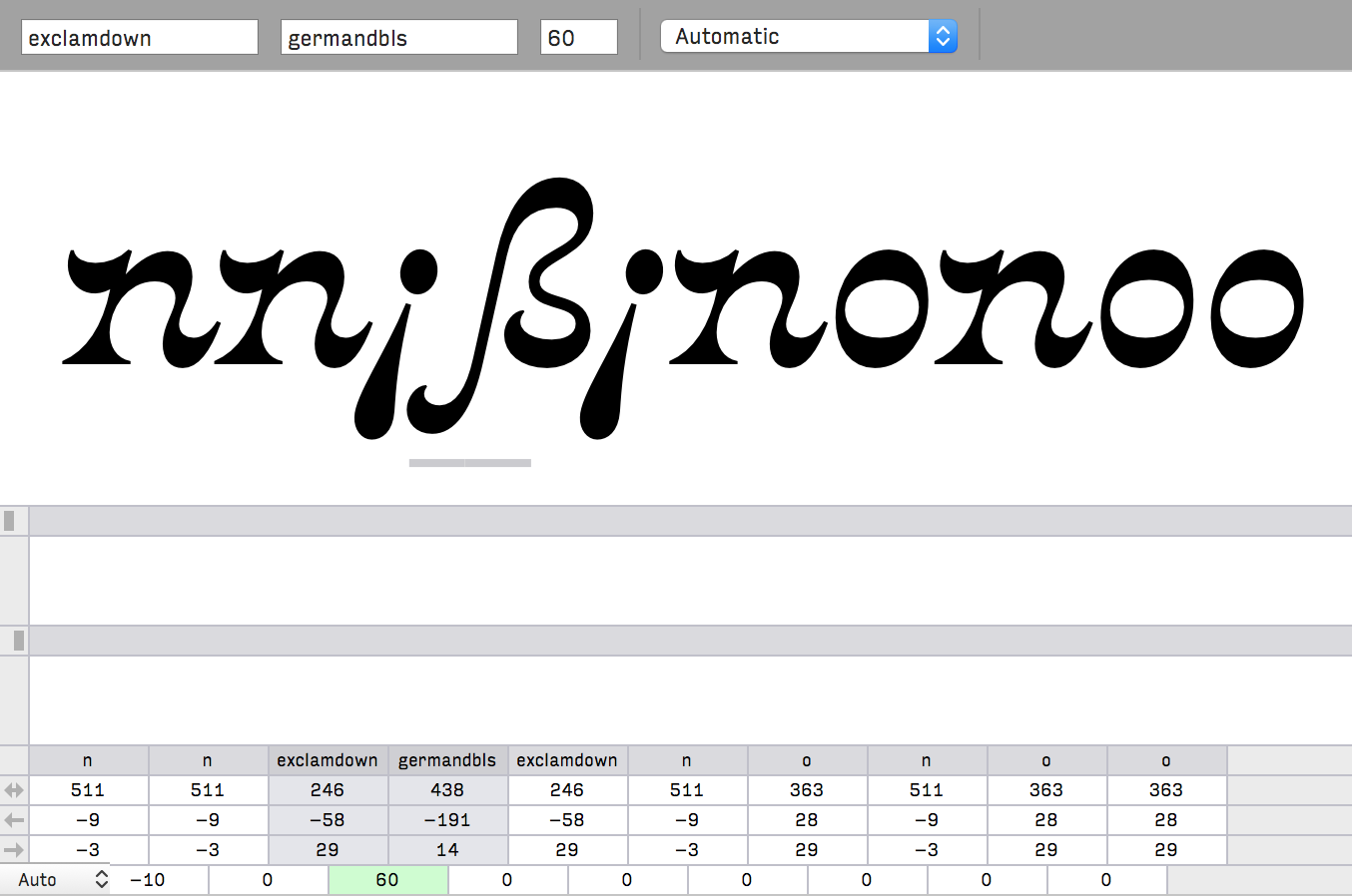
Why did I kern this?
 {: .lightborder}
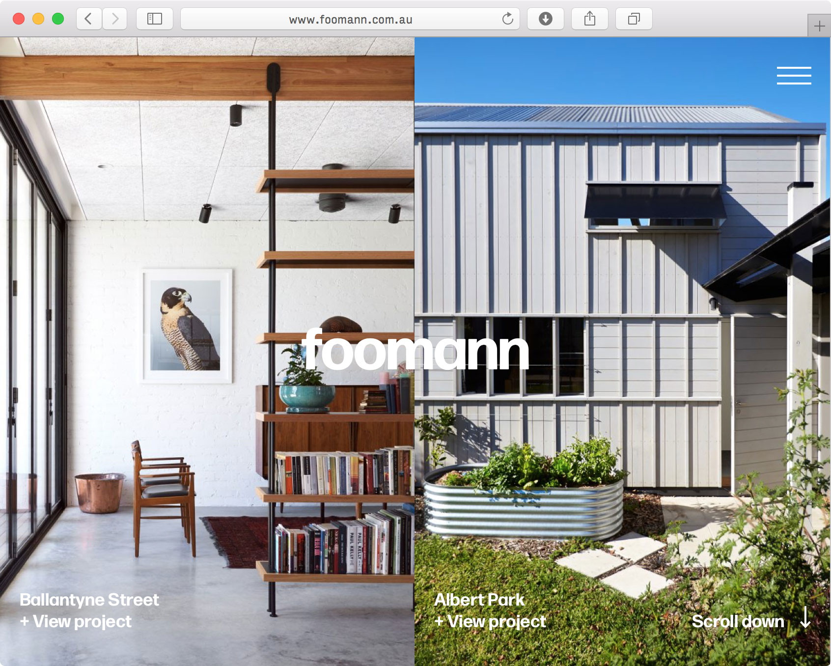
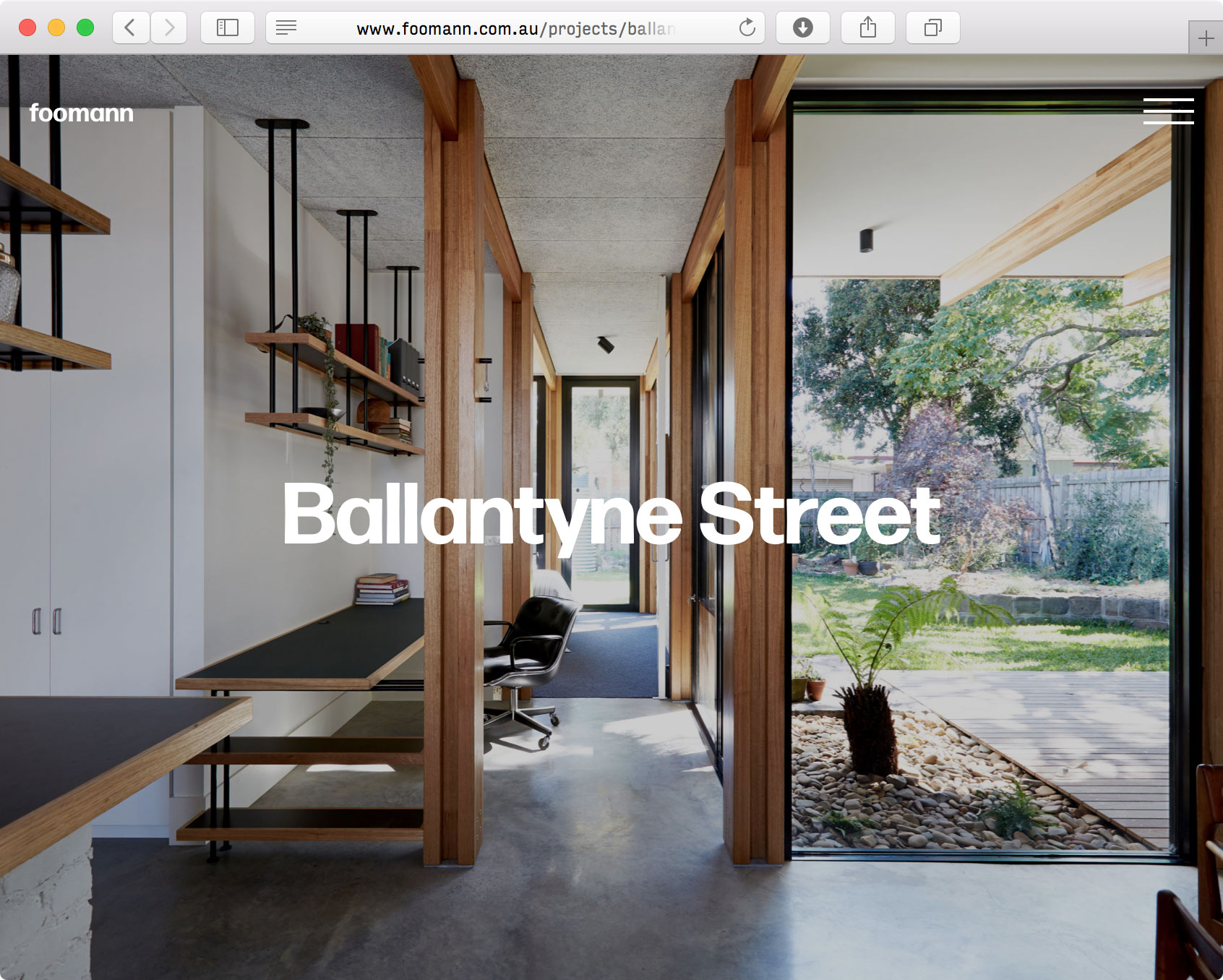
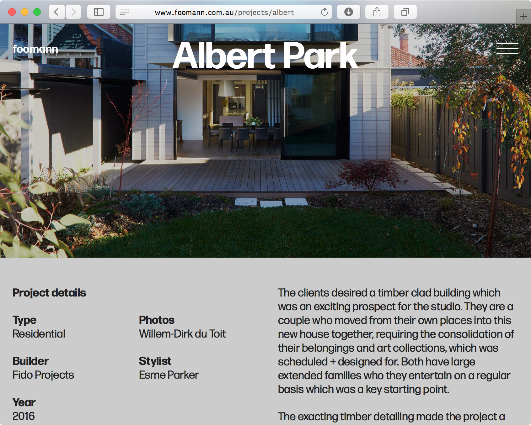
Melbourne-based Foomann Architects recently redesigned their website using Forma DJR for text and display. The website was designed by Ross Paxman and developed by Finn Robertson.
I love how Foong and Sormann’s names are fused together in the introduction, and how that side-by-side partnership plays out in the two-column layout and even in the navigation.
On a site like this with such gorgeous imagery, the job of the type is to get out of the way and let the photos shine. I think Forma does this, while also serving as the glue that holds it all together.
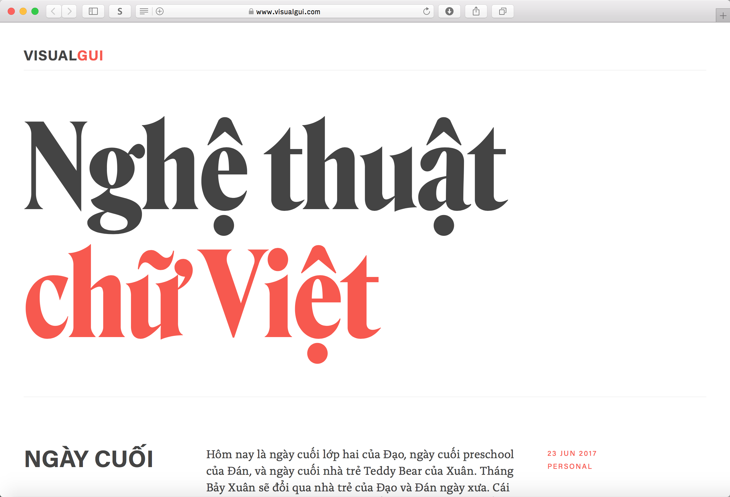
My friend and colleague André Mora started a blog called Seven Thousand Things to document his growing interest in gardening and horticulture.
I have always admired how André can combine typefaces in unexpected ways. Here, he uses a very simple layout with the extra-gritty Turnip RE styles in text and Turnip Regular for post headlines. Vulf Mono takes care of metadata, and the home page is decked out in the leafy Hobeaux Rococeaux.
 {: .lightborder}
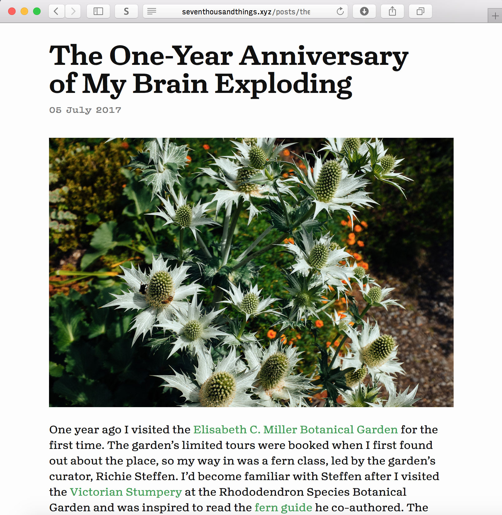 {: .lightborder}
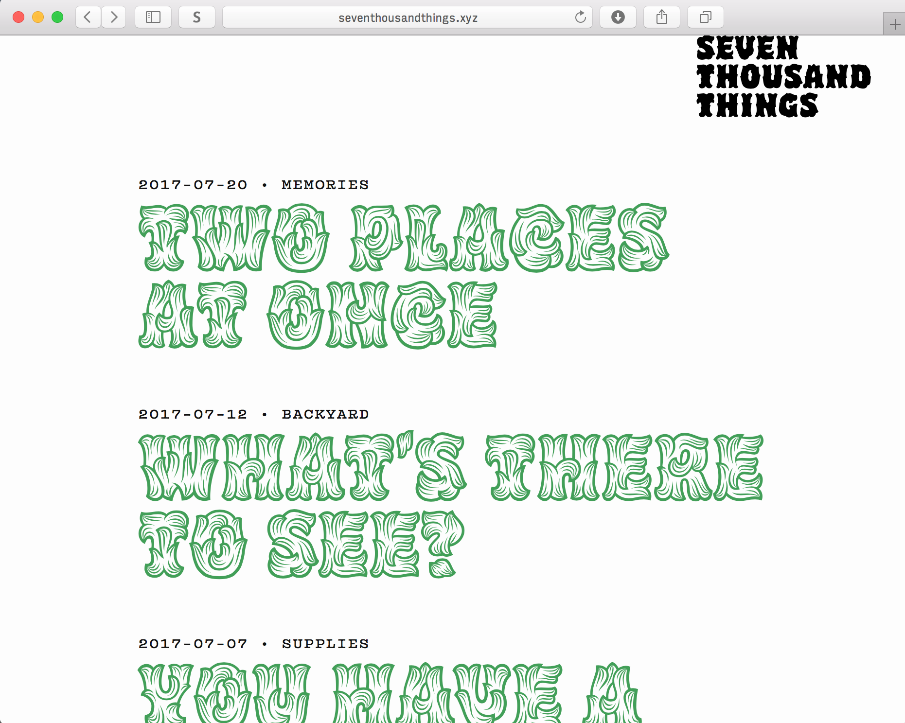 {: .lightborder}