Klooster: December’s Font of the Month

The uncial script was a particularly interesting step in the evolution of the Latin alphabet. Characterized by round, open forms, some uncial letters resemble Roman capitals as we know them today, while others begin to lean towards the forms that would eventually become our lowercase.
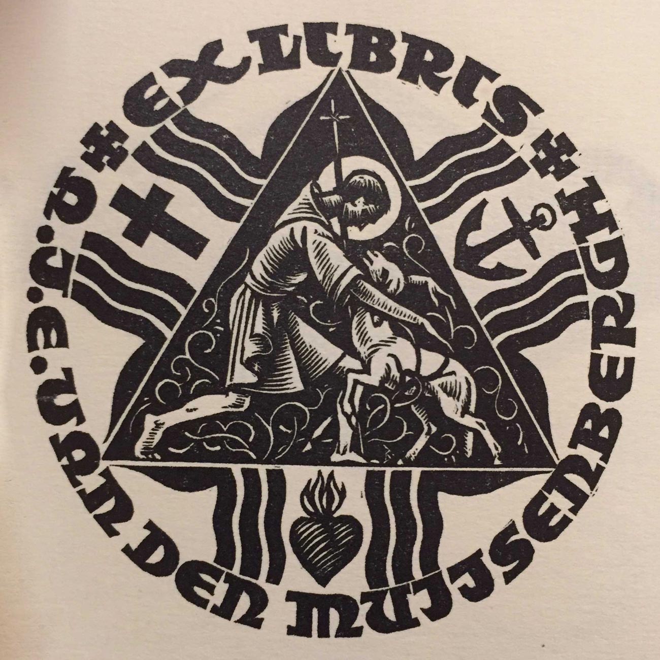
While uncials date back to the fourth century, the inspiration for Klooster is much more recent. Flipping through a friend’s copy of the D. Giltay Veth’s 1950 book, Dutch Bookplates: A selection of modern woodcuts & wood engravings, I was struck by the expressive energy of the woodcut lettering, particularly in the uncial-esque ex-libris of A.J.E. van den Muijsenbergh.
Even though this typeface ended up looking pretty different from the bookplate that inspired it, I sought to capture a bit of that rawness and angularity in Klooster’s loose drawing style. I also gave the face a fair amount of width and bulk, which I think adds to its expressive potential. And it comes with an assortment of alternates, which you can utilize to fine-tune the placement of ascenders, descenders, and uncial forms in your text.
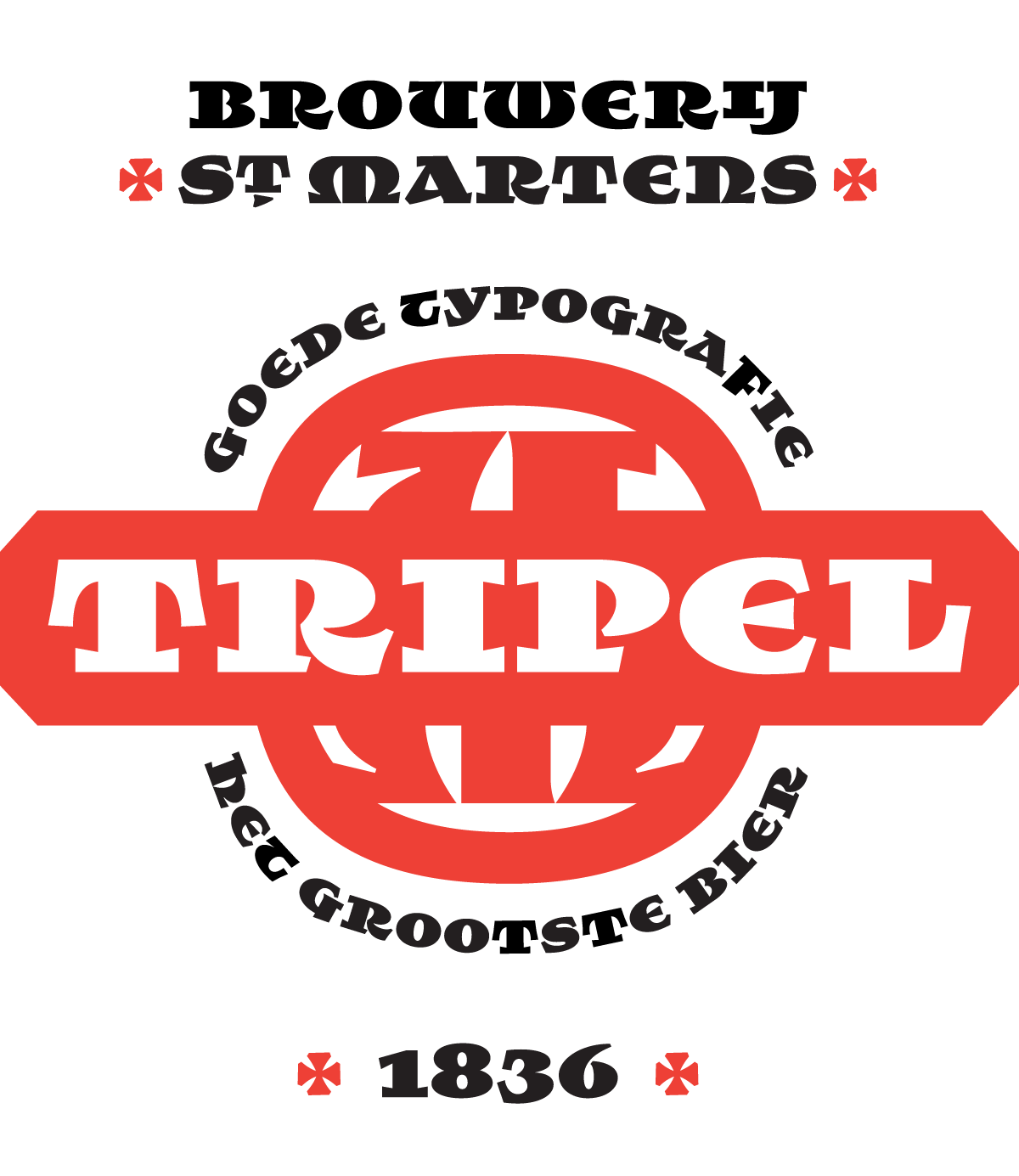
When designing this typeface, my imagined ideal use for it was on the packaging of a beer brewed by monks. So I dubbed it Klooster, the Dutch word for monastery. Klooster is the final Font of the Month Club installment for 2017, but I am already hard at work on a variety of projects for the coming year. Think about joining the club today!