Pappardelle!
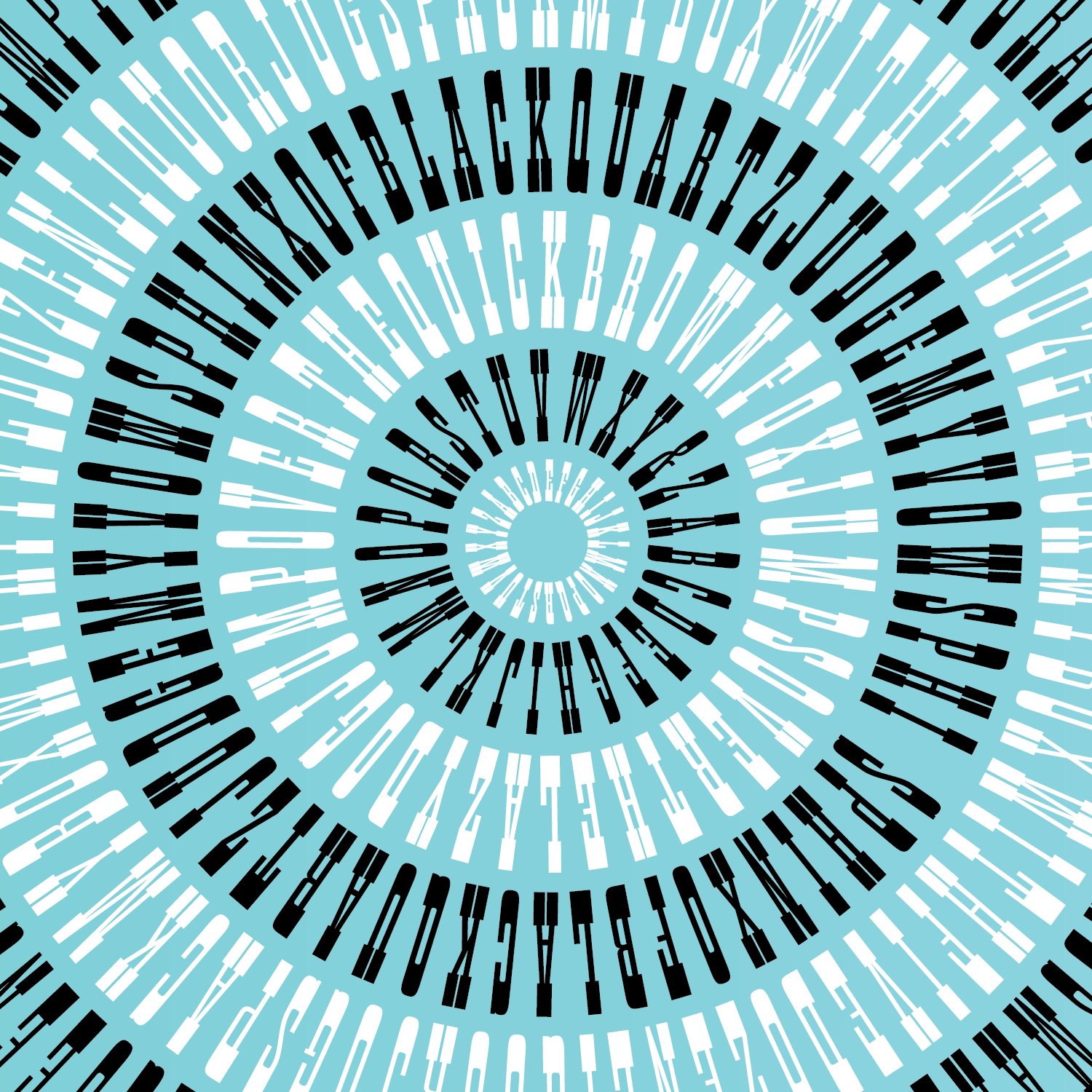
You might have wondered about the condensed slab serif on your Font of the Month Club membership card, so maybe you saw this one coming. But to celebrate six months of this club’s existence, I decided it was time to let Pappardelle loose and see what the club will do with it.
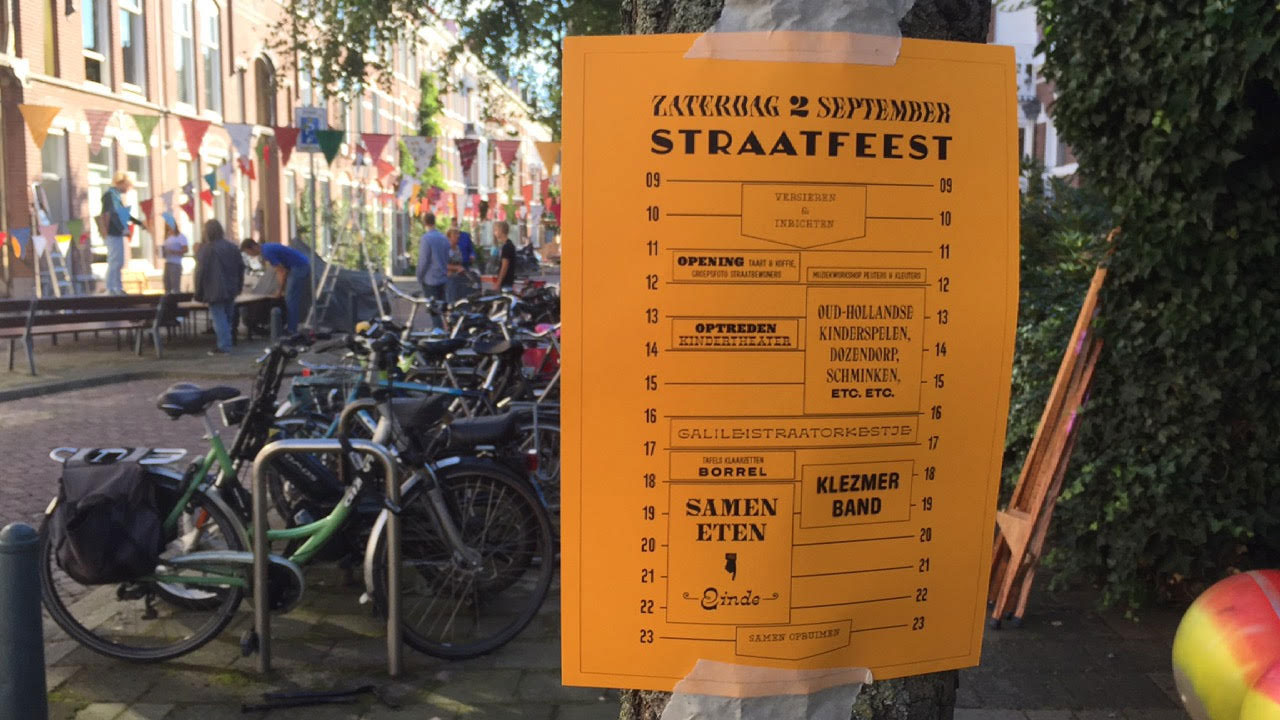
Pappardelle is a twentieth century take on the French Antique genre, following in the footsteps of faces like Playbill, Figaro, and Pro Arte. The direct inspiration for this typeface was Herbert Matter’s branding for the Knoll furniture company. Like its exemplars, Pappardelle has less of the Wild West in it, and is more of a modernist appreciation of the formal game that horizontal stress can play with the Latin alphabet.
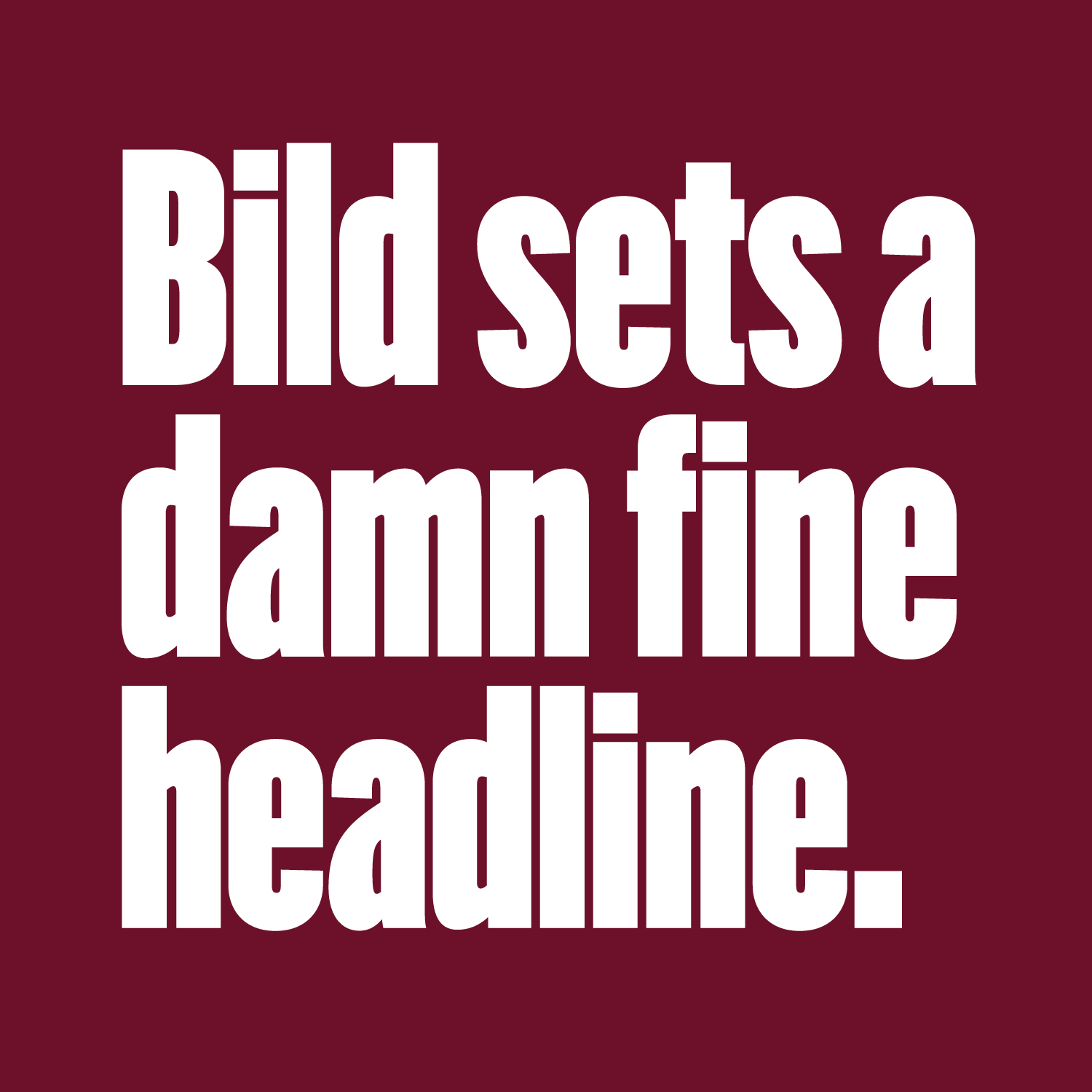
You might have been taught that it’s never a good idea to add letter spacing to lowercase, but here is the exception. I love how this typeface looks with a generous heaping of tracking, big and small(ish), uppercase and lowercase. Some space between the letters really accentuates the stacatto rhythms of the design.
And, in commemoration of the recent release of the first shipping browsers to support OpenType variations, Pappardelle also comes in the new format. It has a variable axis that controls the contrast between the thicks and thins. A font of the Month Club first!
Note: This post is backdated so that it appears in the correct sequence on this blog.
