July’s font of the month: Pomfret
I’ve never been able to resist a good titling face. “Display typography” is a general term that can describe anything with big letters, but “titling” describes something much more specific (book titles, essentially), which tends to imply a certain dignified, inscriptional style—capitals that feel special, but not showy.
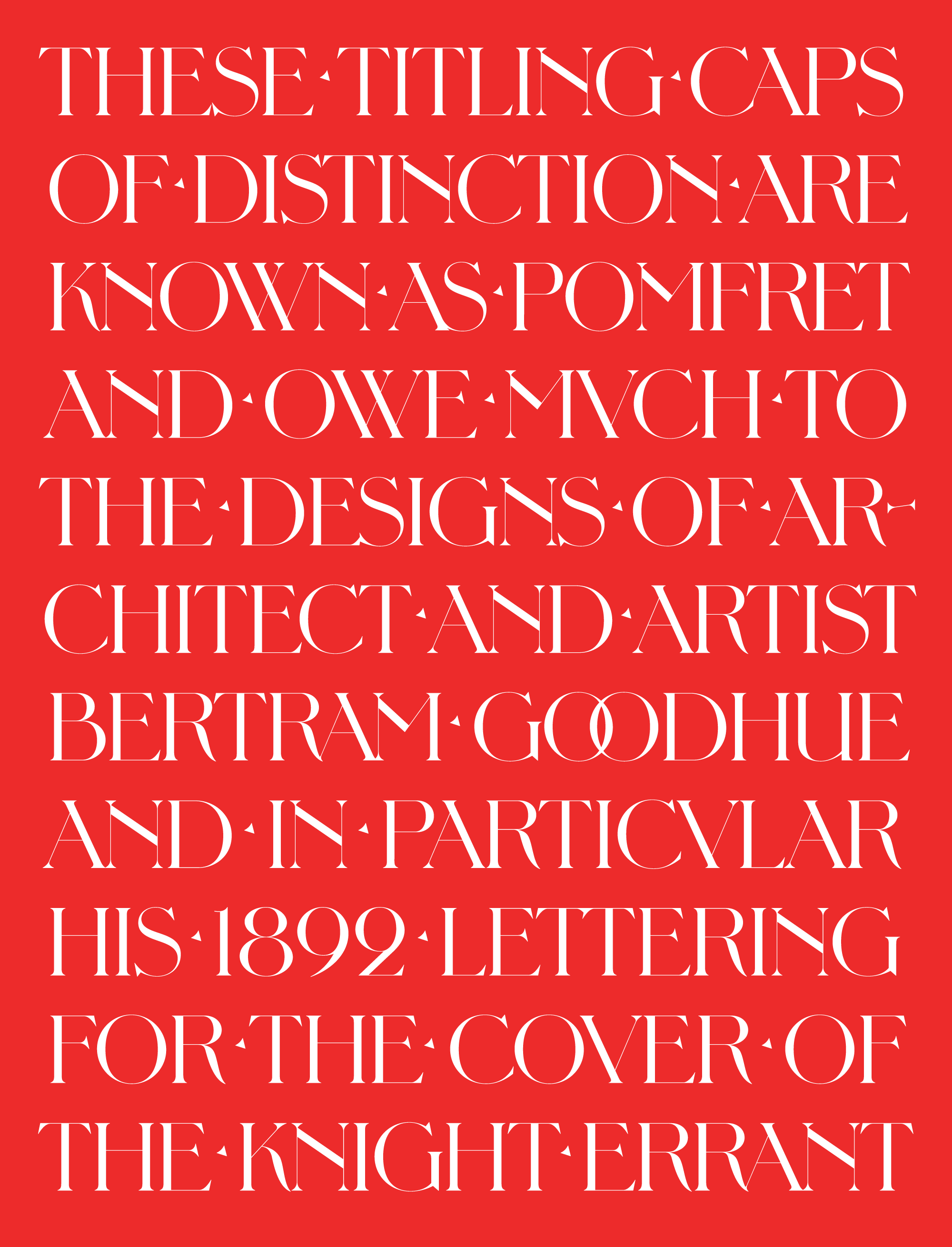
This month I have a titling face for you called Pomfret. It is modeled after the Arts & Crafts-style lettering of Bertram Goodhue, particularly his 1892 cover of the short-lived literary magazine, The Knight Errant.
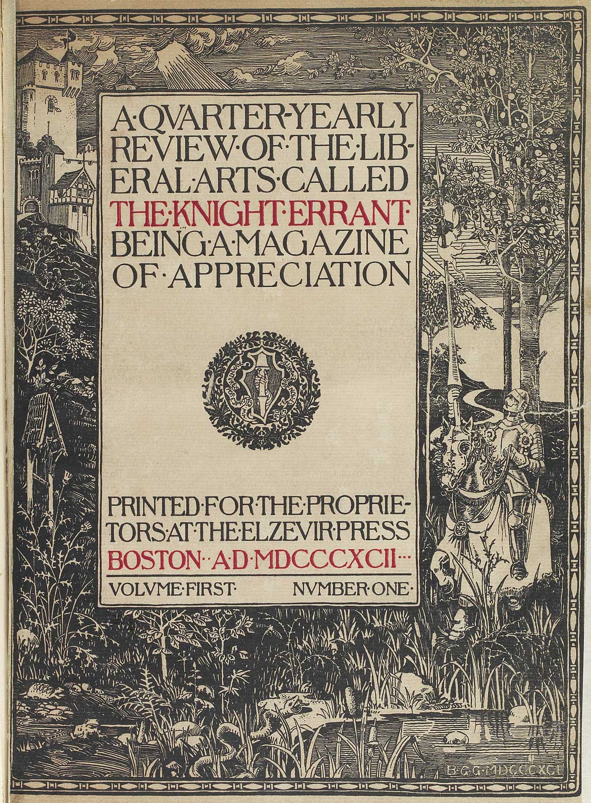
I’ve been familiar with Goodhue’s work for most of my life, just not his typographic work. When I was growing up, my parents worked in downtown Los Angeles, just blocks away from the LA Central Library designed by the very same Bertram Goodhue. I remember visiting this distinctive Egyptian-revival building as a kid, and recall it being one of the first places where I thought “Wow, so THIS is architecture.” It is still on the list of places that I recommend to first-time visitors to LA.
Even if he was better-known as an architect, Goodhue was an accomplished graphic artist as well as the designer of the popular Cheltenham typeface (famously used in the New York Times). I never paid attention to any of his other work until Roger Black encouraged me to try something in this style, sending me a bunch of images including the Knight Errant cover, shown above.
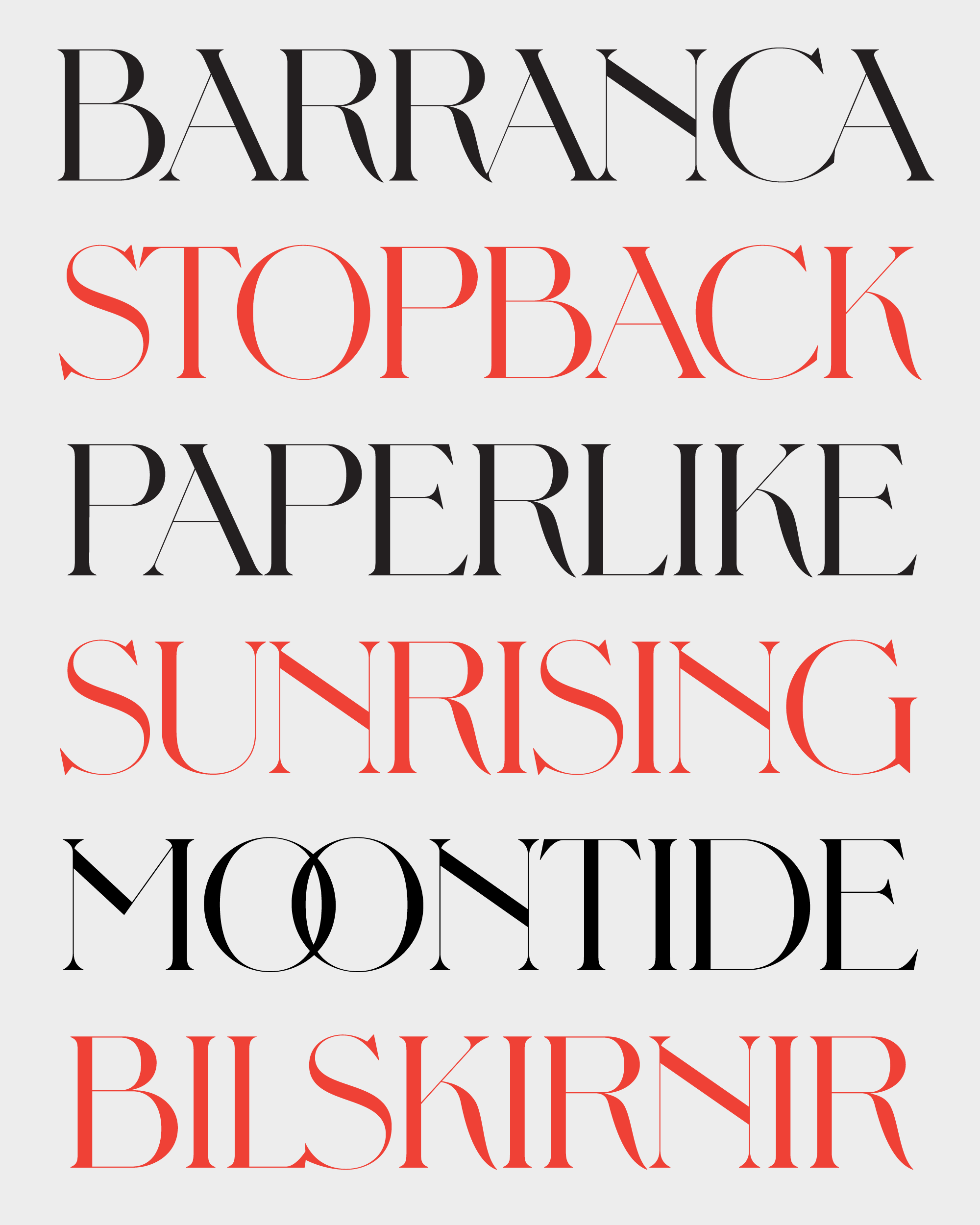
The detail that first drew me into this design is definitely the distinctive leg on the R (see also the K). It’s not brazenly expressive like the R in Map Roman, the other true titling face I’ve done for the club. It kinda just dangles off that flattened, high-waisted bowl, but it manages to do so with a measure of confidence and restraint.
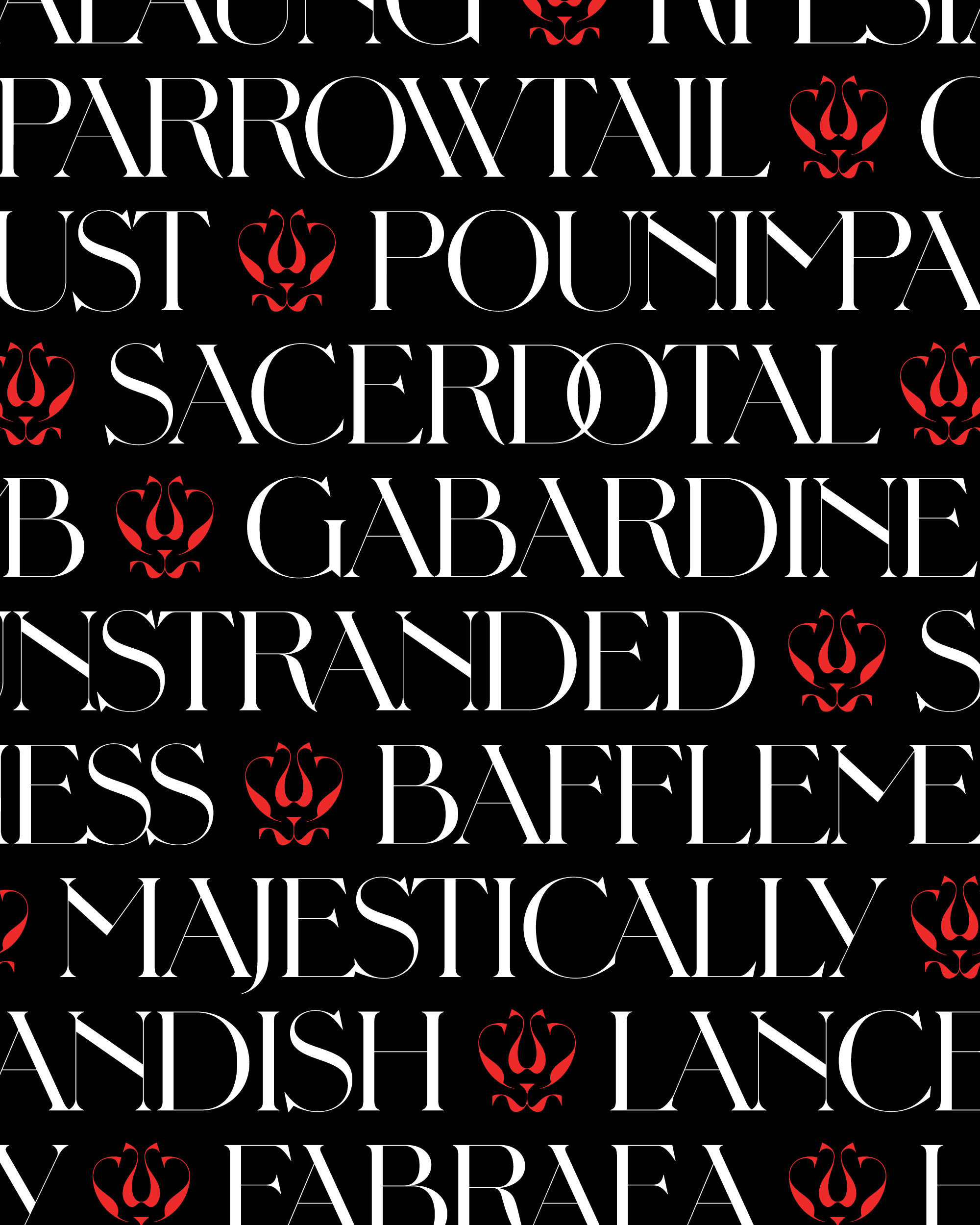
This established the guiding principle for this typeface: it’s okay to do weird things, but do them with restraint. The C and G have subtle but distinctive underbites, and the bottom of the S gets far larger than the top. I also took the liberty to add details that were nowhere to be found in the source material: for example, the high-waisted N, the looped 2, the asymmetrical Y, and the overlapping vertices on the A and V.
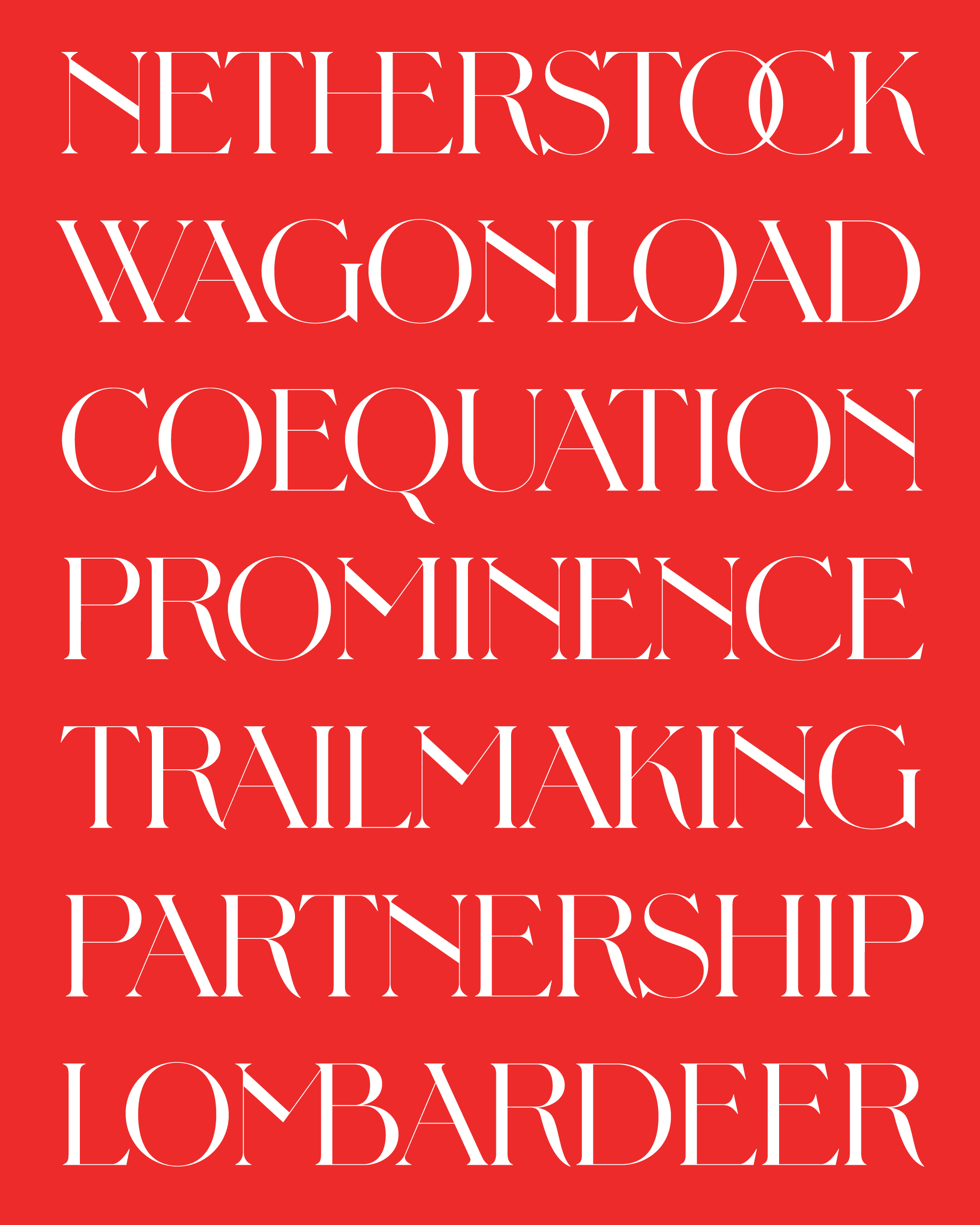
To give Pomfret a little extra edge, I pumped up thick/thin contrast to point that the forms are extremely brittle. I would consider adding lower-contrast versions later, but for now this typeface is really only suited for large sizes.
And while most titling caps call for a bit of letterspacing to underscore their monumentality, Goodhue’s lettering was surprisingly tightly-packed. I followed this approach in the font, which was pretty easy to do thanks to those short, stubby serifs. To cluster the letters together even more, I even added 175+ ligatures; many are implemented by default, but some of the fancier ones are available through the Discretionary Ligatures feature.
And perhaps most importantly, this is the first typeface I’ve ever created where the W is literally two V’s copy/pasted. I don’t know why, but I’m really proud of this little lifehack.
Pomfret is July’s installment of Font of the Month Club; as always, you can sign up for as little as $24.