April’s Font of the Month: Baby Condor
So…I know I said I was going to send you more Lithographer Text this month, but the universe had other plans. (In other words, I boneheadedly overwrote a bunch of my work on it earlier this week, without backing it up.)
I debated sending you what I do have, but it’s just not quite ready for primetime. I always struggle with how “beta” club releases should be. My goal is to send you a slightly doughy cookie each month—something underbaked enough to be nice and chewy, but not so much that you end up with food poisoning.
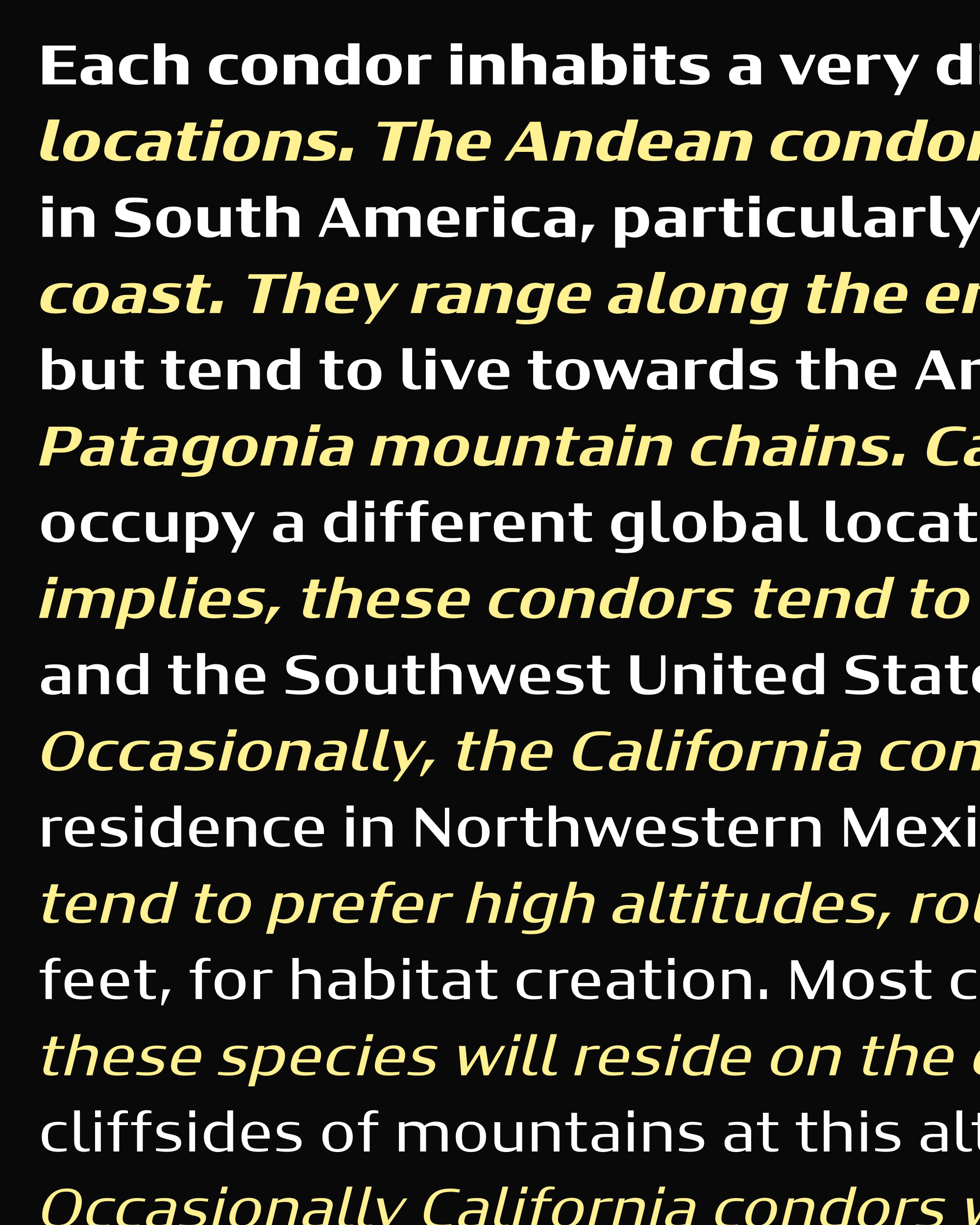
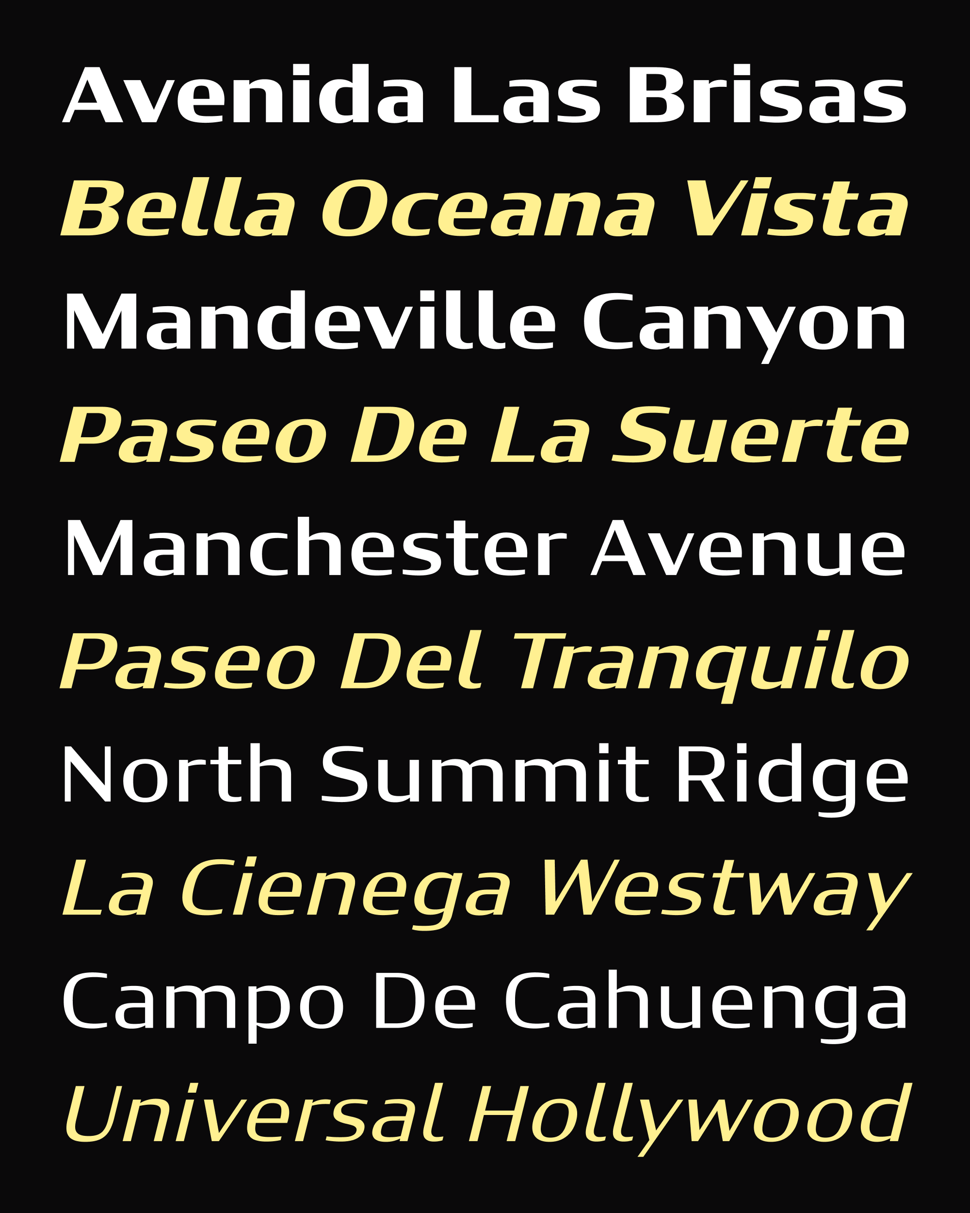
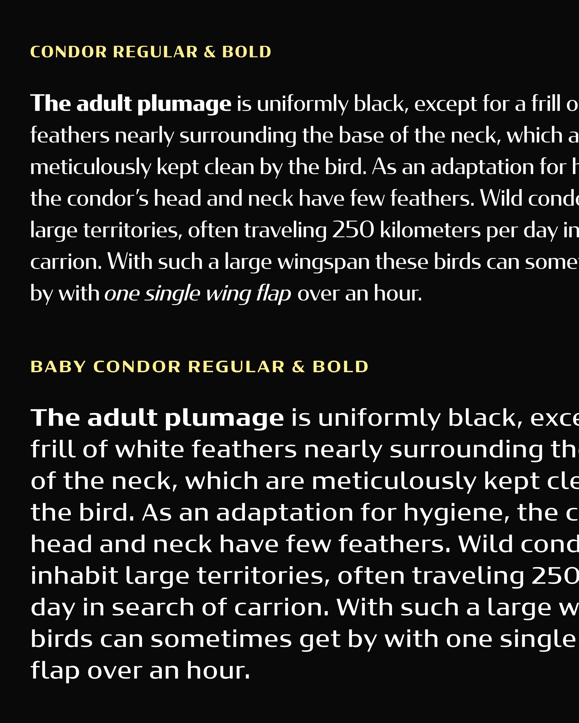
So while Lithographer Text sits in the oven for a little longer, I’m sending you a little something that has been in the slow-cooker since 2010. This is Baby Condor: a cut of my sparkly, contrasty typeface Condor that is, well, less sparkly and contrasty.
It’s always easy to complain about “blanding” and the ubiquity of corporate sans serifs (and believe me I do!). But I certainly understand the appeal of a one-size-fits-all typeface that works as well on a smartwatch as it does on a billboard.
I would love for a stylized design like Condor to be a viable alternative to these branding sans serifs, but I know it is not. Condor is a really finicky design, especially when it comes to size. If you set it just a bit too small, it gets tough on the eyes very quickly. A separate small-size version is the only way for a family like that to even try to compete.
I first imagined a small-size version of Condor shortly after its release in 2010, and I drew it following the approach taken by Font Bureau’s Reading Edge Series. In addition to the lower contrast, it also has a bigger x-height and looser spacing. Its weights, particularly the difference between Regular and Bold, are tuned for harmonious paragraphs instead of punchy headlines.
I remember the talk that Peter Biľak gave at Typographics about the unexpected sales trajectories of fonts, and Condor certainly fits that bill for me. It didn’t get much traction after its release, but in the past few years it has taken on a second life, showing up on packaging, in superhero films, and even on Jeopardy! And earlier this month, the Canadian Space Agency used Condor on the Artemis II mission patch for astronaut Jeremy Hansen, who recently took it on a 10-day voyage around the moon and back. Wild!
Even though it follows the small-optical-size playbook, I still think of Baby Condor as a text-ified display font, rather than a true text font (if that makes any sense). I’m not hoping to read any books set in Baby Condor, but I can see it doing a lot that the original Condor could not.
For example, the Canadian Space Agency also uses Condor for supporting text in a lot of their videos, and have wisely tracked it out when it gets on the small side. My hope is that Baby Condor will offer a more robust alternative to Condor in situations like these, while still preserving plenty of the family’s distinctive flavor.